Subscribe to OW blog for an instantly better inbox
Oops! Something went wrong while submitting the form.
Articles and Podcasts on Customer Service, AI and Automation, Product, and more
The pace of product development has never been faster, and the cost of building on assumptions has never been higher. At Optimal, we've spent nearly two decades helping teams get closer to their users, and what we're seeing right now is a fundamental shift in how research gets done. More teams are running research than ever before and timelines to act on findings are tighter, while the expectations for what research needs to deliver keep rising.
That shift is exactly what's driving Optimal 3.0, our most ambitious reinvention of the platform yet, designed to give every team the speed, depth, and flexibility that modern research demands. Today's release is the next step in that journey.
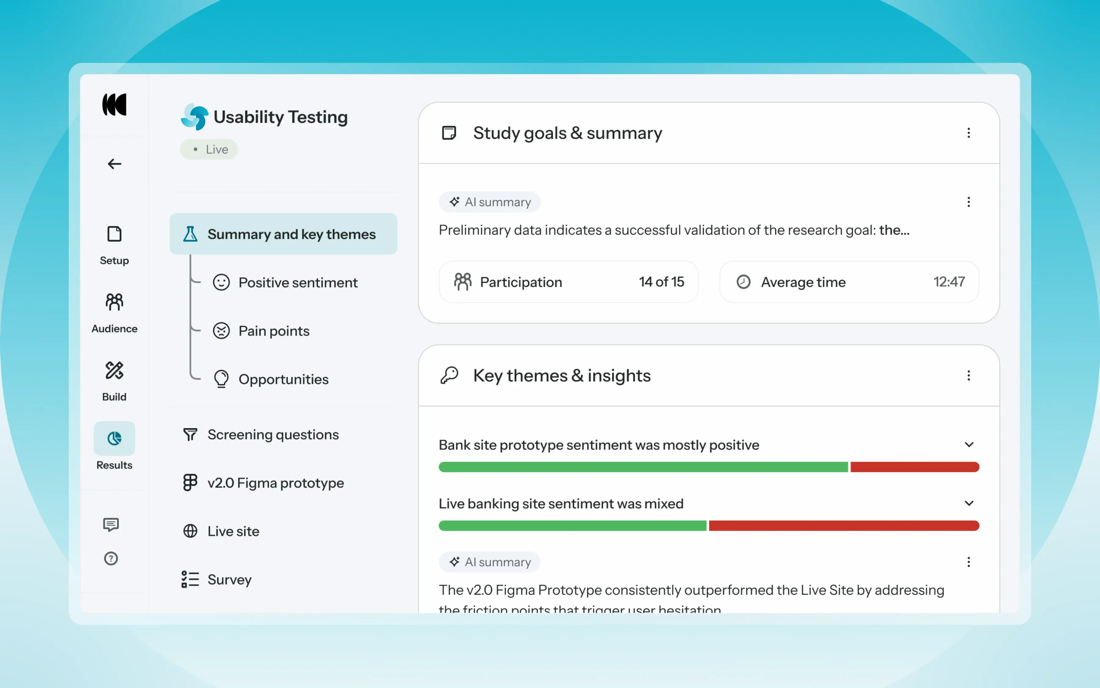
Optimal's new mixed-methods research tool tears down the boundaries between methods. It brings prototype testing, live site testing, and surveys into a single, end-to-end study workflow. And grounded in our product principles: speed to insights, access for all, and communication.
Optimal’s new Usability Testing tool marks the next step in the evolution of Optimal 3.0, giving teams the flexibility to evaluate experiences in whatever form they exist today.
Combine prototype testing, AI prototype testing, live site testing, and surveys in a single study. Test multiple prototypes side by side, compare different live URLs, or mix prototype and live site tasks together all in one workflow. Research can now mirror how products actually evolve, from early concept to shipped experience.
New speak-aloud question types, custom message blocks, auto-generated transcripts and insights, citations and highlight clips help you capture the context and reasoning behind every action. AI-assisted analysis then helps you make sense of it all fast and communicate with impact.
Review a study overview surfacing key themes, pain points, and sentiment analysis combining insights across all your study methods along with detailed results, task analysis and recordings, transcripts, key quotes, and automatically generated citations and video clips.
Coming soon: you can also use AI Chat to chat with your data directly, asking questions and pulling new insights and evidence across all your qualitative and quantitative inputs.
Modern product development is no longer linear. Teams continuously move between:
Traditional usability testing tools were not built for this fluidity. Optimal’s Usability Testing brings the flexibility to match how teams actually work today.
By combining multiple methods into a single study and pairing it with AI-powered synthesis, Usability Testing helps teams reduce setup and analysis time, recruit once, capture richer qualitative context, compare experiences more easily, move faster from feedback to action, and tell clearer, more compelling insight stories.
Learn how to get started with Usability Testing in Optimal and accelerate your path from idea to insight. Book a meeting, start exploring in your account, or join our live training webinar on June 24th to see it in action.

Tania Hockings is the Senior Digital Content Advisor at ACC and has a passion for creating content that caters to users (not the business). Co-presenter and co-author Amy Stoks is a Senior Experience Designer at PwC’s Experience Centre and possesses a love of empathy and collaboration. Ahead of their presentation at UX New Zealand 2017, Tania and Amy share their experience creating a content strategy while working on a project for the Accident Compensation Corporation (ACC’s no-fault scheme helps pay the cost of care for everyone in New Zealand if they’re injured in an accident).It’s a truth universally acknowledged that before you start writing content you’re supposed to have a content strategy. Three months out from launch of the new acc.co.nz beta site, we did not have one. Nor did we have a lot of time, very much resource or a completed content audit.However, we did have:
Here’s a quick look into how we created a content strategy for acc.co.nz without actually realizing it.
We needed more direction than those 37 tasks to get writing, so inspired by our design principles, we wrote some equivalent principles for the content. We decided to start with the tried and tested principles already in play by Govt.nz and GOV.UK — we didn’t have time to reinvent the wheel. We ended up with eight principles for how we would write our content:
We made a checklist of what would and wouldn’t live on acc.co.nz according to the principles...and that was pretty much it. We really didn’t have time to do much else because the design of the site was running ahead of us. We also needed to get some content in front of users at our weekly testing sessions.
We got stuck into writing those 37 tasks using our pair writing approach, which was also an experiment, but more on that in our UX New Zealand talk. While we wrote, we were living and breathing the content principles: we introduced them to our internal subject experts while we were writing and constantly referred back to the principles to help structure the content.After the beta launch, we had a few more content writers on the team and a bit of time to breathe (but not much!). We actually wrote the principles down and put them into a visual briefing pack to give to the subject experts ahead of our pair writing sessions. This pack covered:
As we wrote more content, the briefing pack and our process evolved based on what we learned and feedback from our subject experts about what was and wasn’t working.During the same brief intermission, we also had a chance to revisit the content strategy. However, in practice we just did a brainstorm on a whiteboard of what the strategy might be. It looked like this:

And it stayed like that for another six months.We can’t remember if we ever looked at it much, but we felt good knowing it was there.
We finally got to the end of the project. The launch date was looming, but still no content strategy. So we booked a room. Three of us agreed to meet to nut it out and finally write our formal content strategy. We talked for a bit, going around in circles, until we realized we’d already done it. The briefing pack was the content strategy. Less a formal document and more a living set of principles of how we had and would continue to work.
Yeah, we would. In fact, the ACC digital team is already following the same approach on a new project. Content principles are key: they’re simple, practical to socialize and easy to stick to. We found it really valuable to evolve the strategy as we learned more from user research and subject matter expertise.Of course, it wasn’t all rosy — these projects never are! Some governance and muscle behind what we were doing would have really helped. We found ourselves in some intense stakeholder meetings where we were the first line of defence for the content principles. Unsurprisingly, not everybody agrees with doing less! But we’re pretty sure that having a longer strategy formalized in an official document still wouldn’t have helped us much.The next piece of work for the digital team at ACC is defining that governance and building a collaborative process to design digital products within the organization. The plan is to run informal, regular catch-ups with internal stakeholders to make sure the content strategy is still relevant and working for ACC’s users and the organization itself.
Treat your content strategy less like a formal document and more like a working hypothesis that changes and grows as you learn.A formal document might make you feel good, but it’s likely no one is reading it.Whatever format you choose for your content strategy/working hypothesis, make sure you get it signed off and endorsed by the people who matter. You’ll need back up in those inevitably tense project meetings!The acc.co.nz content strategy looks awesome these days — very visual and easy to read. Tania always has a copy in her notebook and carries it with her everywhere. If you’re lucky enough to run into her on the streets of Wellington, she might just show it to you.
If you'd like to hear more about designing content, plus a bunch of other cool UX-related talks, head along to UX New Zealand 2017 hosted by Optimal Workshop. The conference runs from 11-13 October including a day of fantastic workshops, and you can get your tickets here.
Ah, content audits! If you need to work on a website redesign, information architecture revamp, or a site migration, one of the first things you’ll need to do is a content audit.Most likely a website redesign project will need some amount of re-organization because users can't find anything on the site. First, you’ll need to know who your users are. You’ll find out what it is that the users of your website are doing or looking for. You’ll conduct some preliminary user interviews to ask your project stakeholders what they think their users are looking for. Maybe you’ll get to ask actual users of your website.Then you’ll realize that you could also find out if the website correlates with what your users expect to be able to find. If you only knew what was on your website in the first place...You’ll need to do the content audit. You can’t avoid it now. The spreadsheet comes out. You start your inventory, add the metadata, and add columns to make sense of cells.It was arduous, and it was worth it. Once you do the content audit, you’ll be able to conduct card sorting and affinity mapping to find out what your users are looking for.It reads like a children’s book, doesn’t it? “And then content lived happily ever after...”But, content audits are iterative, not a once in a project cycle activity. Like a routine checkup or a yearly exam, a content audit is essential to keep content relevant and valuable to your users.Conducting a content audit is one of the first steps in putting together a card sort. You need words on a card, right? Your content audit is where you’ll find them.Incidentally, “how to do a content audit” articles are plentiful, but this will be one that focuses on how a card sort makes use of a content audit.
Content audits start off as inventories. They tend to be massive spreadsheets that contain, among other things, metadata about the content you’re keeping track of. For example, an inventory may start as a list of companies, occupations, or cities. Then someone may come along and start collecting empirical metadata around these things. The list becomes a list of the top global brand companies, the best occupations for 2017, or the most dangerous cities in the world.Maybe you’re keeping track of what books you have, what you’ve read, what you haven’t read. Maybe you’re keeping an inventory of your kitchen pantry. Maybe you’re collecting a list of movies and films you should watch or keeping a bucket list of places you want to visit.Consider the scope of these three inventories:
Content inventories are the quantitative kind. The purpose of this list is to know how much content you have, and how many of each different kind. There are 12 countries I want to visit in Asia. I’ve already visited 10 of the 50 states in the United States. There are over 800 pages in the five websites that I’m consolidating.Content inventories give you numbers to work with and provide a current state of affairs before you go making changes. You’ll be able to refer to this when you talk to content owners.
Content audits focus on the qualitative. You add an evaluation of the content (which is qualitative) to that initial simple inventory. The most common is ROT analysis: redundant, obsolete, and trivial. Another type of analysis looks at tone and voice. Kristina Halvorson, in her book Content Strategy for the Web, chunks qualitative data into six groups: usability, knowledge level, findability, actionability, audience, and accuracy.The information you collect in your audit depends on what you want to know. If “easy to understand” is a KPI that you or the business wants to measure, then you’ll want to include readability scores. Every content audit is custom-fit for the purposes of each project.In essence, content audits are lists of things you want to track and your assessment of that thing — whatever that thing is. Things can be physical content as well as digital. Are those spices too old and should be thrown out? Is that travel destination in the midst of political turmoil and should it be taken off the list (for now)? Is that movie now available for streaming? How many of those 800 pages are worth of keeping or updating and how many of those could we archive and take offline?
Content audits are living documents. They need to be updated on a regular basis to maintain a certain level of content quality and relevance. They are pivotal documents, shared across various disciplines, used for various purposes.Search engine optimization (SEO) tools create site crawls that capture page titles, URLs, page elements, and position within a site hierarchy. They are spreadsheets that look and feel deceptively like content inventories. And they essentially are.Content audits are converging:
Content audits are pivotal documents that have many different uses.Someone adds site analytics to the document, then readability scores, then BOOM! There are now even more ways to pivot the table — top landing pages, top pageviews, highest bounce rate, high word count, low word count, oldest content, newest content — where do you want to start?
Stratis Valachis, senior user experience designer at Aviva’s Digital Innovation Garage, took some time out of his busy schedule to answer some questions about designing for conversational user interfaces (CUI). Learn more about his processes for research and design for CUI, what he thinks the future will look like, and some of the biggest challenges he’s faced while designing for CUI.Stratis will be speaking at MUXL2017, the third annual conference around Mobile User Experience in London on the 10th of November at City, University of London. Using case studies through talks and workshops, the conference will cover Core UX principles as well as emerging topics such as AI (Chatbots), VR (AR) & IOT.
Like any design project, you should always start by identifying user needs and real problems. Research how users solve that problem currently and then evaluate for which use cases you can remove friction and enhance the experience by utilizing a conversational interface.Don't try to chat-ify or voice-ify your product just because it's a cool trend. In many ways conversational interfaces (CUIs), both voice and visual, have more usability constraints than traditional GUI. For example, it’s hard to interrupt the conversation to recover from errors, you can't easily skim through information, progress is linear and you very often need to rely on recall.Users make conscious compromises about which type of interface they want to use.This means that a solution utilizing a CUI needs to offer an obvious benefit for your chosen use case, otherwise users won't use your product. That's why special emphasis should be placed on early research about the context in which users will use your product and on why a CUI could provide a better experience. When you begin the design phase, a good practice would be to craft a personality for your interface. Studies have shown that because humans are empathetic, they will assign human character attributes to your CUI anyway, so it's better to make sure this is defined through design. This works really well for platforms like Google Home and Facebook Messenger, which make it clear to the user that each product built on them is a different entity from the default assistant.Some channels like Alexa, though, don't make that distinction clear. In these cases, you need to make sure that the character of your CUI doesn’t significantly deviate from the personality of the default assistant, otherwise you'll mess with their mental model and create confusion. For example, when you're ordering an Uber with Alexa, it’s Alexa that speaks back to you: "Alexa, ask Uber for a ride." "Sure, there's an Uber less than a minute away, would you like me to order it?". While on Google Home, the Google Assistant makes it clear that it passes you over to Uber "Hi, I'm Uber, how can I help?".After you define the personality, start drafting out the core experience of your product.If you're working on a visual CUI, type the conversation down like a screenplay. If you're working with voice, act the dialogue out with your colleagues and use voice simulators to see how it feels in the channel you're designing for. This will make it easier to decide the direction you'd like to follow and will also help you initiate conversations with stakeholders.At this stage, you will be ready to start designing your user flows to define the functionality at a granular level. Again, understanding context is crucial. Make sure you think of the different scenarios in which users will interact with your product and the ways they're likely to phrase their input. User testing is key for this.
Setting the right expectations for users. That applies to both visual and voice interfaces. There's a gap between the mental model users have of what most AI products with conversational interfaces can do, and what they are actually capable of doing. That was a common pattern I've seen in user testing sessions even with users who had previous experience in the conversational channel that was being tested. As a designer your challenge is to make the affordances and constraints clear in a way that feels like a natural part of the conversation and mitigates disappointment from unrealistic expectations. Another challenge is trying to cater for all the different ways people will phrase the requests. The key here is to invest time and resources in user research and NLP (natural language processing) services. If you feel that this is out of scope for your project, you may consider limiting the options for your users as trying to guide them to say things in a certain way will not work. Good examples of this are Facebook Messenger bots which now allow developers to remove the input field entirely from the experience in order to prevent users from making requests that can't be supported.
It might require designers and researchers to slightly alter some techniques they're using (for example thinking aloud during user testing doesn't work with voice interfaces) but the fundamentals will stay the same. You still need to focus on understanding the problem, explore different solutions through divergent thinking, converge, develop and continuously iterate based on user feedback. The exciting thing is that these new technologies significantly expand our toolbox and offer new interesting ways to solve problems for our users.
I would like to see a more widespread integration of voice interfaces with visuals and GUI interaction patterns. A good example of the benefits of this approach is Amazon's Fire TV. Users can converse with the system via voice when it's more efficient than the alternative interaction options (for example, searching for a movie) but use their remote control to interact with visual UI elements for tasks that would be tedious to perform through voice. For example, selecting a movie cover to reveal descriptive text and then skimming through it helps you gauge whether the plot is interesting faster than if you had to consume this information through a conversation. This hybrid approach utilizes the best of each world to create a stronger experience. I think we will see this type of interface a lot more in the future. Think of Iron Man and J.A.R.V.I.S.
Invest time in learning best practices for crafting good dialogue. It's a crucial skill for designers in this field. Google and Amazon's design guidelines are a good starting point. This doesn't mean you should omit training and improving your knowledge in usability for traditional interfaces. Most of the principles are time-proof and channel agnostic and will help you greatly with conversational interfaces.Another thing you should make sure you do is stay up to date with the latest trends. The technology evolves very fast so you need to stay ahead of curve. Attend meetups, work on personal projects and participate in hackathons to practice and learn from the experts.As long as you're really passionate about the field, there will be plenty of opportunities for you to get involved and contribute. We're still in the early stages of mainstream adoption of the technology, so we have the chance to make significant impact on the evolution of the field and shape best practices for years to come, which is really exciting!
We’ve been working hard over the last few weeks on some nifty little changes to the way you can use, create and manage tags in Reframer. Today, we’re happy to announce that all these changes are now live. Yay!Now, you can group your tags and add custom colors. Learn a little bit about how these new features work and how you can use them below.
We made these changes so that the notetaking and analysis stages of your research projects are simpler. Previously, Reframer tags would all be the same shade of blue and organized alphabetically — not always the easiest way to find the tags you’re looking for. Now you can add as many tag groups as you like to your Reframer sessions to make managing and finding your tags much quicker and more effortless. Even better, you can also apply colors to these groups. Pick from our selected palette of colors, or choose a custom one through the hex color code chart. Grouping your tags gives you the freedom to organize your research observations in the way that makes sense to your project. Here are some of the many ways you can group and color your research observations.

These new tag features give you a lot of flexibility — each group doesn’t have to contain only one color. You can add multiple colors within one group (for example, within a ‘sentiment’ group you could select red for ‘angry’, green for ‘happy’ etc).For a bit more guidance on how to write effective research observations in Reframer, check out this article we wrote for UX Mastery.We hope you like these new tag features for Reframer. As always, if you have any feedback please let us know on support@optimalworkshop.comAlternatively, comment below with some of the ways you’ve used these new features in your research.
User interviews are a great research method you can use to gain qualitative data about your users, and understand what they think and feel. But they can be quite time consuming, which can sometimes put people off doing them altogether.They can be a bit of a logistical nightmare to organize. You need to recruit participants, nail down a time and place, bring your gear, and come up with a Plan B if people don’t show up. All of this can take up a fair bit of back and forthing between your research team and other people, and it’s a real headache when you have a deadline to work to.So, how can you reap the great rewards and insights that user interviews provide, while spending less time planning and organizing them? Here are 15 tips and tools to help get you started.
Checklists can be lifesavers, especially when your brain is running 100 miles an hour and you’re wondering if you’ve forgotten to even introduce yourself to your participant.Whether you’re doing your research remotely or in person, it always helps to have a list of all the tasks you need to do so you can check them off one by one.A great checklist should include:
Scripts are also useful for cutting down time. Instead of “umm-ing” and “ahh-ing” your way through your interview, you can have a general idea of what you’ll talk about. Scripts will likely change between each project, but having a loose template that you can chop and change pretty easily will help you save time in the future.Some basic things you’ll want to include in your script:
This is another tip that requires a bit of legwork at the start, but saves lots of hassle later on. If you build up a great network of people willing to take part in your research, recruiting can become much easier.Perhaps you can set up a research panel that people can opt into through your website (something we’ve done here at Optimal Workshop that has been a huge help). If you’re working internally and need to interview users at your own company, you can do a similar thing. Reach out to managers or team leaders to get employees on board, get creative with incentives, reward people with thanks or cakes in public — there are loads of ideas.
Remote user research is great. It allows you to talk to all types of people anywhere in the world, without having to spend time and money for travel to get to them.There are many different tools you can use to conduct your user interview remotely.Some easy to use and free ones are Google Hangouts and Skype. As a bonus, it’s likely your participants will already have one of these installed, saving them time and hassle — just don’t forget to record your session.Here are a couple of recording tools you can use:
Make sure you’re not wasting any precious research time and rehearse your interview with a colleague or friend. This will help you figure out anything you’ve missed, or what could potentially go wrong that could cause you time delays and headaches on the day.
Setting up meetings with colleagues can be difficult, but when you’re reaching out to participants who are volunteering their precious time it can be a nightmare.Make it easier for all involved and use an easy scheduling tool to get rid of most of the hard work.Simply enter in a few times that you’re free to host sessions, and your participants can select which ones work for them.Here are a couple of tools to get you started:
Don’t forget to automate the reminder emails to save yourself some time. Some of the above tools can sort that out for you!
When you’re trying to build a rapport with your participant, it’s easy to go overboard, get off track and waste precious research time. Avoid talking about yourself too much, and focus on asking about your participant, how they feel, and what they think. Make sure you keep your script handy so you know if you’re heading in the wrong direction.
In many user interview scenarios, you’ll have a notetaker to jot down key observations as your session goes on. But if you don’t have the luxury of a notetaker, you’ll likely be relying on yourself to take notes. This can be really distracting when you’re interviewing someone, and will also take up precious research time. Instead, record your interview and only note down timestamps when you come across a key observation.
Ever had something to say and started to explain it to someone, only to get interrupted then lose your train of thought? This can happen to your participants if you’re not careful, which can mean delays with getting the information you need. Stay quiet, and give your participant a few seconds before asking what they’re thinking.
If you’re hosting your interview at your office, let your coworkers know so they don’t interrupt you. Hang a sign up on the door of your meeting room and make sure you close the door. If you’re going out of your office, pick a location that’s quiet and secluded like a meeting room at a library, or a quiet corner in a cafe.
If you’re interviewing users in their own environment, there are many little details that can help you with your research. But you could spend ages taking note of all these details in your session. You can get a good idea of what your participant’s day is like by snapping some images of their workstations, tech they use, and the office as a whole. Use your phone and pop these into Evernote or Dropbox to analyze later.
Qualitative research produces very powerful data, but it also produces a lot of it. It can take you and your team hours, even days, to go through it all.Use a qualitative research tool such as Reframer to tag your observations so you can easily build themes and find patterns in your data while saving hours of analysis. Tags might be related to a particular subject you’re discussing with a participant, a really valuable quote, or even certain problems your participants have encountered — it all depends on your project.
Instead of spending hours writing up some of your findings on Post-it notes and sticking them up on a wall to discuss with your teammates, you can quickly and easily do this online with Trello or MURAL. This is definitely a big timesaver if you’ve got some team members who work remotely.
Presenting your findings to stakeholders can be difficult, and extremely time consuming if you need to explain it all in easy-to-understand terms. Save time and make it easier for your stakeholders by compiling your findings into an infographic, engaging data visualization, or slideshow presentation. Just make sure you bring all the stats you need to answer any questions from stakeholders.For more actionable tips and tricks from UX professionals all over the world, check out our latest ebook. Download and print out templates and checklists, and become a pro for your next user interview.Get our new ebook
Ahead of her talk at UX New Zealand 2016, Lana Gibson from Lanalytics writes about a project she worked on with Te Papa.Te Papa (a museum in Wellington, New Zealand) created audience personas based on user research, and I used these as a basis to create audience segments in Google Analytics to give us further insight into different groups. By regularly engaging with our audience using both qualitative and quantitative user insight methods, we’re starting to build up a three-dimensional picture of their needs and how Te Papa can serve them.
At Te Papa the digital team created six audience personas to inform their site redesign, based on user research:
These formed a good basis for understanding why people are using the site. For example the educator persona wants fodder for lesson plans for her class — trustworthy, subject-based resources that will excite her students. The tourist persona wants practical information — what’s on, how to plan a visit. And they want to get this information quickly and get on with their visit.We’ll follow the tourist persona through a couple more rounds of user research, to give an example of what you can find out by segmenting your audience.
Te Papa holds information for the Tourist audience in the Visit and What’s on sections of the site. I created a segment in Google Analytics which filters the reports to show how people who visit pages within these two sections interact with the whole site. For example the keywords they search for in Google before arriving on Te Papa, what they search for when on the site, and how many of them email us.Deeper digging revealed that the Tourist audience makes up about half of our overall audience. Because the content is useful to everyone wanting to visit the museum, and not just tourists, we broadened the scope of this persona and called the segment ‘Museum visitor’.
Google Analytics segments allow you to see all the pages that a particular audience visits, not just the ones you’ve filtered. For example over 2,000 people who visited a page within the Visit and What’s on sections also visited the Kids and families section in July 2016. So, the audience segment allows us to expand our concept of our audiences.You can segment by a lot of different behaviors. For example you could segment visitors by keyword, isolating people who come to the site from Google after searching for ‘parking’ and ‘opening hours’ and seeing what they do afterwards. But segmenting by site category tests the information architecture of your site, which can be very useful if you’ve got it wrong!
What did we learn from these personas? One example is that the most searched term on the site for the Visit persona was ‘opening hours’. To help fix this, the team put the opening hours on every page of the redesigned site:
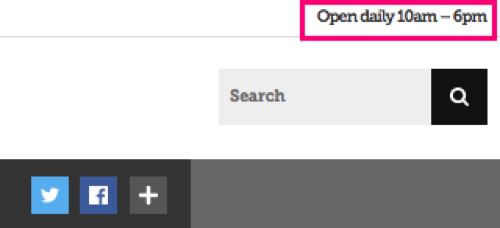
This resulted in a 90% drop in searches that include ‘hours’ (May 2016 compared with May 2015):

After the re-design the team ran a project to increase the reach and engagement of the Te Papa Matariki audience. You can read more about this in "Using data to help people celebrate Matariki". Te Papa holds Matariki events in the museum, such as the Kaumātua kapa haka, and this event in particular enhanced and challenged our ideas about this audience.
The Kaumātua kapa haka is the biggest Matariki event held at Te Papa, and this year we had 4,000 unique page views to the two Kaumātua kapa haka event pages. Traffic spiked over the event weekend, particularly from Facebook and mobile devices. We assumed the traffic was from people who were planning to come to the event, as they sit in the What’s on section. But further analysis indicates that people were visiting for the live streaming of the event — we included embedded Youtube videos on these pages.The popularity of the videos suggests that we’re taking events held within the museum walls out to people on the move, or in the comfort of their own homes. Based on this insight we’re looking into live streaming more events.
We’ve taken Te Papa personas through three iterations, based on user research, analytics, then a practical application of these to the Matariki festival. Each user research method has limitations, but by regularly using qualitative and quantitative methods we’re engaging with a three dimensional view of our audience that’s constantly evolving. Each user research piece builds that view, and allows us to plan projects and site changes with greater clarity about what our users need. It means we can plan projects that will have real and measurable impact, and allow people to engage with Te Papa in useful and meaningful ways.
If you'd like to hear more about how Lana and Ruth redesigned the Te Papa website, plus a bunch of other cool UX-related talks, head along to UX New Zealand 2016 hosted by Optimal Workshop. The conference runs from 12-14 October, 2016, including a day of fantastic workshops, and you can get your tickets here. Got some questions you'd like to ask Lana before the conference? You can Tweet her on @lanalytics00!
