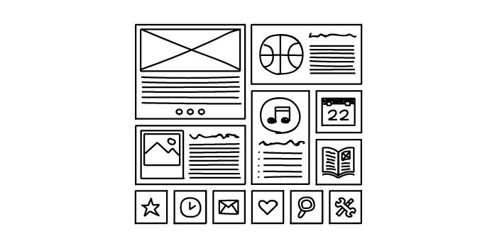
Wireframes. Mockups. HTML. Fonts. Elements. Users. If you’re familiar with user interface design, these terms will be your bread and butter.An integral part of any website or application, user interface design is also arguably one of the most important. This is because your design is what your users see and interact with. If your site or app functions poorly and looks terrible, that’s what your users are going to remember.
But isn’t UX design and UI design the same thing? Or is there just an extremely blurred line between the two? What’s involved with UI design and, more importantly, what makes good design?
What is UI design exactly?
If you’re wondering how to test UI on your website, it’s a good idea to first learn some of the differences between UX and UI design. Although UI design and UX design look similar when written down, they’re actually two totally separate things. However, they should most definitely complement each other.
UX design, according to Nielsen Norman Group, “encompasses all aspects of the end-user's interaction with the company, its services, and its products.” Meanwhile, UI design focuses more on a user’s interaction, the overall design, look and feel of a system. The two still sound similar, right?For those of you still trying to wrap your ahead around the difference, Nielsen Norman Group has a great analogy up on its site that helps to explain it:
"As an example, consider a website with movie reviews. Even if the UI for finding a film is perfect, the UX will be poor for a user who wants information about a small independent release if the underlying database only contains movies from the major studios.”
This just goes to show the complementary relationship between the two and why it’s so important.User interface was popularized in the early 1970s, partly thanks to Fuji Xerox’s ‘Xerox Alto Workstation’ — an early personal computer dubbed “the origin of the PC”. This machine used various icons, multi windows, a mouse, and e-mail, which meant that some sort of design and design principles were needed to create consistency for the future. It was here that human-centred UI was born. UI design also covers graphical user interface design (GUI design). A GUI is the software or interface that works as the medium between a user and the computer.
It uses a number of graphical elements, such as screen cursors, menus, and icons so that users can easily navigate a system. This is also something that has stemmed from Fuji Xerox back in the late 1970s and early 1980s.Since then, UI has developed quickly and so has its design principles. When the Xerox Alto Workstation was first born, Fuji Xerox came up with eight of its own design principles. These were:
Metaphorically digitize the desk environment
Operating on display instead of entering on keyboard
What you see is what you get
Universal but fewer commands
Same operation for the same job at different places
Operating computers as easily as possible
No need to transfer to different jobs
System customized as desired by users
Over time, these principles have evolved and now you’ll likely find many more added to this list. Here are just a few of the most important ones identified in “Characteristics of graphical and web user interfaces” by Wilbert Galitz.
UI design principles:
Principle #1: Clarity
Usability.gov says that the “best interfaces are almost invisible to the user”.Everything in the system, from visual elements, functions, and text, needs to be clear and simple. This includes layout as well as the words used — stay away from jargon and complex terms or analogies that users won’t understand.Aesthetic appeal also fits into this principle. Ensure colors and graphics are used in a simple manner, and elements are grouped in a way that makes sense.
Principle #2: Consistency
The system should have the same or similar functions, uses and look throughout it for consistency. For example, the same color scheme should be used throughout an app, or the terminology on a website should be consistent throughout. Users should also have an idea of what to expect when they use your system. As an example, picture a retail shopping app. You’d expect that any other retail shopping app out there will have similar basic functions: a place to log in or create an account, account settings, a way to navigate and browse stock, a way to purchase stock at the press of a button. However, this doesn’t mean copying another app or website exactly; there should just be consistency so users know what to expect when they encounter your system.Apple even states an “app should respect its users and avoid forcing them to learn new ways to do things for no other reason than to be different”.
Principle #3: Flexibility and customizability
Is there more than one way people can access your system and its functions? Can people perform tasks in a number of different ways, too?Providing your users with a flexible system means people are more in control of what they’re doing. Galitz mentions this can also be done through allowing system customization.Don’t forget use on other kinds of devices, too. In a time when Google is using mobile-friendliness as a ranking signal, and research from Ericsson shows smartphones accounted for 75% of all mobile phone sales in Q4 2015, you know that being flexible is important.
Examples of good UI design
For a list of some of the best user interface examples, check out last year’s Webby Awards category for Best Interface Design. The 2016 category winner was the Reuters TV Web App, while the People’s Choice winner was AssessYourRisk.org.As an aside, this is the second year that the Webby Awards introduced this category — just goes to show how important it is to have good UI design!While you don’t want your site or application to look exactly the same as these winners, you still want yours to function well and be aesthetically pleasing.
To help you get there, there are a number of UI design tools and UI software available.Here’s a list of some of the many out there:
UXPin - An online UI design tool that allows you to create wireframes, mockups, and prototypes all on one platform.
InVision - A prototyping and collaboration tool. More in-depth than Balsamiq, and it allows you to go from mockup to high-fidelity in minutes.
Balsamiq - A simple mockups tool for wireframing, which allows users to test out ideas in the early stage of interface design.
Atomic - An interface design tool that allows you to design in your browser and collaborate with others on your projects.
Have you got any favorite UI design examples, or tips for beautiful design? We’d love to see them — comment below and let us know!
Emotional. Playful. Delightful.These words resonate with user experience (UX) practitioners. We put them in the titles of design books. We build products that move up the design hierarchy of needs, with the goal to go beyond just reliability, usability, and productivity. We want to truly delight the people who use our products.Designing for delight has parallels in the physical world. I see this in restaurants which offer not only delicious food but also an inviting atmosphere; in stores that don’t just sell clothes but also provide superior customer service. Whole industries operate on designing for delight.
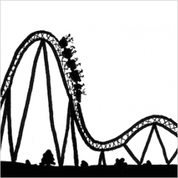
The amusement industry has done this for over 500 years. The world’s oldest operating amusement park, Bakken, first opened for guests in 1583 – about 300 years before the first modern roller coaster. Amusement parks experienced a boom in growth in the US in the 1970s. As of November 2014, China had 59 new amusement parks under construction. Today, hundreds of millions of guests each year visit amusement parks throughout the world.I've been fortunate to work in the amusement industry as the owner of a digital UX design company called Thrill & Create. Here is my story of how I got to do this kind of work, and my observations as a UX practitioner in this market.
Making user-centred purveyors of joy
I've been a fan of amusement parks for most of my life. And it’s somewhat hereditary. Much of my family still lives in Central Florida, and several of them have annual passes to Walt Disney World. My mom was a Cast Member at the Magic Kingdom during its opening season.Although I grew up living east of Washington, DC, I spent most of my childhood waiting for our annual trip to an amusement park. I was a different kind of amusement enthusiast: scared to death of heights, loath to ride roller coasters, but so interested in water rides and swimming that my family thought I was a fish. The love for roller coasters would show up much later. But the collection of park maps from our annual trips grew, and in the pre-RollerCoaster Tycoon days, I would sketch designs for amusement parks.
In college, my interest in amusement received a healthy boost from the internet. In the mid-2000s, before fan communities shifted toward Facebook, unofficial websites were quite popular. My home park — a roller coaster enthusiasts’ term for the park that we visit most frequently, not necessarily the closest park to us — had several of these fansites.The fansites would typically last for a year or two and enjoy somewhat of a rivalry with other fansites before their creators would move on to a different hobby and close their sites. The fansites’ forums became an interesting place to share knowledge and learn history about my home park. They also gave us a place to discuss what we would do if we owned the park, to echo rumors we had heard, and start our own rumors. Some quite active forums still exist for this.
Of course, many of us on the forums wanted to be the first to hear a rumor. So we follow the industry blogs, which are typically the first sources of the news. Screamscape has been announcing amusement-industry rumors since the 1990s. And Screamscape and other sites like it announce news not only in the parks but around the industry. Regular Screamscape readers learn about ride manufacturers, trade names for each kind of ride, industry trade shows, and much more. And the International Association of Amusement Parks and Attractions (IAAPA) keeps an eye on the industry as well.Several years ago, I transitioned from being a software developer to starting a user experience design company. It is now called Thrill & Create. I was faced with a challenge: how to compete against the commoditization of freelance design services. Ultimately, selecting a niche was the answer. And seeing IAAPA’s iconic roller coaster sign outside the Orange County Convention Center during a trip to Central Florida was all I needed to shift my strategy toward the amusement industry.
What UX looks like in the Amusement Industry
Periodically, I see new articles about amusement parks in UX blogs. Here are my observations about how UX looks in the industry, both in the physical world and the digital world.
Parks are focused on interactive rides
The amusement industry is known for introducing rides that are bigger, taller, and faster. But the industry has a more interactive future. Using cleverly-designed shops which produce some of the longest waits in the park, Universal Studios has sold many interactive wands to give guests additional experiences in Hogsmeade and Diagon Alley.
Buzz Lightyear's Astro Blasters at Disneyland
At IAAPA, interactivity and interactive rides are very hot topics. Interactive shooting dark rides came to many parks in the early 2000s. Wonder Mountain’s Guardian, a 2014 addition to Canada’s Wonderland, features the world’s longest interactive screen and a ride program that changes completely for the Halloween season.Also coming in 2015 is the elaborately-themed Justice League: Battle for Metropolis rides at two Six Flags parks. And Wet‘n’Wild Las Vegas will debut 'Slideboarding', which allows riders to participate in a video game by touching targets on their way down the slide, and is marketed as 'the world's first waterslide gaming experience'.
UX design is well-established for the physical space
Terms like 'amusement industry', 'attractions industry', and 'themed entertainment industry' can be interchangeable, but they do have different focuses, and different user experience design needs. The amusement industry encompasses amusement parks, theme parks, zoos, aquaria, museums, and their suppliers; the attractions industry also includes other visitor attractions.Several experience design companies have worked extensively on user-centered themed entertainment.
Jack Rouse Associates, who see themselves as “audience advocates”, have worked with over 35 clients in themed entertainment, including Universal, Ocean Park, and LEGOLAND. Thinkwell Group, which touts a 'guest-centric approach to design', showcases 14 theme park and resort projects and attractions work in 12 countries.Consultants in the industry have been more intentionally user-centered. Sasha Bailyn and her team at Entertainment Designer write regularly about physical-world experience design, including UX, in themed entertainment. Russell Essary, owner of Interactive Magic, applies user-centered design to exhibit design, wayfinding, game design, and much more.
In-house teams, agencies, and freelancers are becoming more common
Several large park chains have in-house or contracted UX design teams. Most mid-sized parks work with in-house marketing staff or with outside design companies. One company I know of specializes in web design and development for the amusement industry. Smaller parks and ride companies tend to work with local web designers, or occasionally free website vendors.
Screenshot of the Memphis Zoo homepage, designed by Speak Creative
Screenshot of the Extreme Engineering homepage, designed by Extreme Engineering
Sometimes, amusement sites with a great user experience are not made by UX practitioners. The website for Extreme Engineering has a very strong, immersive visual design which communicates their brand well. When I contacted them to learn who designed their site, I was surprised to learn that their head of marketing had designed it.
What I think is going well
Several developments have encouraging me in my mission to help the amusement industry become more user-centered.
UX methods are producing clear wins for my clients and their users
My clients in the industry so far have had significant fan followings. Fans have seen my user-centered approach, and they have been eager to help me improve their favorite sites. I told a recent client that it would take a week to get enough responses from his site visitors on an OptimalSort study. Within a few hours, we exceeded our target number of responses.
The Explore the Park feature concept of this Busch Gardens Williamsburg
When I worked on redesign concepts for a network of park fansites, I ran separate OptimalSort studies for all 8 fansites in the network. They used comparable pages from each site as cards. We discovered that some parks’ attractions organized well by themed area, while others organized well by ride type. Based on this, we decided to let users find attractions using either way on every site. User testers received Explore the Park and the two other new features that emerged from our studies (Visit Tips and Fansite Community) very well.
Although not all of the features I designed for The Coaster Crew went live, the redesign of their official website produced solid results. Their Facebook likes increased over 50% within a year, and their site improved significantly in several major KPIs. Several site visitors have said that the Coaster Crew’s website’s design helped them choose to join The Coaster Crew instead of another club. So that's a big win.
In-park guest experiences and accessibility are hot right now
IAAPA offered over 80 education sessions for industry professionals at this past Attractions Expo. At least nine sessions discussed guest experience. Guest experience was also mentioned in several industry publications I picked up at the show, including one which interviewed The Experience Economy author B. Joseph Pine II.
And parks are following through on this commitment, even for non-riders. Parks are increasingly theming attractions in ways that allow non-riders to experience a ride’s theme in the ride’s environment. For example, Manta at SeaWorld Orlando is a flying roller coaster themed to a manta ray. The park realized that not all of its guests will want to ride a thrilling ride with four inversions. So, separate queues allow both riders and non-riders to see aquariums with around 3,000 sea creatures. And Manta becomes, effectively, a walkthrough attraction for guests who do not want to ride the roller coaster.
The industry has also had encouraging innovations recently in accessibility. Attractions Management Magazine recently featured Morgan’s Wonderland, an amusement park geared toward people with physical and cognitive disabilities. Water parks are beginning to set aside times to especially cater to guests with autism. And at IAAPA, ride manufacturer Zamperla donated a fully-accessible ride to Give Kids the World, an amusement-industry charity.
Several successful consultancies are helping amusement parks and attractions deliver both a better guest experience in the park and better results on business metrics. And that's something I'm definitely keen to be a part of.
Amusement business factors with UX implications
While this is not an exhaustive list, here are some factors in the amusement industry which have UX implications.
While ride manufacturers continue to innovate, they are starting to encounter limits on how much physical thrill the human body can handle. A new world’s tallest complete-circuit roller coaster should open in 2017. But that record, only broken one other time since 2003, was broken 5 times between 1994 and 2003. So the industry is shifting toward more immersive attractions and "psychological thriller" rides.
Increased reliance on intellectual property
While some parks still develop their own worlds and characters for attractions, parks today increasingly rely on third-party intellectual property (IP), such as movies, TV shows, and characters. Third-party IP provides guests with a frame of references for interpreting what they see in the park. For example, The Wizarding World of Harry Potter enjoyed a very positive reception from guests due to its faithfulness to the Harry Potter books and films. In the same way, fans will notice if a themed area or attraction is not faithful to the original, and will see it as a broken experience.
Bring your own device
Many guests now carry mobile devices with them in the parks. But so far, guests have not been able to use their mobile devices to trigger changes in a park’s environment. The closest this has come is the interactive wands in The Wizarding World of Harry Potter. Most parks ban mobile devices from most rides due to safety hazards. And amusement parks and museums are both beginning to ban selfie sticks.
Multiple target markets at the same time
Because parks look for gaps in their current offerings and customer bases, they very rarely add new attractions for similar audiences several years in a row. My regional parks tend to handle additions on a 5-10 year cycle. They alternate year by year with additions like a major roller coaster, one or more thrilling flat rides, a family ride, and at least one water ride, to appeal to different market segments, as regularly as possible.The same goes for in-park UX improvements. Themed environment upgrades in a kids’ area appeal to few people in haunted attractions’ target audiences, and vice versa.
Empathy
According to the Association of Zoos and Aquariums (AZA), the fact that most people today will never see sharks, elephants, or pandas in the wild is making conservation efforts more difficult. Zoos and aquaria, in particular, have a large opportunity to allow families to empathize with animals and efforts to conserve threatened species. But, according to an International Zoo Educators Association presentation, most zoo and aquarium guests go there primarily just to see the animals or please their kids.
Ideas for improving the user experience of websites and software in the amusement industry
My primary work interest is to design digital experiences in the amusement industry that support the goals of their target users. To understand where the industry currently stands, I have visited several thousand websites for amusement parks, ride companies, suppliers, zoos, aquaria, museums, and dolphinariums. Below, I've documented a few problems I've seen, and suggested ways companies can solve these problems.
Treat mobile as a top priority
Currently, over 500 websites in the industry are on my radar as sites to improve. At least 90 of them are desktop-only websites with no mobile presence. Several of these sites — even for major ride manufacturers — use Flash and cannot be viewed at all on a mobile device.The industry’s business-to-consumer (B2C) organizations, such as parks, realize that a great deal of traffic comes from mobile and that mobile users are more likely to leave a site that is desktop-only.
These organizations recognize the simple fact that going mobile means selling more tickets. IAAPA itself has capitalized on mobile for their trade show attendees for several years by making a quite resourceful mobile app available.However, at IAAPA, I asked people from several business-to-business (B2B) companies why their sites were not mobile yet. Several told me that they didn’t consider mobile a high priority and that they might start working on a mobile site “in about a year or so.” Thus, they don't feel a great deal of urgency — and I think it's time they did.
Bring design styles and technologies up to date
Many professional UX designers and web designers are well aware of 1990s-style web design artefacts like misused fonts (mainly Comic Sans and Papyrus), black text on a red background,obviously-tiled backgrounds, guestbooks, and splash screens. But I've seen more than a few live amusement websites that still use each of these.Sites that prompt users to install Flash (on mobile devices) or QuickTime increase users’ interaction cost with the site, because the flow of their tasks has been interrupted.
And as Jakob Nielsen says, "Unless everything works perfectly, the novice user will have very little chance of recovery."
If a website needs to use technologies such as Flash or features such as animation or video, a more effective solution would be progressive enhancement. Users whose devices lack the capability to work with these technologies would still see a website with its core features intact and no error messages to distract them from converting.
Organize website information to support user goals and knowledge
Creating an effective website involves much more than using up-to-date design styles. It also involves the following.
Understand why users are on the website
Businesses promote products and services that make them money. Many amusement parks now offer front-of-line passes, VIP tours, pay-per-experience rides, locker rentals, and water park cabana rentals, which are each an additional charge for admitted guests. And per-capita spending is very important to not only parks’ operations, but also their investor relations.Users come to websites with the question, “What’s in it for me?”, and their own sets of goals. Businesses need to know when these goals match their own goals and when they conflict.
The importance of each goal should also be apparent in the design. One water park promotes its changing rooms and locker rentals on its homepage. This valuable space dedicated to logistical information for guests already coming could be used for attracting prospective visitors. Analytics tools and the search queries that they show are helpful tools for understanding why users come to a website. Sites should supplement these by conducting usability studies with users outside their organization. These studies, in turn, could include questions allowing users to describe why would visit that website. The site could use this knowledge to make sure that its content speaks to users’ reasons for visiting.
Understand what users know
Non-technical users are bringing familiarity with how to use the internet when they visit a website. They quickly become perpetual intermediates on the internet, and don’t need to be told how buttons and links work. I've noticed amusement websites that currently label calls to action with “Click Here”, and some even do so on more than one link. This explicit instruction to people is no longer needed, and the best interfaces signal clickable elements in their visual design.
Similarly, people expect to find information in categories they understand and in language familiar to them. So it's important to not make assumptions that people who visit our websites think like us. For example, if a website is organized by model name, users will need to already be familiar with these products and the differences between them. Usability testing exercises, such as card sorting, would contribute to a better design and solve this problem.
Design websites that are consistent with users’ expectations
Websites that aim to showcase a company’s creativity and sense of fun sometimes lack features that people are used to when they visit websites (like easy-to-access menus, vertical scrolling, and so on). But it's important to remember that unconventional designs may lead to increased effort for visitors, which in turn may create a negative experience. A desire to come across as fun may conflict with a visitor's need for ease and simplicity.
The site organization needs to reflect users' goals with minimal barriers to entry. People will be frustrated with things like needing to log in to see prices, having to navigate three levels deep to buy tickets, and coming across unfamiliar or contradictory terms.
Design content for reading
Marketers have written about increased engagement and other benefits resulting from automatically playing videos, animated advertising, and rotating sliders or carousels (all of which usability practitioners have argued against). And this obsession with visual media has sometimes taken attention away from a feature people still want: easy-to-read text.There are still websites in the industry that show walls of text, rivers of text, very small text for main content, text embedded within images, and text written in all-capital letters. But telling clients, “Make the text bigger, higher-contrast, and sentence case”, can conflict with the increasing reliance on exciting visual and interactive design elements.
Goal-directed design shows us what that problem is. For example, if people visit a website to learn more about a company, the website’s design should emphasize the content that gets that message across — in the format that users find most convenient.I recently worked with a leading themed entertainment blogger to improve his site’s usability. His site, Theme Park University, provides deep knowledge of the themed entertainment industry that readers cannot get anywhere else. It first came to my attention when he published a series of posts on why Hard Rock Park in Myrtle Beach, South Carolina – one of the most ambitious new theme park projects in the US in the 2000s — failed after only one season.
As a regular reader, I knew that TPU had truly fantastic content and an engaged community on social media. But users commented to us that the site was cluttered, and so didn't spend much time on the website. We needed to give the website a more open look and feel — in other words, designed to be read.The project was not a full redesign. But by fitting small changes into the site’s existing design, we made the site more open and easier to read while retaining its familiar branding for readers. We also made his site’s advertising more effective, even by having fewer ads on each page.As D. Bnonn Tennant says, “Readership = Revenue.… [A website] has to fulfill a revenue goal. So, every element should be designed to achieve that goal. Including the copy. Especially the copy — because the copy is what convinces visitors to do whatever it is you want them to do on the website".
Three final ideas for getting UX a seat at the table
In helping take UX methods to the amusement industry, I have learned several lessons which would help other practitioners pioneer UX in other industries:
1. Explain UX benefits without UX jargon
When I work for clients in the amusement industry, the biggest challenge that I face is unfamiliarity with UX. Most other professionals in the industry do not know about UX design principles or practices. I have had to educate clients on the importance of giving me feedback early and testing with users often. And because most of my clients have not had a technical background, I have had to explain UX and its benefits in non-UX terms.
2. Be willing to do non-UX project work yourself in a team of one
As a business owner, I regularly prospect for new clients. The biggest challenge in landing projects here is trying to convince people that they should hire a bigger team than just me. A bigger team (and higher rates for a UXer versus a web designer) leads to bigger project costs and more reluctant approvals. So I have had to do development – and even some tech support – myself so far.
3. Realize clients have a lot on their plates — so learn patience
The other main challenge in selling UX to the amusement industry is project priority. Marketing departments that handle websites are used to seeing the website as one job duty out of many. Ride companies without dedicated IT staff tend to see the website as an afterthought, partially because they do most of their business at trade shows instead of online. This has led to several prospects telling me that they might pursue a redesign a year from now or later, but not in the near future. That's OK because I can be ready for them when they're ready for me.
Natalie and Lulu have forged a unique team culture that focuses on positive outputs (and outcomes) for their app’s growing user base. In doing so, they turned the traditional design approach on its head and created a dynamic and supportive team.
Natalie, Director of Design at Hatch, and Lulu, UX Design Specialist, recently spoke at UX New Zealand, the leading UX and IA conference in New Zealand hosted by Optimal Workshop, on their concept of “radical collaboration”.
In their talk, Nat and Lulu share their experience of growing a small app into a big player in the finance sector, and their unique approach to teamwork and culture which helped achieve it.
Background on Natalie Ferguson and Lulu Pachuau
Over the last two decades, Lulu and Nat have delivered exceptional customer experiences for too many organizations to count. After Nat co-founded Hatch, she begged Lulu to join her on their audacious mission: To supercharge wealth building in NZ. Together, they created a design and product culture that inspired 180,000 Kiwi investors to join in just 4 years.
Radical Collaboration - How teamwork makes the dream work 💪💪💪
Nat and Lulu discuss how they nurtured a team culture of “radical collaboration” when growing the hugely popular app Hatch, based in New Zealand. Hatch allows everyday New Zealanders to quickly and easily trade in the U.S. share market.
The beginning of the COVID pandemic spelled huge growth for Hatch and caused significant design challenges for the product. This growth meant that the app had to grow from a baby startup to one that could operate at scale - virtually overnight.
In navigating this challenge, Nat and Lulu coined the term radical collaboration, which aims to “dismantle organizational walls and supercharge what teams achieve”. Radical collaboration has six key pillars, which they discuss alongside their experience at Hatch.
Pillar #1: When you live and breathe your North star
Listening to hundreds of their customers’ stories, combined with their own personal experiences with money, compelled Lulu and Nat to change how their users view money. And so, “Grow the wealth of New Zealanders” became a powerful mission statement, or North Star, for Hatch. The mission was to give people the confidence and the ability to live their own lives with financial freedom and control. Nat and Lulu express the importance of truly believing in the mission of your product, and how this can become a guiding light for any team.
Pillar #2: When you trust each other so much, you’re happy to give up control
As Hatch grew rapidly, trusting each other became more and more important. Nat and Lulu state that sometimes you need to take a step back and stop fueling growth for growth’s sake. It was at this point that Nat asked Lulu to join the team, and Nat’s first request was for Lulu to be super critical about the product design to date - no feedback was out of bounds. Letting go, feeling uncomfortable, and trusting your team can be difficult, but sometimes it’s what you need in order to drag yourself out of status quo design. This resulted in a brief hiatus from frantic delivery to take stock and reprioritize what was important - something that can be difficult without heavy doses of trust!
Pillar #3: When everyone wears all the hats
During their journey, the team at Hatch heard lots of stories from their users. Many of these stories were heard during “Hatcheversery Calls”, where team members would call users on their sign-up anniversary to chat about their experience with the app. Some of these calls were inspiring, insightful, and heartwarming.
Everyone at Hatch made these calls – designers, writers, customer support, engineers, and even the CEO. Speaking to strangers in this way was a challenge for some, especially since it was common to field technical questions about the business. Nevertheless, asking staff to wear many hats like this turned the entire team into researchers and analysts. By forcing ourselves and our team outside of our comfort zone, we forced each other to see the whole picture of the business, not just our own little piece.
Pillar #4: When you do what’s right, not what’s glam
In an increasingly competitive industry, designers and developers are often tempted to consistently deliver new and exciting features. In response to rapid growth, rather than adding more features to the app, Lulu and Nat made a conscious effort to really listen to their customers to understand what problems they needed solving.
As it turned out, filing overseas tax returns was a significant and common problem for their customers - it was difficult and expensive. So, the team at Hatch devised a tax solution. This solution was developed by the entire team, with almost no tax specialists involved until the very end! This process was far from glamorous and it often fell outside of standard job descriptions. However, the team eventually succeeded in simplifying a notoriously difficult process and saved their customers a massive headache.
Pillar #5: When you own the outcome, not your output.
Over time Hatch’s user base changed from being primarily confident, seasoned investors, to being first-time investors. This new user group was typically scared of investing and often felt that it was only a thing wealthy people did.
At this point, Hatch felt it was necessary to take a step back from delivering updates to take stock of their new position. This meant deeply understanding their customers’ journey from signing up, to making their first trade. Once this was intimately understood, the team delivered a comprehensive onboarding process which increased the sign-up conversion rate by 10%!
Pillar #6: When you’re relentlessly committed to making it work
Nat and Lulu describe a moment when Allbirds wanted to work with Hatch to allow ordinary New Zealanders to be involved in their IPO launch on the New York stock exchange. Again, this task faced numerous tax and trade law challenges, and offering the service seemed like yet another insurmountable task. The team at Hatch nearly gave up several times during this project, but everyone was determined to get this feature across the line – and they did. As a result, New Zealanders were some of the few regular investors from outside the U.S that were able to take part in Albirds IPO.
Why it matters 💥
Over four years, Hatch grew to 180,000 users who collectively invested over $1bn. Nat and Lulu’s success underscores the critical role of teamwork and collaboration in achieving exceptional user experiences. Product teams should remember that in the rapidly evolving tech industry, it's not just about delivering the latest features; it's about fostering a positive and supportive team culture that buys into the bigger picture.
The Hatch team grew to be more than team members and technical experts. They grew in confidence and appreciated every moving part of the business. Product teams can draw inspiration from Hatch's journey, where designers, writers, engineers, and even the CEO actively engaged with users, challenged traditional design decisions, and prioritized solving actual user problems. This approach led to better, more user-centric outcomes and a deep understanding of the end-to-end user experience.
Most importantly, through the good times and tough, the team grew to trust each other. The mission weaved its way through each member of the team, which ultimately manifested in positive outcomes for the user and the business.
Nat and Lulu’s concept of radical collaboration led to several positive outcomes for Hatch:
It changed the way they did business. Information was no longer held in the minds of a few individuals – instead, it was shared. People were able to step into other people's roles seamlessly.
Hatch achieved better results faster by focusing on the end-to-end experience of the app, rather than by adding successive features.
The team became more nimble – potential design/development issues were anticipated earlier because everyone knew what the downstream impacts of a decision would be.
Over the next week, Lulu and Nat encourage designers and researchers to get outside of their comfort zone and:
Visit customer support team
Pick up the phone and call a customer
Challenge status quo design decisions. Ask, does this thing solve an end-user problem?