Subscribe to OW blog for an instantly better inbox
Oops! Something went wrong while submitting the form.
Figma has long been the go-to tool for UI/UX designers, known for its intuitive interface and real-time collaboration. In fact, over 95% of Fortune 500 companies rely on Figma, and 13 million monthly active users trust it to design and prototype digital experiences.
If you’re already designing in Figma, integrating with Optimal can help to validate your ideas early, reduce costly mistakes, and deliver experiences users actually want.
Validating designs before development and catching usability issues early has a measurable impact on both users and the business. Research consistently shows that:
Instead of waiting for post-launch analytics or expensive redesigns, you can test your Figma prototypes with real users in hours, not weeks with Optimal. Get quantitative data, watch recordings, analyze heatmaps, and actually see where users struggle, all before a single line of code is written.
Here’s a look into 4 practical ways teams use Figma and Optimal together.
Ever had a debate with your team about which design direction to take? Let data decide.
Here's how:
You've got a bold new concept. It makes perfect sense to you. But will users get it?
The process:
You've built a clickable prototype with multiple screens and interactions. It looks polished. But does it actually work for users?
Step-by-step:
What you'll discover might surprise you. Users will:
The rise of AI design tools like Figma Make has changed the game. You can now generate a functional prototype from a text prompt in minutes. But just because AI can create it doesn't mean users can use it.
Quick workflow:
This is perfect for rapid experimentation.
Figma gives you the power to design and prototype rapidly, while Optimal gives you the insights to make sure those designs actually work for real users. Together, they create a workflow built on real insights, not guesswork.
By testing early and often, teams can reduce risk, build confidence in their designs, and move into development knowing their work has already been validated by users. Gather insights quickly, collaborate more effectively, and keep projects moving forward with evidence-backed decisions.
Ready to validate your next Figma prototype? Use Optimal as part of your workflow and start testing with real users today.
In today's rapidly evolving utility landscape, artificial intelligence presents unprecedented opportunities to transform customer engagement strategies. However, as UX professionals in the energy and utilities sector, it's crucial to implement these technologies thoughtfully, balancing automation with the human touch that customers still expect and value.
The energy and utilities sector faces unique challenges: managing peak demand periods, addressing complex billing inquiries, and communicating effectively during outages. AI can help address these challenges by:
While AI offers significant advantages, implementation requires careful consideration of when and how to deploy these technologies:
As you consider integrating AI into your customer engagement strategy, keep these guidelines in mind:
Optimal's user insights platform can be instrumental in ensuring your AI implementation truly meets customer needs:
Before implementing AI-powered self-service options, use Tree Testing to validate your information architecture:
When determining which tasks should be handled by AI versus human agents:
For AI-enhanced customer portals and apps:
Gather crucial insights about customer comfort with AI:
During the ongoing refinement of your AI systems:
When developing AI-powered customer interfaces for utilities:
As AI capabilities continue to evolve, the most successful utility companies will be those that thoughtfully integrate these technologies into their customer engagement strategies. The goal isn't to replace human interaction but to enhance it, using AI to handle routine tasks while enabling your team to focus on delivering exceptional service where human expertise, creativity, and empathy matter most.
By taking a balanced approach to AI implementation, supported by robust UX research tools like those offered by Optimal, UX professionals in the energy and utilities sector can create more responsive, personalized, and efficient customer experiences that meet the needs of today's consumers while preserving the human connection that remains essential to building lasting customer relationships.
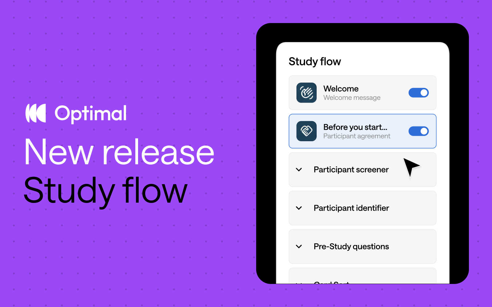
Inspired by insights from Optimal users, we’ve reimagined study creation to bring you a beautifully streamlined experience with the new Study Flow tab.
⚡ Enjoy faster study set up: Messages & instructions and Questionnaire tabs are combined in a single tab - called Study Flow - for faster editing and settings customization.
✨ See it all at a glance: Easily visualize and understand the participant experience—from the welcome message to the final thank-you screen—every step of the way.
🎯 Duplicate questions: Save time and quickly replicate questions for surveys, screening questions, and pre- and post-study questions.
⭐ Experience enhanced UI: Enjoy a modern, clean design with intuitive updates that minimize scrolling and reduce mental load.
🗂️ Collapse and expand sections: Easily navigate studies by collapsing and expanding sections, making it easier to build out specific parts of your study.
This Study Flow tab is available across all Optimal tools, except for Qualitative Insights.
We’re not stopping there. We have some significant improvements on the horizon designed to give you even greater flexibility and control.
Advanced logic: Enhanced logic capabilities is one of our most highly requested features, and we’re thrilled to introduce new capabilities to help you build your ideal study experience – available for surveys and other tools. We will first introduce “display logic”, allowing for:
Customizable sections: Organize your questions into different sections to build a better study experience for your participants. For example, segment your questions into relevant groupings, such as demographics or product usage. With custom sections, you can add new sections, rename, reorder, duplicate, and move questions between different sections.*
*Note: Questions cannot be moved to/from the screening questions section.
These upcoming features will empower you to create dynamic, tailored study experiences for different audiences with ease for more valuable insights.
Start exploring the new Study Flow now.
User research and design doesn’t fail because teams don’t care – it fails because there’s rarely time to explore every option. When deadlines pile up, most teams default to the same familiar research patterns and miss opportunities to get more value from the tools they already have.
We’ve brought together practical, real-world ways to use Optimal – from tree testing and first-click testing to card sorting, surveys, prototype testing, and interviews. Some of these use cases are obvious, but many aren’t. All of them are designed to help teams move faster, reduce risk, and turn user insights into decisions stakeholders trust.
We’ve focused on quick wins and flexible examples you can adapt to your own context – whether you’re benchmarking navigation, validating early designs, improving conversion flows, prioritizing work, or proving the ROI of UX. You don’t need more tools or more processes. You just need smarter ways to use what you already have.
Let’s get into it.
Without a baseline for your navigation or information architecture (IA), you can’t easily tell if any changes you make have a positive effect. If you haven’t done so, benchmark your existing website on tree testing now. Upload your site structure and get results the same day. Now you’ll have IA scores to beat each month. Easy.
Watch video recordings of real people interacting with your sites with live site testing. Combine this with surveys and user interviews to understand where users struggled. You can also use the tree testing pietree to find out exactly where people are getting lost in your website structure and where they go instead.
If you’re just not sure where to begin then take a screenshot of your homepage, or any page that you think might have some issues and get going with first-click testing. Write up a string of things that people might want to do when they find themselves on this page and use these as your tasks. Surprise all your colleagues with a maddening heatmap or video recordings showing where people actually clicked in response to your tasks or where they struggle. Now you’ll have a better idea of which area of your site to focus on for your next step.
You can run live site testing as part of your discovery phase to baseline your live experiences and see how well your current site supports real user goals. Test competitors' sites to see how you stack up. You’ll quickly uncover opportunities to differentiate your site, all before a single wireframe is drawn. All that's required is a URL and then you're set to go. No code needed.
Tree testing is great for testing more than one content structure. It’s easy to run two separate tree testing studies, even more than two. It’ll help you decide which structure you and your team should run with, and it won’t take you long to set them up.
Discover how easy (or not) it is for users to navigate your sign up experience to ensure it works exactly as intended. Create a live site or prototype test to identify any confusion or points of friction. You could also use this test to understand users' first impressions of your home or landing page. Where do they click first and what information is valuable to them?
Use surveys, first-click tests, and card sorting to get your team involved and let their feedback feed your designs: logos, icons, banners, images, the list goes on... For example, by creating a closed image sort with categories, your team can group designs based on their preferences, you can get some quick feedback to help you figure out where you should focus your efforts.
Get a better sense of your users and customers’ motivations with surveys and user interviews. You can also find out what people actually want to see on your website with a card sort, by conducting an image sort of potential products. By providing categories like ‘I would buy this’, ‘I wouldn’t buy this’ to indicate their preferences for each item, you can figure out what types of products appeal to your customers.
The thoughts and feelings of your users are always important. A simple survey or user interview can help you take a deeper look at your checkout process, a recently launched product or service, or even the packaging your product arrives in. Your options are endless.
Companies that incorporate prototype testing in their design process can reduce development costs by 33%. Use prototype testing to ensure your designs hit the mark before you invest too heavily in the build. Build your own prototype with images in Optimal or import a Figma file. You can even test AI-generated prototypes from tools like Lovable or Magic Patterns by dropping the URL into live site testing.
Whether you’re running a blog or a UX conference, surveys can help you generate content ideas and understand any knowledge gaps that might be out there. Figure out what your users and attendees like to read on your blog, or what they want to hear about at your event, and let this feed into what you offer.
Sometimes a change in your product or service means you have to change how it’s presented to your existing customers. Ensure your customers understand the changes to your product or service with prototype and live site testing. Identify issues with user flow, content, or layout that may confuse them. Discover which options they’re most likely to choose with the updates. Uncover what truly matters to your customers.
Some people, including UX Agony Aunt, define return on UX as time saved, money made, and people engaged. By attaching a value to the time spent completing tasks, or to successful completion of tasks, you can approximate an ROI or at least illustrate the difference between two options.
User interviews are teeming with insights but can be time and resource intensive to analyze without automation. Use Optimal Interviews tool to capture key moments, reactions, and pain points with automated highlight reels and clips. These are perfect for storytelling, stakeholder buy-in, and keeping teams connected to who they’re building for.
Survey your organization to build a list of ideas for upcoming work. Understand your audience’s priorities with card sorting to inform your feature development. Categorize your upcoming work ideas to decide collectively what’s best to take on next. Great for clarifying what the team considers the most valuable or pressing work to be done.
Before you run an open card sort to generate new category ideas, you can run a closed card sort to find out if you have any redundant content. Say you wanted to simplify the homepage of your intranet. You can ask participants to sort cards (containing homepage links) based on how often they use them. You could compare this card sort data with analytics from your intranet and see if people’s actual behavior and perception are well aligned.
Onboarding new customers is crucial to keeping them engaged with your product, especially if it involves your users learning how to use it. You can set up a quick study to help your users stay on track with onboarding. For example, say your company provided online email marketing software. You can set up a first-click testing study using a photo of your app, with a task asking your participants where they’d click to see the open rates for a particular email that went out.
If you're lucky enough to attend a UX conference, you can now share the experience with your colleagues. You can easily jot down ideas, quotes and key takeaways in a Qualitative Insights project and keep your notes organized by using a new session for each presenter Bonus, if you’re part of a team, they can watch the live feed rolling into Qualitative Insights!
Tree testing and first-click testing allow you to compare multiple versions of content structures, designs, or flows. You can also compare how users engage with different live websites in one study. This helps decide the best-performing option without guessing.
Using card sorting for sociological research is a great way to deepen your understanding of how different groups may categorize information. For example, by looking at how young people group popular social media platforms, you can understand the relationships between them, and identify where your product may fit in the mix. Then, follow up with surveys or moderated interviews for deeper insights.
Your support and knowledge base within your website can be just as important as any other core action on your website. If your support site is lacking in navigation and UX, this will no doubt increase support tickets and resources. Make sure your online support section is up to scratch. Here’s an article on how to do it quickly.
Create a card sort with your search filters or tags as labels, and have participants rank them according to how important they consider them to be. Analytics can tell you half of the story (where people actually click), so the card sort can give another side: a better idea of what people actually think or want. Follow up with surveys or interviews to confirm insights.
Figure out if your icons are doing their job by testing whether your users are understanding them as intended. Uploading icons you currently use, or plan to use in your interface to first-click testing, and ask your users to identify their meaning by making use of post-task questions.
Optimal Interviews gives you automated insights but you can also engage with AI Chat to dive deeper. Ask AI specific questions about a feature or process or request quotes or examples. Then, get highlight reels and clips to match.
Make the marketing team’s day by doing a fast improvement on some core conversions on your website. Now, there are loads of ways to improve conversions for a check out cart or signup form, but using first-click testing to test out ideas before you start going live A/B test can take mere minutes and give your B version a confidence boost. For deeper insights, try a live site test.
As more and more people are using their smartphones for apps and to browse sites, you need to ensure its design gives your users a great experience. Test your mobile site to ensure people aren’t getting lost in the mobile version of your site. If you haven’t got a mobile-friendly design yet, now’s the time to start designing it!
Have a number of interviews you need to transcribe quickly? Upload up to 20 interviews at once in Optimal Interviews and get automated transcripts, so you can spend less time on admin and more time digging into insights.
People jumping off your website and not continuing their experience is something (depending on the landing page) everyone tries to improve. The metric ‘time on site’ and ‘average page views’ is a metric that shows the value your whole website has to offer. Again, there are many different ways to do this, but one big reason for people jumping off the website is not being able to find what they’re looking for. Use prototype testing or live site testing to watch users in action and understand where things break down.
No, you don’t have to spend thousands of dollars to go to all these countries to test, although that’d be pretty sweet. You can remotely research participants from all over the world, using our integrated recruitment panel. Start seeing how different cultures, languages, and countries interact with your website.
Whether you’re coming up with a new logo design, headline, featured image, or anything, you can preference test it with first-click testing. Create an image that shows the two designs side by side and upload it to first-click testing. From there, you can ask people to click whichever one they prefer! If you want to track multiple clicks per task or watch recordings, use prototype testing instead.
Use first-click testing to understand which elements draw users' attention first on your page. Upload your design and ask participants to click on the most important element, or what catches their eye first. The resulting heatmap will show you if your visual hierarchy is working as intended - are users clicking where you expect them to? This technique helps validate design decisions about sizing, color, positioning, and contrast without needing to build the actual page.
Get the tags and categories in your blog under control to make life easier for your readers. Set up a card sort and use all your tags and categories as card labels. Either use your existing ones or test a fresh set of new tags and categories.
Use AI-powered chat to instantly reformat interview insights and fast-track deliverables for different audiences. Simply specify the details of the deliverable you would like. For example: “Turn this into a 3-sentence Slack summary (no citations).” or “Rewrite this as an exec-ready insight with a clear recommendation.”
As designers, you’ve probably got umpteen designs floating around in your head at any one time. But which of these are really worth pursuing? Figure this out by using Optimal to test out wireframes of new designs before putting any more work into them.
Understand how users navigate help resources, report issues, and conceptualize support categories, especially when they need to locate assistance quickly in time-sensitive situations.
Yes, a good IA improves your SEO. Tree testing helps you understand how people navigate throughout your site. It also helps search engines better understand and index your content, making it more discoverable and relevant in search results. Make sure people can easily find what they’re looking for, and you’ll start to see improvement in your search engine ranking.
Find out what people think are the most important next steps for your team. Set up a survey or card sort and ask people to categorize items and rank them in descending order of importance or impact on their work. This can also help you gauge their thoughts on potential new features for your site, and for bonus points compare team responses with customer responses.
Use a card sort to understand how people perceive your brand, so you can shape or refine your brand personality, tone of voice, and style guidelines. Run this with stakeholders or your audience to uncover current perceptions and where they’d like your brand to go next.
Liven up the workday by creating a fun Easter egg hunt in first-click testing. Simply upload a photo (like those really hard “spot the X” photos), set the correct area of your target, then send out your study with participant identifiers enabled. You can also send these out as competitions and have closing rules based on time, number of participants, or both.
Would an icon or text link work better for navigating to your home page? Before you go ahead and make changes to your site, you can find out by setting up a first-click testing test.
Run a card sort, survey, or internal interviews to understand how responsibilities are perceived across different roles. Work with team leaders and managers to clarify role definitions, reporting lines, and decision-making authority. This helps uncover overlapping responsibilities and opportunities to streamline management and support team workflows.
If you’re running an e-commerce site, ease of use and a great user experience are crucial. To see if your shopping cart and checkout processes are as good as they can be, look into running a live site, prototype or first-click test.
Raise the visibility of good IA by running periodic IA health checks using tree testing and reporting the results. Proactively identifying structural issues early, and backing decisions with clear metrics, helps drive alignment and build confidence across stakeholders.
Heatmaps in our first-click testing tool are a great way of getting first impressions of any design. You can see where people clicked (correctly and incorrectly), giving you insights on what works and doesn’t work with your designs. Because it’s so fast to test, you can iterate until your designs start singing.
Thinking of launching a new product, app or website, or seeking opinions on an existing one? Remote focus groups can provide you with a lot of candid information that may help get your project off the ground. They’re also dangerous because they’re susceptible to groupthink, design by committee, and tunnel vision. Use with caution, but if you do then upload your recordings to Interviews for automated insights! Find patterns across sessions and use AI Chat to dig deeper. Pay attention to emotional triggers.
Whether you want the opinions of your users or from members of your team, you can set up a quick and simple survey. It’s super useful for getting opinions on new ideas (consider it almost like a mini-focus group), or even for brainstorming with teammates.
Use a card sort to understand what content matters most to people, so you can plan what to write first. Ask participants which information is most useful or which tasks they do most often. You can also run this after a top tasks survey to help shape your long list of content.
Got an idea you want to sanity-check before investing more time? Use surveys, first-click testing, or prototype testing to see if people understand the concept and find it valuable. A quick test now can save a lot of rework later.
You can add images to each card that allows you to understand how your participants may organize and label particular items. Very useful if you want to organize some retail products and want to find out how other people would organize them given a visual including shape, color, and other potential context.
For really quick first-click testing, take first-click testing on a tablet, mobile device or laptop to a local coffee shop. Ask people standing in line if they’d like to take part in your super quick test in exchange for a cup of joe. Easy!
Case study by Viget: “One of the most heavily used features of the website is its keyword search, so we wanted to make absolutely certain that our redesigned search box didn’t make search harder for users to find and use.” Use first-click testing to test different variations.
Optimal surveys give you plenty of question options, but one of the simplest ways to take the pulse of your product is an NPS survey to find out how likely they would recommend your product or brand. Use the out-of-the-box NPS question type question to quickly understand customer sentiment and track it over time.
Empathy – the ability to understand and share the experience of another person – is central to the design process. An empathy test is another great tool to use in the design phase because it enables you to find out if you are creating the right kind of feelings with your user. Take your design and show it to users. Provide them with a variety of words that could represent the design – for example “minimalistic”, “dynamic”, or “professional” – and ask them to pick out which words which they think are best suited to their experience.
Drop your email designs into first-click testing to see which version people prefer and where they click first. Use these insights to refine your layout, hierarchy, and calls to action to improve engagement and conversions.
Online survey tools can complement your existing research by sourcing specific information from your participants. For example, if you need to find out more about how your participants use social media, which sites they use, and on which devices, you can do it all through a simple survey questionnaire. Additionally, if you need to identify usage patterns, device preferences or get information on what other products/websites your users are aware of/are using, a questionnaire is the ticket.
Like most things, read a little, and then it’s all about practice. We’ve found that people who get the first click correct are almost three times as likely to complete a task successfully. Get your first clicks right in tree testing and first-click testing and you’ll start seeing your customers smile.
Evil attractors are those labels in your IA that attract unjustified clicks across tasks. This usually means the chosen label is ambiguous, or possibly a catch-all phrase like ‘Resources’. Read how to quickly identify evil attractors in the Destinations table of tree test results and how to fix them.
Check how people with different physical, visual, or cognitive needs move through your content, and spot any areas that might slow them down or cause confusion. Use what you uncover to remove friction and support all users.
An excellent way of gathering valuable qualitative insights alongside the results of your remote card sorts is to run a moderated version of the sorts with a smaller group of participants. When you can observe and interact with your participants as they complete the sort, you’ll be able to ask questions and learn more about their thought processes and the reasons why they have categorized things in a particular way.
Understand how customers perceive your brand by creating a closed card sort. Come up with a list of categories, and ask participants to sort images such as logos, and branded images.
Are these pictures exhilarating, or terrifying? Are they humorous, or offensive? Relaxing, or boring? Productive, or frantic? Happy memories, or a deep sigh?
Card sorting is a well-established technique in the ‘company values’ realm, and there are some great resources to help you and your team brainstorm the values you represent. These ‘in-person’ brainstorm sessions are great, and you can run a remote closed card sort to support your findings. And if you want feedback from more than a small group of people (if your company has, say, more than 15 staff) you can run a remote closed card sort on its own. Use Microsoft’s Reaction Card Method as card inspiration.
Use recorded videos and interviews to observe people interacting with physical products, kiosks, or mobile apps in real-world contexts. Record sessions, capture moments of friction, and bring those insights back into Optimal’s Interviews tool for automated insights.
It’s simple to ask your team about their thoughts, feelings, and motivations with a survey. You can choose to leave participant identifiers blank (so responses are anonymous), or you can ask for a name/email address. As a bonus, you can set up a calendar reminder to send out a new survey in the next quarter. Duplicate the survey and send it out again!
If your company has a physical environment in which your customers visit, you can research new structures using a mixture of tools in Optimal. This especially comes in handy if your customers require certain information within the physical environment in order to make decisions. For example, picture a retail store. Are all the signs clear and communicate the right information? Are people overwhelmed by the physical environment?
Whether it’s a physical library of books, or a digital drive full of ebooks, you can run a card sort to help organize them in a way that makes sense. Will it be by genre, author name, color or topic? Send out the study to your coworkers to get their input! You can also do this at home for your own personal library, and you can include music/CDs/vinyl records and movies!
Similar to how you’d design an IA, you can create a tree test to design an automated phone system. Whether you’re designing from the ground up, or improving your existing system, you will be able to find out if people are getting lost.
And that’s the list. This is not everything you can do with Optimal, but a solid reminder that meaningful user insights don’t have to be slow, heavy, or overcomplicated. Small, well-timed studies can uncover friction, validate decisions, and create momentum across teams.
Ready to get started?
Have a creative use case we missed? Let us know, we’re always learning from the ways our customers push research further, faster, and smarter.
Mobile app testing with users before, during and beyond the design process is essential to ensuring product success. As UX designers we know how important usability is for interaction design, but testing early and often on mobile can sometimes be a challenge. This is where usability testing tools like Chalkmark (our first-click testing tool) can make a big difference.
First-click testing on mobile apps allows you to rapidly test ideas and ensure your design supports user goals before you invest time and money in further design work and development. It helps you determine whether you’re on the right track and whether your users are too — people are 2 to 3 times as likely to successfully complete their task if they got their first click right.
Read on for our top tips for mobile testing with Chalkmark shared through an example of a study we recently ran on Airbnb and TripAdvisor’s mobile apps.
There’s 2 ways that you might approach mobile app testing with Chalkmark: remotely or in person. Chalkmark is great for remote testing because it allows you to gain insights quickly as well as reach people anywhere in the world as the study is simply shared via a link. You might recruit participants via your social networks or email lists or you could use a recruitment service to target specific groups of people. The tool is also flexible enough to work just as well for moderated and in-person research studies. You might pop your study onto a mobile device and hit the streets for some guerrilla testing or you might incorporate it into a usability testing session that you’ve already got planned. There’s no right or wrong way to do it — it really depends on the needs of your project and the resources you have available.
For our Airbnb and TripAdvisor mobile app study example, we decided to test remotely and recruited 30 US based participants through the Optimal Workshop recruitment service.
Chalkmark works by presenting participants with a real-world scenario based task and asking them to complete it simply by clicking on a static image of a design. That image could be anything from a rough sketch of an idea, to a wireframe, to a screenshot of your existing product. Anything that you would like to gather your user’s first impressions on — if you can create an image of it, you can Chalkmark it.
To build your study, all you have to do is upload your testing images and come up with some tasks for your participants to complete. Think about the most common tasks a user would need to complete while using your app and base your mobile testing tasks around those. For our Airbnb and TripAdvisor study, we decided to use 3 tasks for each app and tested both mobile apps together in one study to save time. Task order was randomized to reduce bias and we used screenshots from the live apps for testing.
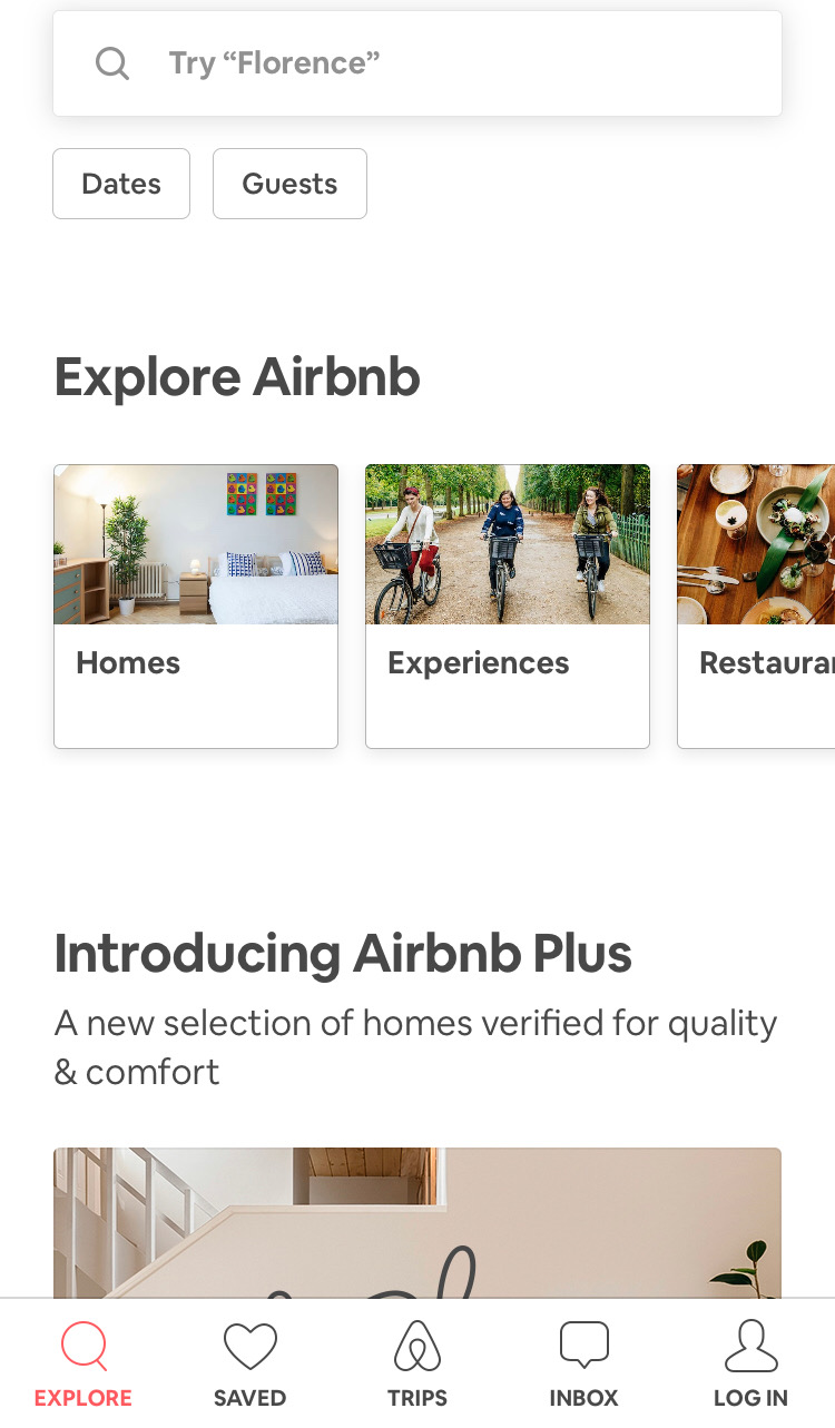
For Airbnb, we focused our mobile testing efforts on the three main areas of their service offering: Homes, Experiences and Restaurants. We wanted to see if people understood the images and labels used and also if there were any potential issues with the way Airbnb presents these three options as horizontally scrollable tiles where the third one is only partially shown in that initial glance.
For TripAdvisor, we were curious to see if the image-only icons on the sticky global navigation menu that appears when the page is scrolled made sense to users. We chose three of these icons to test: Holiday Rentals, Things To Do and Forums.

Our Chalkmark study had a total of 6 tasks — 3 for each app — and we tested both mobile apps together to save time.
Our tasks for this study were:
1. You’ll be spending the holidays with your family in Montreal this year and a friend has recommended you book yourself into an axe throwing workshop during your trip.
2. Where would you go to do this? (Airbnb)
3. You’ve heard that Airbnb has a premium range of places to stay that have been checked by their team to ensure they’re amazing. Where would you go to find out more? (Airbnb)
4. You’re staying with your parents in New York for the week and would like to surprise them by taking them out to dinner but you’re not sure where to take them. Where would you go to look for inspiration? (Airbnb)
5. You’re heading to New Zealand next month and have so many questions about what it’s like! You’d love to ask the online community of locals and other travellers about their experiences. Where would you go to do this? (TripAdvisor)
6. You’re planning a trip to France and would prefer to enjoy Paris from a privately owned apartment instead of a hotel. Where would you go to find out what your options are? (TripAdvisor)
7. You’re currently on a working holiday in Melbourne and you find yourself with an unexpected day off. You’re looking for ideas for things to do. Where would you go to find something like this? (TripAdvisor)
Task order was randomized to reduce bias and we used screenshots from the live apps for testing.All images used for testing were the size of a single phone screen because we wanted to see if they could find their way without needing to scroll. As with everything else, you don’t have to do it this way — you could make the image longer and test a larger section of your design or you could focus on a smaller section. As a testing tool, Chalkmark is flexible and scalable.
We also put a quickly mocked up frame around each image that loosely resembled a smart phone because without it, the image looked like part of it had been cropped out which could have been very distracting for participants! This frame also provided context that we were testing a mobile app.
Chalkmark makes it really easy to make sense of your research through clickmaps and some really handy task results data. These 2 powerful analysis features provide a well-rounded and easy to digest picture of where those valuable first clicks landed so that you can evolve your design quickly and confidently.
A clickmap is a visualization of where your participants clicked on your testing image during the study. It has different views showing heatmaps and actual click locations so you can see exactly where they fell. Clickmaps help you to understand if your participants were on the right track or, if they weren’t, where they went instead.The task results tab in Chalkmark shows how successful your participants were and how long it took them to complete the task. To utilize the task results functionality, all you have to do is set the correct clickable areas on the images you tested with — just click and drag and give each correct area a meaningful name that will then appear alongside the rest of the task results. You can do this during the build process or anytime after the study has been completed. This is very useful if you happen to forget something or are waiting on someone else to get back to you while you set up the test!
For our Airbnb and TripAdvisor study, we set the correct areas on the navigational elements (the tiles, the icons etc) and excluded search. While searching for something isn’t necessarily incorrect, we wanted to see if people could find their way by navigating. For Airbnb, we discovered that 83% of our participants were able to correctly identify where they would need to go to book themselves into an axe throwing workshop. With a median task completion time of 4.89 seconds, this task also had the quickest completion time in the entire study. These findings show that the label and image being used for the ‘Experiences’ section of the app appears to be working quite well.
We also found that 80% of participants were able to find where they’d need to go to access Airbnb Plus. Participants had two options and could go via the ‘Homes’ tile (33%) or through the ‘Introducing Airbnb Plus’ image (47%) further down. Of the remaining participants, 10% clicked on the ‘Introducing Airbnb Plus’ heading, however at the time of testing, this area was not clickable. It’s not a huge deal because these participants were on the right track and would have likely found the right spot to click fairly quickly anyway. It’s just something to consider around user expectations and perhaps making that heading clickable might be worth exploring further.
83% of our participants were able to figure out where to go to find a great restaurant on the Airbnb app which is awesome! An additional 7% would have searched for it which isn’t wrong, but remember, we were testing those navigational tiles. It’s interesting to note that most people selected the tiles — likely indicating they felt they were given enough information to complete the task without needing to search.
For our TripAdvisor tasks, we uncovered some very interesting and actionable insights. We found that 63% of participants were able to correctly identify the ‘Forums’ icon as the place to go for advice from other community members. While 63% is a good result, it does indicate some room for improvement and the possibility that the ‘Forums’ icon might not be reasonating with users as well as it could be. For the remaining participants, 10% clicked on ‘Where to?’ which prompts the user to search for specific locations while 7% clicked on the more general search option that would allow them to search all the content on the app.
63% of participants were able to correctly identify the ‘Holiday Rentals’ icon on the TripAdvisor app when looking for a privately owned apartment rather than a hotel to enjoy Paris from, while 20% of participants appear to have been tripped up by the ‘Hotel’ icon itself.
With 1 in 5 people in this study potentially not being able to distinguish between or determine the meaning behind each of the 2 icons, this is something that might merit further exploration. In another one of the TripAdvisor app’s tasks in this study, 43% of participants were unable to correctly identify the ‘Things To Do’ icon as a place to find inspiration for activities.Where to from here?
If this were your project, you might look at running a quick study to see what people think each of the 6 icons represent. You could slip it into some existing moderated research you had planned or you might run a quick image card sort to see what your users would expect each icon to relate to. Running a study testing all 6 at the same time would allow you to gain insights into how users perceive the icons quickly and efficiently.
Overall, both of these apps tested very well in this study and with a few minor tweaks and iterations that are part of any design process, they could be even better!
Now that you’ve seen an example of mobile testing in Chalkmark, why not try it out for yourself with your app? It’s fast and easy to run and we have lots of great resources to help you on your way including sample studies that allow you to interactively explore both the participant’s and the researcher’s perspective.
Further readingCreate and analyze a first-click test for freeView a first-click test as a participantView first-click test results as a researcherRead our first-click testing 101 guideRead more case studies and research stories to see first-click testing in action
Originally published on 29 March 2019

The word “persona” has many meanings. Sometimes the term refers to a part that an actor plays, other times it can mean a famous person, or even a character in a fictional play or book. But in the field of UX, persona has its own special meaning.
Before you get started with creating personas of your own, learn what they are and the process to create one. We'll even let you in on a great, little tip — how to use Chalkmark to refine and validate your personas.
In the UX field, a persona is created using research and observations of your users, which is analyzed and then depicted in the form of a person’s profile. This individual is completely fictional, but is created based on the research you’ve conducted into your own users. It’s a form of segmentation, which Angus Jenkinson noted in his article “Beyond Segmentation” is a “better intellectual and practical tool for dealing with the interaction between the concept of the ‘individual’ and the concept of ‘group’”.
Typical user personas include very specific information in order to paint an in-depth and memorable picture for the people using them (e.g., designers, marketers etc).
The user personas you create don’t just represent a single individual either; they’ll actually represent a whole group. This allows you to condense your users into just a few segments, while giving you a much smaller set of groups to target.
There are many benefits of using personas. Here are just a few:
There’s no right or wrong way to create a persona; the way you make them can depend on many things, such as your own internal resources, and the type of persona you want.
The average persona that you’ve probably seen before in textbooks, online or in templates isn’t always the best kind to use (picture the common and overused types like ‘Busy Barry’). In fact, the way user personas are constructed is a highly debated topic in the UX industry.
Good user personas are meaningful descriptions — not just a list of demographics and a fake name that allows researchers to simply make assumptions.
Indi Young, an independent consultant and founder of Adaptive Path, is an advocate of creating personas that aren’t just a list of demographics. In an article she penned on medium.com, Indi states: “To actually bring a description to life, to actually develop empathy, you need the deeper, underlying reasoning behind the preferences and statements-of-fact. You need the reasoning, reactions, and guiding principles.”
One issue that can stem from traditional types of personas is they can be based on stereotypes, or even reinforce them. Things like gender, age, ethnicity, culture, and location can all play a part in doing this.
In a study by Phil Turner and Susan Turner titled “Is stereotyping inevitable when designing with personas?” the authors noted: “Stereotyped user representations appear to constrain both design and use in many aspects of everyday life, and those who advocate universal design recognise that stereotyping is an obstacle to achieving design for all.”
So it makes sense to scrap the stereotypes and, in many instances, irrelevant demographic data. Instead, include information that accurately describes the persona’s struggles, goals, thoughts and feelings — all bits of meaningful data.
Creating user personas involves a lot of research and analyzing. Here are a few tips to get you started:
When you’re creating personas for UX, it’s absolutely crucial you start with research; after all, you can’t just pull this information out of thin air by making assumptions! Ensure you use a mixture of both qualitative and quantitative research here in order to cast your net wide and get results that are really valuable. A great research method that falls into the realms of both qualitative and quantitative is user interviews.
When you conduct your interviews, drill down into the types of behaviors, attitudes and goals your users have. It’s also important to mention that you can’t just examine what your users are saying to you — you need to tap into what they’re thinking and how they behave too.
Once you’ve conducted your research, it’s time to analyze it. Look for trends in your results — can you see any similarities among your participants? Can you begin to group some of your participants together based on shared goals, attitudes and behaviors?
After you have sorted your participants into groups, you can create your segments. These segments will become your draft personas. Try to limit the number of personas you create. Having too many can defeat the purpose of creating them in the first place.
Don’t forget the little things! Give your personas a memorable title or name and maybe even assign an image or photo — it all helps to create a “real” person that your team can focus on and remember.
After you’ve finalized your personas, it’s time to review them. Take another look at the responses you received from your initial user interviews and see if they match the personas you created. It’s also important you spend some time reviewing your finalized personas to see if any of them are too similar or overlap with one another. If they do, you might want to jump back a step and segment your data again.
This is also a great time to test your personas. Conduct another set of user interviews and research to validate your personas.
Creating your personas using data from your user interviews can be a fun task — but make sure you don’t go too crazy. Your personas need to be relevant, not overly complex and a true representation of your users.
A great way to ensure your personas don’t get too out of hand is to use a template. There are many of these available online in a number of different formats and of varying quality.
This example from UX Lady contains a number of helpful bits of information you should include, such as user experience goals, tech expertise and the types of devices used. The accompany article also provides a fair bit of guidance on how to fill in your templates too. While this template is good, skip the demographics portion and read Indi Young’s article and books for better quality persona creation.
Now it’s time to let you in on a little tip. Did you know Chalkmark can be used to refine and validate your personas?
One of the trickiest parts of creating personas is actually figuring out which ones are a true representation of your users — so this usually means lots of testing and refining to ensure you’re on the right track. Fortunately, Chalkmark makes the refinement and validation part pretty easy.
First, you need to have your personas finalized or at least drafted. Take your results from your persona software or template you filled in. Create a survey for each segment so that you can see if your participants’ perceptions of themselves matches each of your personas.
Second, create your test. This is a pretty simple demo we made when we were testing our own personas a few years ago at Optimal Workshop. Keep in mind this was a while ago and not a true representation of our current personas — they’ve definitely changed over time! During this step, it’s also quite helpful to include some post-test questions to drill down into your participants’ profiles.
After that, send these tests out to your identified segments (e.g., if you had a retail clothing store, some of your segments might be women of a certain age, and men of a certain age. Each segment would receive its own test). Our test involved three segments: “the aware”, “the informed”, and “the experienced” — again, this has changed over time and you’ll find your personas will change too.
Finally, analyze the results. If you created separate tests for each segment, you will now have filtered data for each segment. This is the real meaty information you use to validate each persona. For example, our three persona tests all contained the questions: “What’s your experience with user research?” And “How much of your job description relates directly to user experience work?”

A
bove, you’ll see the results for Persona #2. This tells us that 34% of respondents identified that their job involves a lot of UX work (75-100%, in fact). In addition, 31% of this segment considered themselves “Confident” with remote user research, while a further 9% and 6% of this segment said they were “Experienced” and “Expert”.

These results all aligned with the persona we associated with that segment: “the informed”.
When you’re running your own tests, you’ll analyze the data in a very similar way. If the results from each of your segments’ Chalkmark tests don’t match up with the personas you created, it’s likely you need to adjust your personas. However, if each segment’s results happen to match up with your personas (like our example above), consider them validated!
For a bit more info on our very own Chalkmark persona test, check out this article.
