Subscribe to OW blog for an instantly better inbox
Oops! Something went wrong while submitting the form.

It requires a certain kind of mind to see beauty in a hamburger bun—Ray Kroc
Maccas. Mickey D’s. The golden arches. Whatever you call it, you know I’m talking about none other than fast-food giant McDonald’s. A survey of 7000 people across six countries 20 years ago by Sponsorship Research International found that more people recognized the golden arches symbol (88%) than the Christian cross (54%). With more than 35,000 restaurants in 118 countries and territories around the world, McDonald’s has come a long way since multi-mixer salesman Ray Kroc happened upon a small fast-food restaurant in 1954.
For an organization of this size and reach, consistency and strong branding are certainly key ingredients in its marketing mix. McDonald’s restaurants all over the world are easily recognised and while the menu does differ slightly between countries, users know what kind of experience to expect. With this in mind, I wondered if the same is true for McDonald’s web presence? How successful is a large organization like McDonald’s at delivering a consistent online user experience tailored to suit diverse audiences worldwide without losing its core meaning? I decided to investigate and gave McDonald’s a good grilling by testing ten of its country-specific websites’ home pages in one Chalkmark study.
First-click testing reveals the first impressions your users have of your designs. This information is useful in determining whether users are heading down the right path when they first arrive at your site. When considering the best way to measure and compare ten of McDonald’s websites from around the world, I choose first-click testing because I wanted to be able to test the visual designs of each website and I wanted to do it all in one research study.My first job in the setup process was to decide which McDonald’s websites would make the cut.
The approach was to divide the planet up by continent, combined with the requirement that the sites selected be available in my native language (English) in order to interpret the results. I chose: Australia, Canada, Fiji, India, Malaysia, New Zealand, Singapore, South Africa, the UK, and the US. The next task was to figure out how to test this. Ten tasks is ideal for a Chalkmark study, so I made it one task per website; however, determining what those tasks would be was tricky. Serving up the same task for all ten ran the risk of participants tiring of the repetition, but a level of consistency was necessary in order to compare the sites. I decided that all tasks would be different, but tied together with one common theme: burgers.
After all, you don’t win friends with salad.
When sourcing participants for my research, I often hand the recruitment responsibilities over to Optimal Workshop because it’s super quick and easy; however, this time I decided to do something a bit different. Because McDonald’s is such a large and well-known organization visited by hundreds of millions of people every year, I decided to recruit entirely via Twitter by simply tweeting the link out. Am I three fries short of a happy meal for thinking this would work? Apparently not. In just under a week I had the 30+ completed responses needed to peel back the wrapper on McDonald’s.
Imagine what could have happened if it had been McDonald’s tweeting that out to the burger-loving masses? Ideally when recruiting for a first-click testing study the more participants you can get the more sure you can be of your results, but aiming for 30-50 completed responses will still provide viable results. Conducting user research doesn’t have to be expensive; you can achieve quality results that cut the mustard for free. It’s a great way to connect with your customers, and you could easily reward participants with, say, a burger voucher by redirecting them somewhere after they do the activity—ooh, there’s an idea!
Interpreting the results from a Chalkmark study is quick and easy.

Everything you need presented under a series of tabs under ‘Analysis’ in the results section of the dashboard:


McDonald’s tested ridiculously well right across the board in the Chalkmark study. Country by country in alphabetical order, here’s what I discovered:

This study clearly shows that McDonald’s are kicking serious goals in the online stakes but before we call it quits and go home, let’s look at why that may be the case. Approaching this the way any UXer worth their salt on their fries would, I stuck all the screens together on a wall, broke out the Sharpies and the Tesla Amazing magnetic notes (the best invention since Post-it notes), and embarked on the hunt for patterns and similarities—and wow did I find them!
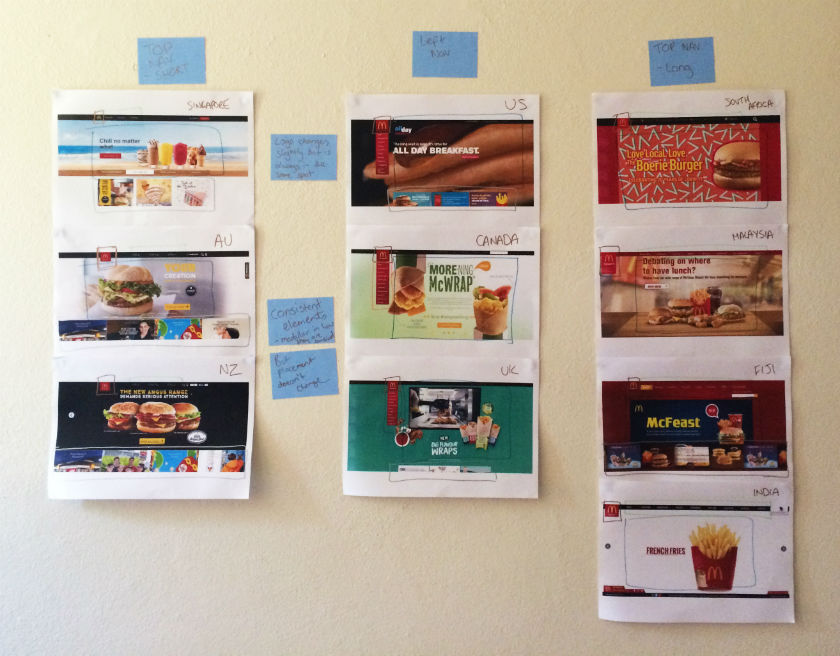
Across the ten websites, I observed just two distinct navigation patterns: navigation menus at the top and to the left. The sites with a top navigation menu could also be broken down into two further groups: those with three labels (Australia, New Zealand, and Singapore) and those with more than three labels (Fiji, India, Malaysia, and South Africa). Australia and New Zealand shared the exact same labelling of ‘eat’, ‘learn’, and ‘play’ (despite being distinct countries), whereas the others had their own unique labels but with some subject matter crossover; for example, ‘People’ versus ‘Our People’.

Canada, the UK, and the US all had the same look and feel with their left side navigation bar, but each with different labels. All three still had navigation elements at the top of the page, but the main content that the other seven countries had in their top navigation bars was located in that left sidebar.

These patterns ensure that each site is tailored to its unique audience while still maintaining some consistency so that it’s clear they belong to the same entity.
If there’s one aspect that screams McDonald’s, it’s the iconic golden arches on the logo. Across the ten sites, the logo does vary slightly in size, color, and composition, but it’s always in the same place and the golden arches are always there. Logo consistently is a no-brainer, and in this case McDonald’s clearly recognizes the strengths of its logo and understands which pieces it can add or remove without losing its identity.

Navigation and logo placement weren’t the only connections one can draw from looking at my wall of McDonald’s. There were also some very interesting but subtle similarities in the page layouts. The middle of the page is always used for images and advertising content, including videos and animated GIFs. The US version featured a particularly memorable advertisement for its all-day breakfast menu, complete with animated maple syrup slowly drizzling its way over a stack of hotcakes.

The bottom of the page is consistently used on most sites to house more advertising content in the form of tiles. The sites without the tiles left this space blank.
Looking at these results, it is quite clear that the same level of consistency and recognition between McDonald’s restaurants is also present between the different country websites. This did make me wonder what role does familiarity play in determining usability? In investigating I found a few interesting articles on the subject. This article by Colleen Roller on UXmatters discusses the connection between cognitive fluency and familiarity, and the impact this has on decision-making. Colleen writes:Because familiarity enables easy mental processing, it feels fluent. So people often equate the feeling of fluency with familiarity. That is, people often infer familiarity when a stimulus feels easy to process. If we’re familiar with an item, we don’t have to think too hard about it and this reduction in performance load can make it feel easier to use. I also found this fascinating read on Smashing Magazine by Charles Hannon that explores why Apple were able to claim ‘You already know how to use it’ when launching the iPad. It’s well worth a look!Oh and about those yoga mats … the answer is yes.
"Dear Optimal Workshop
How do you make a small link attractive to people (icon vs. text)?"
— Cassie
Dear Cassie,
I'm going to dive straight into this interesting question with a good old game of Pros and Cons, and then offer a resolution of sorts, with a meandering thought or two along the way. Let's kick things off with Team Icon.
When shopping online, the number above the little shopping trolley icon tells me how badly behaved I’ve been, and if I click on it, I know I’ll get to gleefully review all the shoes I've selected so far. There’s a whole heap of icons out there like this that people have absorbed and can use without thinking twice. Marli Mesibov wrote a fantastic article on the use of icons for UX Booth on the use of icons that is well worth a look. Marli discusses how they work well on small screens, which is a definite bonus when you’re on the go! Young children who aren’t yet literate can easily figure out how to open and play Angry Birds on their parent’s smartphones thanks to icons. And icons also have a great capacity for bridging language barriers.
On the flipside, there are some issues that may huff and puff and blow that cute little home icon down. Starting with there being no consistent standard for them. Sure, there are a handful that are universal like home and print, but beyond that it seems to be a free-for-all. Icons are very much in the hands of the designer and this leaves a lot of room for confusion to grow like bacteria in a badly maintained office refrigerator. Difficult to understand icons can also seriously hinder a user’s ability to learn how to use your website or application. When icons don't communicate what they intend, well, you can guess what happens. In a great piece advocating for text over icons, Joshua Porter writes about an experience he had:
"I have used this UI now for a week and I still have do a double-take each time I want to navigate. I’m not learning what the icons mean. The folder icon represents 'Projects', which I can usually remember (but I think I remember it because it’s simply the first and default option). The second icon, a factory, is actually a link to the 'Manage' screen, where you manage people and projects. This trips me up every time."
If people can't pick up the meaning of your icons quickly and intuitively, they may just stop trying altogether. And now, over to Team Label.
Sometimes language really is the fastest vehicle you've got for delivering a message. If you choose the right words to label your links, you'll leave the user with very little doubt as to what lies beneath. It’s that simple. Carefully-considered and well-written labels can cut through the noise and leave minimal ambiguity in their wake. Quoting Joshua Porter again: "Nothing says 'manage' like 'manage'. In other words, in the battle of clarity between icons and labels, labels always win."
Text labels can get messy and be just as confusing as unfamiliar icons! Words and phrases sometimes don’t mean the same thing to different people. One person’s flat enclosed shoe may be another person’s ballet pump, and the next person may be left scratching their head because they thought pumps were heels and all they wanted was a ballet flat! Text only labels can also become problematic if there isn’t a clear hierarchy of information, and if you have multiple links on one page or screen. Bombarding people with a page of short text links may make it difficult for them to find a starting point. And text may also hold back people who speak other languages.
Because things are always better when we work together! Capitalise on the combined force of text and icons to solve the dilemma. And I don’t mean you should rely on hovers — make both text and icon visible at all times. Two great examples are Google Apps (because nothing says storage like a weird geometric shape...) and the iPhone App store (because the compass and magnifying glass would pose an interesting challenge without text...):

Whatever you decide to run with, test it. Use whatever techniques you have on hand to test all three possibilities — icons only, text only, and icons and text — on real people. No Pros and Cons list, however wonderful, can beat that. And you know, the results will probably surprise you. I ran a quick study recently using Chalkmark to find out where people on the ASOS women's shoes page would click to get to the homepage (and yes, I can alway find ways to make shoe shopping an integral part of my job). 28 people responded, and...

...a whopping 89% of them clicked the logo, just 7% clicked the home icon, and just one person (the remaining 4%) clicked the label 'Home'. Enough said. Thanks for your question Cassie. To finish, here's some on-topic (and well-earned) comic relief (via @TechnicallyRon)

In 2009, Bob Bailey and Cari Wolfson published published findings that changed how we approach first click testing and usability testing. They analyzed 12 scenario-based user tests and found that if someone gets their first click right, they're about twice as likely to complete their task successfully. This finding was so compelling that we built First Click Testing (formerly Chalkmark) specifically to help teams test this. But we'd never actually validated their research using our own data, until now.
Turns out, we're sitting on one of the world's largest databases of tree testing results. So we analyzed millions of task responses to see if the "first click predicts success" hypothesis holds up.
It does. Convincingly.
Users who get their first click correct are nearly three times more likely to complete their task successfully (70% vs 24% success rate).
Here's how we validated the original study, what our data shows, and why first clicks matter more than you might think.
Bob and Cari analyzed data from twelve usability studies on websites and products with varying amounts and types of content, a range of subject matter complexity, and distinct user interfaces. They found that people were about twice as likely to complete a task successfully if they got their first click right, than if they got it wrong:
If the first click was correct, the chances of getting the entire scenario correct was 87% if the first click was incorrect, the chances of eventually getting the scenario correct was only 46%.
We analyzed millions of tree testing responses in our database. We've found that people who get the first click correct are almost three times as likely to complete a task successfully:
If the first click was correct, the chances of getting the entire scenario correct was 70% if the first click was incorrect, the chances of eventually getting the scenario correct was 24%
To give you another perspective on the same data, here's the inverse:
If the first click was correct, the chances of getting the entire scenario incorrect was 30% if the first click was incorrect, the chances of getting the whole scenario incorrect was 76%
Bob and Cari proved the usefulness of the methodology by linking two key metrics in scenario-based usability studies: first clicks and task success. First Click Testing doesn't measure task success — it's up to the researcher to determine as they're setting up the study what constitutes 'success', and then to interpret the results accordingly. Tree Testing (formerly Treejack) does measure task success — and first clicks.
In a tree test, participants are asked to complete a task by clicking though a text-only version of a website hierarchy, and then clicking 'I'd find it here' when they've chosen an answer. Each task in a tree test has a pre-determined correct answer — as was the case in Bob and Cari's usability studies — and every click is recorded, so we can see participant paths in detail.
Thus, every single time a person completes an individual tree testing task, we record both their first click and whether they are successful or not. When we came to test the 'correct first click leads to task success' hypothesis, we could therefore mine data from millions of task.
To illustrate this, have a look at the results for one task. The overall Task result, you see a score for success and directness, and a breakdown of whether each Success, Fail, or Skip was direct (they went straight to an answer), or indirect (they went back up the tree before they selected an answer):

In the pie tree for the same task, you can look in more detail at how many people went the wrong way from a label (each label representing one page of your website):

In the First Click tab, you get a percentage breakdown of which label people clicked first to complete the task:

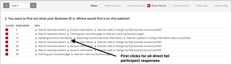
And in the Paths tab, you can view individual participant paths in detail (including first clicks), and can filter the table by direct and indirect success, fails, and skips (this table is only displaying direct success and direct fail paths):
First click analysis is one of the most predictive metrics in usability testing. Whether you're testing wireframes, landing pages, or information architecture, measuring first click success gives you early insight into whether your design will work.
This analysis reinforces something we already knew: first clicks matter. It is worth your time to get that first impression right. You have plenty of options for measuring the link between first clicks and task success in your scenario-based usability tests. From simply noting where your participants go during observations, to gathering quantitative first click data via online tools, you'll win either way. And if you want quantitative first click data, Optimal has you covered. First Click Testing works for wireframes and landing pages, while Tree Testing validates your information architecture.
To finish, here are a few invaluable insights from other researchers on getting the most from first click testing:
About this study
This analysis was conducted in 2015 using millions of task responses from Optimal’s First Click and Tree Testing tools. While the dataset predates recent UI trends, the underlying behavioral principle, that a correct first click strongly predicts task success, remains consistent with modern usability research.
