First Click Testing Data: Correct First Click Lead to 3X Higher Task Success
In 2009, Bob Bailey and Cari Wolfson published published findings that changed how we approach first click testing and usability testing. They analyzed 12 scenario-based user tests and found that if someone gets their first click right, they're about twice as likely to complete their task successfully. This finding was so compelling that we built First Click Testing (formerly Chalkmark) specifically to help teams test this. But we'd never actually validated their research using our own data, until now.
Turns out, we're sitting on one of the world's largest databases of tree testing results. So we analyzed millions of task responses to see if the "first click predicts success" hypothesis holds up.
It does. Convincingly.
Users who get their first click correct are nearly three times more likely to complete their task successfully (70% vs 24% success rate).
Here's how we validated the original study, what our data shows, and why first clicks matter more than you might think.
Original first click testing study: 87% task success rate
Bob and Cari analyzed data from twelve usability studies on websites and products with varying amounts and types of content, a range of subject matter complexity, and distinct user interfaces. They found that people were about twice as likely to complete a task successfully if they got their first click right, than if they got it wrong:
If the first click was correct, the chances of getting the entire scenario correct was 87% if the first click was incorrect, the chances of eventually getting the scenario correct was only 46%.
Our Tree Testing data: First clicks predict 70% task success rate
We analyzed millions of tree testing responses in our database. We've found that people who get the first click correct are almost three times as likely to complete a task successfully:
If the first click was correct, the chances of getting the entire scenario correct was 70% if the first click was incorrect, the chances of eventually getting the scenario correct was 24%
To give you another perspective on the same data, here's the inverse:
If the first click was correct, the chances of getting the entire scenario incorrect was 30% if the first click was incorrect, the chances of getting the whole scenario incorrect was 76%
How Tree Testing measures first click success and task completion
Bob and Cari proved the usefulness of the methodology by linking two key metrics in scenario-based usability studies: first clicks and task success. First Click Testing doesn't measure task success — it's up to the researcher to determine as they're setting up the study what constitutes 'success', and then to interpret the results accordingly. Tree Testing(formerly Treejack) does measure task success — and first clicks.
In a tree test, participants are asked to complete a task by clicking though a text-only version of a website hierarchy, and then clicking 'I'd find it here' when they've chosen an answer. Each task in a tree test has a pre-determined correct answer — as was the case in Bob and Cari's usability studies — and every click is recorded, so we can see participant paths in detail.
Thus, every single time a person completes an individual tree testing task, we record both their first click and whether they are successful or not. When we came to test the 'correct first click leads to task success' hypothesis, we could therefore mine data from millions of task.
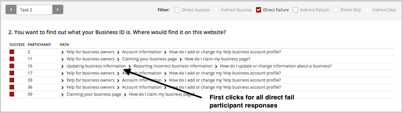
To illustrate this, have a look at the results for one task. The overall Task result, you see a score for success and directness, and a breakdown of whether each Success, Fail, or Skip was direct (they went straight to an answer), or indirect (they went back up the tree before they selected an answer):
In the pie tree for the same task, you can look in more detail at how many people went the wrong way from a label (each label representing one page of your website):
In the First Click tab, you get a percentage breakdown of which label people clicked first to complete the task:
And in the Paths tab, you can view individual participant paths in detail (including first clicks), and can filter the table by direct and indirect success, fails, and skips (this table is only displaying direct success and direct fail paths):
How to run first click tests: Best practices for usability testing
First click analysis is one of the most predictive metrics in usability testing. Whether you're testing wireframes, landing pages, or information architecture, measuring first click success gives you early insight into whether your design will work.
This analysis reinforces something we already knew: first clicksmatter. It is worth your time to get that first impression right. You have plenty of options for measuring the link between first clicks and task success in your scenario-based usability tests. From simply noting where your participants go during observations, to gathering quantitative first click data via online tools, you'll win either way. And if you want quantitative first click data, Optimal has you covered. First Click Testing works for wireframes and landing pages, while Tree Testing validates your information architecture.
To finish, here are a few invaluable insights from other researchers on getting the most from first click testing:
This analysis was conducted in 2015 using millions of task responses from Optimal’s First Click and Tree Testing tools. While the dataset predates recent UI trends, the underlying behavioral principle, that a correct first click strongly predicts task success, remains consistent with modern usability research.
If you missed our live training, don’t worry, we’ve got you covered! In this session, our product experts Katie and Aidan discuss why, how and when to benchmark an existing structure using Treejack.
In Part 1 of this series we looked at how to interpret results from open and hybrid card sorts and now in Part 2, we’re going to talk about closed card sorts. In closed card sorts, participants are asked to sort the cards into predetermined categories and are not allowed to create any of their own. You might use this approach when you are constrained by specific category names or as a quick checkup before launching a new or newly redesigned website.In Part 1, we also discussed the two different - but complementary - types of analysis that are generally used together for interpreting card sort results: exploratory and statistical. Exploratory analysis is intuitive and creative while statistical analysis is all about the numbers. Check out Part 1 for a refresher or learn more about exploratory and statistical analysis in Donna Spencer’s book.
Getting started
Closed card sort analysis is generally much quicker and easier than open and hybrid card sorts because there are no participant created category names to analyze - it’s really just about where the cards were placed. There are some similarities about how you might start to approach your analysis process but overall there’s a lot less information to take in and there isn’t much in the way of drilling down into the details like we did in Part 1.Just like with an open card sort, kick off your analysis process by taking an overall look at the results as a whole. Quickly cast your eye over each individual card sort and just take it all in. Look for common patterns in how the cards have been sorted. Does anything jump out as surprising? Are there similarities or differences between participant sorts?
If you’re redesigning an existing information architecture (IA), how do your results compare to the current state? If this is a final check up before launching a live website, how do these results compare to what you learned during your previous research studies?If you ran your card sort using information architecture tool OptimalSort, head straight to the Overview and Participants Table presented in the results section of the tool. If you ran a moderated card sort using OptimalSort’s printed cards, you’ve probably been scanning them in after each completed session, but now is a good time to double check you got them all. And if you didn’t know about this handy feature of OptimalSort, it’s something to keep in mind for next time!
The Participants Table shows a breakdown of your card sorting data by individual participant. Start by reviewing each individual card sort one by one by clicking on the arrow in the far left column next to the Participants numbers. From here you can easily flick back and forth between participants without needing to close that modal window. Don’t spend too much time on this — you’re just trying to get a general impression of how the cards were sorted into your predetermined categories. Keep an eye out for any card sorts that you might like to exclude from the results. For example participants who have lumped everything into one group and haven’t actually sorted the cards.
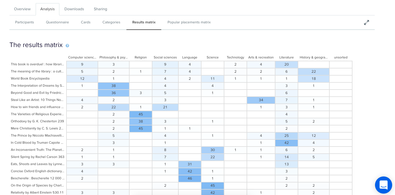
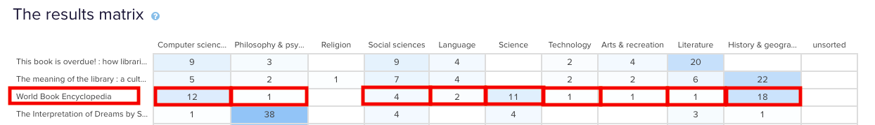
Don’t worry- excluding or including participants isn’t permanent and can be toggled on or off at anytime.Once you’re happy with the individual card sorts that will and won’t be included in your results visualizations, it’s time to take a look at the Results Matrix in OptimalSort. The Results Matrix shows the number of times each card was sorted into each of your predetermined categories- the higher the number, the darker the shade of blue (see below).
Results Matrix in OptimalSort.
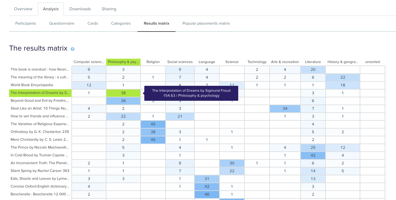
This table enables you to quickly and easily get across how the cards were sorted and gauge the highest and lowest levels of agreement among your participants. This will tell you if you’re on the right track or highlight opportunities for further refinement of your categories.If we take a closer look (see below) we can see that in this example closed card sort conducted on the Dewey Decimal Classification system commonly used in libraries, The Interpretation of Dreams by Sigmund Freud was sorted into ‘Philosophy and psychology’ 38 times in study a completed by 51 participants.
Results Matrix in OptimalSort zoomed in with hover.
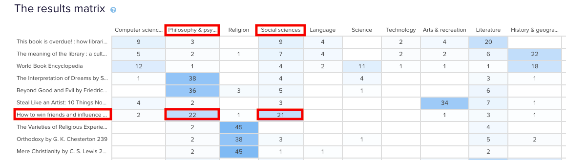
In the real world, that is exactly where that content lives and this is useful to know because it shows that the current state is supporting user expectations around findability reasonably well. Note: this particular example study used image based cards instead of word label based cards so the description that appears in both the grey box and down the left hand side of the matrix is for reference purposes only and was hidden from the participants.Sometimes you may come across cards that are popular in multiple categories. In our example study, How to win friends and influence people by Dale Carnegie, is popular in two categories: ‘Philosophy & psychology’ and ‘Social sciences’ with 22 and 21 placements respectively. The remaining card placements are scattered across a further 5 categories although in much smaller numbers.
Results Matrix showing cards popular in multiple categories.
When this happens, it’s up to you to determine what your number thresholds are. If it’s a tie or really close like it is in this case, you might review the results against any previous research studies to see if anything has changed or if this is something that comes up often. It might be a new category that you’ve just introduced, it might be an issue that hasn’t been resolved yet or it might just be limited to this one study. If you’re really not sure, it’s a good idea to run some in-person card sorts as well so you can ask questions and gain clarification around why your participants felt a card belonged in a particular category. If you’ve already done that great! Time to review those notes and recordings!You may also find yourself in a situation where no category is any more popular than the others for a particular card. This means there’s not much agreement among your participants about where that card actually belongs. In our example closed card sort study, the World Book Encyclopedia was placed into 9 of 10 categories. While it was placed in ‘History & geography’ 18 times, that’s still only 35% of the total placements for that card- it’s hardly conclusive.
Results Matrix showing a card with a lack of agreement.
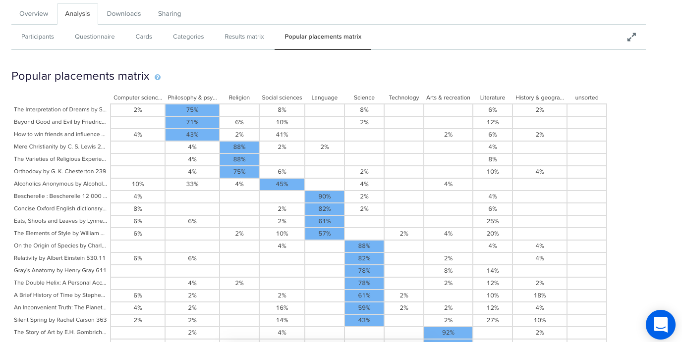
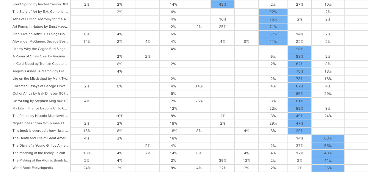
Sometimes this happens when the card label or image is quite general and could logically belong in many of the categories. In this case, an encyclopedia could easily fit into any of those categories and I suspect this happened because people may not be aware that encyclopedias make up a very large part of the category on the far left of the above matrix: ‘Computer science, information & general works’. You may also see this happening when a card is ambiguous and people have to guess where it might belong. Again - if you haven’t already - if in doubt, run some in-person card sorts so you can ask questions and get to the bottom of it!After reviewing the Results Matrix in OptimalSort, visit the Popular Placements Matrix to see which cards were most popular for each of your categories based on how your participants sorted them (see below 2 images).
Popular Placements Matrix in OptimalSort- top half of the diagram.
Popular Placements Matrix in OptimalSort- scrolled to show the bottom half of the diagram.
The diagram shades the most popular placements for each category in blue making it very easy to spot what belongs where in the eyes of your participants. It’s useful for quickly identifying clusters and also highlights the categories that didn’t get a lot of card sorting love. In our example study (2 images above) we can see that ‘Technology’ wasn’t a popular card category choice potentially indicating ambiguity around that particular category name. As someone familiar with the Dewey Decimal Classification system I know that ‘Technology’ is a bit of a tricky one because it contains a wide variety of content that includes topics on medicine and food science - sometimes it will appear as ‘Technology & applied sciences’. These results appear to support the case for exploring that alternative further!
Where to from here?
Now that we’ve looked at how to interpret your open, hybrid and closed card sorts, here are some next steps to help you turn those insights into action!Once you’ve analyzed your card sort results, it’s time to feed those insights into your design process and create your taxonomy which goes hand in hand with your information architecture. You can build your taxonomy out in Post-it notes before popping it into a spreadsheet for review. This is also a great time to identify any alternate labelling and placement options that came out of your card sorting process for further testing.From here, you might move into tree testing your new IA or you might run another card sort focussing on a specific area of your website. You can learn more about card sorting in general via our 101 guide.
When interpreting card sort results, don’t forget to have fun! It’s easy to get overwhelmed and bogged down in the results but don’t lose sight of the magic that is uncovering user insights.I’m going to leave you with this quote from Donna Spencer that summarizes the essence of card sort analysis quite nicely:Remember that you are the one who is doing the thinking, not the technique... you are the one who puts it all together into a great solution. Follow your instincts, take some risks, and try new approaches. - Donna Spencer
Further reading
Card Sorting 101 – Learn about the differences between open, closed and hybrid card sorts, and how to run your own using OptimalSort.
When it comes to designing and testing in the world of information architecture, it’s hard to beat card sorting. As a usability testing method, card sorting is easy to set up, simple to recruit for and can supply you with a range of useful insights. But there’s a long-standing debate in the world of card sorting, and that’s whether it’s better to run card sorts in person (moderated) or remotely over the internet (unmoderated).
This article should give you some insight into the world of online card sorting. We've included an analysis of the benefits (and the downsides) as well as why people use this approach. Let's take a look!
How an online card sort works
Running a card sort remotely has quickly become a popular option just because of how time-intensive in-person card sorting is. Instead of needing to bring your participants in for dedicated card sorting sessions, you can simply set up your card sort using an online tool (like our very own OptimalSort) and then wait for the results to roll in.
So what’s involved in a typical online card sort? At a very high level, here’s what’s required. We’re going to assume you’re already set up with an online card sorting tool at this point.
Define the cards: Depending on what you’re testing, add the items (cards) to your study. If you were testing the navigation menu of a hotel website, your cards might be things like “Home”, “Book a room”, “Our facilities” and “Contact us”.
Work out whether to run a closed or open sort: Determine whether you’ll set the groups for participants to sort cards into (closed) or leave it up to them (open). You may also opt for a mix, where you create some categories but leave the option open for participants to create their own.
Recruit your participants: Whether using a participant recruitment service or by recruiting through your own channels, send out invites to your online card sort.
Wait for the data: Once you’ve sent out your invites, all that’s left to do is wait for the data to come in and then analyze the results.
Online card sorting has a few distinct advantages over in-person card sorting that help to make it a popular option among information architects and user researchers. There are downsides too (as there are with any remote usability testing option), but we’ll get to those in a moment.
Where remote (unmoderated) card sorting excels:
Time savings: Online card sorting is essentially ‘set and forget’, meaning you can set up the study, send out invites to your participants and then sit back and wait for the results to come in. In-person card sorting requires you to moderate each session and collate the data at the end.
Easier for participants: It’s not often that researchers are on the other side of the table, but it’s important to consider the participant’s viewpoint. It’s much easier for someone to spend 15 minutes completing your online card sort in their own time instead of trekking across town to your office for an exercise that could take well over an hour.
Cheaper: In a similar vein, online card sorting is much cheaper than in-person testing. While it’s true that you may still need to recruit participants, you won’t need to reimburse people for travel expenses.
Analytics: Last but certainly not least, online card sorting tools (like OptimalSort) can take much of the analytical burden off you by transforming your data into actionable insights. Other tools will differ, but OptimalSort can generate a similarity matrix, dendrograms and a participant-centric analysis using your study data.
Where in-person (moderated) card sorting excels:
Qualitative insights: For all intents and purposes, online card sorting is the most effective way to run a card sort. It’s cheaper, faster and easier for you. But, there’s one area where in-person card sorting excels, and that’s qualitative feedback. When you’re sitting directly across the table from your participant you’re far more likely to learn about the why as well as the what. You can ask participants directly why they grouped certain cards together.
Online card sorting: Participant numbers
So that’s online card sorting in a nutshell, as well as some of the reasons why you should actually use this method. But what about participant numbers? Well, there’s no one right answer, but the general rule is that you need more people than you’d typically bring in for a usability test.
This all comes down to the fact that card sorting is what’s known as a generative method, whereas usability testing is an evaluation method. Here’s a little breakdown of what we mean by these terms:
Generative method: There’s no design, and you need to get a sense of how people think about the problem you’re trying to solve. For example, how people would arrange the items that need to go into your website’s navigation. As Nielsen Norman Group explains: “There is great variability in different people's mental models and in the vocabulary they use to describe the same concepts. We must collect data from a fair number of users before we can achieve a stable picture of the users' preferred structure and determine how to accommodate differences among users”.
Evaluation method: There’s already a design, and you basically need to work out whether it’s a good fit for your users. Any major problems are likely to crop up even after testing 5 or so users. For example, you have a wireframe of your website and need to identify any major usability issues.
Basically, because you’ll typically be using card sorting to generate a new design or structure from nothing, you need to sample a larger number of people. If you were testing an existing website structure, you could get by with a smaller group.
Where to from here?
Following on from our discussion of generative versus evaluation methods, you’ve really got a choice of 2 paths from here if you’re in the midst of a project. For those developing new structures, the best course of action is likely to be a card sort. However, if you’ve got an existing structure that you need to test in order to usability problems and possible areas of improvement, you’re likely best to run a tree test. We’ve got some useful information on getting started with a tree test right here on the blog.