Subscribe to OW blog for an instantly better inbox
Oops! Something went wrong while submitting the form.
Maze has built a strong reputation for rapid prototype testing and quick design validation. For product teams focused on speed and Figma integration, it offers an appealing workflow. But as research programs mature and teams need deeper insights to inform strategic decisions, many discover that Maze's limitations create friction. Platform reliability issues, restricted research depth, and a narrow focus on unmoderated testing leave gaps that growing teams can't afford.
If you're exploring Maze alternatives that deliver both speed and substance, here are seven platforms worth evaluating.
Teams typically start searching for Maze alternatives when they encounter these constraints:
Before committing to a new platform, evaluate these key factors:
Optimal delivers end-to-end research capabilities that teams commonly piece together from multiple tools. Optimal supports the complete research lifecycle: participant recruitment, prototype testing, live site testing, card sorting, tree testing, surveys, and AI-powered interview analysis.
Broader research methods: Optimal provides specialized tools and in-depth analysis and visualizations that Maze simply doesn't offer. Card sorting and tree testing validate information architecture before you build. Live site testing lets you evaluate actual websites and applications without code, enabling continuous optimization post-launch. This breadth means teams can conduct comprehensive research without switching platforms or compromising study quality.
Deeper qualitative insights: Optimal's new Interviews tool revolutionizes how teams extract value from user research. Upload interview videos and AI automatically surfaces key themes, generates smart highlight reels with timestamped evidence, and produces actionable insights in hours instead of weeks. Every insight comes with supporting video evidence, making stakeholder buy-in effortless.
AI-powered analysis: While Maze provides basic metrics and surface-level reporting, Optimal delivers sophisticated AI analysis that automatically generates insights, identifies patterns, and creates export-ready reports. This transforms research from data collection into strategic intelligence.
Global participant recruitment: Access to over 100 million verified participants across 150+ countries enables sophisticated targeting for any demographic or market. Optimal's fraud prevention and quality assurance processes ensure participant authenticity, something teams consistently report as problematic with Maze's smaller panel.
Enterprise-grade reliability: Optimal serves Fortune 500 companies including Netflix, LEGO, and Apple with SOC 2 compliance, SSO, role-based permissions, and dedicated enterprise support. The platform was built for scale, not retrofitted for it.
Best for: UX researchers, design and product teams, and enterprise organizations requiring comprehensive research capabilities, deeper insights, and proven enterprise reliability.
UserTesting remains one of the most recognized platforms for gathering video feedback from participants. It excels at capturing user reactions and verbal feedback during task completion.
Strengths: Large participant pool with strong demographic filters, robust support for moderated sessions and live interviews, integrations with Figma and Miro.
Limitations: Significantly higher cost at enterprise scale, less flexible for navigation testing or survey-driven research compared to platforms like Optimal, increasingly complex UI following multiple acquisitions (UserZoom, Validately) creates usability issues.
Best for: Large enterprises prioritizing high-volume video feedback and willing to invest in premium pricing for moderated session capabilities.
Lookback specializes in live user interviews and moderated testing sessions, emphasizing rich qualitative feedback over quantitative metrics.
Strengths: Excellent for in-depth qualitative discovery, strong recording and note-taking features, good for teams prioritizing narrative insights over metrics.
Limitations: Narrow focus on moderated research limits versatility, lacks quantitative testing methods, smaller participant pool requires external recruitment for most studies.
Best for: Research teams conducting primarily qualitative discovery work and willing to manage recruitment separately.
PlaybookUX combines usability testing with integrated participant recruitment, appealing to teams wanting simplified procurement.
Strengths: Bundled recruitment reduces vendor management, straightforward pricing model, decent for basic unmoderated studies.
Limitations: Limited research method variety compared to comprehensive platforms, smaller panel size restricts targeting options, basic analysis capabilities require manual synthesis.
Best for: Small teams needing recruitment and basic testing in one package without advanced research requirements.
Lyssna (formerly UsabilityHub) focuses on fast, lightweight tests for design validation; preference tests, first-click tests, and five-second tests.
Strengths: Fast turnaround for simple validation, intuitive interface, affordable entry point for small teams.
Limitations: Limited scope beyond basic design feedback, small participant panel with quality control issues, lacks sophisticated analysis or enterprise features.
Best for: Designers running lightweight validation tests on UI patterns and early-stage concepts.
Hotjar specializes in on-site behavior analytics; heatmaps, session recordings, and feedback widgets that reveal how users interact with live websites.
Strengths: Valuable behavioral data from actual site visitors, seamless integration with existing websites, combines quantitative patterns with qualitative feedback.
Limitations: Focuses on post-launch observation rather than pre-launch validation, doesn't support prototype testing or information architecture validation, requires separate tools for recruitment-based research.
Best for: Teams optimizing live websites and wanting to understand actual user behavior patterns post-launch.
UserZoom (now part of UserTesting) targets enterprise research programs requiring governance, global reach, and sophisticated study design.
Strengths: Extensive research methods and study templates, strong enterprise governance features, supports complex global research operations.
Limitations: Significantly higher cost than Maze or comparable platforms, complex interface with steep learning curve, integration with UserTesting creates platform uncertainty.
Best for: Global research teams at large enterprises with complex governance requirements and substantial research budgets.
Maze serves a specific need: rapid prototype validation for design-focused teams. But as research programs mature and insights drive strategic decisions, teams need platforms that deliver depth alongside speed.
Optimal stands out by combining Maze's prototype testing capabilities with the comprehensive research methods, AI-powered analysis, and enterprise reliability that growing teams require. Whether you're validating information architecture through card sorting, testing live websites without code, or extracting insights from interview videos, Optimal provides the depth and breadth that transforms research from validation into strategic advantage.
If you're evaluating Maze alternatives, consider what your research program needs six months from now, not just today. The right platform scales with your team, deepens your insights, and becomes more valuable as your research practice matures.
Try Optimal for free to experience how comprehensive research capabilities transform user insights from validation into strategic intelligence.

When we first think of a beautiful website or app design, we rarely think of content structures, labels, and categories. But that’s exactly where great design and seamless user experiences begin. Beneath fancy fonts, layout, colors, and animations are the real heroes of user-centric design - information architecture and navigation.
Information architecture (IA) is like the blueprint of your website or app - it’s a conceptual content structure of how content is organized and arranged to create seamless interactions. And as useful as your information may be, if your navigation is flawed, users won’t be able to find it. They’ll simply leave your site and look elsewhere.
So, how does navigation and information architecture complement each other to create seamless user experiences?
Information architecture refers to the practice of organizing, structuring, and labeling content and information to enhance the user's understanding and navigation of a website or application. It involves designing an intuitive, user-friendly, and efficient system to help users find and access the information they need easily. Good IA is essential for delivering a positive user experience and ensuring that your users can achieve their goals effectively.
IA is often confused with navigation structure. Navigation is a part of IA, and it refers to the way users move through a website or application. IA involves more than navigation; it encompasses the overall organization, labeling, and structure of content and information.
There are three key components of IA:
Navigation refers to the process of providing users with a means of moving through a website or application to access the information they need. Navigation is an integral part of IA, as it guides users through the organizational structure and content structure of a site, allowing them to find and access the information they require efficiently.
There are several types of navigation, including utility navigation and content navigation. Utility navigation refers to the elements that help users perform specific actions, such as logging in, creating an account, subscribing, or sharing content. Content navigation, on the other hand, refers to the elements used to guide users through the site's content, such as menus, links, and buttons.
Both types of navigation provide users with a roadmap of how the site is organized and how they can access/interact with the information they need. Effective navigation structures are designed to be intuitive and easy to use. The goal is to minimize the time and effort required for users to find and access the information they need.
The key elements of effective navigation include clear labeling, logical grouping, and consistency across the site.
Since navigation structures need to be intuitive and easy to use, it goes without saying that usability testing is central to determining what is deemed ‘intuitive’ in the first place. What you might deem intuitive, may not be to your target user.
We’ve discussed how clear labeling, logical grouping, and consistency are key elements for designing navigation, but can they be tested and confirmed? One common usability test is called card sorting. Card sorting is a user research technique that helps you discover how people understand, label and categorize information. It involves asking users to sort various pieces of information or content into categories. Researchers use card sorting to inform decisions about product categorization, menu items, and navigation structures. Remember, researching these underlying structures also informs your information architecture - a key factor in determining good website design.
Tree testing is another invaluable research tool for creating intuitive and easy to use navigation structures. Tree testing examines how easy it is for your users to find information using a stripped-back, text-only representation of your website - almost like a sitemap. Rather than asking users to sort information, they are asked to perform a navigation task, for example, “where would you find XYZ product on our site?”. Depending on how easy or difficult users find these tasks gives you a great indication of the strengths and weaknesses of your underlying site structure, which then informs your navigation design.
Combine usability testing and the following tips to nail your next navigation design:
Both information architecture and navigation design contribute to great user experience (UX) design by making it easier for users to find the information they need quickly and efficiently. Information architecture helps users understand the relationships between different types of content and how to access them, while navigation design guides users through the content logically and intuitively.
In addition to making it easier for users to find information, great information architecture and navigation design can also help improve engagement and satisfaction. When users can find what they're looking for quickly and easily, they're more likely to stay on your website or application and explore more content. By contrast, poor information architecture and navigation design can lead to frustration, confusion, and disengagement.
So, when it comes to information architecture vs navigation, what are the best practices for design? Great navigation structure generally considers two factors: (1) what you want your users to do and, (2) what your users want to do. Strike a balance between the two, but ultimately your navigation system should focus on the needs of your users. Be sure to use simple language and remember to nest content into user-friendly categories.
Since great navigation design is typically a result of great IA design, it should come as no surprise that the key design principles of IA focus on similar principles. Dan Brown’s eight design principles lay out the best practices of IA design:
Information architecture and navigation are the unsung heroes of website design that work in synchrony to create seamless user experiences. Information architecture refers to the practice of organizing and structuring content and information, while navigation guides users through the site's structure and content. Both are integral to creating intuitive user experiences.
In many ways, navigation and information architecture share the same traits necessary for success. They both require clear, logical structure, as well as clear labeling and categorization. Their ability to deliver on these traits often determines how well a website or application meets your users needs. Of course, IA and navigation designs should be anchored by user research and usability testing, like card sorting and tree testing, to ensure user experiences are as intuitive as possible!
That’s where Optimal comes in. As the world’s most loved user insights platform, Optimal empowers teams across design, product, research, and content to uncover how users think, organize, and navigate information. Tools like Card Sorting and Tree Testing help you validate and refine your IA and navigation structures with real users, so you can move from guesswork to confidence. Ready to turn user behavior into better navigation? Try Optimal for free.

Financial regulations exist for good reason: to protect consumers, prevent fraud, and ensure market stability. But for UX professionals in the financial sector, these necessary guardrails often feel like insurmountable obstacles to creating seamless user experiences. How do we balance strict compliance requirements with the user-friendly experiences consumers increasingly demand?
The fundamental challenge lies in the seemingly contradictory goals of regulatory compliance and frictionless UX:
This tension creates the "compliance paradox": the very features that make financial services trustworthy from a regulatory perspective often make them frustrating from a user perspective.
Addressing regulatory challenges in financial UX requires more than intuition, it demands systematic research to understand user perceptions, identify friction points, and validate solutions. Optimal's research platform offers powerful tools to transform compliance from a burden to an experience enhancer:
Regulatory information is often buried in complex navigation structures that users struggle to find when needed:
Implementation Strategy:
Understanding where users instinctively look and click during compliance-critical moments helps optimize these experiences:
Implementation Strategy:
Regulatory terminology often clashes with users' mental models of financial services:
Implementation Strategy:
KYC procedures require financial institutions to verify customer identities, a process that can be cumbersome but is essential for preventing fraud and money laundering.
Design Opportunity: Transform identity verification from a barrier to a trust-building feature by:
Modern privacy frameworks grant users specific rights regarding their data while imposing strict requirements on how financial institutions collect, store, and process personal information.
This poses a specific ux challenge: privacy disclosures and consent mechanisms can overwhelm users with legal language and interrupt core user journeys.
Design Opportunity: Create privacy experiences that inform without overwhelming:
AML regulations require monitoring unusual transactions and sometimes interrupting user actions for additional verification.
Design Opportunity: Design for transparency and education:
Rather than designing an ideal experience and then retrofitting compliance, involve your legal and compliance teams from the beginning. This collaborative approach can identify creative solutions that satisfy both regulatory requirements and user needs.
Regulations often focus on disclosure, ensuring users have access to relevant information. But disclosure alone doesn't ensure understanding. Focus on designing for true transparency that builds both compliance and comprehension.
Not every user needs the same level of detail. Design interfaces that provide basic information by default but allow users to explore deeper regulatory details if desired.
The most innovative financial companies are finding ways to turn compliance features into benefits users actually appreciate.
Traditional compliance metrics focus on binary outcomes: did we meet the regulatory requirement or not? For truly successful compliance-centered UX, consider measuring:
The financial institutions that will thrive in the coming years will be those that stop viewing regulations as UX obstacles and start seeing them as opportunities to demonstrate trustworthiness, security, and respect for users' rights. By thoughtfully designing compliance into the core experience, rather than bolting it on afterward, we can create financial products that are both legally sound and genuinely user-friendly.
Remember: Compliance isn't just about avoiding penalties, it's about treating users with the care and respect they deserve when entrusting you with their financial lives. And with the right research tools and methodologies, you can transform regulatory requirements from experience detractors into experience enhancers.
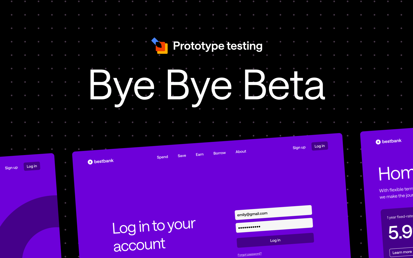
After months of invaluable collaboration with our incredible community, we're thrilled to announce that Prototype Testing has officially graduated from beta and is now available to everyone on the Individual+, Team, and Enterprise plans!
The Prototype Testing Beta was launched with a singular mission: to gather feedback from our community to help shape the future of the tool. Over the past few months, we've been privileged to work alongside a diverse group of customers and UX leaders— who provided invaluable feedback, completed many Usability Tests, and helped us refine the tool.
From the initial rollout to the most recent updates, your input has shaped our decisions, from design tweaks to functional improvements. Together, we’ve tackled challenges, explored creative solutions, and built something that truly aligns with user needs.
We're thrilled to announce our most requested feature is coming to Prototype Testing: seamless video recording that captures the full depth of user experiences.
Video recording transforms your research by:
Your feedback during the beta has shaped an exciting roadmap for 2025 and beyond. While we can't reveal everything just yet, know that every feature and enhancement planned has been inspired by your needs and suggestions.
To our incredible beta participants: your partnership has been invaluable. You've shared your expertise, challenged our assumptions, and helped us build something truly special. Every piece of feedback, every suggestion, and every bug report has contributed to making Prototype Testing a tool that truly serves the UX research community.
This is just the beginning of our mission to make expert research accessible to all. Stay tuned for regular updates as we continue to evolve Prototype Testing based on your needs and feedback. Here's to the next chapter of creating exceptional digital experiences together!
.png)
If you missed our recent live training on Prototype Testing, don’t worry—we’ve got everything you need right here! You can catch up at your convenience, so grab a cup of tea, put your feet up, and enjoy the show.
In the session, we explored the powerful new features of our Prototype Testing tool, offering a step-by-step guide to setting up, running, and analyzing your tests like a seasoned pro. This tool is a game-changer for your design workflow, helping you identify usability issues and gather real user feedback before committing significant resources to development.
We walked through how to create a prototype test from scratch using static images. This method is perfect for early-stage design concepts, where you want to quickly test user flows without a fully interactive prototype.
Figma users, we’ve got you covered! We discussed how to prepare your Figma prototype for the smoothest possible testing experience. From setting up interactions to ensuring proper navigation, these tips ensure participants have an intuitive experience during the test. For more detailed instructions, check out our help article
One of the standout features of the tool is its seamless integration with Figma. We showed how easy it is to import your designs directly from Figma into Optimal, streamlining the setup process. You can bring your working files straight in, and resync when you need to with one click of a button.
We explored how to analyze the usability metrics, and walked through what the results can indicate on click maps and paths. These visual tools allow you to see exactly how participants navigate your design, making it easier to spot pain points, dead ends, or areas of friction. By understanding user behavior, you can rapidly iterate and refine your prototypes for optimal user experience.
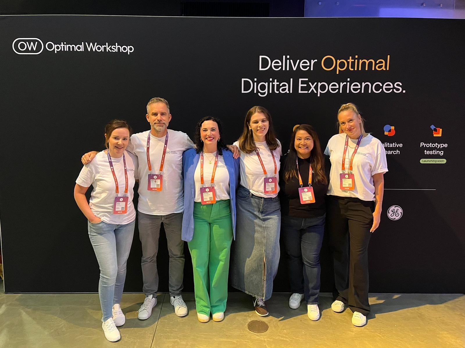
Last week Optimal Workshop was delighted to sponsor UXDX USA 2024 in New York. The User Experience event brings together Product, Design, UX, CX, and Engineering professionals and our team had an amazing time meeting with customers, industry experts, and colleagues throughout the conference. This year, we also had the privilege of sharing some of our industry expertise by running an interactive forum on “Measuring the Value of UX Research” - a topic very close to our hearts.

Our forum, hosted by Optimal Workshop CEO Alex Burke and Product Lead Ella Fielding, was focused on exploring the value of User Experience Research (UXR) from both an industry-wide perspective and within the diverse ecosystem of individual companies and teams conducting this type of research today.
The session brought together a global mix of UX professionals for a rich discussion on measuring and demonstrating the effectiveness of and the challenges facing organizations who are trying to tie UXR to tangible business value today.
The main topics for the discuss were:
With the large range of UX maturity and the democratization of research across teams, we know there’s a lot of opportunity for our customers to improve their ability to tie their user research to tangible business outcomes and embed UX more deeply in all levels of their organizations. To help fill this gap, Optimal Workshop is currently running a large research project on Measuring the Value of UX which will be released in a few weeks.
Keep up to date with the latest news and events by following us on LinkedIn.
