Subscribe to OW blog for an instantly better inbox
Oops! Something went wrong while submitting the form.

Mobile app testing with users before, during and beyond the design process is essential to ensuring product success. As UX designers we know how important usability is for interaction design, but testing early and often on mobile can sometimes be a challenge. This is where usability testing tools like Chalkmark (our first-click testing tool) can make a big difference.
First-click testing on mobile apps allows you to rapidly test ideas and ensure your design supports user goals before you invest time and money in further design work and development. It helps you determine whether you’re on the right track and whether your users are too — people are 2 to 3 times as likely to successfully complete their task if they got their first click right.
Read on for our top tips for mobile testing with Chalkmark shared through an example of a study we recently ran on Airbnb and TripAdvisor’s mobile apps.
There’s 2 ways that you might approach mobile app testing with Chalkmark: remotely or in person. Chalkmark is great for remote testing because it allows you to gain insights quickly as well as reach people anywhere in the world as the study is simply shared via a link. You might recruit participants via your social networks or email lists or you could use a recruitment service to target specific groups of people. The tool is also flexible enough to work just as well for moderated and in-person research studies. You might pop your study onto a mobile device and hit the streets for some guerrilla testing or you might incorporate it into a usability testing session that you’ve already got planned. There’s no right or wrong way to do it — it really depends on the needs of your project and the resources you have available.
For our Airbnb and TripAdvisor mobile app study example, we decided to test remotely and recruited 30 US based participants through the Optimal Workshop recruitment service.
Chalkmark works by presenting participants with a real-world scenario based task and asking them to complete it simply by clicking on a static image of a design. That image could be anything from a rough sketch of an idea, to a wireframe, to a screenshot of your existing product. Anything that you would like to gather your user’s first impressions on — if you can create an image of it, you can Chalkmark it.
To build your study, all you have to do is upload your testing images and come up with some tasks for your participants to complete. Think about the most common tasks a user would need to complete while using your app and base your mobile testing tasks around those. For our Airbnb and TripAdvisor study, we decided to use 3 tasks for each app and tested both mobile apps together in one study to save time. Task order was randomized to reduce bias and we used screenshots from the live apps for testing.
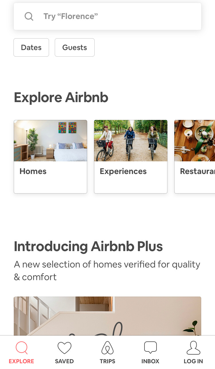
For Airbnb, we focused our mobile testing efforts on the three main areas of their service offering: Homes, Experiences and Restaurants. We wanted to see if people understood the images and labels used and also if there were any potential issues with the way Airbnb presents these three options as horizontally scrollable tiles where the third one is only partially shown in that initial glance.
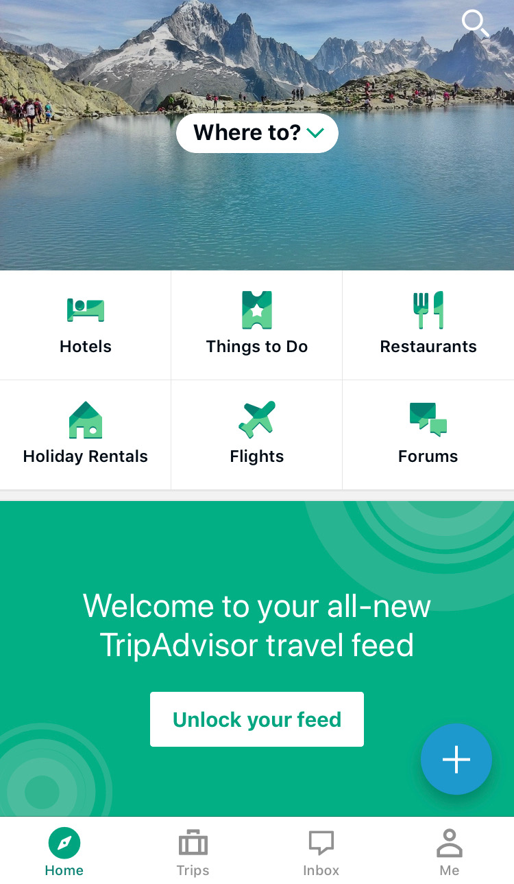
For TripAdvisor, we were curious to see if the image-only icons on the sticky global navigation menu that appears when the page is scrolled made sense to users. We chose three of these icons to test: Holiday Rentals, Things To Do and Forums.
Our Chalkmark study had a total of 6 tasks — 3 for each app — and we tested both mobile apps together to save time.
Our tasks for this study were:
1. You’ll be spending the holidays with your family in Montreal this year and a friend has recommended you book yourself into an axe throwing workshop during your trip.
2. Where would you go to do this? (Airbnb)
3. You’ve heard that Airbnb has a premium range of places to stay that have been checked by their team to ensure they’re amazing. Where would you go to find out more? (Airbnb)
4. You’re staying with your parents in New York for the week and would like to surprise them by taking them out to dinner but you’re not sure where to take them. Where would you go to look for inspiration? (Airbnb)
5. You’re heading to New Zealand next month and have so many questions about what it’s like! You’d love to ask the online community of locals and other travellers about their experiences. Where would you go to do this? (TripAdvisor)
6. You’re planning a trip to France and would prefer to enjoy Paris from a privately owned apartment instead of a hotel. Where would you go to find out what your options are? (TripAdvisor)
7. You’re currently on a working holiday in Melbourne and you find yourself with an unexpected day off. You’re looking for ideas for things to do. Where would you go to find something like this? (TripAdvisor)
Task order was randomized to reduce bias and we used screenshots from the live apps for testing.All images used for testing were the size of a single phone screen because we wanted to see if they could find their way without needing to scroll. As with everything else, you don’t have to do it this way — you could make the image longer and test a larger section of your design or you could focus on a smaller section. As a testing tool, Chalkmark is flexible and scalable.
We also put a quickly mocked up frame around each image that loosely resembled a smart phone because without it, the image looked like part of it had been cropped out which could have been very distracting for participants! This frame also provided context that we were testing a mobile app.
Chalkmark makes it really easy to make sense of your research through clickmaps and some really handy task results data. These 2 powerful analysis features provide a well-rounded and easy to digest picture of where those valuable first clicks landed so that you can evolve your design quickly and confidently.
A clickmap is a visualization of where your participants clicked on your testing image during the study. It has different views showing heatmaps and actual click locations so you can see exactly where they fell. Clickmaps help you to understand if your participants were on the right track or, if they weren’t, where they went instead.The task results tab in Chalkmark shows how successful your participants were and how long it took them to complete the task. To utilize the task results functionality, all you have to do is set the correct clickable areas on the images you tested with — just click and drag and give each correct area a meaningful name that will then appear alongside the rest of the task results. You can do this during the build process or anytime after the study has been completed. This is very useful if you happen to forget something or are waiting on someone else to get back to you while you set up the test!
For our Airbnb and TripAdvisor study, we set the correct areas on the navigational elements (the tiles, the icons etc) and excluded search. While searching for something isn’t necessarily incorrect, we wanted to see if people could find their way by navigating. For Airbnb, we discovered that 83% of our participants were able to correctly identify where they would need to go to book themselves into an axe throwing workshop. With a median task completion time of 4.89 seconds, this task also had the quickest completion time in the entire study. These findings show that the label and image being used for the ‘Experiences’ section of the app appears to be working quite well.
We also found that 80% of participants were able to find where they’d need to go to access Airbnb Plus. Participants had two options and could go via the ‘Homes’ tile (33%) or through the ‘Introducing Airbnb Plus’ image (47%) further down. Of the remaining participants, 10% clicked on the ‘Introducing Airbnb Plus’ heading, however at the time of testing, this area was not clickable. It’s not a huge deal because these participants were on the right track and would have likely found the right spot to click fairly quickly anyway. It’s just something to consider around user expectations and perhaps making that heading clickable might be worth exploring further.
83% of our participants were able to figure out where to go to find a great restaurant on the Airbnb app which is awesome! An additional 7% would have searched for it which isn’t wrong, but remember, we were testing those navigational tiles. It’s interesting to note that most people selected the tiles — likely indicating they felt they were given enough information to complete the task without needing to search.
For our TripAdvisor tasks, we uncovered some very interesting and actionable insights. We found that 63% of participants were able to correctly identify the ‘Forums’ icon as the place to go for advice from other community members. While 63% is a good result, it does indicate some room for improvement and the possibility that the ‘Forums’ icon might not be reasonating with users as well as it could be. For the remaining participants, 10% clicked on ‘Where to?’ which prompts the user to search for specific locations while 7% clicked on the more general search option that would allow them to search all the content on the app.
63% of participants were able to correctly identify the ‘Holiday Rentals’ icon on the TripAdvisor app when looking for a privately owned apartment rather than a hotel to enjoy Paris from, while 20% of participants appear to have been tripped up by the ‘Hotel’ icon itself.
With 1 in 5 people in this study potentially not being able to distinguish between or determine the meaning behind each of the 2 icons, this is something that might merit further exploration. In another one of the TripAdvisor app’s tasks in this study, 43% of participants were unable to correctly identify the ‘Things To Do’ icon as a place to find inspiration for activities.Where to from here?
If this were your project, you might look at running a quick study to see what people think each of the 6 icons represent. You could slip it into some existing moderated research you had planned or you might run a quick image card sort to see what your users would expect each icon to relate to. Running a study testing all 6 at the same time would allow you to gain insights into how users perceive the icons quickly and efficiently.
Overall, both of these apps tested very well in this study and with a few minor tweaks and iterations that are part of any design process, they could be even better!
Now that you’ve seen an example of mobile testing in Chalkmark, why not try it out for yourself with your app? It’s fast and easy to run and we have lots of great resources to help you on your way including sample studies that allow you to interactively explore both the participant’s and the researcher’s perspective.
Further readingCreate and analyze a first-click test for freeView a first-click test as a participantView first-click test results as a researcherRead our first-click testing 101 guideRead more case studies and research stories to see first-click testing in action
Originally published on 29 March 2019
Every day, people around the world use our research tools to craft better experiences for their users. Whether it’s a website for a new public library, an app for a self-driving car startup or even the layout of a physical retail store, our tools give researchers and designers everything they need to ensure the way people work, think and act are at the heart of every design decision.
We talk about our tools on a fairly regular basis (after all, we are quite proud of them), but this time we’re going to do something a little different. Here, we’re going to show you 17 creative ways to use OptimalSort, Treejack, Chalkmark, Reframer and Questions. Hopefully, we’ll inspire you to head off and start doing some more testing of your own. Let’s get started!
Tree testing is one of the best methods to assess the strength of your navigation structure, and Treejack is the best tool to execute this method. You can easily set up more than one Treejack study to run at the same time, allowing you to A/B test different navigation structures and pick a winner.
Ever struggle to get consensus from your team on a new logo or design? Use OptimalSort to solve the problem! Create a closed image sort with categories set up so your team can sort designs based on their preferences. You can then look at the results and determine the best path forward.
Reframer is a powerful qualitative research tool, and most of what makes it so useful for usability tests and user interviews also makes it a great tool for taking notes at conferences. Once you’ve taken all of your notes, you can use tags to mark up different insights and then share the results with your coworkers.
Card sorting is a great way to work out if you have any redundant content on your landing pages. Let’s use the example of simplifying your homepage. You can ask participants to sort cards (containing homepage links) based on how often they use them. You could then compare this data with analytics from your homepage and see if people’s actual behavior and perception are well aligned.
Determine if your icons are helping your users by testing whether they understand their purpose. Upload icons that you’re currently using (or even plan to use) to Chalkmark, and ask your participants to identify their meaning by using the post-task questions feature.
Card sorting isn’t just a technique for the digital realm. Run an open card sort with OptimalSort to figure out where items in a retail store should be grouped. If we use the example of a supermarket, the cards would be different food items and the ‘aisles’ would be the categories.
You can use Questions as a scheduling tool by setting up a survey designed to ask people which times they’re available to come in for usability testing sessions. You can send out one link to every participant and view the results in a single location. Easy!
Did you know you can use our integrated recruitment panel to remotely research participants from all around the world? This is a great way to see how different languages, countries, cultures and backgrounds interact with your website.
Chalkmark’s heatmap feature is an excellent way to get first impressions on your designs. You can see where your users clicked so you can get insights into what’s working (or not working) with your designs. It’s also fast, so it’s easy to iterate.
Empathy tests are a great way to find out whether your website, app or design is creating the right feelings with your users. Set up a closed card sort with a list of the words which could represent your design, then set up categories based on relevance. Show people your design and then ask them to sort the words into the categories which best match the experience.
The number of people using smartphones to browse websites continues to grow, making the UX of mobile websites key. Use Treejack to test the mobile IA of your website so you can work out if people are getting stuck.
Use first-click testing to find out if a text link or an icon is the best choice for navigating back to the homepage of your website. A quick test in Chalkmark will improve your website and save you design work down the line!
Ever heard of multivariate testing? It’s not too complicated. Basically, you just compare more than two versions of your studies to understand which version performs better with your audience. You can run this type of testing with Chalkmark and Treejack to determine the right design to iterate on.
Yep, you heard us. Running a card sort asking people which toppings are good for pizza and which ones aren’t is a great way to introduce people to the benefits of the card sorting method. Plus, it’s always fun to show off the results on a Friday afternoon in the office.
Search engine optimization (SEO) is an important part of any modern website, with an SEO-tuned website much more likely to show up in search results. There are many factors that go into SEO, but one of the most important is a website’s navigation. Use Treejack to improve how people navigate through your website and you’ll likely see your search engine ranking improve.
Login to your Optimal Workshop account on your laptop and get out into the field with Reframer! When you’re out conducting usability tests or user interviews with people away from your office, having Reframer makes it much easier to collect all of the necessary data. Once you’re back, use Reframer’s analysis features to make sense of your findings.
How are you supposed to test your paper prototypes when your users are spread all around the world? Well, you can simply take a photo of your prototype and use Chalkmark to remote test it with your users. Easy.
So that’s our list of 17 creative ways to use our tools. Have you got any of your own? If you do, don’t hesitate to click the little Intercom chat bubble in the corner of your screen and let us know! We always love to hear from you.
If you haven’t yet had the chance to play around with our 5 tools, you can try them for free - forever - by signing up here (no credit card required). Don’t just take our word for it, either. Check out these case studies from Xero and Intercom to learn about how 2 organizations managed to significantly improve different areas of their businesses.
As UX professionals we know the value of card sorting when building an IA or making sense of our content and we know that first clicks and first impressions of our designs matter. Tools like OptimalSort and Chalkmark are two of our wonderful design partners in crime, but did you also know that they work really well with each other? They have a lot in common and they also complement each other through their different strengths and abilities. Here are 3 ways that you can make the most of this wonderful team up in your design process.
Imagine you’re at a point in your design process where you’ve done some research and you’ve fed all those juicy insights into your design process and have come up with a bunch of initial visual design concepts that you’d love to test.
You might approach this by following this 3 step process:
There are two ways you could run this approach: remotely or in person. The remote option is great for when you’re short on time and budget or for when your users are all over the world or otherwise challenging to reach quickly and cheaply. If you’re running it remotely, you would start by popping images of your concepts in whatever state of fidelity they are up to into Chalkmark and coming up with some scenario based tasks for your participants to complete against those flat designs. Chalkmark is super nifty in the way that it gets people to just click on an image to indicate where they would start out when completing a task. That image can be a rough sketch or a screenshot of a high fidelity prototype or live product — it could be anything! Chalkmark studies are quick and painless for participants and great for designers because the results will show if your design is setting your users up for success from the word go. Just choose the most common tasks a user would need to complete on your website or app and send it out.
Next, you would review your Chalkmark results and make any changes or iterations to your designs based on your findings. Choose a maximum of 3 designs to move forward with for the last part of this study. The point of this is to narrow your options down and figure out through research, which design concept you should focus on. Create images of your chosen 3 designs and build a closed card sort in OptimalSort with image based cards by selecting the checkbox for ‘Add card images’ in the tool (see below).

The reason why you want a closed card sort is because that’s how your participants will indicate their preference for or against each concept to you. When creating the study in OptimalSort, name your categories something along the lines of ‘Most preferred’, ‘Least preferred’ and ‘Neutral’. Totally up to you what you call them — if you’re able to, I’d encourage you to have some fun with it and make your study as engaging as possible for your participants!

Limit the number of cards that can be sorted into each category to 1 and uncheck the box labelled ‘Randomize category order’ so that you know exactly how they’re appearing to participants — it’s best if the negative one doesn’t appear first because we’re mostly trying to figure out what people do prefer and the only way to stop that is to switch the randomization off. You could put the neutral option at the end or in the middle to balance it out — totally up to you.
It’s also really important that you include a post study questionnaire to dig into why they made the choices they did. It’s one thing to know what people do and don’t prefer, but it’s also really important to additionally capture the reasoning behind their thinking. It could be something as simple as “Why did you chose that particular option as your most preferred?” and given how important this context is, I would set that question to ‘required’. You may still end up with not-so helpful responses like ‘Because I like the colors’ but it’s still better than nothing — especially if your users are on the other side of the world or you’re being squeezed by some other constraint! It’s something to be mindful of and remember that studies like these contribute to the large amount of research that goes on throughout a project and are not the only piece of research you’ll be running. You’re not pinning all your design’s hopes and dreams on this one study! You’re just trying to quickly find out what people prefer at this point in time and as your process continues, your design will evolve and grow.
You might also ask the same context gathering question for the least preferred option and consider also including an optional question that allows them to share any other thoughts they might have on the activity they just completed — you never know what you might uncover!
If you were running this in person, you could use it to form the basis for a moderated codesign session. You would start your session by running the Chalkmark study to gauge their first impressions and find out where those first clicks are landing and also have a conversation about what your participants are thinking and feeling while they’re completing those tasks with your concepts. Next, you could work with your participants to iterate and refine your concepts together. You could do it digitally or you could just draw them out on paper — it doesn't have to be perfect! Lastly, you could complete your codesign session by running that closed card sort preference test as a moderated study using barcodes printed from OptimalSort (found under the ‘Cards’ tab during the build process) giving you the best of both worlds — conversations with your participants plus analysis made easy! The moderated approach will also allow you to dig deeper into the reasoning behind their preferences.
Your information architecture (IA) is the skeleton structure of your website or app and it can be really valuable to evaluate it from two different angles: non-visual and visual. The non-visual elements of an IA are: language, content, categories and labelling and these are great because they provide a clear and clean starting point. There’s no visual distractions and getting that content right is rightfully so a high priority. The visual elements come along later and build upon that picture and help provide context and bring your design to life. It's a good idea to test your IA through both lenses throughout your design process to ensure that nothing is getting lost or muddied as your design evolves and grows.
Let’s say you’ve already run an open card sort to find out how your users expect your content to be organised and you’ve created your draft IA. You may have also tested and iterated that IA in reverse through a tree test in Treejack and are now starting to sketch up some concepts for the beginnings of the interaction design stages of your work.
At this point in the process, you might run a closed card sort with OptimalSort on your growing IA to ensure that those top level category labels are aligning to user expectations while also running a Chalkmark study on your early visual designs to see how the results from both approaches compare.
When building your closed card sort study, you would set your predetermined categories to match your IA’s top level labels and would then have your participants sort the content that lies beneath into those groups. For your Chalkmark study, think about the most common tasks your users will need to complete using your website or app when it eventually gets released out into the world and base your testing tasks around those. Keep it simple and don’t stress if you think this may change in the future — just go with what you know today.
Once you’ve completed your studies, have a look at your results and ask yourself questions like: Are both your non-visual and visual IA lenses telling the same story? Is the extra context of visual elements supporting your IA or is it distracting and/or unhelpful? Are people sorting your content into the same places that they’re going looking for it during first-click testing? Are they on the same page as you when it’s just words on an actual page but are getting lost in the visual design by not correctly identifying their first click? Has your Chalkmark study unearthed any issues with your IA? Have a look at the Results matrix and the Popular placements matrix in OptimalSort and see how they stack up against your clickmaps in Chalkmark.


A great way to find out if your top level labels and their matching icons are communicating coherently and consistently is to test them by using both OptimalSort and Chalkmark. Icons aren’t the most helpful or useful things if they don’t make sense to your users — especially in cases where label names drop off and your website or app homepage relies solely on that image to communicate what content lives below each one e.g., sticky menus, mobile sites and more.
This approach could be useful when you’re at a point in your design process where you have already defined your IA and are now moving into bringing it to life through interaction design. To do this, you might start by running a closed card sort in OptimalSort as a final check to see if the top level labels that you intend to make icons for are making sense to users. When building the study in OptimalSort, do exactly what we talked about earlier in our non-visual vs visual lens study and set your predetermined categories in the tool to match your level 1 labels. Ask your participants to sort the content that lies beneath into those groups — it’s the next part that’s different for this approach.
Once you’ve reviewed your findings and are confident your labels are resonating with people, you can then develop their accompanying icons for concept testing. You might pop these icons into some wireframes or a prototype of your current design to provide context for your participants or you might just test the icons on their own as they would appear on your future design (e.g., in a row, as a block or something else!) but without any of the other page elements. It’s totally up to you and depends entirely upon what stage you’re at in your project and the thing you’re actually designing — there might be cases where you want to zero in on just the icons and maybe the website header e.g., a sticky menu that sits above a long scrolling, dynamic social feed. In an example taken from a study we recently ran on Airbnb and TripAdvisor’s mobile apps, you might use the below screen on the left but without the icon labels or you might use the screen on the right that shows the smaller sticky menu version of it that appears on scroll.

The main thing here is to test the icons without their accompanying text labels to see if they align with user expectations. Choose the visual presentation approach that you think is best but lose the labels!
When crafting your Chalkmark tasks, it’s also a good idea to avoid using the label language in the task itself. Even though the labels aren’t appearing in the study, just using that language still has the potential to lead your participants. Treat it the same way you would a Treejack task — explain what participants have to do without giving the game away e.g., instead of using the word ‘flights’ try ‘airfares’ or ‘plane tickets’ instead.
Choose one scenario based task question for each level 1 label that has an icon and consider including post study questions to gather further context from your participants — e.g., did they have any comments about the activity they completed? Was anything confusing or unclear and if so, what and why?
Once you’ve completed your Chalkmark study and have analysed the results, have a look at how well your icons tested. Did your participants get it right? If not, where did they go instead? Are any of your icons really similar to each other and is it possible this similarity may have led people down the wrong path?
Alternatively, if you’ve already done extensive work on your IA and are feeling pretty confident in it, you might instead test your icons by running an image card sort in OptimalSort. You could use an open card sort and limit the cards per category to just one — effectively asking participants to name each card rather than a group of cards. An open card sort will allow you to learn more about the language they use while also uncovering what they associate with each one without leading them. You’d need to tweak the default instructions slightly to make this work but it’s super easy to do! You might try something like:
Step 1
Step 2
Step 3
Step 4
Test out your new instructions in preview mode on a colleague from outside of your design team just to be sure it makes sense!
So there’s 3 ideas for ways you might use OptimalSort and Chalkmark together in your design process. Optimal Workshop’s suite of tools are flexible, scalable and work really well with each other — the possibilities of that are huge!

The word “persona” has many meanings. Sometimes the term refers to a part that an actor plays, other times it can mean a famous person, or even a character in a fictional play or book. But in the field of UX, persona has its own special meaning.
Before you get started with creating personas of your own, learn what they are and the process to create one. We'll even let you in on a great, little tip — how to use Chalkmark to refine and validate your personas.
In the UX field, a persona is created using research and observations of your users, which is analyzed and then depicted in the form of a person’s profile. This individual is completely fictional, but is created based on the research you’ve conducted into your own users. It’s a form of segmentation, which Angus Jenkinson noted in his article “Beyond Segmentation” is a “better intellectual and practical tool for dealing with the interaction between the concept of the ‘individual’ and the concept of ‘group’”.
Typical user personas include very specific information in order to paint an in-depth and memorable picture for the people using them (e.g., designers, marketers etc).
The user personas you create don’t just represent a single individual either; they’ll actually represent a whole group. This allows you to condense your users into just a few segments, while giving you a much smaller set of groups to target.
There are many benefits of using personas. Here are just a few:
There’s no right or wrong way to create a persona; the way you make them can depend on many things, such as your own internal resources, and the type of persona you want.
The average persona that you’ve probably seen before in textbooks, online or in templates isn’t always the best kind to use (picture the common and overused types like ‘Busy Barry’). In fact, the way user personas are constructed is a highly debated topic in the UX industry.
Good user personas are meaningful descriptions — not just a list of demographics and a fake name that allows researchers to simply make assumptions.
Indi Young, an independent consultant and founder of Adaptive Path, is an advocate of creating personas that aren’t just a list of demographics. In an article she penned on medium.com, Indi states: “To actually bring a description to life, to actually develop empathy, you need the deeper, underlying reasoning behind the preferences and statements-of-fact. You need the reasoning, reactions, and guiding principles.”
One issue that can stem from traditional types of personas is they can be based on stereotypes, or even reinforce them. Things like gender, age, ethnicity, culture, and location can all play a part in doing this.
In a study by Phil Turner and Susan Turner titled “Is stereotyping inevitable when designing with personas?” the authors noted: “Stereotyped user representations appear to constrain both design and use in many aspects of everyday life, and those who advocate universal design recognise that stereotyping is an obstacle to achieving design for all.”
So it makes sense to scrap the stereotypes and, in many instances, irrelevant demographic data. Instead, include information that accurately describes the persona’s struggles, goals, thoughts and feelings — all bits of meaningful data.
Creating user personas involves a lot of research and analyzing. Here are a few tips to get you started:
When you’re creating personas for UX, it’s absolutely crucial you start with research; after all, you can’t just pull this information out of thin air by making assumptions! Ensure you use a mixture of both qualitative and quantitative research here in order to cast your net wide and get results that are really valuable. A great research method that falls into the realms of both qualitative and quantitative is user interviews.
When you conduct your interviews, drill down into the types of behaviors, attitudes and goals your users have. It’s also important to mention that you can’t just examine what your users are saying to you — you need to tap into what they’re thinking and how they behave too.
Once you’ve conducted your research, it’s time to analyze it. Look for trends in your results — can you see any similarities among your participants? Can you begin to group some of your participants together based on shared goals, attitudes and behaviors?
After you have sorted your participants into groups, you can create your segments. These segments will become your draft personas. Try to limit the number of personas you create. Having too many can defeat the purpose of creating them in the first place.
Don’t forget the little things! Give your personas a memorable title or name and maybe even assign an image or photo — it all helps to create a “real” person that your team can focus on and remember.
After you’ve finalized your personas, it’s time to review them. Take another look at the responses you received from your initial user interviews and see if they match the personas you created. It’s also important you spend some time reviewing your finalized personas to see if any of them are too similar or overlap with one another. If they do, you might want to jump back a step and segment your data again.
This is also a great time to test your personas. Conduct another set of user interviews and research to validate your personas.
Creating your personas using data from your user interviews can be a fun task — but make sure you don’t go too crazy. Your personas need to be relevant, not overly complex and a true representation of your users.
A great way to ensure your personas don’t get too out of hand is to use a template. There are many of these available online in a number of different formats and of varying quality.
This example from UX Lady contains a number of helpful bits of information you should include, such as user experience goals, tech expertise and the types of devices used. The accompany article also provides a fair bit of guidance on how to fill in your templates too. While this template is good, skip the demographics portion and read Indi Young’s article and books for better quality persona creation.
Now it’s time to let you in on a little tip. Did you know Chalkmark can be used to refine and validate your personas?
One of the trickiest parts of creating personas is actually figuring out which ones are a true representation of your users — so this usually means lots of testing and refining to ensure you’re on the right track. Fortunately, Chalkmark makes the refinement and validation part pretty easy.
First, you need to have your personas finalized or at least drafted. Take your results from your persona software or template you filled in. Create a survey for each segment so that you can see if your participants’ perceptions of themselves matches each of your personas.
Second, create your test. This is a pretty simple demo we made when we were testing our own personas a few years ago at Optimal Workshop. Keep in mind this was a while ago and not a true representation of our current personas — they’ve definitely changed over time! During this step, it’s also quite helpful to include some post-test questions to drill down into your participants’ profiles.
After that, send these tests out to your identified segments (e.g., if you had a retail clothing store, some of your segments might be women of a certain age, and men of a certain age. Each segment would receive its own test). Our test involved three segments: “the aware”, “the informed”, and “the experienced” — again, this has changed over time and you’ll find your personas will change too.
Finally, analyze the results. If you created separate tests for each segment, you will now have filtered data for each segment. This is the real meaty information you use to validate each persona. For example, our three persona tests all contained the questions: “What’s your experience with user research?” And “How much of your job description relates directly to user experience work?”

A
bove, you’ll see the results for Persona #2. This tells us that 34% of respondents identified that their job involves a lot of UX work (75-100%, in fact). In addition, 31% of this segment considered themselves “Confident” with remote user research, while a further 9% and 6% of this segment said they were “Experienced” and “Expert”.

These results all aligned with the persona we associated with that segment: “the informed”.
When you’re running your own tests, you’ll analyze the data in a very similar way. If the results from each of your segments’ Chalkmark tests don’t match up with the personas you created, it’s likely you need to adjust your personas. However, if each segment’s results happen to match up with your personas (like our example above), consider them validated!
For a bit more info on our very own Chalkmark persona test, check out this article.

It requires a certain kind of mind to see beauty in a hamburger bun—Ray Kroc
Maccas. Mickey D’s. The golden arches. Whatever you call it, you know I’m talking about none other than fast-food giant McDonald’s. A survey of 7000 people across six countries 20 years ago by Sponsorship Research International found that more people recognized the golden arches symbol (88%) than the Christian cross (54%). With more than 35,000 restaurants in 118 countries and territories around the world, McDonald’s has come a long way since multi-mixer salesman Ray Kroc happened upon a small fast-food restaurant in 1954.
For an organization of this size and reach, consistency and strong branding are certainly key ingredients in its marketing mix. McDonald’s restaurants all over the world are easily recognised and while the menu does differ slightly between countries, users know what kind of experience to expect. With this in mind, I wondered if the same is true for McDonald’s web presence? How successful is a large organization like McDonald’s at delivering a consistent online user experience tailored to suit diverse audiences worldwide without losing its core meaning? I decided to investigate and gave McDonald’s a good grilling by testing ten of its country-specific websites’ home pages in one Chalkmark study.
First-click testing reveals the first impressions your users have of your designs. This information is useful in determining whether users are heading down the right path when they first arrive at your site. When considering the best way to measure and compare ten of McDonald’s websites from around the world, I choose first-click testing because I wanted to be able to test the visual designs of each website and I wanted to do it all in one research study.My first job in the setup process was to decide which McDonald’s websites would make the cut.
The approach was to divide the planet up by continent, combined with the requirement that the sites selected be available in my native language (English) in order to interpret the results. I chose: Australia, Canada, Fiji, India, Malaysia, New Zealand, Singapore, South Africa, the UK, and the US. The next task was to figure out how to test this. Ten tasks is ideal for a Chalkmark study, so I made it one task per website; however, determining what those tasks would be was tricky. Serving up the same task for all ten ran the risk of participants tiring of the repetition, but a level of consistency was necessary in order to compare the sites. I decided that all tasks would be different, but tied together with one common theme: burgers.
After all, you don’t win friends with salad.
When sourcing participants for my research, I often hand the recruitment responsibilities over to Optimal Workshop because it’s super quick and easy; however, this time I decided to do something a bit different. Because McDonald’s is such a large and well-known organization visited by hundreds of millions of people every year, I decided to recruit entirely via Twitter by simply tweeting the link out. Am I three fries short of a happy meal for thinking this would work? Apparently not. In just under a week I had the 30+ completed responses needed to peel back the wrapper on McDonald’s.
Imagine what could have happened if it had been McDonald’s tweeting that out to the burger-loving masses? Ideally when recruiting for a first-click testing study the more participants you can get the more sure you can be of your results, but aiming for 30-50 completed responses will still provide viable results. Conducting user research doesn’t have to be expensive; you can achieve quality results that cut the mustard for free. It’s a great way to connect with your customers, and you could easily reward participants with, say, a burger voucher by redirecting them somewhere after they do the activity—ooh, there’s an idea!
Interpreting the results from a Chalkmark study is quick and easy.

Everything you need presented under a series of tabs under ‘Analysis’ in the results section of the dashboard:


McDonald’s tested ridiculously well right across the board in the Chalkmark study. Country by country in alphabetical order, here’s what I discovered:

This study clearly shows that McDonald’s are kicking serious goals in the online stakes but before we call it quits and go home, let’s look at why that may be the case. Approaching this the way any UXer worth their salt on their fries would, I stuck all the screens together on a wall, broke out the Sharpies and the Tesla Amazing magnetic notes (the best invention since Post-it notes), and embarked on the hunt for patterns and similarities—and wow did I find them!
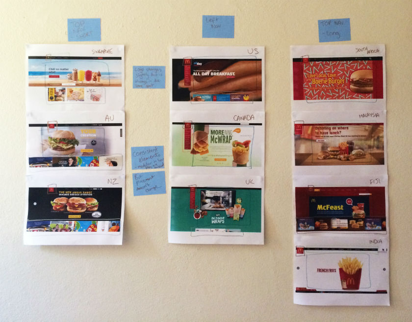
Across the ten websites, I observed just two distinct navigation patterns: navigation menus at the top and to the left. The sites with a top navigation menu could also be broken down into two further groups: those with three labels (Australia, New Zealand, and Singapore) and those with more than three labels (Fiji, India, Malaysia, and South Africa). Australia and New Zealand shared the exact same labelling of ‘eat’, ‘learn’, and ‘play’ (despite being distinct countries), whereas the others had their own unique labels but with some subject matter crossover; for example, ‘People’ versus ‘Our People’.

Canada, the UK, and the US all had the same look and feel with their left side navigation bar, but each with different labels. All three still had navigation elements at the top of the page, but the main content that the other seven countries had in their top navigation bars was located in that left sidebar.

These patterns ensure that each site is tailored to its unique audience while still maintaining some consistency so that it’s clear they belong to the same entity.
If there’s one aspect that screams McDonald’s, it’s the iconic golden arches on the logo. Across the ten sites, the logo does vary slightly in size, color, and composition, but it’s always in the same place and the golden arches are always there. Logo consistently is a no-brainer, and in this case McDonald’s clearly recognizes the strengths of its logo and understands which pieces it can add or remove without losing its identity.

Navigation and logo placement weren’t the only connections one can draw from looking at my wall of McDonald’s. There were also some very interesting but subtle similarities in the page layouts. The middle of the page is always used for images and advertising content, including videos and animated GIFs. The US version featured a particularly memorable advertisement for its all-day breakfast menu, complete with animated maple syrup slowly drizzling its way over a stack of hotcakes.

The bottom of the page is consistently used on most sites to house more advertising content in the form of tiles. The sites without the tiles left this space blank.
Looking at these results, it is quite clear that the same level of consistency and recognition between McDonald’s restaurants is also present between the different country websites. This did make me wonder what role does familiarity play in determining usability? In investigating I found a few interesting articles on the subject. This article by Colleen Roller on UXmatters discusses the connection between cognitive fluency and familiarity, and the impact this has on decision-making. Colleen writes:Because familiarity enables easy mental processing, it feels fluent. So people often equate the feeling of fluency with familiarity. That is, people often infer familiarity when a stimulus feels easy to process. If we’re familiar with an item, we don’t have to think too hard about it and this reduction in performance load can make it feel easier to use. I also found this fascinating read on Smashing Magazine by Charles Hannon that explores why Apple were able to claim ‘You already know how to use it’ when launching the iPad. It’s well worth a look!Oh and about those yoga mats … the answer is yes.
"Dear Optimal Workshop
How do you make a small link attractive to people (icon vs. text)?"
— Cassie
Dear Cassie,
I'm going to dive straight into this interesting question with a good old game of Pros and Cons, and then offer a resolution of sorts, with a meandering thought or two along the way. Let's kick things off with Team Icon.
When shopping online, the number above the little shopping trolley icon tells me how badly behaved I’ve been, and if I click on it, I know I’ll get to gleefully review all the shoes I've selected so far. There’s a whole heap of icons out there like this that people have absorbed and can use without thinking twice. Marli Mesibov wrote a fantastic article on the use of icons for UX Booth on the use of icons that is well worth a look. Marli discusses how they work well on small screens, which is a definite bonus when you’re on the go! Young children who aren’t yet literate can easily figure out how to open and play Angry Birds on their parent’s smartphones thanks to icons. And icons also have a great capacity for bridging language barriers.
On the flipside, there are some issues that may huff and puff and blow that cute little home icon down. Starting with there being no consistent standard for them. Sure, there are a handful that are universal like home and print, but beyond that it seems to be a free-for-all. Icons are very much in the hands of the designer and this leaves a lot of room for confusion to grow like bacteria in a badly maintained office refrigerator. Difficult to understand icons can also seriously hinder a user’s ability to learn how to use your website or application. When icons don't communicate what they intend, well, you can guess what happens. In a great piece advocating for text over icons, Joshua Porter writes about an experience he had:
"I have used this UI now for a week and I still have do a double-take each time I want to navigate. I’m not learning what the icons mean. The folder icon represents 'Projects', which I can usually remember (but I think I remember it because it’s simply the first and default option). The second icon, a factory, is actually a link to the 'Manage' screen, where you manage people and projects. This trips me up every time."
If people can't pick up the meaning of your icons quickly and intuitively, they may just stop trying altogether. And now, over to Team Label.
Sometimes language really is the fastest vehicle you've got for delivering a message. If you choose the right words to label your links, you'll leave the user with very little doubt as to what lies beneath. It’s that simple. Carefully-considered and well-written labels can cut through the noise and leave minimal ambiguity in their wake. Quoting Joshua Porter again: "Nothing says 'manage' like 'manage'. In other words, in the battle of clarity between icons and labels, labels always win."
Text labels can get messy and be just as confusing as unfamiliar icons! Words and phrases sometimes don’t mean the same thing to different people. One person’s flat enclosed shoe may be another person’s ballet pump, and the next person may be left scratching their head because they thought pumps were heels and all they wanted was a ballet flat! Text only labels can also become problematic if there isn’t a clear hierarchy of information, and if you have multiple links on one page or screen. Bombarding people with a page of short text links may make it difficult for them to find a starting point. And text may also hold back people who speak other languages.
Because things are always better when we work together! Capitalise on the combined force of text and icons to solve the dilemma. And I don’t mean you should rely on hovers — make both text and icon visible at all times. Two great examples are Google Apps (because nothing says storage like a weird geometric shape...) and the iPhone App store (because the compass and magnifying glass would pose an interesting challenge without text...):

Whatever you decide to run with, test it. Use whatever techniques you have on hand to test all three possibilities — icons only, text only, and icons and text — on real people. No Pros and Cons list, however wonderful, can beat that. And you know, the results will probably surprise you. I ran a quick study recently using Chalkmark to find out where people on the ASOS women's shoes page would click to get to the homepage (and yes, I can alway find ways to make shoe shopping an integral part of my job). 28 people responded, and...

...a whopping 89% of them clicked the logo, just 7% clicked the home icon, and just one person (the remaining 4%) clicked the label 'Home'. Enough said. Thanks for your question Cassie. To finish, here's some on-topic (and well-earned) comic relief (via @TechnicallyRon)

