


Many organizations are aware that staying relevant essential for their success. This can mean a lot of things to different organizations. What it often means is coming up with plenty of new, innovative ideas and products to keep pace with the demands and needs of the marketplace. It also means keeping up with the expectations and needs of your users, which often means shorter and shorter product development life cycle times. While maintaining this pace can be daunting, it can also be seen as a strength, tightening up your processes and cutting out unnecessary steps.
A vital part of developing new (or tweaking existing) products is considering the end user first. There really is no point in creating anything new if it isn’t meeting a need or filling a gap in the market. How can you make sure you are hitting the right mark? Ask your users. We look into some of the key user research methods available to help you in your product development process.
If you want to know more about how to fit research into your product development process, take a read here.
What is user research? 👨🏻💻
User experience (UX) research, or user research as it’s commonly referred to, is an important part of the product development process. Primarily, UX research involves using different research methods to gather qualitative and quantitative data and insights about how your users interact with your product. It is an essential part of developing, building, and launching a product that truly meets the needs, desires, and requirements of your users.
At its simplest, user research is talking to your users and understanding what they want and why. And using this to deliver what they need.
How does user research fit into the product development process? 🧩🧩
User research is an essential part of the product development process. By asking questions of your users about how your product works and what place it fills in the market, you can create a product that delivers what the market needs to those who need it.
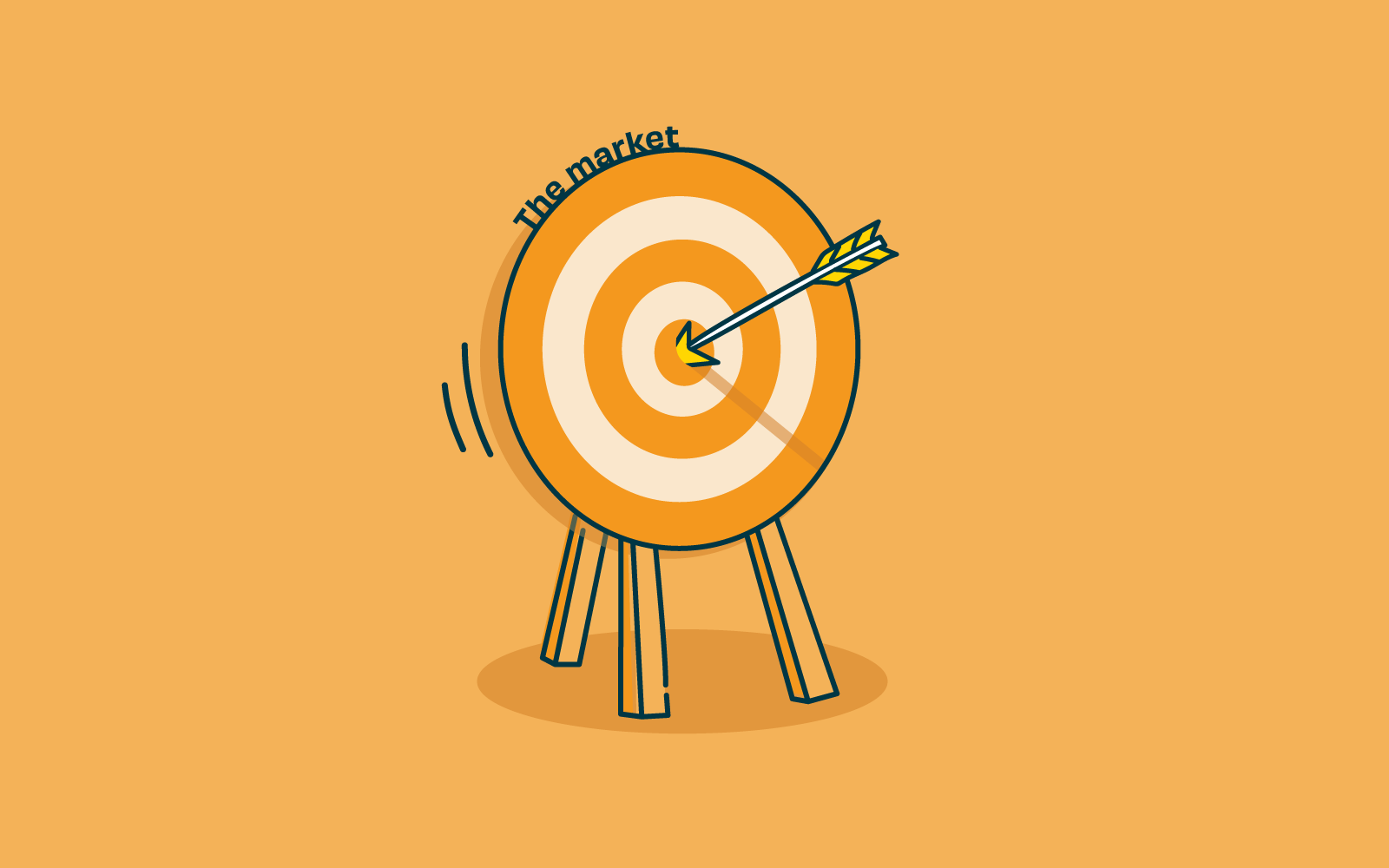
Without user research, you could literally be firing arrows in the dark, or at the very best, working from a very internal organizational view based on assuming that what you believe users need is what they want. With user research, you can collect qualitative and quantitative data that clearly tells you where and what users would like to see and how they would use it.
Investing in user research right at the start of the product development process can save the team and the organization heavy investment in time and money. With detailed data responses, your brand-new product can leapfrog many development hurdles, delivering a final product that users love and want to keep using. Firing arrows to hit a bullseye.
What user research methods should we use? 🥺
Qualitative ResearchMethods
Qualitative research is about exploration. It focuses on discovering things we cannot measure with numbers and typically involves getting to know users directly through interviews or observation.
Usability Testing – Observational
One of the best ways to learn about your users and how they interact with your new product is to observe them in their own environment. Watch how they accomplish tasks, the order they do things, what frustrates them, and what makes the task easier and/or more enjoyable for your subject. The data can be collated to inform the usability of your product, improving intuitive design and what resonates with your users.
Competitive Analysis
Reviewing products already on the market can be a great start to the product development process. Why are your competitors’ products successful? And how well do they behave for users? Learn from their successes, and even better, build on where they may not be performing as well and find where your product fills the gap in the market.
Quantitative Research Methods
Quantitative research is about measurement. It focuses on gathering data and then turning this data into usable statistics.
Surveys
Surveys are a popular user research method for gathering information from a wide range of people. In most cases, a survey will feature a set of questions designed to assess someone’s thoughts on a particular aspect of your new product. They’re useful for getting feedback or understanding attitudes, and you can use the learnings from your survey of a subset of users to draw conclusions about a larger population of users.
Wrap Up 🌯
Gathering information on your users during the product development process and before you invest time and money can be hugely beneficial to the entire process. Collating robust data and insights to guide the new product development and respond directly to user needs, and filling that all-important niche. Undertaking user experience research shouldn’t stop at product development but throughout each and every step of your product life cycle. If you want to find out more about UX research throughout the life cycle of your product, take a read of our article UX research for each product phase.


