Subscribe to OW blog for an instantly better inbox
Oops! Something went wrong while submitting the form.
Articles and Podcasts on Customer Service, AI and Automation, Product, and more
The pace of product development has never been faster, and the cost of building on assumptions has never been higher. At Optimal, we've spent nearly two decades helping teams get closer to their users, and what we're seeing right now is a fundamental shift in how research gets done. More teams are running research than ever before and timelines to act on findings are tighter, while the expectations for what research needs to deliver keep rising.
That shift is exactly what's driving Optimal 3.0, our most ambitious reinvention of the platform yet, designed to give every team the speed, depth, and flexibility that modern research demands. Today's release is the next step in that journey.
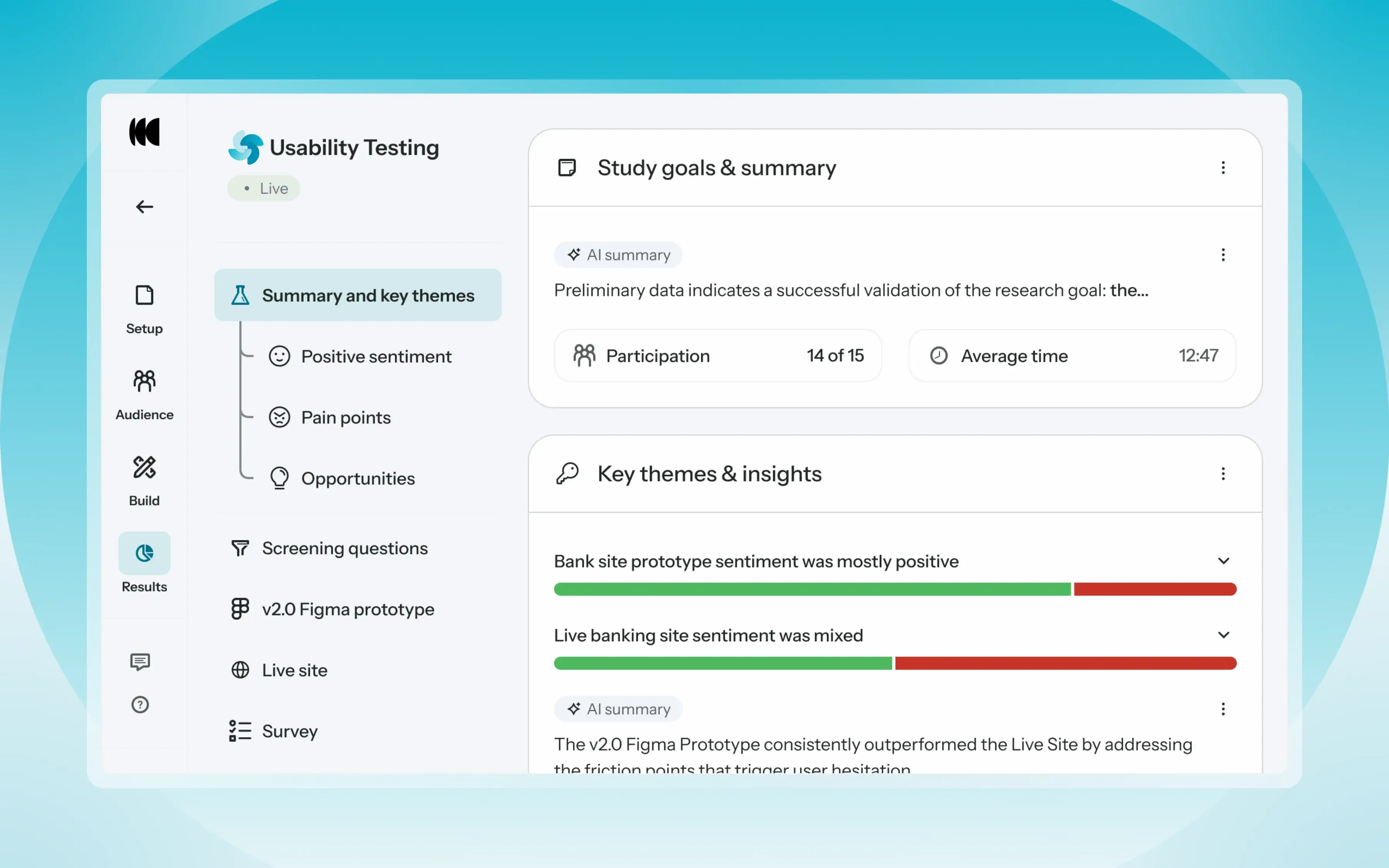
Optimal's new mixed-methods research tool tears down the boundaries between methods. It brings prototype testing, live site testing, and surveys into a single, end-to-end study workflow. And grounded in our product principles: speed to insights, access for all, and communication.
Optimal’s new Usability Testing tool marks the next step in the evolution of Optimal 3.0, giving teams the flexibility to evaluate experiences in whatever form they exist today.
Combine prototype testing, AI prototype testing, live site testing, and surveys in a single study. Test multiple prototypes side by side, compare different live URLs, or mix prototype and live site tasks together all in one workflow. Research can now mirror how products actually evolve, from early concept to shipped experience.
New speak-aloud question types, custom message blocks, auto-generated transcripts and insights, citations and highlight clips help you capture the context and reasoning behind every action. AI-assisted analysis then helps you make sense of it all fast and communicate with impact.
Review a study overview surfacing key themes, pain points, and sentiment analysis combining insights across all your study methods along with detailed results, task analysis and recordings, transcripts, key quotes, and automatically generated citations and video clips.
Coming soon: you can also use AI Chat to chat with your data directly, asking questions and pulling new insights and evidence across all your qualitative and quantitative inputs.
Modern product development is no longer linear. Teams continuously move between:
Traditional usability testing tools were not built for this fluidity. Optimal’s Usability Testing brings the flexibility to match how teams actually work today.
By combining multiple methods into a single study and pairing it with AI-powered synthesis, Usability Testing helps teams reduce setup and analysis time, recruit once, capture richer qualitative context, compare experiences more easily, move faster from feedback to action, and tell clearer, more compelling insight stories.
Learn how to get started with Usability Testing in Optimal and accelerate your path from idea to insight. Book a meeting, start exploring in your account, or join our live training webinar on June 24th to see it in action.
The key purpose of running a card sort is to learn something new about how people conceptualize and organize the information that’s found on your website. The insights you gain from running a card sort can then help you develop a site structure with content labels or headings that best represent the way your users think about this information. Card sorts are in essence a simple technique, however it’s the details of the sort that can determine the quality of your results.
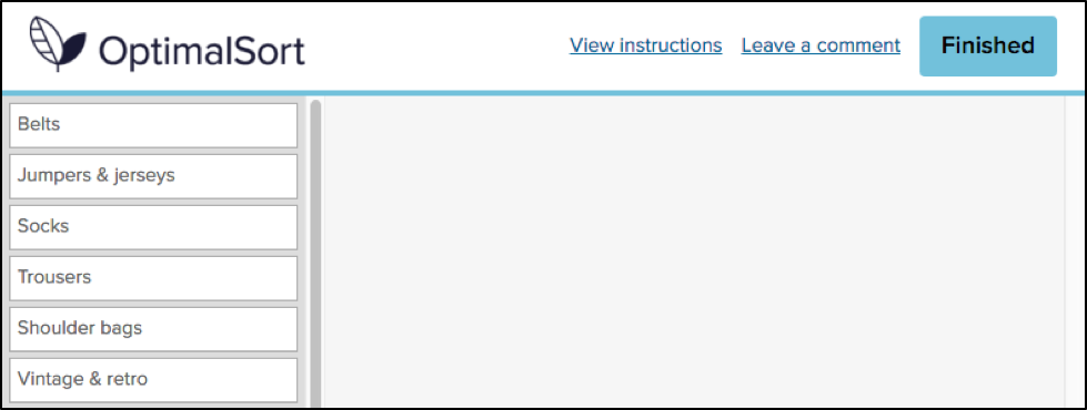
In most cases, each item in a card sort has only a short label, but there are instances where you may wish to add additional context to the items in your sort. Currently, the cards tab in OptimalSort allows you to include a tooltip description, a link within the tooltip description or to format the card as an image (with or without a label).

We generally don’t recommend using tooltip descriptions and links, unless you have a specific reason to do so. It’s likely that they’ll provide your participants with more information than they would normally have when navigating your website, which may in turn influence your results by leading participants to a particular solution.
Legitimate reasons that you may want to use descriptions and links include situations where it’s not possible or practical to translate complex or technical labels (for example, medical, financial, legal or scientific terms) into plain language, or if you’re using a card sort to understand your participants’ preferences or priorities.
If you do decide to include descriptions in your sort, it’s important that you follow the same guidelines that you would otherwise follow for writing card labels. They should be easy for your participants to understand and you should avoid obvious patterns, for example repeating words and phrases, or including details that refer to the current structure of the website.
I was curious to find out how often people were including descriptions in their card sorts, so I asked our development team to look into this data. It turns out that around 15% of cards created in OptimalSort have at least some text entered in the description field. In order to dig into the data a bit further, both Ania and I reviewed a random sample of recent sorts and noted how descriptions were being used in each case.
We found that out of the descriptions that we reviewed, 40% (6% of the total cards) had text that should not have impacted the sort results. Most often, these cards simply had the card label repeated in the description (to be honest, we’re not entirely sure why so many descriptions are being used this way! But it’s now in our roadmap to stop this from happening — stay tuned!). Approximately 20% (3% of the total cards) used descriptions to add context without obviously leading participants, however another 40% of cards have descriptions that may well lead to biased results. On occasion, this included linking to the current content or using what we assumed to be the current top level heading within the description.
So, how much influence could potentially leading card descriptions have on the results of a card sort? I decided to put it to the test by running a series of card sorts to compare the effect of different descriptions. As I also wanted to test the effect of linking card descriptions to existing content, I had to base the sort on a live website. In addition, I wanted to make sure that the card labels and descriptions were easily comprehensible by a general audience, but not so familiar that participants were highly likely to sort the cards in a similar manner.
I selected the government immigration website New Zealand Now as my test case. This site, which provides information for prospective and new immigrants to New Zealand, fit the above criteria and was likely unfamiliar to potential participants.

When I reviewed the New Zealand Now site, I found that the top level navigation labels were clear and easy to understand for me personally. Of course, this is especially important when much of your target audience is likely to be non-native English speaking! On the whole, the second level headings were also well-labeled, which meant that they should translate to cards that participants were able to group relatively easily.
There were, however, a few headings such as “High quality” and “Life experiences”, both found under “Study in New Zealand”, which become less clear when removed from the context of their current location in the site structure. These headings would be particularly useful to include in the test sorts, as I predicted that participants would be more likely to rely on card descriptions in the cases where the card label was ambiguous.

I selected 30 headings to use as card labels from under the sections “Choose New Zealand”, “Move to New Zealand”, “Live in New Zealand”, “Work in New Zealand” and “Study in New Zealand” and tweaked the language slightly, so that the labels were more generic.

I then created four separate sorts in OptimalSort:Round 1: No description: Each card showed a heading only — this functioned as the control sort

Round 2: Site section in description: Each card showed a heading with the site section in the description

Round 3: Short description: Each card showed a heading with a short description — these were taken from the New Zealand Now topic landing pages

Round 4:Link in description: Each card showed a heading with a link to the current content page on the New Zealand Now website

For each sort, I recruited 30 participants. Each participant could only take part in one of the sorts.
An interesting initial finding was that when we queried the participants following the sort, only around 40% said they noticed the tooltip descriptions and even fewer participants stated that they had used them as an aid to help complete the sort.
Participant recognition of descriptions
Of course, what people say they do does not always reflect what they do in practice! To measure the effect that different descriptions had on the results of this sort, I compared how frequently cards were sorted with other cards from their respective site sections across the different rounds.Let’s take a look at the “Study in New Zealand” section that was mentioned above. Out of the five cards in this section,”Where & what to study”, “Everyday student life” and “After you graduate” were sorted pretty consistently, regardless of whether a description was provided or not. The following charts show the average frequency with which each card was sorted with other cards from this section. For example in the control round, “Where & what to study” was sorted with “After you graduate” 76% of the time and with “Everyday day student life” 70% of the time, but was sorted with “Life experiences” or “High quality” each only 10% of the time. This meant that the average sort frequency for this card was 42%.
Untitled chartCreate bar charts
On the other hand, the cards “High quality” and “Life experiences” were sorted much less frequently with other cards in this section, with the exception of the second sort, which included the site section in the description.These results suggest that including the existing site section in the card description did influence how participants sorted these cards — confirming our prediction! Interestingly, this round had the fewest number of participants who stated that they used the descriptions to help them complete the sort (only 10%, compared to 40% in round 3 and 20% in round 4).Also of note is that adding a link to the existing content did not seem to increase the likelihood that cards were sorted more frequently with other cards from the same section. Reasons for this could include that participants did not want to navigate to another website (due to time-consciousness in completing the task, or concern that they’d lose their place in the sort) or simply that it can be difficult to open a link from the tooltip pop-up.
This quick investigation into the impact of descriptions illustrates some of the intricacies around using additional context in your card sorts, and why this should always be done with careful consideration. It’s interesting that we correctly predicted some of these results, but that in this case, other uses of the description had little effect at all. And the results serve as a good reminder that participants can often be influenced by factors that they don’t even recognise themselves!If you do decide to use card descriptions in your cards sorts, here are some guidelines that we recommend you follow:
We’d love to hear your thoughts on how we tested the effects of card descriptions and the results that we got. Would you have done anything differently?Have you ever completed a card sort only to realize later that you’d inadvertently biased your results? Or have you used descriptions in your card sorts to meet a genuine need? Do you think there’s a case to make descriptions more obvious than just a tooltip, so that when they are used legitimately, most participants don’t miss this information?
Let us know by leaving a comment!
Wireframes. Mockups. HTML. Fonts. Elements. Users. If you’re familiar with user interface design, these terms will be your bread and butter.An integral part of any website or application, user interface design is also arguably one of the most important. This is because your design is what your users see and interact with. If your site or app functions poorly and looks terrible, that’s what your users are going to remember.
But isn’t UX design and UI design the same thing? Or is there just an extremely blurred line between the two? What’s involved with UI design and, more importantly, what makes good design?
If you’re wondering how to test UI on your website, it’s a good idea to first learn some of the differences between UX and UI design. Although UI design and UX design look similar when written down, they’re actually two totally separate things. However, they should most definitely complement each other.
UX design, according to Nielsen Norman Group, “encompasses all aspects of the end-user's interaction with the company, its services, and its products.” Meanwhile, UI design focuses more on a user’s interaction, the overall design, look and feel of a system. The two still sound similar, right?For those of you still trying to wrap your ahead around the difference, Nielsen Norman Group has a great analogy up on its site that helps to explain it:
"As an example, consider a website with movie reviews. Even if the UI for finding a film is perfect, the UX will be poor for a user who wants information about a small independent release if the underlying database only contains movies from the major studios.”
This just goes to show the complementary relationship between the two and why it’s so important.User interface was popularized in the early 1970s, partly thanks to Fuji Xerox’s ‘Xerox Alto Workstation’ — an early personal computer dubbed “the origin of the PC”. This machine used various icons, multi windows, a mouse, and e-mail, which meant that some sort of design and design principles were needed to create consistency for the future. It was here that human-centred UI was born. UI design also covers graphical user interface design (GUI design). A GUI is the software or interface that works as the medium between a user and the computer.
It uses a number of graphical elements, such as screen cursors, menus, and icons so that users can easily navigate a system. This is also something that has stemmed from Fuji Xerox back in the late 1970s and early 1980s.Since then, UI has developed quickly and so has its design principles. When the Xerox Alto Workstation was first born, Fuji Xerox came up with eight of its own design principles. These were:
Over time, these principles have evolved and now you’ll likely find many more added to this list. Here are just a few of the most important ones identified in “Characteristics of graphical and web user interfaces” by Wilbert Galitz.
Usability.gov says that the “best interfaces are almost invisible to the user”.Everything in the system, from visual elements, functions, and text, needs to be clear and simple. This includes layout as well as the words used — stay away from jargon and complex terms or analogies that users won’t understand.Aesthetic appeal also fits into this principle. Ensure colors and graphics are used in a simple manner, and elements are grouped in a way that makes sense.
The system should have the same or similar functions, uses and look throughout it for consistency. For example, the same color scheme should be used throughout an app, or the terminology on a website should be consistent throughout. Users should also have an idea of what to expect when they use your system. As an example, picture a retail shopping app. You’d expect that any other retail shopping app out there will have similar basic functions: a place to log in or create an account, account settings, a way to navigate and browse stock, a way to purchase stock at the press of a button. However, this doesn’t mean copying another app or website exactly; there should just be consistency so users know what to expect when they encounter your system.Apple even states an “app should respect its users and avoid forcing them to learn new ways to do things for no other reason than to be different”.
Is there more than one way people can access your system and its functions? Can people perform tasks in a number of different ways, too?Providing your users with a flexible system means people are more in control of what they’re doing. Galitz mentions this can also be done through allowing system customization.Don’t forget use on other kinds of devices, too. In a time when Google is using mobile-friendliness as a ranking signal, and research from Ericsson shows smartphones accounted for 75% of all mobile phone sales in Q4 2015, you know that being flexible is important.
For a list of some of the best user interface examples, check out last year’s Webby Awards category for Best Interface Design. The 2016 category winner was the Reuters TV Web App, while the People’s Choice winner was AssessYourRisk.org.As an aside, this is the second year that the Webby Awards introduced this category — just goes to show how important it is to have good UI design!While you don’t want your site or application to look exactly the same as these winners, you still want yours to function well and be aesthetically pleasing.
To help you get there, there are a number of UI design tools and UI software available.Here’s a list of some of the many out there:
Have you got any favorite UI design examples, or tips for beautiful design? We’d love to see them — comment below and let us know!
Card sorting is an invaluable tool for understanding how people organize information in their minds, making websites more intuitive and content easier to navigate. It’s a useful method outside of information architecture and UX research, too. It can be a useful prioritization technique, or used in a more traditional sense. For example, it’s handy in psychology, sociology or anthropology to inform research and deepen our understanding of how people conceptualize information.
The introduction of remote card sorting has provided many advantages, making it easier than ever to conduct your own research. Tools such as our very own OptimalSort allow you to quickly and easily gather findings from a large number of participants from all around the world. Not having to organize moderated, face-to-face sessions gives researchers more time to focus on their work, and easier access to larger data sets.
One of the main disadvantages of remote card sorting is that it eliminates the opportunity to dive deeper into the choices made by your participants. Human conversation is a great thing, and when conducting a remote card sort with users who could potentially be on the other side of the world, opportunities for our participants to provide direct feedback and voice their opinions are severely limited.Your survey design may not be perfect.
The labels you provide your participants may be incorrect, confusing or redundant. Your users may have their own ideas of how you could improve your products or services beyond what you are trying to capture in your card sort. People may be more willing to provide their feedback than you realize, and limiting their insights to a simple card sort may not capture all that they have to offer.So, how can you run an unmoderated, remote card sort, but do your best to mitigate this potential loss of insight?
In an effort to evaluate the usefulness of the existing “Leave a comment” feature in OptimalSort, I recently asked our development team to pull out some data.You might be asking “There’s a comment box in OptimalSort?”If you’ve never noticed this feature, I can’t exactly blame you. It’s relatively hidden away as an unassuming hyperlink in the top right corner of your card sort.

Comments left by your participants can be viewed in the “Participants” tab in your results section, and are indicated by a grey speech bubble.

The history of the button is unknown even to long-time Optimal Workshop team members. The purpose of the button is also unspecified. “Why would anyone leave a comment while participating in a card sort?”, I found myself wondering.As it turns out, 133,303 comments have been left by participants. This means 133,303 insights, opinions, critiques or frustrations. Additionally, these numbers only represent the participants who noticed the feature in the first place. Considering the current button can easily be missed when focusing on the task at hand, I can’t help but wonder how this number might change if we drew more attention to the feature.
To avoid having to manually analyze and code 133,303 open text fields, I decided to only spend enough time to decipher any obvious patterns. Luckily for me, this didn’t take very long. After looking at only a hundred or so random entries, four distinct types of comments started to emerge.
If you’re running a card sort, chances are you already place a lot of value in the voice of your users. To ensure you capture any additional insights, it’s best to ensure your participants are aware of the opportunity to do so. Here are two ways you may like to ensure your participants have a space to voice their feedback:
One way to encourage your participants to leave comments is to promote the use of the this feature in your card sort instructions. OptimalSort gives you flexibility to customize your instructions every time you run a survey. By making your participants aware of the feature, or offering ideas around what kinds of comments you may be looking for, you not only make them more likely to use the feature, but also open yourself up to a whole range of additional feedback. An advantage of using this feature is that comments can be added in real time during a card sort, so any remarks can be made as soon as they arise.
Adding targeted post-survey questions is the best way to ensure your participants are able to voice any thoughts or concerns that emerged during the activity. Here, you can ask specific questions that touch upon different aspects of your card sort, such as length, labels, categories or any other comments your participants may have. This can not only help you generate useful insights but also inform the design of your surveys in the future.
Card sorts are exploratory by nature. Avoid forcing your participants into choices that may not accurately reflect their thinking by giving them the space to voice their opinions. Providing opportunities to capture feedback opens up the conversation between you and your users, and can lead to surprising insights from unexpected places.

The word “persona” has many meanings. Sometimes the term refers to a part that an actor plays, other times it can mean a famous person, or even a character in a fictional play or book. But in the field of UX, persona has its own special meaning.
Before you get started with creating personas of your own, learn what they are and the process to create one. We'll even let you in on a great, little tip — how to use Chalkmark to refine and validate your personas.
In the UX field, a persona is created using research and observations of your users, which is analyzed and then depicted in the form of a person’s profile. This individual is completely fictional, but is created based on the research you’ve conducted into your own users. It’s a form of segmentation, which Angus Jenkinson noted in his article “Beyond Segmentation” is a “better intellectual and practical tool for dealing with the interaction between the concept of the ‘individual’ and the concept of ‘group’”.
Typical user personas include very specific information in order to paint an in-depth and memorable picture for the people using them (e.g., designers, marketers etc).
The user personas you create don’t just represent a single individual either; they’ll actually represent a whole group. This allows you to condense your users into just a few segments, while giving you a much smaller set of groups to target.
There are many benefits of using personas. Here are just a few:
There’s no right or wrong way to create a persona; the way you make them can depend on many things, such as your own internal resources, and the type of persona you want.
The average persona that you’ve probably seen before in textbooks, online or in templates isn’t always the best kind to use (picture the common and overused types like ‘Busy Barry’). In fact, the way user personas are constructed is a highly debated topic in the UX industry.
Good user personas are meaningful descriptions — not just a list of demographics and a fake name that allows researchers to simply make assumptions.
Indi Young, an independent consultant and founder of Adaptive Path, is an advocate of creating personas that aren’t just a list of demographics. In an article she penned on medium.com, Indi states: “To actually bring a description to life, to actually develop empathy, you need the deeper, underlying reasoning behind the preferences and statements-of-fact. You need the reasoning, reactions, and guiding principles.”
One issue that can stem from traditional types of personas is they can be based on stereotypes, or even reinforce them. Things like gender, age, ethnicity, culture, and location can all play a part in doing this.
In a study by Phil Turner and Susan Turner titled “Is stereotyping inevitable when designing with personas?” the authors noted: “Stereotyped user representations appear to constrain both design and use in many aspects of everyday life, and those who advocate universal design recognise that stereotyping is an obstacle to achieving design for all.”
So it makes sense to scrap the stereotypes and, in many instances, irrelevant demographic data. Instead, include information that accurately describes the persona’s struggles, goals, thoughts and feelings — all bits of meaningful data.
Creating user personas involves a lot of research and analyzing. Here are a few tips to get you started:
When you’re creating personas for UX, it’s absolutely crucial you start with research; after all, you can’t just pull this information out of thin air by making assumptions! Ensure you use a mixture of both qualitative and quantitative research here in order to cast your net wide and get results that are really valuable. A great research method that falls into the realms of both qualitative and quantitative is user interviews.
When you conduct your interviews, drill down into the types of behaviors, attitudes and goals your users have. It’s also important to mention that you can’t just examine what your users are saying to you — you need to tap into what they’re thinking and how they behave too.
Once you’ve conducted your research, it’s time to analyze it. Look for trends in your results — can you see any similarities among your participants? Can you begin to group some of your participants together based on shared goals, attitudes and behaviors?
After you have sorted your participants into groups, you can create your segments. These segments will become your draft personas. Try to limit the number of personas you create. Having too many can defeat the purpose of creating them in the first place.
Don’t forget the little things! Give your personas a memorable title or name and maybe even assign an image or photo — it all helps to create a “real” person that your team can focus on and remember.
After you’ve finalized your personas, it’s time to review them. Take another look at the responses you received from your initial user interviews and see if they match the personas you created. It’s also important you spend some time reviewing your finalized personas to see if any of them are too similar or overlap with one another. If they do, you might want to jump back a step and segment your data again.
This is also a great time to test your personas. Conduct another set of user interviews and research to validate your personas.
Creating your personas using data from your user interviews can be a fun task — but make sure you don’t go too crazy. Your personas need to be relevant, not overly complex and a true representation of your users.
A great way to ensure your personas don’t get too out of hand is to use a template. There are many of these available online in a number of different formats and of varying quality.
This example from UX Lady contains a number of helpful bits of information you should include, such as user experience goals, tech expertise and the types of devices used. The accompany article also provides a fair bit of guidance on how to fill in your templates too. While this template is good, skip the demographics portion and read Indi Young’s article and books for better quality persona creation.
Now it’s time to let you in on a little tip. Did you know Chalkmark can be used to refine and validate your personas?
One of the trickiest parts of creating personas is actually figuring out which ones are a true representation of your users — so this usually means lots of testing and refining to ensure you’re on the right track. Fortunately, Chalkmark makes the refinement and validation part pretty easy.
First, you need to have your personas finalized or at least drafted. Take your results from your persona software or template you filled in. Create a survey for each segment so that you can see if your participants’ perceptions of themselves matches each of your personas.
Second, create your test. This is a pretty simple demo we made when we were testing our own personas a few years ago at Optimal Workshop. Keep in mind this was a while ago and not a true representation of our current personas — they’ve definitely changed over time! During this step, it’s also quite helpful to include some post-test questions to drill down into your participants’ profiles.
After that, send these tests out to your identified segments (e.g., if you had a retail clothing store, some of your segments might be women of a certain age, and men of a certain age. Each segment would receive its own test). Our test involved three segments: “the aware”, “the informed”, and “the experienced” — again, this has changed over time and you’ll find your personas will change too.
Finally, analyze the results. If you created separate tests for each segment, you will now have filtered data for each segment. This is the real meaty information you use to validate each persona. For example, our three persona tests all contained the questions: “What’s your experience with user research?” And “How much of your job description relates directly to user experience work?”

A
bove, you’ll see the results for Persona #2. This tells us that 34% of respondents identified that their job involves a lot of UX work (75-100%, in fact). In addition, 31% of this segment considered themselves “Confident” with remote user research, while a further 9% and 6% of this segment said they were “Experienced” and “Expert”.

These results all aligned with the persona we associated with that segment: “the informed”.
When you’re running your own tests, you’ll analyze the data in a very similar way. If the results from each of your segments’ Chalkmark tests don’t match up with the personas you created, it’s likely you need to adjust your personas. However, if each segment’s results happen to match up with your personas (like our example above), consider them validated!
For a bit more info on our very own Chalkmark persona test, check out this article.
“Questions are never indiscreet, answers sometimes are.”Oscar Wilde
Frequently asked question pages. Love them or hate them, I don’t think they’re going anywhere anytime soon. This debate has been going on for quite some time and there is an equal number of opinions on both sides of the FAQ fence. Nielsen Norman Group’s Susan Farrell says FAQs can still add value to a website when done properly, and Gerry McGovern says FAQs are the dinosaurs of web navigation.
So, how do we really know for sure if they will or won’t add value to a design? Like anything in UX, you have to test it! I don’t know about you, but I’m a shake-it-and-see-what-falls-out kind of UXer, so naturally I decided to run a Treejack study. Scouring the web one fine day, I came across Sainsbury’s Active Kids. Its FAQ page was unlike any I had ever seen and I knew I’d found the one. I was also curious to see how it would test with people who don’t use the website — after all, anyone should be able to use it. Since Active Kids is an active lifestyle program for UK schools and sports clubs, I recruited my participants entirely from the US.
Pull up a chair and get comfy because what I found out should serve as a lesson to us all.
First of all, why did I choose this in the first place? The Active Kids FAQ page caught my attention for three main reasons:
The structure of this FAQs page is quite deep, complex and very different from the rest of the site — almost like another information architecture (IA) had been built within the main structure. Imagine you have a large warehouse with hundreds of shelves, and then somewhere in the middle of it, someone builds a house — that’s how it felt to me.
There are two ways to get to it: through the “Help” label on the top navigation bar and the “FAQ” label in the footer. It also uses a combination of drop-down filters that the user needs to apply, but it also has automatic filter options and confusing labels that can send you down a path you don’t necessarily want to take.
I also found it very interesting that most of the information contained within the FAQs section cannot be located anywhere else on the website and most of this is essential to gaining a fundamental understanding of what Active Kids actually does. Adding to the house in the warehouse analogy, it’s like the house holds all the key information the warehouse needs to function, but no one knows which room it’s kept in.

Treejack was the perfect choice for testing the findability of information on the Active Kids FAQ page and I decided to test the IA of the website as a whole — this means both the warehouse and the house. I couldn’t just test the house in isolation because that’s not how a user would interact with it. The test needed the context of the whole site to gain an understanding of what’s going on. Creating a Treejack study is quick and easy and all you have to do is build the structure out in a basic Excel spreadsheet and then copy and paste it into Treejack.
My next job was to determine the task based scenarios that my participants would use during the study. I decided to choose nine and all were derived from content located in the FAQs section and related to tasks a user might carry out when investigating or participating in the program. Once I had my tree and my tasks, all I had to do was set the correct answers based on where the information currently sits on the Active Kids website and I was ready to launch.
In my experience,recruiting participants for a Treejack study is quick and easy. All you have to do is determine the screener criteria for your participants and Optimal Workshop takes care of the rest. For this study I requested 30 participants and they all had to reside in the US. I ended up with 31 completed responses and it was all over in less than two hours.
So, what fell out of that tree when I tested a website aimed at parents and teachers of kids in the UK with 31 Americans? I’ll be honest with you: it wasn’t pretty. Here’s what I discovered in this study:

On the flip side, 68 per cent of participants in this study were able to locate a phone number to contact Active Kids directly (number 6 on the graph) and 97 per cent were successfully able to work out how to redeem vouchers (number 7). Overall, it wasn’t great.In addition to some very useful quantitative data, Treejack also provides detailed information on the pathways followed by each participant.
Understanding the journey they took is just as valuable as discovering how many found their way to the correct destination. This additional level of granularity will show you where and when your user is getting lost in your structure and where they went next. It’s also handy for spotting patterns (e.g., multiple participants navigating to the same incorrect response).
I always set my studies to collect responses anonymously and when this occurs, Treejack assigns each participant a numerical identifier to help keep track of their experience without the participant having to share his or her personal details. For task 6, the paths chart below shows that participants numbered eight to 20 were able to navigate directly to the correct answer without deviating from the correct path I defined during setup.

For Task 3 (below) , the story told by the paths was quite different. Participant number five navigated back and forth several times through the structure in their attempt to locate information on how to share a wishlist. After all that effort, they were unable to find the information they needed to complete the task and nominated to contact Active Kids directly. Not only is this a bad experience for the user but it also puts unnecessary pressure on the call centre because the information should be readily available on the website.

Treejack also provides insights into where participants started their journey by recording first click data. Just like Chalkmark, this functionality will tell you if your users are starting out on the right foot from that all important first click.In this study I found it interesting that when looking for information regarding the eligibility of home educators in the Active Kids program, 42 per cent of participants clicked on “Schools & Groups” and 19 per cent clicked on “Parents & Community” for their first click. Only 6 per cent clicked on “Help”, which happens to be the only place this information can be found.

I also found the first click results for Task 9 to be very interesting. When looking for basic information on the program, more than half (52 per cent) of the participants in this study went straight to “Help”. This indicates that, for these participants, none of the other options were going to provide them the information they needed.

I mentioned earlier there was a lesson in this for everyone, and rather than dwell on how something tested, it’s time to move on to some lessons learned and constructive ideas for improvement. Based on the results of this Treejack study, here are my top three recommendations for improving the Active Kids website:
Most of the key information required to master the basics of what Active Kids is all about is housed entirely in the FAQs section. FAQs should not be the only place a user can find out basic information needed to understand the purpose of a product, program or service. I believe this website would benefit from some further thinking around what actually belongs in the FAQs section and what could be surfaced much higher.
Another idea would be to follow the lead of the Government Digital Service and remove the FAQs section altogether — food for thought. Frequently asked questions would not be frequently asked questions if people could actually find the information on your site in the first place. Figure out where the answers to these questions really belong.
If you’re using Treejack, just look at the fails in your results and figure out where people went first. Is there a trend? Is this the right place? Maybe think about putting the answer the user is looking for there instead.
If you must have an FAQs section (and believe me I do understand that they don’t just disappear overnight! Just try to keep it as an interim solution only) please consider streamlining the way they are presented to the user. Ditch the filtering and display the list on one page only. Users should not have to drill down through several layers of content and then navigate through each category. For further reading on getting your FAQs straight, this Kissmetrics article is well worth a read.
Looking at the Active Kids website and the results from this study, I feel the intent of this website could use some refining. If we come back to my warehouse and house analogy, the main chunk of the website (the warehouse) seems to be one giant advertisement, while the house (the FAQs) is where the action-oriented stuff lies. The house seems to hold the key information that people need to use the program and I think it could be displayed better. Don’t get me wrong, Active Kids does some incredibly good work for the community and should absolutely shout its achievements from the rooftops, however a sense of balance is required here. I think it’s time for the house and the warehouse to join forces into a solution that offers both rooftop shouting and usable information that facilitates participation.
This study goes to show that regardless of where you are in your design process, whether that’s at the very beginning or a few years post-implementation, there is value to be gained from testing with a fresh set of eyes. I’m still undecided on which side of the FAQs debate I belong to — I’m going to sit on the fence and stand by the “if in doubt — test it” school of thought.
In UX research we are told again and again that to ensure truly user-centered design, it’s important to test ideas with real users as early as possible. There are many benefits that come from introducing the voice of the people you are designing for in the early stages of the design process. The more feedback you have to work with, the more you can inform your design to align with real needs and expectations. In turn, this leads to better experiences that are more likely to succeed in the real world.It is not surprising then that paper prototypes have become a popular tool used among researchers. They allow ideas to be tested as they emerge, and can inform initial designs before putting in the hard yards of building the real thing. It would seem that they’re almost a no-brainer for researchers, but just like anything out there, along with all the praise, they have also received a fair share of criticism, so let’s explore paper prototypes a little further.
Paper prototyping is a simple usability testing technique designed to test interfaces quickly and cheaply. A paper prototype is nothing more than a visual representation of what an interface could look like on a piece of paper (or even a whiteboard or chalkboard). Unlike high-fidelity prototypes that allow for digital interactions to take place, paper prototypes are considered to be low-fidelity, in that they don’t allow direct user interaction. They can also range in sophistication, from a simple sketch using a pen and paper to simulate an interface, through to using designing or publishing software to create a more polished experience with additional visual elements.

Showing a research participant a paper prototype is far from the real deal, but it can provide useful insights into how users may expect to interact with specific features and what makes sense to them from a basic, user-centered perspective. There are some mixed attitudes towards paper prototypes among the UX community, so before we make any distinct judgements, let's weigh up their pros and cons.
We recently embarked on a research project looking at the user interface of our card-sorting tool, OptimalSort. Our research has two main objectives — first of all to benchmark the current experience on laptops and tablets and identify ways in which we can improve the current interface. The second objective is to look at how we can improve the experience of card sorting on a mobile phone.
Rather than replicating the desktop experience on a smaller screen, we want to create an intuitive experience for mobiles, ensuring we maintain the quality of data collected across devices.Our current mobile experience is a scaled down version of the desktop and still has room for improvement, but despite that, 9 per cent of our users utilize the app. We decided to start from the ground up and test an entirely new design using paper prototypes. In the spirit of testing early and often, we decided to jump right into testing sessions with real users. In our first testing sprint, we asked participants to take part in two tasks. The first was to perform an open or closed card sort on a laptop or tablet. The second task involved using paper prototypes to see how people would respond to the same experience on a mobile phone.

What did we find? In the context of our research project, paper prototypes worked remarkably well. We were somewhat apprehensive at first, trying to figure out the exact flow of the experience and whether the people coming into our office would get it. As it turns out, people are clever, and even those with limited experience using a smartphone were able to navigate and identify areas for improvement just as easily as anyone else. Some participants even said they prefered the experience of testing paper prototypes over a laptop. In an effort to make our prototype-based tasks easy to understand and easy to explain to our participants, we reduced the full card sort to a few key interactions, minimizing the number of branches in the UI flow.
This could explain a preference for the mobile task, where we only asked participants to sort through a handful of cards, as opposed to a whole set.The main thing we found was that no matter how well you plan your test, paper prototypes require you to be flexible in adapting the flow of your session to however your user responds. We accepted that deviating from our original plan was something we had to embrace, and in the end these additional conversations with our participants helped us generate insights above and beyond the basics we aimed to address. We now have a whole range of feedback that we can utilize in making more sophisticated, interactive prototypes.
Whether our success with using paper prototypes was determined by the specific setup of our testing sessions, or simply by their pure usefulness as a research technique is hard to tell. By first performing a card sorting task on a laptop or tablet, our participants approached the paper prototype with an understanding of what exactly a card sort required. Therefore there is no guarantee that we would have achieved the same level of success in testing paper prototypes on their own. What this does demonstrate, however, is that paper prototyping is heavily dependent on the context of your assessment.
Paper prototypes are not guaranteed to work for everybody. If you’re designing an entirely new experience and trying to describe something complex in an abstracted form on paper, people may struggle to comprehend your idea. Even a careful explanation doesn’t guarantee that it will be fully understood by the user. Should this stop you from testing out the usefulness of paper prototypes in the context of your project? Absolutely not.
In a perfect world we’d test high fidelity interactive prototypes that resemble the real deal as closely as possible, every step of the way. However, if we look at testing from a practical perspective, before we can fully test sophisticated designs, paper prototypes provide a great solution for generating initial feedback.In his article criticizing the use of paper prototypes, Jake Knapp makes the point that when we show customers a paper prototype we’re inviting feedback, not reactions. What we found in our research however, was quite the opposite.
In our sessions, participants voiced their expectations and understanding of what actions were possible at each stage, without us having to probe specifically for feedback. Sure we also received general comments on icon or colour preferences, but for the most part our users gave us insights into what they felt throughout the experience, in addition to what they thought.
