“Dear Optimal, I want to test the structure of a university website (well certain sections anyway). My gut instinct is that it's pretty 'broken'. Lots of sections feel like they're in the wrong place. I want to test my hypotheses before proposing a new structure. I'm definitely going to do some card sorting, and was planning a mixture of online and offline. My question is about when to bring in tree testing. Should I do this first to test the existing IA? Or is card sorting sufficient? I do intend to tree test my new proposed IA in order to validate it, but is it worth doing it upfront too?" — Matt
Dear Matt,
Ah, the classic chicken or the egg scenario: Which should come first, tree testing or card sorting? It’s a question that many researchers often ask themselves, but I’m here to help clear the air! You should always use both methods when changing up your information architecture (IA) in order to capture the most information.
Tree testing and card sorting, when used together, can give you fantastic insight into the way your users interact with your site. First of all, I’ll run through some of the benefits of each testing method.
What is card sorting and why should I use it?
Card sorting is a great method to gauge the way in which your users organize the content on your site. It helps you figure out which things go together and which things don’t. There are two main types of card sorting: open and closed.
Closed card sorting involves providing participants with pre-defined categories into which they sort their cards. For example, you might be reorganizing the categories for your online clothing store for women. Your cards would have all the names of your products (e.g., “socks”, “skirts” and “singlets”) and you also provide the categories (e.g.,“outerwear”, “tops” and “bottoms”).
Open card sorting involves providing participants with cards and leaving them to organize the content in a way that makes sense to them. It’s the opposite to closed card sorting, in that participants dictate the categories themselves and also label them. This means you’d provide them with the cards only, and no categories.
Card sorting, whether open or closed, is very user focused. It involves a lot of thought, input, and evaluation from each participant, helping you to form the structure of your new IA.
What is tree testing and why should I use it?
Tree testing is a fantastic way to determine how your users are navigating your site and how they’re finding information. Your site is organized into a tree structure, sorted into topics and subtopics, and participants are provided with some tasks that they need to perform. The results will show you how your participants performed those tasks, if they were successful or unsuccessful, and which route they took to complete the tasks. This data is extremely useful for creating a new and improved IA.
Tree testing is an activity that requires participants to seek information, which is quite the contrast to card sorting. Card sorting is an activity that requires participants to sort and organize information. Each activity requires users to behave in different ways, so each method will give its own valuable results.
Comparing tree testing and card sorting: Key differences
Tree testing and card sorting are complementary methods within your UX toolkit, each unlocking unique insights about how users interact with your site structure. The difference is all about direction.
Card sorting is generative. It helps you understand how users naturally group and label your content; revealing mental models, surfacing intuitive categories, and informing your site’s information architecture (IA) from the ground up. Whether using open or closed methods, card sorting gives users the power to organize content in ways that make sense to them.
Tree testing is evaluative. Once you’ve designed or restructured your IA, tree testing puts it to the test. Participants are asked to complete find-it tasks using only your site structure – no visuals, no design – just your content hierarchy. This highlights whether users can successfully locate information and how efficiently they navigate your content tree.
In short:
Card sorting = "How would you organize this?"
Tree testing = "Can you find this?"
Using both methods together gives you clarity and confidence. One builds the structure. The other proves it works.
Which method should you choose?
The right method depends on where you are in your IA journey. If you're beginning from scratch or rethinking your structure, starting with card sorting is ideal. It will give you deep insight into how users group and label content.
If you already have an existing IA and want to validate its effectiveness, tree testing is typically the better fit. Tree testing shows you where users get lost and what’s working well. Think of card sorting as how users think your site should work, and tree testing as how they experience it in action.
Should you run a card or tree test first?
In this scenario, I’d recommend running a tree test first in order to find out how your existing IA currently performs. You said your gut instinct is telling you that your existing IA is pretty “broken”, but it’s good to have the data that proves this and shows you where your users get lost.
An initial tree test will give you a benchmark to work with – after all, how will you know your shiny, new IA is performing better if you don’t have any stats to compare it with? Your results from your first tree test will also show you which parts of your current IA are the biggest pain points and from there you can work on fixing them. Make sure you keep these tasks on hand – you’ll need them later!
Once your initial tree test is done, you can start your card sort, based on the results from your tree test. Here, I recommend conducting an open card sort so you can understand how your users organize the content in a way that makes sense to them. This will also show you the language your participants use to name categories, which will help you when you’re creating your new IA.
Finally, once your card sort is done you can conduct another tree test on your new, proposed IA. By using the same (or very similar) tasks from your initial tree test, you will be able to see that any changes in the results can be directly attributed to your new and improved IA.
Once your test has concluded, you can use this data to compare the performance from the tree test for your original information architecture.
Why using both methods together is most effective
Card sorting and tree testing aren’t rivals, view them as allies. Used together, they give you end-to-end clarity. Card sorting informs your IA design based on user mental models. Tree testing evaluates that structure, confirming whether users can find what they need. This combination creates a feedback loop that removes guesswork and builds confidence. You'll move from assumptions to validation, and from confusion to clarity – all backed by real user behavior.
I have two huge content structures I would like to A/B test. Do you think Treejack would be appropriate?"
— Mike
Hi Mike (and excellent question)!
Firstly, yes, Treejack is great for testing more than one content structure. It’s easy to run two separate Treejack studies — even more than two. It’ll help you decide which structure you and your team should run with, and it won’t take you long to set them up.
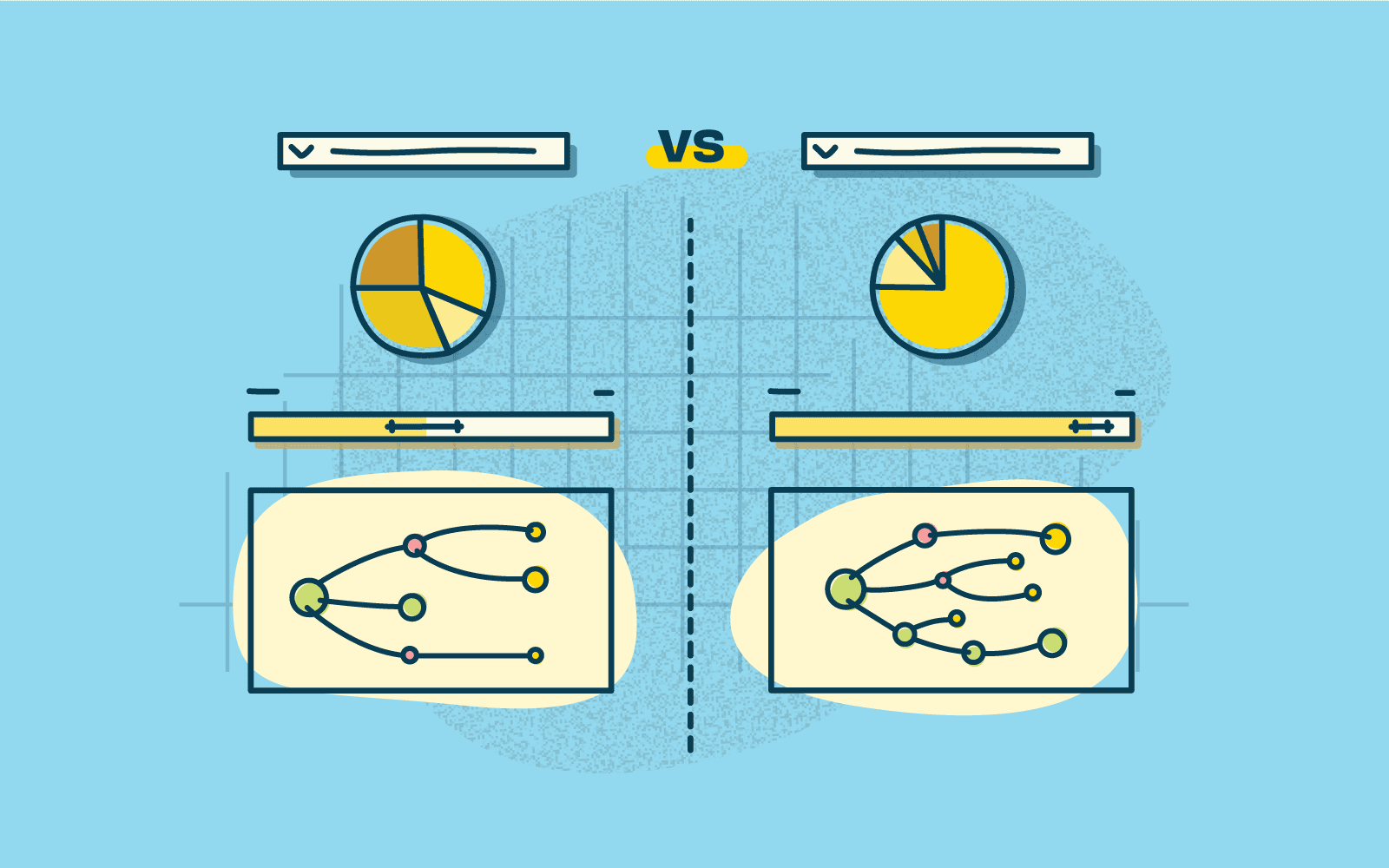
When you’re creating the two tree tests with your two different content structures, include the same tasks in both tests. Using the same tasks will give an accurate measure of which structure performs best. I’ve done it before and I found that the visual presentation of the results — especially the detailed path analysis pietrees — made it really easy to compare Test A with Test B.
Plus (and this is a big plus), if you need to convince stakeholders or teammates of which structure is the most effective, you can’t go past quantitative data, especially when its presented clearly — it’s hard to argue with hard evidence!
Here’s two example of the kinds of results visualizations you could compare in your A/B test: the pietree, which shows correct and incorrect paths, and where people ended up:
And the overall Task result, which breaks down success and directness scores, and has plenty of information worth comparing between two tests:
Keep in mind that running an A/B tree test will affect how you recruit participants — it may not be the best idea to have the same participants complete both tests in one go. But it’s an easy fix — you could either recruit two different groups from the same demographic, or test one group and have a gap (of at least a day) between the two tests.
I’ve one more quick question: why are your two content structures ‘huge’?
I understand that sometimes these things are unavoidable — you potentially work for a government organization, or a university, and you have to include all of the things. But if not, and if you haven’t already, you could run an open card sort to come up with another structure to test (think of it as an A/B/C test!), and to confirm that the categories you’re proposing work for people.
You could even run a closed card sort to establish which content is more important to people than others (your categories could go from ‘Very important’ to ‘Unimportant’, or ‘Use everyday’ to ‘Never use’, for example). You might be able to make your content structure a bit smaller, and still keep its usefulness. Just a thought... and of course, you could try to get this information from your analytics (if available) but just be cautious of this because of course analytics can only tell you what people did and not what they wanted to do.
We love getting stuck into scary, hairy problems to make things better here at Trade Me. One challenge for us in particular is how best to navigate customer reaction to any change we make to the site, the app, the terms and conditions, and so on. Our customers are passionate both about the service we provide — an online auction and marketplace — and its place in their lives, and are rightly forthcoming when they're displeased or frustrated. We therefore rely on our Customer Service (CS) team to give customers a voice, and to respond with patience and skill to customer problems ranging from incorrectly listed items to reports of abusive behavior.
The CS team uses a Customer Relationship Management (CRM) system, Trade Me Admin, to monitor support requests and manage customer accounts. As the spectrum of Trade Me's services and the complexity of the public website have grown rapidly, the CRM system has, to be blunt, been updated in ways which have not always been the prettiest. Links for new tools and reports have simply been added to existing pages, and old tools for services we no longer operate have not always been removed. Thus, our latest focus has been to improve the user experience of the CRM system for our CS team.
And though on the surface it looks like we're working on a product with only 90 internal users, our changes will have flow on effects to tens of thousands of our members at any given time (from a total number of around 3.6 million members).
The challenges of designing customer service systems
We face unique challenges designing customer service systems. Robert Schumacher from GfK summarizes these problems well. I’ve paraphrased him here and added an issue of my own:
1. Customer service centres are high volume environments — Our CS team has thousands of customer interactions every day, and and each team member travels similar paths in the CRM system.
2. Wrong turns are amplified — With so many similar interactions, a system change that adds a minute more to processing customer queries could slow down the whole team and result in delays for customers.
3. Two people relying on the same system — When the CS team takes a phone call from a customer, the CRM system is serving both people: the CS person who is interacting with it, and the caller who directs the interaction. Trouble is, the caller can't see the paths the system is forcing the CS person to take. For example, in a previous job a client’s CS team would always ask callers two or three extra security questions — not to confirm identites, but to cover up the delay between answering the call and the right page loading in the system.
4. Desktop clutter — As a result of the plethora of tools and reports and systems, the desktop of the average CS team member is crowded with open windows and tabs. They have to remember where things are and also how to interact with the different tools and reports, all of which may have been created independently (ie. work differently). This presents quite the cognitive load.
5. CS team members are expert users — They use the system every day, and will all have their own techniques for interacting with it quickly and accurately. They've also probably come up with their own solutions to system problems, which they might be very comfortable with. As Schumacher says, 'A critical mistake is to discount the expert and design for the novice. In contact centers, novices become experts very quickly.'
6. Co-design is risky — Co-design workshops, where the users become the designers, are all the rage, and are usually pretty effective at getting great ideas quickly into systems. But expert users almost always end up regurgitating the system they're familiar with, as they've been trained by repeated use of systems to think in fixed ways.
7. Training is expensive — Complex systems require more training so if your call centre has high churn (ours doesn’t – most staff stick around for years) then you’ll be spending a lot of money. …and the one I’ve added:
8. Powerful does not mean easy to learn — The ‘it must be easy to use and intuitive’ design rationale is often the cause of badly designed CRM systems. Designers mistakenly design something simple when they should be designing something powerful. Powerful is complicated, dense, and often less easy to learn, but once mastered lets staff really motor.
Our project focus
Our improvement of Trade Me Admin is focused on fixing the shattered IA and restructuring the key pages to make them perform even better, bringing them into a new code framework. We're not redesigning the reports, tools, code or even the interaction for most of the reports, as this will be many years of effort. Watching our own staff use Trade Me Admin is like watching someone juggling six or seven things.
The system requires them to visit multiple pages, hold multiple facts in their head, pattern and problem-match across those pages, and follow their professional intuition to get to the heart of a problem. Where the system works well is on some key, densely detailed hub pages. Where it works badly, staff have to navigate click farms with arbitrary link names, have to type across the URL to get to hidden reports, and generally expend more effort on finding the answer than on comprehending the answer.
Groundwork
The first thing that we did was to sit with CS and watch them work and get to know the common actions they perform. The random nature of the IA and the plethora of dead links and superseded reports became apparent. We surveyed teams, providing them with screen printouts and three highlighter pens to colour things as green (use heaps), orange (use sometimes) and red (never use). From this, we were able to immediately remove a lot of noise from the new IA. We also saw that specific teams used certain links but that everyone used a core set. Initially focussing on the core set, we set about understanding the tasks under those links.
The complexity of the job soon became apparent – with a complex system like Trade Me Admin, it is possible to do the same thing in many different ways. Most CRM systems are complex and detailed enough for there to be more than one way to achieve the same end and often, it’s not possible to get a definitive answer, only possible to ‘build a picture’. There’s no one-to-one mapping of task to link. Links were also often arbitrarily named: ‘SQL Lookup’ being an example. The highly-trained user base are dependent on muscle memory in finding these links. This meant that when asked something like: “What and where is the policing enquiry function?”, many couldn’t tell us what or where it was, but when they needed the report it contained they found it straight away.
Sort of difficult
Therefore, it came as little surprise that staff found the subsequent card sort task quite hard. We renamed the links to better describe their associated actions, and of course, they weren't in the same location as in Trade Me Admin. So instead of taking the predicted 20 minutes, the sort was taking upwards of 40 minutes. Not great when staff are supposed to be answering customer enquiries!
We noticed some strong trends in the results, with links clustering around some of the key pages and tasks (like 'member', 'listing', 'review member financials', and so on). The results also confirmed something that we had observed — that there is a strong split between two types of information: emails/tickets/notes and member info/listing info/reports.
We built and tested two IAs
After card sorting, we created two new IAs, and then customized one of the IAs for each of the three CS teams, giving us IAs to test. Each team was then asked to complete two tree tests, with 50% doing one first and 50% doing the other first. At first glance, the results of the tree test were okay — around 61% — but 'Could try harder'. We saw very little overall difference between the success of the two structures, but definitely some differences in task success. And we also came across an interesting quirk in the results.
Closer analysis of the pie charts with an expert in Trade Me Admin showed that some ‘wrong’ answers would give part of the picture required. In some cases so much so that I reclassified answers as ‘correct’ as they were more right than wrong. Typically, in a real world situation, staff might check several reports in order to build a picture. This ambiguous nature is hard to replicate in a tree test which wants definitive yes or no answers. Keeping the tasks both simple to follow and comprehensive proved harder than we expected.
For example, we set a task that asked participants to investigate whether two customers had been bidding on each other's auctions. When we looked at the pietree (see screenshot below), we noticed some participants had clicked on 'Search Members', thinking they needed to locate the customer accounts, when the task had presumed that the customers had already been found. This is a useful insight into writing more comprehensive tasks that we can take with us into our next tests.
What’s clear from analysis is that although it’s possible to provide definitive answers for a typical site’s IAs, for a CRM like Trade Me Admin this is a lot harder. Devising and testing the structure of a CRM has proved a challenge for our highly trained audience, who are used to the current system and naturally find it difficult to see and do things differently. Once we had reclassified some of the answers as ‘correct’ one of the two trees was a clear winner — it had gone from 61% to 69%. The other tree had only improved slightly, from 61% to 63%.
There were still elements with it that were performing sub-optimally in our winning structure, though. Generally, the problems were to do with labelling, where, in some cases, we had attempted to disambiguate those ‘SQL lookup’-type labels but in the process, confused the team. We were left with the dilemma of whether to go with the new labels and make the system initially harder to use for staff but easier to learn for new staff, or stick with the old labels, which are harder to learn. My view is that any new system is going to see an initial performance dip, so we might as well change the labels now and make it better.
The importance of carefully structuring questions in a tree test has been highlighted, particularly in light of the ‘start anywhere/go anywhere’ nature of a CRM. The diffuse but powerful nature of a CRM means that careful consideration of tree test answer options needs to be made, in order to decide ‘how close to 100% correct answer’ you want to get.
Development work has begun so watch this space
It's great to see that our research is influencing the next stage of the CRM system, and we're looking forward to seeing it go live. Of course, our work isn't over— and nor would we want it to be! Alongside the redevelopment of the IA, I've been redesigning the key pages from Trade Me Admin, and continuing to conduct user research, including first click testing using Chalkmark.
This project has been governed by a steadily developing set of design principles, focused on complex CRM systems and the specific needs of their audience. Two of these principles are to reduce navigation and to design for experts, not novices, which means creating dense, detailed pages. It's intense, complex, and rewarding design work, and we'll be exploring this exciting space in more depth in upcoming posts.
Taylor Swift's music has captivated millions, but what do her fans really think about her extensive catalog? We've crunched the numbers, analyzed the data, and uncovered some fascinating insights into how Swifties perceive and categorize their favorite artist's work. Let's dive in!
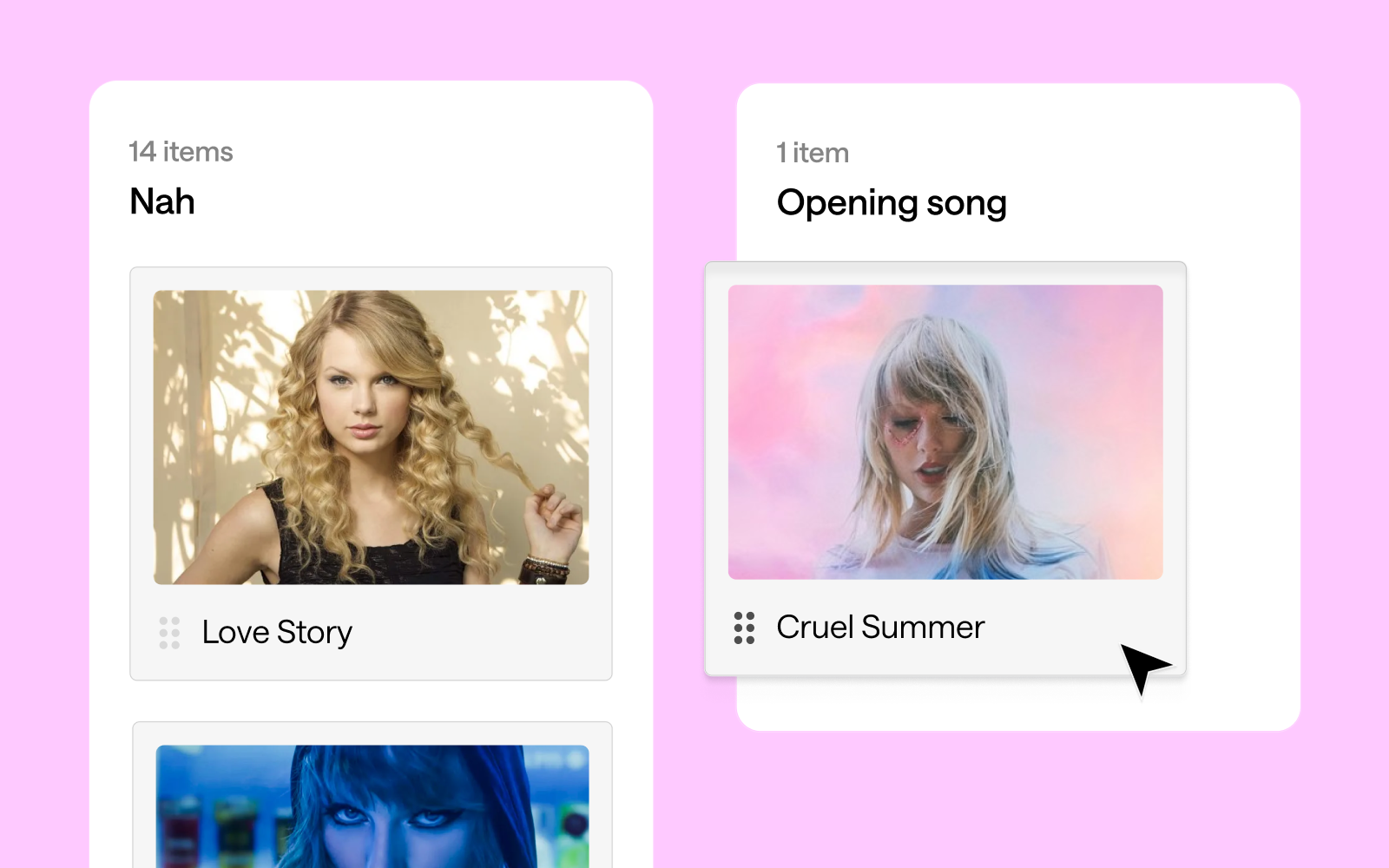
The great debate: openers, encores, and everything in between ⋆.˚✮🎧✮˚.⋆
Our study asked fans to categorize Swift's songs into potential opening numbers, encores, and songs they'd rather not hear (affectionately dubbed "Nah" songs). The results? As diverse as Swift's discography itself!
Opening with a bang 💥
Swifties seem to agree that high-energy tracks make for the best concert openers, but the results are more nuanced than previously suggested. "Shake It Off" emerged as the clear favorite for opening a concert, with 17 votes. "Love Story" follows closely behind with 14 votes, showing that nostalgia indeed plays a significant role. Interestingly, both "Cruel Summer" and "Blank Space" tied for third place with 13 votes each.
This mix of songs from different eras of Swift's career suggests that fans appreciate both her newer hits and classic favorites when it comes to kicking off a show. The strong showing for "Love Story" does indeed speak to the power of nostalgia in concert experiences. It's worth noting that "...Ready for It?", while a popular song, received fewer votes (9) for the opening slot than might have been expected.
Encore extravaganza 🎤
When it comes to encores, fans seem to favor a diverse mix of Taylor Swift's discography, with a surprising tie at the top. "Slut!" (Taylor's Version), "exile", "Guilty as Sin?", and "Bad Blood (Remix)" all received the highest number of votes with 13 each. This variety showcases the breadth of Swift's career and the different aspects of her artistry that resonate with fans for a memorable show finale.
Close behind are "evermore", "Wildest Dreams", "ME!", "Love Story", and "Lavender Haze", each garnering 12 votes. It's particularly interesting to see both newer tracks and classic hits like "Love Story" maintaining strong popularity for the encore slot. This balance suggests that Swifties appreciate both nostalgia and Swift's artistic evolution when it comes to closing out a concert experience.
The "Nah" list 😒
Interestingly, some of Taylor Swift's tracks found themselves on the "Nah" list, indicating that fans might prefer not to hear them in a concert setting. "Clara Bow" tops this category with 13 votes, closely followed by "You're On Your Own, Kid", "You're Losing Me", and "Delicate", each receiving 12 votes.
This doesn't necessarily mean fans dislike these songs - they might just feel they're not well-suited for live performances or don't fit as well into a concert setlist. It's particularly surprising to see "Delicate" on this list, given its popularity. The presence of both newer tracks like "Clara Bow" and older ones like "Delicate" suggests that the "Nah" list isn't tied to a specific era of Swift's career, but rather to individual song preferences in a live concert context.
It's worth noting that even popular songs can end up on this list, highlighting the complex relationship fans have with different tracks in various contexts. This data provides an interesting insight into how Swifties perceive songs differently when considering them for a live performance versus general listening.
1. The "Midnights" Connection: Songs from "Midnights" like "Midnight Rain", "The Black Dog", and "The Tortured Poets Department" showed high similarity in set list placement. This suggests fans see these tracks working well in similar parts of a concert, perhaps as a cohesive segment showcasing the album's distinct sound.
2. Cross-album transitions: There's an intriguing connection between "Guilty as Sin?" and "exile", with a high similarity percentage. This indicates fans see these songs from different albums as complementary in a live setting, potentially suggesting a smooth transition point in the set list that bridges different eras of Swift's career.
3. The show-stoppers: "Shake It Off" stands out as dissimilar to most other songs in terms of placement. This likely reflects its perceived role as a high-energy, statement piece that occupies a unique position in the set list, perhaps as an opener, closer, or peak moment.
4. Set list evolution: There's a noticeable pattern of higher similarity between songs from the same or adjacent eras, suggesting fans envision distinct segments for different periods of Swift's career within the concert. This could indicate a preference for a chronological journey through her discography or strategic placement of different styles throughout the show.
5. Thematic groupings: Some songs from different albums showed higher similarity, such as "Is It Over Now? (Taylor's Version)" and "You're On Your Own, Kid". This suggests fans see them working well together in the set list based on thematic or emotional connections rather than just album cohesion.
What does it all mean?! 💃🏼📊
This card sort data paints a picture of an artist who continually evolves while maintaining certain core elements that define her work. Swift's ability to create cohesive album experiences, make bold stylistic shifts, and maintain thematic threads throughout her career is reflected in how fans perceive and categorize her songs. Moreover, the diversity of opinions on song categorization - with 59 different songs suggested as potential openers - speaks to the depth and breadth of Swift's discography. It also highlights the personal nature of music appreciation; what one fan sees as the perfect opener, another might categorize as a "Nah".
In the end, this analysis gives us a fascinating glimpse into the complex web of associations in Swift's discography. It shows us not just how Swift has evolved as an artist, but how her fans have evolved with her, creating deep and sometimes unexpected connections between songs across her entire career. Whether you're a die-hard Swiftie or a casual listener, or a weirdo who just loves a good card sort, one thing is clear: Taylor Swift's music is rich, complex, and deeply meaningful to her fans. And with each new album, she continues to surprise, delight, and challenge our expectations.
Conclusion: shaking up our understanding 🥤🤔
This deep dive into the Swiftie psyche through a card sort reveals the complexity of Taylor Swift's discography and fans' relationship with it. From strategic song placement in a dream setlist to unexpected cross-era connections, we've uncovered layers of meaning that showcase Swift's artistry and her fans' engagement. The exercise demonstrates how a song can be a potential opener, mid-show energy boost, poignant closer, or a skip-worthy track, highlighting Swift's ability to create diverse, emotionally resonant music that serves various roles in the listening experience.
The analysis underscores Swift's evolving career, with distinct album clusters alongside surprising connections, painting a picture of an artist who reinvents herself while maintaining a core essence. It also demonstrates how fan-driven analyses like card sorting can be insightful and engaging, offering a unique window into music fandom and reminding us that in Swift's discography, there's always more to discover. This exercise proves valuable whether you're a die-hard Swiftie, casual listener, or someone who loves to analyze pop culture phenomena.