“Dear Optimal, I want to test the structure of a university website (well certain sections anyway). My gut instinct is that it's pretty 'broken'. Lots of sections feel like they're in the wrong place. I want to test my hypotheses before proposing a new structure. I'm definitely going to do some card sorting, and was planning a mixture of online and offline. My question is about when to bring in tree testing. Should I do this first to test the existing IA? Or is card sorting sufficient? I do intend to tree test my new proposed IA in order to validate it, but is it worth doing it upfront too?" — Matt
Dear Matt,
Ah, the classic chicken or the egg scenario: Which should come first, tree testing or card sorting?
It’s a question that many researchers often ask themselves, but I’m here to help clear the air! You should always use both methods when changing up your information architecture (IA) in order to capture the most information.
Tree testing and card sorting, when used together, can give you fantastic insight into the way your users interact with your site. First of all, I’ll run through some of the benefits of each testing method.
What is card sorting and why should I use it?
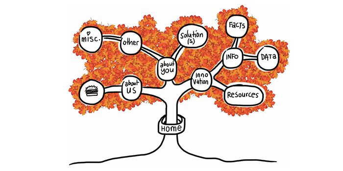
Card sorting is a great method to gauge the way in which your users organize the content on your site. It helps you figure out which things go together and which things don’t. There are two main types of card sorting: open and closed.
Closed card sorting involves providing participants with pre-defined categories into which they sort their cards. For example, you might be reorganizing the categories for your online clothing store for women. Your cards would have all the names of your products (e.g., “socks”, “skirts” and “singlets”) and you also provide the categories (e.g.,“outerwear”, “tops” and “bottoms”).
Open card sorting involves providing participants with cards and leaving them to organize the content in a way that makes sense to them. It’s the opposite to closed card sorting, in that participants dictate the categories themselves and also label them. This means you’d provide them with the cards only, and no categories.
Card sorting, whether open or closed, is very user focused. It involves a lot of thought, input, and evaluation from each participant, helping you to form the structure of your new IA.
What is tree testing and why should I use it?
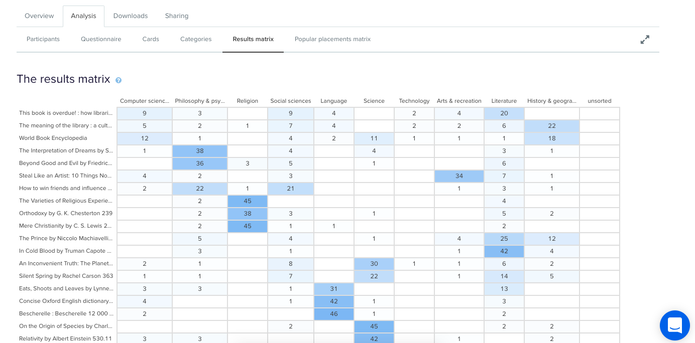
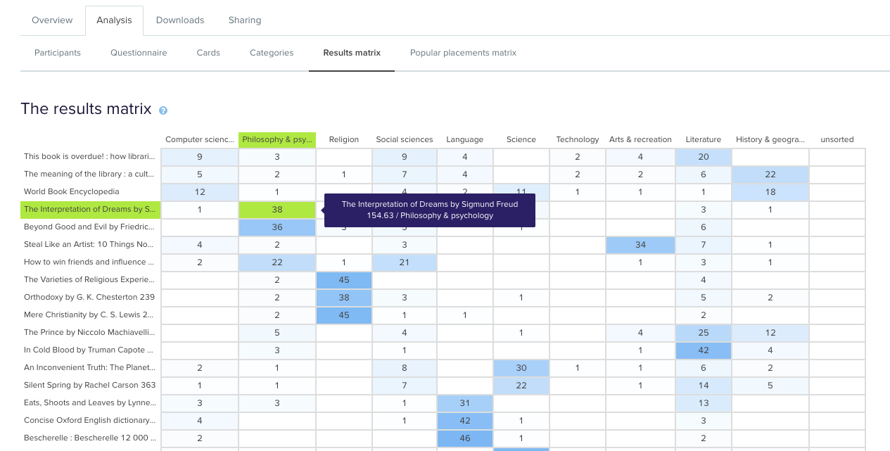
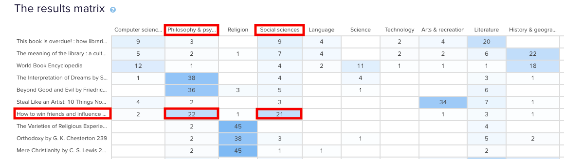
Tree testing is a fantastic way to determine how your users are navigating your site and how they’re finding information. Your site is organized into a tree structure, sorted into topics and subtopics, and participants are provided with some tasks that they need to perform. The results will show you how your participants performed those tasks, if they were successful or unsuccessful, and which route they took to complete the tasks. This data is extremely useful for creating a new and improved IA.
Tree testing is an activity that requires participants to seek information, which is quite the contrast to card sorting. Card sorting is an activity that requires participants to sort and organize information. Each activity requires users to behave in different ways, so each method will give its own valuable results.
Comparing tree testing and card sorting: Key differences
Tree testing and card sorting are complementary methods within your UX toolkit, each unlocking unique insights about how users interact with your site structure. The difference is all about direction.
Card sorting is generative. It helps you understand how users naturally group and label your content; revealing mental models, surfacing intuitive categories, and informing your site’s information architecture (IA) from the ground up. Whether using open or closed methods, card sorting gives users the power to organize content in ways that make sense to them.
Tree testing is evaluative. Once you’ve designed or restructured your IA, tree testing puts it to the test. Participants are asked to complete find-it tasks using only your site structure – no visuals, no design – just your content hierarchy. This highlights whether users can successfully locate information and how efficiently they navigate your content tree.
In short:
- Card sorting = "How would you organize this?"
- Tree testing = "Can you find this?"
Using both methods together gives you clarity and confidence. One builds the structure. The other proves it works.
Which method should you choose?
The right method depends on where you are in your IA journey. If you're beginning from scratch or rethinking your structure, starting with card sorting is ideal. It will give you deep insight into how users group and label content.
If you already have an existing IA and want to validate its effectiveness, tree testing is typically the better fit. Tree testing shows you where users get lost and what’s working well. Think of card sorting as how users think your site should work, and tree testing as how they experience it in action.
Should you run a card or tree test first?
In this scenario, I’d recommend running a tree test first in order to find out how your existing IA currently performs. You said your gut instinct is telling you that your existing IA is pretty “broken”, but it’s good to have the data that proves this and shows you where your users get lost.
An initial tree test will give you a benchmark to work with – after all, how will you know your shiny, new IA is performing better if you don’t have any stats to compare it with? Your results from your first tree test will also show you which parts of your current IA are the biggest pain points and from there you can work on fixing them. Make sure you keep these tasks on hand – you’ll need them later!
Once your initial tree test is done, you can start your card sort, based on the results from your tree test. Here, I recommend conducting an open card sort so you can understand how your users organize the content in a way that makes sense to them. This will also show you the language your participants use to name categories, which will help you when you’re creating your new IA.
Finally, once your card sort is done you can conduct another tree test on your new, proposed IA. By using the same (or very similar) tasks from your initial tree test, you will be able to see that any changes in the results can be directly attributed to your new and improved IA.
Once your test has concluded, you can use this data to compare the performance from the tree test for your original information architecture.
Why using both methods together is most effective
Card sorting and tree testing aren’t rivals, view them as allies. Used together, they give you end-to-end clarity. Card sorting informs your IA design based on user mental models. Tree testing evaluates that structure, confirming whether users can find what they need. This combination creates a feedback loop that removes guesswork and builds confidence. You'll move from assumptions to validation, and from confusion to clarity – all backed by real user behavior.