


Are your visitors really getting the most out of your website? Tree testing (or sometimes referred to as reverse card sorting) takes away the guesswork by telling you how easily, or not, people can find information on your website. Discover why Treejack is the tool of choice for website architects.
What’s tree testing and why does it matter? 🌲 👀
Whether you’re building a website from scratch or improving an existing website, tree testing helps you design your website architecture with confidence. How? Tools like Treejack use analysis to help assess how findable your content is for people visiting your website.
It helps answer burning questions like:
- Do my labels make sense?
- Is my content grouped logically?
- Can people find what they want easily and quickly? If not, why not?
Treejack provides invaluable intel for any Information Architect. Why? Knowing where and why people get lost trying to find your content, gives you a much better chance of fixing the actual problem. And the more easily people can find what they’re looking for, the better their experience which is ultimately better for everyone.
How’s tree testing work? 🌲🌳🌿
Tree testing can be broken down into two main parts:
- The Tree - Your tree is essentially your site map – a text-only version of your website structure.
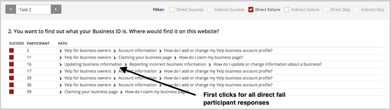
- The Task - Your task is the activity you ask participants to complete by clicking through your tree and choosing the information they think is right. Tools like Treejack analyse the data generated from doing the task to build a picture of how people actually navigated your content in order to try and achieve your task. It tells you if they got it right or wrong, the path they took and the time it took them.
Whether you’re new to tree testing or already a convert, effective tree testing using Treejack has some key steps.
Step 1. The ‘ Why’: Purpose and goals of tree testing
Ask yourself what part of your information architecture needs improvement – is it your whole website or just parts of it? Also think about your audience, they’re the ones you’re trying to improve the website for so the more you know about their needs the better.
Tip: Make the most of what tree testing offers to improve your website by building it into your overall design project plan
Step 2. The ‘How’: Build your tree
You can build your tree using two main approaches:
- Create your tree in spreadsheet and import it into Treejack or
- Build your tree in Treejack itself, using the labels and structure of your website.
Tip: Your category labels are known as ‘parent nodes’. Your information labels are known as ‘child nodes’.
Step 3. The ‘What’: Write your tasks
The quality of your tasks will be reflected in the usefulness of your data so it’s worth making sure you create tasks that really test what you want to improve.
Tip: Use plain language that feels natural and try to write your tasks in a way that reflects the way people who visit your website might actually think when they are trying to find information on your site.
Step 4. The ‘Who’: Recruit participants
The quality of your data will largely depend on the quality of your participants. You want people who are as close to your target audience as possible and with the right attitude - willing and committed to being involved.
Tip: Consider offering some kind of incentive to participants – it shows you value their involvement.
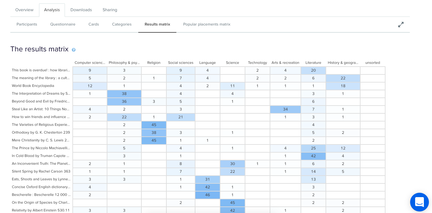
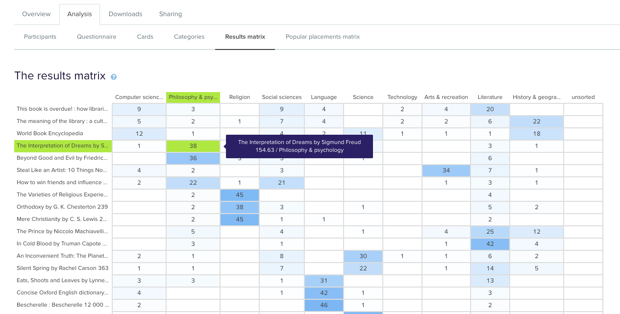
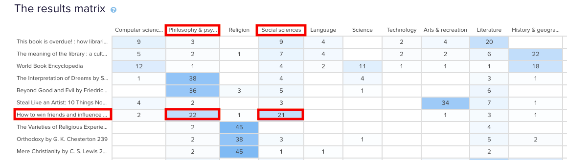
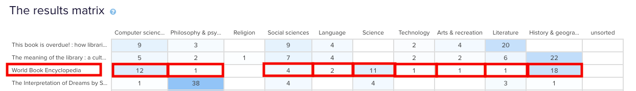
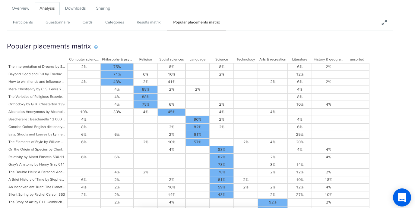
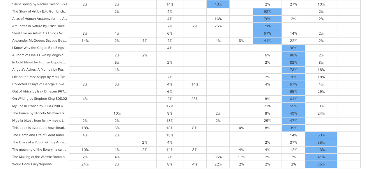
Step 5. The ‘insights’: Interpret your results
Now for the fun part – making sense of the results. Treejack presents the data from your tree testing as a series of tables and visualizations. You can download them in a spreadsheet in their raw format or customized to your needs.
Tip: Use the results to gain quick, practical insights you can act on right away or as a starter to dive deeper into the data.
When should I use tree testing? ⌛
Tree testing is useful whenever you want to find out if your website content is labelled and organised in a way that’s easy to understand. What’s more it can be applied for any website, big (10+ levels with 10000s of labels) or small (3 levels and 22 labels) and any size in between. Our advice for using Treejack is simply this: test big, test small, test often.