


When it comes to designing and testing in the world of information architecture, it’s hard to beat card sorting. As a usability testing method, card sorting is easy to set up, simple to recruit for and can supply you with a range of useful insights. But there’s a long-standing debate in the world of card sorting, and that’s whether it’s better to run card sorts in person (moderated) or remotely over the internet (unmoderated).
This article should give you some insight into the world of online card sorting. We've included an analysis of the benefits (and the downsides) as well as why people use this approach. Let's take a look!
How an online card sort works
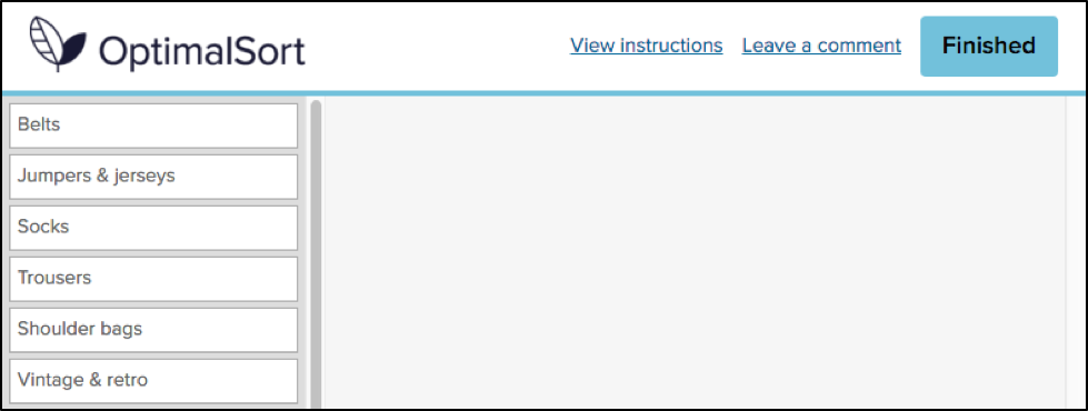
Running a card sort remotely has quickly become a popular option just because of how time-intensive in-person card sorting is. Instead of needing to bring your participants in for dedicated card sorting sessions, you can simply set up your card sort using an online tool (like our very own OptimalSort) and then wait for the results to roll in.
So what’s involved in a typical online card sort? At a very high level, here’s what’s required. We’re going to assume you’re already set up with an online card sorting tool at this point.
- Define the cards: Depending on what you’re testing, add the items (cards) to your study. If you were testing the navigation menu of a hotel website, your cards might be things like “Home”, “Book a room”, “Our facilities” and “Contact us”.
- Work out whether to run a closed or open sort: Determine whether you’ll set the groups for participants to sort cards into (closed) or leave it up to them (open). You may also opt for a mix, where you create some categories but leave the option open for participants to create their own.
- Recruit your participants: Whether using a participant recruitment service or by recruiting through your own channels, send out invites to your online card sort.
- Wait for the data: Once you’ve sent out your invites, all that’s left to do is wait for the data to come in and then analyze the results.
That’s online card sorting in a nutshell – not entirely different from running a card sort in person. If you’re interested in learning about how to interpret your card sorting results, we’ve put together this article on open and hybrid card sorts and this one on closed card sorts.
Why is online card sorting so popular?
Online card sorting has a few distinct advantages over in-person card sorting that help to make it a popular option among information architects and user researchers. There are downsides too (as there are with any remote usability testing option), but we’ll get to those in a moment.
Where remote (unmoderated) card sorting excels:
- Time savings: Online card sorting is essentially ‘set and forget’, meaning you can set up the study, send out invites to your participants and then sit back and wait for the results to come in. In-person card sorting requires you to moderate each session and collate the data at the end.
- Easier for participants: It’s not often that researchers are on the other side of the table, but it’s important to consider the participant’s viewpoint. It’s much easier for someone to spend 15 minutes completing your online card sort in their own time instead of trekking across town to your office for an exercise that could take well over an hour.
- Cheaper: In a similar vein, online card sorting is much cheaper than in-person testing. While it’s true that you may still need to recruit participants, you won’t need to reimburse people for travel expenses.
- Analytics: Last but certainly not least, online card sorting tools (like OptimalSort) can take much of the analytical burden off you by transforming your data into actionable insights. Other tools will differ, but OptimalSort can generate a similarity matrix, dendrograms and a participant-centric analysis using your study data.
Where in-person (moderated) card sorting excels:
- Qualitative insights: For all intents and purposes, online card sorting is the most effective way to run a card sort. It’s cheaper, faster and easier for you. But, there’s one area where in-person card sorting excels, and that’s qualitative feedback. When you’re sitting directly across the table from your participant you’re far more likely to learn about the why as well as the what. You can ask participants directly why they grouped certain cards together.
Online card sorting: Participant numbers
So that’s online card sorting in a nutshell, as well as some of the reasons why you should actually use this method. But what about participant numbers? Well, there’s no one right answer, but the general rule is that you need more people than you’d typically bring in for a usability test.
This all comes down to the fact that card sorting is what’s known as a generative method, whereas usability testing is an evaluation method. Here’s a little breakdown of what we mean by these terms:
Generative method: There’s no design, and you need to get a sense of how people think about the problem you’re trying to solve. For example, how people would arrange the items that need to go into your website’s navigation. As Nielsen Norman Group explains: “There is great variability in different people's mental models and in the vocabulary they use to describe the same concepts. We must collect data from a fair number of users before we can achieve a stable picture of the users' preferred structure and determine how to accommodate differences among users”.
Evaluation method: There’s already a design, and you basically need to work out whether it’s a good fit for your users. Any major problems are likely to crop up even after testing 5 or so users. For example, you have a wireframe of your website and need to identify any major usability issues.
Basically, because you’ll typically be using card sorting to generate a new design or structure from nothing, you need to sample a larger number of people. If you were testing an existing website structure, you could get by with a smaller group.
Where to from here?
Following on from our discussion of generative versus evaluation methods, you’ve really got a choice of 2 paths from here if you’re in the midst of a project. For those developing new structures, the best course of action is likely to be a card sort. However, if you’ve got an existing structure that you need to test in order to usability problems and possible areas of improvement, you’re likely best to run a tree test. We’ve got some useful information on getting started with a tree test right here on the blog.