Subscribe to OW blog for an instantly better inbox
Oops! Something went wrong while submitting the form.
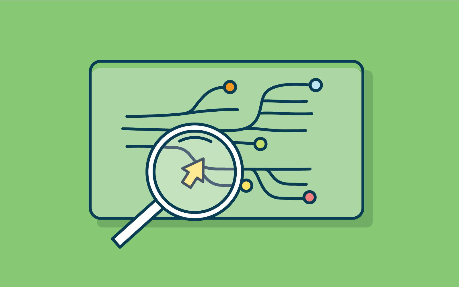
We all know that building a robust information architecture (IA) can make or break your product. And getting it right can rely on robust user research. Especially when it comes to creating human-centered, intuitive products that deliver outstanding user experiences.
But what are the best methods to test your information architecture? To make sure that your focus is on building an information architecture that is truly based on what your users want, and need.
With all the will in the world, your product (or website or mobile app) may work perfectly and be as intuitive as possible. But, if it is only built on information from your internal organizational perspective, it may not measure up in the eyes of your user. Often, organizations make major design decisions without fully considering their users. User research (UX) backs up decisions with data, helping to make sure that design decisions are strategic decisions.
Testing your information architecture can also help establish the structure for a better product from the ground up. And ultimately, the performance of your product. User experience research focuses your design on understanding your user expectations, behaviors, needs, and motivations. It is an essential part of creating, building, and maintaining great products.
Taking the time to understand your users through research can be incredibly rewarding with the insights and data-backed information that can alter your product for the better. But what are the key user research methods for your information architecture? Let’s take a look.
There is more than one way to test your IA. And testing with one method is good, but with more than one is even better. And, of course, the more often you test, especially when there are major additions or changes, you can tweak and update your IA to improve and delight your user’s experience.
Card sorting is a user research method that allows you to discover how users understand and categorize information. It’s particularly useful when you are starting the planning process of your information architecture or at any stage you notice issues or are making changes. Putting the power into your users’ hands and asking how they would intuitively sort the information. In a card sort, participants sort cards containing different items into labeled groups. You can use the results of a card sort to figure out how to group and label the information in a way that makes the most sense to your audience.
There are a number of techniques and methods that can be applied to a card sort. Take a look here if you’d like to know more.
Card sorting has many applications. It’s as useful for figuring out how content should be grouped on a website or in an app as it is for figuring out how to arrange the items in a retail store.You can also run a card sort in person, using physical cards, or remotely with online tools such as OptimalSort.
Taking a look at your information architecture from the other side can also be valuable. Tree testing is a usability method for evaluating the findability of topics on a product. Testing is done on a simplified text version of your site structure without the influence of navigation aids and visual design.
Tree testing tells you how easily people can find information on your product and exactly where people get lost. Your users rely on your information architecture – how you label and organize your content – to get things done.
Tree testing can answer questions like:
Treejack is our tree testing tool and is designed to make it easy to test your information architecture. Running a tree test isn’t actually that difficult, especially if you’re using the right tool. You’ll learn how to set useful objectives, how to build your tree, write your tasks, recruit participants, and measure results.
If you are wanting a fully rounded view of your information architecture, it can be useful to combine your research methods.
Tree testing and card sorting, along with usability testing, can give you insights into your users and audience. How do they think? How do they find their way through your product? And how do they want to see things labeled, organized, and sorted?
If you want to get fully into the comparison of tree testing and card sorting, take a look at our article here, which compares the options and explains which is best and when.
A great information architecture (IA) is essential for a great user experience (UX). And testing your website or app’s information architecture is necessary to get it right.
Card sorting and tree testing are the very best UX research methods for exactly this. But the big question is always: which one should you use, and when? Very possibly you need both. Let’s find out with this quick summary.
Card sorting is used to test the information architecture of a website or app. Participants group individual labels (cards) into different categories according to criteria that makes best sense to them. Each label represents an item that needs to be categorized. The results provide deep insights to guide decisions needed to create an intuitive navigation, comprehensive labeling and content that is organized in a user-friendly way.
Tree testing is also used to test the information architecture of a website or app. When using tree testing participants are presented with a site structure and a set of tasks they need to complete. The goal for participants is to find their way through the site and complete their task. The test shows whether the structure of your website corresponds to what users expect and how easily (or not) they can navigate and complete their tasks.
Card sorting is a UX research method which helps to gather insights about your content categorization. It focuses on creating an information architecture that responds intuitively to the users’ expectations. Things like which items go best together, the best options for labeling, what categories users expect to find on each menu.
Doing a simple card sort can give you all those pieces of information and so much more. You start understanding your user’s thoughts and expectations. Gathering enough insights and information to enable you to develop several information architecture options.
Tree testing is a UX research method that is almost a card sort in reverse. Tree testing is used to evaluate an information architecture structure and simply allows you to see what works and what doesn’t.
Using tree testing will provide insights around whether your information architecture is intuitive to navigate, the labels easy to follow and ultimately if your items are categorized in a place that makes sense. Conversely it will also show where your users get lost and how.
You’ve got this far and fine-tuning your information architecture should be a priority. An intuitive IA is an integral component of a user-friendly product. Creating a product that is usable and an experience users will come back for.
If you are still wondering which method you should use - tree testing or card sorting. The answer is pretty simple - use both.
Just like many great things, these methods work best together. They complement each other, allowing you to get much deeper insights and a rounded view of how your IA performs and where to make improvements than when used separately. We cover more reasons why card sorting loves tree testing in our article which dives deeper into why to use both.
Wanting full, rounded insights into your information architecture is great. And we know that tree testing and card sorting work well together. But is there an order you should do the testing in? It really depends on the particular context of your research - what you’re trying to achieve and your situation.
Tree testing is a great tool to use when you have a product that is already up and running. By running a tree test first you can quickly establish where there may be issues, or snags. Places where users get caught and need help. From there you can try and solve potential issues by moving on to a card sort.
Card sorting is a super useful method that can be instigated at any stage of the design process, from planning to development and beyond. As long as there is an IA structure that can be tested again. Testing against an already existing website navigation can be informative. Or testing a reorganization of items (new or existing) can ensure the organization can align with what users expect.
However, when you decide to implement both of the methods in your research, where possible, tree testing should come before card sorting. If you want a little more on the issue have a read of our article here.
Check out our OptimalSort and Treejack tools - we can help you with your research and the best way forward. Wherever you might be in the process.

Taxonomy is one of those terms that can feel intimidating at first, especially when most definitions relate to classifying plants and animals. But in UX and information architecture, taxonomy has a very different – and incredibly important – meaning. Whether the concept is new to you or you’re looking to strengthen your IA foundations, this guide will demystify taxonomy and show how it supports better navigation, clearer labeling, and more intuitive user experiences.
In information architecture, taxonomy refers to how information is grouped, classified and labeled within a shared information environment. The overarching structure of that shared information environment is the information architecture (IA) and we find our way around it using the navigation. Think of an IA as a house. The taxonomy determines which pieces of furniture belong in each room and we navigate around the house via doorways and hallways. It all fits together to create one shared environment.
For a website architecture example, think of an online shoe store. The shoes might be organized and labelled by color, size, style, season or collection – that’s the taxonomy. The overall picture of where those groups of shoes live is the IA and in our pursuit of new shoes, we might navigate that structure via a navigation bar at the top of the page. In the amazing Grand Taxonomy of Rap Names visualization below, we can see how the information is categorized, connected and labeled through the lines and the colors. There’s no structure or hierarchy to it yet; that would be the next step in the process to build the IA.

There are so many different ways to carve information up into a taxonomy and the key drivers for determining that are your content and, of course, your users. Your taxonomy needs to make sense to your users.You may be starting from scratch with a new website or you may have inherited a taxonomy that for whatever reason just isn’t fit for purpose. The first step when creating an initial taxonomy is to do a comprehensive audit of your content. Ask yourself, is your content relevant? Is it up-to-date? Is it all necessary? Are there opportunities to delete or condense content? Once you have your content sorted, you’re ready to move on to the next step of running a card sort with users. Running a card sort early in your taxonomy creation process will allow you to build it up from an evidence based foundation. There’s no point guessing then testing and potentially going back to square one, when you can co-create with your users and then test that informed approach to validate and further evolve your thinking.When you’re designing your card sort, you’ll need to decide if you’re going to do an open, closed or hybrid sort. Here’s a very high level look at what each type involves:
This early in the taxonomy creation process, it’s best to start out with an open card sort. Not only will this tell you how your users expect your content to be grouped, but will also provide insight into the language and labels that they would expect that content to be associated with. You never know, an open card sort may even surface something you hadn’t considered. At this stage of the process, it’s important to be open to ideas and new possibilities and an open card sort will do just that. Once you’ve settled on the type of card sort you’ll be running, you’ll need to test which can be done through a tool such as Optimal's Card Sorting. It enables you to run unmoderated card sorts remotely (or print out cards for a moderated/in-person card sort!). After your participants have completed your card sort, you can access the benefits of Optimal's powerful result analysis functions.
Learn more about running a card sort and more through our 101 guide.
After you’ve run your initial open card sort with users, you should have everything you need to create the first iteration of your taxonomy. Consider everything you learned during the card sort and cross reference that with your business goals and any tech constraints you might be facing. Don’t stress too much about nailing it this time around, remember this is the first iteration and as you test more and learn more, you can make changes. Build out your taxonomy in Post-it notes with a team and then whack it into a spreadsheet to make future testing and iteration activities easier.
Now that you have the first iteration of your taxonomy, it’s time to have a go at structuring those groups into an IA and running a tree test. A tree test works like a card sort but in reverse – it allows you to test your thinking by working backwards. Optimal’s Tree Testing is an online tree testing tool that helps you assess the findability of your content without any visual design elements. All you need are clear objectives for what you’d like to learn more about and a spreadsheet version of your draft IA (told you it would come in handy!).
Learn more about Tree Testing and tree testing through our equally handy 101 guide.
Another way to test your taxonomy thinking is to run another card sort. However this time, a hybrid or a closed card sort might be more suitable. A closed card sort would be useful if you’ve got evidence to suggest that your group labels are making sense to users but you’re not 100% sure what belongs in each group. A hybrid sort will let you go one step further and tell you if your content does in fact fit within those labels and if not you’ll also pick up some new ideas to iterate your taxonomy further.
Developing a taxonomy is much like any other design process: involve your users early, test your assumptions, and continuously refine your structure as your product and content evolve. Taxonomies aren’t limited to digital experiences – we encounter them everywhere, from libraries to supermarkets – and they all serve the same purpose: helping people find what they need quickly and understand how information relates.
In information architecture, it’s the role of UX designers and information architects to shape these systems so they feel intuitive, scalable, and aligned with real user mental models. When grounded in user research and iterated over time, a strong taxonomy becomes the foundation of clear navigation, meaningful labels, and a more discoverable, user-friendly experience.
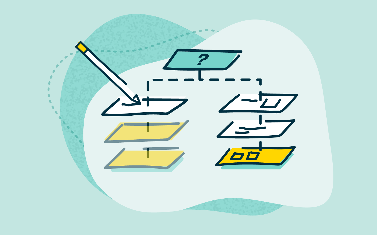
Qualitative user research is about exploration. Exploration is about the journey, not only the destination (or outcome). Gaining information and insights about your users through interviews, usability testing, contextual, observations and diary entries. Using these qualitative research methods to not only answer your direct queries, but to uncover and unravel your users ‘why’.
It can be important to use qualitative research to really dig deep, get to know your users and get inside their heads, and their reasons. Creating intuitive and engaging products that deliver the best user experience.
The term ‘qualitative’ refers to things that cannot be measured numerically and qualitative user research is no exception. Qualitative research is primarily an exploratory research method that is typically done early in the design process and is useful for uncovering insights into people’s thoughts, opinions, and motivations. It allows us to gain a deeper understanding of problems and provides answers to questions we didn’t know we needed to ask.
Qualitative research could be considered the ‘why’. Where quantitative user research uncovers the how or the what users want. Qualitative user research will uncover why they make decisions (and possibly much more).
When undertaking user research it is great to do a mix of quantitative and qualitative research. Which will round out the numbers with human driven insights.
Quantitative user research methods, such as card sorting or tree testing, will answer the ‘what’ your users want, and provide data to support this. These insights are number driven and are based on testing direct interaction with your product. This is super valuable to report to stakeholders. Hard data is difficult to argue what changes need to be made to how your information architecture (IA) is ordered, sorted or designed. To find out more about the quantitative research options, take a read.
Qualitative user research, on the other hand, may uncover a deeper understanding of ‘why’ your users want the IA ordered, sorted or designed a certain way. The devil is in the detail afterall and great user insights are discoverable.
Priorities for your qualitative research needs to be less about the numbers, and more on discovering your users ‘why’. Observing, listening, questioning and looking at reasons for users decisions will provide valuable insights for product design and ultimately improve user experience.
Usability Testing - this research method is used to evaluate how easy and intuitive a product is to use. Observing, noting and watching the participant complete tasks without interference or questions can uncover a lot of insights that data alone can’t give. This method can be done in a couple of ways, moderated or unmoderated. While it can be quicker to do unmoderated and easier to arrange, the deep insights will come out of moderated testing.
Observational - with this qualitative research method your insights will be uncovered from observing and noting what the participant is doing, paying particular attention to their non-verbal communication. Where do they demonstrate frustration, or turn away from the task, or change their approach? Factual note taking, meaning there shouldn’t be any opinions attached to what is being observed, is important to keep the insights unbiased.
Contextual - paying attention to the context in which the interview or testing is done is important. Is it hot, loud, cold or is the screen of their laptop covered in post-its that make it difficult to see? Or do they struggle with navigating using the laptop tracker? All of this noted, in a factual manner, without personal inferring or added opinion based observations can give a window into why the participant struggled or was frustrated at any point.
These research methods can be done as purely observational research (you don’t interview or converse with your participant) and noting how they interact (more interested in the process than the outcome of their product interaction). Or, these qualitative research methods can be coupled with an
Interview - a series of questions asked around a particular task or product. Careful note taking around what the participant says as well as noting any observations. This method should allow a conversation to flow. Whilst the interviewer should be prepared with a list of questions around their topic, remain flexible enough to dig deeper where there might be details or insights of interest. An interviewer that is comfortable in getting to know their participants unpicks reservations and allows a flow of conversation, and generates amazing insights.
With an interview it can be of use to have a second person in the room to act as the note taker. This can free up the interviewer to engage with the participant and unpick the insights.
Using a great note taking side kick, like our Reframer, can take the pain out of recording all these juicy and deep insights. Time-stamping, audio or video recordings and notes all stored in one place. Easily accessed by the team, reviewed, reports generated and stored for later.
You’re creating a new app to support your gym and it’s website. You’re looking to generate personal training bookings, allow members to book classes or have updates and personalise communication for your members. But before investing in final development it needs to be tested. How do your users interact with it? Why would they want to? Does it behave in a way that improves the user experience? Or does it simply not deliver? But why?
First off, using quantitative research like Chalkmark would show how the interface is working. Where are users clicking, where do they go after that. Is it simple to use? You now have direct data that supports your questions, or possibly suggests a change of design to support quicker task completion, or further engagement.
While all of this is great data for the design, does it dig deep enough to really get an understanding of why your users are frustrated? Do they find what they need quickly? Or get completely lost? Finding out these insights and improving on them can make the most of your users’ experience.
When quantitative research is coupled with robust qualitative research that prioritizes an in-depth understanding of what your users need, ultimately the app can make the most of your users’ experience.
Using moderated usability testing for your gym app, observations can be made about how the participant interacts with the interface. Where do they struggle, get lost, or where do they complete a task quickly and simply. This type of research enhances the quantitative data and gives insight into where and why the app is or isn't performing.
Then interviewing participants about why they make decisions on the app, how they use it and why they would use it. These focussed questions, with some free flow conversation will round out your research. Giving valuable insights that can be reviewed, analyzed and reported to the product team and key stakeholders. Focussing the outcome, and designing a product that delivers on not just what users need, but in-depth understand of why.
Quantitative and qualitative user research do work hand in hand, each offering a side to the same coin. Hard number driven data with quantitative user research will deliver the what needs to be addressed. With focussed quantitative research it is possible to really get a handle on why your users interact with your product in a certain way, and how.
The Optimal Workshop platform has all the tools, research methods and even the note taking tools you need to get started with your user research, now, not next week! See you soon.

There are many ways that your website can work wonderfully and of course, the converse is very true. There are lots of (simple) ways a website isn’t working as well or as hard as it can. Your website navigation is crucial to creating a brilliant user experience (UX). As well as being visible to search engine crawls, completing the circle by making your website more visible to potential visitors.
You’ve got a strong homepage, it’s modern, clean, bright and tells your story just right. But your conversions just don’t seem to be happening? Have you considered your navigation? No, not only the menu at the top of your website, but your Information Architecture (IA) sitting in behind. And not just this, but how it is used, interacted with and navigated by your users?
Even if you haven’t already identified an issue with your website it can be super valuable to test your usability regularly. Moments like; building a new website, adding, removing or structuring content can be times when navigation changes can impact how your website performs. And also can be a great instigator for testing and improving. There are some very effective tools to help with finding navigational issues, and with great data and insights shining the way to better sorting and ordering.
Simply put, website navigation is the links within your website that connect the pages. The purpose is for your website visitors to find what they need on your site. And importantly it is also used by search engines to discover and index the content housed on your website.
Search engines use links between pages to understand context and relationships between pages. Ultimately building a picture of what your website is about and who would want to see it, and why.
Whilst strong SEO is vital to finding users, it is always best to make sure your users come first. If your website only talks to search engines it is unlikely to really speak ‘human’ and do what it is intended, make conversions. Users first, search engines after.
Let’s explore some common navigational issues and how great UX research can solve them.
Your website Information Architecture (IA) is always important to consider. How content is stored, ordered and found will impact the UX and the performance of your website SEO. Using a card sorting tool to research how users expect information and content to be sorted, stored and found can be vitally important to how effective your website is. Optimalsort is a quick and effective tool to establish where and how users expect information to be sorted.
Building intuitive IA and making sure navigation, and menus are simple to follow will ensure your users are confident and comfortable making their way through your website. Understanding where they can find the information they need and progressing to the next step.
As well as understanding the order of content with card sorting, combined with our tree-testing tool, Treejack, it can be incredibly useful to understand where users expect information to be found. Looking at how users interact with your website, where they look for information and where they get lost is all great stuff!
Using these insights will keep them on your website longer, more likely to see the task through. And let’s not forget that search engines love it when your website is performing, keeping users longer with strong content that is seen as relevant.
The order of your content is important. This can be how content is stored and the order of your navigation and creating intuitive IA. But can also be as simple as where navigational sign posts are.
It seems obvious, but there is a case for keeping the most important information at the top of drop down menus, and where you want users to take action, usually on your most important pages. Studies show that attention and retention are highest for things that appear at the beginning and at the end of lists.
This is why ‘Contact’ should always be found at the top right corner, the last on the list and in a standard, expected location. Keeping this in mind when creating the order of your pages and what you want your users to interact with will inform your structure.
Understanding exactly how your website is used currently and identifying areas that need to be improved will lead to much stronger user experience (UX). Usability testing should be an essential part of ongoing research for your website success.
One of the biggest issues with website usability is building intuitive navigation. If your users can’t find their way through your website to complete a task, they’re not going to try too hard. They’re far more likely to abandon and find another website (organisation) that makes it easy. Great navigation should act as a simple to follow map from landing page through to task completion.
Using a research tool like Reframer can allow you to test how users complete tasks across your website. Following their journey from their first interaction through to task completion. The data will provide insights into how users engage, navigate and complete their tasks (or don’t). Where do they get stuck, lost or confused? How do they feel (even down to their body language)? How quickly can they find what they are looking for? And the next step?
All great stuff to inform the design team to build an engaging, usable website.
Your users already have set expectations when they arrive on your website. They anticipate your website to look and behave in a regular way that makes navigation, and their decisions, easy. Simple design features, such as your navigation menu across the top of the page, with clear options. It is vital to make life simple and easy when it comes to navigating your website.
Creating an interface that looks clear, is easy and quick to follow will build trust and engagement quickly (remember the 2 second rule). Simple to follow navigation, including descriptive labels, can make completing tasks much simpler and quicker for your users. Guiding them smoothly through your website and ultimately to conversion.
Your homepage is the hardest working page on your website. It’s the first place (most) users will interact with you and it is make or break.
Did you know? You have less than 2 seconds to grab users with a well designed, organised and simple homepage. If they don’t immediately know what to do, trust what they see and get started they will move on (to someone else).
Increased bounce rate does the converse for your SEO. With a homepage that users bounce away from you are likely to see a drop in SEO rankings, meaning ultimately you will see less users!
Did you know that 87% of people that find themselves on the right path after the first click will complete their task? Ensuring that when users land on your homepage they can clearly find the road signs, but not everything that your website contains. Your homepage should simply guide your user to navigate your site, know what to do and how to do it.
A cluttered, busy homepage with too many links will distract your users’ attention, confuse them and maybe even lose them forever! First-click testing will take an informative look at how your homepage interface is performing. Mapping where your user is clicking once they arrive on your homepage and conversely, where they are not engaging.
This can all be highly informative in designing, re-designing or even removing clicks from the users journey through your homepage, and beyond. Using Chalkmark to test your users first clicks is a great way to get started now.
With a website that is intuitive to navigate and content that is relevant you will find users that are engaged and SEO that ranks!
Get started quickly and simply with our range of tools to sort out your navigation.
If you need some more inspiration to help improve your website navigation, grab yourself a copy of our Actionable IA guide that explores actionable ways to fix, refine and build better IAs.
You can also explore Content Design Hub for resources and events for content designers.
Information architecture (IA) is a term used to describe how content or information is organised and arranged. This can relate to a website, a retail store or an app. And you could even consider the way a library is sorted to be IA.
For the purposes of this we will be focussed on websites. IA is fundamentally important to the success of your website. It determines how your users will access the information and the success of their user experience (UX) whilst on your website. And ultimately if you can keep users on your website long enough to complete their task.
IA can be broken down into 3 main areas to consider when building great user experience:
When put like this it does seem pretty straightforward. Maybe even simple? But these tasks need to be straightforward for your users. Putting thought, time and research in at the front of your design and build can mean an intuitive website is built. But at any point in your websites life cycle it can be of value to test and review. IA is the structure that sits in behind and allows the design to tell the story and the content to be found in an easy way.
If you’ve ever tried to use something and thought, “where am I supposed to go next?” or “this doesn’t make any sense,” you are encountering an issue with an information architecture.
The Information Architecture Institute
The way in which your users will use your website depends largely on how the information is presented and organised. By following through the tasks that you expect your users to undertake you can better understand the user experience. If the user can easily flow from point to point, finding what they need in a quick and efficient (and ideally intuitive manner) they are far more likely to stick around. And return when they need to.
The opposite is definitely true also. If users find your website difficult to follow, hard to navigate and get lost or confused. They will not stick around to find out more. They will move on, and swiftly, to your competition. Frustrated, and disengaged. You will find it difficult to win them back.
By providing a simple, clear and straightforward path users can stay focussed on their task, removing overwhelm and confusion. How often do you disappear ‘down a rabbit hole’ when on the internet? Confusing paths or overwhelming options may mean users move off on tangents, and become less likely to complete their initial task. Ultimately the best user experience is one that delivers the right information at the right time. Not too slow and not too complicated.
Always keep in mind that a great IA is:
With all of these lined up in behind great web design, which is clear, bright and attractive. Along with language which appeals to your user. You are providing a UX that will entice, engage and ultimately keep them on your website and converting.
Great IA goes beyond simply being about your user experience. Your organization can benefit hugely with testing, research and insights put into your website IA.
With an IA that creates an easy navigable and engaging website your users are less likely to move off to your competitors. You’ve worked hard to get them to your website, through marketing and SEO. Delivering what your user expects and making it easy to find, means they will complete their task, and are far more likely to return.
By finding what they need quickly, and intuitively, users are more likely to be converted and generate leads or sales. Delivering and answering questions can also reduce the need for support. If you can, your organization's website should answer your users questions, before they complete. This means they are less likely to need to email and /or call for support, reducing overheads and time lag before conversion.
Your organization's reputation is so important, your website may be your only interaction with users. If they have an easy user experience, their questions answered, and are able to complete what they need simply they leave with a great impression of your organization. They are more likely to return and their overall takeaway is that your organization is trustworthy, organised and easy to deal with. The opposite is quite possible with poor IA and design. You get but one chance to grab their attention and keep them. Do it badly and you may never get them back.
Of course the best website IA is based on your users experience. And there is no better way to get a full understanding of your users than by conducting research. At any point in your website's life cycle it can be beneficial to undertake research such as card sorting. At the beginning stages of your website build is best, but your website should be evolving as your organization does, therefore any time there are shifts in what you do or offer is a great time to revisit your UX and how best to deliver this. OptimalSort tests users on how they intuitively would like to see information sorted on your website. Building IA based on data, rather than assumptions, will mean that content and information can be sorted in a way that truly delivers a simple and intuitive experience.
With a great IA, based on card sorting user research, your website content needs to be maintained. Tree testing allows you to see where your users are getting lost in your website navigation. And also how they expect to look for key information. The Treejack tool provides real user insights on how your website navigation is working, how it can work better, and ultimately how to fix paths that don’t work. Providing hard data to inform an intuitive IA.
So, information architecture is fundamental to your website and how it operates. Want to learn more about information architecture? Take a look at our article, or download 'The Actionable IA Guide'.
Supporting your website with user research can mean you build and design a intuitive website that simply rocks!
Learn more about card sorting with our 101 guide. And more on tree testing.
