Subscribe to OW blog for an instantly better inbox
Oops! Something went wrong while submitting the form.

On the fence about card sorting and why you should be using it to improve your user experience? Let’s take a look at why you should take advantage of this powerful user research method.
Simply put, card sorting can help you discover how your users think your content should be organized and categorized. Card sorting gives you insight into how people conceptualize, group and label ideas, enabling you to make confident, informed information architecture (IA) decisions.
In a card sort, participants sort cards containing different items into groups. You can use the results to figure out how to group and label the information on your website in a way that makes the most sense to your audience.
Using card sorting at the start of your website build means you’re able to make decisions based on data, not assumptions. Being informed at the start of your website build can mean saving a lot of time later with revisions or rebuilds. Better to build something intuitive now, than be left wondering later why parts of your website aren’t working as you expect.
It’s best to do card sort research when you want to answer a specific, information-related question. For example, maybe you’re adding a new range of “natural products” to your Health and Beauty site. On the other hand, you may want to redesign how information is grouped together across your entire website.
Card sorting is at its most effective when you’ve got the information and detail you need but you just need guidance on how it's best (most intuitive) to organize it.
While card sorting is typically used in the early stages of the design process, when there’s no live IA, it’s also common to use the technique to make changes to a live IA down the line.
Card sorting is a powerful tool to understand your users and how they make sense of information when they arrive on your website. A good rule to keep in mind is that what makes sense to you and your colleagues may not make sense to your users.
Using an online card sorting tool like OptimalSort it can be useful to check in with users to understand where they think information should sit on your website. As product ranges increase or change over time, it can also be useful to undertake card sort research when updating your website.
Let’s take a look at how card sorting might work for an e-commerce website.
Imagine you run a health and beauty e-commerce business with an active and successful website with a vast range of products that can be grouped in many different ways. At worst the website is clunky and hard to search, making it difficult for shoppers to find the right product, quickly. At best everything is there but it doesn’t quite answer what the user is looking for. It can be incredibly powerful to have a fuller understanding of how our website is viewed from our shoppers (rather than just internally). The goal of our website should be to showcase our products in a way that makes shopping easy, quick and even intuitive.
We are introducing a full range of natural based products that include products intended for babies, children, women and men. These products have previously been categorized by who they are intended for. But we want to know if there is a better way that these could be made available, especially with a market shift to an increased demand in natural based products.
By doing some card sorting with OptimalSort, we gather data from users and the pattern that our audience use to group these products. Through the data analysis we have discovered that a large majority of our users would group by natural products first and then by who the product is intended for (baby, children, women, or men). Armed with this insight (amongst others) we can use it to influence our IA. Ultimately, we end up with a far more intuitive and streamlined user experience (UX).
Did you know that there are multiple ways to use OptimalSort card sorting? Let’s take a look– you may be surprised.
This is by far the biggest use-case for card sorting. When looking at building a new website or making better use of an existing one, utilizing card sorting at the research stage can be insightful and informative. Seeing your website, products and/or navigation from your end user’s perspective can enlighten, inform and assist in creating an enhanced user experience.
When combined with card sorting, tree testing, with Treejack, can help you to improve your navigation and give you a fuller understanding of how your website is used. Tree testing is a technique for evaluating the findability of topics on a website. It’s also commonly known as reverse card sorting and is the perfect technique to complement card sorting. After you’ve analyzed your card sorting results and transformed them into a draft IA, you can test these insights using a tree test. Using this technique, you task users with seeking as opposed to sorting. This technique aims to replicate the experience of using a website – without visual distractions.
Unlike usability testing, tree testing only focuses on the IA of your website. It makes the process of developing an IA much faster, as you can easily make refinements and tweaks without needing to get bogged down in costly redesigns.
You can use OptimalSort to get your team involved and let their feedback feed your designs — logos, icons, banners, images, the list goes on. By creating a closed image sort with categories where your team can group designs based on their preferences, you can get some quick feedback to help you figure out where you should focus your efforts.
Card sorting can take place in person, or online with a tool like OptimalSort. OptimalSort gives you the flexibility to conduct moderated and unmoderated card sorts online. Now, you can collect the data you need, how and when you need it. Plus it only takes a few minutes to design and launch your study.
Not only is OptimalSort simple to use, but it’s backed up with the strength of powerful analysis functionality. Taking the pain of trawling screeds of information, OptimalSort pulls out useful, usable insights from your card sorting data. This allows you to quickly identify common groups at a glance with comprehensive and vibrant visualizations and use this data to support design changes and recommendations.
Part of our OptimalSort analysis is the 3D Cluster View (3DCV). While the addition of ‘3D’ may throw off red flags of being a gimmick, it’s actually entirely appropriate.
The 3DCV basically allows you to visualize the similarity between cards as three-dimensional spatial relationships. Each point in the 3D visualization represents one of the cards from your original sort. Cards that are closer together were more frequently sorted into the same category. Likewise, when you see 2 cards that are quite far apart, they weren’t sorted together as frequently. If you’d like to find out more take a look at OptimalSort 3DCV, we think it’s pretty clever.
If you’re now interested in a card sort of your own, we obviously recommend OptimalSort (which you can get started with for free). Or you want to find out more, take a look at our Card Sorting 101.
Happy sorting!

You’ve just finished running your card sort. The study has closed and the data is waiting to be analyzed. It’s time to take a look at the analysis side of card sorting, specifically in our tool OptimalSort. Let’s get started.
When it comes to analysis, there are essentially two types. There’s exploratory analysis (when you look through data to get impressions, pull out useful ideas and be creative) and statistical analysis (which really just comes down to the numbers). These two types of analysis also go by qualitative and quantitative, respectively.
You’re able to get fantastic insights from both forms.
“Remember that you are the one who is doing the thinking, not the technique… you are the one who puts it all together into a great solution. Follow your instincts, take some risks, and try new approaches.” Donna Spencer, Maadmob.
Whenever you wrap up a study using our card sorting tool, you’ll want to kick off your analysis by heading to the Results Overview section. It’s here that you’ll be able to see how many people actually took part in the study, the average time taken and general statistics about the study itself.
This is useful data to include in presentations to interested stakeholders, just to give them a more holistic view of your research.
With the Results Overview section out of the way, you can make your way over to the Participants Table. This is where you can find information about the individual people who took part in your card sort. You can also start to filter your data here.
Here are just a few of the different actions that you can take:
The Categories tab is the best place to go for open and hybrid card sort results. Take some time to scan the categories people came up with and you’ll be able to quickly build up a good understanding of their ‘mental models’, or how they perceived the theme of your cards.
Consider how different the categories might look for cards containing food items, for example. Some participants might create categories reflecting supermarket aisles, while others might create categories reflecting food groups.
A good place to get started here is by refining your data. Standardize any categories that have similar labels (whether that’s wording, spelling or capitalizations etc). Hybrid card sorts have some set categories, and these will already be standardized.
Note: Before you start throwing categories with similar labels together, take a closer look to see if people had the same conceptual approach. Here’s an example from our card sorting 101 guide:
Of the 15 groups with the word ‘Animal’ in the label, 13 had a similar set of cards, but two participants had labeled their categories slightly differently (Animals and Environment’ and ‘Animals and Nature’) and had thus included extra cards the others didn’t have (‘Glaciers melting faster than previously thought’, for example).
One really useful tool for understanding how your participants think is the Similarity Matrix. This view shows you the percentage of people who grouped 2 cards together.
The most closely related pairings are clustered along the right edge. Higher agreement between participants on which cards go together equates to darker and larger clusters.

There are a few different ways to use the insights from the Similarity Matrix:
Dendrograms are a tool to enable you to spot popular groups of cards, as well to get a general feel of how similar or different your participants’ card sorts were to each other.
There are two dendrograms to explore:
The Participant-Centric Analysis (PCA) view can be useful when you have a lot of results. It’s quite simple. Basically, it aims to find the most popular grouping strategy, and then find two more popular alternatives among participants who agreed with the first strategy.
This approach is called Participant-Centric Analysis because every response (from every participant) is treated as a potential solution, and then ranked for similarity with other responses. What this is telling you is that if you see a card sort with a 11/43 agreement score, this means 10 other participants sorted their cards into groups similar to these ones.
Now that we’ve taken a bit of a deep dive into the analysis side of card sorting in OptimalSort, it’s time to take the tool for a spin and start generating your own data.
Getting started is easy. If you haven’t already, simply sign up for a free account (you don’t need a credit card) and start a card sort. You can also practice by creating a card sort and sending it out to your coworkers, friends or family. Once you start to see results trickling in, you can start to make sense of the data.
For more information, check out the card sorting 101 guide that we’ve put together, or our introduction to card sorting on the Optimal Workshop Blog.
Happy testing!
Despite the abundance of user research methods, card sorting remains one of the best ways to get into the minds of your users and discover how they understand and categorize information.
Given that one of our most popular tools is an online card sorting tool called OptimalSort (You may have heard of it), we thought that we’d answer some common questions about online card sorting – the research method that OptimalSort uses.
Let’s begin!
Traditional card sorting can be done using paper cards and hosted in-person, hence “offline”. Online card sorting is pretty much what it sounds like: a card sort hosted over the internet. But there’s a little more to it.
Primarily, running a card sort online as opposed to hosting one in person means that the process becomes much easier to facilitate. Instead of needing to schedule a time for your participants to come into an office, you can simply send them a link to your card sort. Then, they can complete the test in their own time.
Note that the very benefits of online card sorting mean that you can lose certain insights gained from an in-person card sort, like understanding why your participants sort cards in a certain way. There are ways around this, however. For example, you could pair your card sorting tool with an online video recording solution.
Card sorting is best suited to answering specific, information-related questions. For example, maybe you want to rearrange the layout of your magazine? Or perhaps you need to add several new shopping categories to your website.
In the latter example, card sorting is the perfect technique to find out where people would commonly expect to find those categories on your website. In the card sort, you present participants with a list of cards containing the names of items within certain categories and task them with sorting those items into groups that make sense to them. The end result? You have a clear picture of how your users or customers would arrange the content on your website.
Card sorting is useful when you’ve got the information you need to organize, but you’re just not sure how to organize it.
Compensation is tricky when it comes to online testing methods like card sorting. While there are no hard and fast rules, you may find that it’s the best way to incentivize people to take part in your study. Now, taking part in an online card sort is much easier than trekking across town to sit down for a user interview, so you may want to offer participants the chance to win a prize for taking part instead of compensating them directly.
Note: Offering a discount for your product or service is a great way to compensate users and encourage the use of your product.
Most card sorting tools offer powerful analysis functionality built right into the tool itself, so all you have to worry about is actually putting the card sort together, sending out the links and promoting it.
Using OptimalSort as an example, let’s take a look at some of the analysis functionality and why it’s useful. Other card sorting tools will likely have different analysis options available.
Online card sorting tools can be expensive, but it’s all relative. As just one example of this, online research platforms mean that you’ll likely be gaining access to a whole host of other tools by signing up for an online card sorting tool.
There’s also the fact that it’s a cheaper exercise overall than in-person card sorting as you won’t have to pay as much for compensation, or even use as much of your own time. Time is money!
You can draw qualitative insights directly from the results of an online card sort, but you can also use online card sorting tools alongside participant recording software to build a more holistic understanding. By using recording software, you’ll be able to watch participants as they complete a card sort, and ask them to talk through what they’re doing to learn why they placed cards in a certain way.
In a nutshell, a larger number than you’d probably bring in for a user interview. Aim for between 20 and 30 participants.
Card sorting (whether it’s performed online or offline) is what’s known as a generative user testing method. This means that you’re typically starting without a design, and you’re using the method to get an idea of how people think with regards to the problem you’re trying to solve. A good example of this would be that you’re building a new website, and are using card sorting to learn how people think the content should be grouped and arranged.
Here’s a great quote from Nielsen Norman Group: “There is great variability in different people’s mental models and in the vocabulary they use to describe the same concepts. We must collect data from a fair number of users before we can achieve a stable picture of the users’ preferred structure and determine how to accommodate differences among users”.
We recommend aiming for between 30 and 60 cards, as per our comprehensive 101 guide. Why? Because:
There are a number of online card sorting tools available, including our very own OptimalSort, which is one of the tools included in our platform. OptimalSort has a number of useful features to make it easy to set up and run a card sort with participants based all over the world. Once you’ve gathered all of your responses, built-in analysis features can then help you make sense of the data.
Of course, there are other options available. Take a look at this tools map from User Interviews for a comprehensive overview of the major research tools.
With your card sort done and dusted, it’s time to take that data and build a draft structure of your website or mobile app. Once you’ve put this rough structure together, you can use tree testing to to see how people navigate through it. We’ve got a guide for that too, which you can read here.
So that’s 10 questions about online card sorting – answered! If you’re interested in diving straight into a card sort of your own, we obviously recommend giving OptimalSort a try (which you can do for free).
Happy testing!
Few methods surpass card sorting when you need to figure out how your users understand and categorize information.
Whether you’re working on a new website, mobile app, intranet or even a physical store, this user research method is a powerful way of getting into the minds of the people you’re trying to serve.
For those of you unfamiliar with this method or just needing a recap, a card sort involves participants sorting cards containing different items into groups. It’s as simple as that. You can use the results to then determine how to group and label the information on your app or website in a way that makes sense to the people using it.
Imagine for a moment that you’re the owner of a small fitness apparel store called FitSmart, and you’ve just ordered in a shipment of new fitness trackers. You need to add these new products to your website, but you’re not exactly sure how they fit in alongside the shoes, clothing, equipment and supplements that you also offer.
This is where card sorting comes into play.
With this user research method, you can quickly determine where people might expect to find a fitness tracker category on your website. The card sort will present the test participants with a list of cards containing the names of items found on your website, and ask users to sort the cards into groups that make sense to them.
Remember: You are not your user, and while it is possible to take an educated guess as to where to position these products, using a card sort will take out the guesswork.
One of the other benefits of card sorting is that you can routinely come back to the method whenever you need to update your website.
Running a card sort is quite straightforward – and much simpler when using an online, unmoderated tool. Yes, you can run a card sort in person using paper cards, but you’ll then also have to coordinate with participants to have them meet you in a physical location, actually host each card sort and carry out all of the analysis manually.
Using an online tool like OptimalSort eliminates all of the admin and instead allows you to get on with the task of actually analyzing your results and making effective decisions. If you’d like to try card sorting, you can give OptimalSort a go for free and then follow this guide to set up your first test. We’d love to hear how you get on!
When you’re working in the realm of information architecture – whether that’s reorganizing the way your website is laid out or trying to arrange categories in a mobile shopping app – card sorting isn’t the be-all and end-all.
Card sorting can show you which things should go together, but you also need to be able to work out how people make their way through a website structure. This is where a method called tree testing comes into play.
Also known as reverse card sorting, you can use a tree test to evaluate the findability of different items. In a tree test, you task participants with completing a certain action (like finding fitness trackers) and observe them as they navigate through a text-only version of your website structure. By recording every step that they take, including any wrong turns and how long it takes them to complete the task, you can make more informed changes to the specific placement of different pages and elements.
It’s best to use card sorting and tree testing together.
Card sorting is one of the most effective ways of building products and services that are intuitive for the people using them. If you’re interested in learning more about this research method, check out the hub page for card sorting on the Optimal Workshop Blog.
When it comes to designing and testing in the world of information architecture, it’s hard to beat card sorting. As a usability testing method, card sorting is easy to set up, simple to recruit for and can supply you with a range of useful insights. But there’s a long-standing debate in the world of card sorting, and that’s whether it’s better to run card sorts in person (moderated) or remotely over the internet (unmoderated).
This article should give you some insight into the world of online card sorting. We've included an analysis of the benefits (and the downsides) as well as why people use this approach. Let's take a look!
Running a card sort remotely has quickly become a popular option just because of how time-intensive in-person card sorting is. Instead of needing to bring your participants in for dedicated card sorting sessions, you can simply set up your card sort using an online tool (like our very own OptimalSort) and then wait for the results to roll in.
So what’s involved in a typical online card sort? At a very high level, here’s what’s required. We’re going to assume you’re already set up with an online card sorting tool at this point.
That’s online card sorting in a nutshell – not entirely different from running a card sort in person. If you’re interested in learning about how to interpret your card sorting results, we’ve put together this article on open and hybrid card sorts and this one on closed card sorts.
Online card sorting has a few distinct advantages over in-person card sorting that help to make it a popular option among information architects and user researchers. There are downsides too (as there are with any remote usability testing option), but we’ll get to those in a moment.
Where remote (unmoderated) card sorting excels:
Where in-person (moderated) card sorting excels:
So that’s online card sorting in a nutshell, as well as some of the reasons why you should actually use this method. But what about participant numbers? Well, there’s no one right answer, but the general rule is that you need more people than you’d typically bring in for a usability test.
This all comes down to the fact that card sorting is what’s known as a generative method, whereas usability testing is an evaluation method. Here’s a little breakdown of what we mean by these terms:
Generative method: There’s no design, and you need to get a sense of how people think about the problem you’re trying to solve. For example, how people would arrange the items that need to go into your website’s navigation. As Nielsen Norman Group explains: “There is great variability in different people's mental models and in the vocabulary they use to describe the same concepts. We must collect data from a fair number of users before we can achieve a stable picture of the users' preferred structure and determine how to accommodate differences among users”.
Evaluation method: There’s already a design, and you basically need to work out whether it’s a good fit for your users. Any major problems are likely to crop up even after testing 5 or so users. For example, you have a wireframe of your website and need to identify any major usability issues.
Basically, because you’ll typically be using card sorting to generate a new design or structure from nothing, you need to sample a larger number of people. If you were testing an existing website structure, you could get by with a smaller group.
Following on from our discussion of generative versus evaluation methods, you’ve really got a choice of 2 paths from here if you’re in the midst of a project. For those developing new structures, the best course of action is likely to be a card sort. However, if you’ve got an existing structure that you need to test in order to usability problems and possible areas of improvement, you’re likely best to run a tree test. We’ve got some useful information on getting started with a tree test right here on the blog.

In Part 1 of this series we looked at how to interpret results from open and hybrid card sorts and now in Part 2, we’re going to talk about closed card sorts. In closed card sorts, participants are asked to sort the cards into predetermined categories and are not allowed to create any of their own. You might use this approach when you are constrained by specific category names or as a quick checkup before launching a new or newly redesigned website.In Part 1, we also discussed the two different - but complementary - types of analysis that are generally used together for interpreting card sort results: exploratory and statistical. Exploratory analysis is intuitive and creative while statistical analysis is all about the numbers. Check out Part 1 for a refresher or learn more about exploratory and statistical analysis in Donna Spencer’s book.
Closed card sort analysis is generally much quicker and easier than open and hybrid card sorts because there are no participant created category names to analyze - it’s really just about where the cards were placed. There are some similarities about how you might start to approach your analysis process but overall there’s a lot less information to take in and there isn’t much in the way of drilling down into the details like we did in Part 1.Just like with an open card sort, kick off your analysis process by taking an overall look at the results as a whole. Quickly cast your eye over each individual card sort and just take it all in. Look for common patterns in how the cards have been sorted. Does anything jump out as surprising? Are there similarities or differences between participant sorts?
If you’re redesigning an existing information architecture (IA), how do your results compare to the current state? If this is a final check up before launching a live website, how do these results compare to what you learned during your previous research studies?If you ran your card sort using information architecture tool OptimalSort, head straight to the Overview and Participants Table presented in the results section of the tool. If you ran a moderated card sort using OptimalSort’s printed cards, you’ve probably been scanning them in after each completed session, but now is a good time to double check you got them all. And if you didn’t know about this handy feature of OptimalSort, it’s something to keep in mind for next time!
The Participants Table shows a breakdown of your card sorting data by individual participant. Start by reviewing each individual card sort one by one by clicking on the arrow in the far left column next to the Participants numbers. From here you can easily flick back and forth between participants without needing to close that modal window. Don’t spend too much time on this — you’re just trying to get a general impression of how the cards were sorted into your predetermined categories. Keep an eye out for any card sorts that you might like to exclude from the results. For example participants who have lumped everything into one group and haven’t actually sorted the cards.
Don’t worry- excluding or including participants isn’t permanent and can be toggled on or off at anytime.Once you’re happy with the individual card sorts that will and won’t be included in your results visualizations, it’s time to take a look at the Results Matrix in OptimalSort. The Results Matrix shows the number of times each card was sorted into each of your predetermined categories- the higher the number, the darker the shade of blue (see below).
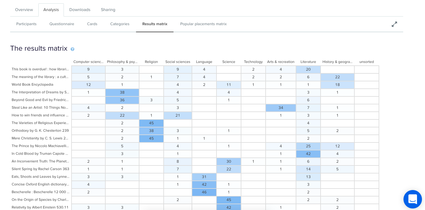
This table enables you to quickly and easily get across how the cards were sorted and gauge the highest and lowest levels of agreement among your participants. This will tell you if you’re on the right track or highlight opportunities for further refinement of your categories.If we take a closer look (see below) we can see that in this example closed card sort conducted on the Dewey Decimal Classification system commonly used in libraries, The Interpretation of Dreams by Sigmund Freud was sorted into ‘Philosophy and psychology’ 38 times in study a completed by 51 participants.
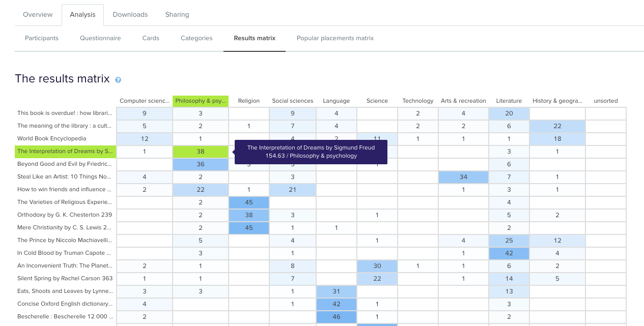
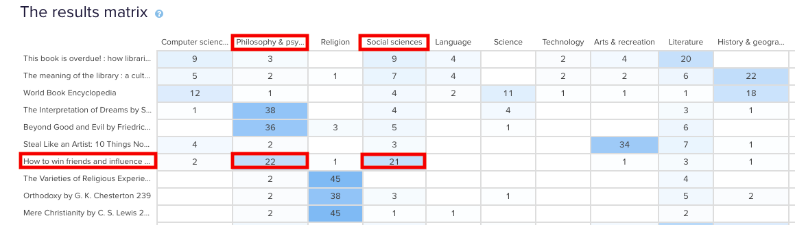
In the real world, that is exactly where that content lives and this is useful to know because it shows that the current state is supporting user expectations around findability reasonably well. Note: this particular example study used image based cards instead of word label based cards so the description that appears in both the grey box and down the left hand side of the matrix is for reference purposes only and was hidden from the participants.Sometimes you may come across cards that are popular in multiple categories. In our example study, How to win friends and influence people by Dale Carnegie, is popular in two categories: ‘Philosophy & psychology’ and ‘Social sciences’ with 22 and 21 placements respectively. The remaining card placements are scattered across a further 5 categories although in much smaller numbers.
When this happens, it’s up to you to determine what your number thresholds are. If it’s a tie or really close like it is in this case, you might review the results against any previous research studies to see if anything has changed or if this is something that comes up often. It might be a new category that you’ve just introduced, it might be an issue that hasn’t been resolved yet or it might just be limited to this one study. If you’re really not sure, it’s a good idea to run some in-person card sorts as well so you can ask questions and gain clarification around why your participants felt a card belonged in a particular category. If you’ve already done that great! Time to review those notes and recordings!You may also find yourself in a situation where no category is any more popular than the others for a particular card. This means there’s not much agreement among your participants about where that card actually belongs. In our example closed card sort study, the World Book Encyclopedia was placed into 9 of 10 categories. While it was placed in ‘History & geography’ 18 times, that’s still only 35% of the total placements for that card- it’s hardly conclusive.
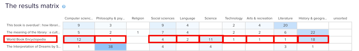
Sometimes this happens when the card label or image is quite general and could logically belong in many of the categories. In this case, an encyclopedia could easily fit into any of those categories and I suspect this happened because people may not be aware that encyclopedias make up a very large part of the category on the far left of the above matrix: ‘Computer science, information & general works’. You may also see this happening when a card is ambiguous and people have to guess where it might belong. Again - if you haven’t already - if in doubt, run some in-person card sorts so you can ask questions and get to the bottom of it!After reviewing the Results Matrix in OptimalSort, visit the Popular Placements Matrix to see which cards were most popular for each of your categories based on how your participants sorted them (see below 2 images).
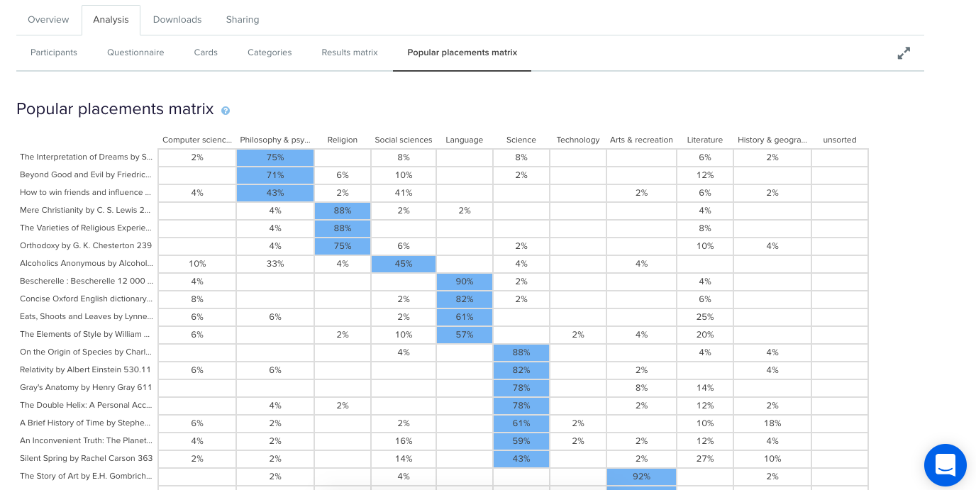
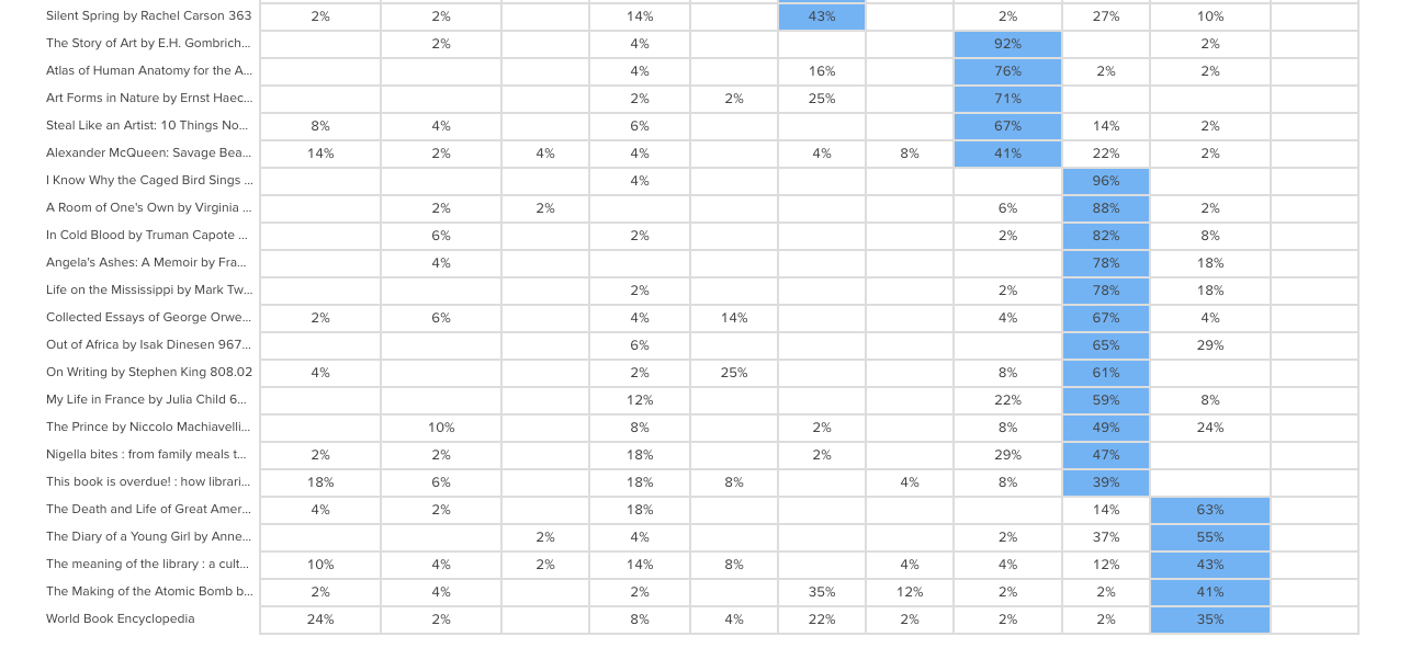
The diagram shades the most popular placements for each category in blue making it very easy to spot what belongs where in the eyes of your participants. It’s useful for quickly identifying clusters and also highlights the categories that didn’t get a lot of card sorting love. In our example study (2 images above) we can see that ‘Technology’ wasn’t a popular card category choice potentially indicating ambiguity around that particular category name. As someone familiar with the Dewey Decimal Classification system I know that ‘Technology’ is a bit of a tricky one because it contains a wide variety of content that includes topics on medicine and food science - sometimes it will appear as ‘Technology & applied sciences’. These results appear to support the case for exploring that alternative further!
Now that we’ve looked at how to interpret your open, hybrid and closed card sorts, here are some next steps to help you turn those insights into action!Once you’ve analyzed your card sort results, it’s time to feed those insights into your design process and create your taxonomy which goes hand in hand with your information architecture. You can build your taxonomy out in Post-it notes before popping it into a spreadsheet for review. This is also a great time to identify any alternate labelling and placement options that came out of your card sorting process for further testing.From here, you might move into tree testing your new IA or you might run another card sort focussing on a specific area of your website. You can learn more about card sorting in general via our 101 guide.
When interpreting card sort results, don’t forget to have fun! It’s easy to get overwhelmed and bogged down in the results but don’t lose sight of the magic that is uncovering user insights.I’m going to leave you with this quote from Donna Spencer that summarizes the essence of card sort analysis quite nicely:Remember that you are the one who is doing the thinking, not the technique... you are the one who puts it all together into a great solution. Follow your instincts, take some risks, and try new approaches. - Donna Spencer
