Subscribe to OW blog for an instantly better inbox
Oops! Something went wrong while submitting the form.

Cards have been created, sorted and sorted again. The participants are all finished and you’re left with a big pile of awesome data that will help you improve the user experience of your information architecture. Now what?Whether you’ve run an open, hybrid or closed card sort online using an information architecture tool or you’ve run an in person (moderated) card sort, it can be a bit daunting trying to figure out where to start the card sort analysis process.
This two-part guide will help you on your way! For Part 1, we’re going to look at how to interpret and analyze the results from open and hybrid card sorts.
Open and hybrid card sorts are great for generating ideas for category names and labels and understanding not only how your users expect your content to be grouped but also what they expect those groups to be called.In both parts of this series, I’m going to be talking a lot about interpreting your results using Optimal Workshop’s online card sorting tool, OptimalSort, but most of what I’m going to share is also applicable if you’re analyzing your data using a spreadsheet or using another tool.
Similar to qualitative and quantitative methods, exploratory and statistical analysis in card sorting are two complementary approaches that work together to provide a detailed picture of your results.
Depending on your objectives - whether you are starting from scratch or redesigning an existing IA - you’ll generally need to use some combination of both of these approaches when analyzing card sort results. Learn more about exploratory and statistical analysis in Donna Spencer’s book.
When analyzing card sort results, start by taking an overall look at the results as a whole. Quickly cast your eye over each individual card sort and just take it all in. Look for common patterns in how the cards have been sorted and the category names given by participants. Does anything jump out as surprising? Are there similarities or differences between participant sorts? If you’re redesigning an existing IA, how do your results compare to the current state?If you ran your card sort using OptimalSort, your first port of call will be the Overview and Participants Table presented in the results section of the tool.If you ran a moderated card sort using OptimalSort’s printed cards, now is a good time to double check you got them all. And if you didn’t know about this handy feature of OptimalSort, it’s something to keep in mind for next time!The Participants Table shows a breakdown of your card sorting data by individual participant. Start by reviewing each individual card sort one by one by clicking on the arrow in the far left column next to the Participants numbers.

From here you can easily flick back and forth between participants without needing to close that modal window. Don’t spend too much time on this — you’re just trying to get a general impression of what happened.Keep an eye out for any card sorts that you might like to exclude from the results. For example participants who have lumped everything into one group and haven’t actually sorted the cards. Don’t worry - excluding or including participants isn’t permanent and can be toggled on or off at anytime.If you have a good number of responses, then the Participant Centric Analysis (PCA) tab (below) can be a good place to head next. It’s great for doing a quick comparison of the different high-level approaches participants took when grouping the cards.The PCA tab provides the most insight when you have lots of results data (30+ completed card sorts) and at least one of the suggested IAs has a high level of agreement among your participants (50% or more agree with at least one IA).

The PCA tab compares data from individual participants and surfaces the top three ways the cards were sorted. It also gives you some suggestions based on participant responses around what these categories could be called but try not to get too bogged down in those - you’re still just trying to gain an overall feel for the results at this stage.Now is also a good time to take a super quick peek at the Categories tab as it will also help you spot patterns and identify data that you’d like to dive deeper into a bit later on!Another really useful visualization tool offered by OptimalSort that will help you build that early, high-level picture of your results is the Similarity Matrix. This diagram helps you spot data clusters, or groups of cards that have been more frequently paired together by your participants, by surfacing them along the edge and shading them in dark blue. It also shows the proportion of times specific card pairings occurred during your study and displays the exact number on hover (below).

In the above screenshot example we can see three very clear clusters along the edge: ‘Ankle Boots’ to ‘Slippers’ is one cluster, ‘Socks’ to ‘Stockings & Hold Ups’ is the next and then we have ‘Scarves’ to ‘Sunglasses’. These clusters make it easy to spot the that cards that participants felt belonged together and also provides hard data around how many times that happened.Next up are the dendrograms. Dendrograms are also great for gaining an overall sense of how similar (or different) your participants’ card sorts were to each other. Found under the Dendrogram tab in the results section of the tool, the two dendrograms are generated by different algorithms and which one you use depends largely on how many participants you have.
If your study resulted in 30 or more completed card sorts, use the Actual Agreement Method (AAM) dendrogram and if your study had fewer than 30 completed card sorts, use the Best Merge Method (BMM) dendrogram.The AAM dendrogram (see below) shows only factual relationships between the cards and displays scores that precisely tell you that ‘X% of participants in this study agree with this exact grouping’.In the below example, the study shown had 34 completed card sorts and the AAM dendrogram shows that 77% of participants agreed that the cards highlighted in green belong together and a suggested name for that group is ‘Bling’. The tooltip surfaces one of the possible category names for this group and as demonstrated here it isn’t always the best or ‘recommended’ one. Take it with a grain of salt and be sure to thoroughly check the rest of your results before committing!

The BMM dendrogram (see below) is different to the AAM because it shows the percentage of participants that agree with parts of the grouping - it squeezes the data from smaller sample sizes and makes assumptions about larger clusters based on patterns in relationships between individual pairs.The AAM works best with larger sample sizes because it has more data to work with and doesn’t make assumptions while the BMM is more forgiving and seeks to fill in the gaps.The below screenshot was taken from an example study that had 7 completed card sorts and its BMM dendrogram shows that 50% of participants agreed that the cards highlighted in green down the left hand side belong to ‘Accessories, Bottoms, Tops’.

Once you’ve gained a high level impression of the results, it’s time to dig deeper and unearth some solid insights that you can share with your stakeholders and back up your design decisions.Explore your open and hybrid card sort data in more detail by taking a closer look at the Categories tab. Open up each category and cross-reference to see if people were thinking along the same lines.Multiple participants may have created the same category label, but what lies beneath could be a very different story. It’s important to be thorough here because the next step is to start standardizing or chunking individual participant categories together to help you make sense of your results.In open and hybrid sorts, participants will be able to label their categories themselves. This means that you may identify a few categories with very similar labels or perhaps spelling errors or different formats. You can standardize your categories by merging similar categories together to turn them into one.OptimalSort makes this really easy to do - you pretty much just tick the boxes alongside each category name and then hit the ‘Standardize’ button up the top (see below). Don’t worry if you make a mistake or want to include or exclude groupings; you can unstandardize any of your categories anytime.

Once you’ve standardized a few categories, you’ll notice that the Agreement number may change. It tells you how many participants agreed with that grouping. An agreement number of 1.0 is equal to 100% meaning everyone agrees with everything in your newly standardized category while 0.6 means that 60% of your participants agree.Another number to watch for here is the number of participants who sorted a particular card into a category which will appear in the frequency column in dark blue in the right-hand column of the middle section of the below image.


From the above screenshot we can see that in this study, 18 of the 26 participant categories selected agree that ‘Cat Eye Sunglasses’ belongs under ‘Accessories’.Once you’ve standardized a few more categories you can head over to the Standardization Grid tab to review your data in more detail. In the below image we can see that 18 participants in this study felt that ‘Backpacks’ belong in a category named ‘Bags’ while 5 grouped them under ‘Accessories’. Probably safe to say the backpacks should join the other bags in this case.

So that’s a quick overview of how to interpret the results from your open or hybrid card sorts.Here's a link to Part 2 of this series where we talk about interpreting results from closed card sorts as well as next steps for applying these juicy insights to your IA design process.
Co-authored by Brandon Dorn, UX designer at Viget.As user experience designers, making sure that websites and tools are usable is a critical component of our work, and conducting user research enables us to assess whether we’re achieving that goal or not. Even if we want to incorporate research, however, certain constraints may stand in our way.
A few years ago, we realized that we were facing this issue at Viget, a digital design agency, and we decided to make an effort to prioritize user research. Almost two years ago, we shared initial thoughts on our progress in this blog post. We’ve continued to learn and grow as researchers since then and hope that what we’ve learned along the way can help your clients and coworkers understand the value of research and become better practitioners. Below are some of those lessons.
Before you can do more research, it needs to be prioritized across your entire organization — not just within your design team. To that end, you should:
If you want people within your organization to get excited about doing more research, they need to understand what research means. To educate your colleagues and clients, you should:
Our commitment to testing assumptions led us to challenge ourselves to do research on every project. While we're dogmatic about this goal, we're decidedly un-dogmatic about the form our research takes from one project to another. To pursue this goal, we seek to:
Learning to be more efficient at planning, conducting, and analyzing research has helped us overturn the idea that some projects merit research while others don't. Remote moderated usability tests are one of our preferred methods, yet, in our experience, the biggest obstacle to incorporating these tests isn't the actual moderating or analyzing, but the overhead of acquiring and scheduling participants. While some agencies contract out the work of recruiting, we've found it less expensive and more reliable to collaborate with our clients to find the right people for our tests. That said, here are some recommendations for holding efficient qualitative tests:
As a generalist design agency, we work with clients whose industries and products vary significantly. While some clients come to us with clear research priorities in mind, others treat it as an afterthought. Rare, however, is the client who is actively opposed to researching their product. More often than not, budget and timelines are the limiting factors. So we try not to make research an ordeal, but instead treat it as part of our normal process even if a client hasn't explicitly asked for it. Common-sense perspectives like Jakob Nielsen’s classic “Discount Usability for the Web” remind us that some research is always better than none, and that some can still be meaningfully pursued. We aren’t pushy about research, of course, but instead try to find a way to make it happen when it isn't a definite priority.
World Usability Day is coming up on November 9, so now is a great time to stop and reflect on how you approach research and to brainstorm ways to improve your process. The tips above reflect some of the lessons we’ve learned at Viget as we’ve tried to improve our own process. We’d love to hear about approaches you’ve used as well.
The key purpose of running a card sort is to learn something new about how people conceptualize and organize the information that’s found on your website. The insights you gain from running a card sort can then help you develop a site structure with content labels or headings that best represent the way your users think about this information. Card sorts are in essence a simple technique, however it’s the details of the sort that can determine the quality of your results.
In most cases, each item in a card sort has only a short label, but there are instances where you may wish to add additional context to the items in your sort. Currently, the cards tab in OptimalSort allows you to include a tooltip description, a link within the tooltip description or to format the card as an image (with or without a label).

We generally don’t recommend using tooltip descriptions and links, unless you have a specific reason to do so. It’s likely that they’ll provide your participants with more information than they would normally have when navigating your website, which may in turn influence your results by leading participants to a particular solution.
Legitimate reasons that you may want to use descriptions and links include situations where it’s not possible or practical to translate complex or technical labels (for example, medical, financial, legal or scientific terms) into plain language, or if you’re using a card sort to understand your participants’ preferences or priorities.
If you do decide to include descriptions in your sort, it’s important that you follow the same guidelines that you would otherwise follow for writing card labels. They should be easy for your participants to understand and you should avoid obvious patterns, for example repeating words and phrases, or including details that refer to the current structure of the website.
I was curious to find out how often people were including descriptions in their card sorts, so I asked our development team to look into this data. It turns out that around 15% of cards created in OptimalSort have at least some text entered in the description field. In order to dig into the data a bit further, both Ania and I reviewed a random sample of recent sorts and noted how descriptions were being used in each case.
We found that out of the descriptions that we reviewed, 40% (6% of the total cards) had text that should not have impacted the sort results. Most often, these cards simply had the card label repeated in the description (to be honest, we’re not entirely sure why so many descriptions are being used this way! But it’s now in our roadmap to stop this from happening — stay tuned!). Approximately 20% (3% of the total cards) used descriptions to add context without obviously leading participants, however another 40% of cards have descriptions that may well lead to biased results. On occasion, this included linking to the current content or using what we assumed to be the current top level heading within the description.
So, how much influence could potentially leading card descriptions have on the results of a card sort? I decided to put it to the test by running a series of card sorts to compare the effect of different descriptions. As I also wanted to test the effect of linking card descriptions to existing content, I had to base the sort on a live website. In addition, I wanted to make sure that the card labels and descriptions were easily comprehensible by a general audience, but not so familiar that participants were highly likely to sort the cards in a similar manner.
I selected the government immigration website New Zealand Now as my test case. This site, which provides information for prospective and new immigrants to New Zealand, fit the above criteria and was likely unfamiliar to potential participants.

When I reviewed the New Zealand Now site, I found that the top level navigation labels were clear and easy to understand for me personally. Of course, this is especially important when much of your target audience is likely to be non-native English speaking! On the whole, the second level headings were also well-labeled, which meant that they should translate to cards that participants were able to group relatively easily.
There were, however, a few headings such as “High quality” and “Life experiences”, both found under “Study in New Zealand”, which become less clear when removed from the context of their current location in the site structure. These headings would be particularly useful to include in the test sorts, as I predicted that participants would be more likely to rely on card descriptions in the cases where the card label was ambiguous.

I selected 30 headings to use as card labels from under the sections “Choose New Zealand”, “Move to New Zealand”, “Live in New Zealand”, “Work in New Zealand” and “Study in New Zealand” and tweaked the language slightly, so that the labels were more generic.

I then created four separate sorts in OptimalSort:Round 1: No description: Each card showed a heading only — this functioned as the control sort

Round 2: Site section in description: Each card showed a heading with the site section in the description

Round 3: Short description: Each card showed a heading with a short description — these were taken from the New Zealand Now topic landing pages

Round 4:Link in description: Each card showed a heading with a link to the current content page on the New Zealand Now website

For each sort, I recruited 30 participants. Each participant could only take part in one of the sorts.
An interesting initial finding was that when we queried the participants following the sort, only around 40% said they noticed the tooltip descriptions and even fewer participants stated that they had used them as an aid to help complete the sort.
Participant recognition of descriptions
Of course, what people say they do does not always reflect what they do in practice! To measure the effect that different descriptions had on the results of this sort, I compared how frequently cards were sorted with other cards from their respective site sections across the different rounds.Let’s take a look at the “Study in New Zealand” section that was mentioned above. Out of the five cards in this section,”Where & what to study”, “Everyday student life” and “After you graduate” were sorted pretty consistently, regardless of whether a description was provided or not. The following charts show the average frequency with which each card was sorted with other cards from this section. For example in the control round, “Where & what to study” was sorted with “After you graduate” 76% of the time and with “Everyday day student life” 70% of the time, but was sorted with “Life experiences” or “High quality” each only 10% of the time. This meant that the average sort frequency for this card was 42%.
Untitled chartCreate bar charts
On the other hand, the cards “High quality” and “Life experiences” were sorted much less frequently with other cards in this section, with the exception of the second sort, which included the site section in the description.These results suggest that including the existing site section in the card description did influence how participants sorted these cards — confirming our prediction! Interestingly, this round had the fewest number of participants who stated that they used the descriptions to help them complete the sort (only 10%, compared to 40% in round 3 and 20% in round 4).Also of note is that adding a link to the existing content did not seem to increase the likelihood that cards were sorted more frequently with other cards from the same section. Reasons for this could include that participants did not want to navigate to another website (due to time-consciousness in completing the task, or concern that they’d lose their place in the sort) or simply that it can be difficult to open a link from the tooltip pop-up.
This quick investigation into the impact of descriptions illustrates some of the intricacies around using additional context in your card sorts, and why this should always be done with careful consideration. It’s interesting that we correctly predicted some of these results, but that in this case, other uses of the description had little effect at all. And the results serve as a good reminder that participants can often be influenced by factors that they don’t even recognise themselves!If you do decide to use card descriptions in your cards sorts, here are some guidelines that we recommend you follow:
We’d love to hear your thoughts on how we tested the effects of card descriptions and the results that we got. Would you have done anything differently?Have you ever completed a card sort only to realize later that you’d inadvertently biased your results? Or have you used descriptions in your card sorts to meet a genuine need? Do you think there’s a case to make descriptions more obvious than just a tooltip, so that when they are used legitimately, most participants don’t miss this information?
Let us know by leaving a comment!
Card sorting is an invaluable tool for understanding how people organize information in their minds, making websites more intuitive and content easier to navigate. It’s a useful method outside of information architecture and UX research, too. It can be a useful prioritization technique, or used in a more traditional sense. For example, it’s handy in psychology, sociology or anthropology to inform research and deepen our understanding of how people conceptualize information.
The introduction of remote card sorting has provided many advantages, making it easier than ever to conduct your own research. Tools such as our very own OptimalSort allow you to quickly and easily gather findings from a large number of participants from all around the world. Not having to organize moderated, face-to-face sessions gives researchers more time to focus on their work, and easier access to larger data sets.
One of the main disadvantages of remote card sorting is that it eliminates the opportunity to dive deeper into the choices made by your participants. Human conversation is a great thing, and when conducting a remote card sort with users who could potentially be on the other side of the world, opportunities for our participants to provide direct feedback and voice their opinions are severely limited.Your survey design may not be perfect.
The labels you provide your participants may be incorrect, confusing or redundant. Your users may have their own ideas of how you could improve your products or services beyond what you are trying to capture in your card sort. People may be more willing to provide their feedback than you realize, and limiting their insights to a simple card sort may not capture all that they have to offer.So, how can you run an unmoderated, remote card sort, but do your best to mitigate this potential loss of insight?
In an effort to evaluate the usefulness of the existing “Leave a comment” feature in OptimalSort, I recently asked our development team to pull out some data.You might be asking “There’s a comment box in OptimalSort?”If you’ve never noticed this feature, I can’t exactly blame you. It’s relatively hidden away as an unassuming hyperlink in the top right corner of your card sort.

Comments left by your participants can be viewed in the “Participants” tab in your results section, and are indicated by a grey speech bubble.

The history of the button is unknown even to long-time Optimal Workshop team members. The purpose of the button is also unspecified. “Why would anyone leave a comment while participating in a card sort?”, I found myself wondering.As it turns out, 133,303 comments have been left by participants. This means 133,303 insights, opinions, critiques or frustrations. Additionally, these numbers only represent the participants who noticed the feature in the first place. Considering the current button can easily be missed when focusing on the task at hand, I can’t help but wonder how this number might change if we drew more attention to the feature.
To avoid having to manually analyze and code 133,303 open text fields, I decided to only spend enough time to decipher any obvious patterns. Luckily for me, this didn’t take very long. After looking at only a hundred or so random entries, four distinct types of comments started to emerge.
If you’re running a card sort, chances are you already place a lot of value in the voice of your users. To ensure you capture any additional insights, it’s best to ensure your participants are aware of the opportunity to do so. Here are two ways you may like to ensure your participants have a space to voice their feedback:
One way to encourage your participants to leave comments is to promote the use of the this feature in your card sort instructions. OptimalSort gives you flexibility to customize your instructions every time you run a survey. By making your participants aware of the feature, or offering ideas around what kinds of comments you may be looking for, you not only make them more likely to use the feature, but also open yourself up to a whole range of additional feedback. An advantage of using this feature is that comments can be added in real time during a card sort, so any remarks can be made as soon as they arise.
Adding targeted post-survey questions is the best way to ensure your participants are able to voice any thoughts or concerns that emerged during the activity. Here, you can ask specific questions that touch upon different aspects of your card sort, such as length, labels, categories or any other comments your participants may have. This can not only help you generate useful insights but also inform the design of your surveys in the future.
Card sorts are exploratory by nature. Avoid forcing your participants into choices that may not accurately reflect their thinking by giving them the space to voice their opinions. Providing opportunities to capture feedback opens up the conversation between you and your users, and can lead to surprising insights from unexpected places.
There has been a flurry of new faces in the Optimal Workshop office since the beginning of the year, myself included! One of the more recent additions is Andy (not to be confused with our CEO Andrew) who has stepped into the role of product manager. I caught up with Andy to hear about how he’s making use of OptimalSort to fast-track the process of prioritizing product improvements.
I was also keen to learn more about how he ensures our users are at the forefront throughout the prioritization process.Only a few weeks in, it’s no surprise that the current challenges of the product manager role are quite different to what they’ll be in a year or two. Aside from learning all he can about Optimal Workshop and our suite of tools, Andy says that the greatest task he currently faces is prioritizing the infinite list of things that we could do. There's certainly no shortage of high value ideas!
So, what’s the best approach for prioritization, especially when everything is brand new to you? Andy says that despite his experience working with a variety of people and different techniques, he’s found that there’s no single, perfect answer. Factors that could favor a particular technique over another range from company strategy, type of product or project, team structure, and time constraints. Just to illustrate the range of potential approaches, this guide by Daniel Zacarias, a freelance product management consultant, discusses no less than 20 popular product prioritization techniques! Above all, a product manager should never make decisions in isolation; you can only be successful if you bring in experts on the business direction and the technical considerations — and of course your users!
For his first pass at tackling the lengthy list of improvements, Andy settled on running a prioritization exercise in OptimalSort. As an added benefit, this gave him the chance to familiarize himself with one of Optimal Workshop’s tools from a user’s perspective.In preparation for the sort, Andy ran quick interviews with members across the Optimal Workshop team in order to understand what they saw as the top priority features. The Customer Success and User Research teams, in particular, were encouraged to contribute suggestions directly from the wealth of user feedback that they receive.
From these suggestions, Andy eliminated any duplicates and created a list of 30 items that covered the top priority features. He then created a closed card sort with these items and asked the whole team to to rank cards as ‘Most important’, ‘Very important’, and ‘Important’. He also added the options ‘Not sure what these cards mean’ and ‘No opinion on these cards’.
He provided descriptions to give a short explanation of each feature, and set the survey options so that participants were required to sort all cards. Although this is not compulsory for an internal prioritization sort such as this, particularly if your participants are motivated to provide feedback, it can ensure that you gather as much feedback as possible.
The benefit of using OptimalSort to prioritize product improvements was that it allowed Andy to efficiently tap into the collective knowledge of the whole team. He admits that he could have approached the activity by running a series of more focussed, detailed meetings with key decision makers, but this wouldn’t have allowed him to engage the whole team and may have taken him longer to arrive at similar insights.
Following an initial review of the prioritization sort results, there were some clear areas of agreement across the team. Topping the lot was implementing the improvements to Reframer that our research has identified as critical. Other clear priorities were increasing the functionality of Chalkmark and streamlining the process of upgrading surveys, so that users can carry this out themselves.Outside of this, the other priorities were not quite as evident. Andy decided to apply a two-tiered approach for ranking the sorted cards by including:
By applying the following criteria to the sort results, Andy was left with a solid list of 15 priority features to take forward. While there’s still more work to be done in terms of integrating these priorities into the product roadmap, the prioritization sort got Andy to the point where he could start having more useful conversations. In addition, he said the exercise gave him confidence in understanding the areas that need more investigation.
Is there anything that we’d do differently when using card sorting for future prioritization exercises? For our next exercise, Andy recommended ensuring each card represented a feature of a similar size. For this initial sort, some cards described smaller, specific features, while others were larger and less well-defined, which meant it could be difficult to compare them side by side in terms of priority.
Thinking back, a ‘Not important’ category could also have been useful. He had initially shied away from doing this, as each card had come from at least one team member’s top five priorities. Andy now recognizes this could have actually encouraged good debate if some team members thought a particular feature was a priority, whereas others ranked it as ‘Not important’.
For the purposes of this sort, he didn’t make use of the card ranking feature which shows the order in which each participant sorted a card within a category. However, he thinks this would be invaluable if he was looking to carry out finer analysis for future prioritization sorts.
While this initial prioritization sort included indirect user feedback via the Customer Success and User Research teams, it would also be invaluable to run a similar exercise with users themselves. In the longer-term, Andy mentioned he’d love to look into developing a customer-facing roadmap and voting system, similar to those run by companies such as Atlassian.
"It’s a product manager’s dream to have a community of highly engaged users and for them to be able to view and directly feedback on the development pipeline. People then have visibility over the range of requests, can see how others’ receive their requests and can often answer each other’s questions," Andy explains.
Have you ever used OptimalSort for a prioritization exercise? What other methods do you use to prioritize what needs to be done? Have you worked somewhere with a customer-facing product road map and how did this work for you? We’d love to learn about your ideas and experience, so leave us a comment below!

“Dear Optimal, I want to test the structure of a university website (well certain sections anyway). My gut instinct is that it's pretty 'broken'. Lots of sections feel like they're in the wrong place. I want to test my hypotheses before proposing a new structure. I'm definitely going to do some card sorting, and was planning a mixture of online and offline. My question is about when to bring in tree testing. Should I do this first to test the existing IA? Or is card sorting sufficient? I do intend to tree test my new proposed IA in order to validate it, but is it worth doing it upfront too?" — Matt
Dear Matt,
Ah, the classic chicken or the egg scenario: Which should come first, tree testing or card sorting?
It’s a question that many researchers often ask themselves, but I’m here to help clear the air! You should always use both methods when changing up your information architecture (IA) in order to capture the most information.
Tree testing and card sorting, when used together, can give you fantastic insight into the way your users interact with your site. First of all, I’ll run through some of the benefits of each testing method.
Card sorting is a great method to gauge the way in which your users organize the content on your site. It helps you figure out which things go together and which things don’t. There are two main types of card sorting: open and closed.
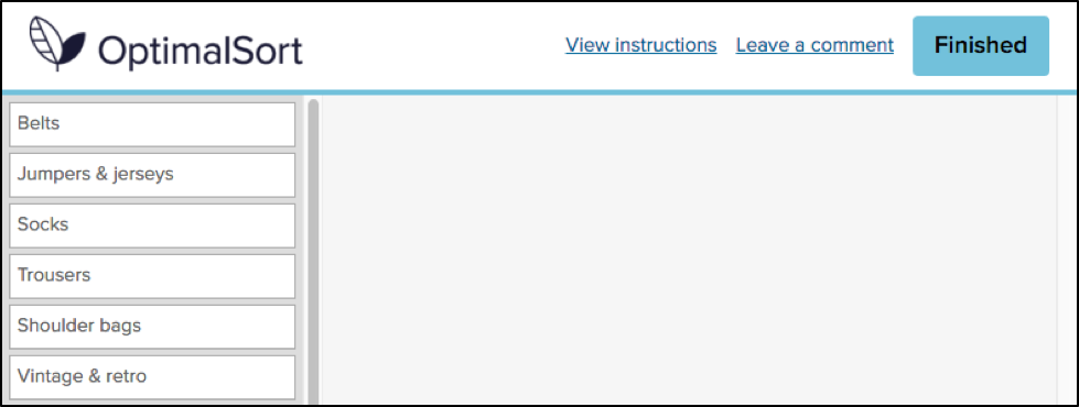
Closed card sorting involves providing participants with pre-defined categories into which they sort their cards. For example, you might be reorganizing the categories for your online clothing store for women. Your cards would have all the names of your products (e.g., “socks”, “skirts” and “singlets”) and you also provide the categories (e.g.,“outerwear”, “tops” and “bottoms”).
Open card sorting involves providing participants with cards and leaving them to organize the content in a way that makes sense to them. It’s the opposite to closed card sorting, in that participants dictate the categories themselves and also label them. This means you’d provide them with the cards only, and no categories.
Card sorting, whether open or closed, is very user focused. It involves a lot of thought, input, and evaluation from each participant, helping you to form the structure of your new IA.
Tree testing is a fantastic way to determine how your users are navigating your site and how they’re finding information. Your site is organized into a tree structure, sorted into topics and subtopics, and participants are provided with some tasks that they need to perform. The results will show you how your participants performed those tasks, if they were successful or unsuccessful, and which route they took to complete the tasks. This data is extremely useful for creating a new and improved IA.
Tree testing is an activity that requires participants to seek information, which is quite the contrast to card sorting. Card sorting is an activity that requires participants to sort and organize information. Each activity requires users to behave in different ways, so each method will give its own valuable results.
Tree testing and card sorting are complementary methods within your UX toolkit, each unlocking unique insights about how users interact with your site structure. The difference is all about direction.
Card sorting is generative. It helps you understand how users naturally group and label your content; revealing mental models, surfacing intuitive categories, and informing your site’s information architecture (IA) from the ground up. Whether using open or closed methods, card sorting gives users the power to organize content in ways that make sense to them.
Tree testing is evaluative. Once you’ve designed or restructured your IA, tree testing puts it to the test. Participants are asked to complete find-it tasks using only your site structure – no visuals, no design – just your content hierarchy. This highlights whether users can successfully locate information and how efficiently they navigate your content tree.
In short:
Using both methods together gives you clarity and confidence. One builds the structure. The other proves it works.
The right method depends on where you are in your IA journey. If you're beginning from scratch or rethinking your structure, starting with card sorting is ideal. It will give you deep insight into how users group and label content.
If you already have an existing IA and want to validate its effectiveness, tree testing is typically the better fit. Tree testing shows you where users get lost and what’s working well. Think of card sorting as how users think your site should work, and tree testing as how they experience it in action.
In this scenario, I’d recommend running a tree test first in order to find out how your existing IA currently performs. You said your gut instinct is telling you that your existing IA is pretty “broken”, but it’s good to have the data that proves this and shows you where your users get lost.
An initial tree test will give you a benchmark to work with – after all, how will you know your shiny, new IA is performing better if you don’t have any stats to compare it with? Your results from your first tree test will also show you which parts of your current IA are the biggest pain points and from there you can work on fixing them. Make sure you keep these tasks on hand – you’ll need them later!
Once your initial tree test is done, you can start your card sort, based on the results from your tree test. Here, I recommend conducting an open card sort so you can understand how your users organize the content in a way that makes sense to them. This will also show you the language your participants use to name categories, which will help you when you’re creating your new IA.
Finally, once your card sort is done you can conduct another tree test on your new, proposed IA. By using the same (or very similar) tasks from your initial tree test, you will be able to see that any changes in the results can be directly attributed to your new and improved IA.
Once your test has concluded, you can use this data to compare the performance from the tree test for your original information architecture.
Card sorting and tree testing aren’t rivals, view them as allies. Used together, they give you end-to-end clarity. Card sorting informs your IA design based on user mental models. Tree testing evaluates that structure, confirming whether users can find what they need. This combination creates a feedback loop that removes guesswork and builds confidence. You'll move from assumptions to validation, and from confusion to clarity – all backed by real user behavior.
