Subscribe to OW blog for an instantly better inbox
Oops! Something went wrong while submitting the form.

Hello, my name is Rick and I’m a sociologist. All together, “Hi, Rick!” Now that we’ve got that out of the way, let me tell you about how I use card sorting in my research. I'll soon be running a series of in-person, moderated card sorting sessions. This article covers why card sorting is an integral part of my research, and how I've designed the study toanswer specific questions about two distinct parts of society.
Card sorting,or pile sorting as it’s sometimes called, has a long history in anthropology, psychology and sociology. Anthropologists, in particular, have used it to study how different cultures think about various categories. Researchers in the 1970s conducted card sorts to understand how different cultures categorize things like plants and animals. Sociologists of that era also used card sorts to examine how people think about different professions and careers. And since then, scholars have continued to use card sorts to learn about similar categorization questions.
In my own research, I study how different groups of people in the United States imagine the category of 'religion'. Asthose crazy 1970s anthropologists showed, card sorting is a great way to understand how people cognitively understand particular social categories. So, in particular,I’m using card sorting in my research to better understand how groups of people with dramatically different views understand 'religion' — namely, evangelical Christians and self-identified atheists. Thinkof it like this. Some people say that religion is the bedrock of American society.
Others say that too much religion in public life is exactly what’s wrong with this country. What's not often considered is these two groups oftenunderstand the concept of 'religion' in very different ways. It’s like the group of blind men and the elephant: one touches the trunk, one touches the ears, and one touches the tail. All three come away with very different ideas of what an elephant is. So you could say that I study how different people experience the 'elephant' of religion in their daily lives. I’m doing so using primarily in-person moderated sorts on an iPad, which I’ll describe below.
The first step in the process was to generate lists of relevant terms for my subjects to sort. Unlike in UX testing, where cards for sorting might come from an existing website, in my world these concepts first have to be mined from the group of people being studied. So the first thing I did was have members of both atheist and evangelical groups complete a free listing task. In a free listing task, participants simply list as many words as they can that meet the criteria given. Sets of both atheist and evangelical respondents were given the instructions: "What words best describe 'religion?' Please list as many as you can.” They were then also asked to list words that describe 'atheism', 'spirituality', and 'Christianity'.
I took the lists generated and standardizedthem by combining synonyms. For example, some of my atheists used words like 'ancient', 'antiquated', and 'archaic' to describe religion. SoI combined all of these words into the one that was mentioned most: 'antiquated'. By doing this, I created a list of the most common words each group used to describe each category. Doing this also gave my research another useful dimension, ideal for exploring alongside my card sorting results. Free lists can beanalyzed themselves using statistical techniques likemulti-dimensional scaling, so I used this technique for apreliminary analysis of the words evangelicals used to describe 'atheism':

Now that I’m armed with these lists of words that atheist and evangelicals used to describe religion, atheism etc., I’m about to embark on phase two of the project: the card sort.
I’ll be conducting my card sorts in person, for various reasons. I have relatively easy access to the specific population that I’m interested in, and for the kind of academic research I’m conducting, in-person activities are preferred. In theory, I could just print the words on some index cards and conduct a manual card sort, but I quickly realized that a software solution would be far preferable, for a bunch of reasons.
First of all, it's important for me to conductinterviews in coffee shops and restaurants, and an iPad on the table is, to put it mildly, more practical than a table covered in cards — no space for the teapot after all.
Second, usingsoftwareeliminates the need for manual data entry on my part. Not only is manual data entry a time consuming process, but it also introduces the possibly of data entry errors which may compromise my research results.
Third, while the bulk of the card sorts are going to be done in person, having an online version will enable meto scale the project up after the initial in-person sorts are complete. The atheist community, in particular, has a significant online presence, making a web solution ideal for additional data collection.
Fourth, OptimalSort gives the option to re-direct respondents after they complete a sort to any webpage, which allows multiple card sorts to be daisy-chained together. It also enables card sorts to be easily combined with complex survey instruments from other providers (e.g. Qualtrics or Survey Monkey), so card sorting data can be gathered in conjunction with other methodologies.
Finally, and just as important, doing card sorts on a tablet is more fun for participants. After all, who doesn’t like to play with an iPad? If respondents enjoy the unique process of the experiment, this is likely to actually improve the quality of the data, andrespondents are more likely to reflect positively on the experience, making recruitment easier. And a fun experience also makes it more likely that respondents will complete the exercise.
Respondents will be handed an iPad Air with 4G data capability. While the venues where the card sorts will take place usually have public Wi-Fi networks available, these networks are not always reliable, so the cellular data capabilities are needed as a back-up (and my pre-testing has shown that OptimalSort works on cellular networks too).
The iPad’s screen orientation will be locked to landscape and multi-touch functions will be disabled to prevent respondents from accidentally leaving the testing environment. In addition, respondents will have the option of using a rubber tipped stylus for ease of sorting the cards. While I personally prefer to use a microfiber tipped stylus in other applications, pre-testing revealed that an old fashioned rubber tipped stylus was easier for sorting activities.

When the respondent receives the iPad, the card sort first page with general instructions will already be open on the tablet in the third party browser Perfect Web. A third party browser is necessary because it is best to run OptimalSort locked in a full screen mode, both for aesthetic reasons and to keep the screen simple and uncluttered for respondents. Perfect Web is currently the best choice in the ever shifting app landscape.

I'll give respondents their instructions and then go to another table to give them privacy (because who wants the creepy feeling of some guy hanging over you as you do stuff?). Altogether, respondents will complete two open card sorts and a fewsurvey-style questions, all chained together by redirect URLs. First, they'll sort 30 cards into groups based on how they perceive 'religion', and name the categories they create. Then, they'll complete a similar card sort, this time based on how they perceive 'atheism'.
Both atheist and evangelicals will receive a mixture of some of the top words that both groups generated in the earlier free listing tasks. To finish, they'll answer a few questions that will provide further data on how they think about 'religion'. After I’ve conducted these card sorts with both of my target populations, I’ll analyze the resulting data on its own and also in conjunction with qualitative data I’ve already collected via ethnographic research and in-depth interviews. I can't wait, actually. In a few months I’ll report back and let you know what I’ve found.
Wynyard Group is a market leader in risk management and crime fighting software used in investigations and intelligence operations by government agencies and financial crime organisations. Wynyard Group has recently joined the journey to incorporate a User Experience (UX) team into their family.
One of our first steps towards UX integration was to create a style guide that our web developers and UX designers can look to for styling, components and patterns. Our purpose was twofold: to help them create high-quality products that are visually and behaviourally consistent. And to free them up to focus on workflow, information architecture, and interaction design elements of the whole rather than the styling of individual parts.
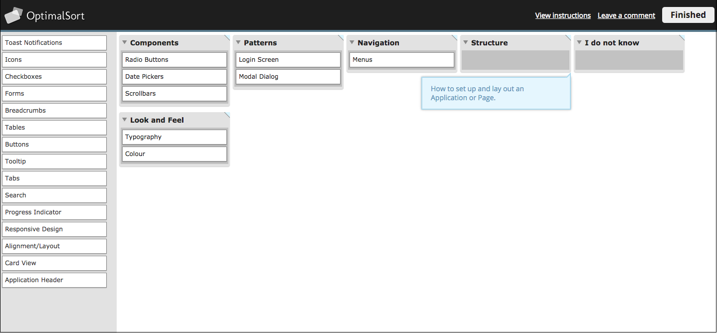
Wynyard currently uses Confluence as an internal wiki for information, so we added a section to it called 'User Experience' which included the subsections 'User Experience Tools' and 'Style Guide'. It then occurred to us that how we group and arrange elements of our style guide might be (probably will be) completely different to our web developers. Thus, we decided to run a card sort to make sure our style guide meets the needs of the audience. And because we're always looking for a chance to test out new technologies, our journey into card sorting with OptimalSort began.
A great idea when starting up new testing projects is to go back to the basics. I’d heard of card sorts before but had never been directly involved in one. So I hit the books, and in particular, Donna Spencer’s book Card Sorting: Designing Usable Categories. After reading through this and researching a few tools we came across OptimalSort. Our developers were spread across Christchurch and Auckland, so having an online tool was definitely a requirement. Having tested it out, I found it was very quick, easy, and customisable. I was sold.
To pick our card sort participants, I went to our internal message board (Yammer) and looked at the members of our Engineering Guild — Web Guild. We had 50 members at the time, but this included a mix of marketers, UX designers, architects, front and back-end developers, and anyone else who was interested in the messages being posted up for this group. Of this I took a subset of 20 that were most likely to be involved in implementing our designs. So I recruited the people that would be taking our wireframes or prototypes and integrating them into current products or new products.
I kicked the process off by creating a card sort that I could test on colleagues to get feedback before I opened it up to our main participants. Some of the cards tested well, while others were a little confusing, and feedback was given. The bonus about this was that while they were completing the test online, I was able to stand in the room and watch, asking and answering questions around the cards.
As with most things you try for the first time, my sort wasn’t ready. One point that came out quite quickly was that I had combined some cards that were process, such as Information Architecture and User Research, and others that could be explored through workplace education (style guide importance). Therefore, I could remove these as they clouded the areas that I wanted participants to group around.
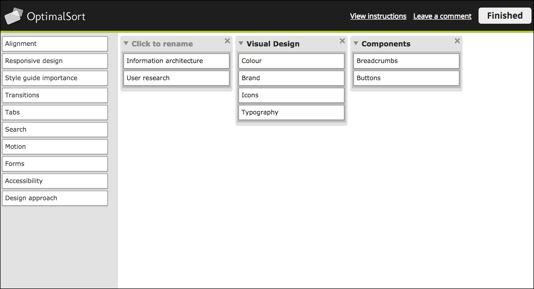
I made changes to the cards based on the feedback I received, and decided to go with a very simple approach with a limited amount of cards. This was because our participants hadn’t completed a card sort before, the card concepts may have been relatively new, and I wanted to see if we got any convergence to start off with. It was also a double check to see if I had created the correct cards. So, my first official card sort looked like this:
I published the sort, and emailed the link with an explanation out to our participants. And the results were … not what we had expected. To come up with this sort, I had ideated around base groups such as visual design, patterns, components and layout, then created cards to go under those categories. I was expecting very similar groupings and even category names to what I had come up with, but this was not quite the case.
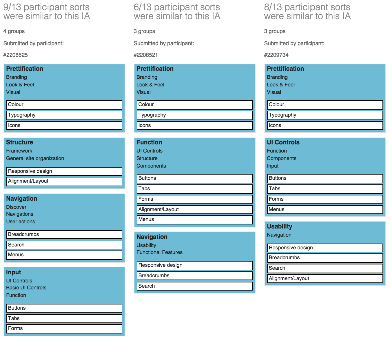
OptimalSort has some really good analysis tools that let you get into more detail behind how the participants grouped the cards. The two tools that we focused on were Participant-Centric Analysis (PCA), and the Similarity Matrix.This is the PCA, which displays common grouping among all participants, and some of the different labels.
And here's the Similarity Matrix:
Overall we had 16 responses, with 4 abandoned. We ended up including 2 of the abandoned results as they were fully complete but were not submitted. So all together that made for 12 participants from our web development team.From these we re-grouped and discussed the results. The first word to jump out was 'Prettification'.
Although this was the main grouping across participants, we decided to use 'Look & Feel' as we felt it connected more with our goals. We also didn’t want to associate visual design with the limitations of prettification, as it is much more than that. It was interesting to see that the cards tended to be grouped by overarching concepts of what the cards were used for (such as 'Navigation'), although more specific concepts such as 'Components' were used. The groupings were a cross between what we would have done in User Experience, and what the developers would call things.
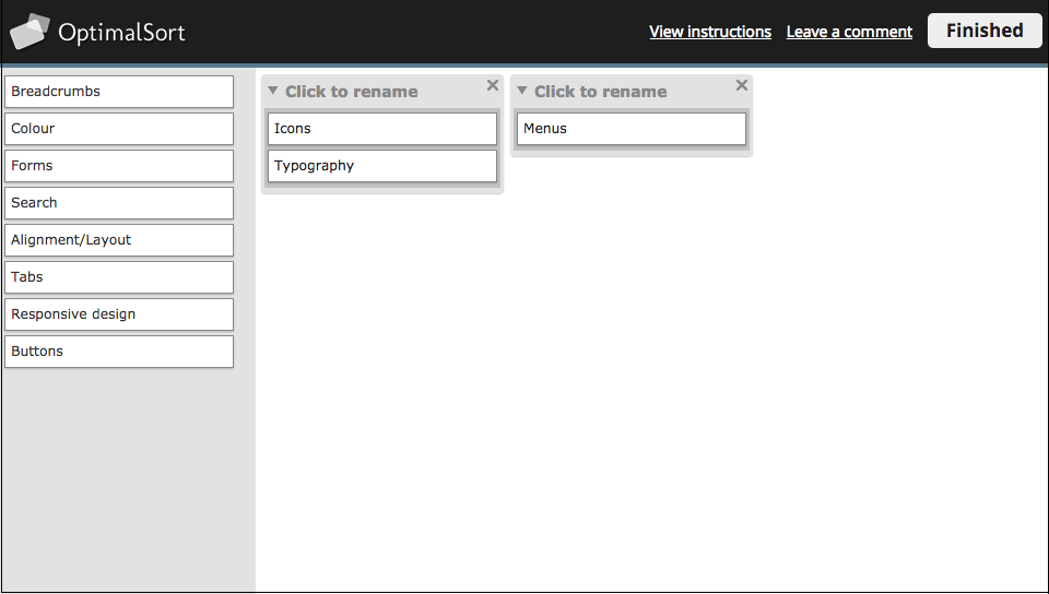
Then we decided to run a closed card sort. We decided to add more cards to see if there was convergence towards the categories they had made, and whether people could group what we believed were easier (ie. Buttons) versus the more difficult (ie Search) cards.
Most of the categories were taken from the results of the previous card sort, but patterns for us were also a very important concept that we wanted to include. By including definitions, we wanted to see if these group concepts were understandable:
The closed sort ended up with 10 completed responses and 4 abandoned. Below is a Popular Placement Matrix. It let us see very clearly where cards had been grouped, and the level of uncertainty around each.
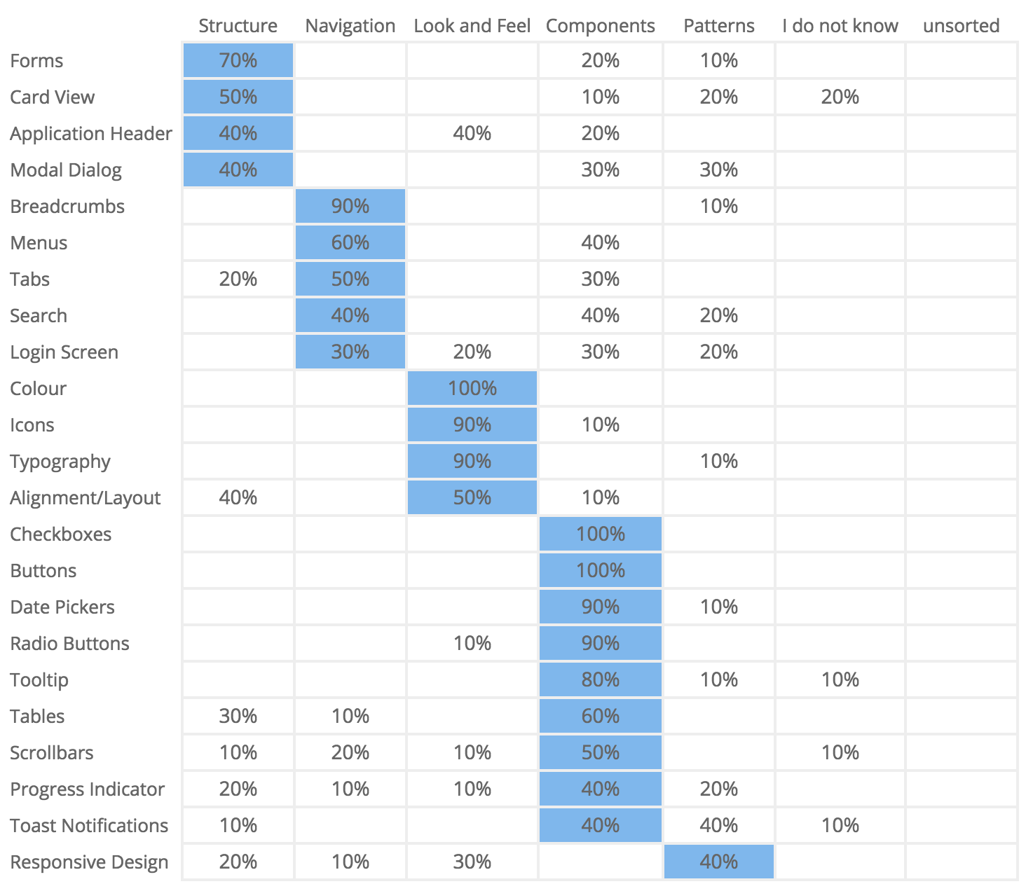
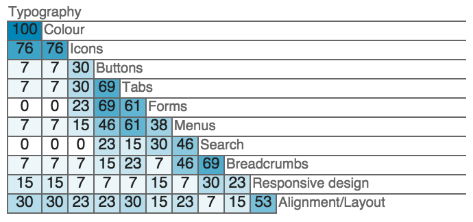
Our participants were relatively clear around what could be grouped under 'Components', such as Checkboxes (100%), and Buttons (100%). They also had high placement confidence around 'Look & Feel', such as Colour (100%), Icons and Typography (90%). The more complicated concept of Responsive Design, which we viewed as a more difficult card to sort, had a fairly even split leaning towards patterns.Some interesting points to note include that 40% thought that Search was part of 'Navigation', or 'Components', and only 20% thought it was a 'Pattern' (which is where we placed it).
The link to navigation could be because people associate search with navigation when they can’t find what they are looking for, or the information architecture has failed. It was also good to note that a majority of the cards were sorted into groups, instead of going into the 'I don’t know' category.Below is a Results Matrix which clearly shows how often cards were sorted into each category.
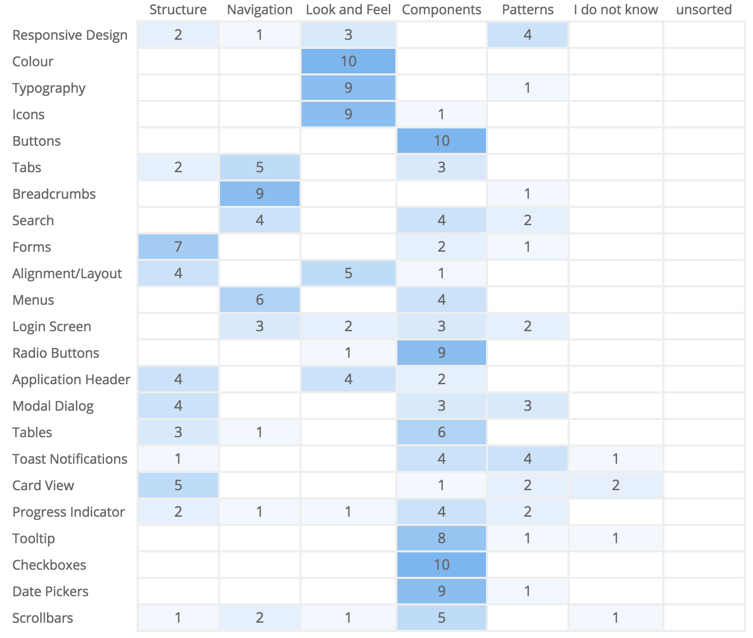
The Results Matrix also shows high confidence around the placement of components and visual elements. This gave us relatively good confidence that if we had an area called 'Visual Design - Look & Feel', and 'Components', our web developers would know what they might find within it. But we also had to acknowledge the uncertainty around some of the cards, shown by the low scores across a range of groups. We decided that 'Structure' was too complicated a concept, as some of the things that had been put under there were patterns, and there didn’t seem to be high confidence around placing cards in this category (other than forms). 'Patterns' was also not well understood, which validated the need to have workplace education and advocacy around them to raise awareness, as they were a grouping we wanted to keep.Overall we had some strong groupings, and some that would need changing or updating, and some that would involve further research and learning.
Overall the card sort was a great learning experience because it cemented the fact that our UX designers and our web developers have a crossover of terminology, but we also have differences. To get the best of both worlds, and to be able to present consistent groupings, we will have a mix from both, where some will require more description and learning than others.
Next steps when we pick up the style guide again will be to present what we have done internally to increase understanding. Then, depending on our direction, we'll run a tree test using Treejack to find out how our style guide structure is working, and if the same people can easily find what they are looking for.
Tweak, test, rinse and repeat.

Have you ever suggested doing an online card sort and been told no 'because the conversation in the room is the most valuable part of a card sort'? I have.
Repeatedly.
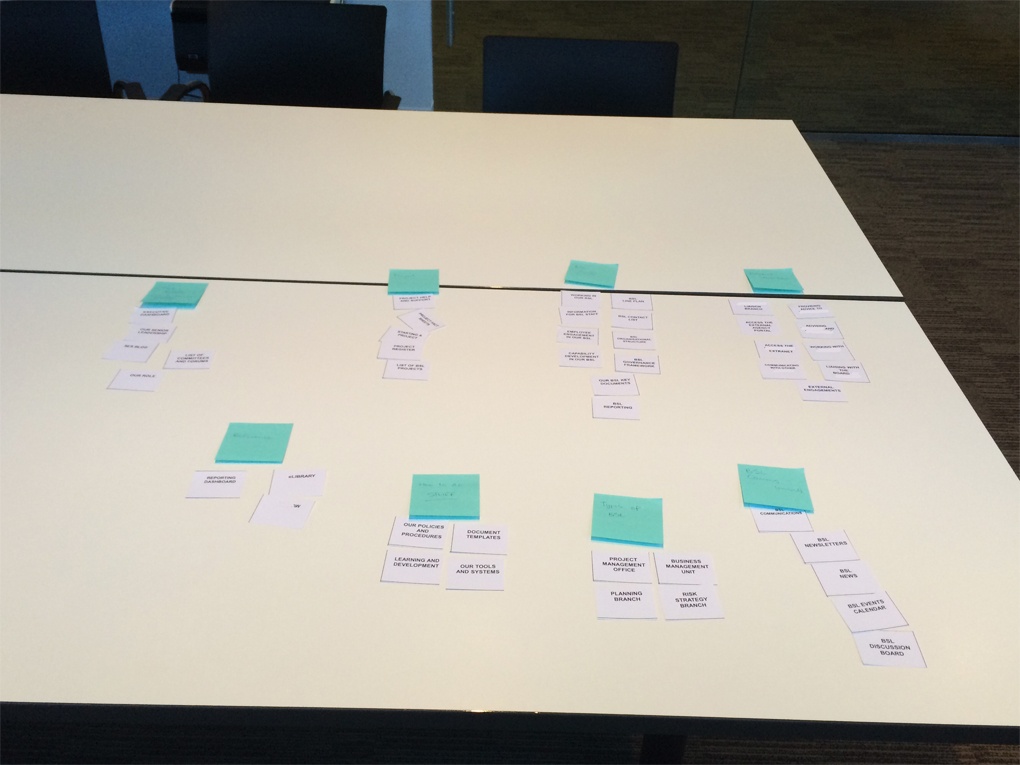
I decided it was time someone actually tested that theory. So when the opportunity came up at work, I jumped on the chance to run this experiment. My research task was to determine the information architecture (IA) for a business line’s area of the workplace intranet. I ran an A/B test with five face-to-face moderated card sorts, each with 2-3 users, and I ran twenty-five online card sorts using OptimalSort. I chose OptimalSort because I’d never used it before, and since I enjoyed using Treejack so much I thought I’d try it out. There were forty-five cards in total. I conducted both tests using only the resources available, mostly of the human variety.
In this piece, I examine the benefits and challenges of both techniques.
I love meeting users. It reminds me of why I do what I do and motivates me to continuously improve.
All five groups of 2-3 people worked well together and nobody had any reservations about sharing their thoughts. Each session was productive. I listened carefully and asked questions to help me understand why decisions were being made.
Working with paper. There’s something satisfying about moving pieces of paper around on a table and being able to cross things out and add new cards. The overall picture is so much clearer when the cards are all spread out in front of you. Users are more inclined to criticise the work at this early stage when it’s on paper and looks unresolved. It’s also inexpensive. Moderated card sorts allow you to spread all the cards out on the table in front of you and narrow it down from there.
Recruiting and organising users for the face to face card sort sessions took almost three days to complete! It was not easy trying to organise fifteen people into groups of three let alone book session times that everyone could agree upon! Even after all that, a few of the sessions still had no shows. I can forgive people their busy lives, but it’s still frustrating.
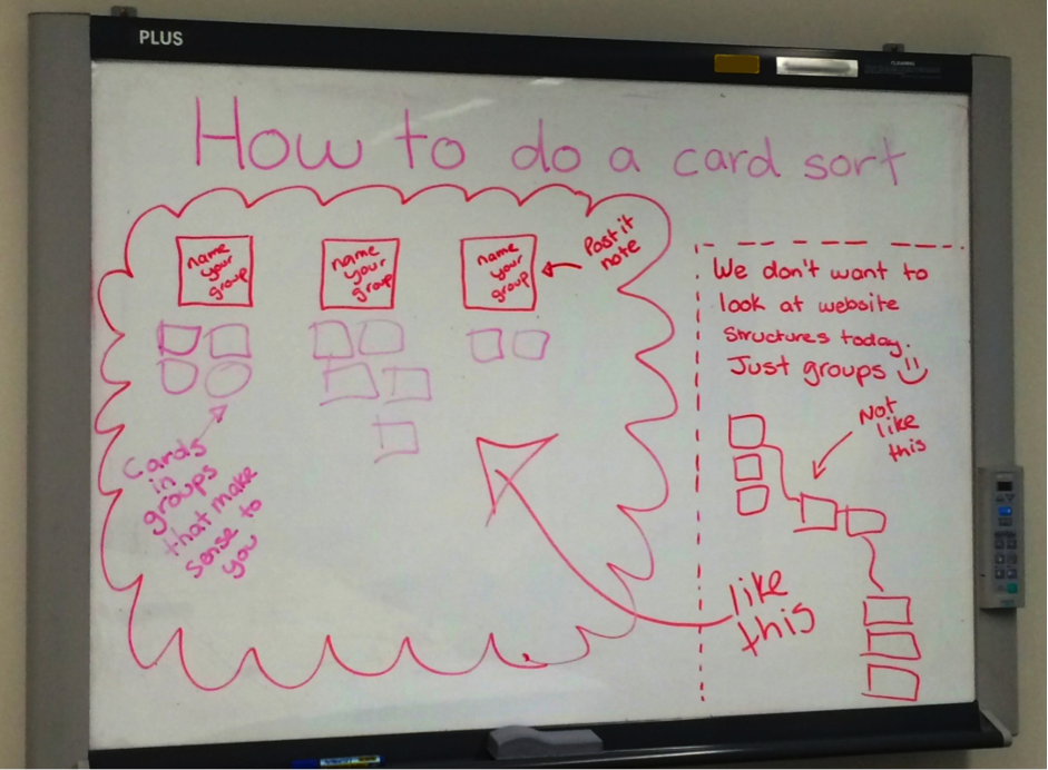
No matter how carefully and patiently I explained to the users that we were just grouping like things together, many felt the need to construct a tree structure. I chose to run this study with a flat hierarchy, for the purposes of understanding what belongs together and how users would name each high level group of information. It’s like as soon as users hear the word ‘website’ they have trouble detaching from what they know. Ultimately I solved this problem by sketching instructions on the whiteboard for each session. This gave users something visual to refer to and kept them focussed on what we all needed to achieve during the session.
I would have loved to have tried the moderated card sort the OptimalSort way with the barcode scanner, but unfortunately I just didn’t have access to one. As a result of this, I had to manually input the cards retrospectively from the moderated sorts into OptimalSort to take advantage of the amazing results graphs. That took a few hours. I know you can pick them up pretty cheap, so I’ll be prepared for next time.
This study received really positive comments from users that showed that they liked the activity were well and truly on board with the coming changes. Presenting positive feedback to executive staff is pretty powerful.
— 'This was an interesting exercise, thanks! I'm glad I got to do this individually via the online approach, rather than having to discuss it in a group: I much prefer solo activities to group ones, as it usually takes less time.'— 'Logical grouping is extremely important in finding information. I'm pleased you are looking at this.'
While it is entertaining to refresh the browser every five seconds to see if it has changed, OptimalSort really does take care of itself. The provided instructions are very useful and I did not receive a single phone call or email asking for help. This gave me time to start putting together the report and work on other projects, which saved both time and money.
You really can’t go past the beautiful yet useful way OptimalSort presents the results. These are charts that carry serious thud value when presented to management or executives because they back up your findings with actual numbers. The charts also make it incredibly easy to interpret the results and start iterating the next phase of the design. My personal favourite is the PCA (Participant-Centric Analysis) tab on the results dashboard. It provides advice on what you could do next when building your IA.
Basically, if OptimalSort had to pick a winning user submission, the first one would be it. It makes taking the next step in the design process that much easier.
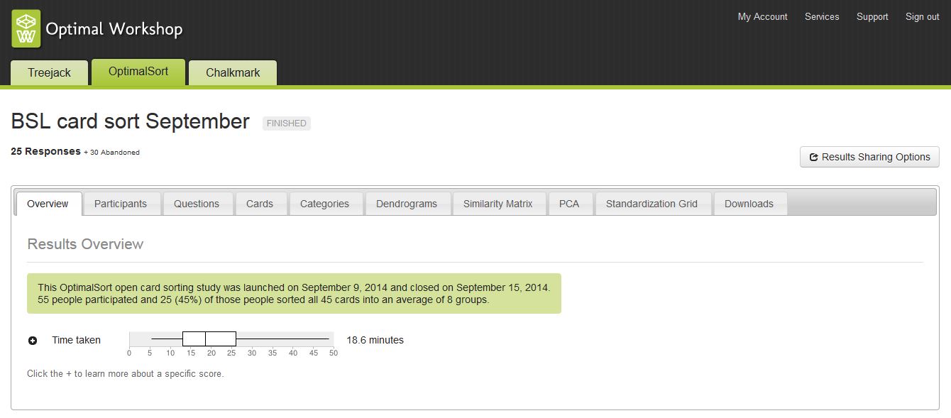
This study closed after one week with twenty-five completed responses and thirty abandoned responses. This is quite high; however I honestly don’t believe the tool itself to be the culprit. Of the thirty abandoned responses received, twenty-one of those participants ended the activity having sorted less than 5% of the cards. Of that number, twelve participants ended the task not having sorted any cards at all. This tells me that they may have been overwhelmed by the size of the task and felt unable to complete it, especially since they were at work after all and had competing priorities. Drawing on this experience, next time I will keep the survey short and sweet to avoid overwhelming the user.
I have a rule around online testing activities. All recorded responses are anonymous — even from me. I do this because I want users to feel comfortable and be willing to participate in future testing activities. I also feel that it preserves the integrity of the results and doesn’t allow for assumptions to come into play. Because of this, I don’t know who responded with what and I can’t ask questions if I’m not clear on something. Had I included some targeted post survey questions, this issue would have been avoided.
I always try to use softer colours to avoid scaring people on the opening screen, but you have to be careful with this one. The background colour is [Ed: was!] also the colour of the submit button on the card sorting screen and it appears against a black background. Choosing a colour that looks nice on your opening screen will not do you any favours when that same colour appears on the submit button and does not contrast well against the black background. Beyond the obvious accessibility issue, you also risk committing the crime of playing ‘Where’s Wally?’ with the user when they can’t find the button!This challenge does however have a happy ending. I mentioned this issue to Optimal Workshop and they fixed it! How awesome is that?!
They complemented each other! Despite the differences in delivery methods, both sets of card sort results told a similar story and each enriched the overall picture. There were no show-stopping differences or contradictions between the two. The themes of comments left in the online version also matched those overheard during the conversations in the moderated sorts.
— 'I was unsure what a couple of these actually meant; I would rename them to make their meaning explicit.' Comment left by a user from the online card sort— 'There’s too much jargon! Make it real and use language that people understand.' Comment made by a user during a moderated card sort
The biggest finding overall was that the user was grouping content by keywords and task related subjects. Not entirely groundbreaking information on its own, however it does break the current model which groups content by organisational structure and product owner. This study indicated that the users don’t see the organisational structure; they just want to solve a problem or find information without having to think about where it lives or who owns it. This research is valuable because we can now back up our design decisions with evidence. We can use this information to construct an IA that will actually work. It has also provided insights into user workflows and their understanding of the organisation as a whole.So, there you have it: mystery solved! But which card sorting activity wins?
Conduct a moderated card sort the OptimalSort way! This study has shown that on their own, moderated card sorts and online card sorts are both valuable in their own way. When combined, they join forces to create a powerful hybrid and it’s really easy to do. You still type your card labels into OptimalSort, but the difference is you print them out and each card has a barcode on it. The next step is to run your moderated card sort as you normally would. Then using a common barcode scanner, you would scan the cards back into OptimalSort and reap all the benefits of the result graphs and analysis tools. This approach gives you the qualitative face time with your users and the quantitative results to back up your thinking.
I really enjoyed running this experiment and I’m huge fan of A/B testing. I would love to hear your thoughts, and look forward to sharing my next discovery with you.
This morning Ieavesdroppeda conversation between Amy Worley (@worleygirl) and The SemanticWill™ (@semanticwill) on "the twitters".Aside from recommending two books by Donna Spencer (@maadonna), I asked Nicole Kaufmann, one of the friendly consultants at Optimal Usability, if she had any advice for Amy about reorganising 404 books into categories that make more sense.I don't know Amy's email address and this is much too long for a tweet. In any case I thought it might be helpful for someone else too so here's what Nicole had to say:In general I would recommend having at least three sources of information (e.g. 1x analytics + 1 open card sort + 1 tree test, or 2 card sorts + 1 tree test) in order to come up with a useful and reliable categorisation structure.Here are four options for how you could consider approaching it (starting with my most preferred to least preferred):
Taylor Swift's music has captivated millions, but what do her fans really think about her extensive catalog? We've crunched the numbers, analyzed the data, and uncovered some fascinating insights into how Swifties perceive and categorize their favorite artist's work. Let's dive in!
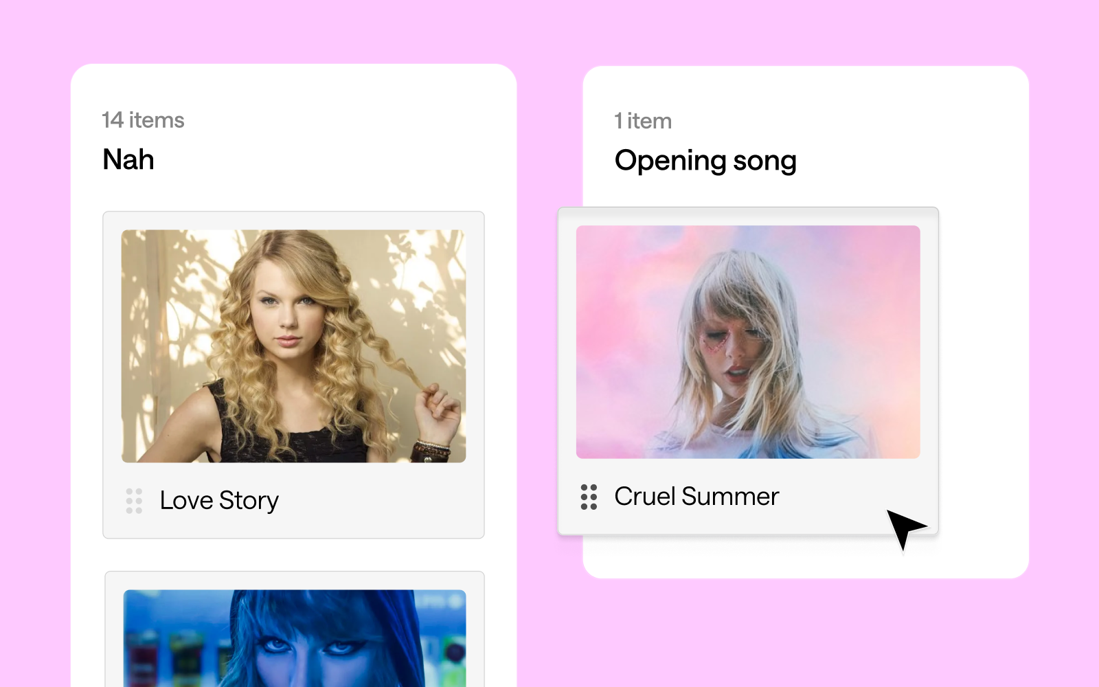
Our study asked fans to categorize Swift's songs into potential opening numbers, encores, and songs they'd rather not hear (affectionately dubbed "Nah" songs). The results? As diverse as Swift's discography itself!
Swifties seem to agree that high-energy tracks make for the best concert openers, but the results are more nuanced than previously suggested. "Shake It Off" emerged as the clear favorite for opening a concert, with 17 votes. "Love Story" follows closely behind with 14 votes, showing that nostalgia indeed plays a significant role. Interestingly, both "Cruel Summer" and "Blank Space" tied for third place with 13 votes each.
This mix of songs from different eras of Swift's career suggests that fans appreciate both her newer hits and classic favorites when it comes to kicking off a show. The strong showing for "Love Story" does indeed speak to the power of nostalgia in concert experiences. It's worth noting that "...Ready for It?", while a popular song, received fewer votes (9) for the opening slot than might have been expected.

When it comes to encores, fans seem to favor a diverse mix of Taylor Swift's discography, with a surprising tie at the top. "Slut!" (Taylor's Version), "exile", "Guilty as Sin?", and "Bad Blood (Remix)" all received the highest number of votes with 13 each. This variety showcases the breadth of Swift's career and the different aspects of her artistry that resonate with fans for a memorable show finale.
Close behind are "evermore", "Wildest Dreams", "ME!", "Love Story", and "Lavender Haze", each garnering 12 votes. It's particularly interesting to see both newer tracks and classic hits like "Love Story" maintaining strong popularity for the encore slot. This balance suggests that Swifties appreciate both nostalgia and Swift's artistic evolution when it comes to closing out a concert experience.

Interestingly, some of Taylor Swift's tracks found themselves on the "Nah" list, indicating that fans might prefer not to hear them in a concert setting. "Clara Bow" tops this category with 13 votes, closely followed by "You're On Your Own, Kid", "You're Losing Me", and "Delicate", each receiving 12 votes.
This doesn't necessarily mean fans dislike these songs - they might just feel they're not well-suited for live performances or don't fit as well into a concert setlist. It's particularly surprising to see "Delicate" on this list, given its popularity. The presence of both newer tracks like "Clara Bow" and older ones like "Delicate" suggests that the "Nah" list isn't tied to a specific era of Swift's career, but rather to individual song preferences in a live concert context.
It's worth noting that even popular songs can end up on this list, highlighting the complex relationship fans have with different tracks in various contexts. This data provides an interesting insight into how Swifties perceive songs differently when considering them for a live performance versus general listening.

Our similarity matrix revealed fascinating insights into how fans envision Taylor Swift's songs fitting together in a concert set list:
1. The "Midnights" Connection: Songs from "Midnights" like "Midnight Rain", "The Black Dog", and "The Tortured Poets Department" showed high similarity in set list placement. This suggests fans see these tracks working well in similar parts of a concert, perhaps as a cohesive segment showcasing the album's distinct sound.
2. Cross-album transitions: There's an intriguing connection between "Guilty as Sin?" and "exile", with a high similarity percentage. This indicates fans see these songs from different albums as complementary in a live setting, potentially suggesting a smooth transition point in the set list that bridges different eras of Swift's career.
3. The show-stoppers: "Shake It Off" stands out as dissimilar to most other songs in terms of placement. This likely reflects its perceived role as a high-energy, statement piece that occupies a unique position in the set list, perhaps as an opener, closer, or peak moment.
4. Set list evolution: There's a noticeable pattern of higher similarity between songs from the same or adjacent eras, suggesting fans envision distinct segments for different periods of Swift's career within the concert. This could indicate a preference for a chronological journey through her discography or strategic placement of different styles throughout the show.
5. Thematic groupings: Some songs from different albums showed higher similarity, such as "Is It Over Now? (Taylor's Version)" and "You're On Your Own, Kid". This suggests fans see them working well together in the set list based on thematic or emotional connections rather than just album cohesion.
This card sort data paints a picture of an artist who continually evolves while maintaining certain core elements that define her work. Swift's ability to create cohesive album experiences, make bold stylistic shifts, and maintain thematic threads throughout her career is reflected in how fans perceive and categorize her songs. Moreover, the diversity of opinions on song categorization - with 59 different songs suggested as potential openers - speaks to the depth and breadth of Swift's discography. It also highlights the personal nature of music appreciation; what one fan sees as the perfect opener, another might categorize as a "Nah".
In the end, this analysis gives us a fascinating glimpse into the complex web of associations in Swift's discography. It shows us not just how Swift has evolved as an artist, but how her fans have evolved with her, creating deep and sometimes unexpected connections between songs across her entire career. Whether you're a die-hard Swiftie or a casual listener, or a weirdo who just loves a good card sort, one thing is clear: Taylor Swift's music is rich, complex, and deeply meaningful to her fans. And with each new album, she continues to surprise, delight, and challenge our expectations.
This deep dive into the Swiftie psyche through a card sort reveals the complexity of Taylor Swift's discography and fans' relationship with it. From strategic song placement in a dream setlist to unexpected cross-era connections, we've uncovered layers of meaning that showcase Swift's artistry and her fans' engagement. The exercise demonstrates how a song can be a potential opener, mid-show energy boost, poignant closer, or a skip-worthy track, highlighting Swift's ability to create diverse, emotionally resonant music that serves various roles in the listening experience.
The analysis underscores Swift's evolving career, with distinct album clusters alongside surprising connections, painting a picture of an artist who reinvents herself while maintaining a core essence. It also demonstrates how fan-driven analyses like card sorting can be insightful and engaging, offering a unique window into music fandom and reminding us that in Swift's discography, there's always more to discover. This exercise proves valuable whether you're a die-hard Swiftie, casual listener, or someone who loves to analyze pop culture phenomena.
