Subscribe to OW blog for an instantly better inbox
Oops! Something went wrong while submitting the form.

User research is vital to the product development process as it helps product teams understand their users' needs, behaviors, preferences, and pain points. By gathering insights from various research methods, such as user interviews, surveys, usability testing, and analytics data, product teams can make informed decisions based on evidence, rather than assumptions or personal opinions.
A UX research repository is a centralized database that stores all user research conducted by a product team, making it easily accessible and shareable across the entire team. There are many benefits to having a UX research repository, such as saving time and resources, enabling data-driven decision-making, and keeping everyone on the product team informed about user needs and preferences.
Specialized tools, like the Treejack tool, can make UX research easier, quicker, and more collaborative. In this article, we’ll discuss a bunch of tools and how they can (and should!) contribute to a centralized UX research repository.
A centralized UX research repository is a valuable asset for product teams to store and access research data related to user experience. It enables product managers and development teams to better understand their user's behavior, preferences, and expectations, which in turn enables them to make informed design and development decisions.
One of the key benefits of UX research repositories, like the Reframer tool, is that it saves time and resources. By storing user research data in one central location, teams can easily access and reuse existing research data. This saves them from having to conduct the same research repeatedly, which can be a waste of precious time and resources. Additionally, a centralized UX research repository can help teams to identify gaps in their research and prioritize areas for future research.
Another advantage of a UX research repository is that it facilitates collaboration across the entire team. With a central repository, research findings can be shared and discussed, enabling cross-functional collaboration. This promotes transparency and helps to ensure that everyone is working towards the same goals. It also helps to avoid duplication of effort, as team members can easily see what others have done, and what is still required.
Additionally, a UX research repository helps to ensure consistency in research practices. By defining research methodology, protocols, and use of prescribed specialized tools, product teams can collect data systematically and compare findings across different studies. This helps to ensure that the insights gained from user research are reliable and accurate, which in turn can be used to guide design decisions.
A UX research repository helps product managers in several ways, including supporting informed product decisions, enhancing the user experience, and providing stakeholders with evidence-based research.
One of the significant advantages of a UX research repository is that it provides product managers with a wealth of data to make informed product decisions. Through usability testing, user interviews, and first-click testing (check out the Chalkmark tool), product managers can gain insights into how users interact with their products, what they like and dislike, and how they use them. By storing all this data in a central repository, product managers can quickly access all research data, not just their own, to inform their decisions about product development and design.
Another advantage of a UX research repository is that it helps to enhance user experience. Using video clips and other multimedia, product managers can share research findings with their team members and stakeholders, making it easier to understand user needs and preferences. This helps ensure that the product design is aligned with user needs, resulting in a better user experience.
Finally, a UX research repository provides stakeholders with evidence-based research to support product decisions. By presenting research findings to stakeholders, product managers can confidently stand behind future recommendations and iterations. This evidence-based approach helps to demonstrate that decisions are grounded in data and not just intuition or opinion.
Specialized tools are essential for conducting high-quality UX research as they provide User Researchers with powerful data collection, analysis, and visualization features. These tools are particularly useful for conducting usability testing, user interviews, and surveys, as they help researchers to gather reliable and accurate data from users. Integrating these specialized tools into a UX research repository can help product teams to streamline their research process and facilitate collaboration within the team.
One such specialized tool is Treejack, which helps researchers to test the information architecture of a product or website. By using Treejack, researchers can review how users interact with navigation, site structure, and content, to ensure users can quickly and easily find the information they need. The results can then be stored in a UX research repository, allowing the team to access and analyze the data at any time.
Chalkmark is another tool that can enhance the quality of research by providing heatmaps and click-density grids of user interactions. These interactions can be tested on mockups and wireframes. Chalkmark helps researchers to identify where users are clicking and which areas are receiving the most attention, providing valuable insights for product design. By integrating Chalkmark into a UX research repository, product teams can store and access the data, making it easier to share insights and collaborate on product development.
Another useful tool is Reframer, which helps researchers to capture insights from user interviews and user testing sessions. Reframer enables researchers to record and transcribe interviews, tag key insights, and share findings with the team - acting as a functional research repository.
User interviews and usability testing are used in UX research to gather insights into user behavior, needs, and preferences. User interviews involve a one-on-one conversation between a User Researcher and a participant, where the researcher asks open-ended questions to understand the user's perspective. Usability testing, on the other hand, involves observing users as they interact with a product to identify usability issues.
Specialized tools play a crucial role in conducting user interviews and usability testing efficiently and effectively. These tools can help with data collection, organization, and analysis, making the research process more streamlined and insightful.
OptimalSort is a specialized tool that aids in conducting card sorting activities for usability testing. Card sorting involves asking users to organize concepts or items into categories to understand how they think about and categorize information. The OptimalSort tool enables researchers to conduct card sorting activities remotely and collect data on how participants group and label items. The tool also generates data visualizations and reports that can be added to the UX research repository for further analysis.
Optimal Workshop’s Reframer tool, mentioned earlier, has been designed specifically to enable researchers to capture and organize interview data in real-time. Researchers can tag and categorize interview data, making it easier to analyze and identify patterns across participants. It then stores this information in a centralized location for all research insights. Reframer also generates reports and data visualizations, making data efficient to share and analyze across teams.
A UX research repository empowers entire teams to make informed product decisions, enhance user experiences, and provide stakeholders with evidence-based research. They can also support awareness and participation in UX among senior leaders, encouraging further research.
Teams are increasingly using specialized tools like Treejack, Chalkmark, OptimalSort, and Reframer to conduct high-quality UX research as they provide powerful data collection, analysis, and visualization features. By using these tools together, product teams can streamline their research process and facilitate improved collaboration within the team.
Are you interested in the benefits of a UX research repository? Check out how Optimal Workshop’s specialized research tools can add value to not only the quality of your data, but how your team collects, analyzes, and shares the results!

In many ways, Information architecture (IA) is the backbone of a digital product or service. It is a conceptual structure for information, designed in a way that allows users to navigate and interact with it in a meaningful way. This is done by organizing, structuring, and labeling content that is intuitive for users. IA considers user needs and goals, as well as the relationships between different types of content, in order to create a user-centric design.
An effective IA design approach leads to better user experiences as it ensures that information is presented in a logical and intuitive way. Essentially, good IA attempts to reduce the chance of a clunky, frustrating user experience by organizing information in a way that makes sense for the target user.
In this article, we’ll discuss the history of information architecture and how user research impacts its effectiveness. We’ll also discuss the roles of conceptual and structural design in user experience. And along the way, we’ll introduce Optimal Workshop’s IA tools, and how they can help you design exceptional IA.
The world is full of information and humans have always had a knack for structuring and organizing it. Take libraries, for example. In ancient Egypt, workers in the Library of Alexandria created a catalog of 120 scrolls to order and describe the inventory. They needed to - estimates of the number of scrolls the library contained range between 40,000 and 400,000! Fast-forward to 1873, and Melvil Dewey came up with the Dewey Decimal System to further categorize and universalize much larger collections of books. Why come up with these solutions? To efficiently comb through, and navigate, masses of information.
As computer technology started to rise more prominently in the 1950s and 1960s, we started organizing computer programs and system designs in a way that made them easier to navigate too. In fact, IBM first mentioned the term architecture in a computational context in 1959 [ref]. When the wonderful ‘worldwide web’ was born in the 1990s, digital information began to be displayed and interacted with on a much larger scale. And, like our librarians, the world decided that online order was desperately needed. This is where the foundations of information architecture as we know it today really started to take shape.
In 1998, Peter Morville and Louis Rosenfeld wrote the book ‘Information Architecture for the World Wide Web’, which became Amazon’s best internet book that year. The authors integrated the ‘librarian’ approach to IA, where the main goal is to design a system where information is labeled for easy navigation and search. This focus on user-centric, logical design has become the backbone of user experience (UX) design today, and why Optimal Workshop’s Treejack tool, among other, exist for researching and designing great IA.
Information architecture is like the blueprint of your digital product - it’s a conceptual structure of how content is organized and arranged to create seamless interactions. But, no matter how much experience you have, or how much you trust your instincts, you will never truly get inside your end users' minds without performing user research. They will be the ones to tell you what information is relevant to them, how to structure it, and even how to label and categorize it.
There are some best practices for organizing information. Start by ordering your content from most critical to least. Think like a web page. What will immediately engage a user, and what subsequent content will keep them engaged? This exercise helps to prioritize and order content. Next, think about how your information should be grouped or categorized. Content that is grouped intuitively helps users consume and navigate information on your website or digital product. Another useful exercise is to consider how different users might access your content. Mapping user journeys (often with entirely different users in mind), challenges how you design your organizational structures in a way that meets multiple users' needs.
But, while those principles can get you started, user research is where designing modern, user-centric products really begins. In terms of information architecture and organizing content, card sorting is one of the most effective ways of designing conceptual structures. Card sorting, executed by Optimal Workshop’s OptimalSort tool, for example, involves asking people to arrange things like labels, articles, and products in a way that makes sense to them. People are different, and the benefit of this technique is that you can identify how information is most commonly organized. It also highlights potential ambiguity that you may need to address early on in the design of your IA.
The roles of conceptual and structural design in user experience are crucial in the development of effective information architecture and user experience (UX) design. Conceptual design involves the creation of a high-level, abstract representation of the overall structure of the information architecture, which helps designers to understand the content, functionality, and overall user experience. Generally, there are limited or no restrictions as to what shape the design can take. Structural design, on the other hand, involves the development of the actual information architecture, including the organization of content, navigation systems, and interaction design.
Effective conceptual and structural design can significantly improve user experience by creating a clear and consistent design language. This allows your target users to easily understand and navigate through content, leading to better engagement and satisfaction. Essentially, well-structured IA can increase the accessibility of content, making it easier for users to find the information they are looking for, regardless of their level of experience with the website or digital product.
Tools such as Optimal Workshop's Chalkmark tool can help designers to test and validate their conceptual and structural design decisions by enabling them to create and analyze user interactions with information architecture. This helps designers identify areas of the structure that are confusing or difficult to navigate, which can then be streamlined to create a more intuitive user experience.
As we discussed earlier, modern information architecture is no longer limited to physical implementation, like libraries, but instead extends to digital platforms and software applications. With the rise of the internet and mobile devices, IA has become a critical aspect of UX design. The focus has shifted from organizing information in a static, hierarchical manner to creating dynamic and interactive information environments that adapt to the needs of individual users.
One of the key changes in IA has been the shift towards a more user-centered design approach. This involves creating IA that is tailored to the needs and preferences of specific user groups, such as individuals with disabilities or users with different levels of technical expertise. This approach requires a deep understanding of user needs and behaviors, which is achieved through research and user testing. This research is increasingly done remotely and online using a suite of tools, like those provided by Optimal Workshop.
Optimal Workshop's Reframer tool, for example, allows designers to collaborate and capture user insights and translate them into design solutions. This tool helps designers to identify patterns in user behavior and preferences, enabling them to create IA that is intuitive and easy to use.
As technology continues to evolve, IA is likely to become even more integral to UX design. With the emergence of new technologies such as artificial intelligence, virtual and augmented reality, designers will need to create IA that is capable of adapting to these new interfaces and provide solid structures that lead to seamless user experiences.
Information architecture is an essential aspect of user experience design that involves organizing, structuring, and labeling digital content in a way that makes it easy for users to find and understand. Great IA leads to better user experiences by presenting information in intuitive and logical designs. This is why information architecture is crucial for website design.
The history of IA as we know it today dates back to the 1950s and evolved with the rise of the internet. Now, we think of modern IA design as being user-centric, which involves in-depth research to understand users' needs and goals. Optimal Workshop's IA tools, such as Treejack, OptimalSort, and Chalkmark, can help designers create exceptional IA by testing and validating conceptual and structural designs.
Well-structured information architecture can significantly improve the accessibility of content, which leads to better engagement and user satisfaction. This will become increasingly important as users interact with technology through new mediums, like virtual and augmented reality. So, remember to set solid foundations by investing in IA design when you start your next project!
A great user experience (UX) is one of the largest drivers of growth and revenue through user satisfaction. However, when budgets get tight, or there is a squeeze on timelines, user research is one of the first things to go. Often at the cost of user satisfaction.
This short sighted view can mean project managers are preoccupied with achieving milestones and short term goals. And UX teams get stuck researching products they weren’t actually involved with developing. As a result no one has the space and understanding to really develop a product that speaks to users needs, desires and wants. There must be a better way to produce a product that is user-driven. Thankfully there is.
User research is an important part of the product development process. Primarily, user research involves using different research methods to gather information about your end users.
Essentially it aims to create the best possible experience for your users by listening and learning directly from those that already or potentially will use your product. You might conduct interviews to help you understand a particular problem, carry out a tree test to identify bottlenecks or problems in your navigation, or do some usability testing to directly observe your users as they perform different tasks on your website or in your app. Or a combination of these to understand what users really want.
To a project manager and team, this likely sounds fairly familiar, that any project can’t be managed in a silo. Regular check-ins and feedback are essential to making smart decisions. The same with UX research. It can make the whole process quicker and more efficient. By taking a step back, digging into your users’ minds, and gaining a fuller understanding of what they want upfront, it can curtail short-term views and decisions.
Bringing more user research into your development process has major benefits for the team, and the ultimately the quality of that final product. There are three key benefits:
As a project manager, making space and planning for user research can be one of the best ways to ensure the team is creating a product that truly is user-driven.
There are a couple of ways you can bring UX research into your product development process.
It can be more difficult to integrate UX research throughout the process, as it means planning the project with various stages of research built in to check the development of features. But ultimately this approach is likely to turn out the best product. One that has been considered, checked and well thought out through the whole product development process. To help you on the way we have laid out 6 key steps to help you integrate UX research into your product development process.
Take a step back, look at your product and define your research questions.
It may be tempting just to ask, ‘do users like our latest release?’ This however does not get to why or what your users like or don’t like. Try instead:
These questions help to form the basis of specific questions about your product and specific areas of research to explore which in turn help shape the type of research you undertake.
With a few key research questions to focus on, it’s time to create your research plan.
A great research plan covers your project’s goals, scope, timing, and deliverables. It’s essential for keeping yourself organized but also for getting key stakeholder signoff.
Every project plan requires attention to detail including a user research project. And with any good project there are a set of steps to help make sense of it.
Many user research methods benefit from an observational style of testing. Particularly if you are looking into why users undertake a specific task or struggle.
Typically, there are two approaches to testing:
It’s time to gather insights and data. The questions you are asking will influence how you run your research sessions and the methods you’ve chosen.
If you are running surveys you will be asking users through a banner or invitation to fill out your survey. Unmoderated and very specific questions. Gathering qualitative data and analyzing patterns.
If you’re using something qualitative like interviews or heat mapping, you’ll want to implement software and gather as much information as possible.
Analyze your findings, interrogate your data and find those insights that dive into the way your users think. How do they love your product? But how do they also struggle?
Pull together your findings and insights into an easy to understand report. And get socializing. Bring your key stakeholders together and share your findings. Bringing everyone across the findings together can bring everyone on the journey. And for the development process can mean decisions can be user-driven.
Part of any project, UX research should be essential to developing a product that is user-driven. Integrating user research into your development process can be challenging. But with planning and strategy it can be hugely beneficial to saving time and money in the long run.
Many organizations are aware that staying relevant essential for their success. This can mean a lot of things to different organizations. What it often means is coming up with plenty of new, innovative ideas and products to keep pace with the demands and needs of the marketplace. It also means keeping up with the expectations and needs of your users, which often means shorter and shorter product development life cycle times. While maintaining this pace can be daunting, it can also be seen as a strength, tightening up your processes and cutting out unnecessary steps.
A vital part of developing new (or tweaking existing) products is considering the end user first. There really is no point in creating anything new if it isn’t meeting a need or filling a gap in the market. How can you make sure you are hitting the right mark? Ask your users. We look into some of the key user research methods available to help you in your product development process.
If you want to know more about how to fit research into your product development process, take a read here.
User experience (UX) research, or user research as it’s commonly referred to, is an important part of the product development process. Primarily, UX research involves using different research methods to gather qualitative and quantitative data and insights about how your users interact with your product. It is an essential part of developing, building, and launching a product that truly meets the needs, desires, and requirements of your users.
At its simplest, user research is talking to your users and understanding what they want and why. And using this to deliver what they need.
User research is an essential part of the product development process. By asking questions of your users about how your product works and what place it fills in the market, you can create a product that delivers what the market needs to those who need it.
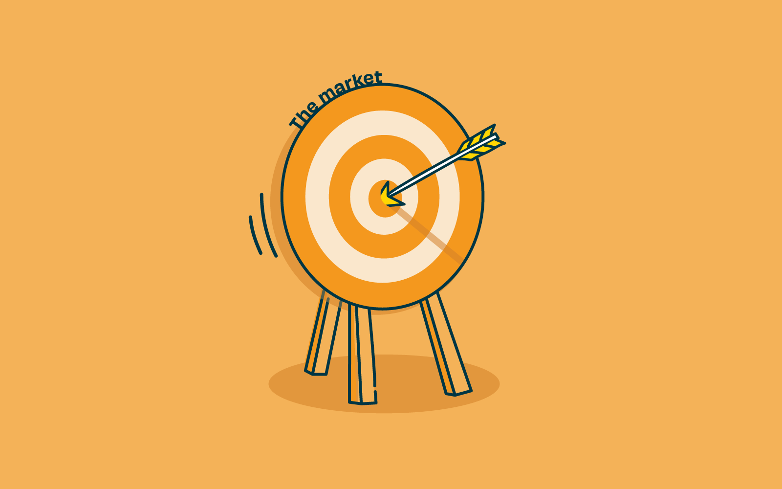
Without user research, you could literally be firing arrows in the dark, or at the very best, working from a very internal organizational view based on assuming that what you believe users need is what they want. With user research, you can collect qualitative and quantitative data that clearly tells you where and what users would like to see and how they would use it.
Investing in user research right at the start of the product development process can save the team and the organization heavy investment in time and money. With detailed data responses, your brand-new product can leapfrog many development hurdles, delivering a final product that users love and want to keep using. Firing arrows to hit a bullseye.
Qualitative research is about exploration. It focuses on discovering things we cannot measure with numbers and typically involves getting to know users directly through interviews or observation.
One of the best ways to learn about your users and how they interact with your new product is to observe them in their own environment. Watch how they accomplish tasks, the order they do things, what frustrates them, and what makes the task easier and/or more enjoyable for your subject. The data can be collated to inform the usability of your product, improving intuitive design and what resonates with your users.
Reviewing products already on the market can be a great start to the product development process. Why are your competitors’ products successful? And how well do they behave for users? Learn from their successes, and even better, build on where they may not be performing as well and find where your product fills the gap in the market.
Quantitative research is about measurement. It focuses on gathering data and then turning this data into usable statistics.
Surveys are a popular user research method for gathering information from a wide range of people. In most cases, a survey will feature a set of questions designed to assess someone’s thoughts on a particular aspect of your new product. They’re useful for getting feedback or understanding attitudes, and you can use the learnings from your survey of a subset of users to draw conclusions about a larger population of users.
Gathering information on your users during the product development process and before you invest time and money can be hugely beneficial to the entire process. Collating robust data and insights to guide the new product development and respond directly to user needs, and filling that all-important niche. Undertaking user experience research shouldn’t stop at product development but throughout each and every step of your product life cycle. If you want to find out more about UX research throughout the life cycle of your product, take a read of our article UX research for each product phase.
Sitting inside any beautifully crafted and designed digital product, there must be a fully functional and considered information architecture.
As much as information architecture shouldn’t be developed in a vacuum. Neither should the design and look of digital products. In fact, a large proportion of the function of digital designers is devoted to supporting users locating content they need and driving them towards content that the product owners want them to find.
Incorporating visual markers to make sure that certain content is distinct from the rest or creating layers that demonstrate the diverse content on a product.
If you do not have quality content, it is impossible to design a quality digital product. It all comes back to creating a user experience that makes sense and is designed to make task completion simple. And this relates back to designing the product with the content planned for it in mind.
As a designer, the more you know about information architecture, the better the products you design will meet your user requirements and deliver what they need. If you work with an information architect, even better. If you’re still learning about information architecture the 8 Principles according to Dan Brown is a great place to begin.
If you haven’t come across Dan Brown yet, you have more than likely come across his 8 principles. Dan Brown is one of the UX world's most prolific experts with a career that spans most areas of UX designs. He’s written 3 books on the subject and experience across a multitude of high profile projects. Aiding large organizations to make the most of their user experience.
It’s highly likely that you’ve already used some, or all, of these IA principles in your designs. Don’t be shy about mastering them, or at the very least be familiar. They can only help you become a better user experience designer.
Mastering the 8 principles, according to IA expert Dan Brown will see you mastering the complex tasks of information architecture. Understanding IA is key to creating digital designs with a content structure that is functional, logical and just what your users need to navigate your product. Design without good IA doesn’t work as well, just as a content structure without a well designed interface will not engage users.
According to Abby Covert, a leader in the field of information architecture, IA is ‘the way we arrange the parts to make sense of the whole.’ Information architecture (IA) is found in every digital product, from websites and apps to an intranet.
For the purposes of this article we focus on the importance of information architecture to user experience (UX) design because IA is fundamentally important to the success of your user experience. It determines how users will access your content and ultimately how successful their experience is when using your product.
When put like this it does seem pretty straightforward. Maybe even simple? But these tasks need to be straightforward for your users. Putting thought, time and research in at the front of your design and build can help build an intuitive product. IA is the structure that sits in behind and allows the design to tell the story and the content to be found in an easy way.
Information architecture forms the framework for any UX design project. You need to consider the visual elements, functionality, interaction, and navigation and if they are built according to IA principles. If not considered fully even the most compelling content and powerful user experience design can fail without an organized and functional IA design. Disorganized content can make finding your way through difficult, meaning users get lost, annoyed and frustrated. Frustrated users don’t stick around and most likely don’t come back.
Through solving or preempting users’ issues with research and designing powerful and effective IA it reduces usability and navigation problems. Meaning that researched, thought through and designed information architecture can save both money and time for your organization in the longer term.
Often it can be confusing that there isn’t much difference between IA and UX design. While these terms do relate to each other and need to be considered alongside, they are not one and the same.
“Information architecture (IA) is the discipline of making information findable and understandable, helping people understand their surroundings and find what they’re looking for online and in the real world” - Interaction Design
“User experience (UX) design is the process design teams use to create products
that provide meaningful and relevant experiences to users” - Interaction Design
UX design is well grounded with good functional information architecture but that’s not where it stops. The user experience focus is on influencing users’ behaviors and actions through emotion and psychology. Information architecture is focussed on the users' goals and task completion. They work together to create the very best user experience. IA provides the foundation of a well organized space that is easy to navigate and UX design ensures that the overall experience meets (or exceeds) users’ expectations, through their wants, needs and desires.
There are four key components to consider when building a strong information architecture:
How information is named and represented. Labels need to communicate information to users without using too much space or requiring much work on the user’s part.
How people make their way through information. Without robust IA which has been thought through this is the quickest way to confuse users. If they can’t find their way to the information they need, they won’t be able to complete their task. It really is that simple.
How people will look for information (keywords, categories). A search system is especially important when there is a lot of content to wade through. A search engine, filters, and many other tools help users search content. Great UX design will consider how the information will be displayed once searched.
How the information is ordered. These help users to predict where they can find information easily:
Information architecture is a key part of a powerful user experience design. Efficient IA helps users quickly and easily move through content and find what they want. And what do users want but to find what they want, complete their task and get on with their day!
Provide an IA that functions well, is intuitive to use and well labeled, coupled with UX design that is smooth, attractive and responds to users needs, wants and desires and you’ll have a winner on the day.
