August 10, 2022
4 min

Why is information architecture important to UX design?

What is information architecture? ✏️

According to Abby Covert, a leader in the field of information architecture, IA is ‘the way we arrange the parts to make sense of the whole.’ Information architecture (IA) is found in every digital product, from websites and apps to an intranet. 

For the purposes of this article we focus on the importance of information architecture to user experience (UX) design because IA is fundamentally important to the success of your user experience. It determines how users will access your  content and ultimately how successful their experience is when using your product. 

When put like this it does seem pretty straightforward. Maybe even simple? But these tasks need to be straightforward for your users. Putting thought, time and research in at the front of your design and build can help build an intuitive product. IA is the structure that sits in behind and allows the design to tell the story and the content to be found in an easy way.

The role of information architecture in UX design 🏗️

Information architecture forms the framework for any UX design project. You need to consider the visual elements, functionality, interaction, and navigation and if they are built according to IA principles. If not considered fully even the most compelling content and powerful user experience design can fail without an organized and functional IA design. Disorganized content can make finding your way through difficult, meaning users get lost, annoyed and frustrated. Frustrated users don’t stick around and most likely don’t come back.

Through solving or preempting users’ issues with research and designing powerful and effective IA it reduces usability and navigation problems. Meaning that researched, thought through and designed information architecture can save both money and time for your organization in the longer term.

What is the difference between IA and UX? 🤯

Often it can be confusing that there isn’t much difference between IA and UX design. While these terms do relate to each other and need to be considered alongside, they are not one and the same.

Information architecture (IA) is the discipline of making information findable and understandable, helping people understand their surroundings and find what they’re looking for online and in the real world” - Interaction Design

User experience (UX) design is the process design teams use to create products
that provide meaningful and relevant experiences to users” - Interaction Design

UX design is well grounded with good functional information architecture but that’s not where it stops. The user experience focus is on influencing users’ behaviors and actions through emotion and psychology. Information architecture is focussed on the users' goals and task completion. They work together to create the very best user experience. IA provides the foundation of a well organized space that is easy to navigate and UX design ensures that the overall experience meets (or exceeds) users’ expectations, through their wants, needs and desires.

The key components of IA 🧱

There are four key components to consider when building a strong information architecture:

Labeling

How information is named and represented. Labels need to communicate information to users without using too much space or requiring much work on the user’s part.

Navigation

How people make their way through information. Without robust IA which has been thought through this is the quickest way to confuse users. If they can’t find their way to the information they need, they won’t be able to complete their task. It really is that simple.

Search

How people will look for information (keywords, categories). A search system is especially important when there is a lot of content to wade through. A search engine, filters, and many other tools help users search content. Great UX design will consider how the information will be displayed once searched.

Organization

How the information is ordered. These help users to predict where they can find information easily:

  • Hierarchical is the hierarchy of the content and literally the order of importance
    the user expects to see information against what the organization needs.
  • Sequential Taking a stroll in your user's shoes can be valuable. Considering the path a user would take and the journey they make. Walking step-by-step, ensuring that as users progress through their tasks they are easily led to the next step.
  • Matrix This is a little more complicated for users as it lets them choose how to navigate on their own. Users are given the choice of content organization. For example, the searchability of a website. Where the user could choose to search by topic, size, price or any other filter or option.

Wrap up 🥙

Information architecture is a key part of a powerful user experience design. Efficient IA helps users quickly and easily move through content and find what they want.  And what do users want but to find what they want, complete their task and get on with their day!

Provide an IA that functions well, is intuitive to use and well labeled, coupled with UX design that is smooth, attractive and responds to users needs, wants and desires and you’ll have a winner on the day.

Share this article
Author
Optimal
Workshop

Related articles

View all blog articles
Learn more
1 min read

IA vs User Flow: Understanding the Differences and How to Use Them Together

Click, click, click, BOOM! There it is. That thing you were looking for. You couldn’t find it on other websites, but you found it here, and it was easy. You feel like a hero. You thank the website and you leave with a sense of achievement.

What if you could replicate that feeling on your website? What if you could make every user journey so satisfying? By combining information architecture and user flow, you can.

But what are they and how are they different? In this article, we’ll explain how they influence website design and how you can (and should) use them together in your project. We’ll also discuss different user flow research techniques, how they inform great information architecture, and how it doesn’t have to be difficult or time consuming.

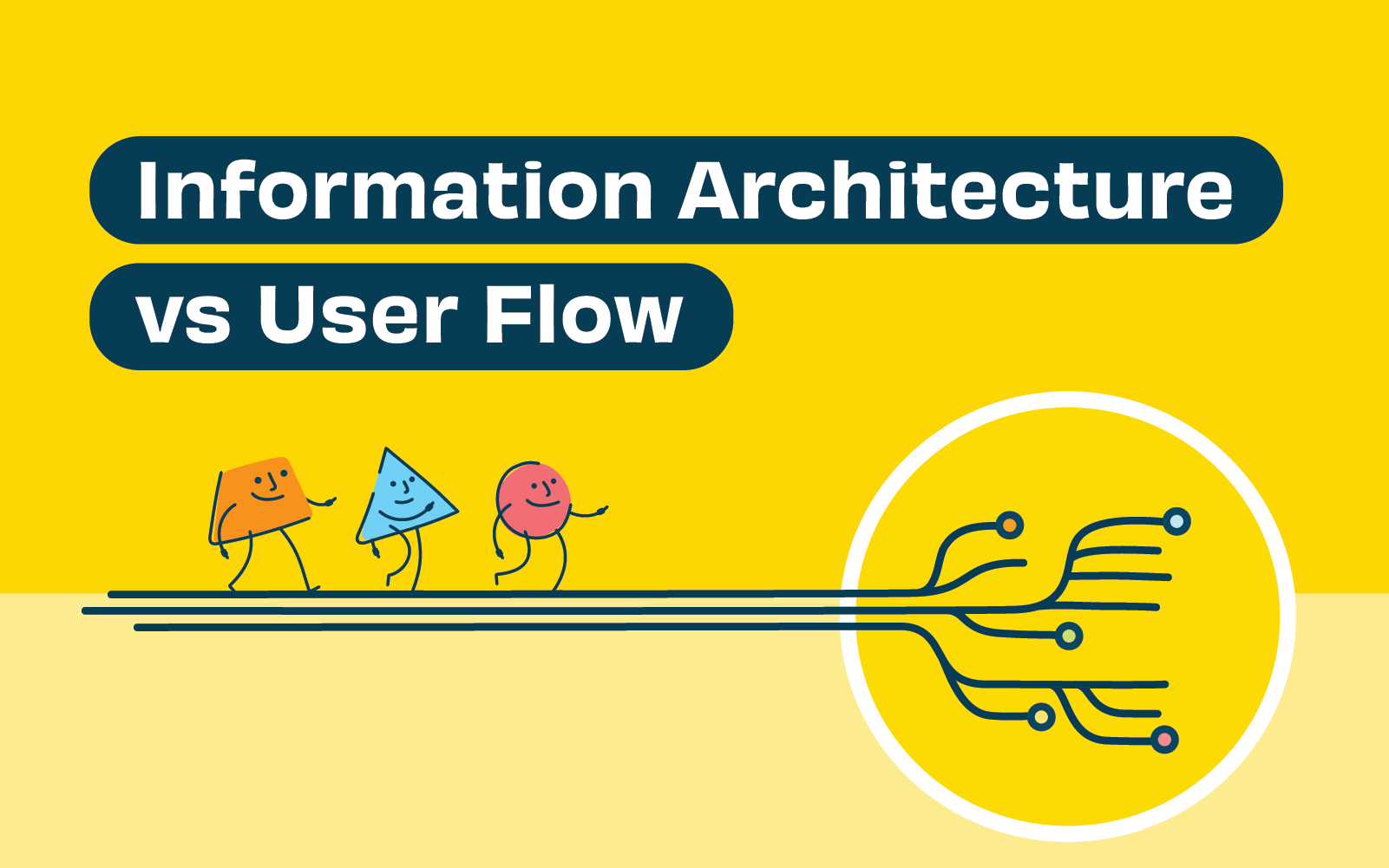
What is Information Architecture? 🏗️

Information architecture is the system and structure you use to organize and label content on your website, app or product. It relates closely to user experience design, but it’s slightly different. Think of it as the structure or framework upon which user-facing assets are built.

That being the case, if your information architecture has flaws, your website design will have flaws. It determines how information will be accessible, usable and relevant on your website and should be treated as a critical element of your project. How can we ensure that we have our content organized efficiently to promote seamless interactions?

The answer is research. Without research you’re just guessing. The problem with guessing is that, well, you’re guessing. You tend to organize, categorize and label things the way that you (and maybe your team) would organize things. It’s biassed and subjective. In reality, people process information in all sorts of different ways and good information architecture should reflect that. You’ll often hear us say ‘test early and test often’. This mantra helps to avoid any little niggles during the user experience design process. Card sorting and tree testing are a couple of techniques that you can use to test early.

Card sorting is a research technique that asks users to categorize different pieces of information or content. It’s best used when you have specific, information-related questions. For example, you may want to categorize products in an online store in the most logical way. Or you may have a mountain of blog post categories that need refining. Whatever it is, the benefit of a card sort is that you end up with consensus of how your users expect to see information. Card sorts can even be performed remotely using tools such as OptimalSort.

Tree testing examines how easy it is for your users to find information using a stripped back, text-only representation of your website - almost like a sitemap. Rather than asking users to sort information, they are asked to perform a navigation task, for example, “where would you find today’s best deals?”. Depending on how easy or difficult users find these tasks gives you a great indication of the strengths and weaknesses of your underlying site structure.

As the base structure of your website or app, information architecture has a fundamental influence on how well users access and use your content. It makes sense then that when designing it, you should receive real-world user feedback early on in the piece. Fortunately, there are great online tools like Treejack to quickly and easily test your site structures, categorization and labels.

What is User Flow? 🌊

User flow describes the steps involved for a user to complete a certain task. It lays out what needs to happen for a user to get from starting point to a defined finish line. Why is it important? Because we want that journey to be as efficient as it can possibly be. If it’s not, the user will be left frustrated and dissatisfied, no matter how beautiful the website design is.

At the heart of user flow is, you guessed it, the user. A path that seems obvious to designers might be confusing to an end-user. It’s important to distance yourself from the project and put yourself in the user's shoes. Even better - watch the user. How do they react to a fork in the road? How do they get back on track? Where are they stumbling?

User testing is a great way to observe user flow. But what are you testing? Normally you test based on a user flow diagram. A user flow diagram is generated based on insights from your research from card sorting, tree testing, and questionnaires, for example. It visually outlines the possible paths a user can take to achieve a certain task. The basic structure of a user flow diagram considers the following:

  • A critical path
  • Entry points
  • User end goals
  • Success metrics (time to completion, number of clicks)
  • Steps the user will take in between

Once you have created a user flow diagram you can test it with your users. User testing can be remote or in person and uses a variety of techniques depending on the constraints of your projects. You may consider testing something rough and conceptual like a paper prototype before producing more detailed prototypes.

How to Use Information Architecture and User Flow Together 🤝🏻

By doing the work upfront to create great information architecture you put yourself in a great position to create great user flow. After all, information architecture is designed based on user research. Performing content audits and creating content inventories help to inform early content decisions, followed by user research techniques such as card sorting and tree testing. This research has a direct influence on user flow, since information and content has been given meaning and structure.

The foundational work in designing information architecture leads to user flow diagrams which, as we discussed, are helpful tools in creating seamless user flow. They bridge the gap between information architecture and final user experience by visualizing pathways of specific tasks. By performing user tests on prototypes, the researcher will inevitably find speed bumps, which may highlight flaws in information architecture.

Information architecture and user flow are integrated. This means there should be a constant feedback loop. Early research and categorisation when building information architecture may not translate to seamless user flow in practice. This could be due to integration factors outside of the digital ecosystem you’re designing.

User flow and information architecture are complementary components of creating exceptional website design. Designers should make a conscious decision to apply both in synchrony.

To Sum it Up 🧾

Understanding the relationship between information architecture and user flow is important for any website design. Information architecture provides the organization and structure of content, where user flow applies that structure to how users execute certain tasks in the simplest possible way. The two are intertwined and, when used effectively, provide a framework to ensure seamless, user-friendly website design.

User research and user testing heavily influence the design of both information architecture and user flow. We want users to feel a sense of accomplishment rather than frustration when using a website. Achieving this requires an investment in understanding user needs and goals, and how they consume and categorize information. This is where research techniques such as content audits, tree testing, card sorting and user testing become invaluable.

We’ve always placed high value on solid research, but don’t be put off by it. The research techniques we’ve discussed are highly scalable, and you can be as involved as you want or need to be. Sometimes you don’t even have to be in the same room! The most important thing is to get outside of your team’s bubble and gain real user insight. Check out our information architecture services to ensure you’re on the right path towards powerful, user-centric website design.

Learn more
1 min read

CRUX #6: Information architecture in unexpected places

According to Abby Covert, author, teacher and community leader in the field of information architecture (IA) : ‘IA is the way we arrange pieces of content to make sense when experienced as a whole. By this definition: there is information architecture in everything. Mindblown?’

😮 (That’s a resounding yes from an IA rookie like me.)

In this issue of CRUX we go in search of information architecture and have some surprising encounters in the worlds of emoji, elevators, walking tracks, games and more. We meet UX designers, developers, researchers and even a Senior Park Ranger. It seems you can have your ‘IA hat’ on without even realising it. That’s the power of information architecture.

Some highlights from this issue:

  • UX research and strategy specialist, Q Walker explores the world of emoji from an information architecture perspective and sparks curiosity along the way. Have you ever wondered why clock emojis are organized under travel and places? 🤔
  • We talk to Senior Park Ranger David Rogers about the thinking behind creating and building New Zealand’s national walking track network and reveal how information architecture can also live ‘in the wild’.
  • UX developer Ben Chapman delves into the classification systems of libraries over time and ponders the pros and cons for users of moving information online.
  • We talk to Sam Cope, Lead UX Designer at Wētā Workshop’s Interactive division about what it takes to drive design decisions with the end user in mind - something crucial for any video game’s success, whether it’s a blockbuster or something more niche.
  • And much more about information architecture in unexpected places….

The stories and people in this issue of CRUX certainly captured our imagination and attention - we hope they inspire and even surprise you too.

Get comfortable and settle in for a great read. Welcome to CRUX #6.

A plug for the next issue

Do you have a burning idea to share or a conversation you’re dying to kickstart that’s of interest to the world of UX?  Now’s your chance.  We’re already on the lookout for contributors for our next edition of CRUX for 2022.  To find out more please drop us a line.

Learn more
1 min read

Understanding and refining choreography for your information architecture

What is information architecture (IA) without its complementary elements? On this blog we’ve already discussed the information architecture elements of taxonomy and ontology, and now it’s time to take a look at choreography. While taxonomy refers to how information is grouped, classified and labeled and ontology refers to the meaning behind our words, choreography describes the rules for how all those parts should interact.

Choreography is essentially the nuts and bolts that bring organization, structure and meaning together to form one well-oiled machine that supports, enables and delights users on their path to task completion within a specific context.An often overlooked element of information architecture, nailing your choreography is essential to the delivery of a seamless user experience because it is present in everything your users will do on your website.

Understanding choreography and IA

Coming back to our house analogy from my taxonomy blog, choreography would be present throughout the entire house determining how everything works together. It’s in the positioning of the door handles and hinges to enable easy access and use of rooms and so you don’t swing an open door into a shower screen or into the knees of a toilet user (who should have locked the door anyway). Choreography appears in open plan living environments seamlessly flowing from one space to the next. The way that the laundry is usually a room that includes an external door allowing an easy workflow from storing the dirty clothes, to washing them to hanging them outside on the line to dry. These are all examples of choreography.

In the context of a website, choreography is present in a number of different website elements. These might include: the rules for how a menu might respond or behave under specific circumstances, the way the user interface adapts to suit different devices, the hierarchical relationship between content and much more.

Choreography examples

To help you understand how choreography might appear in a website IA context, I’ve scoured the internet and have found 3 interesting examples I’d like to share with you.

Mental Floss

Mental Floss is an online publication designed for curious minds — sounds awesome! But the thing I find most interesting is the choreography that is present in the surfacing behavior of the top navigation menu. There are two different ways to access its content: you can either click on the big orange menu button in the top right hand corner and you’ll get everything in one hit — including the footer links (see two images below) — or you can scroll down or up the page and it will automatically drop down and become sticky giving you just the level 1 IA headings and that sticky orange menu button (see third image below).

A screenshot of the homepage of Mental Floss. The headline says "The typo that helped end World War II"

Mental Floss as it appears when I first open the home page.

Mental_floss_menu

When I click on the big orange button

Menal_Floss_scroll

Now look what happens when I scroll a bit.... Ta da!

If you go with the scrolling option, you’re not going to miss out because Mental Floss appears to have been designed to be explored — might have something to do with that curiosity thing! All the links that live under the big menu button are distributed throughout the long scrolling page, so when you’re exploring the content, you also get everything! If you get really stuck, that sticky orange menu button is always there to help. If I scroll I get one thing and if I click I get something else, but no matter how I choose to consume the content I get access to everything without having to think about it. This website’s choreography supports both exploratory and direct navigation styles and brings all the parts together.

IKEA US Inspiration page

Part blog, part catalogue, part how-to hub, the Inspiration page on IKEA’s US website is a fascinating IA example because it exists outside the patterns used on the rest of the website. It’s like an IA within an IA. While the rest of the website has a wide rigid structure typical of large IAs, the Inspiration page (also titled ‘IKEA Ideas’) is more organic and is organized by content tags and is navigated by filtering (see below).

Ikea_Ideas
The IKEA Ideas homepage and tag cloud.
Tag_Cloud

The tag cloud-like thing displays the content tags in alphabetical order. Each piece can be assigned up to four tags and users can filter by clicking or just peruse the whole lot by scrolling. Upon clicking a content tag, the piece selection below is automatically updated to only include pieces with the selected tag.Choreography on this part of IKEA’s US website is present in the relationship and behavior of the content tags and how that affects the information on the page.

Do nothing for 2 minutes

Do nothing for 2 minutes has a completely flat IA and its choreography is present in the way it responds to user behavior and the way it presents visual and audio content. The website opens to a single page (see below image) showing an image of a beautiful sunset at the beach accompanied by the soothing sound of waves gently crashing and a group of seagulls fighting over a pickle someone tossed them from a McDonald’s cheeseburger (maybe that was me). It gives me a very clear instruction to “do nothing for 2 minutes” and presents a timer that immediately starts counting down.

Do_Nothing
A relaxing scene on the 'Do nothing for 2 minutes homepage'

In the centre of the screen in that sunlight created highlight are the the words “Just relax and listen to the waves. Don’t touch your mouse or keyboard.” It’s a bit hard to read and I didn’t instantly notice it but when I don’t follow its guidance, the timer resets and tells me to “try again”(see below image).

Do_Nothing_Fail
When I fail to do nothing, the timer resets

When I comply with its instructions, the clock ticks down and when there are just 40 seconds to go something magical happens — the wave sounds stop. It’s not jarring or surprising, in fact it actually felt like I dropped to a deeper state of relaxation. Like an experienced lead dance partner, this website’s choreography pushes and pulls the follower where it wants them to go. The rule here is: if I touch my mouse or keyboard, the clock resets, and if I follow the instructions, I get to access an additional layer of relaxation when the sound drops off. It forces me to take 2 whole minutes of out my day in a strict but supportive way.

When I reach the end of the 2 minutes, I’m congratulated and shown an advertisement for a book to help me further explore this technique. I usually hate seeing things like that but I don’t mind in this case because it doesn’t come across as pushy and it’s already given me something.

Refining the choreography of your IA

When you break it down, choreography is about behaviors and relationships between all the pieces of the IA. It’s about which parts go together, what they do and how that fits in with everything else. Think content pairings in a card sort and the hierarchical position of content within the IA’s tree structure — why do those cards go together and why does label Y appear directly before label X? These choices are deliberate; it’s not just a case of “Oh let’s just put them wherever,” or “I’m going to whack a certain label at the very top because my boss told me because that’s where he thinks it should go.” Choreography exists throughout your entire IA and like everything else, all refinements must be determined by user research.

When running a card sort, pay close attention to:

  • card pairings
  • cards that are consistently not paired
  • the hierarchy of cards within each group (card order)
  • the conversation between your participants (moderated card sorts only) for insights into the logic behind the pairings and hierarchical positioning

Cards that are paired — or not — as well as their hierarchical placement can not only provide insight into your users’ taxonomical expectations but can also help you identify relationships (or lack thereof) between content and elements. Say you were running a card sort on an intranet and two cards labeled ‘Annual Leave’ and ‘Public Holidays’ were consistently being grouped together under ‘Human Resources’. What’s their expected relationship and interaction beyond the subject matter connection? Does one appear before the other? Is one linked to the other one’s page? Or are they together on one page and if so how do they interact? (if at all). For moderated card sorts, listen closely to the conversation for insight into this and be sure to ask your participants about anything you’re not sure of.

If your IA is a bit further along in its development or you’d like to evaluate an existing IA, tree testing can help you understand the choreography that will best support your users.

Keep an eye on:

  • the location of the first click
  • the pathways followed

The pathways followed by participants in a tree test will help you determine the right sequence of interactions required by a user to reach their goal — the ultimate step by step flow to task completion. What order do the labels need to be in? And what lives underneath them? And again, in what order?Think of it like a path through the woods to a lake. Your IA’s choreography should enable your users to be seamlessly guided along a smooth pathway made of big stone steps. They shouldn’t be running into trees or bushwhacking to create their own pathways.

When looking at a tree test, consider how many of your participants did not follow the pathway/s you defined as correct. Where did they go instead? What does the right path look like to your users? Also look at where the all important first click landed. If users start out on the correct first click, they are almost 3 times as likely to reach their goal. If your participants started out on a different first click, you’ll need to explore why that is. It could indicate ambiguity in the labels, it could also be a sign of an expectations mismatch, a hierarchical issue or it could be something else entirely! The tree test will help you identify where the issues are, but you’ll need to go and have a conversation with your users to understand why it’s happening.

Unless more than say 80% of your participants achieved direct success in reaching their goal (meaning they never strayed from the big stone path that you defined) you’ll need to check these things anyway to resolve findability and usability issues. Choreography related insights are an extra thing you can pull from what you’re already doing. And of course always remember that any choreography related data has to be considered in conjunction with whether or not the labels are even correct. Choreography is just one piece of the puzzle; it sets the rules for how all the parts interact and isn’t going to be much help if the parts aren’t even right in the first place!

Choreography in information architecture might be one of the most overlooked elements but it’s not hard to give it the time and consideration it deserves and your users will thank you for it!

Seeing is believing

Explore our tools and see how Optimal makes gathering insights simple, powerful, and impactful.