What is Information Architecture?
Information architecture (IA) is a term used to describe how content or information is organised and arranged. This can relate to a website, a retail store or an app. And you could even consider the way a library is sorted to be IA.
For the purposes of this we will be focussed on websites. IA is fundamentally important to the success of your website. It determines how your users will access the information and the success of their user experience (UX) whilst on your website. And ultimately if you can keep users on your website long enough to complete their task.
IA can be broken down into 3 main areas to consider when building great user experience:
- Navigation: How people make their way through information (website content)
- Labels: How information is named and represented.
- Search: How people will look for information (keywords, categories)
When put like this it does seem pretty straightforward. Maybe even simple? But these tasks need to be straightforward for your users. Putting thought, time and research in at the front of your design and build can mean an intuitive website is built. But at any point in your websites life cycle it can be of value to test and review. IA is the structure that sits in behind and allows the design to tell the story and the content to be found in an easy way.
Why is Information Architecture important to web design? 🏗️
If you’ve ever tried to use something and thought, “where am I supposed to go next?” or “this doesn’t make any sense,” you are encountering an issue with an information architecture.
The Information Architecture Institute
The way in which your users will use your website depends largely on how the information is presented and organised. By following through the tasks that you expect your users to undertake you can better understand the user experience. If the user can easily flow from point to point, finding what they need in a quick and efficient (and ideally intuitive manner) they are far more likely to stick around. And return when they need to.
The opposite is definitely true also. If users find your website difficult to follow, hard to navigate and get lost or confused. They will not stick around to find out more. They will move on, and swiftly, to your competition. Frustrated, and disengaged. You will find it difficult to win them back.
What does good information architecture look like for my users? 👀
By providing a simple, clear and straightforward path users can stay focussed on their task, removing overwhelm and confusion. How often do you disappear ‘down a rabbit hole’ when on the internet? Confusing paths or overwhelming options may mean users move off on tangents, and become less likely to complete their initial task. Ultimately the best user experience is one that delivers the right information at the right time. Not too slow and not too complicated.
Always keep in mind that a great IA is:
- Navigation: Always think straightforward, simple and intuitive. Keep the navigation menu clean, clear and brief. Content and information where it’s expected to be. No point putting dog collars under dog food.
- Labels: Consider how pages, content and information is named. This needs to be direct and simple to understand. If you want people to find your store label the page ‘location’ or ‘find us’ or even ‘find our store’.
- Search: Most of your users will use search as a last resort. They will try to navigate their way through your website before resorting to a search option. Considering carefully the keywords for information that support the search tool. If they have already failed to find the information through your navigation, don’t let them down now.
With all of these lined up in behind great web design, which is clear, bright and attractive. Along with language which appeals to your user. You are providing a UX that will entice, engage and ultimately keep them on your website and converting.
What does great information architecture look like for my organization?
Great IA goes beyond simply being about your user experience. Your organization can benefit hugely with testing, research and insights put into your website IA.
With an IA that creates an easy navigable and engaging website your users are less likely to move off to your competitors. You’ve worked hard to get them to your website, through marketing and SEO. Delivering what your user expects and making it easy to find, means they will complete their task, and are far more likely to return.
By finding what they need quickly, and intuitively, users are more likely to be converted and generate leads or sales. Delivering and answering questions can also reduce the need for support. If you can, your organization's website should answer your users questions, before they complete. This means they are less likely to need to email and /or call for support, reducing overheads and time lag before conversion.
Your organization's reputation is so important, your website may be your only interaction with users. If they have an easy user experience, their questions answered, and are able to complete what they need simply they leave with a great impression of your organization. They are more likely to return and their overall takeaway is that your organization is trustworthy, organised and easy to deal with. The opposite is quite possible with poor IA and design. You get but one chance to grab their attention and keep them. Do it badly and you may never get them back.
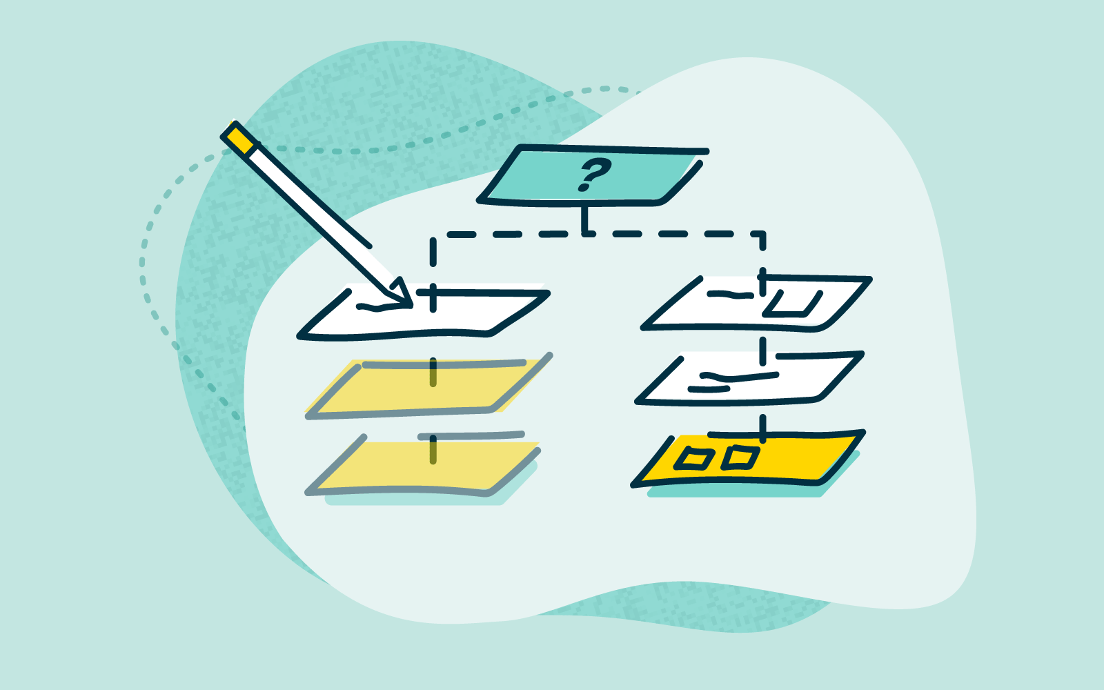
Creating great information architecture 👷🏻
User research with OptimalSort
Of course the best website IA is based on your users experience. And there is no better way to get a full understanding of your users than by conducting research. At any point in your website's life cycle it can be beneficial to undertake research such as card sorting. At the beginning stages of your website build is best, but your website should be evolving as your organization does, therefore any time there are shifts in what you do or offer is a great time to revisit your UX and how best to deliver this. OptimalSort tests users on how they intuitively would like to see information sorted on your website. Building IA based on data, rather than assumptions, will mean that content and information can be sorted in a way that truly delivers a simple and intuitive experience.
Maintaining your website with Treejack
With a great IA, based on card sorting user research, your website content needs to be maintained. Tree testing allows you to see where your users are getting lost in your website navigation. And also how they expect to look for key information. The Treejack tool provides real user insights on how your website navigation is working, how it can work better, and ultimately how to fix paths that don’t work. Providing hard data to inform an intuitive IA.
Wrap Up 🌮
So, information architecture is fundamental to your website and how it operates. Want to learn more about information architecture? Take a look at our article, or download 'The Actionable IA Guide'.
Supporting your website with user research can mean you build and design a intuitive website that simply rocks!
Learn more about card sorting with our 101 guide. And more on tree testing.