Subscribe to OW blog for an instantly better inbox
Oops! Something went wrong while submitting the form.
Articles and Podcasts on Customer Service, AI and Automation, Product, and more
A year ago, we looked at the user research market and made a decision.
We saw product teams shipping faster than ever while research tools stayed stuck in time. We saw researchers drowning in manual work, waiting on vendor emails, stitching together fragmented tools. We heard "should we test this?" followed by "never mind, we already shipped."
The dominant platforms got comfortable. We didn't.
Today, we're excited to announce Optimal 3.0, the result of refusing to accept the status quo and building the fresh alternative teams have been asking for.
The gap between product velocity and research velocity has never been wider. The situation isn't sustainable. And it's not the researcher's fault. The tools are the problem. They’re:
These platforms haven't changed because they don't have to, so we set out to challenge them.
Optimal 3.0 isn't an incremental update to the old way of doing things. It's a fundamental rethinking of what a research platform should be.
Research For All, Not Just Researchers.
For 18 years, we've believed research should be accessible to everyone, not just specialists. Optimal 3.0 takes that principle further.
Unlimited seats. Zero gatekeeping.
Designers can validate concepts without waiting for research bandwidth. PMs can test assumptions without learning specialist tools. Marketers can gather feedback without procurement nightmares. Research shouldn't be rationed by licenses or complexity. It should be a shared capability across your entire team.
A Complete Ecosystem in One Place.
Stop stitching together point solutions.Optimal 3.0 gives you everything you need in one platform:
Recruitment Built In Access millions of verified participants worldwide without the vendor tag. Target by demographics, behaviors, and custom screeners. Launch studies in minutes, not days. No endless email chains. No procurement delays.
Testing That Adapts to You
Learn more about Live Site Testing
AI-Powered Analysis (With Control) Interview analysis used to take weeks. We've reduced it to minutes.
Our AI automatically identifies themes, surfaces key quotes, and generates summaries, while you maintain full control over the analysis.
As one researcher told us: "What took me 4 weeks to manually analyze now took me 5 minutes."
This isn't about replacing researcher judgment. It's about amplifying it. The AI handles the busywork, tagging, organizing, timestamping. You handle the strategic thinking and judgment calls. That's where your value actually lives.
Learn more about Optimal Interviews
Chat Across All Your Data Your research data is now conversational.
Ask questions and get answers instantly, backed by actual video evidence from your studies. Query across multiple Interview studies at once. Share findings with stakeholders complete with supporting clips.
Every insight comes with the receipts. Because stakeholders don't just need insights, they need proof.
A Dashboard Built for Velocity See all your studies, all your data, in one place. Track progress across your entire team. Jump from question to insight in seconds. Research velocity starts with knowing what you have.
Integration Layer
Optimal 3.0 fits your workflow. It doesn't dominate it. We integrate with the tools you already use, Figma, Slack, your existing tech stack, because research shouldn't force you to abandon how you work.
What Didn't Change: Methodological Rigor
Here's what we didn't do: abandon the foundations that made teams trust us.
Card sorting, tree testing, first-click tests, surveys, the methodologically sound tools that Amazon, Google, Netflix, and HSBC have relied on for years are all still here. Better than ever.
We didn't replace our roots. We built on them.
18 years of research methodology, amplified by modern AI and unified in a complete ecosystem.
Product development isn't slowing down. AI is accelerating everything. Competitors are moving faster. Customer expectations are higher than ever.
Research can either be a bottleneck or an accelerator.
The difference is having a platform that:
Optimal 3.0 is built for research that arrives before the decision is made. Research that shapes products, not just documents them. Research that helps teams ship confidently because they asked users first.
A Fresh Alternative
We're not trying to be the biggest platform in the market.
We're trying to be the best alternative to the clunky tools that have dominated for years.
Amazon, Google, Netflix, Uber, Apple, Workday, they didn't choose us because we're the incumbent. They chose us because we make research accessible, fast, and actionable.
"Overall, each release feels like the platform is getting better." — Lead Product Designer at Flo
"The one research platform I keep coming back to." — G2 Review
This launch represents our biggest transformation, but it's not the end. It's a new beginning.
We're continuing to invest in:
Our goal is simple: make user research so fast and accessible that it becomes impossible not to include users in every decision.
See What We've Built
If you're evaluating research platforms and tired of the same old clunky tools, we'd love to show you the alternative.
Book a demo or start a free trial
The platform that turns "should we?" into "we did."
Welcome to Optimal 3.0.

We’ve said it once and we’ll certainly say it again: user research is a critical part of the design process. By applying the right research methods to the problems you’re trying to solve, you can pull out fantastic insights which you can use to build products and services that meet the needs of your users.
This won’t be news to any user researchers or designers reading this article – but for those on the marketing side of the organizational fence, it’s time to sit up, take notice, and learn just how valuable user research is. Hint: It’s quite valuable!
Now, thanks to the wealth of information about UX research that’s available online, not to mention the array of tools available, marketers can easily take advantage of powerful research methods to supercharge their marketing campaigns and their user insights.
But, I hear you ask, isn’t ‘user research’ just another term for ‘market research’? Well, not exactly. That’s why we’ll start this article off by exploring the difference between the two.
Regardless of organization, profession or field, market research and user research are terms often mixed up or used interchangeably. This comes down mostly to the fact that both terms contain the word ‘research’, but there’s a little more to it.Both market research and user research overlap (check out the diagram below), with a shared focus on things like personas, analytics and competitor analysis. More broadly, user research is seen as a more qualitative approach, whereas market research is typically seen as quantitative. In practice, however, both user researchers and market researchers – at least those doing their jobs correctly – will use a combination of both research approaches.

Looked at another way, market research is typically used to inform sales and marketing (Who will buy what), whereas user research is used to drive product decisions by understanding user needs (What do our users want).
Market research, broadly speaking, has always been tied to the bottom line of an organization, and using research as a way to improve revenue lines through an understanding of an organization’s users. Market research seeks the answers to questions such as:
But this is starting to change. As we’ve seen in the world of design, market research has also undertaken a user-centered shift to try and actually understand the user as opposed to just their intent. There is still a way to go, however. The ESOMAR Global Report from 2017 found that just 15 percent of worldwide spend on market research was qualitative.
As SimpleUsability explains: “The two disciplines co-exist on a moving scale, often overlapping, rather than existing as two polarising variables”.
For marketers (and user researchers to an extent), this really means one thing: focus on the method, not the overarching label. Marketers should take a deep dive into the world of user research and explore all of the methods that researchers utilize on a daily basis:
These are just a few of the methods popular among user researchers – but there are many, many more. Check out the chart below from Christian Rohrer (via Nielsen Norman Group).

Any journey into the world of UX research really needs to start with a holistic understanding of the different methods available and an understanding of what each method can tell you. If you haven’t read it before, we highly recommend the Intro to UX guide on our blog. Then, you can dive into detail by reading about different types of testing and research.
What comes next? The world of user research is a very different place now than what it was even 10 years ago. In the past few years, there’s been a surge in the number of powerful remote UX research tools available, with options available for every method and approach. There are card sorting and tree testing tools, tools for contextual inquiries and even tools for running remote user interviews over the internet. Exploring the different options available to you and playing around with different combinations of tools will put you in the best position to run your own research projects – which brings us to our final recommendation.
With an idea of the methods you can use and the tools available online, you’ll want to put together a UX research plan to build up all of the information you currently have as well as the questions you need to answer.
So here we are. The line between user research and market research continues to blur with every passing day as both sides of the organizational fence rally around a common point: Figuring out their users.
User researchers understand the value of leveraging the various methods available to them. The only question is, will you?

For many people, UX research is seen as a chore: they know that it’s useful and important, but are liable to just keep putting it off. Then, there are others who carry out discovery research at the start of a new project, but then quickly forget about it as they lose themselves in the design and development process. Lastly, we’ve got people who carry out research on a regular basis, both at the start of a project as discovery work and throughout to test assumptions and work through design or development problems.
Regardless of where you sit on the above scale, the insights that only user-focused research can deliver are key to building successful products, and if you don’t build products that address real user needs, then your competitors certainly will.
Paula Makuck sums it quite well: “User research helps us to understand how people go about performing tasks and achieving goals that are important to them. It gives us context and perspective and puts us in a position to respond with useful, simplified, and productive design solutions.”

Of course, there’s a big jump from understanding the value of user research to actually successfully executing the entire research workflow. What’s more, the internet is filled with thousands of articles, guides and books that attempt to either explain the ‘how’ of the entire process or focus in on one small aspect. This article is designed to shine a high-level light on the key stages of the research workflow, and then point you off to more useful resources where appropriate. This article is for everyone who’s ever said: “Ok, I get the value of user research, but where do I actually start?”.
With that in mind, let’s dive into the first section of our guide, stakeholder interviews.
A stakeholder is anyone who has a stake in your research, and more specifically the output. Working with stakeholders is especially important for anyone carrying out user research as you need to know both what they already know about a particular problem and what they need to find out. Understandably, strong communication throughout the research process is key.
While the way in which you communicate with stakeholders during a project may vary, interviews are the best way to identify what they know and need to know at the beginning. As with user interviews, it’s hard to beat sitting down face to face with someone to discuss their needs and problems. Digital.gov has an excellent article on the why of stakeholder interviews, as well as how to actually go about the process of setting them up. You can find that article here.
We’re not done with our stakeholders just yet, either. They’ll play an integral role in the entire user research workflow as we move through the various stages of our project.
With our stakeholder interviews wrapped up, it’s time to turn our attention to another critical part of the early-stage user research process; identifying our known data. It’s certainly not always easy (and one of the reasons why a good research repository is so key), but the work is important.
Why? Well, in addition to helping you avoid duplicate research work, taking the time to assess all of the existing data related to your research problem may help you to identify further avenues of research.
So what does this stage of the research workflow look like? It depends on your organization. For those with an established research function, it may be as easy as accessing the company Airtable or Google Drive and pulling up any existing findings. For those without such an operation, things may be a little trickier. Research will have almost certainly been carried out at some point or another, but your mileage may vary when it comes to actually locating it.
Here are just a few of the functions within an organization where you’re likely to find existing data:
Wherever you end up locating existing research data, taking the time to collate it will certainly serve you well as you begin your own research project.
Your approach is the mechanism by which you’ll gather more information about your research problem. In simple terms, the research questions and the methodologies you’ll use to answer them.
Research questions are essentially your research objectives. The ‘why’ of your research project. These should be informed by the existing data you’ve uncovered as well as discussions with your stakeholders. As for what research questions should look like, here are some examples:
When formulating your research questions, keep in mind that these are not the same questions you should be asking your users. Basically, they should be broad enough that you can use them to then generate tasks or questions for your users, the outputs of which should hopefully shed a little more light on the problem you’re working on.
As for the methods you’ll use to actually attempt to answer these questions, we’ll get to those further down.
Putting together a detailed research plan is really a process that overlaps many of the steps we’ve outlined above. You’ll want to feed in things like who your stakeholders are, research methodologies, any budget estimates and the participants or participant groups you’re likely to bring on board.
For these reasons, a research plan is something that you should develop throughout the early stages of your research project and then refer back to throughout to ensure you’re still focusing on what you set out to answer. It’s fine to pivot a project if the problem leads you in a more useful direction, but always compare refer to your plan and stakeholders when doing so. Scope creep and rabbit holes are all too common in the field of user research.
Most of what we’ve talked about above will end up constituting your research plan, but a formal document is still an extremely useful tool to have. Don’t fall into the trap of simply dumping everything into a folder on your computer. Such an approach may be fine for you during the project (and possibly even when you need to come back in the future), but it’ll be a nightmare for anyone else needing to pick up where you left off.
Now we come to the data gathering stage of the research process, requiring the use of various research methods to answer our questions. As we covered in our Intro to UX research guide, there’s really no shortage of user research methods available. From card sorting to usability testing, each method – when used correctly – can be a powerful way to get the answers you need.
The methods you end up using should be informed by your research questions. While some questions are best answered using qualitative methods (like user interviews or usability tests), others are better suited to quantitative testing methods. Alternatively, you could even use a combination by mixing methods.
Determining which method to use requires careful consideration of your research question. If we take a look at the question: “How do our existing users go about tracking their purchases?”, we’d want to look at how they navigate through the website, meaning tree testing would be a suitable option. Alternatively, the question: “How do potential customers of ours decide between us and one of our competitors?”, would be better suited to a qualitative research method like a user interview where we can sit down with a user and ask them questions directly.
Of course, to even execute any of these research methodologies, you’re going to need participants.
You’ve got a research plan, key stakeholders, the questions you need to answer and an understanding of the methods you’d like to use to answer those questions. Now, it’s time to turn our attention to participant recruitment.
There’s a common misconception that finding participants is one of the hardest parts of the user research process, being time consuming, costly and annoying – but this isn’t actually the case. With just a little digging, you’ll likely be able to uncover a pool of people without ever leaving your desk.
Here are just a few of the potential participant sources that researchers, designers and marketers use on a regular basis. This list is by no means exhaustive, but should serve as a good starting point. You’ll also want to consider payment. Your participants are giving up some of their time to help you, so think about a small monetary reward or even a discount for your products or services. The amount and how you broach this depends on the channel.
We’ve now recruited our participants, chosen our testing methods and run the tests. With the results starting to roll in, it’s time to analyze the data and make sense of it all. No small task. The insights you draw out of your data will obviously depend on the user research methods you’ve used, with methods like card sorting and tree testing giving you more quantitative data to analyze, and usability tests and user interviews providing you with qualitative insights. In any case, the key thing to focus on with this part of the UX research workflow is drawing out useful insights that help you to address your research questions and how you’re going to present this information back to your stakeholders.
We’re now at the penultimate step in the research process; taking what we’ve learned and communicating it back to our stakeholders. Consider the following before you sit down in a room with them.
Aim to have detailed answers to your research questions as well as actionable next steps for your stakeholders. You’ve just put in significant time running the research process and as such are best suited to actually making suggestions based on the outputs of that research. It’s also important to understand not only your stakeholders, but the groups likely to be making use of the research further down the track. The easier you can make the process for them (of utilizing your research), the more value they’ll see in the process. Consider using tools that utilize visualizations as one way of making it easy for people to make sense of your research.
Lastly, it’s often a good idea to actually sit down with your stakeholders in a room again instead of simply sending your research results over in an email. Being able to sit down with your stakeholders one-on-one and explain your findings and recommendations will put you in good stead for future research projects.

Let’s recap on what we’ve covered. We’ve gone through:
There’s a final step that can be easy to overlook, but it’s a critical one in order to ensure that your research (and the insights you’ve managed to uncover) remain accessible. One of the most common failings of the user research process is storing the data in a sustainable way. All too often, the people conducting the studies run their tests, pull out the information they need, and then simply leave the data in the tool they used to run the research or in nested folders on the organization’s server.
The solution is quite simple in theory, although a little harder in practice – especially when you’re working within a larger team. We’ve talked about building research repositories in this article (point 4), but the key takeaway is that while you should certainly use the right tool to store your findings, you also need to ensure you create a sustainable process. There’s no sense going to the trouble of setting up a new tool if you don’t have a system in place for others to feed in their own research or access historical research in the future.
You don’t need much to create a research repository – you’ll often find many researchers are able to put together one using a tool like Airtable or Excel. Whatever you end up using, just make sure it’s easy to update and access.
Hopefully, by breaking down each stage of the research workflow into actionable steps, we’ve shown that it’s actually quite a simple undertaking – albeit one with quite a few steps. Let us know if you’ve got any questions or thoughts of your own.
Design has a problem — historical and still pressing — of only designing for users that are easily accessible, are able to participate, or who meet some pre-determined idea of a ‘target’ or an ‘average’ user.
This is bad for organisations, who are missing out on a huge segment of the people they’d like to reach, and it’s bad for users, who can feel shut out of the services they’d like to access.
Remote research allows you to address common diversity and inclusion challenges of in-person research, and create a better product or service as a result.
While you’re probably already making considered attempts to include a diverse range of participants, the reality is that many people are simply not able to participate in research.
Some people cannot make it in to your research facilities for an hour on a weekday for an in-person interview — not now and not pre-pandemic either. That list includes single parents and other full-time carers, who are overwhelmingly women. (It’s also likely to exclude people with mobility challenges and certain chronic illnesses.)
One of the greatest strengths of remote research is that it enables asynchronous responses, which means people can fit it in whenever it makes the most sense for them. This makes it easier to research with shift workers, night owls, and people in precarious contract work, who may not be able request time off.
Research is mostly good at including people that are nearby, with spare time, and with the means to come and go as you require them to; they’ve got to fit with your schedule and your project plan.
Planning your research to be remote by default allows you to work with and around these constraints in ways that will improve the validity and richness of your data and insights.
As an example, Paper Giant recently worked with Atlassian to conduct research with knowledge workers. Using remote research methods, we were able to speak to people in workplaces from multiple countries in North America, Europe and Australasia. This is far more representative of Atlassian’s user base than if we had only interviewed participants local to us, and helped us avoid treating Australia’s workplace culture as universal.
Remote research also allows you to speak to people who might be uncomfortable with the intensity of a one-on-one interview in unfamiliar surroundings.
For example, autistic people commonly report finding eye contact overwhelming, but no one quite makes direct eye contact on video calls anyway, so this is one less thing they have to manage.
Body language is harder to interpret over a video call, which means remote research works best when it doesn’t rely on non-verbal cues. This equalises the process for everyone.
Research shows that non-native speakers, people with auditory processing disorders and people with high anxiety “often prefer text channels so they can have more time to process messages and craft responses.”
Inclusion is a challenge as well as an opportunity when you’re using digital tools for research — such tools rely on digital literacy and digital infrastructure that people might not have. It’s worth remembering here that remote research doesn’t have to be digital. It can mean a phone call; it can mean sending something through the post.
This means you need to know who your users are and take into account any kind of access or inclusion issues they may have. For example, when Paper Giant has worked with participants with low literacy, we’ve designed comics as a way of getting people’s feedback on stuff rather than relying on words — those can be sent through the post. We’ve also used Easy English principles in documents for people with acquired brain injury.
Many people are only turning to remote research now, as a response to COVID-19. But it would be a mistake to view it as the fallback option. Remote research allows you to engage a much broader diversity of participants, leading to richer and better validated insights.
Paper Giant writes about research, design, innovation and ethics in our fortnightly newsletter – subscribe here.
You’re ready to run your next research project. You’ve collaborated with the product team on the problem space, there’s buy-in and budget – now what?
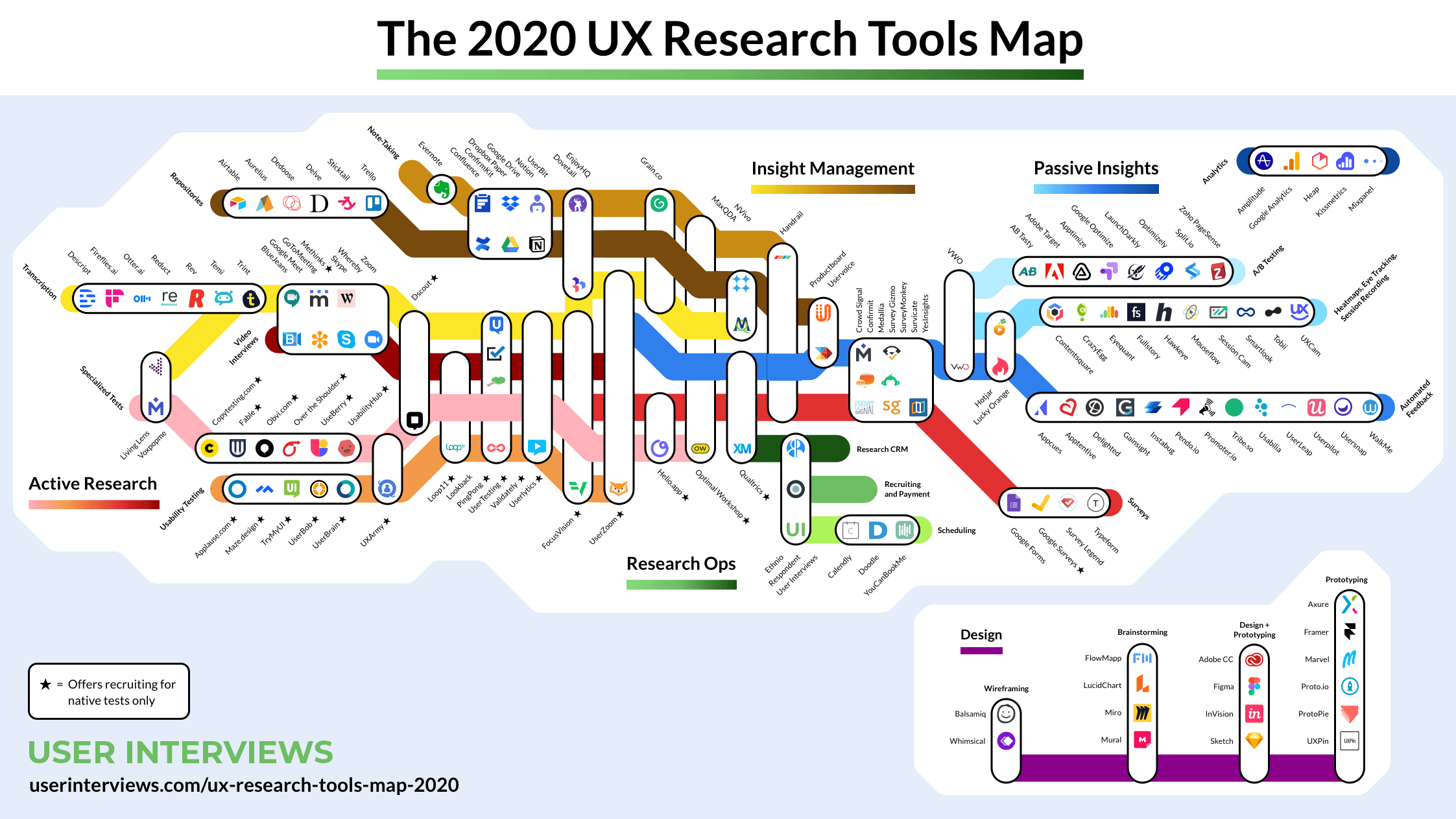
Well, it’s time to look at an essential part of the research workflow: the research tool stack. I know, I can already hear the grumblings. “Why do we even need a tool stack?” and “Why do I even have to think about this? Why can’t I just keep using [insert popular user research tool here]?”. Well, here's why.
We’ve done a LOT of research in our time here. That’s only natural, we build user research tools for people like you. And, in that time, we’ve learned a lot about matching the right tools to the right methods, and what you need to consider when integrating all of these tools together. What’s more, we’ve got a fairly good idea of some of the other tools you should consider which can make your life as a researcher much, much easier.
The right tools will help you succeed. It’s really as simple as that. When you’ve got a capable tool stack that you can use when you’re in the midst of a research project, you’ll be able to gather better data, faster, and ensure you’re not wasting time. This is true in any business area. Whether that’s marketing, technology or customer support, well thought-out and vetted tool stacks and change the way you work.
There’s also the ResearchOps consideration. If you’re not too familiar with this term, ResearchOps is basically a movement to operationalize and socialize user research in organizations around the world.
By that we mean:
Key to ResearchOps success is the UX tool stack. It falls into the standardization point mentioned above. A curated list of tools will make it easier to launch new research projects and onboard new people – whether they’ve got “research” as a part of their job title isn’t relevant. Which tools are used where will obviously differ from company to company, but as a researcher, you should ensure that you have a set list of the tools that you use on a regular basis and a good understanding of why you use them.
Before you start looking at software reviews to find UX tools, you need a solid understanding of your research question and the methods that you’ll use to answer it.
Let’s recap on research questions. As we’ve discussed in articles-past, research questions are basically your research objectives – the ‘why’ of your research. These need to come from discussions with your stakeholders (product teams, for example) and take into account any previous research or learnings.
A popular example research question that I like to use is “How do our users currently use the ‘Order history’ feature on our website?”. It’s hits all of those good research question points. It’s actionable (in the sense that you can identify a clear way to answer it) and specific (you’ll know when you’ve found the answers to it). A final note on research questions: They’re not the questions that you’ll ask your participants during your research sessions. Instead, they should inform the questions you’ll ask.
So, now that we’ve got a clearer picture of what research questions are, we can turn to the research methods. The methods you select will depend on your research questions. For example, some questions are best answered using qualitative methods, whereas others will benefit from quantitative methods. Some questions may even be answered through a combination of the 2 approaches.
Let’s use our earlier research question as an example of how to identify the right research method. As it’s focused on how people use a specific part of our website, we’d probably want to conduct some usability testing to watch them as they use the feature. Then, we might ask them questions or conduct dedicated user interviews to ask more in-depth questions. We could also run a tree test to see how people move through our website (with a focus on how they interact with the order history feature).
**Warning: Promotion of Optimal Workshop tools**
The user research/UX space is an interesting one when it comes to the tools that are available to the people needing to do research. As a growing field, the number of options continues to grow alongside it. If you want a list of every tool that’s out there, Nikki Anderson published a great article on UX Collective, which you can read here. In this article, however, we’re going to talk about the tools that we provide. Yes, we’re doing a little bit of self-promotion, but our user research tools are used by some of the biggest companies in the world – and for good reason. Allow me to explain.
Our platform contains 5 distinct tools, each of which is designed to execute a specific research method. This means that the platform as a whole can be useful across a large part of a research project. Let’s take a look at each of the different tools and the methods they’re designed around.
Naturally, it’s easier to understand what we’re talking about by seeing these tools in action for yourself. If you haven’t already, join the likes of Uber, IBM and NASA and try all 5 out for yourself.
Now that we’ve got an understanding of some of the research methods (and the tools that we’ll use to execute them), we can turn our attention to another critical area – participant recruitment.
You don’t necessarily need a panel of participants ready to go at all times, but it’s a good idea to at least have an idea of where you can source people quickly. After all, as most researchers will tell you, research projects can often spring up out of the blue and you may need to hurriedly pull together a few participants to take part in a study.
If you’re interested in learning about the best way to go about sourcing quality participants for your next research project, we’ve got you covered with this article here.
In a nutshell, you need to:
Aside from the research-focused tools, there’s an entirely different category of tools that you can use to help you with your research. I like to categorize these as the tools that make your life easier. They’re not essential, but they will help you to reduce some of the admin load and headaches that can come with managing these processes manually.
As we touched on at the beginning of this article, the UX tool stack is an important aspect of ResearchOps. Documentation is equally key – but specifically documentation surrounding how the research tools are used within the organization, and for what purpose.
Good documentation for your UX tools should really just follow the same guidelines for other types of documentation. O’Reilly Media has a good article on best practices for good documentation. We’ve edited the list to make it clearer:
As in any profession, the tools that you have in your toolkit are (more often than not) essential in enabling you to do your job effectively. This is certainly true in user research, where having a set of easy to use, powerful tools can help you answer your research questions and extract useful insights.Your toolkit will certainly and adapt and change over time, especially as you discover new tools to add to your arsenal, but we find (unsurprisingly) that we still depend on our capable set to execute some of the core research methods. Sign up for free today and take them for a spin. We don’t think you’ll regret it.

Summary: A detailed UX research plan helps you keep your overarching research goals in mind as you work through the logistics of a research project.
There’s nothing quite like the feeling of sitting down to interview one of your users, steering the conversation in interesting directions and taking note of valuable comments and insights. But, as every researcher knows, it’s also easy to get carried away. Sometimes, the very process of user research can be so engrossing that you forget the reason you’re there in the first place, or unexpected things that come up that can force you to change course or focus.
This is where a UX research plan comes into play. Taking the time to set up a detailed overview of your high-level research goals, team, budget and timeframe will give your research the best chance of succeeding. It's also a good tool for fostering alignment - it can make sure everyone working on the project is clear on the objectives and timeframes. Over the course of your project, you can refer back to your plan – a single source of truth. After all, as Benjamin Franklin famously said: “By failing to prepare, you are preparing to fail”.
In this article, we’re going to take a look at the best way to put together a research plan.
Any project needs a plan to be successful, and user research is no different. As we pointed out above, a solid plan will help to keep you focused and on track during your research – something that can understandably become quite tricky as you dive further down the research rabbit hole, pursuing interesting conversations during user interviews and running usability tests. Thought of another way, it’s really about accountability. Even if your initial goal is something quite broad like “find out what’s wrong with our website”, it’s important to have a plan that will help you to identify when you’ve actually discovered what’s wrong.
So what does a UX research plan look like? It’s basically a document that outlines the where, why, who, how and what of your research project.
It’s time to create your research plan! Here’s everything you need to consider when putting this plan together.
The first thing you need to do is work out who the stakeholders are on your project. These are the people who have a stake in your research and stand to benefit from the results. In those instances where you’ve been directed to carry out a piece of research you’ll likely know who these people are, but sometimes it can be a little tricky. Stakeholders could be C-level executives, your customer support team, sales people or product teams. If you’re working in an agency or you’re freelancing, these could be your clients.
Make a list of everyone you think needs to be consulted and then start setting up catch-up sessions to get their input. Having a list of stakeholders also makes it easy to deliver insights back to these people at the end of your research project, as well as identify any possible avenues for further research. This also helps you identify who to involve in your research (not just report findings back to).
Action: Make a list of all of your stakeholders.
Before we get into timeframes and budgets you first need to determine your research questions, also known as your research objectives. These are the ‘why’ of your research. Why are you carrying out this research? What do you hope to achieve by doing all of this work? Your objectives should be informed by discussions with your stakeholders, as well as any other previous learnings you can uncover. Think of past customer support discussions and sales conversations with potential customers.
Here are a few examples of basic research questions to get you thinking. These questions should be actionable and specific, like the examples we’ve listed here:
A good research question should be actionable in the sense that you can identify a clear way to attempt to answer it, and specific in that you’ll know when you’ve found the answer you’re looking for. It's also important to keep in mind that your research questions are not the questions you ask during your research sessions - they should be broad enough that they allow you to formulate a list of tasks or questions to help understand the problem space.
Action: Create a list of possible research questions, then prioritize them after speaking with stakeholders.
Your budget will play a role in how you conduct your research, and possibly the amount of data you're able to gather.
Having a large budget will give you flexibility. You’ll be able to attract large numbers of participants, either by running paid recruitment campaigns on social media or using a dedicated participant recruitment service. A larger budget helps you target more people, but also target more specific people through dedicated participant services as well as recruitment agencies.
Note that more money doesn't always equal better access to tools - e.g. if I work for a company that is super strict on security, I might not be able to use any tools at all. But it does make it easier to choose appropriate methods and that allow you to deliver quality insights. E.g. a big budget might allow you to travel, or do more in-person research which is otherwise quite expensive.
With a small budget, you’ll have to think carefully about how you’ll reward participants, as well as the number of participants you can test. You may also find that your budget limits the tools you can use for your testing. That said, you shouldn’t let your budget dictate your research. You just have to get creative!
Action: Work out what the budget is for your research project. It’s also good to map out several cheaper alternatives that you can pursue if required.
How long do you think your user research project will take? This is a necessary consideration, especially if you’ve got people who are expecting to see the results of your research. For example, your organization’s marketing team may be waiting for some of your exploratory research in order to build customer personas. Or, a product team may be waiting to see the results of your first-click test before developing a new signup page on your website.
It’s true that qualitative research often doesn’t have a clear end in the way that quantitative research does, for example as you identify new things to test and research. In this case, you may want to break up your research into different sub-projects and attach deadlines to each of them.
Action: Figure out how long your research project is likely to take. If you’re mixing qualitative and quantitative research, split your project timeframe into sub-projects to make assigning deadlines easier.
Who you recruit for your research comes from your research questions. Who can best give you the answers you need? While you can often find participants by working with your customer support, sales and marketing teams, certain research questions may require you to look further afield.
The methods you use to carry out your research will also have a part to play in your participants, specifically in terms of the numbers required. For qualitative research methods like interviews and usability tests, you may find you’re able to gather enough useful data after speaking with 5 people. For quantitative methods like card sorts and tree tests, it’s best to have at least 30 participants. You can read more about participant numbers in this Nielsen Norman article.
At this stage of the research plan process, you’ll also want to write some screening questions. These are what you’ll use to identify potential participants by asking about their characteristics and experience.
Action: Define the participants you’ll need to include in your research project, and where you plan to source them. This may require going outside of your existing user base.
The research methods you use should be informed by your research questions. Some questions are best answered by quantitative research methods like surveys or A/B tests, with others by qualitative methods like contextual inquiries, user interviews and usability tests. You’ll also find that some questions are best answered by multiple methods, in what’s known as mixed methods research.
If you’re not sure which method to use, carefully consider your question. If we go back to one of our earlier research question examples: “How do our current customers go about tracking their orders?”, we’d want to test the navigation pathways.
If you’re not sure which method to use, it helps to carefully consider your research question. Let’s use one of our earlier examples: “Is it easy for users to check their order history in our iPhone app?” as en example. In this case, because we want to see how users move through our app, we need a method that’s suited to testing navigation pathways – like tree testing.
For the question: “What actions do our customers take when they’re thinking about buying a new TV?”, we’d want to take a different approach. Because this is more of an exploratory question, we’re probably best to carry out a round of user interviews and ask questions about their process for buying a TV.
Action: Before diving in and setting up a card sort, consider which method is best suited to answer your research question.
A protocol is essentially a script for your user research. For the most part, it’s a list of the tasks and questions you want to cover in your in-person sessions. But, it doesn’t apply to all research types. For example, for a tree test, you might write your tasks, but this isn't really a script or protocol.
Writing your protocol should start with actually thinking about what these questions will be and getting feedback on them, as well as:
Action: This is essentially a research plan within a research plan – it’s what you’d take to every session.
Happy researching!

One of the most common topics of conversation that I come across in research circles is how to deal with the administrative burden of user research. I see it time and again – both junior and experienced researchers alike struggling to balance delivering outputs for their stakeholders as well as actually managing the day-to-day of their jobs.
It’s not easy! Research is an admin-heavy field. All forms of user testing require a significant time investment for participant recruitment, user interviews mean sorting through notes in order to identify themes and different qualitative methods can leave you with pages of spreadsheet data. Staring down this potential mountain of administrative work is enough to make even the most seasoned researchers run for the hills.
Enter ResearchOps. Sprouting up in 2018, various researchers came together to try and standardize different research practices and processes in order to support researchers and streamline operations. It may seem like a silver bullet, but the fundamental questions still remain. How can you, as a researcher, manage the administrative side of your job? And where does your responsibility end and your colleagues’ begin? Well, it’s time to find out.
As we touched on in the introduction, ResearchOps is here and it’s here to stay. Like its cousin DesignOps, ResearchOps represents an earnest and combined effort on the part of the research community to really establish research practices and give researchers a kind-of backbone to support them. Carrying out effective user research is more important now than ever before, so it’s key that vetted practices and processes are in place to guide the growing community of researchers. ResearchOps can also be instrumental in helping us establish boundaries and lines of communication.
But, it’s important to frame ResearchOps. This new ‘practice’ won’t magically solve the administrative burden that comes along with doing research. In fact, it’s likely that simply by having access to clear processes and practices, many researchers will identify more opportunities to run their research practices more effectively, which in many cases will mean, yep, you guessed it, more administrative work. Interestingly, Kate Towsey (one of the ‘founders’ of ResearchOps), best summed this situation up by describing ResearchOps as an API – elements you can ‘plug’ into your own research practice.
In dealing with these issues, there are some key questions you need to ask yourself.
If you speak to researchers from different organizations, you’ll quickly realize that no two research practices are run the same way. In some cases, research teams are very well established operations, with hundreds of researchers following clearly set out processes and procedures in a very structured way. On the opposite end of the spectrum, you’ve got the more haphazard research operations, where people (perhaps not even ‘researchers’ in the traditional sense) are using research methods. The varied way in which research practices operate means the question of ownership is often a difficult one to answer – but it’s important.
Before we get into some of the strategies you can use to reduce and manage the administrative side of user research, you need to get a clear picture of who owns research in your organization. A fuzzy understanding of ownership makes the task of establishing boundaries near-impossible.
Research is an admin-intensive practice. There’s no getting around it. And, while it’s true that some tools can help you to reduce the day-to-day admin of your job (typically by making certain methods easier to execute), there’s still a fair amount of strategic thinking that you’ll need to do. In other words, it’s time to look at some strategies you can use to ensure you’re doing the job in the most efficient way.
Understand what your colleagues expect from you, and what your organization expects from you. Knowing where your job stops (and where the jobs of the other members of your team begin) is key to the smooth running of a research practice. We’re talking about you – we’ll get to how research as a practice interacts with other parts of the organization in the next section. If you’re one of 5 researchers in your organization, a lack of alignment will lead to duplication of work, missed opportunities, and, in many cases, more admin. This is a constant issue, and it’s not one that researchers alone deal with. Needing to scramble to set up a meeting because 2 teams realize they’re both working on the same project happens all too often, in every type of organization.
Research, as a practice, can touch nearly every area of an organization. This is both by design and necessity. Research is consultative, and requires input from a number of parts of an organization. If not managed carefully, operating your research without clear boundaries can mean you’re stuck with significant amounts of administrative work.
Think about a typical research project:
The ResearchOps community put together this fantastic framework (below) which maps out the majority of research processes.
“You can’t possibly handle any one bubble without touching many of the others, so it’s important to establish clear boundaries for what you, as research ops and as a person, cover,” Kate Towsey explains.
As for how to actually establish these boundaries – and in turn reduce the chance of an administrative overload – turn to conversations. One of the best ways to clear up any fogginess around remit is to simply pull the different parties into the same room and talk through your perspectives.
In certain situations, it may make sense to outsource. Of course, we’re not talking about simply taking your research practice and outsourcing it wholesale, but instead taking select components that are well suited to being managed by third parties.
The obvious candidate here is participant recruitment. It’s typically one of the most time-consuming and admin-heavy parts of the research process, and coincidentally one that’s also easy to outsource. Participant recruitment services have access to tens of thousands of participants, and can pull together groups of participants for your research project, meaning you can eliminate the task of going out and searching for people manually. You simply specify the type of participant you require, and the service handles the rest.
Of course, there will always be times where manual participant recruitment is preferable, for example when you’re trying to recruit for user interviews for an extremely niche subject area, or you’re dealing with participants directly from your customer base.
Taking the time to establish a useful, usable repository of all of your research will be one of the best investments you can make as a researcher. There is a time commitment involved in setting up a research repository, but upsides are significant. For example, you’ll reduce admin as you’ll have a clear process for storing the insights from studies that you conduct. You’ll also find that when embarking on a new research project, you’ll have a good place to start. Instead of just blinding going out and starting from scratch, you can search through past studies in the repository to see if any similar research has been run in the past. That way, you can maximise the use of past research and focus on new research to get new insights.
What a good research repository looks like will depend on your organization’s needs to some extent, but there are some things to keep in mind:
User research is always going to require a fair amount of administrative work, but there are actions you can take to minimize some of these more arduous and repetitive tasks – you just need to know where to start.
For more research strategy content, stay tuned to the Optimal Workshop Blog.
Happy testing!
