Say hello to our new look

Today we’re launching a new look for Optimal Workshop. While it’s a new direction for us visually, there’s also a little more to this story than meets the eye. This new identity represents a total rethink about how we present ourselves to the world, from our tools like OptimalSort and Reframer to way we present updates just like this one.
This brand update was a 7-month effort from concept through to execution, involving talents from both inside and outside the walls of our Wellington Office. Here, we’ll share a little about what made us decide to make this change and where you’re going to see the biggest changes.
So, without further adieu…
Why we made this change
- We’d experienced a lot of change and grown at a rapid pace – Our previous brand had grown organically for 12 years. But we’ve matured, and we need a brand identity that will continue to grow with us.
- We needed a brand that’s accessible to all – We place accessibility at the heart of our product decisions, and we wanted the same for our brand. Our previous design guidelines often made this a struggle.
- We needed a brand identity that clearly communicates what we do – Our brand needs to be clear, flexible and robust. A brand system that’s simple to configure means it’s easier to create new assets and ensures every bit of the design is usable, beautiful and communicates our value clearly.
What’s new
Here’s a quick round-up of some of the changes you can expect to see around the place – from the big things like our company logo right through to the smaller tweaks we’ve applied across the website.
Our tools
When you log back into your account, you’ll find that everything works exactly the way that it did before – we’ve just applied a fresh coat of paint. Of course, if you do happen to come across any bugs or quirks, get in touch with our support team by clicking the little blue chat icon in the bottom right corner of the screen.
Our logo
The most noticeable change is front and center with our logo. We’ve evolved it to outline what’s important. Now, we like to think that you can interpret it in a few different ways:
- A cycle of learning
- Circling the answer/highlighting the solution
- Putting “Optimal Workshop” at the centre

Our bold new logo
We’ve also designed our new logo to be quite flexible. We’re able to swap out the colors as well as the “O” to celebrate special occasions, people and events:

Our colors
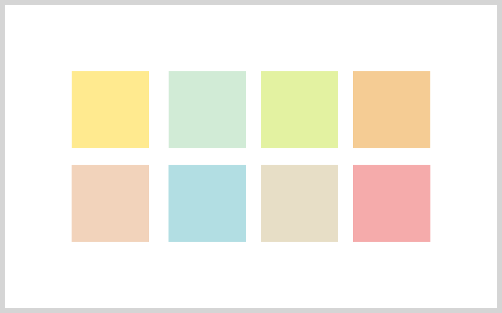
We’ve also refreshed our color palette. We still love green and blue, but we’ve introduced yellow as well as a few other options. Here are the highlights (no pun intended):Our new brand color is yellow. The color of Post-it notes, smiley face emojis and bright ideas. We hope it represents things like warmth, approachability, insight, discovery and enlightenment.
Our new colour palette ranges from yellow through to green and blue. We use tints of yellow to allow flexibility and accessibility when designing, while the dark navy is versatile and reliable. We place an emphasis on whites and grey tints for freshness and lightness.
We also use accent colors to add more variety and life. We’ll let you find these on your own as you experience the new palette on our website.

Our new colour palette 1

Our new colour palette 2
Our typeface
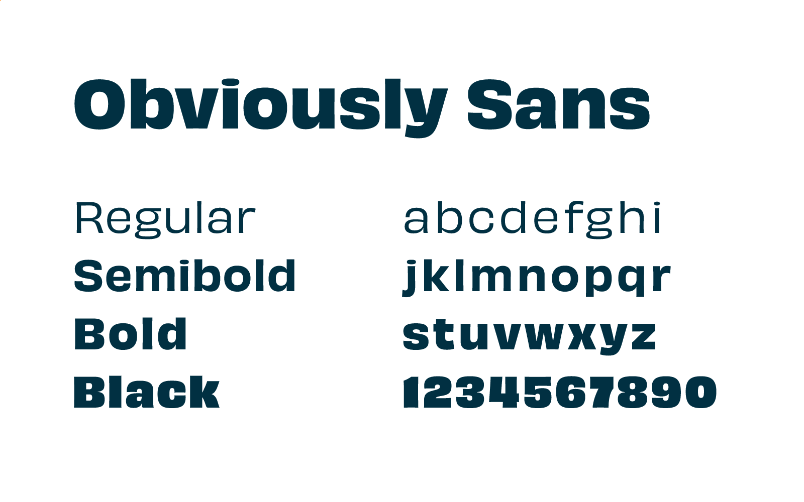
One of the biggest improvements we’ve made to the accessibility of the website comes in the form of our new typeface. Obviously Sans is our new heading typeface – it has a “steady” style, but it’s also quite interesting structurally.
You’ll see Obviously Sans throughout the website, app and blog. It’ll also make its way into our emails and other comms too!

Highlighting what matters
The act of highlighting something is universally understood. We all use highlighters and we all know what it means when we highlight something. Highlighting to find patterns is what research is all about.
We often highlight to:
- Discover themes
- Uncover insights
- Simplify complexity
- Emphasize meaning
Here’s what the highlighting looks like in practice:

Wrap-up
So, that’s our brand refresh. We’re still the same Optimal Workshop, just with a new look that better represents who we are and what we do.
We’re trying to become an ever-more important part of the work that user experience professionals carry out every day. Whether that means hosting user interviews, validating their ideas, testing and probing their information architectures or running surveys, we want to be a part of it.
We believe in better experiences for all and putting people at the heart of decisions. The team at Optimal Workshop genuinely enjoy working together to build something that will leave the world in a better state than we found it.
Join us on the journey – there’s more to come.
