Subscribe to OW blog for an instantly better inbox
Oops! Something went wrong while submitting the form.
Articles and Podcasts on Customer Service, AI and Automation, Product, and more
A year ago, we looked at the user research market and made a decision.
We saw product teams shipping faster than ever while research tools stayed stuck in time. We saw researchers drowning in manual work, waiting on vendor emails, stitching together fragmented tools. We heard "should we test this?" followed by "never mind, we already shipped."
The dominant platforms got comfortable. We didn't.
Today, we're excited to announce Optimal 3.0, the result of refusing to accept the status quo and building the fresh alternative teams have been asking for.
The gap between product velocity and research velocity has never been wider. The situation isn't sustainable. And it's not the researcher's fault. The tools are the problem. They’re:
These platforms haven't changed because they don't have to, so we set out to challenge them.
Optimal 3.0 isn't an incremental update to the old way of doing things. It's a fundamental rethinking of what a research platform should be.
Research For All, Not Just Researchers.
For 18 years, we've believed research should be accessible to everyone, not just specialists. Optimal 3.0 takes that principle further.
Unlimited seats. Zero gatekeeping.
Designers can validate concepts without waiting for research bandwidth. PMs can test assumptions without learning specialist tools. Marketers can gather feedback without procurement nightmares. Research shouldn't be rationed by licenses or complexity. It should be a shared capability across your entire team.
A Complete Ecosystem in One Place.
Stop stitching together point solutions.Optimal 3.0 gives you everything you need in one platform:
Recruitment Built In Access millions of verified participants worldwide without the vendor tag. Target by demographics, behaviors, and custom screeners. Launch studies in minutes, not days. No endless email chains. No procurement delays.
Testing That Adapts to You
Learn more about Live Site Testing
AI-Powered Analysis (With Control) Interview analysis used to take weeks. We've reduced it to minutes.
Our AI automatically identifies themes, surfaces key quotes, and generates summaries, while you maintain full control over the analysis.
As one researcher told us: "What took me 4 weeks to manually analyze now took me 5 minutes."
This isn't about replacing researcher judgment. It's about amplifying it. The AI handles the busywork, tagging, organizing, timestamping. You handle the strategic thinking and judgment calls. That's where your value actually lives.
Learn more about Optimal Interviews
Chat Across All Your Data Your research data is now conversational.
Ask questions and get answers instantly, backed by actual video evidence from your studies. Query across multiple Interview studies at once. Share findings with stakeholders complete with supporting clips.
Every insight comes with the receipts. Because stakeholders don't just need insights, they need proof.
A Dashboard Built for Velocity See all your studies, all your data, in one place. Track progress across your entire team. Jump from question to insight in seconds. Research velocity starts with knowing what you have.
Integration Layer
Optimal 3.0 fits your workflow. It doesn't dominate it. We integrate with the tools you already use, Figma, Slack, your existing tech stack, because research shouldn't force you to abandon how you work.
What Didn't Change: Methodological Rigor
Here's what we didn't do: abandon the foundations that made teams trust us.
Card sorting, tree testing, first-click tests, surveys, the methodologically sound tools that Amazon, Google, Netflix, and HSBC have relied on for years are all still here. Better than ever.
We didn't replace our roots. We built on them.
18 years of research methodology, amplified by modern AI and unified in a complete ecosystem.
Product development isn't slowing down. AI is accelerating everything. Competitors are moving faster. Customer expectations are higher than ever.
Research can either be a bottleneck or an accelerator.
The difference is having a platform that:
Optimal 3.0 is built for research that arrives before the decision is made. Research that shapes products, not just documents them. Research that helps teams ship confidently because they asked users first.
A Fresh Alternative
We're not trying to be the biggest platform in the market.
We're trying to be the best alternative to the clunky tools that have dominated for years.
Amazon, Google, Netflix, Uber, Apple, Workday, they didn't choose us because we're the incumbent. They chose us because we make research accessible, fast, and actionable.
"Overall, each release feels like the platform is getting better." — Lead Product Designer at Flo
"The one research platform I keep coming back to." — G2 Review
This launch represents our biggest transformation, but it's not the end. It's a new beginning.
We're continuing to invest in:
Our goal is simple: make user research so fast and accessible that it becomes impossible not to include users in every decision.
See What We've Built
If you're evaluating research platforms and tired of the same old clunky tools, we'd love to show you the alternative.
Book a demo or start a free trial
The platform that turns "should we?" into "we did."
Welcome to Optimal 3.0.

Return on investment (ROI) is often the term on everyone’s lips when starting a big project or even when reviewing a website. It’s especially popular with those that hold the purse strings. As UX researchers it is important to consider the ROI of the work we do and understand how to measure this.
We’ve lined up 5 key ways to measure ROI for UX research to help you get the conversation underway with stakeholders so you can show real and tangible benefits to your organization.
Put simply, a product that meets and exceeds user expectations leads to increased revenue. When potential buyers are able to find and purchase what they’re looking for, easily, they’ll complete their purchase, and are far more likely to come back. The simple fact that users can finish their task will increase sales and improve overall customer satisfaction which has an influence on their loyalty. Repeat business means repeat sales. Means increased revenue.
Creating, developing and maintaining a usable website is more important than you might think. And this is measurable! Tracking and analyzing website performance prior to the UX research and after can be insightful and directly influenced by changes made based on UX research.
Measurable: review the website (product) performance prior to UX research and after changes have been made. The increase in clicks, completed tasks and/or baskets will tell the story.
UX research done at the initial stages of a project can lead to a reduction in development time of by 33% to 50%! And reduced time developing, means reduced costs (people and overheads) and a speedier to market date. What’s not to love?
Measurable: This one is a little more tricky as you have saved time (and cost) up front. Aiding in speed to market and performance prior to execution. Internal stakeholder research may be of value post the live date to understand how the project went.
And the double hitter? Creating a product that has the user in mind up front, reduces the need to rehash or revisit as quickly. Reducing ongoing costs. Early UX research can help with the detection of errors early on in the development process. Fixing errors after development costs a company up to 100 times more than dealing with the same error before development.
Measureable: Again, as UX research has saved time and money up front this one can be difficult to track. Though depending on your organization and previous projects you could conduct internal research to understand how the project compares and the time and cost savings.
Did you know that 70% of projects fail due to the lack of user acceptance? This is often because project managers fail to understand the user requirements properly. Thanks to UX research early on, gaining insights into users and only spending time developing the functions users actually want, saving time and reducing development costs. Make sure you get confirmation on those requirements by iterative testing. As always, fail early, fail often. Robust testing up front means that in the end, you’ll have a product that will meet the needs of the user.
Measurable: Where is the product currently? How does it perform? Set a benchmark up front and review post UX research. The deliverables should make the ROI obvious.
Thanks to UX research you can find out exactly what your customers want, need and expect from you. This gives you a competitive advantage over other companies in your market. But you should be aware that more and more companies are investing in UX while customers are ever more demanding, their expectations continue to grow and they don’t tolerate bad experiences. And going elsewhere is an easy decision to make.
Measurable: Murky this one, but no less important. Knowing, understanding and responding to competitors can help keep you in the lead, and developing products that meet and exceed those user expectations.
Showing the ROI on the work we do is an essential part of getting key stakeholders on board with our research. It can be challenging to talk the same language, ultimately we all want the same outcome…a product that works well for our users, and delivers additional revenue.
For some continued reading (or watching in this case), Anna Bek, Product and Delivery Manager at Xplor explored the same concept of "How to measure experience" during her UX New Zealand 2020 – watch it here as she shares a perspective on UX ROI.

Over the past year, we've been busy getting ready to bring Reframer v2 out of beta. After implementing a ton of feedback from our superb beta users and plenty of usability testing, the day has finally arrived. It's time to say bye-bye beta!
Reframer v2 is a connected, collaborative and flexible workflow for your qualitative research and analysis. It allows you to capture, code, group, visualize and analyze your data within one single tool. And it's now available to all Optimal Workshop customers on a paid plan!
Conducting user interviews or usability tests? Reframer v2 is your new best friend.
To all the Reframer users out there, you'll be chuffed to know that we've taken the best bits of the original tool and added better analysis and collaboration (among other things). We think you'll really enjoy using Reframer v2 (and there's plenty of help to get you up and running in no time).
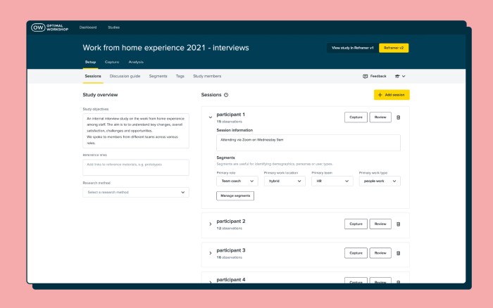
We made it our mission to alleviate those pesky pain points that so many researchers have when conducting qualitative analysis.
Observations, notes and metadata spread across different tools? No thanks. There's no need for multiple platforms anymore.
Reframer v2 offers an intuitive end-to-end qualitative research workflow within one tool. Create and conduct interview sessions, capture notes, tag, group, theme, analyze, and collaborate without having to leave the app.
With all your juicy data living in different tools, it can be pretty tricky to filter and gain in-depth insight.
Reframer v2 doesn't take a "one size fits all" approach. It's specifically built for qualitative research, with all your metadata and context in one place, all easily searchable with powerful filters.
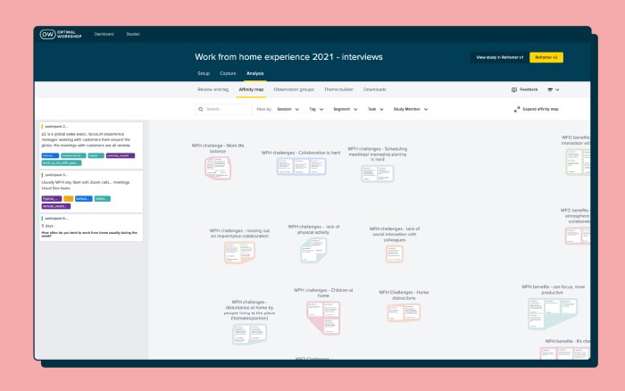
When you're ready for analysis, you don't want to be stuck doing it one way or the other.
We've added two different analysis methods to Reframer v2. Affinity mapping helps you with observation-based analysis, which is flexible, visual and collaborative. While the Themes tab offers tag-based analysis with powerful filters, giving you more quantifiable results.
Collaboration is key during qualitative research and analysis.
You can work together with your team members in Reframer v2. Simply invite them to your study and any edits or notes they make will show on the affinity map in real-time. You can also see their activity in the Study Members tab.
Reframer v1 will be turned off eventually, and Reframer v2 will simply become Reframer. But we want to make sure that v2 is up to scratch, your data is safe and sound, and you're confident in using v2 before that happens.
Take a look at the next steps of the Reframer v2 release:
Reframer v2 is rolled out to all paid customers. Based on feedback, we'll continue to build in and iterate on the most requested features. Reframer v2 will be the default for all new paid users, but current users can continue to toggle between v1 and v2.
Reframer v2 is rolled out to all customers and is the default for all users. All studies in legacy Reframer will be moved into v2. Paid customers will have access to the full feature set, free users will have access to a limited version of the tool.
Legacy Reframer is turned off and v2 becomes the new (and only) Reframer.

So there you have it! We're really excited to have Reframer v2 in front of all our paid customers, and we can't wait to hear what you think of it. If you've got suggestions or thoughts (good, bad or ugly), we want to know! Simply click the Feedback icon in the header and voila!

An impressive line-up of researchers, strategists, and designers from the global UX community shared their ideas, experiences, insights, and approaches to effective ways of working at this year’s 100% virtual 3-day UX New Zealand conference.
We introduce 7 speakers, highlight what they had to say, and share their full video presentations.
Designers focus on creating great experiences for customers but who’s looking out for the designers themselves? Marine Bucher, Service Designer at Humankind shared how a Design Ops approach is creating and maintaining a healthy environment for 170+ designers globally and 40+ locally in New Zealand, to thrive at ANZ bank.
“The goal of Design Ops is to remove all operational headaches so designers can focus on designing and researching.”
An impressive trio from Deloitte Digital: Carol Yung, Georgia Chetwynd-Talbot, and Matt Cobham took us through what it was like to be part of the agile team tasked with designing and piloting a core service of the UK’s pandemic response in just weeks, and delivering it at scale in just 2-3 months.
"Our lifecycle from design, to build, to deployment was extremely quick, learning as we went. We had to think and act like a start-up’."
Have you ever had a stakeholder ask you to present the findings of your study one hour before a meeting? Michael Ryan, User Research Director at Liberty Mutual Insurances shared his solution to this and other challenges researchers face presenting their work in a practical and entertaining talk.
“Can you present the findings from last week’s study now? Scenarios like that used to stress me out as a UX researcher so I came up with 1-pagers.”
Sarah Goforth, Senior UX Researcher at Trade Me considers herself and her fellow researchers, Kaitiaki, 'guardians of our people'. Sarah shared the challenges and wins of building their particular type of UX research operations (ReOPs) at Trade Me which includes everyone, (researchers and non-researchers), in the process.
"Not having an impact with your research really sucks as a researcher…and should not be wasted."
Phil Balagtas, President, and Founder of Futures Thinking believes designers have a responsibility to design better futures and policies for generations to come by embedding a future-thinking mindset into the products and services they design. He referenced the confusing, often intelligible world of Terms and Conditions to illustrate the need for designers to take a more human-centered approach.
"Policies are not always designed as a dialogue. Yet it's a gateway to using a service."
After introducing the four-day week at Perpetual Guardian, Andrew Barnes, Founder of 4 Day Week Global, actively advocates for its adoption by others as part of the future of work. He talks through the issues, challenges, and opportunities of embracing a 4 day working week in the digital age.
“When we started back in 2018 we were a pretty lone voice…The 4 day week has been given rocket fuel by Covid-19.”
While many avoid or despair when faced with UX complexity, Sophia Prater, Founder & Lead UX Designer at Rewired UX embraces complexity, untangling it with an approach she calls Object-Oriented UX. She shared four tough questions to ask early on to help wrangle complexity to benefit the user.
"I see portfolio pieces like this a lot. I can tell complexity has been completely swept under the rug and the end-user ends up handling it.”
For a taste of what even more speakers from UX New Zealand 2022 had to share, head over to our highlights reel.

User research is key to discovering the inner workings of your users’ minds – their emotional, organizational, informative needs and desires. These are all super important to creating a user experience that is intuitive and meeting your users’ needs in a way that means they feel loved, cared for and considered. All the deep understanding stuff that keeps them coming back!
Qualitative research allows you to collect verbatim data from participants that give insights into why they do or feel things. You can even get into whether ‘Dee’ understood how the website worked or why ‘Andrew’ would (or wouldn’t) revisit the app outside of testing.
Gathering these awesome insights is one step. Analyzing and organizing these is a skill and talent in its own right. And armed with the right tools or methods it can be immersive, interesting and a great way to get under the skin of your users. Let’s take a look at affinity mapping as a method of analyzing this data - as a tool it can help researchers visualize and easily group and theme data.
Affinity mapping is used outside of the UX world and can be done independently, however is a great analysis method to use collaboratively. For researchers, it can be a great tool to collaborate and engage the team and potentially stakeholders. Bringing people together to identify, discuss and resolve user experience issues.
Here we’ll lay out what affinity mapping is, specifically why it’s useful for user research and set out key steps to get you underway.
By definition, affinity mapping is the process of collecting, organizing, and grouping qualitative data to create an affinity diagram.
Put simply it is a tool to group, map, sort and categorize information. A tool where you’ll look at the information and patterns of your qualitative user research and work to group these together to make sense of them. It helps you to find patterns, similar outcomes and insights that allow you to draw conclusions and collate results in a cohesive manner, then report to the wider team in a way that makes sense and provides a clear road to applicable and achievable outcomes.
An affinity diagram is what you have once you have gone through the affinity mapping process. It is the final ‘diagram’ of your grouping, sorting and categorizing. An ordered visual sorting of insights and information from your user research. And the place to filter or funnel observations and information into patterns and reach final outcomes.
Allowing you to see where the key outtakes are and where there may need to be improvements, changes or updates. And from here a roadmap can be decided.

Essentially the mapping part is the process of creating the diagram, a visual sorting of insights and information from your user research. So how do you make affinity mapping work for you?
This could be a table, desk, pinboard or even a whiteboard. Somewhere that you can stick, pin or attach your insights to in a collaborative space. Becoming more common recently is the use of shared digital and online whiteboard tools. allowing people to access and participate remotely.
Write observations, thoughts, research insights on individual cards or sticky notes.
As a group read, comment and write notes or observations. Stick each of the notes onto the board, desk or whiteboard. Add, and shuffle into groups as you go. You can keep adding or moving as you go.
This will start to make sense as more sticky notes are added to the map. Creating groups for similar observations or insights, or for each pattern or theme.

As more notes are added there will be natural groups formed. Openly discuss if there are notes that are more difficult to categorize or themes to be decided. (We’ve outlined some ideas for UX research themes in another section below.)
You’ve tidied everything into themes and groups, now what? How do you decide which of these are priorities for your organization? Discussion and voting can be the best way to decide what outcomes make the most sense and may have the biggest impact on your business.
Pulling together and reporting on the findings through your affinity diagram process should be key to putting actionable outcomes in place.
Commonly, user research is digested through thematic analysis. During thematic analysis, you aim to make sense of all the notes, observations, and discoveries you’ve documented across all your information sources, by creating themes to organize the information.
Depending on your role and the type of research you conduct, the themes you create for your affinity diagram can vary. Here are some examples of affinity groups that you could form from your UX research:
Qualitative user testing and the resulting observations can be some of the best insights you get into your users’ minds. Filtering, organizing and ordering these disparate and very individual observations can be tricky. Especially if done in silo.
So, draw a team together, bring in stakeholders from throughout your organization and work collaboratively to sort, organize and categorize through affinity mapping. This opens the doors to discussion, buy-in and ultimately a collective understanding of user research. Its importance and its role within the organization. And most importantly the real-world implications UX research and its insights have on organizational products and output.

Information architecture (IA) is everywhere. Like the best websites and apps in the digital world, information architecture also brings clarity and understanding to the real world. It helps us navigate complexity and clutter, enables us to get things done more easily even with enjoyment, and reduces our cognitive load as we go about our lives.
As Abby Covert, IA advocate and author of ‘How to Make Sense of Any Mess’, puts it:
‘I believe information architecture has the power to make the world a clearer place’
We share five examples of information architecture at work in everyday life.

Does your phone home screen look like a random bunch of icons or a well-laid-out work of art? Fitness, entertainment, shopping, transport, banking…these days there’s some kind of app for every aspect of your life. While it’s handy to be able to access all these apps on the go, keeping track of them can be a mission unless you have some kind of system. If finding the right app at the right time is driving you crazy - maybe it’s time to give your phone information architecture some love?

Are your books arranged by subject, category, author, size, color, or something else? Do you go for the common approach that everyone understands like a library or something more personal like ‘books I read a lot’ or ‘books I’ll never read’? However you do it, there’s some kind of system, (or information architecture), at work that drives your decisions about where individual books end up on your shelf - what’s yours?

When you’ve got lots on and feeling overwhelmed or you’re packing for that well-earned holiday and don’t want to forget anything, chances are you enlist the help of some kind of list. What a relief to get all that stuff out of your head somewhere, in some kind of order. Whether you put pen to paper and stick it on your fridge or carry it around on your phone, the main thing is you’ve got a list somewhere - that’s a great information architecture starting point.

Supermarket shopping - love it or hate you - it’s got to be done. Do you browse the aisles or aim to get in and out as quickly as possible? Whether you’re pushing a trolley around your local haunt, out of town in unfamiliar territory or simply shopping online, you’re relying on some kind of signposts to guide your way through the myriad of products. Phew - Information architecture can be a lifesaver. It can also change lives as Jennie Leng discovered in her case study on online shopping at Countdown.
https://www.youtube.com/watch?v=abnHLaGV_aw&list=PLKQWFP9YS6b479paxcG89cOjHUjQcPlem&index=19&t=7s

Imagine you’re doing a spot of research ahead of a job interview, looking for the right person in a big company to pitch your product or you’re the newbie at work and unsure who’s who - an organizational chart can save time, and embarrassment - and generally make life easier. All power to information architecture!
So there you have it. Information architecture isn’t all about content audits, complex site maps or complex tree testing projects. It’s also about systems and structures that help us navigate everyday life in the real world.

What is information architecture (IA) without its complementary elements? On this blog we’ve already discussed the information architecture elements of taxonomy and ontology, and now it’s time to take a look at choreography. While taxonomy refers to how information is grouped, classified and labeled and ontology refers to the meaning behind our words, choreography describes the rules for how all those parts should interact.
Choreography is essentially the nuts and bolts that bring organization, structure and meaning together to form one well-oiled machine that supports, enables and delights users on their path to task completion within a specific context.An often overlooked element of information architecture, nailing your choreography is essential to the delivery of a seamless user experience because it is present in everything your users will do on your website.
Coming back to our house analogy from my taxonomy blog, choreography would be present throughout the entire house determining how everything works together. It’s in the positioning of the door handles and hinges to enable easy access and use of rooms and so you don’t swing an open door into a shower screen or into the knees of a toilet user (who should have locked the door anyway). Choreography appears in open plan living environments seamlessly flowing from one space to the next. The way that the laundry is usually a room that includes an external door allowing an easy workflow from storing the dirty clothes, to washing them to hanging them outside on the line to dry. These are all examples of choreography.
In the context of a website, choreography is present in a number of different website elements. These might include: the rules for how a menu might respond or behave under specific circumstances, the way the user interface adapts to suit different devices, the hierarchical relationship between content and much more.
To help you understand how choreography might appear in a website IA context, I’ve scoured the internet and have found 3 interesting examples I’d like to share with you.
Mental Floss is an online publication designed for curious minds — sounds awesome! But the thing I find most interesting is the choreography that is present in the surfacing behavior of the top navigation menu. There are two different ways to access its content: you can either click on the big orange menu button in the top right hand corner and you’ll get everything in one hit — including the footer links (see two images below) — or you can scroll down or up the page and it will automatically drop down and become sticky giving you just the level 1 IA headings and that sticky orange menu button (see third image below).

Mental Floss as it appears when I first open the home page.

When I click on the big orange button

Now look what happens when I scroll a bit.... Ta da!
If you go with the scrolling option, you’re not going to miss out because Mental Floss appears to have been designed to be explored — might have something to do with that curiosity thing! All the links that live under the big menu button are distributed throughout the long scrolling page, so when you’re exploring the content, you also get everything! If you get really stuck, that sticky orange menu button is always there to help. If I scroll I get one thing and if I click I get something else, but no matter how I choose to consume the content I get access to everything without having to think about it. This website’s choreography supports both exploratory and direct navigation styles and brings all the parts together.
Part blog, part catalogue, part how-to hub, the Inspiration page on IKEA’s US website is a fascinating IA example because it exists outside the patterns used on the rest of the website. It’s like an IA within an IA. While the rest of the website has a wide rigid structure typical of large IAs, the Inspiration page (also titled ‘IKEA Ideas’) is more organic and is organized by content tags and is navigated by filtering (see below).


The tag cloud-like thing displays the content tags in alphabetical order. Each piece can be assigned up to four tags and users can filter by clicking or just peruse the whole lot by scrolling. Upon clicking a content tag, the piece selection below is automatically updated to only include pieces with the selected tag.Choreography on this part of IKEA’s US website is present in the relationship and behavior of the content tags and how that affects the information on the page.
Do nothing for 2 minutes has a completely flat IA and its choreography is present in the way it responds to user behavior and the way it presents visual and audio content. The website opens to a single page (see below image) showing an image of a beautiful sunset at the beach accompanied by the soothing sound of waves gently crashing and a group of seagulls fighting over a pickle someone tossed them from a McDonald’s cheeseburger (maybe that was me). It gives me a very clear instruction to “do nothing for 2 minutes” and presents a timer that immediately starts counting down.

In the centre of the screen in that sunlight created highlight are the the words “Just relax and listen to the waves. Don’t touch your mouse or keyboard.” It’s a bit hard to read and I didn’t instantly notice it but when I don’t follow its guidance, the timer resets and tells me to “try again”(see below image).

When I comply with its instructions, the clock ticks down and when there are just 40 seconds to go something magical happens — the wave sounds stop. It’s not jarring or surprising, in fact it actually felt like I dropped to a deeper state of relaxation. Like an experienced lead dance partner, this website’s choreography pushes and pulls the follower where it wants them to go. The rule here is: if I touch my mouse or keyboard, the clock resets, and if I follow the instructions, I get to access an additional layer of relaxation when the sound drops off. It forces me to take 2 whole minutes of out my day in a strict but supportive way.
When I reach the end of the 2 minutes, I’m congratulated and shown an advertisement for a book to help me further explore this technique. I usually hate seeing things like that but I don’t mind in this case because it doesn’t come across as pushy and it’s already given me something.
When you break it down, choreography is about behaviors and relationships between all the pieces of the IA. It’s about which parts go together, what they do and how that fits in with everything else. Think content pairings in a card sort and the hierarchical position of content within the IA’s tree structure — why do those cards go together and why does label Y appear directly before label X? These choices are deliberate; it’s not just a case of “Oh let’s just put them wherever,” or “I’m going to whack a certain label at the very top because my boss told me because that’s where he thinks it should go.” Choreography exists throughout your entire IA and like everything else, all refinements must be determined by user research.
When running a card sort, pay close attention to:
Cards that are paired — or not — as well as their hierarchical placement can not only provide insight into your users’ taxonomical expectations but can also help you identify relationships (or lack thereof) between content and elements. Say you were running a card sort on an intranet and two cards labeled ‘Annual Leave’ and ‘Public Holidays’ were consistently being grouped together under ‘Human Resources’. What’s their expected relationship and interaction beyond the subject matter connection? Does one appear before the other? Is one linked to the other one’s page? Or are they together on one page and if so how do they interact? (if at all). For moderated card sorts, listen closely to the conversation for insight into this and be sure to ask your participants about anything you’re not sure of.
If your IA is a bit further along in its development or you’d like to evaluate an existing IA, tree testing can help you understand the choreography that will best support your users.
Keep an eye on:
The pathways followed by participants in a tree test will help you determine the right sequence of interactions required by a user to reach their goal — the ultimate step by step flow to task completion. What order do the labels need to be in? And what lives underneath them? And again, in what order?Think of it like a path through the woods to a lake. Your IA’s choreography should enable your users to be seamlessly guided along a smooth pathway made of big stone steps. They shouldn’t be running into trees or bushwhacking to create their own pathways.
When looking at a tree test, consider how many of your participants did not follow the pathway/s you defined as correct. Where did they go instead? What does the right path look like to your users? Also look at where the all important first click landed. If users start out on the correct first click, they are almost 3 times as likely to reach their goal. If your participants started out on a different first click, you’ll need to explore why that is. It could indicate ambiguity in the labels, it could also be a sign of an expectations mismatch, a hierarchical issue or it could be something else entirely! The tree test will help you identify where the issues are, but you’ll need to go and have a conversation with your users to understand why it’s happening.
Unless more than say 80% of your participants achieved direct success in reaching their goal (meaning they never strayed from the big stone path that you defined) you’ll need to check these things anyway to resolve findability and usability issues. Choreography related insights are an extra thing you can pull from what you’re already doing. And of course always remember that any choreography related data has to be considered in conjunction with whether or not the labels are even correct. Choreography is just one piece of the puzzle; it sets the rules for how all the parts interact and isn’t going to be much help if the parts aren’t even right in the first place!
Choreography in information architecture might be one of the most overlooked elements but it’s not hard to give it the time and consideration it deserves and your users will thank you for it!
