Subscribe to OW blog for an instantly better inbox
Oops! Something went wrong while submitting the form.
Articles and Podcasts on Customer Service, AI and Automation, Product, and more
A year ago, we looked at the user research market and made a decision.
We saw product teams shipping faster than ever while research tools stayed stuck in time. We saw researchers drowning in manual work, waiting on vendor emails, stitching together fragmented tools. We heard "should we test this?" followed by "never mind, we already shipped."
The dominant platforms got comfortable. We didn't.
Today, we're excited to announce Optimal 3.0, the result of refusing to accept the status quo and building the fresh alternative teams have been asking for.
The gap between product velocity and research velocity has never been wider. The situation isn't sustainable. And it's not the researcher's fault. The tools are the problem. They’re:
These platforms haven't changed because they don't have to, so we set out to challenge them.
Optimal 3.0 isn't an incremental update to the old way of doing things. It's a fundamental rethinking of what a research platform should be.
Research For All, Not Just Researchers.
For 18 years, we've believed research should be accessible to everyone, not just specialists. Optimal 3.0 takes that principle further.
Unlimited seats. Zero gatekeeping.
Designers can validate concepts without waiting for research bandwidth. PMs can test assumptions without learning specialist tools. Marketers can gather feedback without procurement nightmares. Research shouldn't be rationed by licenses or complexity. It should be a shared capability across your entire team.
A Complete Ecosystem in One Place.
Stop stitching together point solutions.Optimal 3.0 gives you everything you need in one platform:
Recruitment Built In Access millions of verified participants worldwide without the vendor tag. Target by demographics, behaviors, and custom screeners. Launch studies in minutes, not days. No endless email chains. No procurement delays.
Testing That Adapts to You
Learn more about Live Site Testing
AI-Powered Analysis (With Control) Interview analysis used to take weeks. We've reduced it to minutes.
Our AI automatically identifies themes, surfaces key quotes, and generates summaries, while you maintain full control over the analysis.
As one researcher told us: "What took me 4 weeks to manually analyze now took me 5 minutes."
This isn't about replacing researcher judgment. It's about amplifying it. The AI handles the busywork, tagging, organizing, timestamping. You handle the strategic thinking and judgment calls. That's where your value actually lives.
Learn more about Optimal Interviews
Chat Across All Your Data Your research data is now conversational.
Ask questions and get answers instantly, backed by actual video evidence from your studies. Query across multiple Interview studies at once. Share findings with stakeholders complete with supporting clips.
Every insight comes with the receipts. Because stakeholders don't just need insights, they need proof.
A Dashboard Built for Velocity See all your studies, all your data, in one place. Track progress across your entire team. Jump from question to insight in seconds. Research velocity starts with knowing what you have.
Integration Layer
Optimal 3.0 fits your workflow. It doesn't dominate it. We integrate with the tools you already use, Figma, Slack, your existing tech stack, because research shouldn't force you to abandon how you work.
What Didn't Change: Methodological Rigor
Here's what we didn't do: abandon the foundations that made teams trust us.
Card sorting, tree testing, first-click tests, surveys, the methodologically sound tools that Amazon, Google, Netflix, and HSBC have relied on for years are all still here. Better than ever.
We didn't replace our roots. We built on them.
18 years of research methodology, amplified by modern AI and unified in a complete ecosystem.
Product development isn't slowing down. AI is accelerating everything. Competitors are moving faster. Customer expectations are higher than ever.
Research can either be a bottleneck or an accelerator.
The difference is having a platform that:
Optimal 3.0 is built for research that arrives before the decision is made. Research that shapes products, not just documents them. Research that helps teams ship confidently because they asked users first.
A Fresh Alternative
We're not trying to be the biggest platform in the market.
We're trying to be the best alternative to the clunky tools that have dominated for years.
Amazon, Google, Netflix, Uber, Apple, Workday, they didn't choose us because we're the incumbent. They chose us because we make research accessible, fast, and actionable.
"Overall, each release feels like the platform is getting better." — Lead Product Designer at Flo
"The one research platform I keep coming back to." — G2 Review
This launch represents our biggest transformation, but it's not the end. It's a new beginning.
We're continuing to invest in:
Our goal is simple: make user research so fast and accessible that it becomes impossible not to include users in every decision.
See What We've Built
If you're evaluating research platforms and tired of the same old clunky tools, we'd love to show you the alternative.
Book a demo or start a free trial
The platform that turns "should we?" into "we did."
Welcome to Optimal 3.0.

There is an enormous amount of information on the internet. Every page you load is crammed with it. With so much information around, it’s incredibly important to remember that for human minds to be able to actually process and make sense of it, considered, strategic, ordered information architecture is needed.
Information architecture is everywhere digitally, but where does it actually live? IA sits in behind all of the digital interfaces we humans use (and even out in the real world). It ideally has been considered, researched, and implemented with humans in mind, though as we all know, this isn’t always the case.
Information architecture always has a role to play, and here we’ll focus on 4 key digital spaces where information architecture is most prominent, and likely most familiar.
To find out more about putting information architecture into action check out our blog.

Information architecture for websites can often be confused with navigation. While site navigation is super important, (think of it as the ‘skin’ that sits above the information), that’s only part of the story. Great website architecture considers and organizes user requirements, organizing the content and structure of the website with labels, search and navigation that simply makes sense and is easy to use. Done well, it will feel simple and straightforward, guiding users through smoothly.
Hubspot has a great article on IA for websites and how they can be structured. From a complex library system, to travel booking systems. Each has its own needs and can be quite deep in layers of information. The trick is to create a website structure, based on user needs, that makes sense of the piles of information and a simple navigation that sits above, making the journey to task completion as quick as possible. Working together they make any user experience feel quick, simple, and intuitive!

An organization's app acts as the first point of contact. It needs to be super simple, clean, and quick to interact with. A well thought out, thorough, researched, and organized information architecture plays a big part in this.
Information architecture for mobile use has a different set of rules than websites. The key consideration here is around the ease of use across a smaller screen. Navigation that makes sense for a laptop or desktop computer can be clunky in a mobile app.
An app's interface needs to have fewer options, and fewer clicks to complete the task. Researching and designing an app’s IA with just the right amount of information is key. Some retail apps are simplified websites, whereas other apps exist on their own merits, with no need for a website.
Bringing it back to the humans that will interact with the app is key to creating a product that delivers on user requirements and increases interaction.

An organizational intranet is possibly less of a priority than a website or an app but is vitally important to the success of an organization. And in these times of remote or hybrid working, intranets have proven to be more valuable than ever. An intranet is more than where to stick newsletters for staff, it is an interface that can make or break the productivity or even the wellbeing of an organization.
Access to files, information, messaging platforms, and corporate requirements wherever and whenever people are working is more important than ever. A well researched and designed information architecture can build an intranet that meets users’ requirements, increase communication and interaction and ultimately boost productivity.
Conducting UX research with staff on what they need to access, when, and how will help inform the intranet IA far more intuitively. The information available (and needed) can be huge, keeping it simple and human focused is key.
Have you ever thought about how poor internal information architecture might be hurting your business?

Social media software is complex in terms of ecosystem and display of information. Each social media platform has developed over time, think back to Facebook and how it looked when it initially launched. And through the uptake of users, gathering of information over time, and continual research and testing, it has evolved into what we see today. And will continue to evolve with users’ needs.
Every user has a different experience based on the individuals, groups, organizations and even retailers that they choose to interact with (or haven’t chosen via advertising). The piles of information that sit behind and are brought to the interface for an individual through their choice, associations, labels, tags, interests, age, etc will present them with a unique feed.
The interface of a social media platform needs to be considered, tested, tested again, and occasionally tested or changed once launched as the interaction of users is vitally important.
The information architecture sitting behind is huge in order to enable the agility to pull the right information forward in a dynamic and coherent way. Continuously learning, testing and requesting interaction from users through options to ‘hide’ posts that aren’t appropriate or respond to direct queries about what they do and don’t want to see are just some instances of continuous user research.
Social media continues to be a sophisticated information architecture that is constantly updating and changing with user needs.
Information architecture lives wherever there is information needing to be found by humans. Successful information architecture is sorted, organized and labeled in a way that is simple, intuitive, and considered. Making interaction and life simple, which in a world where there are an increasing number of websites, apps, and tools to choose from – intuitive information architecture has never been more important for your business and your customers.

Making a difference through UX was a shared passion among an impressive line-up of 7 researchers, strategists, and designers from the global UX community at this year’s 100% virtual 3-day UX New Zealand conference.
These days Darya Pilram, Senior Researcher at Twitter, spends her days trying to understand the motivation and techniques of groups who ‘hire’ technology to spread harmful narratives. The desert of Mogadishu and the urban conflicts of South Africa are just some of the unlikely places she’s leveraged the power of frontline research to create change.
"I realized the only way to influence change was by bringing folks along with me - and so I did. I bought them right into the field with me."
Experience Designer Beth McPhail refuses to buy into the mindset that ‘accessibility is a creativity killer’. She challenges her peers to view accessibility as an opportunity to grow creatively while making technology more inclusive.
“Accessibility is making it possible for someone to attend the party…and lose themselves in the music.”
Kelsey Gee is back challenging designers across all levels to think differently about how design can be used across different mediums and constraints to generate meaningful experiences and meaningful change. In this session, she explores design’s role in creating empowering experiences that break both cycles of crime and institutional racism. (If you missed Part 1 from Mini Con head over here)
"I truly believe that our superpower lies in our ability to redesign society, especially for our whanau and our most vulnerable communities…and once again explore design’s role in creating equal opportunities across safe, seamless, and healing public services."
In 1985, a researcher botched an interview question which led to a new understanding of trauma and its long-term effects. It grew awareness of the need to be trauma-informed in your work but what’s it actually mean? UX Researcher Melissa Eggleston explores what it means to be trauma-informed and shares practical advice on how to achieve it.
"Trauma is everywhere and something for us to think about…regardless of whether we’re working with people we know are dealing with traumatic events…it’s really all over the place."
One in five people experiences “mental illness or significant mental distress” in New Zealand. It’s a problem the Government knows needs to be addressed but how? In her powerful presentation, Rachael Reeves reveals what’s involved in balancing the complexities of Government with the need to rethink the way we design health products.
"Be warned you can’t please everyone and it can be tough to keep product vision aligned when you’re talking about serious consequences for people."
One billion new internet users (NIU) will come online for the first time over the next 5 years. These NIU's are using their first smartphones, with most of their online activities focused on communication, maintaining social connections, and entertainment. Tiane Lee, UX Research Lead at Google outlines the challenges and considerations behind adapting research for varying levels of digital literacy, including practical ideas for planning and conducting remote research with NIU.
"NIU’s are typically less digitally literate, they may show lower confidence in digital capability, and they may perceive lower value of the internet for things like chatting and entertainment.”
Michael Tam introduces us to the niche field of conditions design and cites a purpose built high diving board on Wellington city’s busy waterfront in New Zealand as a good example of conditions design. Find out why in this fascinating talk.
"What really impressed me here…hats off to the council because they didn’t design an experience that would discourage people from doing it. It’s designed for people to have fun (vs Hong Kong where public spaces are designed for Tai Chi not fun like this). The design allows it to happen by influencing human behavior to stay safe but encouraging fun and exploration.”
For a taste of what even more speakers from UX New Zealand 2022 had to share, head over to our highlights reel

In the crowded and complex world we live in, great user experiences can make all the difference to the way we navigate day-to-day life.
CRUX#5 reveals the many faces of information architecture at work and its positive impact in the fields of business, entertainment, education, and more. Our enthusiastic and knowledgeable contributors generously paint a picture of the challenges, opportunities and benefits of harnessing the power of IA in their world.
As always we're grateful to all our contributors for helping shine a light on the fascinating, even addictive world of UX. They certainly captured our imagination and attention - we hope they inspire and even surprise you too.
P.S. We’re already on the lookout for contributors for our next edition of CRUX for 2022. To find out more please drop us a line.

Return on investment (ROI) is often the term on everyone’s lips when starting a big project or even when reviewing a website. It’s especially popular with those that hold the purse strings. As UX researchers it is important to consider the ROI of the work we do and understand how to measure this.
We’ve lined up 5 key ways to measure ROI for UX research to help you get the conversation underway with stakeholders so you can show real and tangible benefits to your organization.
Put simply, a product that meets and exceeds user expectations leads to increased revenue. When potential buyers are able to find and purchase what they’re looking for, easily, they’ll complete their purchase, and are far more likely to come back. The simple fact that users can finish their task will increase sales and improve overall customer satisfaction which has an influence on their loyalty. Repeat business means repeat sales. Means increased revenue.
Creating, developing and maintaining a usable website is more important than you might think. And this is measurable! Tracking and analyzing website performance prior to the UX research and after can be insightful and directly influenced by changes made based on UX research.
Measurable: review the website (product) performance prior to UX research and after changes have been made. The increase in clicks, completed tasks and/or baskets will tell the story.
UX research done at the initial stages of a project can lead to a reduction in development time of by 33% to 50%! And reduced time developing, means reduced costs (people and overheads) and a speedier to market date. What’s not to love?
Measurable: This one is a little more tricky as you have saved time (and cost) up front. Aiding in speed to market and performance prior to execution. Internal stakeholder research may be of value post the live date to understand how the project went.
And the double hitter? Creating a product that has the user in mind up front, reduces the need to rehash or revisit as quickly. Reducing ongoing costs. Early UX research can help with the detection of errors early on in the development process. Fixing errors after development costs a company up to 100 times more than dealing with the same error before development.
Measureable: Again, as UX research has saved time and money up front this one can be difficult to track. Though depending on your organization and previous projects you could conduct internal research to understand how the project compares and the time and cost savings.
Did you know that 70% of projects fail due to the lack of user acceptance? This is often because project managers fail to understand the user requirements properly. Thanks to UX research early on, gaining insights into users and only spending time developing the functions users actually want, saving time and reducing development costs. Make sure you get confirmation on those requirements by iterative testing. As always, fail early, fail often. Robust testing up front means that in the end, you’ll have a product that will meet the needs of the user.
Measurable: Where is the product currently? How does it perform? Set a benchmark up front and review post UX research. The deliverables should make the ROI obvious.
Thanks to UX research you can find out exactly what your customers want, need and expect from you. This gives you a competitive advantage over other companies in your market. But you should be aware that more and more companies are investing in UX while customers are ever more demanding, their expectations continue to grow and they don’t tolerate bad experiences. And going elsewhere is an easy decision to make.
Measurable: Murky this one, but no less important. Knowing, understanding and responding to competitors can help keep you in the lead, and developing products that meet and exceed those user expectations.
Showing the ROI on the work we do is an essential part of getting key stakeholders on board with our research. It can be challenging to talk the same language, ultimately we all want the same outcome…a product that works well for our users, and delivers additional revenue.
For some continued reading (or watching in this case), Anna Bek, Product and Delivery Manager at Xplor explored the same concept of "How to measure experience" during her UX New Zealand 2020 – watch it here as she shares a perspective on UX ROI.

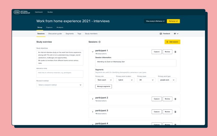
Over the past year, we've been busy getting ready to bring Reframer v2 out of beta. After implementing a ton of feedback from our superb beta users and plenty of usability testing, the day has finally arrived. It's time to say bye-bye beta!
Reframer v2 is a connected, collaborative and flexible workflow for your qualitative research and analysis. It allows you to capture, code, group, visualize and analyze your data within one single tool. And it's now available to all Optimal Workshop customers on a paid plan!
Conducting user interviews or usability tests? Reframer v2 is your new best friend.
To all the Reframer users out there, you'll be chuffed to know that we've taken the best bits of the original tool and added better analysis and collaboration (among other things). We think you'll really enjoy using Reframer v2 (and there's plenty of help to get you up and running in no time).
We made it our mission to alleviate those pesky pain points that so many researchers have when conducting qualitative analysis.
Observations, notes and metadata spread across different tools? No thanks. There's no need for multiple platforms anymore.
Reframer v2 offers an intuitive end-to-end qualitative research workflow within one tool. Create and conduct interview sessions, capture notes, tag, group, theme, analyze, and collaborate without having to leave the app.
With all your juicy data living in different tools, it can be pretty tricky to filter and gain in-depth insight.
Reframer v2 doesn't take a "one size fits all" approach. It's specifically built for qualitative research, with all your metadata and context in one place, all easily searchable with powerful filters.
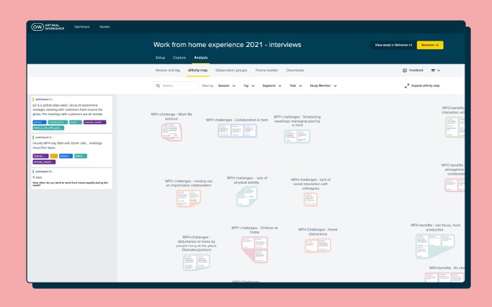
When you're ready for analysis, you don't want to be stuck doing it one way or the other.
We've added two different analysis methods to Reframer v2. Affinity mapping helps you with observation-based analysis, which is flexible, visual and collaborative. While the Themes tab offers tag-based analysis with powerful filters, giving you more quantifiable results.
Collaboration is key during qualitative research and analysis.
You can work together with your team members in Reframer v2. Simply invite them to your study and any edits or notes they make will show on the affinity map in real-time. You can also see their activity in the Study Members tab.
Reframer v1 will be turned off eventually, and Reframer v2 will simply become Reframer. But we want to make sure that v2 is up to scratch, your data is safe and sound, and you're confident in using v2 before that happens.
Take a look at the next steps of the Reframer v2 release:
Reframer v2 is rolled out to all paid customers. Based on feedback, we'll continue to build in and iterate on the most requested features. Reframer v2 will be the default for all new paid users, but current users can continue to toggle between v1 and v2.
Reframer v2 is rolled out to all customers and is the default for all users. All studies in legacy Reframer will be moved into v2. Paid customers will have access to the full feature set, free users will have access to a limited version of the tool.
Legacy Reframer is turned off and v2 becomes the new (and only) Reframer.

So there you have it! We're really excited to have Reframer v2 in front of all our paid customers, and we can't wait to hear what you think of it. If you've got suggestions or thoughts (good, bad or ugly), we want to know! Simply click the Feedback icon in the header and voila!
An impressive line-up of researchers, strategists, and designers from the global UX community shared their ideas, experiences, insights, and approaches to effective ways of working at this year’s 100% virtual 3-day UX New Zealand conference.
We introduce 7 speakers, highlight what they had to say, and share their full video presentations.
Designers focus on creating great experiences for customers but who’s looking out for the designers themselves? Marine Bucher, Service Designer at Humankind shared how a Design Ops approach is creating and maintaining a healthy environment for 170+ designers globally and 40+ locally in New Zealand, to thrive at ANZ bank.
“The goal of Design Ops is to remove all operational headaches so designers can focus on designing and researching.”
An impressive trio from Deloitte Digital: Carol Yung, Georgia Chetwynd-Talbot, and Matt Cobham took us through what it was like to be part of the agile team tasked with designing and piloting a core service of the UK’s pandemic response in just weeks, and delivering it at scale in just 2-3 months.
"Our lifecycle from design, to build, to deployment was extremely quick, learning as we went. We had to think and act like a start-up’."
Have you ever had a stakeholder ask you to present the findings of your study one hour before a meeting? Michael Ryan, User Research Director at Liberty Mutual Insurances shared his solution to this and other challenges researchers face presenting their work in a practical and entertaining talk.
“Can you present the findings from last week’s study now? Scenarios like that used to stress me out as a UX researcher so I came up with 1-pagers.”
Sarah Goforth, Senior UX Researcher at Trade Me considers herself and her fellow researchers, Kaitiaki, 'guardians of our people'. Sarah shared the challenges and wins of building their particular type of UX research operations (ReOPs) at Trade Me which includes everyone, (researchers and non-researchers), in the process.
"Not having an impact with your research really sucks as a researcher…and should not be wasted."
Phil Balagtas, President, and Founder of Futures Thinking believes designers have a responsibility to design better futures and policies for generations to come by embedding a future-thinking mindset into the products and services they design. He referenced the confusing, often intelligible world of Terms and Conditions to illustrate the need for designers to take a more human-centered approach.
"Policies are not always designed as a dialogue. Yet it's a gateway to using a service."
After introducing the four-day week at Perpetual Guardian, Andrew Barnes, Founder of 4 Day Week Global, actively advocates for its adoption by others as part of the future of work. He talks through the issues, challenges, and opportunities of embracing a 4 day working week in the digital age.
“When we started back in 2018 we were a pretty lone voice…The 4 day week has been given rocket fuel by Covid-19.”
While many avoid or despair when faced with UX complexity, Sophia Prater, Founder & Lead UX Designer at Rewired UX embraces complexity, untangling it with an approach she calls Object-Oriented UX. She shared four tough questions to ask early on to help wrangle complexity to benefit the user.
"I see portfolio pieces like this a lot. I can tell complexity has been completely swept under the rug and the end-user ends up handling it.”
For a taste of what even more speakers from UX New Zealand 2022 had to share, head over to our highlights reel.
