


What is information architecture? ✏️
According to Abby Covert, a leader in the field of information architecture, IA is ‘the way we arrange the parts to make sense of the whole.’ Information architecture (IA) is found in every digital product, from websites and apps to an intranet.
For the purposes of this article we focus on the importance of information architecture to user experience (UX) design because IA is fundamentally important to the success of your user experience. It determines how users will access your content and ultimately how successful their experience is when using your product.
When put like this it does seem pretty straightforward. Maybe even simple? But these tasks need to be straightforward for your users. Putting thought, time and research in at the front of your design and build can help build an intuitive product. IA is the structure that sits in behind and allows the design to tell the story and the content to be found in an easy way.
The role of information architecture in UX design 🏗️
Information architecture forms the framework for any UX design project. You need to consider the visual elements, functionality, interaction, and navigation and if they are built according to IA principles. If not considered fully even the most compelling content and powerful user experience design can fail without an organized and functional IA design. Disorganized content can make finding your way through difficult, meaning users get lost, annoyed and frustrated. Frustrated users don’t stick around and most likely don’t come back.
Through solving or preempting users’ issues with research and designing powerful and effective IA it reduces usability and navigation problems. Meaning that researched, thought through and designed information architecture can save both money and time for your organization in the longer term.
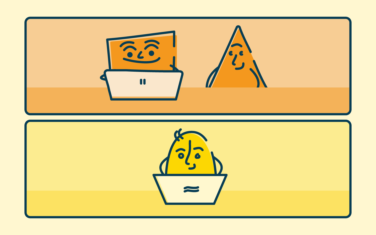
What is the difference between IA and UX? 🤯
Often it can be confusing that there isn’t much difference between IA and UX design. While these terms do relate to each other and need to be considered alongside, they are not one and the same.
“Information architecture (IA) is the discipline of making information findable and understandable, helping people understand their surroundings and find what they’re looking for online and in the real world” - Interaction Design
“User experience (UX) design is the process design teams use to create products
that provide meaningful and relevant experiences to users” - Interaction Design
UX design is well grounded with good functional information architecture but that’s not where it stops. The user experience focus is on influencing users’ behaviors and actions through emotion and psychology. Information architecture is focussed on the users' goals and task completion. They work together to create the very best user experience. IA provides the foundation of a well organized space that is easy to navigate and UX design ensures that the overall experience meets (or exceeds) users’ expectations, through their wants, needs and desires.
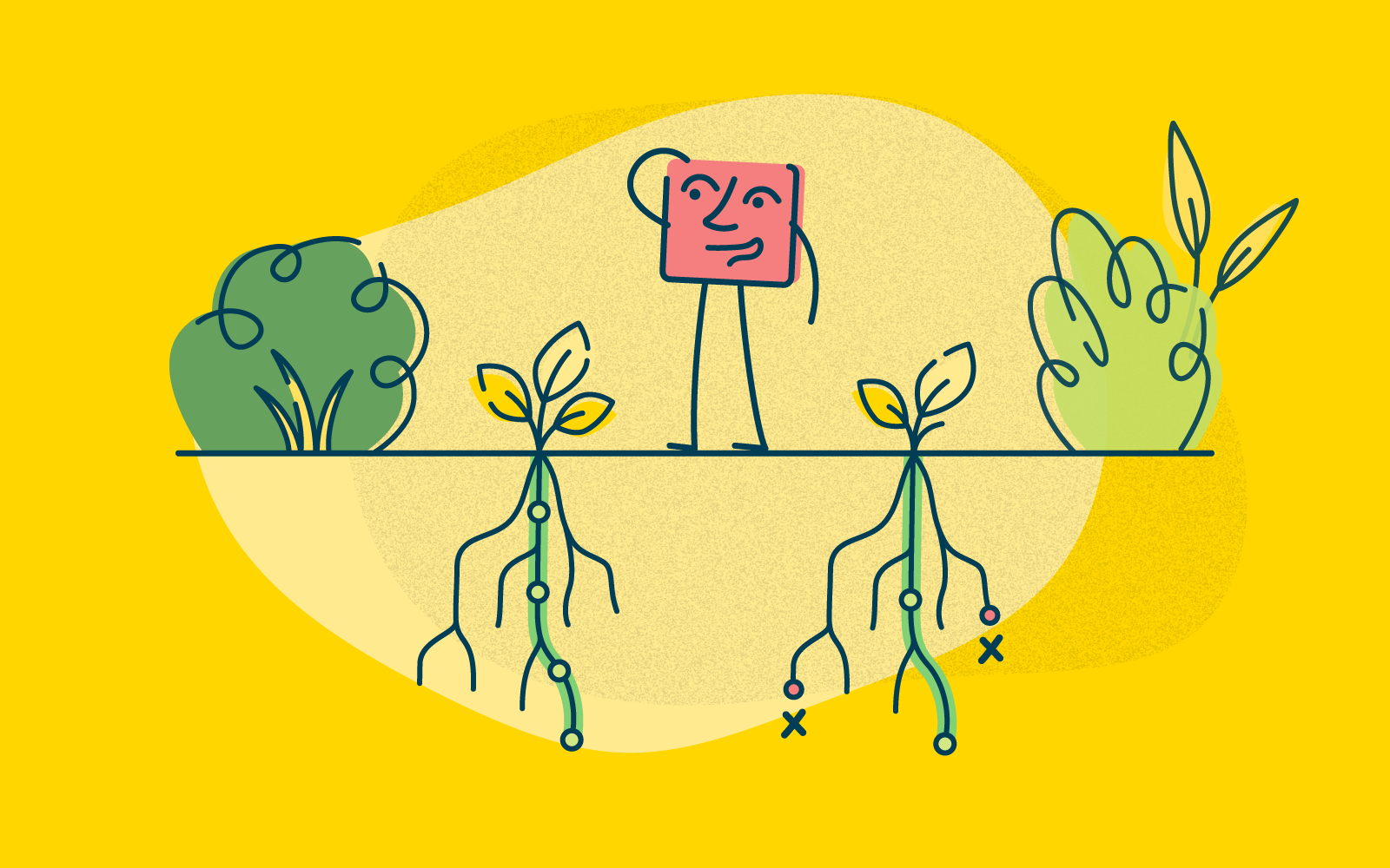
The key components of IA 🧱
There are four key components to consider when building a strong information architecture:
Labeling
How information is named and represented. Labels need to communicate information to users without using too much space or requiring much work on the user’s part.
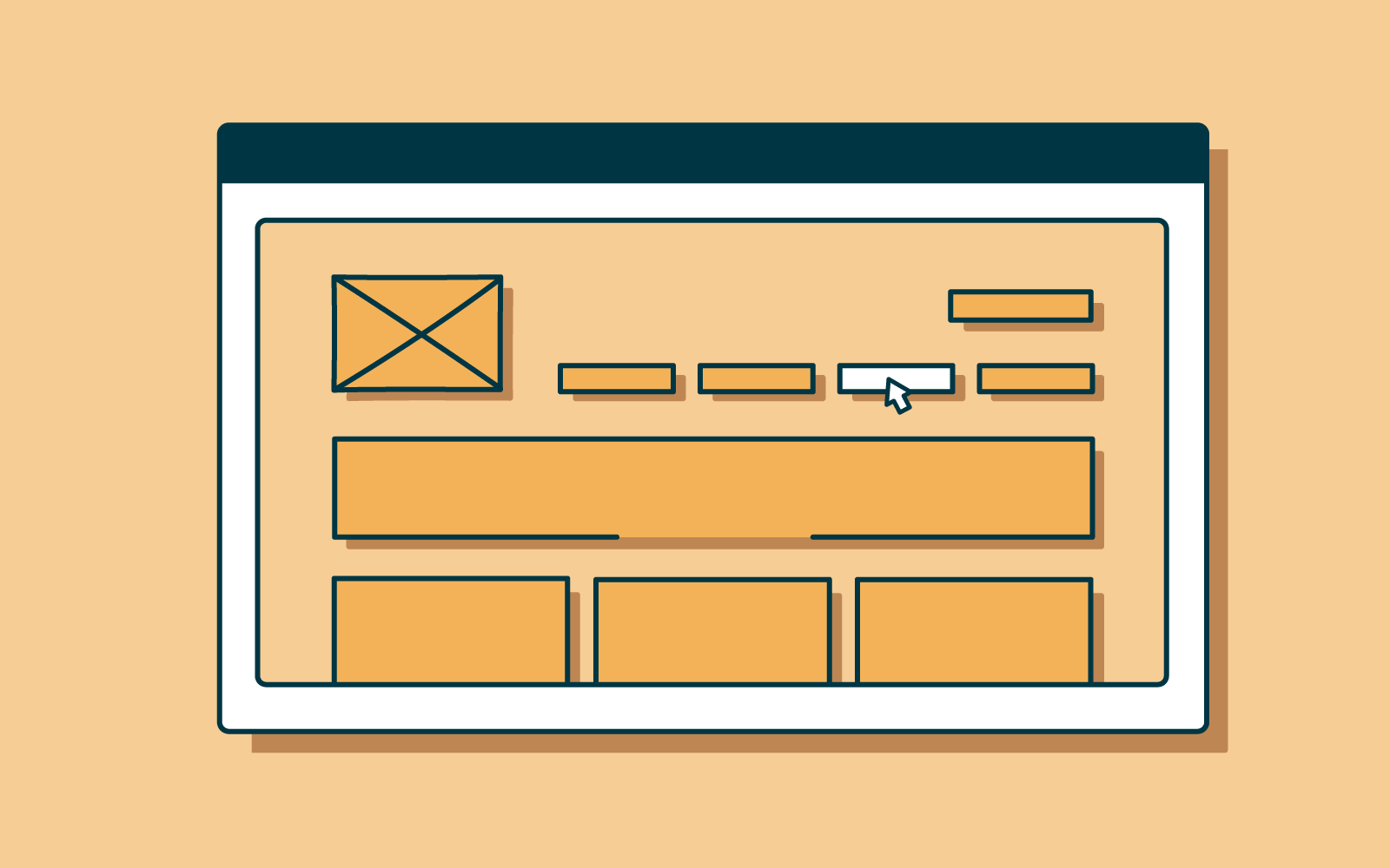
Navigation
How people make their way through information. Without robust IA which has been thought through this is the quickest way to confuse users. If they can’t find their way to the information they need, they won’t be able to complete their task. It really is that simple.
Search
How people will look for information (keywords, categories). A search system is especially important when there is a lot of content to wade through. A search engine, filters, and many other tools help users search content. Great UX design will consider how the information will be displayed once searched.
Organization
How the information is ordered. These help users to predict where they can find information easily:
- Hierarchical is the hierarchy of the content and literally the order of importance
the user expects to see information against what the organization needs. - Sequential Taking a stroll in your user's shoes can be valuable. Considering the path a user would take and the journey they make. Walking step-by-step, ensuring that as users progress through their tasks they are easily led to the next step.
- Matrix This is a little more complicated for users as it lets them choose how to navigate on their own. Users are given the choice of content organization. For example, the searchability of a website. Where the user could choose to search by topic, size, price or any other filter or option.
Wrap up 🥙
Information architecture is a key part of a powerful user experience design. Efficient IA helps users quickly and easily move through content and find what they want. And what do users want but to find what they want, complete their task and get on with their day!
Provide an IA that functions well, is intuitive to use and well labeled, coupled with UX design that is smooth, attractive and responds to users needs, wants and desires and you’ll have a winner on the day.