Subscribe to OW blog for an instantly better inbox
Oops! Something went wrong while submitting the form.
Articles and Podcasts on Customer Service, AI and Automation, Product, and more
A year ago, we looked at the user research market and made a decision.
We saw product teams shipping faster than ever while research tools stayed stuck in time. We saw researchers drowning in manual work, waiting on vendor emails, stitching together fragmented tools. We heard "should we test this?" followed by "never mind, we already shipped."
The dominant platforms got comfortable. We didn't.
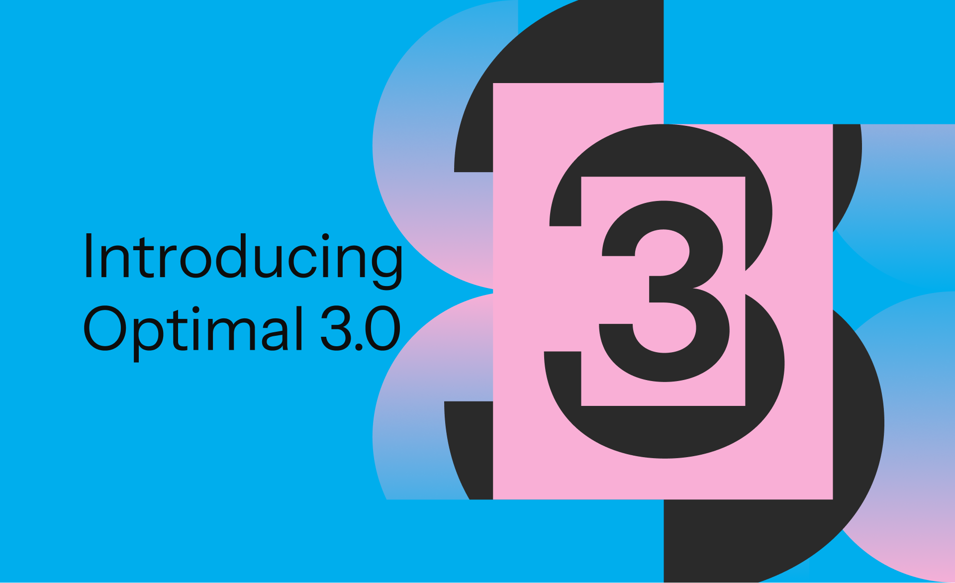
Today, we're excited to announce Optimal 3.0, the result of refusing to accept the status quo and building the fresh alternative teams have been asking for.
The gap between product velocity and research velocity has never been wider. The situation isn't sustainable. And it's not the researcher's fault. The tools are the problem. They’re:
These platforms haven't changed because they don't have to, so we set out to challenge them.
Optimal 3.0 isn't an incremental update to the old way of doing things. It's a fundamental rethinking of what a research platform should be.
Research For All, Not Just Researchers.
For 18 years, we've believed research should be accessible to everyone, not just specialists. Optimal 3.0 takes that principle further.
Unlimited seats. Zero gatekeeping.
Designers can validate concepts without waiting for research bandwidth. PMs can test assumptions without learning specialist tools. Marketers can gather feedback without procurement nightmares. Research shouldn't be rationed by licenses or complexity. It should be a shared capability across your entire team.
A Complete Ecosystem in One Place.
Stop stitching together point solutions.Optimal 3.0 gives you everything you need in one platform:
Recruitment Built In Access millions of verified participants worldwide without the vendor tag. Target by demographics, behaviors, and custom screeners. Launch studies in minutes, not days. No endless email chains. No procurement delays.
Testing That Adapts to You
Learn more about Live Site Testing
AI-Powered Analysis (With Control) Interview analysis used to take weeks. We've reduced it to minutes.
Our AI automatically identifies themes, surfaces key quotes, and generates summaries, while you maintain full control over the analysis.
As one researcher told us: "What took me 4 weeks to manually analyze now took me 5 minutes."
This isn't about replacing researcher judgment. It's about amplifying it. The AI handles the busywork, tagging, organizing, timestamping. You handle the strategic thinking and judgment calls. That's where your value actually lives.
Learn more about Optimal Interviews
Chat Across All Your Data Your research data is now conversational.
Ask questions and get answers instantly, backed by actual video evidence from your studies. Query across multiple Interview studies at once. Share findings with stakeholders complete with supporting clips.
Every insight comes with the receipts. Because stakeholders don't just need insights, they need proof.
A Dashboard Built for Velocity See all your studies, all your data, in one place. Track progress across your entire team. Jump from question to insight in seconds. Research velocity starts with knowing what you have.
Integration Layer
Optimal 3.0 fits your workflow. It doesn't dominate it. We integrate with the tools you already use, Figma, Slack, your existing tech stack, because research shouldn't force you to abandon how you work.
What Didn't Change: Methodological Rigor
Here's what we didn't do: abandon the foundations that made teams trust us.
Card sorting, tree testing, first-click tests, surveys, the methodologically sound tools that Amazon, Google, Netflix, and HSBC have relied on for years are all still here. Better than ever.
We didn't replace our roots. We built on them.
18 years of research methodology, amplified by modern AI and unified in a complete ecosystem.
Product development isn't slowing down. AI is accelerating everything. Competitors are moving faster. Customer expectations are higher than ever.
Research can either be a bottleneck or an accelerator.
The difference is having a platform that:
Optimal 3.0 is built for research that arrives before the decision is made. Research that shapes products, not just documents them. Research that helps teams ship confidently because they asked users first.
A Fresh Alternative
We're not trying to be the biggest platform in the market.
We're trying to be the best alternative to the clunky tools that have dominated for years.
Amazon, Google, Netflix, Uber, Apple, Workday, they didn't choose us because we're the incumbent. They chose us because we make research accessible, fast, and actionable.
"Overall, each release feels like the platform is getting better." — Lead Product Designer at Flo
"The one research platform I keep coming back to." — G2 Review
This launch represents our biggest transformation, but it's not the end. It's a new beginning.
We're continuing to invest in:
Our goal is simple: make user research so fast and accessible that it becomes impossible not to include users in every decision.
See What We've Built
If you're evaluating research platforms and tired of the same old clunky tools, we'd love to show you the alternative.
Book a demo or start a free trial
The platform that turns "should we?" into "we did."
Welcome to Optimal 3.0.
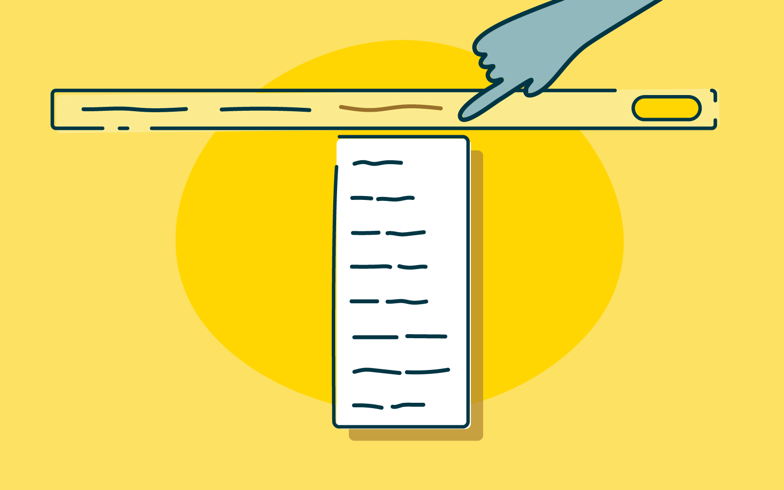
Summary: In this article, we’re going to take a look at what labeling is and why it’s important, go over some examples and show you how you can improve the labels on your own website.
Generally speaking, the modern web is a far more user-friendly place than it was 10 years ago. Growing consensus around things like accessibility and user experience has led to a web that’s easier to use, faster and more useful for more people. One of the areas that’s really helping to push things along in this regard is efforts around website architecture, and more specifically information architecture (IA). There's a lot to talk about when it comes to IA, so we recommend checking out our getting started guide if you're completely new to the field.
IA is largely made up of 4 components or systems. There are:
We’ve talked a lot about the organization, navigation and search side of IA before, now we’re going to take a look at what labeling is and why it’s important, go over some examples of good labeling and bad labeling and show you how you can improve the labels on your own website.
Let’s get started!
Labeling, in the most basic sense, is a type of representation. On the web, we use labels to represent larger chunks of information simply because we can’t crowd every page with all of the information on the entire website – it’s just not practical and it doesn’t look very nice. Take an ‘About us’ label that you might find on an organization’s homepage as an example. For most users, this label should mean that by clicking on or interacting with it, they’ll find information about the organization – office locations, staff, company history, etc. Because we can’t list all of this detail on the homepage, we use the label ‘About us’ to trigger the right association in the user’s mind.
We can use all sorts of labels for this purpose throughout a website, which in turn means we can keep our pages as clear and understandable as possible, making it easier for users to find what they’re actually looking for.
People spend huge amounts of energy decoding the meaning behind certain words in books, lyrics music and dialogue in films – but that’s not the case with the web. The web has evolved in an entirely different way. Given that people generally want to access the information they’re after as quickly and with as little hassle as possible, you can’t use unclear or difficult labels and expect users to sit there decoding the intended meaning. Chances are if they can’t find what they’re looking for, they’re going to leave and look for it somewhere else.
Labeling systems are also a way of identifying websites where it’s clear that the organization does not place a heavy emphasis on the needs of its users. Commonly, you’ll see this on websites where labels aren’t clear, but instead, use internal terminology that only people who work at the organization will understand.
Let’s now take a look at 2 examples of labeling systems, one planned and the other unplanned. For the purposes of this exercise, imagine that the following labels are represented as a navigation bar on a website.
Imagine you’ve just arrived on the website of the unplanned system for the first time. Chances are, you have little idea of what the labels are referring to. It’s clear that they've been designed based on the assumption that users will already know what they mean.
We can probably determine that these labels have something to do with a government body, whether that’s at a state or federal level, with some labels being quite clear like “Community issues board” and “Report a fault”, but others are just entirely confusing like “1752 overpass project” and “Small business”. As a result, we’re left sitting here wondering what each label is actually pointing to.
The planned system paints a much clearer picture. It’s not perfect, but we have more of an idea about what we’re likely to find behind each label. What’s more, we can see by looking at all of the labels that they’re related. Sure, there are outliers like “Support center” and “Account information”, but it’s not hard to see how these relate to the others. They’re also clear labels in their own right.
Importantly, this isn’t an entirely new labeling system – there’s a near-global precedent for this arrangement of labels and so we’re not asking our users to take on the substantial cognitive task of learning a new system.
Effective labels are simple and focused. Ideally, the labels on your website should be written using language that’s easily understandable to your users and reflects the content that’s behind them. After all, labels are designed to trigger associations in your users’ minds, allowing them to make their way through your website as quickly and with as little trouble as possible.
Let’s look at a real example of a website with poor labeling.

This is the website of Motorix International. Imagine you’ve just landed on the homepage and this top navigation bar is the first thing you see. Certain labels make sense immediately because we’ve seen them so many times before. We can probably assume that ‘Home’ takes us back to the homepage, ‘Products’ will show us a list of this company’s products and ‘News’ will be some sort of press release or blog page. But there are fundamental problems with the rest of the labels. ‘President’, ‘Access’, ‘Sales Agents’, ‘Inquiring’ and ‘Banks’ are all essentially open to interpretation.
Now, let’s move on and look at an example of a website with good labeling.

This is the sidebar of the AccorHotels group website. As you can see, nearly all of the labels here are clear and easily understandable – even without the context of the rest of the page. In addition to the usual items you’d expect to see on a hotel website (pointing you to information about hotel sub-brands and related facilities), AccorHotels has added icons to the four labels at the bottom of the list to provide additional guidance. ‘Professional Solutions’, ‘Loyalty Program’, ‘My bookings’ and ‘Support’ are all likely things that AccorHotels users regularly look for or return to on a regular basis, and the added icons help to anchor these labels in the sidebar.
With an understanding of why labeling is so important, how should you go and effect these changes on your own website? In general, you should be able to base the majority of your labeling decisions on best practice, whether that’s web best-practice or industry best practice. Labeling depends on user association, so it’s a good idea to follow good examples of what’s come before.
Here’s some more guidance for improving your labeling:
Welcome to our second speaker interview for UX New Zealand 2019 (check out our first interview with Gregg Bernstein). In the lead up to the conference, we’re catching up with the people who’ll be sharing their stories with you at the conference in October. Today, we chat with Nate Foulds, the product researcher for Stories at Instagram.
Nate: Yeah, so I took a pretty non-traditional path. When I was in college I never really thought about design or technology at all. I knew a couple people in computer science and digital design, but it wasn’t really on my radar. I studied political science and art history, and I really wanted to go into art law. But it was senior year and I got cold feet, so I decided to scrap that idea and spend a year teaching English abroad, just to take some time to figure out what to do next.
After a year I moved to San Francisco without a job or anything – just a connection. I had a friend working at an agency, Beyond, that was just starting out and needed some help with some pretty basic marketing-type stuff. Things like light data analysis and social listening, which was big at the time, basically analyzing what people are saying about your company on social media.
And so I started doing that and it turned out to be a pretty good fit. I liked working with so many different clients, getting the inside scoop on how their customers felt and then delivering recommendations for design and marketing. Over time, that work turned more and more into original user research with customers rather than just social listening.
Nate: I started at the Times after being at the agency for 5 years, and it was my first proper in-house role. At the Times, I led research for news products, which are basically the main website and news app. Projects I worked on included the redesign of The New York Times home page and the mobile app, including the concepting of a personalized news section called ‘For You’.
It was a really interesting time to be there since it was during the 2016 election cycle in the US. We witnessed the field of candidates and then the election itself where Donald Trump won, and then the post-election wake-up call that everyone had. Subscriptions grew an insane amount, just between the few quarters before the election to after the election itself, something like 30 percent, which was about 5 times more than growth periods prior.
And so all of a sudden we had this massive amount of people who were wanting to pay more attention to the news. It was really exciting for us to think about the sorts of features we could offer them to start and keep on subscribing. Like, how much are people willing to pay for the news in the first place? How much can we offer additional news value versus what we think of as complementary features? We found that podcasts and newsletters were really popular, as well as the cooking app and the crossword app. Some of these are complementary businesses that are value-adds for people once they’re in the door with the main news, or for those who don’t like the main news but value the rest.
A special thing about being there is the fact that you're surrounded by some of the greatest journalists in the country. There were times when I led research engagements that involved journalists as partners, and that inevitably resulted in some funny moments. I was once conducting interviews with an observer who was herself a Pulitzer Prize winning investigative journalist. I remember being in the room with her, Jodi Kantor, and I was leading the interview, but I felt so nervous in front of her as someone who's devoted her life to doing this as a skill.
Nate: Well in some ways Instagram is similar to the Times since it's still a consumer product. I feel comfortable working on those sorts of products where the goal is that anyone can pick up and use them. But as a company, it's pretty different, and a lot of that is just because it was born out of the tech world, versus the Times, which is a journalism company first. A lot of the resources and the infrastructure at Instagram allow you to move fast, test things, get feedback quickly and that sort of stuff. As a researcher, it really unlocks a lot of potential for coming up with ideas, getting feedback on them quickly, testing them, and seeing the results.
Nate: The whole time I've been at Instagram, since January 2018, I've been on the stories engagement team. It’s part of the home team, which is the home tab on Instagram that includes the feed, stories, comments, likes – that sort of stuff.
The research I focus on is how stories fits within the ecosystem of Instagram, thinking about where they appear, how people interact with them, the order in which they appear, how people react to different types of content, etc. Some of the work that we've been doing recently is about how to make stories better for people newer to Instagram, who could be in different markets, or who aren’t so digital-first.
Nate: There are some similarities, but at the same time it's so different. People usually say that in-house, you have one product and you feel an ownership over it, which I really value personally. At brands like Instagram and The New York Times I’ve enjoyed working on the core pieces – those companies are never going to outsource the core code for the main part of the experience. So I think it's cool to be on the inside and have the ability and influence to affect the product experience.
I’m also surprised by how much depth people can devote to a single feature. At an agency, every 3 to 6 months you're changing your focus completely, in a totally new context with a new audience and a new client. When I found out I was going to be on the stories team at Instagram, I first thought, how could I possibly spend this much time doing research for stories, how could it be a full-time focus for someone?
Soon I realized the depth of the experience, thinking about things like the transition when you swipe from one person's story to the next, understanding what that best experience feels like. The ability to focus completely and go deep on these micro-interactions is a major difference from my agency experience.
A major similarity, though, are those skills you also need in an agency, like pitching and selling ideas and projects, having well-designed presentations, and keeping a large network of people that you're constantly having coffee with. They’re useful skills that will never go out of style no matter where you work.
Nate: There’s this one person who comes to mind, Tomer Sharon, you might have heard of him. He was a UX researcher at Google for a long time, and he's this incredible thought leader on research and design. Basically every time I had to pick up something new I would google his writing and speaking. I had this master doc in Google Docs that was just called UX, most of it was derived from Tomer, and it evolved over the years to be something I would use every time I had to go to an interview. I've never met him, though he also lives in New York; my study of his work might creep him out. He's had a huge influence on my career. One day I’ll hopefully get to tell him that.
Nate: I know it’s a really common one, especially in UX, but, ‘You are not the user’. I think it's technically called the false-consensus effect, where people tend to design with themselves in mind. A lot of the time this can be great, intuition is a skill that designers have developed. But at the same time it's important to call out our biases.
One example at Instagram is that everyone who works here tends to follow each other, so you might have 50 or more people on your personal Instagram account that are co-workers. And a lot of the time, my co-workers produce pretty good content because they know what creative tools are available, or maybe they're on work trips or offsites. So as a way to remind myself what the experience is like for someone who doesn't have automatic access to this type of content, I basically mute co-workers as soon as I follow them so they don't show up in my stories section. It shows me the normal experience for people who don’t necessarily have that content in their ecosystem.
Nate: At Facebook we talk about communities a lot, so lately I've been reading about how communities are formed, the types of relationships between people in communities, hierarchical roles within communities, feelings of belonging, being in multiple communities at once, how people express their identities in communities. And especially how you begin to become a member of a community, and also leave that community.
What does it mean to step into a community for a week or for a month? How can I engage with something or someone that might be interesting now, but won’t be relevant at a certain point in time? How can we make the process of going in and out of these communities as easy as possible? There’s a lot to think about in the future when it comes to mapping online community dynamics to the real world.
Nate: I’m excited to come to New Zealand in general because I’ve never been before, and I’m excited for UX New Zealand because it’s a multi-disciplinary, cross-functional conference, focusing on design, product managers, research – I'm sure there will be so many different roles there. For me that's a lot more exciting than just a research-focused conference. I'm really excited to meet people across so many different roles, working at agencies, working in-house, working solo, and to hear their different perspectives.
I didn't know this at first, but I read that Wellington is the culinary capital of New Zealand, so I've been reading about the coffee and the craft beer and all the good food there. I wish I had more time in Wellington, but I'm going to be driving from Auckland to Wellington and stopping at Tongariro National Park where I’m looking forward to doing the crossing!
UX New Zealand is just around the corner. Whether you're new to UX or a seasoned professional, you'll gain valuable insights and inspiration - and have fun along the way! Learn more on the UX New Zealand website.

Summary: User researcher Ashlea McKay runs through some of her top tips for carrying out advanced analysis in tree testing tool Treejack.
Tree testing your information architecture (IA) with Treejack is a fantastic way to find out how easy it is for people to find information on your website and pinpoint exactly where they’re getting lost. A quick glance at the results visualization features within the tool will give you an excellent starting point, however your Treejack data holds a much deeper story that you may not be aware of or may be having trouble pinning down. It’s great to be able to identify a sticking point that’s holding your IA back, but you also want to see where that fits into the rest of the story and also not just where people are getting lost in the woods, but why.
Thankfully, this is something that is super quick and easy to find — you just have to know where to look. To help you gain a fuller picture of your tree testing data, I’ve pulled together this handy guide of my top tips for running advanced analysis in Treejack.
Treejack results are exciting and it can be all too easy to breeze past the Participants tab to get to those juicy insights as quickly as possible, but stopping for a moment to take a look is worth it. You need to ensure that everyone who has been included in your study results belongs there. Take some time to flick through each participant one by one and see if there’s anyone you’d need to exclude.
Keep an eye out for any of the following potential red flags:
Treejack also automatically excludes incomplete responses and marks them as ‘abandoned’, but you have full control over who is and isn’t included and you might like to reintroduce some of these results if you feel they’re useful. For example, you might like to bring back someone who completed 9 out of a total of 10 tasks before abandoning it as this might mean that they were interrupted or may have accidentally closed their browser tab or window before reaching the end.
You can add, remove or filter participant data from your overall results pool at any time during your analysis, but at a minimum deciding who does and doesn’t belong at the very beginning will save you a lot of time and effort that I certainly learned about the hard way.
Once you’re happy with the responses that will be included in your results, you’re good to go. If you made any changes, all you have to do is reload your results which you can do from the Participants tab and all your data on the other tabs will be updated to reflect your new participant pool.
Pietrees are the heart and soul of Treejack. They bring all the data Treejack collected on your participants’ journeys for a single task during your study together into one interactive and holistic view. After gaining an overall feel for your results by reviewing the task by task statistics under the Task Results tab, pietrees are your next stop in advanced analysis in Treejack.
Start by reviewing the overall size of the pietree. Is it big and scattered with small circles representing each node (also called a ‘pie’ or a ‘branch’)? Or is it small with large circular nodes? Or is it somewhere in between? The overall size of the pietree can provide insight into how long and complex your participants’ pathways to their nominated correct answer were.
Smaller pietrees with bigger circular nodes like the one shown in the example below taken from a study I ran in 2018 testing IKEA’s US website, happen when participants follow more direct pathways to their destination — meaning they didn’t stray from the path that you set as correct when you built the study.

This is a good thing! You want your participants to be able to reach their goal quickly and directly without clicking off into other areas but when they can’t and you end up with a much larger and more scattered pietree, the trail of breadcrumbs they leave behind them will show you exactly where you’re going wrong — also a good thing! Larger and more scattered pietrees happen when indirect and winding pathways were followed and sometimes you’ll come across a pietree like the one shown below where just about every second and third level node has been clicked on.

This can indicate that people felt quite lost in general while trying to complete their task because bigger pietrees tend to show large amounts of people clicking into the wrong nodes and immediately turning back. This is shown with red (incorrect path) and blue (back from here) color coding on the nodes of the tree and you can view exactly how many people did this along with the rest of that node’s activity by hovering over each one (see below image).
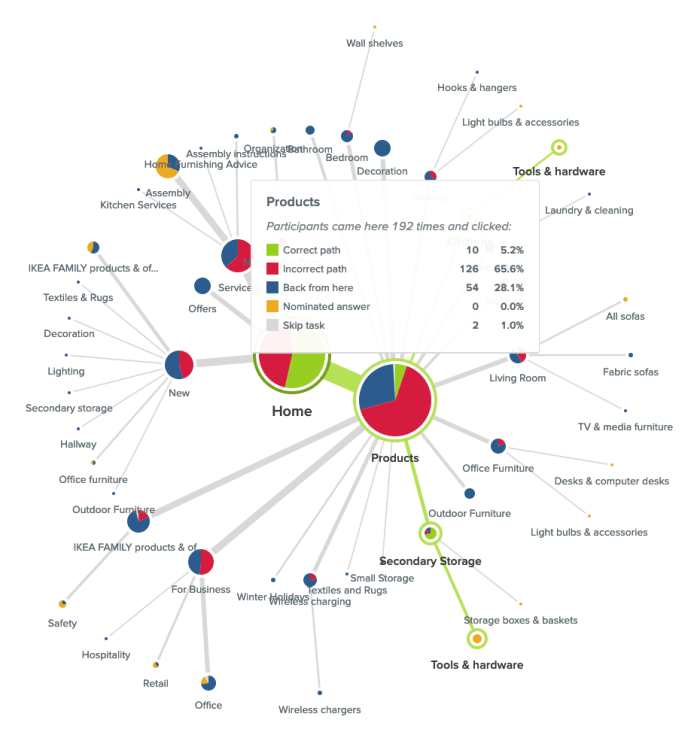
In this case people were looking for an electric screwdriver and while ‘Products’ was the right location for that content, there was something about the labels underneath it that made 28.1% of its total visitors think they were in the wrong place and turn back. It could be that the labels need a bit of work or more likely that the placement of that content might not be right — ‘Secondary Storage’ and ‘Kitchens’ (hidden by the hover window in the image above) aren’t exactly the most intuitive locations for a power tool.
When analyzing your pietree keep an eye out for any labels that might be potentially leading your users astray. Were there large numbers of people starting on or visiting the same incorrect node of your IA? In the example shown below, participants were attempting to replace lost furniture assembly instructions and the pietree for this task shows that the 2 very similar labels of ‘Assembly instructions’ (correct location) and ‘Assembly’ (incorrect location) were likely tripping people up as almost half the participants in the study were in the right place (‘Services’), but took a wrong turn and ultimately chose the wrong destination node.

Have a look at your pietree to see the number of times ‘Home’ was clicked. If that number is more than twice that of your participants, this can be a big indicator that people were lost in your IA tree overall. I remember a project where I was running an intranet benchmarking tree test that had around 80 participants and ‘Home’ had been clicked on a whopping 648 times and the pietrees were very large and scattered. When people are feeling really lost in an IA, they’ll often click on ‘Home’ as a way to clear the slate and start their journey over again. The Paths tab — which we’re going to talk about next — will allow you to dig deeper into findings like this in your own studies.
While the pietrees bring all your participants’ task journeys together into one visualization, the Paths tab separates them out so you can see exactly what each individual got up to during each task in your study.
As we discussed earlier, you want your IA to support your users and enable them to follow the most direct pathway to the content that will help them achieve their goal. The paths table will help show you if your IA is there yet or if it needs more work. Path types are color coded by directness and also use arrows to communicate which direction participants were traveling in at each point of their journey so you can see where in the IA that they were moving forward and where they were turning back. You can also filter by path type by checking/unchecking the boxes next to the colours and their text-based label names at the top of the table.
Here’s what those types mean:

It’s also important to note that while some tasks may appear to be successful on the surface — e.g., your participants correctly identified the location of that content — if they took a convoluted path to get to that correct answer, something isn’t quite right with your tree and it still needs work. Success isn’t always the end of the story and failed tasks aren’t the only ones you should be checking for lengthy paths. Look at the lengths of all your paths to gain a full picture of how your participants experienced your IA.
If you’re seeing large numbers of people failing tasks — either directly or indirectly — it’s worth taking a closer look at the paths table to find out exactly what they did and where they went. Did multiple people select the same wrong node? When people clicked into the wrong node, did they immediately turn back or did they keep going further down? And if they kept going, which label or labels made them think they were on the right track?
In the Sephora study example on that task I mentioned earlier where no one was successful in finding the correct answer, 22% of participants (7 people) started their journey on the wrong first node of ‘Help & FAQs’ and not one of those participants turned back beyond that particular Level 1 starting point (ie clicked on ‘Home’ to try another path). Some did backtrack during their journey but only as far back as the ‘Help & FAQs’ node that they started on indicating that it was likely the label that made them think they were on the right track. We’ll also take a closer look at the importance of accurate first clicks later on in this guide.

Treejack allows participants to skip tasks either before attempting a task or during one. The paths table will show you which node the skip occurred at, how many other nodes were clicked before they threw in the towel and how close (or not) they were to successfully completing their task. People skipping tasks in the real world affects conversion rates and more, but if you can find out where it’s happening in the IA during a tree test, you can improve it and better support your users and in turn meet your business goals.
Coming back to that Sephora study, when participants were looking to book an in-store beauty consultation, Participant 14 (see below image) was in the right area of the IA a total of 5 times during their journey (‘About Sephora’ and ‘Ways to Shop’). Each time they were just 2-3 clicks away from finding the right location for that content, but ultimately ended up skipping the task. It’s possible that the labels on the next layer down didn’t give this participant what they needed to feel confident they were still on the right track.

Borrowing a little functionality from Chalkmark, the first clicks tab in Treejack will help you to understand if your participants started their journey on the right foot because that first click matters! Research has shown that people are 2-3 times as likely to successfully complete their task if they start out on the right first click.
This is a really cool feature to have in Treejack because Chalkmark is image based, but when you’re tree testing you don’t always have a visual thing to test. And besides, a huge part of getting the bones of an IA right is to be deliberately visual distraction-free! Having this functionality in Treejack means you can start finding out if people are on the right track from much earlier stages in your project saving you a lot of time and messy guesswork.
Under the First clicks tab you will find a table with 2 columns. The first column shows which nodes of your tree were clicked first and the percentage of your participants that did that, and the second column shows the percentage of participants that visited that node during the task overall. The first column will tell you how many participants got their first click right (the correct first click nodes are shown in bold text ) and the second will tell you how many found their way there at some point during their journey overall including those who went there first.
Have a look at how many participants got their first click right and how many didn’t. For those who didn’t, where did they go instead?
Also look at how the percentage of correct first clicks compares to the percentage of participants who made it there eventually but didn’t go there first — is the number in the second column the same or is it bigger? How much bigger? Are people missing the first click but still making it there in the end? Not the greatest experience, but better than nothing! Besides that task’s paths table and pietree will help you pinpoint the exact location of the issues anyway so you can fix them.
When considering first-click data in your own Treejack study, just like you would with the pietrees, use the data under the Task results tab as a starting point to identify which tasks you’d like to take a closer look at. For example, in that Sephora study I mentioned, Task 5 showed some room for improvement. Participants were tasked with finding out if Sephora ships to PO boxes and only 44% of participants were able to do this as shown in the image below.

Looking at the first click table for this task (below), we can see that only 53% of participants overall started on the right first click which was ‘Help & FAQs’ (as shown in bold text).

Almost half the participants who completed this task started off on the wrong foot and a quarter overall clicked on ‘About Sephora’ first. We also know that 69% of participants visited that correct first node during the task which shows that some people were able to get back on track, but almost a third of participants still didn’t go anywhere near the correct location for that content. In this particular case, it’s possible that the correct first click of ‘Help & FAQs’ didn’t quite connect with participants as the place where postage options can be found.
As we near the end of this advanced Treejack analysis guide, our last stop is the Destinations tab. Under here you’ll find a detailed matrix showing where your participants ended their journeys for each task across your entire study. It’s a great way to quickly see how accurate those final destinations were and if they weren’t, where people went instead. It’s also useful for tasks that have multiple correct answers because it can tell you which one was most popular with participants and potentially highlight opportunities to streamline your IA by removing unnecessary duplication.
Along the vertical axis of the grid you’ll find your entire IA tree expanded out and along the horizontal axis, you’ll see your tasks shown by number. For a refresher on which task is which, just hover over the task number on the very handy sticky horizontal axis. Where these 2 meet in the grid, the number of participants who selected that node of the tree for that task will be displayed. If there isn’t a number in the box — regardless of shading — no one selected that node as their nominated correct answer for that task.
The boxes corresponding to the correct nodes for each task are shaded in green. Numberless green boxes can tell you in one quick glance if people aren’t ending up where they should be and if you scroll up and down the table, you’ll be able to see where they went instead.
Red boxes with numbers indicate that more than 20% of people incorrectly chose that node as well as how many did that. Orange boxes with numbers do the same but for nodes where between 10% and 20% of people selected it. And finally, boxes with numbers and no shading, indicate that less than 10% selected that node.
In the below example taken from that Sephora study we’ve been talking about in this guide, we can see that ‘Services’ was one of the correct answers for Task 4 and no one selected it.

The Destinations table is as long as the IA when it’s fully expanded and when we scroll all the way down through it (see below), we can see that there were a total of 3 correct answers for Task 4. For this task, 8 participants were successful and their responses were split across the 2 locations for the more specific ‘Beauty Services’ with the one under ‘Book a Reservation’ being the most popular and potentially best placed because it was chosen by 7 out of the 8 participants.

When viewed in isolation, each tab in Treejack offers a different and valuable perspective on your tree test data and when combined, they come together to build a much richer picture of your study results overall. The more you use Treejack, the better you’ll get at picking up on patterns and journey pathways in your data and you’ll be mastering that IA in no time at all!
Further reading
Welcome to our first UX New Zealand 2019 speaker interview. In the lead up to the conference (which is just around the corner!), we’re catching up with the people who’ll be sharing their stories with you in October.
Today, we chat to Gregg Bernstein, the Senior Director of User Research at Vox Media.
Gregg: Yeah, I'm a big fan too. It's a treat to get to work with them.
Gregg: So what got me into user research is that I was actually a designer for a number of years. And, after a while, I got pretty tired of design. I used to do a lot of album covers and posters for punk rock bands and independent bands and things like that. And I just felt like I was doing the same thing over and over.
I decided to go to graduate school because, after teaching design at a university for a couple of years, I wanted to teach design full time, instead of doing design work. And it was in grad school that I realized that I liked understanding the information that informs the design in the first place, right? I was fascinated by exploring what the opportunities were and who would consume the final product.
And then I realized what I was really interested in was actually UX research, a term which I didn't even know existed at the time. And then once I realized that this was an entire area of study, it made it clear to me that that's where I wanted to go with my career. So I ended up turning my master's degree in graphic design into a more encompassing study of user experience and UX research. And fortunately ended up getting to do that work at MailChimp just a year after graduating with my MFA.
Gregg: Not exactly. I was given the opportunity to scale up the team and scale up the research practices.
When I first started, all of our work was in service of the UX team. So it was a lot of interviews and usability tests and competitive analyses that were solely to make the MailChimp app better. But over time, as my team shared our work in presentations and in internal newsletters, the rest of the company started asking us questions and it wasn't coming from our traditional UX partners. It wasn't coming from engineering, it was coming from the accounting team or the marketing team and all of this demand for research was evidence that we needed to hire more people and become more of a consultancy to the entire organization.
So I was able to scale up what we were doing in that sense, to serve not just our product and our application, but the entire organization. And really think about what are the questions that are going to help us as a business and help us make smarter decisions.
Gregg: I think in hindsight it's more gratifying. When you're in the thick of it, it's, "wow, there's so much demand, how are we going to satisfy everyone?" It becomes a prioritization challenge to try to figure out, which work do we take on now versus what's nice to know but isn't going to help us with either building the right product or marketing in the right way, increasing revenue.
So I was gratified to be put in a position to hire people and try to answer more questions. But when you're in the thick of it's also just a whole lot of, "Oh gosh, how do I do this?"
Gregg: It's a lot different at Vox. There is a product team and that's where I live and that's where my team lives. We work within our product organization. But media is so different because you don't (at least in our case) require anybody to sign up or pay for the product. Anybody can read The Verge, anybody can listen to a Vox.com podcast. Anybody can keep up with Polygon wherever they keep up with Polygon. So there's not a true exchange of money for products, so the whole idea of there being a product changes.
One of my roles at Vox is really to help us understand how we can make it easier for journalists to write their stories. So we have a content management system we call Chorus, all of our different networks, whether it's Vox or The Verge or Eater, they use Chorus to write their stories. And then that sends their stories to our websites, but also to Apple news, to Google News, newsletters and Facebook and Twitter. Wherever the stories need to go.
There's the research into, how do we make that experience of writing the news better? How do we make the experience of consuming the news better? What would make a podcast listener have a better experience and find more podcasts? How does somebody who watches us only on YouTube discover other YouTube channels that we create content on?
So it's a very different type of research. I try to help all of our teams make better decisions, whether it's the podcast team with how to market the podcast, or our product team with how to make it easier to write a story. And now I’m working on a new line of business which is how do we sell our content management system to other newsrooms? So, I don't know if you're familiar with Funny Or Die or The Ringer, those are other media companies, but they’re running on our CMS. And so there's research into how do we make our products usable for other organizations that we don't work with day to day.
Gregg: They don't have their own research teams. I mean they are all journalists, they all know how to conduct their own investigations. But when it comes to the user experience research, I was the first hire in a company with that skillset and I still help all of our different sub brands when they have questions. Let's say we’re interested in starting up a new newsletter focused on a very specific topic. What they might come to me to understand is the context around that topic. So how do people currently satisfy their need to get information on that topic? Where do they go? Do they pay for it? At what time of day do they read it or watch it or consume it. Those are the types of studies where I will partner with The Verge or Vox or Curbed or whoever it is, and help them get that information.
My primary research audience is our product teams. There are always questions around how can we make the editorial or audience experience better. That's always going to be my first responsibility, but that's 70% of the work. The other 30% is how do I help our other colleagues around the company that are in these sub-brands get answers to their questions too.
Gregg: I prefer any type of job where I'm helping people make better decisions. I think that's really the job of the researcher is to help people make better decisions. So whether it's helping people understand what the YouTube audience for vox.com looks like, or how we make MailChimp easier to use for a small business owner? That doesn't really matter as long as I feel like I’m giving people better information to make better decisions.
Gregg: It does because there are only 4 researchers at Vox right now, soon to be 3 because one is returning to graduate school. So there's few researchers, but there's no shortage of questions, which means part of the job of research is to help everyone understand where they can get information to make better decisions. If you look at LinkedIn right now, you'll see that there's something like 30,000 UX engineer positions open, but only 4,000 UX research positions open.
There's a shortage of researchers. There's not a lot of demand for the role, but there is a demand for information. So you kind of have to give people the skills or a playbook to understand, there's information out there, here's where you can find it. But not only that, you have to give them the means to get that information in a way where it's not going to disrupt their normal deadlines. So research can't be some giant thing that you're asking people to adopt. You have to give people the skills to become their own researchers.
At Vox we've put together a website that has examples of the work we've done, resources on how to do it and how somebody can do it themselves. A form people can fill out if they need help with a project.
So we're really trying to be as transparent as possible and saying, "these are things that you could do. Here are examples of things that we've done. Here are people you can talk to." There's also Slack channels that we host where anybody can ask us questions. So if I can't do the work myself or if my team can't do it, people will still know that there are options available to them.
Gregg: The first thing you can do is go on a listening tour and just understand how people make decisions now. What information they use to make those decisions and what the opportunities are. Just get that context.
That's step 1, step 2 is to pick one small tightly scoped project that is going to be easy to accomplish but also is going to be meaningful to a lot of people. So what's the one thing that everybody's confused about in your product? Quickly do that research to help illuminate the context of that problem space and offer some scenarios.
And the reason you pick one tightly scoped project is then you can point to it and say, this is what user research can do. This didn't take long, it didn't cost a lot, but we've learned a ton. So I think the starting point is just creating that evidence that people can point to and say, "Hey, look what we did. We could be doing this every day." So you just have to make the case that research is achievable and prove that it's not impossible to put into place.
Gregg: I think I'm making progress within Vox. I think people are seeing that research is not hard to incorporate, that it should be a consideration for any project.
I think once people see that they can do their own research, that's step one of a longer process. Like you want everyone to be aware of research and starting to do their own research, but that's a stopgap. Ideally, you want it to get to the point where everyone is saying we need more research and then you can hire dedicated experts who can do the research all the time. And that's where we got to at Vox a year ago where I was able to hire more people, or a year and a half ago, I could hire more people because there was a demand for it and I couldn't be in every meeting and I couldn't take on every project. But the projects were important and we were going to make big decisions based on research. We needed to have more people who were experts doing this work.
So I think everyone being a researcher is the first of a long process to get to having a dedicated research staff. But you have to start with something small, which is everyone could do their own research.
Gregg: The thing I'm most looking forward to about the conference itself is I get so much out of meeting attendees and hearing what challenges they're facing. Whether they're a designer or developer or just somebody who works in user experience in any capacity. I want to hear what work looks like for them and how their teams are growing or how their organizations are growing.
In addition to the speakers, that's what I want to hear, is the audience. And then Wellington, I've never been there. I'm super excited to spend a day just walking around and seeing everything and eating some food and having a good time. It doesn't take much to satisfy me so just being there is going to be enough.
UX New Zealand is just around the corner. Whether you're new to UX or a seasoned professional, you'll gain valuable insights and inspiration - and have fun along the way! Learn more on the UX New Zealand website.
As UX professionals we know the value of card sorting when building an IA or making sense of our content and we know that first clicks and first impressions of our designs matter. Tools like OptimalSort and Chalkmark are two of our wonderful design partners in crime, but did you also know that they work really well with each other? They have a lot in common and they also complement each other through their different strengths and abilities. Here are 3 ways that you can make the most of this wonderful team up in your design process.
Imagine you’re at a point in your design process where you’ve done some research and you’ve fed all those juicy insights into your design process and have come up with a bunch of initial visual design concepts that you’d love to test.
You might approach this by following this 3 step process:
There are two ways you could run this approach: remotely or in person. The remote option is great for when you’re short on time and budget or for when your users are all over the world or otherwise challenging to reach quickly and cheaply. If you’re running it remotely, you would start by popping images of your concepts in whatever state of fidelity they are up to into Chalkmark and coming up with some scenario based tasks for your participants to complete against those flat designs. Chalkmark is super nifty in the way that it gets people to just click on an image to indicate where they would start out when completing a task. That image can be a rough sketch or a screenshot of a high fidelity prototype or live product — it could be anything! Chalkmark studies are quick and painless for participants and great for designers because the results will show if your design is setting your users up for success from the word go. Just choose the most common tasks a user would need to complete on your website or app and send it out.
Next, you would review your Chalkmark results and make any changes or iterations to your designs based on your findings. Choose a maximum of 3 designs to move forward with for the last part of this study. The point of this is to narrow your options down and figure out through research, which design concept you should focus on. Create images of your chosen 3 designs and build a closed card sort in OptimalSort with image based cards by selecting the checkbox for ‘Add card images’ in the tool (see below).

The reason why you want a closed card sort is because that’s how your participants will indicate their preference for or against each concept to you. When creating the study in OptimalSort, name your categories something along the lines of ‘Most preferred’, ‘Least preferred’ and ‘Neutral’. Totally up to you what you call them — if you’re able to, I’d encourage you to have some fun with it and make your study as engaging as possible for your participants!

Limit the number of cards that can be sorted into each category to 1 and uncheck the box labelled ‘Randomize category order’ so that you know exactly how they’re appearing to participants — it’s best if the negative one doesn’t appear first because we’re mostly trying to figure out what people do prefer and the only way to stop that is to switch the randomization off. You could put the neutral option at the end or in the middle to balance it out — totally up to you.
It’s also really important that you include a post study questionnaire to dig into why they made the choices they did. It’s one thing to know what people do and don’t prefer, but it’s also really important to additionally capture the reasoning behind their thinking. It could be something as simple as “Why did you chose that particular option as your most preferred?” and given how important this context is, I would set that question to ‘required’. You may still end up with not-so helpful responses like ‘Because I like the colors’ but it’s still better than nothing — especially if your users are on the other side of the world or you’re being squeezed by some other constraint! It’s something to be mindful of and remember that studies like these contribute to the large amount of research that goes on throughout a project and are not the only piece of research you’ll be running. You’re not pinning all your design’s hopes and dreams on this one study! You’re just trying to quickly find out what people prefer at this point in time and as your process continues, your design will evolve and grow.
You might also ask the same context gathering question for the least preferred option and consider also including an optional question that allows them to share any other thoughts they might have on the activity they just completed — you never know what you might uncover!
If you were running this in person, you could use it to form the basis for a moderated codesign session. You would start your session by running the Chalkmark study to gauge their first impressions and find out where those first clicks are landing and also have a conversation about what your participants are thinking and feeling while they’re completing those tasks with your concepts. Next, you could work with your participants to iterate and refine your concepts together. You could do it digitally or you could just draw them out on paper — it doesn't have to be perfect! Lastly, you could complete your codesign session by running that closed card sort preference test as a moderated study using barcodes printed from OptimalSort (found under the ‘Cards’ tab during the build process) giving you the best of both worlds — conversations with your participants plus analysis made easy! The moderated approach will also allow you to dig deeper into the reasoning behind their preferences.
Your information architecture (IA) is the skeleton structure of your website or app and it can be really valuable to evaluate it from two different angles: non-visual and visual. The non-visual elements of an IA are: language, content, categories and labelling and these are great because they provide a clear and clean starting point. There’s no visual distractions and getting that content right is rightfully so a high priority. The visual elements come along later and build upon that picture and help provide context and bring your design to life. It's a good idea to test your IA through both lenses throughout your design process to ensure that nothing is getting lost or muddied as your design evolves and grows.
Let’s say you’ve already run an open card sort to find out how your users expect your content to be organised and you’ve created your draft IA. You may have also tested and iterated that IA in reverse through a tree test in Treejack and are now starting to sketch up some concepts for the beginnings of the interaction design stages of your work.
At this point in the process, you might run a closed card sort with OptimalSort on your growing IA to ensure that those top level category labels are aligning to user expectations while also running a Chalkmark study on your early visual designs to see how the results from both approaches compare.
When building your closed card sort study, you would set your predetermined categories to match your IA’s top level labels and would then have your participants sort the content that lies beneath into those groups. For your Chalkmark study, think about the most common tasks your users will need to complete using your website or app when it eventually gets released out into the world and base your testing tasks around those. Keep it simple and don’t stress if you think this may change in the future — just go with what you know today.
Once you’ve completed your studies, have a look at your results and ask yourself questions like: Are both your non-visual and visual IA lenses telling the same story? Is the extra context of visual elements supporting your IA or is it distracting and/or unhelpful? Are people sorting your content into the same places that they’re going looking for it during first-click testing? Are they on the same page as you when it’s just words on an actual page but are getting lost in the visual design by not correctly identifying their first click? Has your Chalkmark study unearthed any issues with your IA? Have a look at the Results matrix and the Popular placements matrix in OptimalSort and see how they stack up against your clickmaps in Chalkmark.


A great way to find out if your top level labels and their matching icons are communicating coherently and consistently is to test them by using both OptimalSort and Chalkmark. Icons aren’t the most helpful or useful things if they don’t make sense to your users — especially in cases where label names drop off and your website or app homepage relies solely on that image to communicate what content lives below each one e.g., sticky menus, mobile sites and more.
This approach could be useful when you’re at a point in your design process where you have already defined your IA and are now moving into bringing it to life through interaction design. To do this, you might start by running a closed card sort in OptimalSort as a final check to see if the top level labels that you intend to make icons for are making sense to users. When building the study in OptimalSort, do exactly what we talked about earlier in our non-visual vs visual lens study and set your predetermined categories in the tool to match your level 1 labels. Ask your participants to sort the content that lies beneath into those groups — it’s the next part that’s different for this approach.
Once you’ve reviewed your findings and are confident your labels are resonating with people, you can then develop their accompanying icons for concept testing. You might pop these icons into some wireframes or a prototype of your current design to provide context for your participants or you might just test the icons on their own as they would appear on your future design (e.g., in a row, as a block or something else!) but without any of the other page elements. It’s totally up to you and depends entirely upon what stage you’re at in your project and the thing you’re actually designing — there might be cases where you want to zero in on just the icons and maybe the website header e.g., a sticky menu that sits above a long scrolling, dynamic social feed. In an example taken from a study we recently ran on Airbnb and TripAdvisor’s mobile apps, you might use the below screen on the left but without the icon labels or you might use the screen on the right that shows the smaller sticky menu version of it that appears on scroll.

The main thing here is to test the icons without their accompanying text labels to see if they align with user expectations. Choose the visual presentation approach that you think is best but lose the labels!
When crafting your Chalkmark tasks, it’s also a good idea to avoid using the label language in the task itself. Even though the labels aren’t appearing in the study, just using that language still has the potential to lead your participants. Treat it the same way you would a Treejack task — explain what participants have to do without giving the game away e.g., instead of using the word ‘flights’ try ‘airfares’ or ‘plane tickets’ instead.
Choose one scenario based task question for each level 1 label that has an icon and consider including post study questions to gather further context from your participants — e.g., did they have any comments about the activity they completed? Was anything confusing or unclear and if so, what and why?
Once you’ve completed your Chalkmark study and have analysed the results, have a look at how well your icons tested. Did your participants get it right? If not, where did they go instead? Are any of your icons really similar to each other and is it possible this similarity may have led people down the wrong path?
Alternatively, if you’ve already done extensive work on your IA and are feeling pretty confident in it, you might instead test your icons by running an image card sort in OptimalSort. You could use an open card sort and limit the cards per category to just one — effectively asking participants to name each card rather than a group of cards. An open card sort will allow you to learn more about the language they use while also uncovering what they associate with each one without leading them. You’d need to tweak the default instructions slightly to make this work but it’s super easy to do! You might try something like:
Step 1
Step 2
Step 3
Step 4
Test out your new instructions in preview mode on a colleague from outside of your design team just to be sure it makes sense!
So there’s 3 ideas for ways you might use OptimalSort and Chalkmark together in your design process. Optimal Workshop’s suite of tools are flexible, scalable and work really well with each other — the possibilities of that are huge!
Time, money, people, access, reach. The resources we have at our disposal can also become constraints. In the real world, research projects don’t always follow a perfect plan. There are times when we have to be pragmatic and work with what we have, but there are limits. Knowing where those limits are and when to push back can be really challenging. If we don’t push back in the right way, our research results and design decisions could be compromised and if we push back in the wrong way, we may be inviting a whole host of new resourcing constraints that might just make life harder for us.
Let’s take a look at some research approach compromises that you should push back on, some examples of useful workarounds that will still allow you to gain the insights you need for your project and some constructive ways to lead those push back conversations.
We know we’re not our users and this is definitely one of those moments where we have a responsibility to speak up and try to find a better way. Experts and frontline staff who interact with users or customers all day long certainly have a lot of value to contribute to the design process, however you really do need to gather insights from the people you’re designing for. Failing to include users or customers in your research has a high likelihood of coming back to bite you in the form of poorly designed products, services and experiences that will need to be redesigned costing you more time and money. If you do happen to get away with it and produce something that is fit for purpose, it’s because you were lucky. Don’t base your design decisions on luck and don’t let your stakeholders and team do it either.
Focus groups are a pain for a number of reasons, but one of the biggest issues is that the information that you’ll gather through them more often than not lacks depth, context and sometimes even authenticity. When you bring a group of people together into a room, instead of useful and useable insights, you’re more likely to end up with a pile of not-so-helpful opinions and you open your research up to a delightful thing called groupthink where your participants may say they agree with something when they actually don’t. Also, the things that people say they do in a focus group might not align to what they actually do in reality. It’s not their fault – they most likely think they’re being helpful but they’re really just giving you a bunch data you can’t be sure of.
There’s a time and a place for when a survey might be appropriate, but a standalone research study isn’t it. A survey on its own isn’t enough to gain an appropriate level of depth to inform complex design decisions – it’s more of a starting point or a study to complement a round of user interviews. Surveys don’t allow you to dig deeper into participant responses – you can’t ask follow up questions in that moment and keep asking questions until you get the insight you need. You also don’t know what they’re doing or where they are when they complete your survey. You have no context or control over their environment – they might not complete the whole thing in one sitting and may leave it open on their device while they go off and complete other non-survey related tasks.
Surveys function best when they’re brief and don’t take up too much of your participant’s time because if they’re too long or require in-depth detail to be shared, people might just start providing quick or less than helpful responses just to get through it and finish. If there’s an incentive on offer, you also run the risk of participants providing nonsense responses just to complete the study to obtain the reward or they might just tell you what they think you want to hear so they don’t miss out.
Skipping this very important early step in the design process in the hopes of saving time or money can end up being quite costly. If you launch into the design stage of a new product or a major redesign of an existing product without conducting UX research upfront, you’ll likely end up designing something that isn’t needed, wanted or fit for purpose. When this happens, all that time and money you apparently ‘saved’ – and then some – will get spent anyway trying to clean up the mess like I mentioned earlier. Start your design journey out on the right foot and work with your team and stakeholders to find a way to not skip this critical piece of research.
If you have to choose between talking to 5 users or customers or no one at all, always pick the former. Talking to a smaller group is far better than talking to absolutely no one and essentially designing off your and your team’s opinion and not much else. Research is scalable. You don’t have to run 20+ user interviews to gather useful and deep insights – in many cases patterns tend to appear around the 5-10 participants mark. You can run your research in smaller bites and more often to save on time and keep your project moving along. If you’re short on time or money or your customers are hard to reach location wise, run your user interviews over the phone!
I’ve met people who aren’t a fan of the term ‘guerilla research’. I’ve been told it’s a negative term that can imply that you’re doing something you don’t have permission to be doing. Well guess what? Sometimes you are! We’re not all in privileged positions where UX research is an accepted and willingly supported practice. UX maturity comes in many shapes and sizes and some of us still need to prove the value of UX research to our stakeholders and organisations.
Hitting the streets or a customer facing environment (e.g., a store) with a mobile device for a few hours one afternoon is a good way to gather research insights quickly. While you will have to limit your interactions with participants to under 3 to 5 minutes, it can be a good way to get a lot of responses to a handful of big burning questions that you might be tackling during your discovery research.
As always, research begets research and this approach might give you the insights you need to secure buy in for a much larger piece of research. You might also use this technique to gather quantitative data or run a quick usability test a new feature. First-click testing tools like Chalkmark for example, are great for this because all the participant has to do is click on an image on a screen. It takes seconds for them to complete and you can include post study questions in the tool for them to answer or you can just have a conversation with them then and there.
When it comes to remote research there are a lot of different methods and techniques covering the entire design process from start to finish. It’s super flexible and scalable and the level of depth you can achieve in a short space of time and effort can be significant. The depth compromise here is not being in the same room as your participants. For example if you’re running a remote card sort with OptimalSort, you won’t get to hear a conversation about why certain cards were placed where they were, however you will gather a decent amount of solid quantitative data quickly and most of the analysis work is done for you saving even more time. You can also fill in any qualitative research gaps by including pre and post study questions and you could also use your findings to help prove the need for resources to conduct face to face research to complement your remote study.
Also called split testing, live A/B testing on a website or app is a quick way to test out a new feature or an idea for a new feature. Much like with remote research, you won’t get to ask why your research participants did what they did, but you will obtain quantitative evidence of what they did in real time while attempting to complete a real task. It’s a quick and dirt cheap way to find out what does and doesn’t work. You could always ask your website visitors to complete a quick exit survey when they leave your website or app or you could consider positioning a quick poll that appears in the moment that they’re completing the task e.g., during checkout. You can test anything from a whole page to the language used in a Call to Action (CTA), and while the results are largely quantitative, you’ll always learn something new that you can use to inform your next iterative design decision.
When approaching push back conversations it can be helpful to try to understand where these requests or constraints are coming from and why. Why are you being told to just run a focus group? Why isn’t there any funding for participant recruitment or a reasonable amount of time for you to complete the research? Why has it been suggested that you skip talking to actual users or customers? And so on. Talk to your stakeholders. Consider framing it as you trying to understand their needs and goals better so that you can help them achieve them – after all, that is exactly what you’re trying to do.
Talk to your team and colleagues as well. If you can find out what is driving the need for the research depth compromise, you might just be able to meet any constraints halfway. For example, maybe you could pitch the option of running a mixed methods research approach to bridge any resourcing gaps. You might run a survey and 5 x 20 minute user interviews over the phone or a video call if you’re short on time for example. It’s also possible that there might be a knowledge gap or a misunderstanding around how long research takes and how much it costs. A little education can go a very long way in convincing others of the importance of UX research. Take your stakeholders along for the journey and do research together where possible. Build those relationships and increased UX maturity may follow.
Pushing back might feel intimidating or impossible, but it’s something that every UX researcher has had to do in their career. User and research advocacy is a big part of the job. Have confidence in your abilities and view these conversations as an opportunity to grow. It can take some practice to get it right, but we have a responsibility to our users, customers, team, stakeholders and clients to do everything we can to ensure that design decisions are supported by solid evidence. They’re counting on us to gather and provide the insights that deliver amazing experiences and it’s not unreasonable to have a conversation about how we can all work better together to achieve awesome things. It’s not about ensuring your research follows a pitch perfect plan. Compromise and pragmatism are completely normal parts of the process and these conversations are all about finding the right way to do that for your project.
