June 6, 2019

The ultimate reading list for new user researchers

Having a library of user research books is invaluable. Whether you’re an old hand in the field of UX research or just dipping your toes in the water, being able to reference detailed information on methods, techniques and tools will make your life much easier.

There’s really no shortage of user research/UX reading lists online, so we wanted to do something a little different. We’ve broken our list up into sections to make finding the right book for a particular topic as easy as possible.

General user research guides

These books cover everything you need to know about a number of UX/user research topics. They’re great to have on your desk to refer back to – we certainly have them on the bookshelf here at Optimal Workshop.

Observing the User Experience: A Practitioner's Guide to User Research

Mike Kuniavsky

Observing the User Experience: A Practitioner’s Guide to User Research

This book covers 13 UX research techniques in a reference format. There’s a lot of detail, making it a useful resource for people new to the field and those who just need more clarification around a certain topic. There’s also a lot of practical information that you’ll find applicable in the real world. For example, information about how to work around research budgets and tight time constraints.

Just Enough Research

Erika Hall

Just Enough Research

In Just Enough Research, author Erika Hall explains that user research is something everyone can and should do. She covers several research methods, as well as things like how to identify your biases and make use of your findings. Designers are also likely to find this one quite useful, as she clearly covers the relationship between research and design.

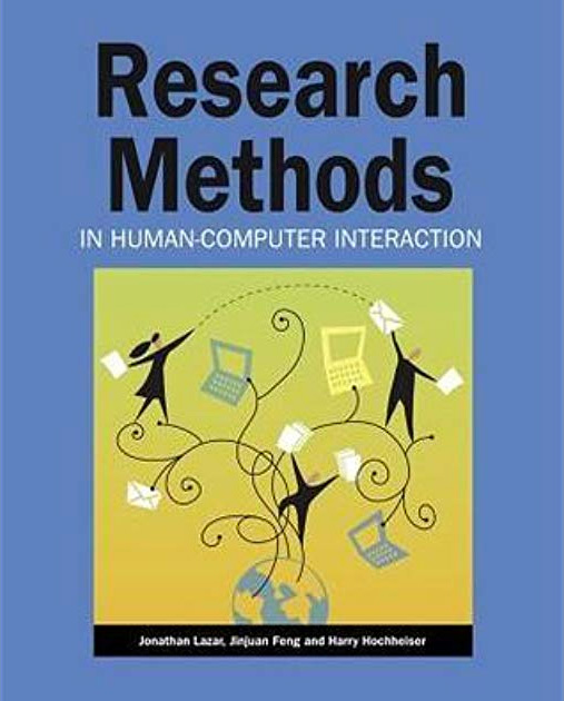
Research Methods in Human-Computer Interaction

Harry Hochheiser, Jonathan Lazar, Jinjuan Heidi Feng

Research Methods in Human-Computer Interaction

Like Observing the User Experience, this is a dense guide – but it’s another essential one. Here, experts on human-computer interaction and usability explain different qualitative and quantitative research methods in an easily understandable format. There are also plenty of real examples to help frame your thinking around the usefulness of different research methods.

Information architecture

If you’re new to information architecture (IA), understanding why it’s such an important concept is a great place to start. There’s plenty of information online, but there are also several well-regarded books that make great starting points.

Information Architecture for the World Wide Web: Designing Large-Scale Web Sites

Peter Morville, Louis Rosenfeld

Information Architecture for the World Wide Web: Designing Large-Scale Web Site

You’ll probably hear this book referred to as “the polar bear book”, just because the cover features a polar bear. But beyond featuring a nice illustration of a bear, this book clearly covers the process of creating large websites that are both easy to navigate and appealing to use. It’s a useful book for designers, information architects and user researchers.

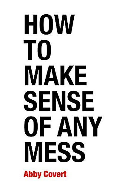
How to Make Sense of Any Mess

Abby Covert

How to Make Sense of Any Mess

This is a great introduction to information architecture and serves as a nice counter to the polar bear book, being much shorter and more easily digestible. Author Abby Covert explains complex concepts in a way anyone can understand and also includes a set of lessons and exercises with each chapter.

User interviews

For those new to the task, the prospect of interviewing users is always daunting. That makes having a useful guide that much more of a necessity!

Interviewing Users: How to Uncover Compelling Insights

Steve Portigal

Interviewing Users: How to Uncover Compelling Insights

While interviewing users may seem like something that doesn’t require a guide, an understanding of different interview techniques can go a long way. This book is essentially a practical guide to the art of interviewing users. Author Steve Portigal covers how to build rapport with your participants and the art of immersing yourself in how other people see the world – both key skills for interviewers!

Usability testing

Web usability is basically the ease of use of a website. It’s a broad topic, but there are a number of useful books that explain why it’s important and outline some of the key principles.

Don't Make Me Think: A Common Sense Approach to Web Usability

Steve Krug

Don't Make Me Think: A Common Sense Approach to Web Usability

Don’t Make Me Think is the first introduction to the world of UX and usability for many people, and for good reason – it’s a concise introduction to the topics and is easy to digest. Steve Krug explains some of the key principles of intuitive navigation and information architecture clearly and without overly technical language. In the latest edition, he’s updated the book to include mobile usability considerations.

As a testament to just how popular this book is, it was released in 2000 and has since had 2 editions and sold 400,000 copies.

Design

The design–research relationship is an important one, even if it’s often misunderstood. Thankfully, authors like Don Norman and Vijay Kumar are here to explain everything.

The Design of Everyday Things

Don Norman

The Design of Everyday Things

This book, by cognitive scientist and usability engineer Don Norman, explains how design is the communication between an object and its user, and how to improve this communication as a way of improving the user experience. If nothing else, this book will force you to take another look at the design of everyday objects and assess whether or not they’re truly user-friendly.

101 Design Methods: A Structured Approach for Driving Innovation in Your Organization

Vijay Kumar

101 Design Methods: A Structured Approach for Driving Innovation in Your Organization

A guidebook for innovation in the context of product development, this book approaches the subject in a slightly different way to many other books on the same subject. The focus here is that the practice of creating new products is actually a science – not an art. Vijay Kumar outlines practical methods and useful tools that researchers and designers can use to drive innovation, making this book useful for anyone involved in product development.

See our list on Goodreads

We've put together a list of all of the above books on Goodreads, which you can access here.

Further reading

For experienced practitioners and newcomers alike, user research can often seem like a minefield to navigate. It can be tricky to figure out which method to use when, whether you bring a stakeholder into your usability test (you should) and how much you should pay participants. Take a look at some of the other articles on our blog if you’d like to learn more.

Share this article
Author
Optimal
Workshop

Related articles

View all blog articles
Learn more
1 min read

Mixed methods research in 2021

User experience research is super important to developing a product that truly engages, compels and energises people. We all want a website that is easy to navigate, simple to follow and compels our users to finish their tasks. Or an app that supports and drives engagement.

We’ve talked a lot about the various types of research tools that help improve these outcomes. 

There is a rising research trend in 2021.

Mixed method research - what is more compelling than these user research quantitative tools? Combining these with awesome qualitative research! Asking the same questions in various ways can provide deeper insights into how our users think and operate. Empowering you to develop products that truly talk to your users, answer their queries or even address their frustrations.

Though it isn’t enough to simply ‘do research’, as with anything you need to approach it with strategy, focus and direction. This will funnel your time, money and energy into areas that will generate the best results.

Mixed Method UX research is the research trend of 2021

With the likes of Facebook, Amazon, Etsy, eBay, Ford and many more big organizations offering newly formed job openings for mixed methods researchers it becomes very obvious where the research trend is heading.

It’s not only good to have, but now becoming imperative, to gather data, dive deeper and generate insights that provide more information on our users than ever before. And you don't need to be Facebook to reap the benefits. Mixed method research can be implemented across the board and can be as narrow as finding out how your homepage is performing through to analysing in depth the entirety of your product design.

And with all of these massive organizations making the move to increase their data collection and research teams. Why wouldn’t you?

The value in mixed method research is profound. Imagine understanding what, where, how and why your customers would want to use your service. And catering directly for them. The more we understand our customers, the deeper the relationship and the more likely we are to keep them engaged.

Although of course by diving deep into the reasons our users like (or don’t like) how our products operate can drive your organization to target and operate better at a higher level. Gearing your energies to attracting and keeping the right type of customer, providing the right level of service and after care. Potentially reducing overheads, by not delivering to expected levels.

What is mixed method research?

Mixed methods research isn’t overly complicated, and doesn’t take years for you to master. It simply is a term used to refer to using a combination of quantitative and qualitative data. This may mean using a research tool such as card sorting alongside interviews with users. 

Quantitative research is the tangible numbers and metrics that can be gathered through user research such as card sorting or tree testing.

Qualitative research is research around users’ behaviour and experiences. This can be through usability tests, interviews or surveys.

For instance you may be asking ‘how should I order the products on my site?’. With card sorting you can get the data insights that will inform how a user would like to see the products sorted. Coupled with interviews you will get the why.

Understanding the thinking behind the order, and why one user likes to see gym shorts stored under shorts and another would like to see them under active wear. With a deeper understanding of how and why users decide how content should be sorted are made will create a highly intuitive website. 

Another great reason for mixed method research would be to back up data insights for stakeholders. With a depth and breadth of qualitative and quantitative research informing decisions, it becomes clearer why changes may need to be made, or product designs need to be challenged.

How to do mixed method research

Take a look at our article for more examples of the uses of mixed method research. 

Simply put mixed method research means coupling quantitative research, such as tree testing, card sorting or first click testing, with qualitative research such as surveys, interviews or diary entry.

Say, for instance, the product manager has identified that there is an issue with keeping users engaged on the homepage of your website. We would start with asking where they get stuck, and when they are leaving.

This can be done using a first-click tool, such as Chalkmark, which will map where users head when they land on your homepage and beyond. 

This will give you the initial qualitative data. However, it may only give you some of the picture. Coupled with qualitative data, such as watching (and reporting on) body language. Or conducting interviews with users directly after their experience so we can understand why they found the process confusing or misleading.

A fuller picture, means a better understanding.

Key is to identify what your question is and honing in on this through both methods. Ultimately, we are answering your question from both sides of the coin.

Upcoming research trends to watch

Keeping an eye on the progression of the mixed method research trend, will mean keeping an eye on these:

1. Integrated Surveys

Rather than thinking of user surveys as being a one time, in person event, we’re seeing more and more often surveys being implemented through social media, on websites and through email. This means that data can be gathered frequently and across the board. This longitude data allows organizations to continuously analyse, interpret and improve products without really ever stopping. 

Rather than relying on users' memories for events and experiences data can be gathered in the moment. At the time of purchase or interaction. Increasing the reliability and quality of the data collected. 

2. Return to the social research

Customer research is rooted in the focus group. The collection of participants in one space, that allows them to voice their opinions and reach insights collectively. This did used to be an overwhelming task with days or even weeks to analyse unstructured forums and group discussions.

However, now with the advent of online research tools this can also be a way to round out mixed method research.

3. Co-creation

The ability to use your customers input to build better products. This has long been thought a way to increase innovative development. Until recently it too has been cumbersome and difficult to wrangle more than a few participants. But, there are a number of resources in development that will make co-creation the buzzword of the decade.

4. Owned Panels & Community

Beyond community engagement in the social sphere. There is a massive opportunity to utilise these engaged users in product development. Through a trusted forum, users are far more likely to actively and willingly participate in research. Providing insights into the community that will drive stronger product outcomes.

What does this all mean for me

So, there is a lot to keep in mind when conducting any effective user research. And there are a lot of very compelling reasons to do mixed method research and do it regularly. 

To remain innovative, and ahead of the ball it remains very important to be engaged with your users and their needs. Using qualitative and qualitative research to inform product decisions means you can operate knowing a fuller picture.

One of the biggest challenges with user research can be the coordination and participant recruitment. That’s where we come in.

Taking the pain out of the process and streamlining your research. Take a look at our Qualitative Research option, Reframer. Giving you an insight into how we can help make your mixed method research easier and analyse your data efficiently and in a format that is easy to understand.

User research doesn’t need to take weeks or months. With our participant recruitment we can provide reliable and quality participants across the board that will provide data you can rely on.

Why not get in deeper with mixed method research today!

Learn more
1 min read

Collating your user testing notes

It’s been a long day. Scratch that - it’s been a long week! Admit it. You loved every second of it.

Twelve hour days, the mad scramble to get the prototype ready in time, the stakeholders poking their heads in occasionally, dealing with no-show participants and the excitement around the opportunity to speak to real life human beings about product or service XYZ. Your mind is exhausted but you are buzzing with ideas and processing what you just saw. You find yourself sitting in your war room with several pages of handwritten notes and with your fellow observers you start popping open individually wrapped lollies leftover from the day’s sessions. Someone starts a conversation around what their favourite flavour is and then the real fun begins. Sound familiar? Welcome to the post user testing debrief meeting.

How do you turn those scribbled notes and everything rushing through your mind into a meaningful picture of the user experience you just witnessed? And then when you have that picture, what do you do next? Pull up a bean bag, grab another handful of those lollies we feed our participants and get comfy because I’m going to share my idiot-proof, step by step guide for turning your user testing notes into something useful.

Let’s talk

Get the ball rolling by holding a post session debrief meeting while it’s all still fresh your collective minds. This can be done as one meeting at the end of the day’s testing or you could have multiple quick debriefs in between testing sessions. Choose whichever options works best for you but keep in mind this needs to be done at least once and before everyone goes home and forgets everything. Get all observers and facilitators together in any meeting space that has a wall like surface that you can stick post its to - you can even use a window! And make sure you use real post its - the fake ones fall off!

Mark your findings (Tagging)

Before you put sharpie to post it, it’s essential to agree as a group on how you will tag your observations. Tagging the observations now will make the analysis work much easier and help you to spot patterns and themes. Colour coding the post its is by far the simplest and most effective option and how you assign the colours is entirely up to you. You could have a different colour for each participant or testing session, you could have different colours to denote participant attributes that are relevant to your study eg senior staff and junior staff, or you could use different colours to denote specific testing scenarios that were used. There’s many ways you could carve this up and there’s no right or wrong way. Just choose the option that suits you and your team best because you’re the ones who have to look at it and understand it. If you only have one colour post it eg yellow, you could colour code the pen colours you use to write on the notes or include some kind of symbol to help you track them.

Processing the paper (Collating)

That pile of paper is not going to process itself! Your next job as a group is to work through the task of transposing your observations to post it notes. For now, just stick them to the wall in any old way that suits you. If you’re the organising type, you could group them by screen or testing scenario. The positioning will all change further down the process, so at this stage it’s important to just keep it simple. For issues that occur repeatedly across sessions, just write them down on their own post its- doubles will be useful to see further down the track.In addition to  holding a debrief meetings, you also need to round up everything that was used to capture the testing session/s. And I mean EVERYTHING.

Handwritten notes, typed notes, video footage and any audio recordings need to be reviewed just in case something was missed. Any handwritten notes should be typed to assist you with the completion of the report. Don’t feel that you have to wait until the testing is completed before you start typing up your notes because you will find they pile up very quickly and if your handwriting is anything like mine…. Well let’s just say my short term memory is often required to pick up the slack and even that has it’s limits. Type them up in between sessions where possible and save each session as it’s own document. I’ll often use the testing questions or scenario based tasks to structure my typed notes and I find that makes it really easy to refer back to.Now that you’ve processed all the observations, it’s time to start sorting your observations to surface behavioural patterns and make sense of it all.

Spotting patterns and themes through affinity diagramming

Affinity diagramming is a fantastic tool for making sense of user testing observations. In fact it’s just about my favourite way to make sense of any large mass of information. It’s an engaging and visual process that grows and evolves like a living creature taking on a life of its own. It also builds on the work you’ve just done which is a real plus!By now, testing is over and all of your observations should all be stuck to a wall somewhere. Get everyone together again as a group and step back and take it all in. Just let it sit with you for a moment before you dive in. Just let it breathe. Have you done that? Ok now as individuals working at the same time, start by grouping things that you think belong together. It’s important to just focus on the content of the labels and try to ignore the colour coded tagging at this stage, so if session one was blue post its don’t group all the blue ones together just because they’re all blue! If you get stuck, try grouping by topic or create two groups eg issues and wins and then chunk the information up from there.

You will find that the groups will change several times over the course of the process  and that’s ok because that’s what it needs to do.While you do this, everyone else will be doing the same thing - grouping things that make sense to them.  Trust me, it’s nowhere near as chaotic as it sounds! You may start working as individuals but it won’t be long before curiosity kicks in and the room is buzzing with naturally occurring conversation.Make sure you take a step back regularly and observe what everyone else is doing and don’t be afraid to ask questions and move other people’s post its around- no one owns it! No matter how silly something may seem just put it there because it can be moved again. Have a look at where your tagged observations have ended up. Are there clusters of colour? Or is it more spread out? What that means will depend largely on how you decided to tag your findings. For example if you assigned each testing session its own colour and you have groups with lot’s of different colours in them you’ll find that the same issue was experienced by multiple people.Next, start looking at each group and see if you can break them down into smaller groups and at the same time consider the overall picture for bigger groups eg can the wall be split into say three high level groups.Remember, you can still change your groups at anytime.

Thinning the herd (Merging)

Once you and your team are happy with the groups, it’s time to start condensing the size of this beast. Look for doubled up findings and stack those post its on top of each other to cut the groups down- just make sure you can still see how many there were. The point of merging is to condense without losing anything so don’t remove something just because it only happened once. That one issue could be incredibly serious. Continue to evaluate and discuss as a group until you are happy. By now clear and distinct groups of your observations should have emerged and at a glance you should be able to identify the key findings from your study.

A catastrophe or a cosmetic flaw? (Scoring)

Scoring relates to how serious the issues are and how bad the consequences of not fixing them are. There are arguments for and against the use of scoring and it’s important to recognise that it is just one way to communicate your findings.I personally rarely use scoring systems. It’s not really something I think about when I’m analysing the observations. I rarely rank one problem or finding over another. Why? Because all data is good data and it all adds to the overall picture.I’ve always been a huge advocate for presenting the whole story and I will never diminish the significance of a finding by boosting another. That said, I do understand the perspective of those who place metrics around their findings. Other designers have told me they feel that it allows them to quantify the seriousness of each issue and help their client/designer/boss make decisions about what to do next.We’ve all got our own way of doing things, so I’ll leave it up to you to choose whether or not you score the issues. If you decide to score your findings there are a number of scoring systems you can use and if I had to choose one, I quite like Jakob Nielsen’s methodology for the simple way it takes into consideration multiple factors. Ultimately you should choose the one that suits your working style best.

Let’s say you did decide to score the issues. Start by writing down each key finding on it’s own post it and move to a clean wall/ window. Leave your affinity diagram where it is. Divide the new wall in half: one side for wins eg findings that indicate things that tested well and the other for issues. You don’t need to score the wins but you do need to acknowledge what went well because knowing what you’re doing well is just as important as knowing where you need to improve. As a group (wow you must be getting sick of each other! Make sure you go out for air from time to time!) score the issues based on your chosen methodology.Once you have completed this entire process you will have everything you need to write a kick ass report.

What could possibly go wrong? (and how to deal with it)

No process is perfect and there are a few potential dramas to be aware of:

People jumping into solution mode too early

In the middle of the debrief meeting, someone has an epiphany. Shouts of We should move the help button! or We should make the yellow button smaller! ring out and the meeting goes off the rails.I’m not going to point fingers and blame any particular role because we’ve all done it, but it’s important to recognise that’s not why we’re sitting here. The debrief meeting is about digesting and sharing what you and the other observers just saw. Observing and facilitating user testing is a privilege. It’s a precious thing that deserves respect and if you jump into solution mode too soon, you may miss something. Keep the conversation on track by appointing a team member to facilitate the debrief meeting.

Storage problems

Handwritten notes taken by multiple observers over several days of testing adds up to an enormous pile of paper. Not only is it a ridiculous waste of paper but they have to be securely stored for three months following the release of the report. It’s not pretty. Typing them up can solve that issue but it comes with it’s own set of storage related hurdles. Just like the handwritten notes, they need to be stored securely. They don’t belong on SharePoint or in the share drive or any other shared storage environment that can be accessed by people outside your observer group. User testing notes are confidential and are not light reading for anyone and everyone no matter how much they complain. Store any typed notes in a limited access storage solution that only the observers have access to and if anyone who shouldn’t be reading them asks, tell them that they are confidential and the integrity of the research must be preserved and respected.

Time issues

Before the storage dramas begin, you have to actually pick through the mountain of paper. Not to mention the video footage, and the audio and you have to chase up that sneaky observer who disappeared when the clock struck 5. All of this takes up a lot of time. Another time related issue comes in the form of too much time passing in between testing sessions and debrief meetings. The best way to deal with both of these issues  is to be super organised and hold multiple smaller debriefs in between sessions where possible. As a group, work out your time commitments before testing begins and have a clear plan in place for when you will meet.  This will prevent everything piling up and overwhelming you at the end.

Disagreements over scoring

At the end of that long day/week we’re all tired and discussions around scoring the issues can get a little heated. One person’s showstopper may be another person’s mild issue. Many of the ranking systems use words as well as numbers to measure the level of severity and it’s easy to get caught up in the meaning of the words and ultimately get sidetracked from the task at hand. Be proactive and as a group set ground rules upfront for all discussions. Determine how long you’ll spend discussing an issue and what you will do in the event that agreement cannot be reached. People want to feel heard and they want to feel like their contributions are valued. Given that we are talking about an iterative process, sometimes it’s best just to write everything down to keep people happy and merge and cull the list in the next iteration. By then they’ve likely had time to reevaluate their own thinking.

And finally...

We all have our own ways of making sense of our user testing observations and there really is no right or wrong way to go about it. The one thing I would like to reiterate is the importance of collaboration and teamwork. You cannot do this alone, so please don’t try. If you’re a UX team of one, you probably already have a trusted person that you bounce ideas off. They would be a fantastic person to do this with. How do you approach this process? What sort of challenges have you faced? Let me know in the comments below.

Learn more
1 min read

Usability Experts Unite: The Power of Heuristic Evaluation in User Interface Design

Usability experts play an essential role in the user interface design process by evaluating the usability of digital products from a very important perspective - the users! Usability experts utilize various techniques such as heuristic evaluation, usability testing, and user research to gather data on how users interact with digital products and services. This data helps to identify design flaws and areas for improvement, leading to the development of user-friendly and efficient products.

Heuristic evaluation is a usability research technique used to evaluate the user interface design of a digital product based on a set of ‘heuristics’ or ‘usability principles’. These heuristics are derived from a set of established principles of user experience design - attributed to the landmark article “Improving a Human-Computer Dialogue” published by web usability pioneers Jakob Nielsen and Rolf Molich in 1990. The principles focus on the experiential aspects of a user interface. 

In this article, we’ll discuss what heuristic evaluation is and how usability experts use the principles to create exceptional design. We’ll also discuss how usability testing works hand-in-hand with heuristic evaluation, and how minimalist design and user control impact user experience. So, let’s dive in!

Understanding Heuristic Evaluation


Heuristic evaluation helps usability experts to examine interface design against tried and tested rules of thumb. To conduct a heuristic evaluation, usability experts typically work through the interface of the digital product and identify any issues or areas for improvement based on these broad rules of thumb, of which there are ten. They broadly cover the key areas of design that impact user experience - not bad for an article published over 30 years ago!

The ten principles are:

  1. Prevention error: Well-functioning error messages are good, but instead of messages, can these problems be removed in the first place? Remove the opportunity for slips and mistakes to occur.
  2. Consistency and standards: Language, terms, and actions used should be consistent to not cause any confusion.
  3. Control and freedom for users: Give your users the freedom and control to undo/redo actions and exit out of situations if needed.
  4. System status visibility: Let your users know what’s going on with the site. Is the page they’re on currently loading, or has it finished loading?
  5. Design and aesthetics: Cut out unnecessary information and clutter to enhance visibility. Keep things in a minimalist style.
  6. Help and documentation: Ensure that information is easy to find for users, isn’t too large and is focused on your users’ tasks.
  7. Recognition, not recall: Make sure that your users don’t have to rely on their memories. Instead, make options, actions and objects visible. Provide instructions for use too.
  8. Provide a match between the system and the real world: Does the system speak the same language and use the same terms as your users? If you use a lot of jargon, make sure that all users can understand by providing an explanation or using other terms that are familiar to them. Also ensure that all your information appears in a logical and natural order.
  9. Flexibility: Is your interface easy to use and it is flexible for users? Ensure your system can cater to users to all types, from experts to novices.
  10. Help users to recognize, diagnose and recover from errors: Your users should not feel frustrated by any error messages they see. Instead, express errors in plain, jargon-free language they can understand. Make sure the problem is clearly stated and offer a solution for how to fix it.

Heuristic evaluation is a cost-effective way to identify usability issues early in the design process (although they can be performed at any stage) leading to faster and more efficient design iterations. It also provides a structured approach to evaluating user interfaces, making it easier to identify usability issues. By providing valuable feedback on overall usability, heuristic evaluation helps to improve user satisfaction and retention.

The Role of Usability Experts in Heuristic Evaluation

Usability experts play a central role in the heuristic evaluation process by providing feedback on the usability of a digital product, identifying any issues or areas for improvement, and suggesting changes to optimize user experience.

One of the primary goals of usability experts during the heuristic evaluation process is to identify and prevent errors in user interface design. They achieve this by applying the principles of error prevention, such as providing clear instructions and warnings, minimizing the cognitive load on users, and reducing the chances of making errors in the first place. For example, they may suggest adding confirmation dialogs for critical actions, ensuring that error messages are clear and concise, and making the navigation intuitive and straightforward.

Usability experts also use user testing to inform their heuristic evaluation. User testing involves gathering data from users interacting with the product or service and observing their behavior and feedback. This data helps to validate the design decisions made during the heuristic evaluation and identify additional usability issues that may have been missed. For example, usability experts may conduct A/B testing to compare the effectiveness of different design variations, gather feedback from user surveys, and conduct user interviews to gain insights into users' needs and preferences.

Conducting user testing with users that represent, as closely as possible, actual end users, ensures that the product is optimized for its target audience. Check out our tool Reframer, which helps usability experts collaborate and record research observations in one central database.

Minimalist Design and User Control in Heuristic Evaluation

Minimalist design and user control are two key principles that usability experts focus on during the heuristic evaluation process. A minimalist design is one that is clean, simple, and focuses on the essentials, while user control refers to the extent to which users can control their interactions with the product or service.

Minimalist design is important because it allows users to focus on the content and tasks at hand without being distracted by unnecessary elements or clutter. Usability experts evaluate the level of minimalist design in a user interface by assessing the visual hierarchy, the use of white space, the clarity of the content, and the consistency of the design elements. Information architecture (the system and structure you use to organize and label content) has a massive impact here, along with the content itself being concise and meaningful.

Incorporating minimalist design principles into heuristic evaluation can improve the overall user experience by simplifying the design, reducing cognitive load, and making it easier for users to find what they need. Usability experts may incorporate minimalist design by simplifying the navigation and site structure, reducing the number of design elements, and removing any unnecessary content (check out our tool Treejack to conduct site structure, navigation, and categorization research). Consistent color schemes and typography can also help to create a cohesive and unified design.

User control is also critical in a user interface design because it gives users the power to decide how they interact with the product or service. Usability experts evaluate the level of user control by looking at the design of the navigation, the placement of buttons and prompts, the feedback given to users, and the ability to undo actions. Again, usability testing plays an important role in heuristic evaluation by allowing researchers to see how users respond to the level of control provided, and gather feedback on any potential hiccups or roadblocks.

Usability Testing and Heuristic Evaluation

Usability testing and heuristic evaluation are both important components of the user-centered design process, and they complement each other in different ways.

Usability testing involves gathering feedback from users as they interact with a digital product. This feedback can provide valuable insights into how users perceive and use the user interface design, identify any usability issues, and help validate design decisions. Usability testing can be conducted in different forms, such as moderated or unmoderated, remote or in-person, and task-based or exploratory. Check out our usability testing 101 article to learn more.

On the other hand, heuristic evaluation is a method in which usability experts evaluate a product against a set of usability principles. While heuristic evaluation is a useful method to quickly identify usability issues and areas for improvement, it does not involve direct feedback from users.

Usability testing can be used to validate heuristic evaluation findings by providing evidence of how users interact with the product or service. For example, if a usability expert identifies a potential usability issue related to the navigation of a website during heuristic evaluation, usability testing can be used to see if users actually have difficulty finding what they need on the website. In this way, usability testing provides a reality check to the heuristic evaluation and helps ensure that the findings are grounded in actual user behavior.

Usability testing and heuristic evaluation work together in the design process by informing and validating each other. For example, a designer may conduct heuristic evaluation to identify potential usability issues and then use the insights gained to design a new iteration of the product or service. The designer can then use usability testing to validate that the new design has successfully addressed the identified usability issues and improved the user experience. This iterative process of designing, testing, and refining based on feedback from both heuristic evaluation and usability testing leads to a user-centered design that is more likely to meet user needs and expectations.

Conclusion

Heuristic evaluation is a powerful usability research technique that usability experts use to evaluate digital product interfaces based on a set of established principles of user experience design. After all these years, the ten principles of heuristic evaluation still cover the key areas of design that impact user experience, making it easier to identify usability issues early in the design process, leading to faster and more efficient design iterations. Usability experts play a critical role in the heuristic evaluation process by identifying design flaws and areas for improvement, using user testing to validate design decisions, and ensuring that the product is optimized for its intended users.

Minimalist design and user control are two key principles that usability experts focus on during the heuristic evaluation process. A minimalist design is clean, simple, and focuses on the essentials, while user control gives users the freedom and control to undo/redo actions and exit out of situations if needed. By following these principles, usability experts can create an exceptional design that enhances visibility, reduces cognitive load, and provides a positive user experience. 

Ultimately, heuristic evaluation is a cost-effective way to identify usability issues at any point in the design process, leading to faster and more efficient design iterations, and improving user satisfaction and retention. How many of the ten heuristic design principles does your digital product satisfy? 

Seeing is believing

Explore our tools and see how Optimal makes gathering insights simple, powerful, and impactful.