Subscribe to OW blog for an instantly better inbox
Oops! Something went wrong while submitting the form.
Articles and Podcasts on Customer Service, AI and Automation, Product, and more
A year ago, we looked at the user research market and made a decision.
We saw product teams shipping faster than ever while research tools stayed stuck in time. We saw researchers drowning in manual work, waiting on vendor emails, stitching together fragmented tools. We heard "should we test this?" followed by "never mind, we already shipped."
The dominant platforms got comfortable. We didn't.
Today, we're excited to announce Optimal 3.0, the result of refusing to accept the status quo and building the fresh alternative teams have been asking for.
The gap between product velocity and research velocity has never been wider. The situation isn't sustainable. And it's not the researcher's fault. The tools are the problem. They’re:
These platforms haven't changed because they don't have to, so we set out to challenge them.
Optimal 3.0 isn't an incremental update to the old way of doing things. It's a fundamental rethinking of what a research platform should be.
Research For All, Not Just Researchers.
For 18 years, we've believed research should be accessible to everyone, not just specialists. Optimal 3.0 takes that principle further.
Unlimited seats. Zero gatekeeping.
Designers can validate concepts without waiting for research bandwidth. PMs can test assumptions without learning specialist tools. Marketers can gather feedback without procurement nightmares. Research shouldn't be rationed by licenses or complexity. It should be a shared capability across your entire team.
A Complete Ecosystem in One Place.
Stop stitching together point solutions.Optimal 3.0 gives you everything you need in one platform:
Recruitment Built In Access millions of verified participants worldwide without the vendor tag. Target by demographics, behaviors, and custom screeners. Launch studies in minutes, not days. No endless email chains. No procurement delays.
Testing That Adapts to You
Learn more about Live Site Testing
AI-Powered Analysis (With Control) Interview analysis used to take weeks. We've reduced it to minutes.
Our AI automatically identifies themes, surfaces key quotes, and generates summaries, while you maintain full control over the analysis.
As one researcher told us: "What took me 4 weeks to manually analyze now took me 5 minutes."
This isn't about replacing researcher judgment. It's about amplifying it. The AI handles the busywork, tagging, organizing, timestamping. You handle the strategic thinking and judgment calls. That's where your value actually lives.
Learn more about Optimal Interviews
Chat Across All Your Data Your research data is now conversational.
Ask questions and get answers instantly, backed by actual video evidence from your studies. Query across multiple Interview studies at once. Share findings with stakeholders complete with supporting clips.
Every insight comes with the receipts. Because stakeholders don't just need insights, they need proof.
A Dashboard Built for Velocity See all your studies, all your data, in one place. Track progress across your entire team. Jump from question to insight in seconds. Research velocity starts with knowing what you have.
Integration Layer
Optimal 3.0 fits your workflow. It doesn't dominate it. We integrate with the tools you already use, Figma, Slack, your existing tech stack, because research shouldn't force you to abandon how you work.
What Didn't Change: Methodological Rigor
Here's what we didn't do: abandon the foundations that made teams trust us.
Card sorting, tree testing, first-click tests, surveys, the methodologically sound tools that Amazon, Google, Netflix, and HSBC have relied on for years are all still here. Better than ever.
We didn't replace our roots. We built on them.
18 years of research methodology, amplified by modern AI and unified in a complete ecosystem.
Product development isn't slowing down. AI is accelerating everything. Competitors are moving faster. Customer expectations are higher than ever.
Research can either be a bottleneck or an accelerator.
The difference is having a platform that:
Optimal 3.0 is built for research that arrives before the decision is made. Research that shapes products, not just documents them. Research that helps teams ship confidently because they asked users first.
A Fresh Alternative
We're not trying to be the biggest platform in the market.
We're trying to be the best alternative to the clunky tools that have dominated for years.
Amazon, Google, Netflix, Uber, Apple, Workday, they didn't choose us because we're the incumbent. They chose us because we make research accessible, fast, and actionable.
"Overall, each release feels like the platform is getting better." — Lead Product Designer at Flo
"The one research platform I keep coming back to." — G2 Review
This launch represents our biggest transformation, but it's not the end. It's a new beginning.
We're continuing to invest in:
Our goal is simple: make user research so fast and accessible that it becomes impossible not to include users in every decision.
See What We've Built
If you're evaluating research platforms and tired of the same old clunky tools, we'd love to show you the alternative.
Book a demo or start a free trial
The platform that turns "should we?" into "we did."
Welcome to Optimal 3.0.

We've launched a brand new series of 'bite sized' presentations to make your lunch break more inspiring. Together with speakers, community groups, and organizations from around the world — these virtual events dive into a variety of topics impacting our industry today.
Join us at the end of every month for Lunch n' Learn.
Sign up now to stay in the loop.
In our first Lunch n Learn, Clara Kliman- Silver, Senior UX Researcher at Google unpacked some of the barriers to effective designer-developer collaboration.
In her talk "UX in a distributed world", Clara discussed various workflow stages, the role of design systems, common pain points, and mitigation strategies — all based on UX research studies with designers, developers, and product teams over the last three years.
Clara also covered research on UX tools, how tools have transformed workflows, and where a perceived tooling problem might actually be a process issue (and what you can do about it). In addition, she considered how tools and workflows might evolve in the future.
https://www.youtube.com/watch?v=x4sYWOdROBM
📹: UX in a distributed world.
Clara Kliman-Silver is a Senior UX Researcher at Google who studies design teams, design systems, UX tools, and designer-developer collaboration.
She specializes in participatory design and generative methods to investigate workflows, understand designer-developer experiences, and imagine ways to create UIs.
In previous roles, she has conducted research on developer tools, artificial intelligence, and healthcare. Clara holds a Bachelors of Science in Cognitive Science from Brown University.
Grab your lunch, invite your colleagues, and we hope to see you at the next Lunch n' Learn.
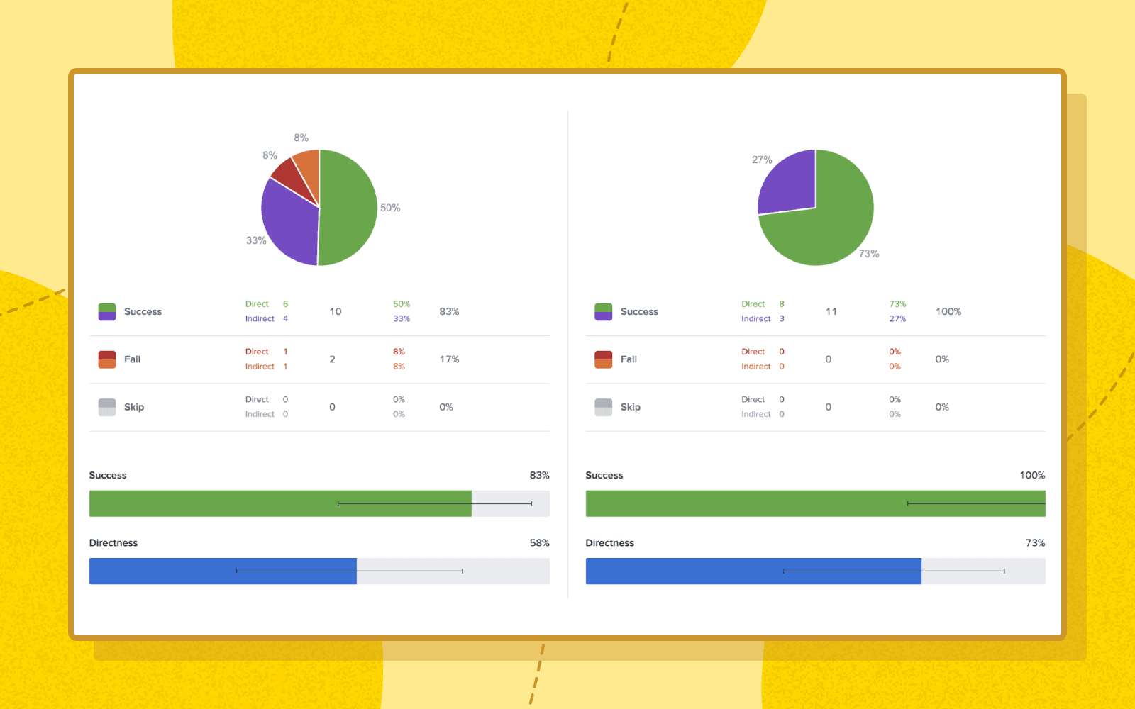
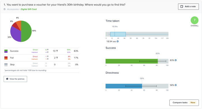
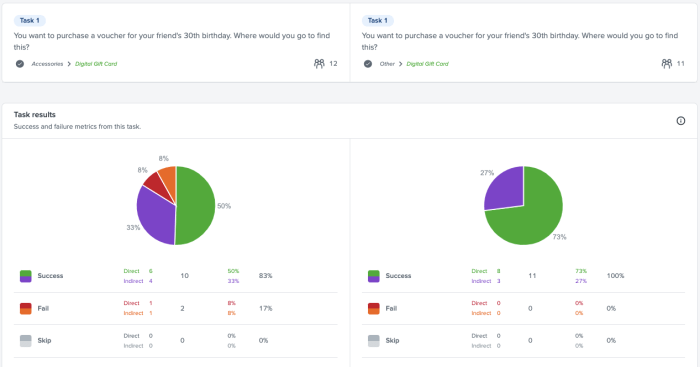
Testing and comparing multiple variations of trees will help you nail down an effective navigation structure before you implement it, saving time and costly mistakes. Treejack's comparison feature allows you to compare two tasks from two different Treejack studies without leaving the results page. It helps make comparing your variations easier and faster by putting results side-by-side for you to explore simultaneously.
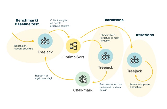
The image above shows a common workflow of how Optimal Workshop tools can be used together to improve your navigation structure.
First things first, sign into your Optimal Workshop account.
Open the tree test that you want to start your comparison from, then navigate to the Task Results tab in the Analysis section.
Click the ‘compare tasks’ button in your chosen task.
Next select the study and task you want to compare then click 'Compare tasks'.
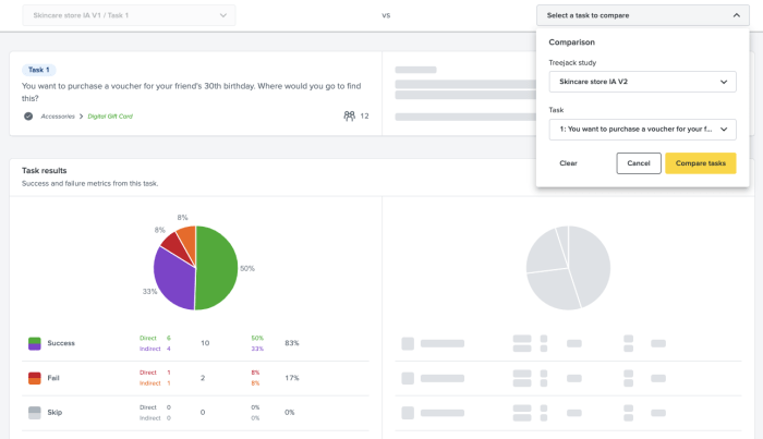
You can now compare the two tasks together and start the analysis process. Do this as many times, with as many tests and tasks, as you need to.
We’ve got a lot of exciting improvements in the pipeline and as always, we’d love your feedback. You can make feature requests, vote on existing requests and send feedback in Optimal Workshop using the Resource Centre. It's located at the bottom right hand corner of your account, just click the ? icon.
Log in now let us know what you think!

Ever wondered what the relationship is between information architecture (IA) and UX? Simply put, IA is the foundation of UX. We outline why.
According to Abby Covert, a leader in the field of information architecture, IA is ‘the way we arrange the parts to make sense of the whole.’ This can relate to a website, a retail store or an app. And you could even consider the way a library is sorted to be information architecture. For the purposes of this article, we will focus on digital products (apps or websites).
Well-organized information architecture is fundamentally important to the success of your product. As a designer, knowing the content you are delivering and how, is fundamental to creating a UX that performs. Working with the needs of the organization and meeting the requirements of the users in a meaningful and delightful way. Organizing and structuring the information so that navigating, searching, and understanding your product is seamless is ultimately what UX design is all about. Arranging the parts to make sense of the whole, you could say.
While design is about creating visual pointers for users to find their way, information architecture can be broken down into 3 main areas to consider when building a great user experience:
When put like this it does seem pretty straightforward. Maybe even simple? But these tasks need to be straightforward for your users. Putting thought, time, and research at the front of your design and build can increase your chances of delivering an intuitive product. In fact, at any point in your product’s life cycle, it’s worth testing and reviewing these 3 areas.
Developing a well-thought-out and researched information architecture for your product could be considered a foundation step to creating a great UX product. To help you on your way, here are 6 key things to consider when building effective information architecture for a great user experience.
Information architecture is the foundation of designing a great product that meets (or even exceeds) your users’ needs, wants, and desires. By balancing an organization’s needs with insight into what users actually want, you’re well equipped to design an information architecture that helps build a product that delivers a positive user experience. Research, test, research, and test again should be the mantra throughout the development, design, and implementation of your product and beyond.

Sitting inside any beautifully crafted and designed digital product, there must be a fully functional and considered information architecture.
As much as information architecture shouldn’t be developed in a vacuum. Neither should the design and look of digital products. In fact, a large proportion of the function of digital designers is devoted to supporting users locating content they need and driving them towards content that the product owners want them to find.
Incorporating visual markers to make sure that certain content is distinct from the rest or creating layers that demonstrate the diverse content on a product.
If you do not have quality content, it is impossible to design a quality digital product. It all comes back to creating a user experience that makes sense and is designed to make task completion simple. And this relates back to designing the product with the content planned for it in mind.
As a designer, the more you know about information architecture, the better the products you design will meet your user requirements and deliver what they need. If you work with an information architect, even better. If you’re still learning about information architecture the 8 Principles according to Dan Brown is a great place to begin.
If you haven’t come across Dan Brown yet, you have more than likely come across his 8 principles. Dan Brown is one of the UX world's most prolific experts with a career that spans most areas of UX designs. He’s written 3 books on the subject and experience across a multitude of high profile projects. Aiding large organizations to make the most of their user experience.
It’s highly likely that you’ve already used some, or all, of these IA principles in your designs. Don’t be shy about mastering them, or at the very least be familiar. They can only help you become a better user experience designer.
Mastering the 8 principles, according to IA expert Dan Brown will see you mastering the complex tasks of information architecture. Understanding IA is key to creating digital designs with a content structure that is functional, logical and just what your users need to navigate your product. Design without good IA doesn’t work as well, just as a content structure without a well designed interface will not engage users.

A great information architecture (IA) is essential for a great user experience (UX). And testing your website or app’s information architecture is necessary to get it right.
Card sorting and tree testing are the very best UX research methods for exactly this. But the big question is always: which one should you use, and when? Very possibly you need both. Let’s find out with this quick summary.
Card sorting is used to test the information architecture of a website or app. Participants group individual labels (cards) into different categories according to criteria that makes best sense to them. Each label represents an item that needs to be categorized. The results provide deep insights to guide decisions needed to create an intuitive navigation, comprehensive labeling and content that is organized in a user-friendly way.
Tree testing is also used to test the information architecture of a website or app. When using tree testing participants are presented with a site structure and a set of tasks they need to complete. The goal for participants is to find their way through the site and complete their task. The test shows whether the structure of your website corresponds to what users expect and how easily (or not) they can navigate and complete their tasks.
Card sorting is a UX research method which helps to gather insights about your content categorization. It focuses on creating an information architecture that responds intuitively to the users’ expectations. Things like which items go best together, the best options for labeling, what categories users expect to find on each menu.
Doing a simple card sort can give you all those pieces of information and so much more. You start understanding your user’s thoughts and expectations. Gathering enough insights and information to enable you to develop several information architecture options.
Tree testing is a UX research method that is almost a card sort in reverse. Tree testing is used to evaluate an information architecture structure and simply allows you to see what works and what doesn’t.
Using tree testing will provide insights around whether your information architecture is intuitive to navigate, the labels easy to follow and ultimately if your items are categorized in a place that makes sense. Conversely it will also show where your users get lost and how.
You’ve got this far and fine-tuning your information architecture should be a priority. An intuitive IA is an integral component of a user-friendly product. Creating a product that is usable and an experience users will come back for.
If you are still wondering which method you should use - tree testing or card sorting. The answer is pretty simple - use both.
Just like many great things, these methods work best together. They complement each other, allowing you to get much deeper insights and a rounded view of how your IA performs and where to make improvements than when used separately. We cover more reasons why card sorting loves tree testing in our article which dives deeper into why to use both.
Wanting full, rounded insights into your information architecture is great. And we know that tree testing and card sorting work well together. But is there an order you should do the testing in? It really depends on the particular context of your research - what you’re trying to achieve and your situation.
Tree testing is a great tool to use when you have a product that is already up and running. By running a tree test first you can quickly establish where there may be issues, or snags. Places where users get caught and need help. From there you can try and solve potential issues by moving on to a card sort.
Card sorting is a super useful method that can be instigated at any stage of the design process, from planning to development and beyond. As long as there is an IA structure that can be tested again. Testing against an already existing website navigation can be informative. Or testing a reorganization of items (new or existing) can ensure the organization can align with what users expect.
However, when you decide to implement both of the methods in your research, where possible, tree testing should come before card sorting. If you want a little more on the issue have a read of our article here.
Check out our OptimalSort and Treejack tools - we can help you with your research and the best way forward. Wherever you might be in the process.

Designing for a mobile app is quite different to designing for websites. The content may be similar (even the same) but the intent for users is likely to be different, as are the environments and occasions they use them. When designing for mobile the information architecture (IA) uses a different set of rules. The key consideration needs to be around ease of use on a smaller screen for a user that is possibly on the move and very likely distracted. They have limited time, limited attention and need a quick result.
Your app could be the first point of contact. It might be the only way your user interacts with you on a regular basis. It needs to be super simple, clean, and quick to interact with. A well thought out, thoroughly researched, and organized information architecture plays a big part in helping to deliver an easy and enjoyable user experience.
According to Abby Covert, a leader in the field of information architecture, IA is ‘the way we arrange the parts to make sense of the whole.’ Information architecture (IA)is found in every digital product, from websites, apps to an intranet and can even be applied to the physical world in places like libraries and supermarkets.For the purposes of this blog we will focus on the importance of information architecture for mobile apps. Researching and designing an app’s IA with just the right amount of information is key. And providing a way of navigating that content in a way that is quick and intuitive is key to a good user experience.
The first thing to understand about mobile app information architecture is that it’s different – and not just with regards to size. The sheer physicality and specifications of mobile devices mean we need to consider different design requirements. Because mobile devices are light and portable, users are in constant contact with them and they are by far the most convenient way to access information. With mobile apps it can be even more important to consider the user journey, to keep that journey as short as possible, and anticipate the user's needs. Consideration should be given to:
Most mobile device interfaces are accessed through touch screens. Users rely on learnt gestures – in addition to a simple interface – to interact. Because of their smaller dimensions, users often expect the content structures to be simpler and smaller. Also, because of limited bandwidth and connectivity, mobile devices require app designs to be optimized for loading time, with reduced data demands.
Because we have constant access to our mobile devices, we tend to use them a lot more. They come with us on the bus, walking the dog, or even watching TV. We often use them while ‘doing’ something else. This means we often use the device under difficult viewing conditions, or among a variety of distractions.
We have different attitudes, behaviors and priorities while using mobile devices. Many of us often have our mobile device within arms reach at all times. We have become attached to these devices and feel ‘lost’ when we don’t have them nearby. Some people even consider them an extension of their being!
We need to think of mobile devices as having their own particular information architecture structure to work within their unique requirements and environments. While the structure of a responsive website may follow the same IA, native apps often employ navigational structures that are tab-based. There’s no one or ‘right’ way to architect a mobile site or application. Rather it’s dependent on factors like the size of the content you need to organize or what the intended user journey is that informs the choice of information architecture structure. Let’s take a look at some of the most popular IA structures for mobile apps:
A standard website structure with an index page and a series of sub pages. If you are designing a responsive website you may be restricted to this structure, however introducing additional structural patterns could allow you to tailor the user experience for mobile.
Gives you a central index from which users will navigate from. It’s the default pattern on Apple’s iPhone, with a home screen and the various apps users download. Users can’t navigate between spokes but must return to the hub (home screen), instead.


Leads users in a linear fashion to more detailed content. It’s a simplified interface which quickly leads on to the next step. It can be most useful when users are in distracting conditions because it’s a quick and easy method of navigation.
Regular app users will be familiar with this structure. It’s a collection of sections tied together by a toolbar menu. This allows the user to quickly scan and understand the functionality of the app as soon as it’s opened. Easy to navigate throughout the app.


Allows the user to navigate within a set of data by selecting filter options to create a view that suits them. Can be more difficult to view on mobile if there is too much content, as it can be difficult to display.

When designing for mobile devices it is important to always keep in mind the user journey and how (and when) users are likely to be interacting with your app. What is their primary objective? What is your organization's objective? How do you move them through their tasks to enable them to complete them quickly, simply and easily? Working within the size restrictions and limitations of mobile devices and users needs and desires with a thoroughly thought out IA structure will always win on the day.
