Thank you! Your submission has been received!
Oops! Something went wrong while submitting the form.

Design

Learn more
1 min read

The ultimate reading list for new user researchers

Having a library of user research books is invaluable. Whether you’re an old hand in the field of UX research or just dipping your toes in the water, being able to reference detailed information on methods, techniques and tools will make your life much easier.

There’s really no shortage of user research/UX reading lists online, so we wanted to do something a little different. We’ve broken our list up into sections to make finding the right book for a particular topic as easy as possible.

General user research guides

These books cover everything you need to know about a number of UX/user research topics. They’re great to have on your desk to refer back to – we certainly have them on the bookshelf here at Optimal Workshop.

Observing the User Experience: A Practitioner's Guide to User Research

Mike Kuniavsky

Observing the User Experience: A Practitioner’s Guide to User Research

This book covers 13 UX research techniques in a reference format. There’s a lot of detail, making it a useful resource for people new to the field and those who just need more clarification around a certain topic. There’s also a lot of practical information that you’ll find applicable in the real world. For example, information about how to work around research budgets and tight time constraints.

Just Enough Research

Erika Hall

Just Enough Research

In Just Enough Research, author Erika Hall explains that user research is something everyone can and should do. She covers several research methods, as well as things like how to identify your biases and make use of your findings. Designers are also likely to find this one quite useful, as she clearly covers the relationship between research and design.

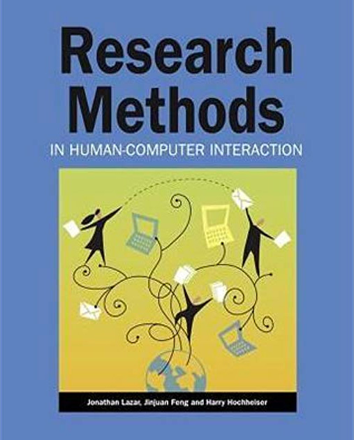
Research Methods in Human-Computer Interaction

Harry Hochheiser, Jonathan Lazar, Jinjuan Heidi Feng

Research Methods in Human-Computer Interaction

Like Observing the User Experience, this is a dense guide – but it’s another essential one. Here, experts on human-computer interaction and usability explain different qualitative and quantitative research methods in an easily understandable format. There are also plenty of real examples to help frame your thinking around the usefulness of different research methods.

Information architecture

If you’re new to information architecture (IA), understanding why it’s such an important concept is a great place to start. There’s plenty of information online, but there are also several well-regarded books that make great starting points.

Information Architecture for the World Wide Web: Designing Large-Scale Web Sites

Peter Morville, Louis Rosenfeld

Information Architecture for the World Wide Web: Designing Large-Scale Web Site

You’ll probably hear this book referred to as “the polar bear book”, just because the cover features a polar bear. But beyond featuring a nice illustration of a bear, this book clearly covers the process of creating large websites that are both easy to navigate and appealing to use. It’s a useful book for designers, information architects and user researchers.

How to Make Sense of Any Mess

Abby Covert

How to Make Sense of Any Mess

This is a great introduction to information architecture and serves as a nice counter to the polar bear book, being much shorter and more easily digestible. Author Abby Covert explains complex concepts in a way anyone can understand and also includes a set of lessons and exercises with each chapter.

User interviews

For those new to the task, the prospect of interviewing users is always daunting. That makes having a useful guide that much more of a necessity!

Interviewing Users: How to Uncover Compelling Insights

Steve Portigal

Interviewing Users: How to Uncover Compelling Insights

While interviewing users may seem like something that doesn’t require a guide, an understanding of different interview techniques can go a long way. This book is essentially a practical guide to the art of interviewing users. Author Steve Portigal covers how to build rapport with your participants and the art of immersing yourself in how other people see the world – both key skills for interviewers!

Usability testing

Web usability is basically the ease of use of a website. It’s a broad topic, but there are a number of useful books that explain why it’s important and outline some of the key principles.

Don't Make Me Think: A Common Sense Approach to Web Usability

Steve Krug

Don't Make Me Think: A Common Sense Approach to Web Usability

Don’t Make Me Think is the first introduction to the world of UX and usability for many people, and for good reason – it’s a concise introduction to the topics and is easy to digest. Steve Krug explains some of the key principles of intuitive navigation and information architecture clearly and without overly technical language. In the latest edition, he’s updated the book to include mobile usability considerations.

As a testament to just how popular this book is, it was released in 2000 and has since had 2 editions and sold 400,000 copies.

Design

The design–research relationship is an important one, even if it’s often misunderstood. Thankfully, authors like Don Norman and Vijay Kumar are here to explain everything.

The Design of Everyday Things

Don Norman

The Design of Everyday Things

This book, by cognitive scientist and usability engineer Don Norman, explains how design is the communication between an object and its user, and how to improve this communication as a way of improving the user experience. If nothing else, this book will force you to take another look at the design of everyday objects and assess whether or not they’re truly user-friendly.

101 Design Methods: A Structured Approach for Driving Innovation in Your Organization

Vijay Kumar

101 Design Methods: A Structured Approach for Driving Innovation in Your Organization

A guidebook for innovation in the context of product development, this book approaches the subject in a slightly different way to many other books on the same subject. The focus here is that the practice of creating new products is actually a science – not an art. Vijay Kumar outlines practical methods and useful tools that researchers and designers can use to drive innovation, making this book useful for anyone involved in product development.

See our list on Goodreads

We've put together a list of all of the above books on Goodreads, which you can access here.

Further reading

For experienced practitioners and newcomers alike, user research can often seem like a minefield to navigate. It can be tricky to figure out which method to use when, whether you bring a stakeholder into your usability test (you should) and how much you should pay participants. Take a look at some of the other articles on our blog if you’d like to learn more.

Learn more
1 min read

My journey running a design sprint

Recently, everyone in the design industry has been talking about design sprints. So, naturally, the team at Optimal Workshop wanted to see what all the fuss was about. I picked up a copy of The Sprint Book and suggested to the team that we try out the technique.

In order to keep momentum, we identified a current problem and decided to run the sprint only two weeks later. The short notice was a bit of a challenge, but in the end we made it work. Here’s a run down of how things went, what worked, what didn’t, and lessons learned.

A sprint is an intensive focused period of time to get a product or feature designed and tested with the goal of knowing whether or not the team should keep investing in the development of the idea. The idea needs to be either validated or not validated by the end of the sprint. In turn, this saves time and resource further down the track by being able to pivot early if the idea doesn’t float.

If you’re following The Sprint Book you might have a structured 5 day plan that looks likes this:

  • Day 1 - Understand: Discover the business opportunity, the audience, the competition, the value proposition and define metrics of success.
  • Day 2 - Diverge: Explore, develop and iterate creative ways of solving the problem, regardless of feasibility.
  • Day 3 - Converge: Identify ideas that fit the next product cycle and explore them in further detail through storyboarding.
  • Day 4 - Prototype: Design and prepare prototype(s) that can be tested with people.
  • Day 5 - Test: User testing with the product's primary target audience.
Design sprint cycle
 With a Design Sprint, a product doesn't need to go full cycle to learn about the opportunities and gather feedback.

When you’re running a design sprint, it’s important that you have the right people in the room. It’s all about focus and working fast; you need the right people around in order to do this and not have any blocks down the path. Team, stakeholder and expert buy-in is key — this is not a task just for a design team!After getting buy in and picking out the people who should be involved (developers, designers, product owner, customer success rep, marketing rep, user researcher), these were my next steps:

Pre-sprint

  1. Read the book
  2. Panic
  3. Send out invites
  4. Write the agenda
  5. Book a meeting room
  6. Organize food and coffee
  7. Get supplies (Post-its, paper, Sharpies, laptops, chargers, cameras)

Some fresh smoothies for the sprinters made by our juice technician
 Some fresh smoothies for the sprinters made by our juice technician

The sprint

Due to scheduling issues we had to split the sprint over the end of the week and weekend. Sprint guidelines suggest you hold it over Monday to Friday — this is a nice block of time but we had to do Thursday to Thursday, with the weekend off in between, which in turn worked really well. We are all self confessed introverts and, to be honest, the thought of spending five solid days workshopping was daunting. At about two days in, we were exhausted and went away for the weekend and came back on Monday feeling sociable and recharged again and ready to examine the work we’d done in the first two days with fresh eyes.

Design sprint activities

During our sprint we completed a range of different activities but here’s a list of some that worked well for us. You can find out more information about how to run most of these over at The Sprint Book website or checkout some great resources over at Design Sprint Kit.

Lightning talks

We kicked off our sprint by having each person give a quick 5-minute talk on one of these topics in the list below. This gave us all an overview of the whole project and since we each had to present, we in turn became the expert in that area and engaged with the topic (rather than just listening to one person deliver all the information).

Our lightning talk topics included:

  • Product history - where have we come from so the whole group has an understanding of who we are and why we’ve made the things we’ve made.
  • Vision and business goals - (from the product owner or CEO) a look ahead not just of the tools we provide but where we want the business to go in the future.
  • User feedback - what have users been saying so far about the idea we’ve chosen for our sprint. This information is collected by our User Research and Customer Success teams.
  • Technical review - an overview of our tech and anything we should be aware of (or a look at possible available tech). This is a good chance to get an engineering lead in to share technical opportunities.
  • Comparative research - what else is out there, how have other teams or products addressed this problem space?

Empathy exercise

I asked the sprinters to participate in an exercise so that we could gain empathy for those who are using our tools. The task was to pretend we were one of our customers who had to present a dendrogram to some of our team members who are not involved in product development or user research. In this frame of mind, we had to talk through how we might start to draw conclusions from the data presented to the stakeholders. We all gained more empathy for what it’s like to be a researcher trying to use the graphs in our tools to gain insights.

How Might We

In the beginning, it’s important to be open to all ideas. One way we did this was to phrase questions in the format: “How might we…” At this stage (day two) we weren’t trying to come up with solutions — we were trying to work out what problems there were to solve. ‘We’ is a reminder that this is a team effort, and ‘might’ reminds us that it’s just one suggestion that may or may not work (and that’s OK). These questions then get voted on and moved into a workshop for generating ideas (see Crazy 8s).Read a more detailed instructions on how to run a ‘How might we’ session on the Design Sprint Kit website.

Crazy 8s

This activity is a super quick-fire idea generation technique. The gist of it is that each person gets a piece of paper that has been folded 8 times and has 8 minutes to come up with eight ideas (really rough sketches). When time is up, it’s all pens down and the rest of the team gets to review each other's ideas.In our sprint, we gave each person Post-it notes, paper, and set the timer for 8 minutes. At the end of the activity, we put all the sketches on a wall (this is where the art gallery exercise comes in).

Mila our data scientist sketching intensely during Crazy 8s
 Mila our data scientist sketching intensely during Crazy 8s

A close up of some sketches from the team
 A close up of some sketches from the team

Art gallery/Silent critique

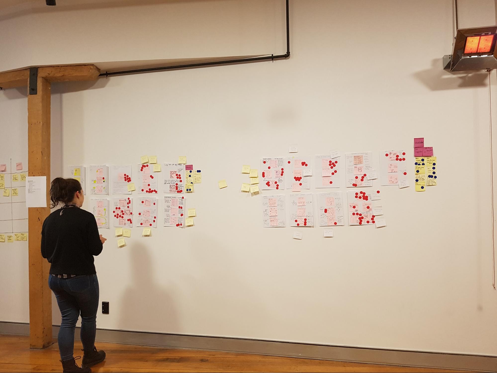
The art gallery is the place where all the sketches go. We give everyone dot stickers so they can vote and pull out key ideas from each sketch. This is done silently, as the ideas should be understood without needing explanation from the person who made them. At the end of it you’ve got a kind of heat map, and you can see the ideas that stand out the most. After this first round of voting, the authors of the sketches get to talk through their ideas, then another round of voting begins.

Mila putting some sticky dots on some sketches
 Mila putting some sticky dots on some sketches

Bowie, our head of security/office dog, even took part in the sprint...kind of.
 Bowie, our head of security, even took part in the sprint...kind of

Usability testing and validation

The key part of a design sprint is validation. For one of our sprints we had two parts of our concept that needed validating. To test one part we conducted simple user tests with other members of Optimal Workshop (the feature was an internal tool). For the second part we needed to validate whether we had the data to continue with this project, so we had our data scientist run some numbers and predictions for us.

6-dan-design-sprintOur remote worker Rebecca dialed in to watch one of our user tests live
 Our remote worker Rebecca dialed in to watch one of our user tests live
"I'm pretty bloody happy" — Actual feedback.
 Actual feedback

Challenges and outcomes

One of our key team members, Rebecca, was working remotely during the sprint. To make things easier for her, we set up 2 cameras: one pointed to the whiteboard, the other was focused on the rest of the sprint team sitting at the table. Next to that, we set up a monitor so we could see Rebecca.

Engaging in workshop activities is a lot harder when working remotely. Rebecca would get around this by completing the activities and take photos to send to us.

8-rebecca-design-sprint
 For more information, read this great Medium post about running design sprints remotely

Lessons

  • Lightning talks are a great way to have each person contribute up front and feel invested in the process.
  • Sprints are energy intensive. Make sure you’re in a good place with plenty of fresh air with comfortable chairs and a break out space. We like to split the five days up so that we get a weekend break.
  • Give people plenty of notice to clear their schedules. Asking busy people to take five days from their schedule might not go down too well. Make sure they know why you’d like them there and what they should expect from the week. Send them an outline of the agenda. Ideally, have a chat in person and get them excited to be part of it.
  • Invite the right people. It’s important that you get the right kind of people from different parts of the company involved in your sprint. The role they play in day-to-day work doesn’t matter too much for this. We’re all mainly using pens and paper and the more types of brains in the room the better. Looking back, what we really needed on our team was a customer support team member. They have the experience and knowledge about our customers that we don’t have.
  • Choose the right sprint problem. The project we chose for our first sprint wasn’t really suited for a design sprint. We went in with a well defined problem and a suggested solution from the team instead of having a project that needed fresh ideas. This made the activities like ‘How Might We’ seem very redundant. The challenge we decided to tackle ended up being more of a data prototype (spreadsheets!). We used the week to validate assumptions around how we can better use data and how we can write a script to automate some internal processes. We got the prototype working and tested but due to the nature of the project we will have to run this experiment in the background for a few months before any building happens.

Overall, this design sprint was a great team bonding experience and we felt pleased with what we achieved in such a short amount of time. Naturally, here at Optimal Workshop, we're experimenters at heart and we will keep exploring new ways to work across teams and find a good middle ground.

Further reading

Learn more
1 min read

Designing for conversational user interfaces: A Q&A with Stratis Valachis

Stratis Valachis, senior user experience designer at Aviva’s Digital Innovation Garage, took some time out of his busy schedule to answer some questions about designing for conversational user interfaces (CUI). Learn more about his processes for research and design for CUI, what he thinks the future will look like, and some of the biggest challenges he’s faced while designing for CUI.Stratis will be speaking at MUXL2017, the third annual conference around Mobile User Experience in London on the 10th of November at City, University of London. Using case studies through talks and workshops, the conference will cover Core UX principles as well as emerging topics such as AI (Chatbots), VR (AR) & IOT.

What does the research and design process for conversational interfaces look like?

Like any design project, you should always start by identifying user needs and real problems. Research how users solve that problem currently and then evaluate for which use cases you can remove friction and enhance the experience by utilizing a conversational interface.Don't try to chat-ify or voice-ify your product just because it's a cool trend. In many ways conversational interfaces (CUIs), both voice and visual, have more usability constraints than traditional GUI. For example, it’s hard to interrupt the conversation to recover from errors, you can't easily skim through information, progress is linear and you very often need to rely on recall.Users make conscious compromises about which type of interface they want to use.This means that a solution utilizing a CUI needs to offer an obvious benefit for your chosen use case, otherwise users won't use your product. That's why special emphasis should be placed on early research about the context in which users will use your product and on why a CUI could provide a better experience. When you begin the design phase, a good practice would be to craft a personality for your interface. Studies have shown that because humans are empathetic, they will assign human character attributes to your CUI anyway, so it's better to make sure this is defined through design. This works really well for platforms like Google Home and Facebook Messenger, which make it clear to the user that each product built on them is a different entity from the default assistant.Some channels like Alexa, though, don't make that distinction clear. In these cases, you need to make sure that the character of your CUI doesn’t significantly deviate from the personality of the default assistant, otherwise you'll mess with their mental model and create confusion. For example, when you're ordering an Uber with Alexa, it’s Alexa that speaks back to you: "Alexa, ask Uber for a ride." "Sure, there's an Uber less than a minute away, would you like me to order it?". While on Google Home, the Google Assistant makes it clear that it passes you over to Uber "Hi, I'm Uber, how can I help?".After you define the personality, start drafting out the core experience of your product.If you're working on a visual CUI, type the conversation down like a screenplay. If you're working with voice, act the dialogue out with your colleagues and use voice simulators to see how it feels in the channel you're designing for. This will make it easier to decide the direction you'd like to follow and will also help you initiate conversations with stakeholders.At this stage, you will be ready to start designing your user flows to define the functionality at a granular level. Again, understanding context is crucial. Make sure you think of the different scenarios in which users will interact with your product and the ways they're likely to phrase their input. User testing is key for this.

What are some of the biggest challenges you've faced designing for CUI?

Setting the right expectations for users. That applies to both visual and voice interfaces. There's a gap between the mental model users have of what most AI products with conversational interfaces can do, and what they are actually capable of doing. That was a common pattern I've seen in user testing sessions even with users who had previous experience in the conversational channel that was being tested. As a designer your challenge is to make the affordances and constraints clear in a way that feels like a natural part of the conversation and mitigates disappointment from unrealistic expectations. Another challenge is trying to cater for all the different ways people will phrase the requests. The key here is to invest time and resources in user research and NLP (natural language processing) services. If you feel that this is out of scope for your project, you may consider limiting the options for your users as trying to guide them to say things in a certain way will not work. Good examples of this are Facebook Messenger bots which now allow developers to remove the input field entirely from the experience in order to prevent users from making requests that can't be supported.

How do you think CUI is going to change the way designers and researchers do their work?

It might require designers and researchers to slightly alter some techniques they're using (for example thinking aloud during user testing doesn't work with voice interfaces) but the fundamentals will stay the same. You still need to focus on understanding the problem, explore different solutions through divergent thinking, converge, develop and continuously iterate based on user feedback. The exciting thing is that these new technologies significantly expand our toolbox and offer new interesting ways to solve problems for our users.

What improvements to this kind of technology do you wish to see? How would you like this technology to progress in the future?

I would like to see a more widespread integration of voice interfaces with visuals and GUI interaction patterns. A good example of the benefits of this approach is Amazon's Fire TV. Users can converse with the system via voice when it's more efficient than the alternative interaction options (for example, searching for a movie) but use their remote control to interact with visual UI elements for tasks that would be tedious to perform through voice. For example, selecting a movie cover to reveal descriptive text and then skimming through it helps you gauge whether the plot is interesting faster than if you had to consume this information through a conversation. This hybrid approach utilizes the best of each world to create a stronger experience. I think we will see this type of interface a lot more in the future. Think of Iron Man and J.A.R.V.I.S.

Any advice for young designers and researchers hoping to get into this part of the industry?

Invest time in learning best practices for crafting good dialogue. It's a crucial skill for designers in this field. Google and Amazon's design guidelines are a good starting point. This doesn't mean you should omit training and improving your knowledge in usability for traditional interfaces. Most of the principles are time-proof and channel agnostic and will help you greatly with conversational interfaces.Another thing you should make sure you do is stay up to date with the latest trends. The technology evolves very fast so you need to stay ahead of curve. Attend meetups, work on personal projects and participate in hackathons to practice and learn from the experts.As long as you're really passionate about the field, there will be plenty of opportunities for you to get involved and contribute. We're still in the early stages of mainstream adoption of the technology, so we have the chance to make significant impact on the evolution of the field and shape best practices for years to come, which is really exciting!

Learn more
1 min read

Understanding UI design and its principles

Wireframes. Mockups. HTML. Fonts. Elements. Users. If you’re familiar with user interface design, these terms will be your bread and butter.An integral part of any website or application, user interface design is also arguably one of the most important. This is because your design is what your users see and interact with. If your site or app functions poorly and looks terrible, that’s what your users are going to remember.

But isn’t UX design and UI design the same thing? Or is there just an extremely blurred line between the two? What’s involved with UI design and, more importantly, what makes good design?

What is UI design exactly?

If you’re wondering how to test UI on your website, it’s a good idea to first learn some of the differences between UX and UI design. Although UI design and UX design look similar when written down, they’re actually two totally separate things. However, they should most definitely complement each other.

UX design, according to Nielsen Norman Group, “encompasses all aspects of the end-user's interaction with the company, its services, and its products.” Meanwhile, UI design focuses more on a user’s interaction, the overall design, look and feel of a system. The two still sound similar, right?For those of you still trying to wrap your ahead around the difference, Nielsen Norman Group has a great analogy up on its site that helps to explain it:

"As an example, consider a website with movie reviews. Even if the UI for finding a film is perfect, the UX will be poor for a user who wants information about a small independent release if the underlying database only contains movies from the major studios.”

This just goes to show the complementary relationship between the two and why it’s so important.User interface was popularized in the early 1970s, partly thanks to Fuji Xerox’s ‘Xerox Alto Workstation’ — an early personal computer dubbed “the origin of the PC”. This machine used various icons, multi windows, a mouse, and e-mail, which meant that some sort of design and design principles were needed to create consistency for the future. It was here that human-centred UI was born. UI design also covers graphical user interface design (GUI design). A GUI is the software or interface that works as the medium between a user and the computer.

It uses a number of graphical elements, such as screen cursors, menus, and icons so that users can easily navigate a system. This is also something that has stemmed from Fuji Xerox back in the late 1970s and early 1980s.Since then, UI has developed quickly and so has its design principles. When the Xerox Alto Workstation was first born, Fuji Xerox came up with eight of its own design principles. These were:

  • Metaphorically digitize the desk environment
  • Operating on display instead of entering on keyboard
  • What you see is what you get
  • Universal but fewer commands
  • Same operation for the same job at different places
  • Operating computers as easily as possible
  • No need to transfer to different jobs
  • System customized as desired by users

Over time, these principles have evolved and now you’ll likely find many more added to this list. Here are just a few of the most important ones identified in “Characteristics of graphical and web user interfaces” by Wilbert Galitz.

UI design principles:

Principle #1: Clarity

Usability.gov says that the “best interfaces are almost invisible to the user”.Everything in the system, from visual elements, functions, and text, needs to be clear and simple. This includes layout as well as the words used — stay away from jargon and complex terms or analogies that users won’t understand.Aesthetic appeal also fits into this principle. Ensure colors and graphics are used in a simple manner, and elements are grouped in a way that makes sense.

Principle #2: Consistency

The system should have the same or similar functions, uses and look throughout it for consistency. For example, the same color scheme should be used throughout an app, or the terminology on a website should be consistent throughout. Users should also have an idea of what to expect when they use your system. As an example, picture a retail shopping app. You’d expect that any other retail shopping app out there will have similar basic functions: a place to log in or create an account, account settings, a way to navigate and browse stock, a way to purchase stock at the press of a button. However, this doesn’t mean copying another app or website exactly; there should just be consistency so users know what to expect when they encounter your system.Apple even states an “app should respect its users and avoid forcing them to learn new ways to do things for no other reason than to be different”.

Principle #3: Flexibility and customizability

Is there more than one way people can access your system and its functions? Can people perform tasks in a number of different ways, too?Providing your users with a flexible system means people are more in control of what they’re doing. Galitz mentions this can also be done through allowing system customization.Don’t forget use on other kinds of devices, too. In a time when Google is using mobile-friendliness as a ranking signal, and research from Ericsson shows smartphones accounted for 75% of all mobile phone sales in Q4 2015, you know that being flexible is important.

Examples of good UI design

For a list of some of the best user interface examples, check out last year’s Webby Awards category for Best Interface Design. The 2016 category winner was the Reuters TV Web App, while the People’s Choice winner was AssessYourRisk.org.As an aside, this is the second year that the Webby Awards introduced this category — just goes to show how important it is to have good UI design!While you don’t want your site or application to look exactly the same as these winners, you still want yours to function well and be aesthetically pleasing.

To help you get there, there are a number of UI design tools and UI software available.Here’s a list of some of the many out there:

  • UXPin - An online UI design tool that allows you to create wireframes, mockups, and prototypes all on one platform.
  • InVision - A prototyping and collaboration tool. More in-depth than Balsamiq, and it allows you to go from mockup to high-fidelity in minutes.
  • Balsamiq - A simple mockups tool for wireframing, which allows users to test out ideas in the early stage of interface design.
  • Atomic - An interface design tool that allows you to design in your browser and collaborate with others on your projects.

Have you got any favorite UI design examples, or tips for beautiful design? We’d love to see them — comment below and let us know!

Further reading

Learn more
1 min read

Are users always right? Well. It's complicated

About six months ago, I came across aninteresting question on Stack Exchange headlined 'Should you concede to user demands that are clearly inferior?' It stuck in my mind because the question in itself is complex, and contains a few complicated assumptions.

In the world of user experience research and design, the users needs and wants are paramount. Dollars and hours are spent poring through data and interviewing and collating information into a cohesive explanation of what works and what doesn't for users. Designs are based on how users intuitively interact with products and websites. Organisations respond to suggestions that come through on support and on Twitter, and if a significant numbers of users want a particular change, chances are those organisations will act. But the question itself throws this most sacred of stances up in the air, because it contains the phrase 'user demands that are clearly inferior'. Now, that is a loaded statement.

How the good reconcile the existence of the bad

I imagine it's sometimes hard for designers to get rid of the feeling that they know best. As a writer, I know what I like and don't like. I 'know' good writing from bad, and I have strong opinions about books and articles that aren't worth the pages or bandwidth it takes to publish them. But this stance often puts me in conflict with the huge amount of empirical evidence that certain writing I disdain is actually 'good': and that evidence is readers. For Fifty Shades of Lame, it's millions of them. Aggghh!

In the same way, I've never met a designer who didn't have strong opinions about what they adore and deplore in their own art forms. And I wonder how tough it sometimes is to implement changes that to a designers mind make no sense. Do any of you UX designers out there ever secretly think, when you discover what users are asking for, 'these people have no taste, they don't know what they want, how ridiculous!'? Is there a secret current of despair and frustration at user ignorance running deep and unspoken through the river of design?

The main views from the Stack Exchange discussion

xkcd  Workflow

On Stack Exchange, Matt described how he and his team implemented a single tree view (75 items) with a scroll wheel, and because it was an internalchange,they were able to get quick feedback from existing users. The feedback wasn't positive, and many people wanted the change to be reversed. He explains: ‘To my mind, the way we redeveloped it is unambiguously better. But the user base was equally emphatic in rejecting it. So today, to the complaints of my fellow team members, I removed our new implementation and set it to work in the manner the users were used to.'

He then goes on to ask 'What was the right course of action here? Is there a point at which the user's fear of change becomes an important UX consideration in its own right?' The responses are varied and fascinating, and can be roughly broken into three camps:

  1. If your users don't want something, you'd be stupid to try and implement it.
  2. Users are often change averse, so if you really think your change will be better, then you need to ease them into it.
  3. If you're convinced the change is positive, you still need to test it on your users, and be open to admitting you were wrong.

So where do we stand?

One of the problems with the term 'User Experience' is the word 'user'. It's a depersonalised and generic way of describing who it is you're serving. Because there is a person at the heart of the enterprise who is trying to achieve something. They may not be trying to achieve what you expect them to. They certainly may not be trying to achieve what you want them to.

Context is everything.

Who is the person who is asking for a change, or asking for something to stay the same?We would argue that people aren't 'change-averse', but 'confusion/discomfort/inefficiency-averse' people want easier ways of doing things. So if by changing a feature you mess up a person's workflow, then potentially you didn't do your research.

If you look closely at the behavior of users — how people actually interact with a particular aspect of your design, rather than just hearing their opinions — then you'll be able to base your design on empirical evidence. So, we (roughly) come down on the side of the people who use the product. If they want to get something done, and they want to do that in a particular way, then they have right of way.

It's your job not to serve your tastes, but to give people the experience you promise them. And to the author of Fifty Shades of Grey, I say, 'Good on you EL James. You gave them what they wanted.'

What do you think?

Learn more
1 min read

Selling your design recommendations to clients and colleagues

If you’ve ever presented design findings or recommendations to clients or colleagues, then perhaps you’ve heard them say:

  • “We don’t have the budget or resources for those improvements.”
  • “The new executive project has higher priority.”
  • “Let’s postpone that to Phase 2.”

As an information architect, I‘ve presented recommendations many times. And I’ve crashed and burned more than once by doing a poor job of selling some promising ideas. Here’s some things I’ve learned from getting it wrong.

Buyers prefer sellers they like and trust

You need to establish trust with peers, developers, executives and so on before you present your findings and recommendations . It sounds obvious, yet presentations often fail due to unfamiliarity, sloppiness or designer arrogance. A year ago I ran an IA test on a large company website. The project schedule was typically “aggressive” and the client’s VPs were endlessly busy. So I launched the test without their feedback. Saved time, right?Wrong. The client ignored all my IA recommendations, and their VPs ultimately rewrote my site map from scratch. I could have argued that they didn’t understand user-centered design. The truth is that I failed to establish credibility. I needed them to buy into the testing process, suggest test questions beforehand, or take the test as a control group. Anything to engage them would have helped – turning stakeholders into collaborators is a great way to establish trust.

Techniques for presenting UX recommendations

Many presentation tactics can be borrowed from salespeople, but a single blog post can’t do justice to the entire sales profession. So I’d just like to offer a few ideas for thought. No Jedi mind tricks though. Sincerity matters.

Emphasize product benefits, not product features

Beer commercials on TV don’t sell beer. They sell backyard parties and voluptuous strangers. Likewise, UX recommendations should emphasize product benefits rather than feature sets. This may be common marketing strategy. However, the benefits should resonate with stakeholders and not just test participants. Stakeholders often don’t care about Joe End User. They care about ROI, a more flexible platform, a faster way to publish content – whatever metrics determine their job performance.Several years ago, I researched call center data at a large corporation. To analyze the data, I eventually built a Web dashboard. The dashboard illustrated different types of customer calls by product. When I showed it to my co-workers, I presented the features and even the benefits of tracking usability issues this way.However, I didn’t research the specific benefits to my fellow designers. Consequently it was much, much harder to sell the idea. I should have investigated how a dashboard would fit into their daily routines. I had neglected the question that they silently asked: “What’s in it for me?”

Have a go at contrast selling

When selling your recommendations, consider submitting your dream plan first. If your stakeholders balk, introduce the practical solution next. The contrast in price will make the modest recommendation more palatable.While working on e-commerce UI, I once ran a usability test on a checkout flow. The test clearly suggested improvements to the payment page. To try slipping it into an upcoming sprint, I asked my boss if we could make a few crucial fixes. They wouldn’t take much time. He said...no. In essence, my boss was comparing extra work to doing nothing. My mistake was compromising the proposal before even presenting it. I should have requested an entire package first: a full redesign of the shopping cart experience on all web properties. Then the comparison would have been a huge effort vs. a small effort.Retailers take this approach every day. Car dealerships anchor buyers to lofty sticker prices, then offer cash back. Retailers like Amazon display strikethrough prices for similar effect. This works whenever buyers prefer justifying a purchase based on savings, not price.

Use the alternative choice close

Alternative Choice is a closing technique in which a buyer selects from two options. Cleverly, each answer implies a sale. Here are examples adapted for UX recommendations:

  • “Which website could we implement these changes on first, X or Y?”
  • “Which developer has more time available in the next sprint, Tom or Harry?”

This is better than simply asking, “Can we start on Website X?” or “Do we have any developers available?” Avoid any proposition that can be rejected with a direct “No.”

Convince with the embarrassment close

Buying decisions are emotional. When presenting recommendations to stakeholders, try appealing to their pride (remember, you’re not actually trying to embarrass someone). Again, sincerity is important. Some UX examples include:

  • “To be an industry leader, we need a best-of-breed design like Acme Co.”
  • “I know that you want your co mpany to be the best. That’s why we’re recommending a full set of    improvements instead of a quick fix.”

Techniques for answering objections once you’ve presented

Once you’ve done your best to present your design recommendations, you may still encounter resistance (surprise!). To make it simple, I’ve classified objections using the three points in the triangle model of project management: Time, Price and Quality. Any project can only have two. And when presenting design research, you’re advocating Quality, i.e. design usability or enhancements. Pushback on Quality generally means that people disagree with your designs (a topic for another day).

Therefore, objections will likely be based on Time or Price instead.In a perfect world, all design recommendations yield ROI backed by quantitative data. But many don’t. When selling the intangibles of “user experience” or “usability” improvements, here are some responses to consider when you hear “We don’t have time” or “We can’t afford it”.

“We don’t have time” means your project team values Time over Quality

If possible, ask people to consider future repercussions. If your proposal isn’t implemented now, it may require even more time and money later. Product lines and features expand, and new websites and mobile apps get built. What will your design improvements cost across the board in 6 months? Opportunity costs also matter. If your design recommendations are postponed, then perhaps you’ll miss the holiday shopping season, or the launch of your latest software release. What is the cost of not approving your recommendations?

“We can’t afford it” means your project team values Price over Quality

Many project sponsors nix user testing to reduce the design price tag. But there’s always a long-term cost. A buggy product generates customer complaints. The flawed design must then be tested, redesigned, and recoded. So, which is cheaper: paying for a single usability test now, or the aggregate cost of user dissatisfaction and future rework? Explain the difference between price and cost to your team.

Parting Thoughts

I realize that this only scratches the surface of sales, negotiation, persuasion and influence. Entire books have been written on topics like body language alone. Uncommon books in a UX library might be “Influence: The Psychology of Persuasion” by Robert Cialdini and “Secrets of Closing the Sale” by Zig Ziglar. Feel free to share your own ideas or references as well.Any time we present user research, we’re selling. Stakeholder mental models are just as relevant as user mental models.

No results found.

Please try different keywords.

Subscribe to OW blog for an instantly better inbox

Thanks for subscribing!
Oops! Something went wrong while submitting the form.

Seeing is believing

Explore our tools and see how Optimal makes gathering insights simple, powerful, and impactful.