Subscribe to OW blog for an instantly better inbox
Oops! Something went wrong while submitting the form.
Articles and Podcasts on Customer Service, AI and Automation, Product, and more
A year ago, we looked at the user research market and made a decision.
We saw product teams shipping faster than ever while research tools stayed stuck in time. We saw researchers drowning in manual work, waiting on vendor emails, stitching together fragmented tools. We heard "should we test this?" followed by "never mind, we already shipped."
The dominant platforms got comfortable. We didn't.
Today, we're excited to announce Optimal 3.0, the result of refusing to accept the status quo and building the fresh alternative teams have been asking for.
The gap between product velocity and research velocity has never been wider. The situation isn't sustainable. And it's not the researcher's fault. The tools are the problem. They’re:
These platforms haven't changed because they don't have to, so we set out to challenge them.
Optimal 3.0 isn't an incremental update to the old way of doing things. It's a fundamental rethinking of what a research platform should be.
Research For All, Not Just Researchers.
For 18 years, we've believed research should be accessible to everyone, not just specialists. Optimal 3.0 takes that principle further.
Unlimited seats. Zero gatekeeping.
Designers can validate concepts without waiting for research bandwidth. PMs can test assumptions without learning specialist tools. Marketers can gather feedback without procurement nightmares. Research shouldn't be rationed by licenses or complexity. It should be a shared capability across your entire team.
A Complete Ecosystem in One Place.
Stop stitching together point solutions.Optimal 3.0 gives you everything you need in one platform:
Recruitment Built In Access millions of verified participants worldwide without the vendor tag. Target by demographics, behaviors, and custom screeners. Launch studies in minutes, not days. No endless email chains. No procurement delays.
Testing That Adapts to You
Learn more about Live Site Testing
AI-Powered Analysis (With Control) Interview analysis used to take weeks. We've reduced it to minutes.
Our AI automatically identifies themes, surfaces key quotes, and generates summaries, while you maintain full control over the analysis.
As one researcher told us: "What took me 4 weeks to manually analyze now took me 5 minutes."
This isn't about replacing researcher judgment. It's about amplifying it. The AI handles the busywork, tagging, organizing, timestamping. You handle the strategic thinking and judgment calls. That's where your value actually lives.
Learn more about Optimal Interviews
Chat Across All Your Data Your research data is now conversational.
Ask questions and get answers instantly, backed by actual video evidence from your studies. Query across multiple Interview studies at once. Share findings with stakeholders complete with supporting clips.
Every insight comes with the receipts. Because stakeholders don't just need insights, they need proof.
A Dashboard Built for Velocity See all your studies, all your data, in one place. Track progress across your entire team. Jump from question to insight in seconds. Research velocity starts with knowing what you have.
Integration Layer
Optimal 3.0 fits your workflow. It doesn't dominate it. We integrate with the tools you already use, Figma, Slack, your existing tech stack, because research shouldn't force you to abandon how you work.
What Didn't Change: Methodological Rigor
Here's what we didn't do: abandon the foundations that made teams trust us.
Card sorting, tree testing, first-click tests, surveys, the methodologically sound tools that Amazon, Google, Netflix, and HSBC have relied on for years are all still here. Better than ever.
We didn't replace our roots. We built on them.
18 years of research methodology, amplified by modern AI and unified in a complete ecosystem.
Product development isn't slowing down. AI is accelerating everything. Competitors are moving faster. Customer expectations are higher than ever.
Research can either be a bottleneck or an accelerator.
The difference is having a platform that:
Optimal 3.0 is built for research that arrives before the decision is made. Research that shapes products, not just documents them. Research that helps teams ship confidently because they asked users first.
A Fresh Alternative
We're not trying to be the biggest platform in the market.
We're trying to be the best alternative to the clunky tools that have dominated for years.
Amazon, Google, Netflix, Uber, Apple, Workday, they didn't choose us because we're the incumbent. They chose us because we make research accessible, fast, and actionable.
"Overall, each release feels like the platform is getting better." — Lead Product Designer at Flo
"The one research platform I keep coming back to." — G2 Review
This launch represents our biggest transformation, but it's not the end. It's a new beginning.
We're continuing to invest in:
Our goal is simple: make user research so fast and accessible that it becomes impossible not to include users in every decision.
See What We've Built
If you're evaluating research platforms and tired of the same old clunky tools, we'd love to show you the alternative.
Book a demo or start a free trial
The platform that turns "should we?" into "we did."
Welcome to Optimal 3.0.

In Part 1 of this series we looked at how to interpret results from open and hybrid card sorts and now in Part 2, we’re going to talk about closed card sorts. In closed card sorts, participants are asked to sort the cards into predetermined categories and are not allowed to create any of their own. You might use this approach when you are constrained by specific category names or as a quick checkup before launching a new or newly redesigned website.In Part 1, we also discussed the two different - but complementary - types of analysis that are generally used together for interpreting card sort results: exploratory and statistical. Exploratory analysis is intuitive and creative while statistical analysis is all about the numbers. Check out Part 1 for a refresher or learn more about exploratory and statistical analysis in Donna Spencer’s book.
Closed card sort analysis is generally much quicker and easier than open and hybrid card sorts because there are no participant created category names to analyze - it’s really just about where the cards were placed. There are some similarities about how you might start to approach your analysis process but overall there’s a lot less information to take in and there isn’t much in the way of drilling down into the details like we did in Part 1.Just like with an open card sort, kick off your analysis process by taking an overall look at the results as a whole. Quickly cast your eye over each individual card sort and just take it all in. Look for common patterns in how the cards have been sorted. Does anything jump out as surprising? Are there similarities or differences between participant sorts?
If you’re redesigning an existing information architecture (IA), how do your results compare to the current state? If this is a final check up before launching a live website, how do these results compare to what you learned during your previous research studies?If you ran your card sort using information architecture tool OptimalSort, head straight to the Overview and Participants Table presented in the results section of the tool. If you ran a moderated card sort using OptimalSort’s printed cards, you’ve probably been scanning them in after each completed session, but now is a good time to double check you got them all. And if you didn’t know about this handy feature of OptimalSort, it’s something to keep in mind for next time!
The Participants Table shows a breakdown of your card sorting data by individual participant. Start by reviewing each individual card sort one by one by clicking on the arrow in the far left column next to the Participants numbers. From here you can easily flick back and forth between participants without needing to close that modal window. Don’t spend too much time on this — you’re just trying to get a general impression of how the cards were sorted into your predetermined categories. Keep an eye out for any card sorts that you might like to exclude from the results. For example participants who have lumped everything into one group and haven’t actually sorted the cards.
Don’t worry- excluding or including participants isn’t permanent and can be toggled on or off at anytime.Once you’re happy with the individual card sorts that will and won’t be included in your results visualizations, it’s time to take a look at the Results Matrix in OptimalSort. The Results Matrix shows the number of times each card was sorted into each of your predetermined categories- the higher the number, the darker the shade of blue (see below).
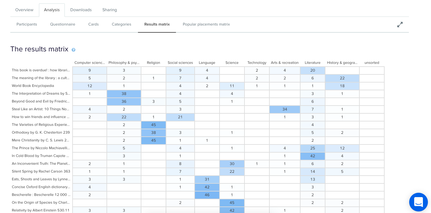
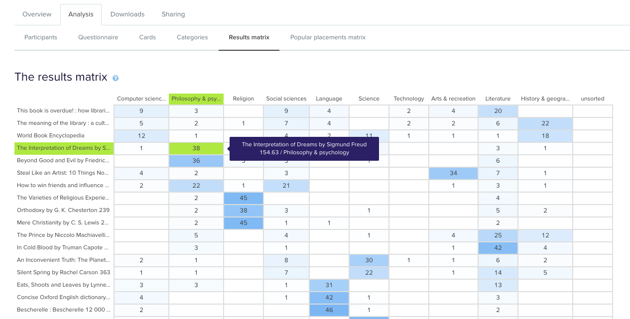
This table enables you to quickly and easily get across how the cards were sorted and gauge the highest and lowest levels of agreement among your participants. This will tell you if you’re on the right track or highlight opportunities for further refinement of your categories.If we take a closer look (see below) we can see that in this example closed card sort conducted on the Dewey Decimal Classification system commonly used in libraries, The Interpretation of Dreams by Sigmund Freud was sorted into ‘Philosophy and psychology’ 38 times in study a completed by 51 participants.
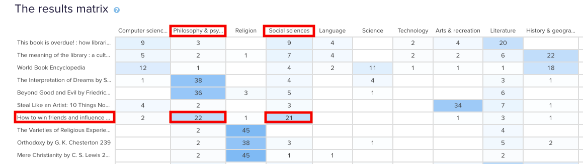
In the real world, that is exactly where that content lives and this is useful to know because it shows that the current state is supporting user expectations around findability reasonably well. Note: this particular example study used image based cards instead of word label based cards so the description that appears in both the grey box and down the left hand side of the matrix is for reference purposes only and was hidden from the participants.Sometimes you may come across cards that are popular in multiple categories. In our example study, How to win friends and influence people by Dale Carnegie, is popular in two categories: ‘Philosophy & psychology’ and ‘Social sciences’ with 22 and 21 placements respectively. The remaining card placements are scattered across a further 5 categories although in much smaller numbers.
When this happens, it’s up to you to determine what your number thresholds are. If it’s a tie or really close like it is in this case, you might review the results against any previous research studies to see if anything has changed or if this is something that comes up often. It might be a new category that you’ve just introduced, it might be an issue that hasn’t been resolved yet or it might just be limited to this one study. If you’re really not sure, it’s a good idea to run some in-person card sorts as well so you can ask questions and gain clarification around why your participants felt a card belonged in a particular category. If you’ve already done that great! Time to review those notes and recordings!You may also find yourself in a situation where no category is any more popular than the others for a particular card. This means there’s not much agreement among your participants about where that card actually belongs. In our example closed card sort study, the World Book Encyclopedia was placed into 9 of 10 categories. While it was placed in ‘History & geography’ 18 times, that’s still only 35% of the total placements for that card- it’s hardly conclusive.
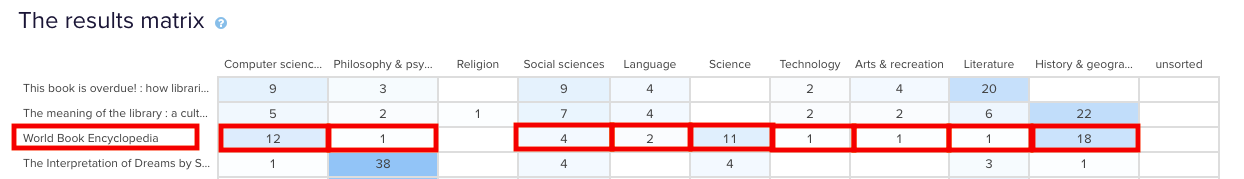
Sometimes this happens when the card label or image is quite general and could logically belong in many of the categories. In this case, an encyclopedia could easily fit into any of those categories and I suspect this happened because people may not be aware that encyclopedias make up a very large part of the category on the far left of the above matrix: ‘Computer science, information & general works’. You may also see this happening when a card is ambiguous and people have to guess where it might belong. Again - if you haven’t already - if in doubt, run some in-person card sorts so you can ask questions and get to the bottom of it!After reviewing the Results Matrix in OptimalSort, visit the Popular Placements Matrix to see which cards were most popular for each of your categories based on how your participants sorted them (see below 2 images).
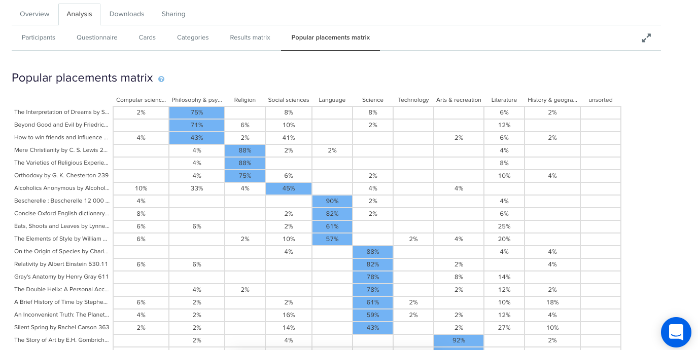
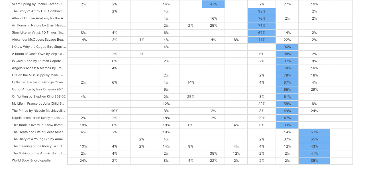
The diagram shades the most popular placements for each category in blue making it very easy to spot what belongs where in the eyes of your participants. It’s useful for quickly identifying clusters and also highlights the categories that didn’t get a lot of card sorting love. In our example study (2 images above) we can see that ‘Technology’ wasn’t a popular card category choice potentially indicating ambiguity around that particular category name. As someone familiar with the Dewey Decimal Classification system I know that ‘Technology’ is a bit of a tricky one because it contains a wide variety of content that includes topics on medicine and food science - sometimes it will appear as ‘Technology & applied sciences’. These results appear to support the case for exploring that alternative further!
Now that we’ve looked at how to interpret your open, hybrid and closed card sorts, here are some next steps to help you turn those insights into action!Once you’ve analyzed your card sort results, it’s time to feed those insights into your design process and create your taxonomy which goes hand in hand with your information architecture. You can build your taxonomy out in Post-it notes before popping it into a spreadsheet for review. This is also a great time to identify any alternate labelling and placement options that came out of your card sorting process for further testing.From here, you might move into tree testing your new IA or you might run another card sort focussing on a specific area of your website. You can learn more about card sorting in general via our 101 guide.
When interpreting card sort results, don’t forget to have fun! It’s easy to get overwhelmed and bogged down in the results but don’t lose sight of the magic that is uncovering user insights.I’m going to leave you with this quote from Donna Spencer that summarizes the essence of card sort analysis quite nicely:Remember that you are the one who is doing the thinking, not the technique... you are the one who puts it all together into a great solution. Follow your instincts, take some risks, and try new approaches. - Donna Spencer
Cards have been created, sorted and sorted again. The participants are all finished and you’re left with a big pile of awesome data that will help you improve the user experience of your information architecture. Now what?Whether you’ve run an open, hybrid or closed card sort online using an information architecture tool or you’ve run an in person (moderated) card sort, it can be a bit daunting trying to figure out where to start the card sort analysis process.
This two-part guide will help you on your way! For Part 1, we’re going to look at how to interpret and analyze the results from open and hybrid card sorts.
Open and hybrid card sorts are great for generating ideas for category names and labels and understanding not only how your users expect your content to be grouped but also what they expect those groups to be called.In both parts of this series, I’m going to be talking a lot about interpreting your results using Optimal Workshop’s online card sorting tool, OptimalSort, but most of what I’m going to share is also applicable if you’re analyzing your data using a spreadsheet or using another tool.
Similar to qualitative and quantitative methods, exploratory and statistical analysis in card sorting are two complementary approaches that work together to provide a detailed picture of your results.
Depending on your objectives - whether you are starting from scratch or redesigning an existing IA - you’ll generally need to use some combination of both of these approaches when analyzing card sort results. Learn more about exploratory and statistical analysis in Donna Spencer’s book.
When analyzing card sort results, start by taking an overall look at the results as a whole. Quickly cast your eye over each individual card sort and just take it all in. Look for common patterns in how the cards have been sorted and the category names given by participants. Does anything jump out as surprising? Are there similarities or differences between participant sorts? If you’re redesigning an existing IA, how do your results compare to the current state?If you ran your card sort using OptimalSort, your first port of call will be the Overview and Participants Table presented in the results section of the tool.If you ran a moderated card sort using OptimalSort’s printed cards, now is a good time to double check you got them all. And if you didn’t know about this handy feature of OptimalSort, it’s something to keep in mind for next time!The Participants Table shows a breakdown of your card sorting data by individual participant. Start by reviewing each individual card sort one by one by clicking on the arrow in the far left column next to the Participants numbers.

From here you can easily flick back and forth between participants without needing to close that modal window. Don’t spend too much time on this — you’re just trying to get a general impression of what happened.Keep an eye out for any card sorts that you might like to exclude from the results. For example participants who have lumped everything into one group and haven’t actually sorted the cards. Don’t worry - excluding or including participants isn’t permanent and can be toggled on or off at anytime.If you have a good number of responses, then the Participant Centric Analysis (PCA) tab (below) can be a good place to head next. It’s great for doing a quick comparison of the different high-level approaches participants took when grouping the cards.The PCA tab provides the most insight when you have lots of results data (30+ completed card sorts) and at least one of the suggested IAs has a high level of agreement among your participants (50% or more agree with at least one IA).

The PCA tab compares data from individual participants and surfaces the top three ways the cards were sorted. It also gives you some suggestions based on participant responses around what these categories could be called but try not to get too bogged down in those - you’re still just trying to gain an overall feel for the results at this stage.Now is also a good time to take a super quick peek at the Categories tab as it will also help you spot patterns and identify data that you’d like to dive deeper into a bit later on!Another really useful visualization tool offered by OptimalSort that will help you build that early, high-level picture of your results is the Similarity Matrix. This diagram helps you spot data clusters, or groups of cards that have been more frequently paired together by your participants, by surfacing them along the edge and shading them in dark blue. It also shows the proportion of times specific card pairings occurred during your study and displays the exact number on hover (below).

In the above screenshot example we can see three very clear clusters along the edge: ‘Ankle Boots’ to ‘Slippers’ is one cluster, ‘Socks’ to ‘Stockings & Hold Ups’ is the next and then we have ‘Scarves’ to ‘Sunglasses’. These clusters make it easy to spot the that cards that participants felt belonged together and also provides hard data around how many times that happened.Next up are the dendrograms. Dendrograms are also great for gaining an overall sense of how similar (or different) your participants’ card sorts were to each other. Found under the Dendrogram tab in the results section of the tool, the two dendrograms are generated by different algorithms and which one you use depends largely on how many participants you have.
If your study resulted in 30 or more completed card sorts, use the Actual Agreement Method (AAM) dendrogram and if your study had fewer than 30 completed card sorts, use the Best Merge Method (BMM) dendrogram.The AAM dendrogram (see below) shows only factual relationships between the cards and displays scores that precisely tell you that ‘X% of participants in this study agree with this exact grouping’.In the below example, the study shown had 34 completed card sorts and the AAM dendrogram shows that 77% of participants agreed that the cards highlighted in green belong together and a suggested name for that group is ‘Bling’. The tooltip surfaces one of the possible category names for this group and as demonstrated here it isn’t always the best or ‘recommended’ one. Take it with a grain of salt and be sure to thoroughly check the rest of your results before committing!

The BMM dendrogram (see below) is different to the AAM because it shows the percentage of participants that agree with parts of the grouping - it squeezes the data from smaller sample sizes and makes assumptions about larger clusters based on patterns in relationships between individual pairs.The AAM works best with larger sample sizes because it has more data to work with and doesn’t make assumptions while the BMM is more forgiving and seeks to fill in the gaps.The below screenshot was taken from an example study that had 7 completed card sorts and its BMM dendrogram shows that 50% of participants agreed that the cards highlighted in green down the left hand side belong to ‘Accessories, Bottoms, Tops’.

Once you’ve gained a high level impression of the results, it’s time to dig deeper and unearth some solid insights that you can share with your stakeholders and back up your design decisions.Explore your open and hybrid card sort data in more detail by taking a closer look at the Categories tab. Open up each category and cross-reference to see if people were thinking along the same lines.Multiple participants may have created the same category label, but what lies beneath could be a very different story. It’s important to be thorough here because the next step is to start standardizing or chunking individual participant categories together to help you make sense of your results.In open and hybrid sorts, participants will be able to label their categories themselves. This means that you may identify a few categories with very similar labels or perhaps spelling errors or different formats. You can standardize your categories by merging similar categories together to turn them into one.OptimalSort makes this really easy to do - you pretty much just tick the boxes alongside each category name and then hit the ‘Standardize’ button up the top (see below). Don’t worry if you make a mistake or want to include or exclude groupings; you can unstandardize any of your categories anytime.

Once you’ve standardized a few categories, you’ll notice that the Agreement number may change. It tells you how many participants agreed with that grouping. An agreement number of 1.0 is equal to 100% meaning everyone agrees with everything in your newly standardized category while 0.6 means that 60% of your participants agree.Another number to watch for here is the number of participants who sorted a particular card into a category which will appear in the frequency column in dark blue in the right-hand column of the middle section of the below image.


From the above screenshot we can see that in this study, 18 of the 26 participant categories selected agree that ‘Cat Eye Sunglasses’ belongs under ‘Accessories’.Once you’ve standardized a few more categories you can head over to the Standardization Grid tab to review your data in more detail. In the below image we can see that 18 participants in this study felt that ‘Backpacks’ belong in a category named ‘Bags’ while 5 grouped them under ‘Accessories’. Probably safe to say the backpacks should join the other bags in this case.

So that’s a quick overview of how to interpret the results from your open or hybrid card sorts.Here's a link to Part 2 of this series where we talk about interpreting results from closed card sorts as well as next steps for applying these juicy insights to your IA design process.

Reframer is a qualitative research tool that was built to help teams capture and make sense of their research findings quickly and easily. For those of you who have been a long-standing Optimal Workshop customer, you may know that Reframer has been in beta for some time. In fact, it has been in beta for 2 whole years. Truth was that, while we’ve cheerfully responded to your feedback with a number of cool features and improvements, we had some grand plans up our sleeve. So, we took everything we learned and went back to drawing board with the goal to provide the best dang experience we can.We’ll soon be ready to launch Reframer out of beta and let it take its place proudly as a full time member of our suite of user research tools. However, in the spirit of continuous improvement, we want to give you all a chance to use it and give us feedback on the new experience so far.
Awesome! You’ll get to experience the newer version of Reframer with a fresh set of eyes. To enable Reframer, log in to your Optimal Workshop account. On your dashboard you’ll see a button to join the Reframer beta on your screen at right.
Any new studies you create will automatically use the slick new version. Not quite ready to learn the new awesome? No worries you can toggle back and forth between the old version and the new in the top right corner of your screen.To learn about Reframer’s new look and features, watch the video or read the transcript below to hear more about these changes and why we made them.
This year. Stay tuned.
We’re this close to having our qualitative research tool, Reframer, all set to release from beta.But we just couldn’t wait to share some of the changes we’ve got lined up. So, we’ve gone ahead and launched a fresh version of Reframer to give you a taste of what’s to come.These latest updates include a more streamlined workflow and a cleaner user interface, as well as laying the foundations for some exciting features in the coming months.So let’s take a look at the revamped Reframer.We’ve updated the study screen to help you get started and keep track of where your research is at.
What’s the most important thing when observing a research session? Collecting insights of course! So we’ve simplified the capture experience to let you focus on taking great notes.
Now for something totally new — introducing review mode. Here you can see your own observations, as well as those made by anyone else in your team. This makes it easy to tidy up and edit your data after your session is complete. You can filter, search and tag observations, so you’ll be ready to make sense of everything when you move to analysis.We’ve added more guidance throughout Reframer, so you’ll have the confidence you’re on the right track. New users will be up and running in no time with improved help and easy access to resources.You might notice a few changes to our UI as well, but it’s not just about looks.
And that’s where we’re at.We've got a lot more exciting features to come, so why not jump in, give the new Reframer a try and tell us what you think!Send us your feedback and ideas at research@optimalworkshop.com and keep an eye out for more changes coming soon. Catch you later!

Recently, everyone in the design industry has been talking about design sprints. So, naturally, the team at Optimal Workshop wanted to see what all the fuss was about. I picked up a copy of The Sprint Book and suggested to the team that we try out the technique.
In order to keep momentum, we identified a current problem and decided to run the sprint only two weeks later. The short notice was a bit of a challenge, but in the end we made it work. Here’s a run down of how things went, what worked, what didn’t, and lessons learned.
A sprint is an intensive focused period of time to get a product or feature designed and tested with the goal of knowing whether or not the team should keep investing in the development of the idea. The idea needs to be either validated or not validated by the end of the sprint. In turn, this saves time and resource further down the track by being able to pivot early if the idea doesn’t float.
If you’re following The Sprint Book you might have a structured 5 day plan that looks likes this:

When you’re running a design sprint, it’s important that you have the right people in the room. It’s all about focus and working fast; you need the right people around in order to do this and not have any blocks down the path. Team, stakeholder and expert buy-in is key — this is not a task just for a design team!After getting buy in and picking out the people who should be involved (developers, designers, product owner, customer success rep, marketing rep, user researcher), these were my next steps:

Due to scheduling issues we had to split the sprint over the end of the week and weekend. Sprint guidelines suggest you hold it over Monday to Friday — this is a nice block of time but we had to do Thursday to Thursday, with the weekend off in between, which in turn worked really well. We are all self confessed introverts and, to be honest, the thought of spending five solid days workshopping was daunting. At about two days in, we were exhausted and went away for the weekend and came back on Monday feeling sociable and recharged again and ready to examine the work we’d done in the first two days with fresh eyes.
During our sprint we completed a range of different activities but here’s a list of some that worked well for us. You can find out more information about how to run most of these over at The Sprint Book website or checkout some great resources over at Design Sprint Kit.
We kicked off our sprint by having each person give a quick 5-minute talk on one of these topics in the list below. This gave us all an overview of the whole project and since we each had to present, we in turn became the expert in that area and engaged with the topic (rather than just listening to one person deliver all the information).
Our lightning talk topics included:
I asked the sprinters to participate in an exercise so that we could gain empathy for those who are using our tools. The task was to pretend we were one of our customers who had to present a dendrogram to some of our team members who are not involved in product development or user research. In this frame of mind, we had to talk through how we might start to draw conclusions from the data presented to the stakeholders. We all gained more empathy for what it’s like to be a researcher trying to use the graphs in our tools to gain insights.
In the beginning, it’s important to be open to all ideas. One way we did this was to phrase questions in the format: “How might we…” At this stage (day two) we weren’t trying to come up with solutions — we were trying to work out what problems there were to solve. ‘We’ is a reminder that this is a team effort, and ‘might’ reminds us that it’s just one suggestion that may or may not work (and that’s OK). These questions then get voted on and moved into a workshop for generating ideas (see Crazy 8s).Read a more detailed instructions on how to run a ‘How might we’ session on the Design Sprint Kit website.
This activity is a super quick-fire idea generation technique. The gist of it is that each person gets a piece of paper that has been folded 8 times and has 8 minutes to come up with eight ideas (really rough sketches). When time is up, it’s all pens down and the rest of the team gets to review each other's ideas.In our sprint, we gave each person Post-it notes, paper, and set the timer for 8 minutes. At the end of the activity, we put all the sketches on a wall (this is where the art gallery exercise comes in).


The art gallery is the place where all the sketches go. We give everyone dot stickers so they can vote and pull out key ideas from each sketch. This is done silently, as the ideas should be understood without needing explanation from the person who made them. At the end of it you’ve got a kind of heat map, and you can see the ideas that stand out the most. After this first round of voting, the authors of the sketches get to talk through their ideas, then another round of voting begins.

The key part of a design sprint is validation. For one of our sprints we had two parts of our concept that needed validating. To test one part we conducted simple user tests with other members of Optimal Workshop (the feature was an internal tool). For the second part we needed to validate whether we had the data to continue with this project, so we had our data scientist run some numbers and predictions for us.


One of our key team members, Rebecca, was working remotely during the sprint. To make things easier for her, we set up 2 cameras: one pointed to the whiteboard, the other was focused on the rest of the sprint team sitting at the table. Next to that, we set up a monitor so we could see Rebecca.
Engaging in workshop activities is a lot harder when working remotely. Rebecca would get around this by completing the activities and take photos to send to us.

Overall, this design sprint was a great team bonding experience and we felt pleased with what we achieved in such a short amount of time. Naturally, here at Optimal Workshop, we're experimenters at heart and we will keep exploring new ways to work across teams and find a good middle ground.

Doing research is one difficult task — sharing the results with your team is another. Reports can be skim read, forgotten and filed away. People can drift off into a daydream during slideshow presentations, and others may not understand what you’re trying to communicate.This is a problem that many research teams encounter, and it made me think a lot about how to make the wider team really engage in user feedback. While we at Optimal Workshop have a bunch of documents and great tools like Intercom, Evernote and Reframer to capture all our feedback, I wanted to figure out how I could make it fun and engaging to get people to read what our users tell us.How can we as designers and researchers better translate our findings into compelling insights and anecdotes for others to embrace and enjoy? After some thought and a trip to the craft store, I came up with this workshop activity that was a hit with the team.
Each fortnight we’ve been taking turns at running a full company activity instead of doing a full company standup (check in). Some of these activities included things like pairing up and going for a walk along the waterfront to talk about a challenge we are currently facing, or talk about a goal we each have. During my turn I came up with the idea of an arts and crafts session to get the team more engaged in reading some of our user feedback.Before the meeting, I asked every team member to bring one piece of user feedback that they found in Intercom, Evernote or Reframer. This feedback could be positive such as “Your customer support team is awesome” , a suggestion such as “It would be great to be able to hover over tags and see a tooltip with the description”, or it could be negative (opportunity) such as “I’m annoyed and confused with how recruitment works”.This meant that everyone in the team had to dig through the systems and tools we use and look for insights (nuggets) as their first task. This also helped the team gain appreciation for how much data and feedback our user researchers had been gathering.

After we all had one piece of feedback each I told everyone they get to spend the next half hour doing arts and crafts. They could use whatever they could find to create a poster, postcard, or visual interpretation of the insight they had.I provided colored card, emoji stickers, stencils, printed out memes, glitter and glue.During the next 30 minutes I stood back and saw everybody grinning and talking about their posters. The best thing was they were actually sharing their pieces of feedback with one another! We had everyone from devs, marketing, design, operations and finance all participating, which meant that people from all kinds of departments had a chance to read feedback from our customers.

At the end of the meeting we created a gallery in the office and we all spent time reading each poster because it was so fun to see what everyone came up with. We also hung up a few of these in spots around the office that get a lot of foot traffic, so that we can all have a reminder of some of the things our customers told us. I hope that each person took something away with them, and in the future, when working on a task they’ll remember back to a poster and think about how to tackle some of these requests!

Time needed: 30 minutesInsights: Print off a pile of customer insights or encourage the team to find and bring in their own. Have backups as some might be hard to turn into posters.Tools: Scissors, glue sticks, blue tack for creating the gallery.Crafts: Paper, pens, stickers, stencils, googly eyes (anything goes!)

Interested in other creative ways to tell stories? Our User Researcher Ania shares 8 creative ways to share your user research.If you do something similar in your team, we’d love to hear about it in the comments below!

One of the great things about being in the UX field is the UX community. So many inspiring and generally all-round awesome people who are passionate about what they do. What happens when you get a big bunch of those fantastic people all in the one place? You can practically watch the enthusiasm and inspiration levels rise as people talk about ideas, experiences and challenges, and how they can help each other solve problems.Luckily for us, there are lots of events dedicated to getting UX people together in one place to share, learn, grow, and connect. CanUX is one of those, and I was fortunate enough to be there in Ottawa to speak at this year’s event.

CanUX is the annual big UX event for Canada. Started 8 years ago by volunteers who wanted to create an opportunity for the Canadian UX community to get together, it’s grown from a small event to a major conference with top speakers from around the world. Still run by two of the original volunteers, CanUX has kept its focus on community which comes through clearly in how it’s organized. From the day of the week and time of year it’s held, through to details such as a yoga class at the venue to kick off the second day of the conference, there are countless details, small and large, that encourage people to go along, to meet others, and to catch up with old friends from previous CanUX conferences.Aware that there are natural energy lulls in conferences, as people’s brains fill up with inspiration and knowledge, the CanUX team have a regular MC, Rob Woodbridge. This is a man who bounds across the stage, encourages (and actually gets!) audience participation, swears, cracks jokes, and generally seems to have a lot of fun while being the most effective MC I have ever encountered. (Naturally, he’s a bit controversial — some people love to hate him because of that unbridled enthusiasm. But either way, he sets the tone for passionate, engaging presentations!)

With all the attention to detail around the rest of the conference, it’s not surprising that the same care is shown to the conference programme. All of the main presenters are seen ahead of time by one of the organizers, and then invited to be at CanUX. A very small number of short presentation times are set aside for an open call for submissions, to help encourage newer speakers. Presentations are chosen to cover research, design and IA topics, with both practical and inspirational talks in each.The talks themselves were fantastic, covering everything from the challenges of designing spacesuits for NASA, tips for overcoming challenges of being the lone UX person in a company, to the future of robotics in services, and how to get design systems up and working in a large organization. Two of the themes that came through strongest for me this year were inclusivity and empathy — for all of the wonderfully diverse people in the world, and also for people we often forget to take the time to understand and empathize with: our peers and our colleagues.

I feel very privileged to have been able to be involved in a conference that was so full of passion and dedication to UX, and to share the stage with so many inspiring people. The topic for my presentation was a subset of the outcomes of qualitative research I have been doing into who UX people are; in particular, the different types of challenges we face depending on our roles, the type of team we are in, our experience level, and (if reasonably new to UX) where our UX knowledge comes from. My talk seemed to be well received (yay!) — although some of the enthusiasm may have been due to the shoes with squirrel heels I was wearing, which got a lot of attention!

Overall, CanUX was the best organized and most thoughtful conference I’ve ever attended. The passion that the volunteer organizers have for the UX field comes through clearly, and really helps build community. Here’s hoping I’m lucky enough to get back to Ottawa for another one!
