Subscribe to OW blog for an instantly better inbox
Oops! Something went wrong while submitting the form.
Articles and Podcasts on Customer Service, AI and Automation, Product, and more
A year ago, we looked at the user research market and made a decision.
We saw product teams shipping faster than ever while research tools stayed stuck in time. We saw researchers drowning in manual work, waiting on vendor emails, stitching together fragmented tools. We heard "should we test this?" followed by "never mind, we already shipped."
The dominant platforms got comfortable. We didn't.
Today, we're excited to announce Optimal 3.0, the result of refusing to accept the status quo and building the fresh alternative teams have been asking for.
The gap between product velocity and research velocity has never been wider. The situation isn't sustainable. And it's not the researcher's fault. The tools are the problem. They’re:
These platforms haven't changed because they don't have to, so we set out to challenge them.
Optimal 3.0 isn't an incremental update to the old way of doing things. It's a fundamental rethinking of what a research platform should be.
Research For All, Not Just Researchers.
For 18 years, we've believed research should be accessible to everyone, not just specialists. Optimal 3.0 takes that principle further.
Unlimited seats. Zero gatekeeping.
Designers can validate concepts without waiting for research bandwidth. PMs can test assumptions without learning specialist tools. Marketers can gather feedback without procurement nightmares. Research shouldn't be rationed by licenses or complexity. It should be a shared capability across your entire team.
A Complete Ecosystem in One Place.
Stop stitching together point solutions.Optimal 3.0 gives you everything you need in one platform:
Recruitment Built In Access millions of verified participants worldwide without the vendor tag. Target by demographics, behaviors, and custom screeners. Launch studies in minutes, not days. No endless email chains. No procurement delays.
Testing That Adapts to You
Learn more about Live Site Testing
AI-Powered Analysis (With Control) Interview analysis used to take weeks. We've reduced it to minutes.
Our AI automatically identifies themes, surfaces key quotes, and generates summaries, while you maintain full control over the analysis.
As one researcher told us: "What took me 4 weeks to manually analyze now took me 5 minutes."
This isn't about replacing researcher judgment. It's about amplifying it. The AI handles the busywork, tagging, organizing, timestamping. You handle the strategic thinking and judgment calls. That's where your value actually lives.
Learn more about Optimal Interviews
Chat Across All Your Data Your research data is now conversational.
Ask questions and get answers instantly, backed by actual video evidence from your studies. Query across multiple Interview studies at once. Share findings with stakeholders complete with supporting clips.
Every insight comes with the receipts. Because stakeholders don't just need insights, they need proof.
A Dashboard Built for Velocity See all your studies, all your data, in one place. Track progress across your entire team. Jump from question to insight in seconds. Research velocity starts with knowing what you have.
Integration Layer
Optimal 3.0 fits your workflow. It doesn't dominate it. We integrate with the tools you already use, Figma, Slack, your existing tech stack, because research shouldn't force you to abandon how you work.
What Didn't Change: Methodological Rigor
Here's what we didn't do: abandon the foundations that made teams trust us.
Card sorting, tree testing, first-click tests, surveys, the methodologically sound tools that Amazon, Google, Netflix, and HSBC have relied on for years are all still here. Better than ever.
We didn't replace our roots. We built on them.
18 years of research methodology, amplified by modern AI and unified in a complete ecosystem.
Product development isn't slowing down. AI is accelerating everything. Competitors are moving faster. Customer expectations are higher than ever.
Research can either be a bottleneck or an accelerator.
The difference is having a platform that:
Optimal 3.0 is built for research that arrives before the decision is made. Research that shapes products, not just documents them. Research that helps teams ship confidently because they asked users first.
A Fresh Alternative
We're not trying to be the biggest platform in the market.
We're trying to be the best alternative to the clunky tools that have dominated for years.
Amazon, Google, Netflix, Uber, Apple, Workday, they didn't choose us because we're the incumbent. They chose us because we make research accessible, fast, and actionable.
"Overall, each release feels like the platform is getting better." — Lead Product Designer at Flo
"The one research platform I keep coming back to." — G2 Review
This launch represents our biggest transformation, but it's not the end. It's a new beginning.
We're continuing to invest in:
Our goal is simple: make user research so fast and accessible that it becomes impossible not to include users in every decision.
See What We've Built
If you're evaluating research platforms and tired of the same old clunky tools, we'd love to show you the alternative.
Book a demo or start a free trial
The platform that turns "should we?" into "we did."
Welcome to Optimal 3.0.

We all want to be experts in what we do. We train, we practice, and we keep learning. We even do 10,000 hours of something believing it will make us an expert.
But what if our ‘expertise’ actually comes with some downfalls? What if experts can be less creative and innovative than their less experienced counterparts? What if they lack flexibility and are more prone to error?
Ruth Brown, freelance Design Lead, recently spoke at UX New Zealand, the leading UX and IA conference in New Zealand hosted by Optimal Workshop, on how experts can cover their blind spots.
In her talk, Ruth discusses the paradox of expertise, how it shows up in design (and especially design research), and most importantly - what we can do about it.
Ruth is a freelance researcher and design leader. She currently works in the design team at ANZ. In the past, she has been GM of Design Research at Xero and Head of User Experience at Trade Me.
Ruth loves people. She has spent much of her career understanding how people think, feel, and behave. She cares a lot about making things that make people’s lives better. Her first love was engineering until she realized that people were more interesting than maths. On a good day, she gets to do both.
Contact Details:
Email address: ruthbrownnz@gmail.com
LinkedIn URL: https://www.linkedin.com/in/ruth-brown-309a872/
Ruth is an avid traveler and travel planner. She is incredibly organized but recounts a time when she made a mistake on her father’s travel documents. The error (an incorrect middle name on a plane ticket) cost her up to $1,000 and, perhaps worse, dealt a severe knock to her confidence as a self-stylized travel agent!
What caused the mistake? Ruth, after recovering from the error, realized that she had auto-filled her father’s middle name field with her own, voiding the ticket. She had been the victim of two common ways that people with expertise fail:
This combination is known as the Paradox of Expertise.
While experts are great at many things and we rely on them every day, they do have weaknesses. Ruth argues that the more we know about our weaknesses, the more we can avoid them.
Ruth touches on what’s happening inside the brain of experts, and what’s happening outside the brain (social).
In her talk, Ruth focuses on the three things that have the most impact on design and research experts.
Hundreds of studies support the claim that experts are bad at predicting the future. One study by Philip Tetlock tested 284 experts (across multiple fields) and 27,450 predictions. It was found that after 20 years, the experts did “little better than dart-throwing chimpanzees”.
As designers and researchers, one of the most difficult things we get asked is to predict the future. We get asked questions like; will people use this digital product? How will people use it? How much will they pay?
Since experts are so bad at predicting the future, how can we reduce the damage?
In general, experts are fairly average teachers. Despite knowing the principles, theory, and practice of our fields, experts aren’t usually very good teachers. This is because experts tend to think in abstraction and concepts that have been built up over thousands of hours of experience. This leads experts to skip the explanation of foundational steps i.e. explaining why the concepts themselves are important.
Ruth highlights the fact that experts find it hard to process new information, especially new information that challenges closely held beliefs or experiences. It is difficult to throw away existing arguments (or schemas) in place of new, seemingly untested arguments.
Understanding the Paradox of Expertise can help designers and researchers become more effective in their roles and avoid common pitfalls that hinder their work.
Ruth's insights into the inner workings of experts' brains shed light on the cognitive processes that can work against us. The development of schemas and the efficiency of information processing, while beneficial, can also lead to cognitive biases and resistance to new information. This insight reminds UX professionals to remain open-minded and adaptable when tackling design and research challenges.
The three key points Ruth emphasizes - the inability of experts to predict the future accurately, their challenges as teachers, and their resistance to innovation - have direct implications for the UX field. UX designers often face the daunting task of predicting user behavior and needs, and recognizing the limitations of expertise in this regard is crucial. Furthermore, the importance of embracing interdisciplinary teams and seeking diverse perspectives is underscored as a means to mitigate the shortcomings of expertise. Collaboration and humility in acknowledging that others may be better suited to certain tasks can lead to more well-rounded and innovative solutions.
Finally, Ruth's call to stay curious and open-minded is particularly relevant to UX professionals. In a rapidly evolving field, the ability to adapt to new information and perspectives is critical. By recognizing that expertise is not a fixed state but an ongoing practice, designers and researchers can continuously improve their work and deliver better user experiences.

UX New Zealand is a leading UX and IA conference hosted by Optimal Workshop, that brings together industry professionals for three days of thought leadership, meaningful networking and immersive workshops.
At UX New Zealand 2023, we featured some of the best and brightest in the fields of user experience, research and design. A raft of local and international speakers touched on the most important aspects of UX in today’s climate for service designers, marketers, UX writers and user researchers.
These speakers are some of the pioneers leading the way and pushing the standard for user experience today. Their experience and perspectives are invaluable for those working at the coalface of UX, and together, there’s a tonne of valuable insight on offer.
Every month we have fun and informative “bite sized” presentations to add some inspiration to your lunch break. These virtual events allow us to partner with amazing speakers, community groups and organizations to share their insights and hot takes on a variety of topics impacting our industry.
Join us at the end of every month for Lunch n' Learn.
We all know that testing your IA is essential to create a functioning user experience.
But prior to testing, what is the best way to decide between multiple possible IA approaches?
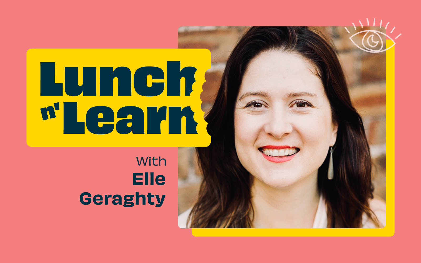
For Elle Geraghty, the answer is a thorough understanding of potential categorisation options that can be matched to your business and user needs.
Elle Geraghty is a consultant content strategist from Sydney, Australia who specialises in large website redesign.
Over the past 15 years, she has worked with Qantas, Atlassian, the Australian Museum, Virgin Mobile Australia and all levels of the Australian government.
Elle also teaches and coaches content strategy and information architecture.... and through all this work she has developed a great IA categorisation system which she will share with you today.
Connect with Elle on:

Pressure on budgets, deadlines, and constantly shifting goalposts can mean that our projects sometimes become familiar, impersonal, and “blah”. How can we evolve from our obsession with status quo content engagement and instead, using our raised awareness, help to usher culture and society’s changing demands into our digital products?
Ebony Kenney, UX Analyst at Ripefruit Creative, Ripefruit Foundation, and a Federal Government Agency, recently spoke at UX New Zealand, the leading UX and IA conference in New Zealand hosted by Optimal Workshop, on how social justice can permeate our work as Usability professionals.
In her talk, Ebony takes us on a journey beyond the status quo to deliver digital products that are equitable and champion social justice.
Ebony L. Kenney is a Graphic Design, Market Research, and Usability veteran, excelling at the art of inquiry. She is said to be a "clear wifi signal” with her finger on the pulse, and insights to elevate any conversation. She draws from a scientific approach which yields itself to facilitating discussions that inspire thought and action. She holds a BA in English and MA in Design. She has most recently served as a User Experience Product Lead for applications, and Data Analyst for workforce morale efforts at a federal agency.
She is also the founder of Ripefruit Foundation, a non-profit effort dedicated to identifying and strengthening peripheral skills as they appear along the spectrum of neurodiversity, and Ripefruit Creative, a design agency dedicated to the realm of education and equity.
Contact Details:
Email address: ekenney11@gmail.com
LinkedIn URL: https://www.linkedin.com/in/ebonylkenney/
Ebony’s talk explores how Usability professionals often focus too much on the details, for example, the elements of a page, or a specific user path. As a result, it’s easy to forget the bigger picture - the potential for the project to make a difference, to be welcoming, and to be an accessible experience for a diverse set of users. Additionally, constraints on timelines, uninformed or unwilling product owners, and the endless loop of shifting requirements distract us from even a hint of a higher purpose. Throughout our projects, things that are important, like designing a nurturing, protective, and supportive environment that encourages engagement start to get deprioritized.
Ebony challenges us to work in ways that ensure we don’t leave behind equity and social justice in our digital products.
Her talk introduces the concept of "third space," which is a hybrid space that combines different realities. Combining the concepts of “safe space” and “third space”, she arrives at the “safe third space”, which has embedded social justice and is the pinnacle of product design.
Ebony asks us to think about social justice as rungs on a ladder, starting with “reality” and finishing on “justice” as we climb the ladder.
When discussing equity, Ebony highlights the difference between need-based and strength-based equity. Need-based equity identifies everyone's needs, while strength-based equity goes further by identifying the different strengths of the people involved.
Essentially, everyone has a unique lens through which they view and experience the world. Teams and organizations should value their employee's unique lenses and should encourage employees to feel comfortable speaking their minds. Additionally, teams and organizations should nurture safe spaces so that these views can be shared and therefore add value to a project or product achieving equity and social justice.
When we think about our users, we should climb the social justice ladder and think about people on the “fringes” of our user base. In other words, don’t just cater to the most valuable user, or the most engaged user, as often happens when we start delivering projects. We should challenge status quo processes and assumptions in an attempt to better reflect society in our digital products.
Bringing social justice into the UX design process can be done by marrying the basic UX design process with the social justice ladder.
Ebony suggests a few ways that UX professionals can adopt social justice practices in our day-to-day work. These practices help to foster diverse thinking within project teams, which in turn helps us to get closer to achieving equity and social justice when designing digital products.
In these ways, organizations and teams can keep social justice front and center when designing a digital product, rather than letting it slip by the wayside. If you can create safe spaces for your team to thrive and share unique points of view (or at least look for them), you are much more likely to design products that nurture engagement, create a welcoming environment, and ultimately meet the needs of diverse user groups.

Working in a multi-disciplined product team can be daunting, but how can those relationships be built, and what does that mean for your team, your stakeholders, and the users of the product?
Kate Keep, Product Owner, and Brad Millen, UX Designer, both work in the Digital team at the Accident Compensation Corporation (ACC). They recently spoke at UX New Zealand, the leading UX and IA conference in New Zealand hosted by Optimal Workshop, about their experience working on a large project within an organization that was new to continuous improvement and digital product delivery.
In their talk, Kate and Brad discuss how they were able to pull a team together around a common vision, and three key principles they found useful along the way.
Kate is a Product Owner working in the Digital team at ACC, and her team currently look after ACC’s Injury Prevention websites. Kate is also a Photographer, which keeps her eye for detail sharp and her passion for excellence alive. She comes from a Contact Centre background which drives her dedication to continuously search for the optimal customer experience. Kate and the team are passionate about accessibility and building websites that are inclusive for all of Aotearoa.
Contact Details:
Email address: kate.keep@acc.co.nz
LinkedIn URL: Not provided
Brad is a Digital UX Designer in Digital team at ACC. Before launching into the world of UX, Brad studied game design which sparked his interest in the way people interact, engage and perceive products. This helped to inform his ethos that you’re always designing with others in mind.
Brad and Kate preface their talk by acknowledging that they were both new to their roles and came from different career backgrounds when this project began, which presented a significant challenge. Kate was a Product Owner with no previous delivery experience, while Brad, was a UX designer. To overcome these challenges, they needed to quickly figure out how to work together effectively.
Their talk focuses on three key principles that they believe are essential when building a digital product in a large, multi-disciplined team.
The first principle emphasizes the importance of building trust-based relationships. They highlight the need to understand each other's perspectives and work together towards a common vision for the customer. This can only be achieved by building a strong sense of trust with everyone on the team. They stress the value of open and honest communication - both within the team and with stakeholders.
Kate, as Product Owner, identified her role as being one of “setting the vision and getting the hell out of the way”. In this way, she avoided putting Brad and his team of designers in a state of paralysis by critiquing decisions all of the time. Additionally, she was clear from the outset with Brad that she needed “ruthless honesty” in order to build a strong relationship.
The second principle revolves around creating an environment of psychological safety. Kate explains that team members should feel comfortable challenging the status quo and working through disagreements without fear of ridicule. This type of safety improves communication and fast-tracks the project by allowing the team to raise issues without feeling they need to hide and wait for something to break.
They also advocate for a flat hierarchy where everyone has an equal say in decision-making. This approach empowers team members and encourages autonomy. It also means that decisions don’t need to wait for meetings, where juniors are scheduled to report issues or progress to seniors. Instead, all team members should feel comfortable walking up to a manager and, having built a relationship with them, flag what’s on their mind without having to wait.
This combination of psychological safety and flat hierarchy, coupled with building trust, means that the team dynamic is efficient and productive.
The third principle centers on keeping the customer's voice at the forefront of the product development process. Brad and Kate recommend regularly surfacing customer feedback and involving the entire team in understanding customer needs and goals. They also highlight the importance of making customer feedback tangible and visible to all team members and stakeholders.
Kate and Brad’s talk sets a firm foundation for building positive and efficient team dynamics. The principles that they discuss champion empowerment and autonomy, which ultimately help multi-disciplined teams to gel when developing digital products. In practice, these principles set the stage for several key advantages.
They stress that building trust is key, not only for the immediate project team but for organizational stakeholders too. It’s just as crucial for the success of the product that all key stakeholders buy into the same way of thinking i.e. trusting the expertise of the product design and development teams. Kate stresses that sometimes Product Owners need to absorb stakeholder pressure and take failures on the chin so that they to let design teams do what they do best.
That being said, Kate also realizes that sometimes difficult decisions need to be made when disagreements arise within the project team. This is when the value of building trust works both ways. In other words, Kate, as Product Owner, needed to make decisions in the best interest of the team to keep the project moving.
Psychological safety, in practice, means leading by example and providing a safe environment for people to be honest and feel comfortable enough to speak up when necessary. This can even mean being honest about what scares you. People tend to value this type of honesty, and it establishes common ground by encouraging team members (and key stakeholders) to be upfront with each other.
Finally, keeping the customer's voice front and center is important, not just as design best practice, but also as a way of keeping the project team grounded. Whenever the project experiences a bump in the road, or a breakdown in team communication, Kate and Brad suggest always coming back to the question, “What’s most important to the customer?”. Allow user feedback to be accessible to everyone in the team. This means that the customer's voice can be present throughout the whole project, and everyone, including key stakeholders, never lose sight of the real-life application of the product. In this way, teams are consistently able to work with facts and insights rather than making assumptions that they think are best for the product.
UX New Zealand is a leading UX and IA conference hosted by Optimal Workshop, that brings together industry professionals for three days of thought leadership, meaningful networking and immersive workshops.
At UX New Zealand 2023, we featured some of the best and brightest in the fields of user experience, research and design. A raft of local and international speakers touched on the most important aspects of UX in today’s climate for service designers, marketers, UX writers and user researchers.
These speakers are some of the pioneers leading the way and pushing the standard for user experience today. Their experience and perspectives are invaluable for those working at the coalface of UX, and together, there’s a tonne of valuable insight on offer.

In 2020, over 64,200,000,000,000 gigabytes of data was produced online. This would take 1.8 billion years to download! With so much data at our fingertips, how can UX Researchers leverage it to better understand their business and user needs? This talk uses real-life examples of how the discipline of data science can (and should!) complement UX research to create better user experiences.
Grishma Jena, Data Scientist with the UX Research Operations team for IBM Software in San Francisco, USA, recently spoke at UXNZ, the leading UX and IA conference in New Zealand hosted by Optimal Workshop, on how Data Scientists can work in synergy with UX researchers.
In her talk, Grishma uncovers the benefits of bridging the gap between quantitative and qualitative perspectives in the pursuit of creating better, more user-centric products.
Grishma is a Data Scientist with the UX Research Operations team for IBM Software. As the only Data Scientist in the organization, she supports 100+ user researchers and designers and uses data to understand user struggles and opportunities to enhance user experiences. She earned her Masters in Computer Science at the University of Pennsylvania. Her research interests are in Machine Learning and Natural Language Processing. She has spoken and facilitated workshops at multiple conferences including PyCon US (the largest Python conference in the world). She has also taught Python at the San Francisco Public Library.
She enjoys introducing new technical concepts to people and helping them use data and code to drive change. In her free time, Grishma enjoys traveling, cooking, writing, and acting.
Contact Details:
Email: grishma.jena@gmail.com
Grishma highlights the beneficial and often necessary synergy between data science and user experience research. She first explains how data science fits into UX, and then briefly provides an overview of the data science process. Through this process, valuable insights can be shared with user research teams who can then interpret and share them with designers, developers, and product managers to create better user experiences.
Data science in user research involves using data-driven techniques to gain insights from user behavior and interactions, ultimately improving the user experience. Examples of data science in user research include:
Data Scientists generally start off with a question and a set of data, followed by a process of ‘data wrangling’, cleaning, exploring/modeling, and evaluating. Data Scientists use various processes, algorithms, and machine learning techniques, for example, to extract patterns and insights.
Generally, the process is as follows:
The goal of the data science pipeline is to transform raw data into actionable insights that drive decision-making and lead to improved user experiences. The process involves iteratively refining the analysis based on feedback from users and other teams, and revisiting earlier stages as needed, to ensure the quality and relevance of the insights generated.
Generally, data scientists are more quantitative, whereas user researchers are more qualitative. But what if we were to combine the two? Grishma goes on to explain real-life examples of how these disciplines can work in harmony to achieve exceptional user experience.
Data scientists delve deep into the numerical aspects of user behavior and product performance, while user researchers typically focus on understanding user preferences, motivations, and behaviors through direct interaction and observation. These two roles approach the same challenge – improving products and user experiences – from different angles, each offering unique insights into user behavior and product performance.
By combining the quantitative rigor of data science with the empathetic understanding of user researchers, a synergy emerges that can unlock a deeper, more holistic understanding of user needs, behaviors, and pain points. This collaboration has the potential to not only reveal blind spots in product development but also drive innovation and enhance the overall user experience.
To illustrate the power of this collaboration, Grishma describes real-life case studies from Airbnb, Google, Spotify, and ABN Amro. Below is a high-level summary of each case study:
In summary, data scientists and user researchers have different perspectives, strengths, and weaknesses. Collaborating allows the two disciplines to:
The synergy between data science and user research ultimately leads to a more comprehensive understanding of user needs, better product design, and improved user experiences. It ensures that both the quantitative and qualitative aspects of user behavior are considered, creating a more empathetic and user-centric approach to product development.

Our exciting new feature, segments, saves time by allowing you to create and save groups of participant responses based on various filters. Think of it as your magic wand to effortlessly organize and scrutinize the wealth of data and insight you collect in your studies. Even more exciting is that the segments are available in all our quantitative study tools, including Optimal Sort, Treejack, Chalkmark, and Questions.
In a nutshell, segments let you effortlessly create and save groups of participants' results based on various filters, saving you and the team time and ensuring you are all on the same page.
A segment represents a demographic within the participants who completed your study. These segments can then be applied to your study results, allowing you to easily view and analyze the results of that specific demographic and spot the hidden trends.
Put simply, you've got a treasure trove of participant data, and you need to be able to slice and dice it in various ways. Segmenting your data will help you dissect and explore your results for deeper and more accurate results.
Question responses: Using a screener survey or pre - or post-study questions with pre-set answers (like multi-choice), you can segment your results based on their responses.
URL tag: If you identify participants using a unique identifier such as a URL tag, you can select these to create segments.
Tree test tasks, card sort categories created, first click test and survey responses: Depending on your study type, you can create a segment to categorize participants based on their response in the study.
Time taken: You can select the time taken filter to view data from those who completed your study in a short space of time. This may highlight some time wasters who speed through and probably haven’t provided you with high-quality responses. On the other hand, it can provide insight into A/B tests for example, it could show you if it’s taking participants of a tree test longer to find a destination in one tree or another.
With this feature, you can save and apply multiple segments to your results, using a combination of AND/OR logic when creating conditions. This means you can get super granular insights from your participants and uncover those gems that might have otherwise remained hidden.
This feature is your go-to when you have results from two or more participant segments. For example, imagine you're running a study involving both teachers and students. You could focus on a segment that gave a specific answer to a particular task, question, or card sort. It allows you to drill down into the nitty-gritty of your data and gain more understanding of your customers.
Let's explore how you can harness the power of segments:
Save time: Create and save segments to ensure everyone on your team is on the same page. With segments, there's no room for costly data interpretation mishaps as everyone is singing from the same hymn book.
Surface hidden trends: Identifying hidden trends or patterns within your study is much easier. With segments, you can zoom in on specific demographics and make insightful, data-driven decisions with confidence.
Organized chaos: No more data overload! With segments, you can organize participant data into meaningful groups, unleashing clarity and efficiency.
Ready to take segments for a spin? To create a new segment or edit an existing one, go to Results > Participants > Segments. Select the ‘Create segment’ button and select the filters you want to use. You can add multiple conditions, and save the segment. To select a segment to apply to your results, click on ‘All included participants’ and select your segment from the drop-down menu. This option will apply to all your results in your study.

We can't wait to see the exciting discoveries you'll make with this powerful tool. Get segmenting, and let us know what you think!
