Subscribe to OW blog for an instantly better inbox
Oops! Something went wrong while submitting the form.

User research is vital to the product development process as it helps product teams understand their users' needs, behaviors, preferences, and pain points. By gathering insights from various research methods, such as user interviews, surveys, usability testing, and analytics data, product teams can make informed decisions based on evidence, rather than assumptions or personal opinions.
A UX research repository is a centralized database that stores all user research conducted by a product team, making it easily accessible and shareable across the entire team. There are many benefits to having a UX research repository, such as saving time and resources, enabling data-driven decision-making, and keeping everyone on the product team informed about user needs and preferences.
Specialized tools, like the Treejack tool, can make UX research easier, quicker, and more collaborative. In this article, we’ll discuss a bunch of tools and how they can (and should!) contribute to a centralized UX research repository.
A centralized UX research repository is a valuable asset for product teams to store and access research data related to user experience. It enables product managers and development teams to better understand their user's behavior, preferences, and expectations, which in turn enables them to make informed design and development decisions.
One of the key benefits of UX research repositories, like the Reframer tool, is that it saves time and resources. By storing user research data in one central location, teams can easily access and reuse existing research data. This saves them from having to conduct the same research repeatedly, which can be a waste of precious time and resources. Additionally, a centralized UX research repository can help teams to identify gaps in their research and prioritize areas for future research.
Another advantage of a UX research repository is that it facilitates collaboration across the entire team. With a central repository, research findings can be shared and discussed, enabling cross-functional collaboration. This promotes transparency and helps to ensure that everyone is working towards the same goals. It also helps to avoid duplication of effort, as team members can easily see what others have done, and what is still required.
Additionally, a UX research repository helps to ensure consistency in research practices. By defining research methodology, protocols, and use of prescribed specialized tools, product teams can collect data systematically and compare findings across different studies. This helps to ensure that the insights gained from user research are reliable and accurate, which in turn can be used to guide design decisions.
A UX research repository helps product managers in several ways, including supporting informed product decisions, enhancing the user experience, and providing stakeholders with evidence-based research.
One of the significant advantages of a UX research repository is that it provides product managers with a wealth of data to make informed product decisions. Through usability testing, user interviews, and first-click testing (check out the Chalkmark tool), product managers can gain insights into how users interact with their products, what they like and dislike, and how they use them. By storing all this data in a central repository, product managers can quickly access all research data, not just their own, to inform their decisions about product development and design.
Another advantage of a UX research repository is that it helps to enhance user experience. Using video clips and other multimedia, product managers can share research findings with their team members and stakeholders, making it easier to understand user needs and preferences. This helps ensure that the product design is aligned with user needs, resulting in a better user experience.
Finally, a UX research repository provides stakeholders with evidence-based research to support product decisions. By presenting research findings to stakeholders, product managers can confidently stand behind future recommendations and iterations. This evidence-based approach helps to demonstrate that decisions are grounded in data and not just intuition or opinion.
Specialized tools are essential for conducting high-quality UX research as they provide User Researchers with powerful data collection, analysis, and visualization features. These tools are particularly useful for conducting usability testing, user interviews, and surveys, as they help researchers to gather reliable and accurate data from users. Integrating these specialized tools into a UX research repository can help product teams to streamline their research process and facilitate collaboration within the team.
One such specialized tool is Treejack, which helps researchers to test the information architecture of a product or website. By using Treejack, researchers can review how users interact with navigation, site structure, and content, to ensure users can quickly and easily find the information they need. The results can then be stored in a UX research repository, allowing the team to access and analyze the data at any time.
Chalkmark is another tool that can enhance the quality of research by providing heatmaps and click-density grids of user interactions. These interactions can be tested on mockups and wireframes. Chalkmark helps researchers to identify where users are clicking and which areas are receiving the most attention, providing valuable insights for product design. By integrating Chalkmark into a UX research repository, product teams can store and access the data, making it easier to share insights and collaborate on product development.
Another useful tool is Reframer, which helps researchers to capture insights from user interviews and user testing sessions. Reframer enables researchers to record and transcribe interviews, tag key insights, and share findings with the team - acting as a functional research repository.
User interviews and usability testing are used in UX research to gather insights into user behavior, needs, and preferences. User interviews involve a one-on-one conversation between a User Researcher and a participant, where the researcher asks open-ended questions to understand the user's perspective. Usability testing, on the other hand, involves observing users as they interact with a product to identify usability issues.
Specialized tools play a crucial role in conducting user interviews and usability testing efficiently and effectively. These tools can help with data collection, organization, and analysis, making the research process more streamlined and insightful.
OptimalSort is a specialized tool that aids in conducting card sorting activities for usability testing. Card sorting involves asking users to organize concepts or items into categories to understand how they think about and categorize information. The OptimalSort tool enables researchers to conduct card sorting activities remotely and collect data on how participants group and label items. The tool also generates data visualizations and reports that can be added to the UX research repository for further analysis.
Optimal Workshop’s Reframer tool, mentioned earlier, has been designed specifically to enable researchers to capture and organize interview data in real-time. Researchers can tag and categorize interview data, making it easier to analyze and identify patterns across participants. It then stores this information in a centralized location for all research insights. Reframer also generates reports and data visualizations, making data efficient to share and analyze across teams.
A UX research repository empowers entire teams to make informed product decisions, enhance user experiences, and provide stakeholders with evidence-based research. They can also support awareness and participation in UX among senior leaders, encouraging further research.
Teams are increasingly using specialized tools like Treejack, Chalkmark, OptimalSort, and Reframer to conduct high-quality UX research as they provide powerful data collection, analysis, and visualization features. By using these tools together, product teams can streamline their research process and facilitate improved collaboration within the team.
Are you interested in the benefits of a UX research repository? Check out how Optimal Workshop’s specialized research tools can add value to not only the quality of your data, but how your team collects, analyzes, and shares the results!

In many ways, Information architecture (IA) is the backbone of a digital product or service. It is a conceptual structure for information, designed in a way that allows users to navigate and interact with it in a meaningful way. This is done by organizing, structuring, and labeling content that is intuitive for users. IA considers user needs and goals, as well as the relationships between different types of content, in order to create a user-centric design.
An effective IA design approach leads to better user experiences as it ensures that information is presented in a logical and intuitive way. Essentially, good IA attempts to reduce the chance of a clunky, frustrating user experience by organizing information in a way that makes sense for the target user.
In this article, we’ll discuss the history of information architecture and how user research impacts its effectiveness. We’ll also discuss the roles of conceptual and structural design in user experience. And along the way, we’ll introduce Optimal Workshop’s IA tools, and how they can help you design exceptional IA.
The world is full of information and humans have always had a knack for structuring and organizing it. Take libraries, for example. In ancient Egypt, workers in the Library of Alexandria created a catalog of 120 scrolls to order and describe the inventory. They needed to - estimates of the number of scrolls the library contained range between 40,000 and 400,000! Fast-forward to 1873, and Melvil Dewey came up with the Dewey Decimal System to further categorize and universalize much larger collections of books. Why come up with these solutions? To efficiently comb through, and navigate, masses of information.
As computer technology started to rise more prominently in the 1950s and 1960s, we started organizing computer programs and system designs in a way that made them easier to navigate too. In fact, IBM first mentioned the term architecture in a computational context in 1959 [ref]. When the wonderful ‘worldwide web’ was born in the 1990s, digital information began to be displayed and interacted with on a much larger scale. And, like our librarians, the world decided that online order was desperately needed. This is where the foundations of information architecture as we know it today really started to take shape.
In 1998, Peter Morville and Louis Rosenfeld wrote the book ‘Information Architecture for the World Wide Web’, which became Amazon’s best internet book that year. The authors integrated the ‘librarian’ approach to IA, where the main goal is to design a system where information is labeled for easy navigation and search. This focus on user-centric, logical design has become the backbone of user experience (UX) design today, and why Optimal Workshop’s Treejack tool, among other, exist for researching and designing great IA.
Information architecture is like the blueprint of your digital product - it’s a conceptual structure of how content is organized and arranged to create seamless interactions. But, no matter how much experience you have, or how much you trust your instincts, you will never truly get inside your end users' minds without performing user research. They will be the ones to tell you what information is relevant to them, how to structure it, and even how to label and categorize it.
There are some best practices for organizing information. Start by ordering your content from most critical to least. Think like a web page. What will immediately engage a user, and what subsequent content will keep them engaged? This exercise helps to prioritize and order content. Next, think about how your information should be grouped or categorized. Content that is grouped intuitively helps users consume and navigate information on your website or digital product. Another useful exercise is to consider how different users might access your content. Mapping user journeys (often with entirely different users in mind), challenges how you design your organizational structures in a way that meets multiple users' needs.
But, while those principles can get you started, user research is where designing modern, user-centric products really begins. In terms of information architecture and organizing content, card sorting is one of the most effective ways of designing conceptual structures. Card sorting, executed by Optimal Workshop’s OptimalSort tool, for example, involves asking people to arrange things like labels, articles, and products in a way that makes sense to them. People are different, and the benefit of this technique is that you can identify how information is most commonly organized. It also highlights potential ambiguity that you may need to address early on in the design of your IA.
The roles of conceptual and structural design in user experience are crucial in the development of effective information architecture and user experience (UX) design. Conceptual design involves the creation of a high-level, abstract representation of the overall structure of the information architecture, which helps designers to understand the content, functionality, and overall user experience. Generally, there are limited or no restrictions as to what shape the design can take. Structural design, on the other hand, involves the development of the actual information architecture, including the organization of content, navigation systems, and interaction design.
Effective conceptual and structural design can significantly improve user experience by creating a clear and consistent design language. This allows your target users to easily understand and navigate through content, leading to better engagement and satisfaction. Essentially, well-structured IA can increase the accessibility of content, making it easier for users to find the information they are looking for, regardless of their level of experience with the website or digital product.
Tools such as Optimal Workshop's Chalkmark tool can help designers to test and validate their conceptual and structural design decisions by enabling them to create and analyze user interactions with information architecture. This helps designers identify areas of the structure that are confusing or difficult to navigate, which can then be streamlined to create a more intuitive user experience.
As we discussed earlier, modern information architecture is no longer limited to physical implementation, like libraries, but instead extends to digital platforms and software applications. With the rise of the internet and mobile devices, IA has become a critical aspect of UX design. The focus has shifted from organizing information in a static, hierarchical manner to creating dynamic and interactive information environments that adapt to the needs of individual users.
One of the key changes in IA has been the shift towards a more user-centered design approach. This involves creating IA that is tailored to the needs and preferences of specific user groups, such as individuals with disabilities or users with different levels of technical expertise. This approach requires a deep understanding of user needs and behaviors, which is achieved through research and user testing. This research is increasingly done remotely and online using a suite of tools, like those provided by Optimal Workshop.
Optimal Workshop's Reframer tool, for example, allows designers to collaborate and capture user insights and translate them into design solutions. This tool helps designers to identify patterns in user behavior and preferences, enabling them to create IA that is intuitive and easy to use.
As technology continues to evolve, IA is likely to become even more integral to UX design. With the emergence of new technologies such as artificial intelligence, virtual and augmented reality, designers will need to create IA that is capable of adapting to these new interfaces and provide solid structures that lead to seamless user experiences.
Information architecture is an essential aspect of user experience design that involves organizing, structuring, and labeling digital content in a way that makes it easy for users to find and understand. Great IA leads to better user experiences by presenting information in intuitive and logical designs. This is why information architecture is crucial for website design.
The history of IA as we know it today dates back to the 1950s and evolved with the rise of the internet. Now, we think of modern IA design as being user-centric, which involves in-depth research to understand users' needs and goals. Optimal Workshop's IA tools, such as Treejack, OptimalSort, and Chalkmark, can help designers create exceptional IA by testing and validating conceptual and structural designs.
Well-structured information architecture can significantly improve the accessibility of content, which leads to better engagement and user satisfaction. This will become increasingly important as users interact with technology through new mediums, like virtual and augmented reality. So, remember to set solid foundations by investing in IA design when you start your next project!
Are your users engaged in your website? The success of your website will largely depend on your answer. After all, engaged users are valuable users; they keep coming back and will recommend your site to colleagues, friends, and family. So, if you’re not sure if your users are engaged or not, consider looking into your user engagement metrics.
User engagement can be measured using a number of key metrics provided by website analytics platforms. Metrics such as bounce rate, time on page, and click-through rate all provide clues to user engagement and therefore overall website user experience.
This article will help you understand user engagement and why it’s important to measure. We’ll also discuss how to apply user engagement insights to improve website success. Combining a little bit of data with some user research is a powerful thing, so let’s get into it.
User engagement metrics provide valuable insight for both new and existing websites. They should be checked regularly as a sort of ‘pulse check’ for website user experience and performance. So, what metrics should you be looking at? Website metrics can be overwhelming; there are hundreds if not thousands to analyze, so let’s focus on three:
Measures the percentage of users that visit just one page on your site before leaving. If your bounce rate is high it suggests that users aren’t finding the content relevant, engaging, or useful. It points to a poor initial reaction to your site and means that users are arriving, making a judgment about your design or content, and then leaving.
Calculated by the time difference between the point when a person lands on the page and when they move on to the next one. It indicates how engaging or relevant individual pages on your website are. Low time on page figures suggest that users aren’t getting what they need from a certain page, either in terms of the content, the aesthetics, or both.
Click-through rate compares the number of times someone clicks on your content, to the number of impressions you get (how many times an internal link or ad was viewed). The higher the rate, the better the engagement and performance of that element. User experience design can influence click-through rates through copywriting, button contrasts, heading structure, navigation, etc.
Conversion rates are perhaps the pinnacle of user engagement metrics. Conversion rate is the percentage of users that perform specific tasks you define. They are therefore dictated by your goals, which could include form submissions, transactions, etc. If your website has high conversion rates, you can be fairly confident that your website is matching your users’ needs, requirements, and expectations.
But how do these metrics help? Well, they don’t give you an answer directly. The metrics point to potential issues with website user experience. They guide further research and subsequent updates that lead to website improvement. In the next section, we’ll discuss how these and others can support better website user experiences.
So, you’ve looked at your website’s user engagement metrics and discovered some good, and some bad. The good news is, there’s value in discovering both! The catch? You just need to find it. Remember, the metrics on their own don’t give you answers; they provide you direction.
The ‘clues’ that user engagement metrics provide are the starting point for further research. Remember, we want to make data-driven decisions. We want to avoid making assumptions and jumping to conclusions about why our website is reporting certain metrics. Fortunately, there are a bunch of different ways to do this.
User research data can be gathered by using both qualitative and quantitative research techniques. Insights into user behavior and needs can reveal why your website might be performing in certain ways. Research can include both qualitative and quantitative techniques.
The type of research depends on what question you want to answer. Being specific about your question will help you identify what research technique(s) to deploy and ultimately the quality of your answer. If you’re serious about website improvement; identify problem areas with user engagement metrics, and investigate how to fix them with user research.
If you have conducted user research and found weak areas on your website, there are many things to consider. Three good places to start are navigation, content, and website layout. Combined, these have a huge impact on user experience and can be leveraged to address disappointing engagement metrics.
Navigation is a crucial aspect of creating a good user experience since it fundamentally connects pages and content which allows users to find what they need. Navigation should be simple and easy to follow, with important information/actions at the top of menus. Observing the results of card sorting, tree testing, and user testing can be particularly useful in website optimization efforts. You may find that search bars, breadcrumb trails, and internal links can also help overcome navigation issues.
Are users seeing compelling or relevant content when they arrive on your site? Is your content organized in a way that encourages further exploration? Card sorting and content audits are useful in answering these questions and can help provide you with the insights required to optimize your content. You should identify what content might be redundant, out of date, or repetitive, as well as any gaps that may need filling.
A well-designed layout can improve the overall usability of a website, making it easier for users to find what they're looking for, understand the content, and engage with it. Consider how consistent your heading structures are and be sure to use consistent styling throughout the site, such as similar font sizes and colors. Don’t be afraid to use white space; it’s great at breaking up sections and making content more readable.
An additional factor related to layout is mobile optimization. Mobile-first design is necessary for apps, but it should also factor into your website design. How responsive is your website? How easy is it to navigate on mobile? Is your font size appropriate? You might find that poor mobile experience is negatively impacting user engagement metrics.
User experience design is an iterative, ongoing process, so it’s important to keep a record of your website’s user experience metrics at various points of development. Fortunately, website analytics platforms will provide you with historic user data and key metrics; but be sure to keep a separate record of what improvements you make along the way. This will help you pinpoint what changes impacted different metrics.
Define your goals and create a website optimization checklist that monitors key metrics on your site. For example, whenever you make an update, ensure bounce rates don’t exceed a certain number during the days following; check that your conversion rates are performing as they should be; check your time on sites hasn’t dropped. Be sure to compare metrics between desktop and mobile too.
User’s needs and expectations change over time, so keep an eye on how new content is performing. For example, which new blog posts have attracted the most attention? What pages or topics have had the most page views compared to the previous period? Tracking such changes can help to inform what your users are currently engaged in, and will help guide your user experience improvements.
User engagement metrics allow you to put clear parameters around user experience. They allow you to measure where your website is performing well, and where your website might need improving. Their main strength is in how accessible they are; you can access key metrics on website analytics platforms in moments. However, user engagement metrics on their own may not reveal how and why certain website improvements should be made. In order to understand what’s going on, you often need to dig a little deeper.
Time on page, bounce rate, click-through rate, and conversion rates are all great starting points to understand your next steps toward website improvement. Use them to define where further research may be needed. Not sure why your average pages per session is two? Try conducting first-click testing; where are they heading that seems to be a dead end? Is your bounce rate too high? Conduct a content audit to find out if your information is still relevant, or look into navigation roadblocks. Whatever the question; keep searching for the answer.
User engagement metrics will keep you on your toes, but that’s a good thing. They empower you to make ongoing website improvements and ensure that users are at the heart of your website design.

User experience (UX) is the pointy end of website design. Great UX validates a lot of hard work behind the scenes, but poor UX will quickly render it useless. Why? Users are becoming more and more impatient. If they can’t find what they’re looking for, or interactions aren’t intuitive, they’ll simply leave as quickly as they arrive. What’s worse? They probably won’t come back! Thankfully, many businesses are recognizing the importance of great user experience and its influence on website performance.
In this article, we’ll cover 4 key UX metrics to measure the success of your website performance: bounce rate, time on site, pages per session, and conversion rate. Captured by website analytics platforms, these metrics provide you with a high-level understanding of how well users are engaging with your website, and where you might be able to improve user experience. We’ll also look at the roles of navigation, content, and the customer journey, and how they impact overall website performance.
If a user bounces on a trampoline, they’re probably having fun. If they’re bouncing on your website, they’re probably having the opposite of fun. Let’s discuss bounce rate, and why it’s such a good indicator of why your users aren’t having much fun.
Bounce rate is a UX metric that measures the percentage of users that visit just one page on your site before leaving. Essentially they arrive and they might scroll, but they don’t click anywhere; they simply leave. A high bounce rate means that a lot of people are doing this. Why is this (usually) a bad thing? Generally speaking, you want users to be so engaged in the page they landed on that they stay and have a look around. You want them to explore your other content, maybe fill in a form, watch a video, etc.
There are a bunch of ways to improve your bounce rate, but there are two key things you should consider if you’re experiencing a high bounce rate:
Bounce rates give you a strong indication of what your users' first impressions are of your website. You’ll need to dig deeper to find out the cause of high bounce rates, but it’s certainly worthwhile. Use the 3 elements mentioned above as your starting point.
As a final note on bounce rates, we want to point out that there are exceptions where high bounce rates might not directly relate to poor user engagement. For example, users may arrive at a blog post that contains everything they wanted to know. This usually happens if you're generating traffic to a specific page from social media or search engines. However, if your home page has a high bounce rate, for example, you’ll want to investigate. So, be sure to keep bounce rate metrics in context.
In addition to bounce rate, you should find out how long users are sticking around in general. Time on site is the next logical UX metric to analyze. The longer users spend on your site, the more confident you can be that you’re providing exceptional user engagement and experience.
Keep an eye on the following metrics to gauge time on site and website performance:
So, armed with these metrics, what should we look for to improve website performance? Well, firstly you should look for some benchmarks. How are you performing compared to other sites in your industry? How do time on page figures compare with each other? For example, if some of your pages are getting over 5 minutes of time-on-page and others are getting 20 seconds, there’s a disparity between how useful, engaging, or relevant the content is.
Even if your website is performing well, we recommend analyzing your time on site metrics to understand where improvements could be made. A great place to start is a content audit. This pulls together data from all of your content into one place where you can analyze what is redundant, obsolete, and trivial (ROT analysis). What’s driving engagement? What information isn’t adding value? Overlapping this audit with time on page figures can reveal extremely useful insights into how you can improve user experience by providing the most useful content.
You should also shine a light on your navigation. If users can’t find their way through your content, they’re not going to stick around. Can you streamline your navigation? Can you order your content from most to least relevant to better meet user needs? Are some menus confusingly labeled? Improve your website performance by taking a critical look at the factors that influence time on page.
Pages per session calculate the average number of pages on your website that users access per session. It is calculated by taking the total page views and dividing it by the total number of sessions that have taken place across the same period.
Pages per session is an important UX metric to track because it reveals how relevant and ‘explorable’ your website is. The higher the figure, the more pages your users are visiting during their stay, and the more engaged they’re likely to be. As we highlighted earlier with bounce rate, users will quickly leave if they’re not finding what they want. Therefore, in general, if users are sticking around, it’s a good indication you’re providing a good user experience.
How can you increase pages per session? Firstly, provide useful, relevant content at every turn. No matter where your users may land on your website, they should be satisfied and gratified. All going well, this initial content will leave them thirsty for more. This is another great reason to perform regular content audits - to critically analyze the type of content that makes up your site.
But great content doesn’t automatically mean great user experiences. User engagement might be high, but how are they getting between pages? How easily are they getting from one part of your site to the next? This is where navigation comes to the fore. And whilst menus and sub-menus are obviously important, we want to highlight call-to-actions and internal links.
Cleverly placed call-to-actions and internal links pull users along. They sit there within the content (or below the content) urging them to learn more and search more. A good example of this is ‘related articles’ at the end of a blog. Of course, the key is that they should be relevant. Disrupting the user’s journey with something unrelated could put them off, rather than retain them. This is particularly true for call-to-action buttons - they should be visible and attractive, but not so much as to obstruct the user.
It’s important to remember the goal of your website. Good UX is great, but there’s no point aiming for the highest page per session figures unless you’re getting conversions. Which, incidentally, is our next subject.
Tracking conversion rate is the ultimate test of user experience design. Of course, there are a lot of factors involved in conversion rate, so we’ll focus on which elements of UX design can have the most impact.
Conversion rate is the percentage of users that perform specific tasks you define. Conversion rates are therefore dictated by your goals, and in most cases, will include things like transactions, newsletter sign-ups, phone calls, completing contact forms, or downloading a white paper. Why are conversion rates important to track? Well, your website is a machine for [insert your purpose here]! In many cases, we simply want to increase sales or leads.
There are a few ways to increase conversion rates. Firstly, if you haven’t already, review or build your customer journey map. Customer journey mapping is a technique used to help you visualize your customer’s key touchpoints, sentiments, pain points, and actions. It helps you understand how your user gets from awareness of your product/brand/website, right through to conversion. Every customer journey is slightly different, which is why it’s so important to understand. Fail to understand your customer and it will be glaringly obvious in your user experience design.
Customer journey mapping leads nicely to your value proposition. Do you have it clearly defined? What is your point of difference? How is it being communicated? Whilst encouraging a user to explore and engage in your website is great, some users may be time-poor. Could you speed up the consumption of your information? Trial a short video on your home page or landing page, for example. You may find that it increases engagement and conversion rates.
Increasing conversion rates can also be achieved by reducing navigation friction. Make call-to-action buttons obvious and easy to find. Ensure the readability of buttons and text. Perhaps your forms could be optimized, for example, you may want to reduce the number of fields required, or you could embed forms at the bottom of key pages, reducing the chance of clicking away. Form optimization can be a simple yet effective way of improving conversion rates.
Tracking UX metrics is an ongoing task that ensures you’re meeting the needs of your users. As your users’ needs, demands, and expectations change, so should your website design. One of the easiest ways to do this is to keep track of your UX metrics for website performance.
Bounce rate, time on site, pages per session, and conversion rates are some of the most revealing metrics. Collectively, they highlight user engagement levels on your website and give strong indications of where your UX design is meeting expectations, or where it’s falling short.
The key strength of these metrics depends on how you interpret them. You may need to dig deeper into why certain aspects of your site aren’t performing well. Implement some of the research techniques mentioned in this article, like content audits or customer journey mapping, to find clues to the answer. The answers could very well lead to a significant boost in website performance!
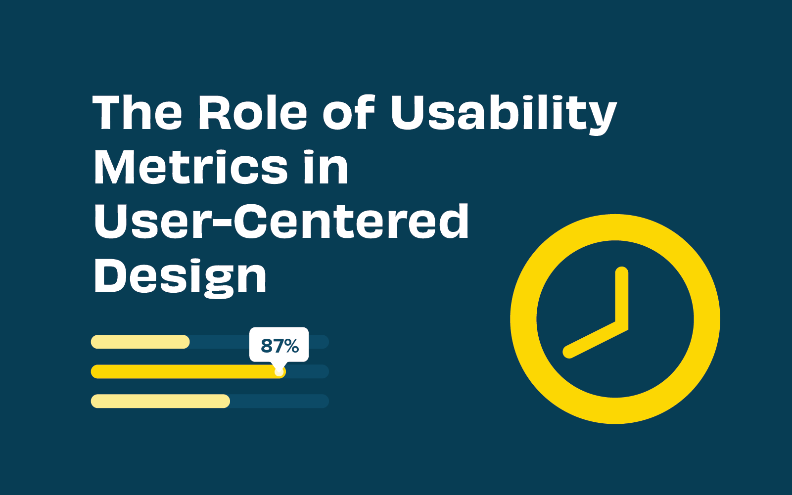
The term ‘usability’ captures sentiments of how usable, useful, enjoyable, and intuitive a website or app is perceived by users. By its very nature, usability is somewhat subjective. But what we’re really looking for when we talk about usability is how well a website can be used to achieve a specific task or goal. Using this definition we can analyze usability metrics (standard units of measurement) to understand how well user experience design is performing.
Usability metrics provide helpful insights before and after any digital product is launched. They help us form a deeper understanding of how we can design with the user front of mind. This user-centered design approach is considered the best-practice in building effective information architecture and user experiences that help websites, apps, and software meet and exceed users' needs.
In this article, we’ll highlight key usability metrics, how to measure and understand them, and how you can apply them to improve user experience.
Usability metrics aim to understand three core elements of usability, namely: effectiveness, efficiency, and satisfaction. A variety of research techniques offer designers an avenue for quantifying usability. Quantifying usability is key because we want to measure and understand it objectively, rather than making assumptions.
There are a few key metrics that we can measure directly if we’re looking to quantify effectiveness, efficiency, and satisfaction. Here are four common examples:
Usability metrics are outputs from research techniques deployed when conducting usability testing. Usability testing in web design, for example, involves assessing how a user interacts with the website by observing (and listening to) users completing defined tasks, such as purchasing a product or signing up for newsletters.
Conducting usability testing and collecting usability metrics usually involves:
Tools such Reframer are helpful in conducting usability tests remotely, and they enable live collaboration of multiple team members. It is extremely handy when trying to record and organize those insightful observations! Using paper prototypes is an inexpensive way to test usability early in the design process.
User-centered design challenges designers to put user needs first. This means in order to deploy user-centered design, you need to understand your user. This is where usability testing and metrics add value to website and app performance; they provide direct, objective insight into user behavior, needs, and frustrations. If your user isn’t getting what they want or expect, they’ll simply leave and look elsewhere.
Usability metrics identify which parts of your design aren’t hitting the mark. Recognizing where users might be having trouble completing certain actions, or where users are regularly making errors, are vital insights when implementing user-centered design. In short, user-centered design relies on data-driven user insight.
But why hark on about usability metrics and user-centered design? Because at the heart of most successful businesses is a well-solved user problem. Take Spotify, for example, which solved the problem of dodgy, pirated digital files being so unreliable. People liked access to free digital music, but they had to battle viruses and fake files to get it. With Spotify, for a small monthly fee, or the cost of listening to a few ads, users have the best of both worlds. The same principle applies to user experience - identify recurring problems, then solve them.
Usability metrics should be analyzed by design teams of every size. However, there are some things to bear in mind when using usability metrics to inform design decisions:
Remember, data analysis is only as good as the data itself. Give yourself the best chance of designing exceptional user experiences by collecting, researching, and analyzing meaningful and accurate usability metrics.
Usability metrics are a guiding light when it comes to user experience. As the old saying goes, “you can’t manage what you can’t measure”. By including usability metrics in your design process, you invite direct user feedback into your product. This is ideal because we want to leave any assumptions or guesswork about user experience at the door.
User-centered design inherently relies on constant user research. Usability metrics such as success rate, time-based efficiency, number of errors, and post-task satisfaction will highlight potential shortcomings in your design. Subsequently, they identify where improvements can be made, AND they lay down a benchmark to check whether any resulting updates addressed the issues.
Ready to start collecting and analyzing usability metrics? Check out our guide to planning and running effective usability tests to get a head start!

Understanding your customers is central to any organization which wants to deliver an outstanding experience. But how do you understand your customers better? Tailoring their experience with your products and your organization to suit them should include a customer journey map.
It doesn’t mean your organization needs a brightly colored, fully designed infographic that outlines each and every action your user takes within your product. It does mean an effective customer journey map that promotes empathy and provides a clear vision for improving customer interactions. There are no rules around what that visualization looks like and it is up to your team to create one that makes the most of your customer’s journey.
Customer journey mapping (sometimes referred to as a user experience map) is a technique that allows you to visualize your customer’s key touchpoints, sentiments, pain points, and actions. Plotted in sequential order. It’s a map of a customer’s experience with your brand or product, from awareness to purchase and beyond.
Customer journey mapping helps you look beyond key touchpoints and encourages empathy with your customers. To understand who they are, even a persona to give them a life and demographic. Helping designers and key stakeholders understand where they are coming from. And where you can address their needs, avoid their pain points and encourage them to engage with your product. And even identify opportunities for innovation and improvement across the board.
What’s better than a customer that feels seen and understood once? A customer that feels the organization or product really understands their needs (and responds to their frustrations). Like all successful, long-term relationships, keeping customers returning is built on empathy and a solid grasp of their needs and frustrations.
When you want to get to know your customer, like really get to know them, it’s essential to map their customer journey. Creating a shared understanding of what your customers think, feel, and struggle with as they interact with your organization. Spending the time to establish a customer journey map can help align around identifying known problems, identifying new user pain points, and removing roadblocks for your customers, ensuring their success.
Spending the time to get inside the mind and journeys of your customers through mapping helps your team to:
Here are 8 key steps to get the most out of your customer journey map process:
Each and every customer’s journey is different. This, of course, means that there is no single best customer journey map example or template. Instead, the best customer journey map for any given situation will depend not only on your customers but also on your product, your team, and the goals you’re hoping to achieve by creating the map in the first place.
We’ve found a few examples of customer journey maps to help inspire your thinking:
Current state customer journey maps help you to visualize a user’s experience as it is right now. These are fact-based journey maps - to create an accurate, current state journey map. A good dose of user research data around your actual customers and interactions will help shape this.

Future state customer journey maps focus on what the customer journey can and should look like in the future. Although UX data is certainly an important aspect of understanding customers, future state journey maps involve a fair amount of creative speculation and interpretation. These customer journey maps focus on customer hopes and wants (future feelings), in addition to experiences and reactions. They can be a little objective and should be developed in balance with both positive and negative interactions.
Day in the life customer journey maps help you visualize your customer’s entire daily routine. Interactions with family, their commute, work meetings, afternoon coffee, etc. Regardless of whether or not the activities are related to your company. This type of journey map should be organized chronologically to give key insights into how and where customers are. What are the distractions, and where could they interact with your brand or product? How can key pain points be eased?
Service blueprints are a useful counterpart to a classic customer journey map. Whereas a customer journey map focuses on the thoughts, needs, and actions of the customer, a service blueprint reflects the perspective of the organization and its employees. What needs to happen behind the scenes to ensure the customer’s experience is the very best it can be.
Circular customer journey maps may be useful to visualize the customer journey as a circle or loop. Recognizing that some customers are recurring and non-transactional. Particularly through subscription-based relationships.
An empathy map is used to create a shared understanding of customers around their wants, needs, thoughts, and actions. This can be a great starting point to getting under your customer’s skin.

There is no one size fits all customer journey map. Each customer is unique, each organization is different. Through creating customer journeys, personas and visualizing their key touchpoints, pain points, and understanding who they are, empathy throughout the organization can be generated. With this as a tool to bring key stakeholders on board and to pinpoint where products (and services) can be improved to keep customers or even bring new ones on board, the user experience can be better and more effective.
