Understanding your customers is central to any organization which wants to deliver an outstanding experience. But how do you understand your customers better? Tailoring their experience with your products and your organization to suit them should include a customer journey map.
It doesn’t mean your organization needs a brightly colored, fully designed infographic that outlines each and every action your user takes within your product. It does mean an effective customer journey map that promotes empathy and provides a clear vision for improving customer interactions. There are no rules around what that visualization looks like and it is up to your team to create one that makes the most of your customer’s journey.
What is customer journey mapping? 🤔
Customer journey mapping (sometimes referred to as a user experience map) is a technique that allows you to visualize your customer’s key touchpoints, sentiments, pain points, and actions. Plotted in sequential order. It’s a map of a customer’s experience with your brand or product, from awareness to purchase and beyond.
Customer journey mapping helps you look beyond key touchpoints and encourages empathy with your customers. To understand who they are, even a persona to give them a life and demographic. Helping designers and key stakeholders understand where they are coming from. And where you can address their needs, avoid their pain points and encourage them to engage with your product. And even identify opportunities for innovation and improvement across the board.
Why you need a customer journey map 💥
What’s better than a customer that feels seen and understood once? A customer that feels the organization or product really understands their needs (and responds to their frustrations). Like all successful, long-term relationships, keeping customers returning is built on empathy and a solid grasp of their needs and frustrations.
When you want to get to know your customer, like really get to know them, it’s essential to map their customer journey. Creating a shared understanding of what your customers think, feel, and struggle with as they interact with your organization. Spending the time to establish a customer journey map can help align around identifying known problems, identifying new user pain points, and removing roadblocks for your customers, ensuring their success.
Spending the time to get inside the mind and journeys of your customers through mapping helps your team to:
Get an understanding of multiple customer pathways and unravel complex user experiences
Create target personas and allow insights to solve problems more effectively
Increase your organization’s empathy for your current and future customers
Identify potential pain points and roadblocks for your customers
Breakdown silos within your organization and improve alignment across teams
With a clearer understanding of your customers, better insights to achieve stakeholder buy-in
How to create a customer journey map 🛤️
Here are 8 key steps to get the most out of your customer journey map process:
Bring key stakeholders together for an initial brainstorming session
Identify potential user personas - demographics, pain points, interests, etc
Create an empathy map - get a real feel for your customer, who they are, and what they want
Flesh out your ideas with user research. Get under your user persona skin with focus groups, interviews, and surveys
Identify possible customer touchpoints
Choose the information you want to highlight - not everything will be relevant
Decide on the best customer journey map tool to answer your questions
Start building your map
Customer journey mapping examples 🗺️
Each and every customer’s journey is different. This, of course, means that there is no single best customer journey map example or template. Instead, the best customer journey map for any given situation will depend not only on your customers but also on your product, your team, and the goals you’re hoping to achieve by creating the map in the first place.
We’ve found a few examples of customer journey maps to help inspire your thinking:
Current state customer journey maps help you to visualize a user’s experience as it is right now. These are fact-based journey maps - to create an accurate, current state journey map. A good dose of user research data around your actual customers and interactions will help shape this.
An example of a customer journey map
Future state customer journey maps focus on what the customer journey can and should look like in the future. Although UX data is certainly an important aspect of understanding customers, future state journey maps involve a fair amount of creative speculation and interpretation. These customer journey maps focus on customer hopes and wants (future feelings), in addition to experiences and reactions. They can be a little objective and should be developed in balance with both positive and negative interactions.
Day in the life customer journey maps help you visualize your customer’s entire daily routine. Interactions with family, their commute, work meetings, afternoon coffee, etc. Regardless of whether or not the activities are related to your company. This type of journey map should be organized chronologically to give key insights into how and where customers are. What are the distractions, and where could they interact with your brand or product? How can key pain points be eased?
Service blueprints are a useful counterpart to a classic customer journey map. Whereas a customer journey map focuses on the thoughts, needs, and actions of the customer, a service blueprint reflects the perspective of the organization and its employees. What needs to happen behind the scenes to ensure the customer’s experience is the very best it can be.
Circular customer journey maps may be useful to visualize the customer journey as a circle or loop. Recognizing that some customers are recurring and non-transactional. Particularly through subscription-based relationships.
An empathy map is used to create a shared understanding of customers around their wants, needs, thoughts, and actions. This can be a great starting point to getting under your customer’s skin.
An example of an empathy map
Wrap Up 🌯
There is no one size fits all customer journey map. Each customer is unique, each organization is different. Through creating customer journeys, personas and visualizing their key touchpoints, pain points, and understanding who they are, empathy throughout the organization can be generated. With this as a tool to bring key stakeholders on board and to pinpoint where products (and services) can be improved to keep customers or even bring new ones on board, the user experience can be better and more effective.
If you missed our recent live training on Prototype Testing, don’t worry—we’ve got everything you need right here! You can catch up at your convenience, so grab a cup of tea, put your feet up, and enjoy the show.
In the session, we explored the powerful new features of our Prototype Testing tool, offering a step-by-step guide to setting up, running, and analyzing your tests like a seasoned pro. This tool is a game-changer for your design workflow, helping you identify usability issues and gather real user feedback before committing significant resources to development.
Here’s a quick recap of the highlights:
1. Creating a prototype test from scratch using images
We walked through how to create a prototype test from scratch using static images. This method is perfect for early-stage design concepts, where you want to quickly test user flows without a fully interactive prototype.
2. Preparing your Figma prototype for testing
Figma users, we’ve got you covered! We discussed how to prepare your Figma prototype for the smoothest possible testing experience. From setting up interactions to ensuring proper navigation, these tips ensure participants have an intuitive experience during the test. For more detailed instructions, check out our help article
3. Seamless Figma prototype imports
One of the standout features of the tool is its seamless integration with Figma. We showed how easy it is to import your designs directly from Figma into Optimal, streamlining the setup process. You can bring your working files straight in, and resync when you need to with one click of a button.
4. Understanding usability metrics and analyzing results
We explored how to analyze the usability metrics, and walked through what the results can indicate on click maps and paths. These visual tools allow you to see exactly how participants navigate your design, making it easier to spot pain points, dead ends, or areas of friction. By understanding user behavior, you can rapidly iterate and refine your prototypes for optimal user experience.
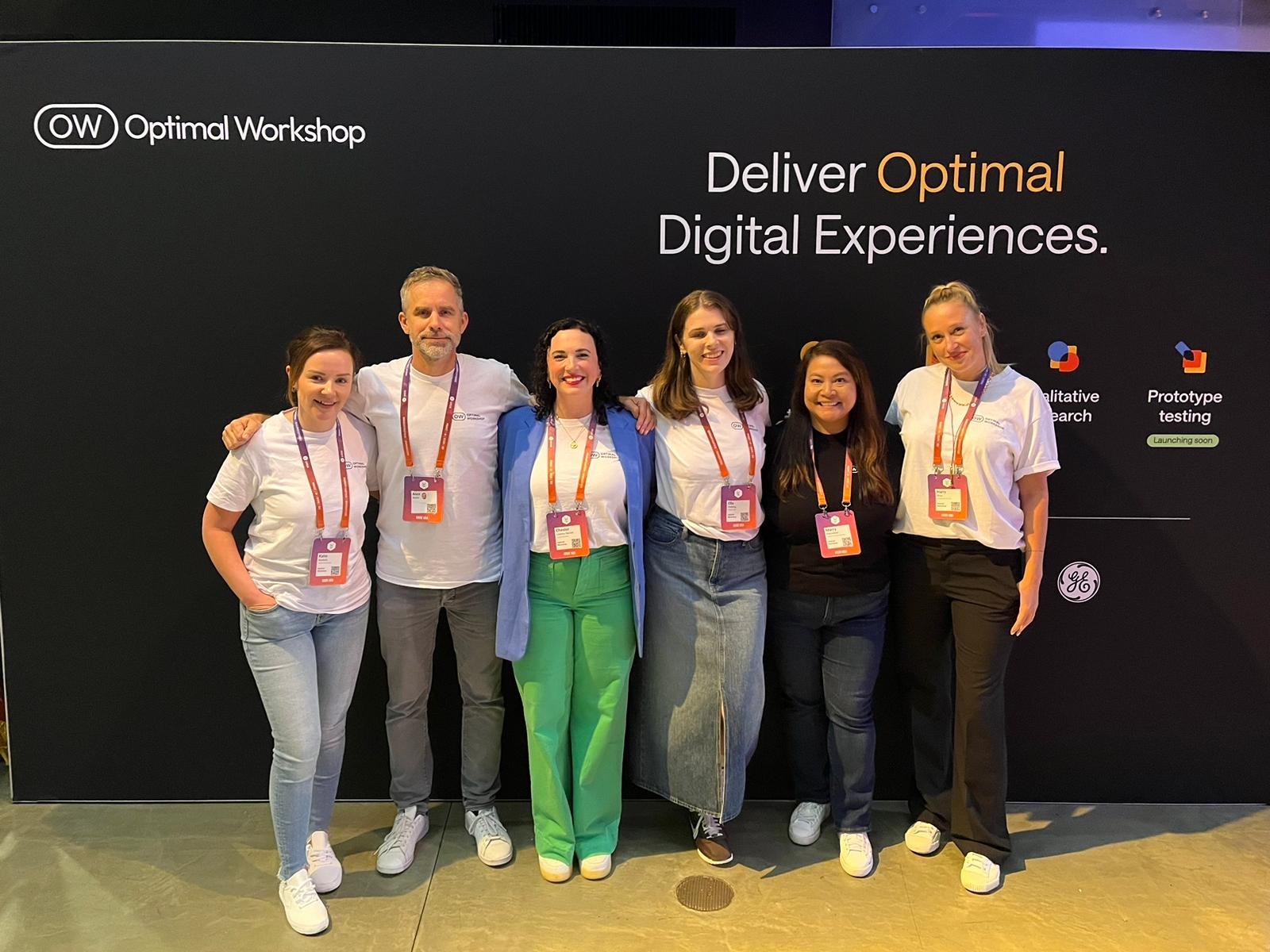
Last week Optimal Workshop was delighted to sponsor UXDX USA 2024 in New York. The User Experience event brings together Product, Design, UX, CX, and Engineering professionals and our team had an amazing time meeting with customers, industry experts, and colleagues throughout the conference. This year, we also had the privilege of sharing some of our industry expertise by running an interactive forum on “Measuring the Value of UX Research” - a topic very close to our hearts.
Our forum, hosted by Optimal Workshop CEO Alex Burke and Product Lead Ella Fielding, was focused on exploring the value of User Experience Research (UXR) from both an industry-wide perspective and within the diverse ecosystem of individual companies and teams conducting this type of research today.
The session brought together a global mix of UX professionals for a rich discussion on measuring and demonstrating the effectiveness of and the challenges facing organizations who are trying to tie UXR to tangible business value today.
The main topics for the discuss were:
Metrics that Matter: How do you measure UXR's impact on sales, customer satisfaction, and design influence?
Challenges & Strategies: What are the roadblocks to measuring UXR impact, and how can we overcome them?
Beyond ROI: UXR's value beyond just financial metrics
Some of the key takeaways from our discussions during the session were:
The current state of UX maturity and value
Many UX teams don’t measure the impact of UXR on core business metrics and there were more attendees who are not measuring the impact of their work than those that are measuring it.
Alex & Ella discussed with the attendees the current state of UX research maturity and the ability to prove value across different organizations represented in the room. Most organizations were still early in their UX research maturity with only 5% considering themselves advanced in having research culturally embedded.
Defining and proving the value of UX research
The industry doesn’t have clear alignment or understanding of what good measurement looks like. Many teams don’t know how to accurately measure UXR impact or don’t have the tools or platforms to measure it, which serve as core roadblocks for measuring UXRs’ impact.
Alex and Ella discussed challenges in defining and proving the value of UX research, with common values being getting closer to customers, innovating faster, de-risking product decisions, and saving time and money. However, the value of research is hard to quantify compared to other product metrics like lines of code or features shipped.
Measuring and advocating for UX research
When teams are measuring UXR today there is a strong bias for customer feedback, but little ability or understanding about how to measure impact on business metrics like revenue.
The most commonly used metrics for measuring UXR are quantitative and qualitative feedback from customers as opposed to internal metrics like stakeholder involvement or tieing UXR to business performance metrics (including financial performance).
Attendees felt that in organizations where research is more embedded, researchers spend significant time advocating for research and proving its value to stakeholders rather than just conducting studies. This included tactics like research repositories and pointing to past study impacts as well as ongoing battles to shape decision making processes.
One of our attendees highlighted that engaging stakeholders in the process of defining key research metrics prior to running research was a key for them in proving value internally.
Relating user research to financial impact
Alex and Ella asked the audience if anyone had examples of demonstrating financial impact of research to justify investment in the team and we got some excellent examples from the audience proving that there are tangible ways to tie research outcomes to core business metrics including:
Calculating time savings for employees from internal tools as a financial impact metric.
Measuring a reduction in calls to service desks as a way to quantify financial savings from research.
Most attendees recognise the value in embedding UXR more deeply in all levels of their organization - but feel like they’re not succeeding at this today.
Most attendees feel that UXR is not fully embedded in their orgnaization or culture, but that if it was - they would be more successful in proving its overall value.
Stakeholder buy-in and engagement with UXR, particularly from senior leadership varied enormously across organizations, and wasn’t regularly measured as an indicator of UXR value
In organizations where research was more successfully embedded, researchers had to spend significant time and effort building relationships with internal stakeholders before and after running studies. This took time and effort away from actual research, but ended up making the research more valuable to the business in the long run.
With the large range of UX maturity and the democratization of research across teams, we know there’s a lot of opportunity for our customers to improve their ability to tie their user research to tangible business outcomes and embed UX more deeply in all levels of their organizations. To help fill this gap, Optimal Workshop is currently running a large research project on Measuring the Value of UX which will be released in a few weeks.
Understanding your customers is central to any organization which wants to deliver an outstanding experience. But how do you understand your customers better? Tailoring their experience with your products and your organization to suit them should include a customer journey map.
It doesn’t mean your organization needs a brightly colored, fully designed infographic that outlines each and every action your user takes within your product. It does mean an effective customer journey map that promotes empathy and provides a clear vision for improving customer interactions. There are no rules around what that visualization looks like and it is up to your team to create one that makes the most of your customer’s journey.
What is customer journey mapping? 🤔
Customer journey mapping (sometimes referred to as a user experience map) is a technique that allows you to visualize your customer’s key touchpoints, sentiments, pain points, and actions. Plotted in sequential order. It’s a map of a customer’s experience with your brand or product, from awareness to purchase and beyond.
Customer journey mapping helps you look beyond key touchpoints and encourages empathy with your customers. To understand who they are, even a persona to give them a life and demographic. Helping designers and key stakeholders understand where they are coming from. And where you can address their needs, avoid their pain points and encourage them to engage with your product. And even identify opportunities for innovation and improvement across the board.
Why you need a customer journey map 💥
What’s better than a customer that feels seen and understood once? A customer that feels the organization or product really understands their needs (and responds to their frustrations). Like all successful, long-term relationships, keeping customers returning is built on empathy and a solid grasp of their needs and frustrations.
When you want to get to know your customer, like really get to know them, it’s essential to map their customer journey. Creating a shared understanding of what your customers think, feel, and struggle with as they interact with your organization. Spending the time to establish a customer journey map can help align around identifying known problems, identifying new user pain points, and removing roadblocks for your customers, ensuring their success.
Spending the time to get inside the mind and journeys of your customers through mapping helps your team to:
Get an understanding of multiple customer pathways and unravel complex user experiences
Create target personas and allow insights to solve problems more effectively
Increase your organization’s empathy for your current and future customers
Identify potential pain points and roadblocks for your customers
Breakdown silos within your organization and improve alignment across teams
With a clearer understanding of your customers, better insights to achieve stakeholder buy-in
How to create a customer journey map 🛤️
Here are 8 key steps to get the most out of your customer journey map process:
Bring key stakeholders together for an initial brainstorming session
Identify potential user personas - demographics, pain points, interests, etc
Create an empathy map - get a real feel for your customer, who they are, and what they want
Flesh out your ideas with user research. Get under your user persona skin with focus groups, interviews, and surveys
Identify possible customer touchpoints
Choose the information you want to highlight - not everything will be relevant
Decide on the best customer journey map tool to answer your questions
Start building your map
Customer journey mapping examples 🗺️
Each and every customer’s journey is different. This, of course, means that there is no single best customer journey map example or template. Instead, the best customer journey map for any given situation will depend not only on your customers but also on your product, your team, and the goals you’re hoping to achieve by creating the map in the first place.
We’ve found a few examples of customer journey maps to help inspire your thinking:
Current state customer journey maps help you to visualize a user’s experience as it is right now. These are fact-based journey maps - to create an accurate, current state journey map. A good dose of user research data around your actual customers and interactions will help shape this.
An example of a customer journey map
Future state customer journey maps focus on what the customer journey can and should look like in the future. Although UX data is certainly an important aspect of understanding customers, future state journey maps involve a fair amount of creative speculation and interpretation. These customer journey maps focus on customer hopes and wants (future feelings), in addition to experiences and reactions. They can be a little objective and should be developed in balance with both positive and negative interactions.
Day in the life customer journey maps help you visualize your customer’s entire daily routine. Interactions with family, their commute, work meetings, afternoon coffee, etc. Regardless of whether or not the activities are related to your company. This type of journey map should be organized chronologically to give key insights into how and where customers are. What are the distractions, and where could they interact with your brand or product? How can key pain points be eased?
Service blueprints are a useful counterpart to a classic customer journey map. Whereas a customer journey map focuses on the thoughts, needs, and actions of the customer, a service blueprint reflects the perspective of the organization and its employees. What needs to happen behind the scenes to ensure the customer’s experience is the very best it can be.
Circular customer journey maps may be useful to visualize the customer journey as a circle or loop. Recognizing that some customers are recurring and non-transactional. Particularly through subscription-based relationships.
An empathy map is used to create a shared understanding of customers around their wants, needs, thoughts, and actions. This can be a great starting point to getting under your customer’s skin.
An example of an empathy map
Wrap Up 🌯
There is no one size fits all customer journey map. Each customer is unique, each organization is different. Through creating customer journeys, personas and visualizing their key touchpoints, pain points, and understanding who they are, empathy throughout the organization can be generated. With this as a tool to bring key stakeholders on board and to pinpoint where products (and services) can be improved to keep customers or even bring new ones on board, the user experience can be better and more effective.


.png)