Subscribe to OW blog for an instantly better inbox
Oops! Something went wrong while submitting the form.
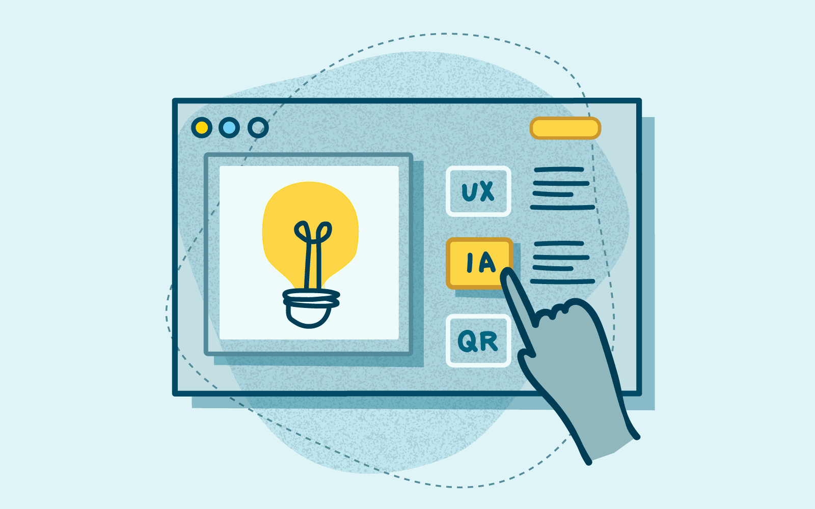
As an information architect, I’ve worked on loads of website redesigns. Interestingly, every single one of these projects has come about because the website has had navigation problems. But before you go ahead and change up your information architecture (IA), how do you figure out whether the new navigation is any better than the existing one? How do you know if it’s worth the hours of design to implement it?
In this article, I’ll walk you through how to benchmark a site navigation using tree testing.
When you start any project, you need to identify success metrics. How would the project sponsor (or your client if you’re in an agency) consider the project to be a success? What KPIs determine how the project is doing?
Put your stake in the ground, draw a line in the sand — or whatever metaphor you wish to use. This is how you objectively determine how far you’ve gone from where you started. At the same time, benchmarking is the perfect exercise to figure out the areas that need improvement. To do this, you’ll need to lay down the groundwork.
If you’re benchmarking your IA as part of a web redesign project, great! Hopefully, that means you’ve already gone through the exercise of determining who your users are and what it is that your users would be doing on the site. If not, it’s time to find out. User research is a crucial part of benchmarking. If you don’t know who your users are and why they’re on your site, how can you improve it?
Of course, everyone has a different approach to benchmarking information architecture. Different navigation problems merit different solutions. This is one that I’ve talked myself into for a global navigation project and it’s worked out for me. If you have a different approach, please share! I’m always open to new processes.
Without further preamble, here’s the quick rundown of my approach to assessing and benchmarking a site navigation:
If it’s a new project, who is your target audience? Set up some kind of intercept or survey to find out who your users are. Find out what kind of people are coming to your site. Are they shopping for new cars or used cars? Are they patients or healthcare providers? If patients, then what kind of patients? Chronic care, acute care? If the project timeline doesn’t allow for this, discuss this with your project stakeholders. Ideally, they should have some idea of who their target audience is and you should at least be able to create proto user segments to direct your discovery.
If you have more than one user group, it’s best to identify the primary user group to focus efforts. If you have to design for everyone, you end up getting nowhere, satisfying no one. And guess what? This is not a novel idea.
“When you design for everyone, you design for no one.” — @aarron http://t.co/JIJ2c82d Ethan Marcotte (@beep) May 24, 2012
Your project stakeholder won’t like to hear this, but I would start with one user group and then iterate with additional user groups. Focus your efforts with one user group and do a good job. Then rinse and repeat with the remaining user groups. Your job is not done.
Interview or survey a couple of people who use your website and find out what they are doing on your site. What are they trying to do? Are they trying to find out information about services you provide? Are they trying to purchase things from your online store? How did they get there? Why did they choose your site over another website?
From your user interviews, could you identify 8-10 priority user tasks that you could use? For this, we’re trying to figure out what tasks to use in a navigation test. What are the main reasons why users would be on your site? How would the navigation best serve them? If your navigation says nothing about your users’ tasks, then you have your work cut out for you.
How would you benchmark without some metrics? There are a couple kinds of metrics that we could collect: quantitative and qualitative. For quantitative, I’m assuming that you have some kind of analytics running on your site as well as event tracking. Track which navigation links are getting the most interaction. Be sure to use event tracking on both primary, utility, and footer links. Name them accordingly. Try and determine which links get the most interaction, on which pages, and follow where the users tend to end up.
Of course, with quantitative data, you don’t have a really good understanding of the reasons behind user behavior. You can make assumptions, but those won’t get you very far. To get this kind of knowledge, you’ll need some qualitative data in the form of tree testing, also known as navigation testing.
I’ve only used Optimal Workshop’s First-click testing tool for tree testing, so I can’t speak to the process with other services (I imagine that it would be similar). Here are the general steps below — you can find a more detailed process in this Tree Testing 101 guide.
For my recent project, I focused benchmarking on the primary navigation. Don’t combine different types of navigation testing in one — you can do that in a usability test. Here, we’ll just be testing the primary navigation. Search and utility links are secondary, so save those for another time.
Take the user tasks you’ve identified earlier and enter them into a tree test. From this point on, go with best practices when setting up your tree test.
For more tips on setting up your tree test, check out this Knowledge Base article.
Once you’ve finished testing, it’s time to look for patterns. Set up the baseline metrics using success rate, time spent, patterns in the pietrees — this is the fun stuff!
Focus on the tasks that did not fare as well, particularly the ones that had an overall score of 7 or below. This is an easy indicator that you should pay more attention to the labeling or even the choice you indicated as the correct answer.
From here, you can set up the same tree test using a competitor’s site tree and the same user tasks. This is helpful to test whether a competitor’s navigation structure is an improvement over your existing one. It also helps with discussions where a stakeholder is particularly married to a certain navigation scheme and you’re asked to answer: which one is better? Having the results from this test helps you answer the question objectively.
When you have a proposed sitemap, test it again with the same tasks and you can use these to figure out whether the changes you made changed anything. You can also conduct this test over time.
You could daisy-chain one tree test after another to test an existing nav and a competitor’s. Just keep in mind that you may need to limit the number of user tasks per tree test so that you don’t overwhelm the participant.

There are many ways that your website can work wonderfully and of course, the converse is very true. There are lots of (simple) ways a website isn’t working as well or as hard as it can. Your website navigation is crucial to creating a brilliant user experience (UX). As well as being visible to search engine crawls, completing the circle by making your website more visible to potential visitors.
You’ve got a strong homepage, it’s modern, clean, bright and tells your story just right. But your conversions just don’t seem to be happening? Have you considered your navigation? No, not only the menu at the top of your website, but your Information Architecture (IA) sitting in behind. And not just this, but how it is used, interacted with and navigated by your users?
Even if you haven’t already identified an issue with your website it can be super valuable to test your usability regularly. Moments like; building a new website, adding, removing or structuring content can be times when navigation changes can impact how your website performs. And also can be a great instigator for testing and improving. There are some very effective tools to help with finding navigational issues, and with great data and insights shining the way to better sorting and ordering.
Simply put, website navigation is the links within your website that connect the pages. The purpose is for your website visitors to find what they need on your site. And importantly it is also used by search engines to discover and index the content housed on your website.
Search engines use links between pages to understand context and relationships between pages. Ultimately building a picture of what your website is about and who would want to see it, and why.
Whilst strong SEO is vital to finding users, it is always best to make sure your users come first. If your website only talks to search engines it is unlikely to really speak ‘human’ and do what it is intended, make conversions. Users first, search engines after.
Let’s explore some common navigational issues and how great UX research can solve them.
Your website Information Architecture (IA) is always important to consider. How content is stored, ordered and found will impact the UX and the performance of your website SEO. Using a card sorting tool to research how users expect information and content to be sorted, stored and found can be vitally important to how effective your website is. Optimalsort is a quick and effective tool to establish where and how users expect information to be sorted.
Building intuitive IA and making sure navigation, and menus are simple to follow will ensure your users are confident and comfortable making their way through your website. Understanding where they can find the information they need and progressing to the next step.
As well as understanding the order of content with card sorting, combined with our tree-testing tool, Treejack, it can be incredibly useful to understand where users expect information to be found. Looking at how users interact with your website, where they look for information and where they get lost is all great stuff!
Using these insights will keep them on your website longer, more likely to see the task through. And let’s not forget that search engines love it when your website is performing, keeping users longer with strong content that is seen as relevant.
The order of your content is important. This can be how content is stored and the order of your navigation and creating intuitive IA. But can also be as simple as where navigational sign posts are.
It seems obvious, but there is a case for keeping the most important information at the top of drop down menus, and where you want users to take action, usually on your most important pages. Studies show that attention and retention are highest for things that appear at the beginning and at the end of lists.
This is why ‘Contact’ should always be found at the top right corner, the last on the list and in a standard, expected location. Keeping this in mind when creating the order of your pages and what you want your users to interact with will inform your structure.
Understanding exactly how your website is used currently and identifying areas that need to be improved will lead to much stronger user experience (UX). Usability testing should be an essential part of ongoing research for your website success.
One of the biggest issues with website usability is building intuitive navigation. If your users can’t find their way through your website to complete a task, they’re not going to try too hard. They’re far more likely to abandon and find another website (organisation) that makes it easy. Great navigation should act as a simple to follow map from landing page through to task completion.
Using a research tool like Reframer can allow you to test how users complete tasks across your website. Following their journey from their first interaction through to task completion. The data will provide insights into how users engage, navigate and complete their tasks (or don’t). Where do they get stuck, lost or confused? How do they feel (even down to their body language)? How quickly can they find what they are looking for? And the next step?
All great stuff to inform the design team to build an engaging, usable website.
Your users already have set expectations when they arrive on your website. They anticipate your website to look and behave in a regular way that makes navigation, and their decisions, easy. Simple design features, such as your navigation menu across the top of the page, with clear options. It is vital to make life simple and easy when it comes to navigating your website.
Creating an interface that looks clear, is easy and quick to follow will build trust and engagement quickly (remember the 2 second rule). Simple to follow navigation, including descriptive labels, can make completing tasks much simpler and quicker for your users. Guiding them smoothly through your website and ultimately to conversion.
Your homepage is the hardest working page on your website. It’s the first place (most) users will interact with you and it is make or break.
Did you know? You have less than 2 seconds to grab users with a well designed, organised and simple homepage. If they don’t immediately know what to do, trust what they see and get started they will move on (to someone else).
Increased bounce rate does the converse for your SEO. With a homepage that users bounce away from you are likely to see a drop in SEO rankings, meaning ultimately you will see less users!
Did you know that 87% of people that find themselves on the right path after the first click will complete their task? Ensuring that when users land on your homepage they can clearly find the road signs, but not everything that your website contains. Your homepage should simply guide your user to navigate your site, know what to do and how to do it.
A cluttered, busy homepage with too many links will distract your users’ attention, confuse them and maybe even lose them forever! First-click testing will take an informative look at how your homepage interface is performing. Mapping where your user is clicking once they arrive on your homepage and conversely, where they are not engaging.
This can all be highly informative in designing, re-designing or even removing clicks from the users journey through your homepage, and beyond. Using Chalkmark to test your users first clicks is a great way to get started now.
With a website that is intuitive to navigate and content that is relevant you will find users that are engaged and SEO that ranks!
Get started quickly and simply with our range of tools to sort out your navigation.
If you need some more inspiration to help improve your website navigation, grab yourself a copy of our Actionable IA guide that explores actionable ways to fix, refine and build better IAs.
You can also explore Content Design Hub for resources and events for content designers.
Information architecture (IA) is a term used to describe how content or information is organised and arranged. This can relate to a website, a retail store or an app. And you could even consider the way a library is sorted to be IA.
For the purposes of this we will be focussed on websites. IA is fundamentally important to the success of your website. It determines how your users will access the information and the success of their user experience (UX) whilst on your website. And ultimately if you can keep users on your website long enough to complete their task.
IA can be broken down into 3 main areas to consider when building great user experience:
When put like this it does seem pretty straightforward. Maybe even simple? But these tasks need to be straightforward for your users. Putting thought, time and research in at the front of your design and build can mean an intuitive website is built. But at any point in your websites life cycle it can be of value to test and review. IA is the structure that sits in behind and allows the design to tell the story and the content to be found in an easy way.
If you’ve ever tried to use something and thought, “where am I supposed to go next?” or “this doesn’t make any sense,” you are encountering an issue with an information architecture.
The Information Architecture Institute
The way in which your users will use your website depends largely on how the information is presented and organised. By following through the tasks that you expect your users to undertake you can better understand the user experience. If the user can easily flow from point to point, finding what they need in a quick and efficient (and ideally intuitive manner) they are far more likely to stick around. And return when they need to.
The opposite is definitely true also. If users find your website difficult to follow, hard to navigate and get lost or confused. They will not stick around to find out more. They will move on, and swiftly, to your competition. Frustrated, and disengaged. You will find it difficult to win them back.
By providing a simple, clear and straightforward path users can stay focussed on their task, removing overwhelm and confusion. How often do you disappear ‘down a rabbit hole’ when on the internet? Confusing paths or overwhelming options may mean users move off on tangents, and become less likely to complete their initial task. Ultimately the best user experience is one that delivers the right information at the right time. Not too slow and not too complicated.
Always keep in mind that a great IA is:
With all of these lined up in behind great web design, which is clear, bright and attractive. Along with language which appeals to your user. You are providing a UX that will entice, engage and ultimately keep them on your website and converting.
Great IA goes beyond simply being about your user experience. Your organization can benefit hugely with testing, research and insights put into your website IA.
With an IA that creates an easy navigable and engaging website your users are less likely to move off to your competitors. You’ve worked hard to get them to your website, through marketing and SEO. Delivering what your user expects and making it easy to find, means they will complete their task, and are far more likely to return.
By finding what they need quickly, and intuitively, users are more likely to be converted and generate leads or sales. Delivering and answering questions can also reduce the need for support. If you can, your organization's website should answer your users questions, before they complete. This means they are less likely to need to email and /or call for support, reducing overheads and time lag before conversion.
Your organization's reputation is so important, your website may be your only interaction with users. If they have an easy user experience, their questions answered, and are able to complete what they need simply they leave with a great impression of your organization. They are more likely to return and their overall takeaway is that your organization is trustworthy, organised and easy to deal with. The opposite is quite possible with poor IA and design. You get but one chance to grab their attention and keep them. Do it badly and you may never get them back.
Of course the best website IA is based on your users experience. And there is no better way to get a full understanding of your users than by conducting research. At any point in your website's life cycle it can be beneficial to undertake research such as card sorting. At the beginning stages of your website build is best, but your website should be evolving as your organization does, therefore any time there are shifts in what you do or offer is a great time to revisit your UX and how best to deliver this. OptimalSort tests users on how they intuitively would like to see information sorted on your website. Building IA based on data, rather than assumptions, will mean that content and information can be sorted in a way that truly delivers a simple and intuitive experience.
With a great IA, based on card sorting user research, your website content needs to be maintained. Tree testing allows you to see where your users are getting lost in your website navigation. And also how they expect to look for key information. The Treejack tool provides real user insights on how your website navigation is working, how it can work better, and ultimately how to fix paths that don’t work. Providing hard data to inform an intuitive IA.
So, information architecture is fundamental to your website and how it operates. Want to learn more about information architecture? Take a look at our article, or download 'The Actionable IA Guide'.
Supporting your website with user research can mean you build and design a intuitive website that simply rocks!
Learn more about card sorting with our 101 guide. And more on tree testing.

Are your visitors really getting the most out of your website? Tree testing (or sometimes referred to as reverse card sorting) takes away the guesswork by telling you how easily, or not, people can find information on your website. Discover why Treejack is the tool of choice for website architects.
Whether you’re building a website from scratch or improving an existing website, tree testing helps you design your website architecture with confidence. How? Tools like Treejack use analysis to help assess how findable your content is for people visiting your website.
It helps answer burning questions like:
Treejack provides invaluable intel for any Information Architect. Why? Knowing where and why people get lost trying to find your content, gives you a much better chance of fixing the actual problem. And the more easily people can find what they’re looking for, the better their experience which is ultimately better for everyone.
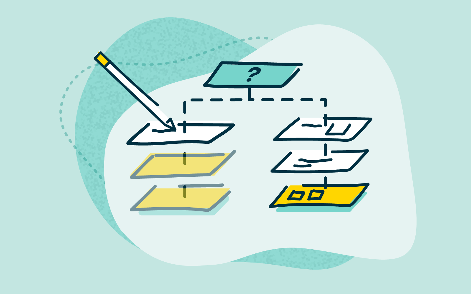
Tree testing can be broken down into two main parts:
Whether you’re new to tree testing or already a convert, effective tree testing using Treejack has some key steps.
Ask yourself what part of your information architecture needs improvement – is it your whole website or just parts of it? Also think about your audience, they’re the ones you’re trying to improve the website for so the more you know about their needs the better.
Tip: Make the most of what tree testing offers to improve your website by building it into your overall design project plan
You can build your tree using two main approaches:
Tip: Your category labels are known as ‘parent nodes’. Your information labels are known as ‘child nodes’.
The quality of your tasks will be reflected in the usefulness of your data so it’s worth making sure you create tasks that really test what you want to improve.
Tip: Use plain language that feels natural and try to write your tasks in a way that reflects the way people who visit your website might actually think when they are trying to find information on your site.
The quality of your data will largely depend on the quality of your participants. You want people who are as close to your target audience as possible and with the right attitude - willing and committed to being involved.
Tip: Consider offering some kind of incentive to participants – it shows you value their involvement.
Now for the fun part – making sense of the results. Treejack presents the data from your tree testing as a series of tables and visualizations. You can download them in a spreadsheet in their raw format or customized to your needs.
Tip: Use the results to gain quick, practical insights you can act on right away or as a starter to dive deeper into the data.
Tree testing is useful whenever you want to find out if your website content is labelled and organised in a way that’s easy to understand. What’s more it can be applied for any website, big (10+ levels with 10000s of labels) or small (3 levels and 22 labels) and any size in between. Our advice for using Treejack is simply this: test big, test small, test often.

Information architecture (IA) is the backbone of the web – and essentially every other digital experience. It’s the system that’s used to organize and label content on websites in apps, and it ultimately determines the paths that people take to find what they’re looking for.
IA also underpins the design. Functioning as a kind-of skeleton beneath the polished veneer of what people see, it’s the foundation. Get it wrong, and the house falls down. A poorly thought-out IA and UX may not always cause your target audience to leave a website and look elsewhere, but the odds are certainly higher.
A good IA can make all the difference. After all, would you rather stumble through a website, dropping in and out of pages trying to find what you’re looking for, or use a website with a structure that’s intuitive and reflects the people using it?
We’re always focused on the importance of good information architecture here at Optimal Workshop – after all, we’ve developed a platform of tools to help people do just that – so we thought it was a good idea to compile some more useful IA resources.
The Optimal Workshop blog is a goldmine for resources on information architecture. For 10 years, we’ve been busy writing our own helpful guides and resources – and sourcing information from some of the brightest minds in the industry, covering everything from site maps to visual hierarchy.
Read about how a small retailer with an online store used Optimal Workshop to improve its website just in time for the busy Christmas shopping season.
Alan & Co is a retailer with several stores and a popular online storefront. Though it still services a lot of customers through its physical stores, the online arm of Alan & Co is growing rapidly. People from all over the world purchase goods through Alan & Co’s online store.
But, despite sales going up and up, staff at Alan & Co have been hearing from customers that the online store can be difficult to use. Finding certain items is confusing and time-consuming, and many are starting to get frustrated and look elsewhere instead.
Seeing an advertisement for Optimal Workshop, the head of online sales at Alan & Co decides to give them a go and see if she can get to the bottom of the problem.

All the way back in 2014, the web passed a pretty significant milestone: 1 billion websites. Of course, fewer than 200 million of these are actually active as of 2019, but there’s an important underlying point. People love to create. If the current digital age that we live in has taught us anything, it’s that it’s never been as easy to get information and ideas out into the world.
Understandably, this ability has been used – and often misused. Overloaded, convoluted websites are par for the course, with a common tactic for website renewal being to simply update them with a new coat of paint while ignoring the swirling pile of outdated and poorly organized content below.
So what are you supposed to do when trying to address this problem on your own website or digital project? Well, there’s a fairly robust technique called top tasks management. Here, we’ll go over exactly what it is and how you can use it.
Ideally, all websites would be given regular, comprehensive reviews. Old content could be revisited and analyzed to see whether it’s still actually serving a purpose. If not, it could be reworked or just removed entirely. Based on research, content creators could add new content to address user needs. Of course, this is just the ideal. The reality is that there’s never really enough time or resource to manage the growing mass of digital content in this way. The solution is to hone in on what your users actually use your website for and tailor the experience accordingly by looking at top tasks.
What are top tasks? They're basically a small set of tasks (typically around 5, but up to 10 is OK too) that are most important to your users. The thinking goes that if you get these core tasks right, your website will be serving the majority of your users and you’ll be more likely to retain them. Ignore top tasks (and any sort of task analysis), and you’ll likely find users leaving your website to find something else that better fits their needs.
The counter to top tasks is tiny tasks. These are everything on a website that’s not all that important for the people actually using it. Commonly, tiny tasks are driven more by the organization’s needs than those of the users. Typically, the more important a task is to a user, the less information there is to support it. On the other hand, the less important a task is to a user, the more information there is. Tiny tasks stem very much from ‘organization first’ thinking, wherein user needs are placed lower on the list of considerations.
According to Jerry McGovern (who penned an excellent write-up of top tasks on A List Apart), the top tasks model says “Focus on what really matters (the top tasks) and defocus on what matters less (the tiny tasks).”
Figuring out your top tasks is an important step in clearing away the fog and identifying what actually matters to your users. We’ll call this stage of the process task discovery, and these are the steps:
We’ll go into detail on the above steps, explaining the best way of handling each one. Keep in mind that this process isn’t something you’ll be able to complete in a week – it’s more likely a 6 to 8-week project, depending on the size of your website, how large your user base is and the receptiveness of your organization to help out.
The first part of the task process is to get out into the wider organization and discover what your users are actually trying to accomplish on your website or by using your products. It’s all about getting into the minds of your users – trying to see the world through their eyes, effectively.
If you’re struggling to think of places where you might find customer tasks, here are some of the best sources:
It’s important to note that you need to cast a wide net when gathering task data. You can’t just rely on analytics data. Why? Well, downloads and page visits only reflect what you have, but not what your users might actually be searching for.
As for search, Jerry McGovern explains why it doesn’t actually tell the entire story: “When we worked on the BBC intranet, we found they had a feature called “Top Searches” on their homepage. The problem was that once they published the top searches list, these terms no longer needed to be searched for, so in time a new list of top searches emerged! Similarly, top tasks tend to get bookmarked, so they don’t show up as much in search. And the better the navigation, the more likely the site search is to reflect tiny tasks.”
At the end of the initial task-gathering stage you should be left with around 300 to 500 tasks. Of course, this can scale up or down depending on the size of the website or product.
Now that you’ve got your long list of tasks, it’s time to trim them back until you’ve got a shortlist of 100 or less. Keep in mind that working through your long list of tasks is going to take some time, so plan for this process to take at least 4 weeks (but likely more).
It’s important to involve stakeholders from across the organization during the shortlist process. Bring in people from support, sales, product, marketing and leadership areas of the organization. In addition to helping you to create a more concise and usable list, the shortlist process helps your stakeholders to think about areas of overlap and where they may need to work together.
When working your list down to something more usable, try and consolidate and simplify. Stay away from product names as well as internal organization and industry jargon. With your tasks, you essentially want to focus on the underlying thing that a user is trying to do. If you were focusing on tasks for a bank, opt for “Transactions” instead of “Digital mobile payments”. Similarly, bring together tasks where possible. “Customer support”, “Help and support” and “Support center” can all be merged.
At a very technical level, it also helps to avoid lengthy tasks. Stick to around 7 to 8 words and try and avoid verbs, using them only when there’s really no other option. You’ll find that your task list becomes quick to navigate when tasks begin with “look”, “find” and “get”. Finally, stay away from specific audiences and demographics. You want to keep your tasks universal.
With your shortlist created, it’s time to take it to your users. Using a survey tool like Optimal's Surveys, add in each one of your shortlisted tasks and have users rank 5 tasks on a scale from 1 to 5, with 5 being the most important and 1 being the least important.
If you’re thinking that your users will never take the time to work through such a long list, consider that the very length of the list means they’ll seek out the tasks that matter to them and ignore the ones that don’t.

Now for the task analysis side of the project. What you want at the end of the user survey end of the project is a league table of entire shortlist of tasks. We’re going to use the example from Cisco’s top tasks project, which has been documented over at A List Apart by Gerry McGovern (who actually ran the project). The entire article is worth a read as it covers the process of running a top task project for a large organization.
Here’s what a league table of the top 20 tasks looks like from Cisco:

Here’s the breakdown of the vote for Cisco’s tasks:
While the pattern may seem surprising, it’s actually not unusual. As Jerry explains: “We have done this process over 400 times and the same patterns emerge every single time.”
Focusing on top tasks management is really a practice that needs to be conducted on a semi-regular basis. The approach benefits organizations in a multitude of ways, bringing different teams and people together to figure out how to best address why your users are coming to your website and what they actually need from you.
As we explained at the beginning of this article, top tasks is really about clearing away the fog and understanding on what really matters. Instead of spreading yourself thin and focusing on a host of tiny tasks, hone in on those top tasks that actually matter to your users.
The top tasks approach is an effective way of giving you a clear idea of what you should be focusing on when designing or redesigning your website, but this should really just be one aspect of the work you do.
Utilizing a host of other UX research methods can give you a much more comprehensive idea of what’s working and what’s not. With card sorting, for example, you can learn how your users think the content on your website should be arranged. Then, with this data in hand, you can use tree testing to assemble draft structures of your website and test how people navigate their way through it. You can keep iterating on these structures to ensure you’ve created the most user-friendly navigation.
Take a look at our 101 guides to learn more about card sorting and tree testing, as well as the other user research methods you can use to make solid improvements to your website. If you’d rather just start putting methods into practice using user research tools, take our UX platform for a spin for free here.
