Subscribe to OW blog for an instantly better inbox
Oops! Something went wrong while submitting the form.
Articles and Podcasts on Customer Service, AI and Automation, Product, and more
A year ago, we looked at the user research market and made a decision.
We saw product teams shipping faster than ever while research tools stayed stuck in time. We saw researchers drowning in manual work, waiting on vendor emails, stitching together fragmented tools. We heard "should we test this?" followed by "never mind, we already shipped."
The dominant platforms got comfortable. We didn't.
Today, we're excited to announce Optimal 3.0, the result of refusing to accept the status quo and building the fresh alternative teams have been asking for.
The gap between product velocity and research velocity has never been wider. The situation isn't sustainable. And it's not the researcher's fault. The tools are the problem. They’re:
These platforms haven't changed because they don't have to, so we set out to challenge them.
Optimal 3.0 isn't an incremental update to the old way of doing things. It's a fundamental rethinking of what a research platform should be.
Research For All, Not Just Researchers.
For 18 years, we've believed research should be accessible to everyone, not just specialists. Optimal 3.0 takes that principle further.
Unlimited seats. Zero gatekeeping.
Designers can validate concepts without waiting for research bandwidth. PMs can test assumptions without learning specialist tools. Marketers can gather feedback without procurement nightmares. Research shouldn't be rationed by licenses or complexity. It should be a shared capability across your entire team.
A Complete Ecosystem in One Place.
Stop stitching together point solutions.Optimal 3.0 gives you everything you need in one platform:
Recruitment Built In Access millions of verified participants worldwide without the vendor tag. Target by demographics, behaviors, and custom screeners. Launch studies in minutes, not days. No endless email chains. No procurement delays.
Testing That Adapts to You
Learn more about Live Site Testing
AI-Powered Analysis (With Control) Interview analysis used to take weeks. We've reduced it to minutes.
Our AI automatically identifies themes, surfaces key quotes, and generates summaries, while you maintain full control over the analysis.
As one researcher told us: "What took me 4 weeks to manually analyze now took me 5 minutes."
This isn't about replacing researcher judgment. It's about amplifying it. The AI handles the busywork, tagging, organizing, timestamping. You handle the strategic thinking and judgment calls. That's where your value actually lives.
Learn more about Optimal Interviews
Chat Across All Your Data Your research data is now conversational.
Ask questions and get answers instantly, backed by actual video evidence from your studies. Query across multiple Interview studies at once. Share findings with stakeholders complete with supporting clips.
Every insight comes with the receipts. Because stakeholders don't just need insights, they need proof.
A Dashboard Built for Velocity See all your studies, all your data, in one place. Track progress across your entire team. Jump from question to insight in seconds. Research velocity starts with knowing what you have.
Integration Layer
Optimal 3.0 fits your workflow. It doesn't dominate it. We integrate with the tools you already use, Figma, Slack, your existing tech stack, because research shouldn't force you to abandon how you work.
What Didn't Change: Methodological Rigor
Here's what we didn't do: abandon the foundations that made teams trust us.
Card sorting, tree testing, first-click tests, surveys, the methodologically sound tools that Amazon, Google, Netflix, and HSBC have relied on for years are all still here. Better than ever.
We didn't replace our roots. We built on them.
18 years of research methodology, amplified by modern AI and unified in a complete ecosystem.
Product development isn't slowing down. AI is accelerating everything. Competitors are moving faster. Customer expectations are higher than ever.
Research can either be a bottleneck or an accelerator.
The difference is having a platform that:
Optimal 3.0 is built for research that arrives before the decision is made. Research that shapes products, not just documents them. Research that helps teams ship confidently because they asked users first.
A Fresh Alternative
We're not trying to be the biggest platform in the market.
We're trying to be the best alternative to the clunky tools that have dominated for years.
Amazon, Google, Netflix, Uber, Apple, Workday, they didn't choose us because we're the incumbent. They chose us because we make research accessible, fast, and actionable.
"Overall, each release feels like the platform is getting better." — Lead Product Designer at Flo
"The one research platform I keep coming back to." — G2 Review
This launch represents our biggest transformation, but it's not the end. It's a new beginning.
We're continuing to invest in:
Our goal is simple: make user research so fast and accessible that it becomes impossible not to include users in every decision.
See What We've Built
If you're evaluating research platforms and tired of the same old clunky tools, we'd love to show you the alternative.
Book a demo or start a free trial
The platform that turns "should we?" into "we did."
Welcome to Optimal 3.0.

Picture this scenario: You're in your local coffee shop and hear a new song. You want to listen to it when you get back to the office. How do you obtain it? If you’re one of the 232 million Spotify users, you’ll simply open the app, search for the song and add it to your playlist. Within seconds, you’ll have the song ready to play whenever and wherever you want.
This new norm of music streaming wasn’t always the status quo. In the early days of the internet, the process of finding music was easy but nowhere nearly as easy as it is now. You’d often still be able to find any song you wanted, but you would need to purchase it individually or as part of an album, download it to your computer and then sync it across to a portable music player like the iPod.
Spotify is a prime example of successful human-centered design. The music service directly addresses the primary pain points with accessing music and building music collections by allowing users to pay a monthly fee and immediately gain access to a significant catalog of the world’s music.
It’s also far from the only example. Take HelloFresh, for example. Founded by Dominik Richter, Thomas Griesel and Jessica Nilsson in 2011, this company delivers a box of ingredients and recipes to your door each week, meaning there’s no need for grocery shopping or thinking about what to cook. It’s a service that addresses a fairly common problem: People struggle to find the time to go out and buy groceries and also create tasty, healthy meals, so the founders addressed both issues.
Both HelloFresh and Spotify are solutions to real user problems. They weren’t born as a result of people sitting in a black box and trying to come up with new products or services. This is the core of human-centered design – identifying something that people have trouble with and then building an appropriate answer.
But, someone is likely to ask, what’s even the point of human-centered design? Shouldn’t all products and services be designed for the people using them? Well, yes.
Interestingly, while terms like human-centered design and design thinking have become much more popular in recent years, they’re not entirely new methods of design. Designers have been doing this same work for decades, just under a different name: design. Just take one look at some of the products put together by famed industrial designer Dieter Rams (who famously influenced ex-Apple design lead Jony Ive). You can’t look at the product below and say it was designed without the end user in mind.

Why did human-centered design even gain traction as a term? David Howell (a UX designer from Australia) explains that designers often follow Parkinson’s Law, where “work expands so as to fill the time available for its completion”. He notes that designers could always do more (more user research, more ideation, more testing, etc), and that by wrapping everything under a single umbrella (like human-centered design) designers can “speak to their counterparts in business as a process and elevate their standing, getting the coveted seat at the table”.
Human-centered design, for all intents and purposes, is really just a way for designers to package up the important principles intrinsic to good design and sell them to those who may not be sympathetic to exactly why they’re important. At a broader level, the same thinking can be applied to UX as a whole. Good user experience should naturally fall under design, but occasionally a different way of looking at something is necessary to drive the necessary progress.
So human-centered design can really just be thought of as a vehicle to sell the importance of a user-first approach to organizations – that’s useful, but how exactly are you supposed to start? How do you sell something that’s both easily understandable but at the same time quite nebulous? Well, you sell it in the same way you’d sell user research.
In the simplest terms, a product designed and built based on user input is going to perform better than one that was assembled based on internal organizational thinking.
When utilized in the right way, taking a human-centered approach to product design leads to products that resonate much more effectively with people. We looked at Spotify at the beginning of this article for a company that’s continuously adopted this practice, but there are countless others. AirBnB, Uber, Pinterest and more all jump to mind. Google and LinkedIn, meanwhile, serve as good examples of the ‘old guard’ that are starting to invest more in the user experience.
In 2013, Microsoft was set to unveil the latest version of its Xbox video game console. Up until that point, the company had found significant success in the videogame market. Past versions of the Xbox console had largely performed very well both critically and commercially. With the newest version, however, the company quickly ran into problems.
The new ‘Xbox One’ was announced with several features that attracted scorn from both the target market and the gaming press. The console would, for example, tie both physical and digital purchases to users’ accounts, meaning they wouldn’t be able to sell them on (a popular practice). The console would also need to remain connected to the internet to check these game licenses, likely leading to significant problems for those without reliable internet access. Lastly, Microsoft also stated that users would have to keep an included camera system plugged in at all times otherwise the console wouldn’t function. This led to privacy advocates arguing that the camera system’s data could be used for things like targeted advertising and user surveillance.
Needless to say, after seeing the response from the press and the console’s target market, Microsoft backtracked and eventually released the Xbox One without the always-on requirement, game licensing system or camera connection requirement.
Think of the costs Microsoft likely incurred having to roll back every one of these decisions so late into the product’s development. If you’re able to identify an issue in the research or prototype phase, it’s going to be significantly cheaper to fix here as opposed to 3 years into development with a release on the horizon.
As the Spotify founders discovered back in back in 2008, taking a human-centered approach to product design can lead to revolutionary products and experiences. It’s not surprising. After all, how can you be expected to build something that people want to use without understanding said people?

All the way back in 2014, the web passed a pretty significant milestone: 1 billion websites. Of course, fewer than 200 million of these are actually active as of 2019, but there’s an important underlying point. People love to create. If the current digital age that we live in has taught us anything, it’s that it’s never been as easy to get information and ideas out into the world.
Understandably, this ability has been used – and often misused. Overloaded, convoluted websites are par for the course, with a common tactic for website renewal being to simply update them with a new coat of paint while ignoring the swirling pile of outdated and poorly organized content below.
So what are you supposed to do when trying to address this problem on your own website or digital project? Well, there’s a fairly robust technique called top tasks management. Here, we’ll go over exactly what it is and how you can use it.
Ideally, all websites would be given regular, comprehensive reviews. Old content could be revisited and analyzed to see whether it’s still actually serving a purpose. If not, it could be reworked or just removed entirely. Based on research, content creators could add new content to address user needs. Of course, this is just the ideal. The reality is that there’s never really enough time or resource to manage the growing mass of digital content in this way. The solution is to hone in on what your users actually use your website for and tailor the experience accordingly by looking at top tasks.
What are top tasks? They're basically a small set of tasks (typically around 5, but up to 10 is OK too) that are most important to your users. The thinking goes that if you get these core tasks right, your website will be serving the majority of your users and you’ll be more likely to retain them. Ignore top tasks (and any sort of task analysis), and you’ll likely find users leaving your website to find something else that better fits their needs.
The counter to top tasks is tiny tasks. These are everything on a website that’s not all that important for the people actually using it. Commonly, tiny tasks are driven more by the organization’s needs than those of the users. Typically, the more important a task is to a user, the less information there is to support it. On the other hand, the less important a task is to a user, the more information there is. Tiny tasks stem very much from ‘organization first’ thinking, wherein user needs are placed lower on the list of considerations.
According to Jerry McGovern (who penned an excellent write-up of top tasks on A List Apart), the top tasks model says “Focus on what really matters (the top tasks) and defocus on what matters less (the tiny tasks).”
Figuring out your top tasks is an important step in clearing away the fog and identifying what actually matters to your users. We’ll call this stage of the process task discovery, and these are the steps:
We’ll go into detail on the above steps, explaining the best way of handling each one. Keep in mind that this process isn’t something you’ll be able to complete in a week – it’s more likely a 6 to 8-week project, depending on the size of your website, how large your user base is and the receptiveness of your organization to help out.
The first part of the task process is to get out into the wider organization and discover what your users are actually trying to accomplish on your website or by using your products. It’s all about getting into the minds of your users – trying to see the world through their eyes, effectively.
If you’re struggling to think of places where you might find customer tasks, here are some of the best sources:
It’s important to note that you need to cast a wide net when gathering task data. You can’t just rely on analytics data. Why? Well, downloads and page visits only reflect what you have, but not what your users might actually be searching for.
As for search, Jerry McGovern explains why it doesn’t actually tell the entire story: “When we worked on the BBC intranet, we found they had a feature called “Top Searches” on their homepage. The problem was that once they published the top searches list, these terms no longer needed to be searched for, so in time a new list of top searches emerged! Similarly, top tasks tend to get bookmarked, so they don’t show up as much in search. And the better the navigation, the more likely the site search is to reflect tiny tasks.”
At the end of the initial task-gathering stage you should be left with around 300 to 500 tasks. Of course, this can scale up or down depending on the size of the website or product.
Now that you’ve got your long list of tasks, it’s time to trim them back until you’ve got a shortlist of 100 or less. Keep in mind that working through your long list of tasks is going to take some time, so plan for this process to take at least 4 weeks (but likely more).
It’s important to involve stakeholders from across the organization during the shortlist process. Bring in people from support, sales, product, marketing and leadership areas of the organization. In addition to helping you to create a more concise and usable list, the shortlist process helps your stakeholders to think about areas of overlap and where they may need to work together.
When working your list down to something more usable, try and consolidate and simplify. Stay away from product names as well as internal organization and industry jargon. With your tasks, you essentially want to focus on the underlying thing that a user is trying to do. If you were focusing on tasks for a bank, opt for “Transactions” instead of “Digital mobile payments”. Similarly, bring together tasks where possible. “Customer support”, “Help and support” and “Support center” can all be merged.
At a very technical level, it also helps to avoid lengthy tasks. Stick to around 7 to 8 words and try and avoid verbs, using them only when there’s really no other option. You’ll find that your task list becomes quick to navigate when tasks begin with “look”, “find” and “get”. Finally, stay away from specific audiences and demographics. You want to keep your tasks universal.
With your shortlist created, it’s time to take it to your users. Using a survey tool like Optimal's Surveys, add in each one of your shortlisted tasks and have users rank 5 tasks on a scale from 1 to 5, with 5 being the most important and 1 being the least important.
If you’re thinking that your users will never take the time to work through such a long list, consider that the very length of the list means they’ll seek out the tasks that matter to them and ignore the ones that don’t.

Now for the task analysis side of the project. What you want at the end of the user survey end of the project is a league table of entire shortlist of tasks. We’re going to use the example from Cisco’s top tasks project, which has been documented over at A List Apart by Gerry McGovern (who actually ran the project). The entire article is worth a read as it covers the process of running a top task project for a large organization.
Here’s what a league table of the top 20 tasks looks like from Cisco:

Here’s the breakdown of the vote for Cisco’s tasks:
While the pattern may seem surprising, it’s actually not unusual. As Jerry explains: “We have done this process over 400 times and the same patterns emerge every single time.”
Focusing on top tasks management is really a practice that needs to be conducted on a semi-regular basis. The approach benefits organizations in a multitude of ways, bringing different teams and people together to figure out how to best address why your users are coming to your website and what they actually need from you.
As we explained at the beginning of this article, top tasks is really about clearing away the fog and understanding on what really matters. Instead of spreading yourself thin and focusing on a host of tiny tasks, hone in on those top tasks that actually matter to your users.
The top tasks approach is an effective way of giving you a clear idea of what you should be focusing on when designing or redesigning your website, but this should really just be one aspect of the work you do.
Utilizing a host of other UX research methods can give you a much more comprehensive idea of what’s working and what’s not. With card sorting, for example, you can learn how your users think the content on your website should be arranged. Then, with this data in hand, you can use tree testing to assemble draft structures of your website and test how people navigate their way through it. You can keep iterating on these structures to ensure you’ve created the most user-friendly navigation.
Take a look at our 101 guides to learn more about card sorting and tree testing, as well as the other user research methods you can use to make solid improvements to your website. If you’d rather just start putting methods into practice using user research tools, take our UX platform for a spin for free here.

Note: We’re gradually rolling out this feature, so it may not appear for you straight away.
We’ve made a few changes to our navigation header in-app to make it easier and more intuitive to use. In this blog post, we’ll explore the changes you’re going to see, why we made these changes and take a look at some of the testing that took place behind the scenes.
Let’s dive in!
We’ve shuffled most tabs in the header around, but you’ll see the most obvious change when you create a study. You’ll now land directly on the ‘New Study’ screen, instead of being dropped in ‘Settings’ and then having to find your way to ‘Create Study’.
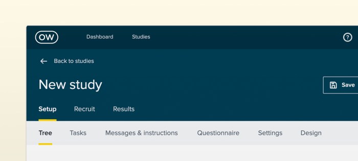
We’ve also made some changes to the ‘Create’, ‘Recruit’ and ‘Results’ tabs. These are now set in the header so you can easily navigate between creating, recruiting and reviewing results, instead of having to go back to ‘Settings’ to manage recruitment.
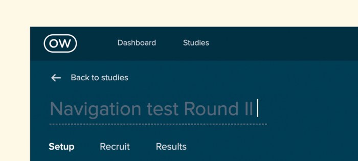
When you click ‘Back to studies’, you’ll now be taken back to the folder you’re currently working in. Previously you’d be taken back to the ‘All studies’ dashboard, so no more scrolling through the dashboard to find the folder you’re looking for. You can also rename your study in the header now, instead of having to navigate back to ‘Setup’.
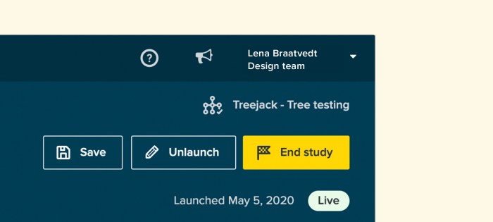
Finally, you can now end your study by clicking the ‘End study’ button in the header. We’d discovered that some people had trouble ending their studies in the past, now you can just click the button with the tiny checkered flag.
Our goal is to create the world’s best user research platform – and a big part of that is ensuring that our tools are easy to use. Through testing, we found that our old navigation header had usability, consistency and design issues. Specifically, usability testing and tree testing showed that simplifying our information architecture (IA) would drastically improve the user experience and flow.
We asked the question: “How might we improve the flow of our tool without affecting customers that currently use our tools?”
This led us down a research rabbit hole, but we came to the conclusion that we’d need to redesign the navigation header across all of our tools and adjust the IA to match the user journey. In other words, we needed to redesign the navigation to match how people were using our tools.
User research and testing inform all of the changes that we make to our tools, and this project was no different.
We ran 3 tree tests using Treejack, testing 3 different IAs with 97 participants (30 per test). We also ran a first-click test using Chalkmark to validate what we were doing in Treejack.
The 3 IA’s we tested were:
Note: A caveat of the results is that we used the phrase ‘Set up’ in many questions which would bias the second test in favor of any question where ‘Setup’ is the correct answer.
We found that the third tree performed the best during our test. On average, it required a little less backtracking and was less direct than the first 2 tests, but had a higher chance of completion simply because there were fewer options available.
So that’s our new in-app header navigation – we hope you like it. Got a question? Feedback? Click the yellow Intercom circle in the bottom right-hand corner to get in touch with our support team.
Happy testing!

Think about the last time you were visiting a friend or family member’s house and needed to find something. Like a spoon, for example. You start in the kitchen because that’s where we’ve all been trained to find things like spoons. But where do you look next? Some may look in the drawer near the dishwasher, while others may look to the drawer that’s by the cabinet that holds dishes and bowls. Point is, people use context clues and other points of reference (like familiarity and habits) to find things that they’re looking for.
The same goes for navigating a webpage.
However, unlike the spoon example, there’s much more variation in website structure than kitchen layout. Websites vary from industry to industry, ranging in purpose from ecommerce to digital portfolios and everything in between. So when someone lands on your website to find something or complete a task, is it obvious where they should go to get things done?
Your gut might tell you that it is. The people on your design team might tell you that it is too. But what really matters is what happens with actual users. Whenever you’re building a new website or optimizing an existing one, it’s important that you build it with quality user insights. That starts with user experience (UX) research.
And before you ask if we mean qualitative or quantitative research – the answer is both. Let’s explore a particular user research method that’s essential for gathering the information needed to build intuitive site navigation. It’s called tree testing.
For anyone unfamiliar with tree testing (sometimes referred to as ‘reverse card sorting’ or ‘card-based classification’), it’s a series of tests that help you understand where and why people get lost in your content.
It works by taking text-based versions of websites and stripping the influence of navigation aids or design elements to build a study. Participants are shown the text-only version of your website or app and are asked to indicate where they would find specific items or topics.
By removing everything but the labels and how they’re organized, you can work out just how effective your website structure is at enabling people to find what they need. If test participants consistently struggle to locate specific items, you’ll know there are issues with your structure. It can also help you visualize what paths participants take to get to specific site information.
Another point worth mentioning is that tree testing not only uncovers site navigation flaws, but it reveals word choice and microcopy that may not be clear to users. To reference back to the initial analogy, one person might say “where would I find your spoons,” while another may ask, “where do you keep your utensils?” So, tree testing can also be helpful for understanding which words work best in your site structure.
While it’s best to conduct a tree test early in the research phase of a project, there’s never a wrong time. (Unless that time is not at all). And if you have an existing website, this is a good time to establish a base of your existing site structure. The results you gather here can help to highlight any issues with your site’s structure and provide the data needed to compare to any improvements.
If you’re starting from scratch with a new website, you can run tree tests on different versions of your proposed site structure and then compare the results to determine which makes the most sense to your users.
Running a tree test is simple. You can use an online tool (like TreeJack) to collect all of the necessary quantitative data you need to ensure successful site navigation.

But what about the qualitative side of it all? We’re so glad you asked.
Running tree tests is a great way to gather quantitative data about your site navigation and topic findability, but it's not so good at providing you with qualitative insights, or why people are looking for information the way that they are.
Traditionally, you could get your gift cards ready and set up an in-person study where you watch people perform the tasks laid out in your tree test, and subsequently ask why they searched for things the way they did. But that takes a lot of time, coordination, and compensation. Alternatively, you could set up a remote usability test using a platform designed to record users as they complete your tree test.
This way, you’ll get the quantitative results you need to make decisions, backed by qualitative insights from real people. You’ll be able to set up your test to get answers to questions like:
Teams that solely rely on quantitative data are only getting half the story. By pairing tree testing tools, like Optimal Workshop’s Treejack, with UserTesting’s Human Insight Platform, researchers are able to not only see how people search for information on a website but get to the bottom of why. When used together, quantitative and qualitative data reveal the most valuable insights for tree testing.

This is a guest post from our friends over at Askable. Check out their blog.
Writing screening questions is an everyday part of life as a UXer or researcher of any kind, really. And at first glance, they seem straightforward enough. Draft up some questions that help to either qualify or disqualify people from taking part in your research, whether that’s a survey, an interview or something in between.
At Askable, we have seen thousands and thousands of screening questions. Some horrible and some amazing - and everything in between.
So here we go – 5 of the most common mistakes made when writing screening questions – oh and how to avoid them.
What’s the quickest way of knowing if someone went on a holiday in the last 6 months… You ask them, right? “Have you been on a holiday in the last 6 months – Yes or No?”. Duh.
But actually, a question worded in this way is signposting the answer you’re looking for, which may lead to false answers! And also, the answer doesn’t give you any extra information about that person’s travel habits, etc.
So, perhaps a better way to ask the question would be: “When was the last time you went on a holiday?” Provide multiple choices. This also gives you that added info, like if it was a month ago or 5 months ago, in this case.
Open-ended screening questions can be great, but only for certain info. Avoid using them when you have strict criteria. But instead, use them for getting inside your applicant’s head a bit more. An example would be to ask as a follow up to the example above “Tell me about where you went on your last holiday”.
Open-ended questions are also fine when the answers could vary wildly. A good example is “What is your occupation”. There are simply way too many possible responses to have as a multi-choice.
How many people in the general public know what EV stands for? It’s Electric Vehicle by the way.
Or how about the term ‘Financial Services’? Are we talking about a bank or payments company or an accountant?
Work off the lowest common denominator, assume the applicant doesn’t know anything about your industry. Because often, they don’t or they think of it differently to you. When we live and breathe a topic, it’s all too easy to forget that others do not.
We often write too many screening questions for a number of reasons. Sometimes we do it because we forget that screening questions are just that – to screen. Not to survey! Don’t start adding questions in there that are actually part of your research.
Other times it can be because our criteria is just way too narrow. Whatever the reason, a good rule of thumb is to never have more than 15 and the less the better.
We have learned this time and time again at Askable – most people are good and honest! We even have a saying now for it – “default to honesty”.
Don’t get overly concerned that your screening questions give too much away. Of course, keep it vague, but don’t go crazy. The 99% of people in our experience won’t take advantage of you. So serve the 99 and not the 1.
Wrap Up
Think about these next time you are writing up some screening questions, setting up your research or trying to figure out who it is you really want to talk with. Do this and you will be on your way to some seriously awesome and accurate insights!

In-person user testing is an important part of any research project, helping you to see first-hand how your users interact with your prototypes and products – but what are you supposed to do when it’s not a viable option?
The recent outbreak of coronavirus is forcing user researchers and designers to rethink traditional testing approaches, especially in-person testing. So what’s the solution? Enter unmoderated user testing. This approach circumvents the need to meet your participants face-to-face as it’s done entirely over the internet. As you can probably guess, this also means there are a few considerable benefits.
Here, we'll take a look at 5 reasons to consider this testing approach. But first, let's explore what unmoderated user testing is.
In the most basic sense, unmoderated user testing removes the ‘moderated’ part of the equation. Instead of having a facilitator guide participants through the test, participants complete the testing activity by themselves and in their own time. For the most part, everything else stays the same.
The key differences are that:
However, there are a number of upsides to unmoderated user testing, which we’ll cover below.
There’s a good chance that your organization’s customers don’t exist solely in your city, or even just in your country, so why limit yourself to testing local individuals? Moderated user testing requires you to either bring in people who can visit your office or for you to actually travel to another physical location and host testing sessions there.
With unmoderated user testing, you can use a variety of participant recruitment services to access large groups of participants from all over the globe. Making these services even more useful is the fact many allow you to recruit the exact participants you need. For example, drivers of Toyota hybrid vehicles who live in Calgary.
Have a think for a moment about all of the typical costs that go along with a hosted user testing session. There’s the cost of a location if you’re traveling to another city, the remuneration for the people you’re testing and the cost of equipment (that you may not typically have access to). Sure, moderated testing can be made much more affordable if you’re hosting a session in your own office and you have all of the required gear, but that’s not the case for everyone doing research.
Unmoderated user testing really only requires you to choose the tool with which you want to run your user test (variable cost), set up your study and then send out the link to your participants.
Unmoderated user testing means you can set aside the difficult task of managing participants in person, from scheduling through to finding notetakers and people to help you with the recording equipment. As we noted in the above section about cost, all you have to do is select the tool and then set up and run your study.
Running in-person, qualitative usability testing sessions can deliver some truly useful insights. There’s really nothing like sitting down in front of a participant and seeing how they interact with the product you’re working on, hearing their frustrations and learning about how they work. But any insights you gain from these sessions you’ll have to derive yourself. There’s no magic button that can generate useful qualitative analysis for you.
With unmoderated user testing, and especially with the right set of tools, you can run your tests and then have analysis generated automatically from your data. Take our IA tool Treejack as just one example. The functionality built into the tool means you can send out text-based versions of your website structure and then see how people make their way through the website to find what they’re looking for. At the end of your test, Treejack will present you with an array of useful, detailed visualizations like this one:

Ever heard of the observer effect? It’s a theory that basically states that the observation of a phenomenon will inevitably change that phenomenon, commonly due to the instruments used in the measurement. The observer effect and other biases often come into play during moderated research sessions specifically as a result of having a moderator in the room – typically with their own biases. Removing the moderator from the equation means you’ll get more reliable data from your study.
Unmoderated user research requires unmoderated testing tools. With health concerns like coronavirus and influenza leading to reduced travel and in turn making in-person testing more difficult, there’s never been a better time to start using unmoderated testing tools. If you haven’t already, take our full set of 5 tools for a spin for free (no credit card required).
