10 examples of great website navigation and why they’re awesome - Part 1
Early on in my career, a wonderful mentor of mine shared what I consider to be my all time favourite analogy for describing the difference and relationship between information architecture (IA) and navigation. She called it the warehouse and the department store. A department store is a beautiful space with many different product category based departments joined by clear, wide and well lit pathways. These pathways are lined with featured products highlighting the best each department has to offer and the order and placement of each department makes perfect sense to customers. Women’s clothing is the largest department and adjacent to it, you will find the women’s shoe department and a little bit further down, women’s handbags and accessories. It flows intuitively allowing customers to find everything they need without having to hunt for it. As for the warehouse, it’s out the back of the store but it’s also hidden in pockets throughout it supporting the department store experience every step of the way by making it easy for staff to access extra stock or store special orders for customers. It’s not that nice to look at it, but without it there wouldn’t be a beautiful department store to shop in. The warehouse is the IA and the department store is the navigation. I’ve written about and have worked with IA's a lot throughout my career and today I am especially excited to step out into the department store and share some examples of great website navigation. I’ve trawled the internet and have pulled together (in no particular order) what I think are some great website navigation examples, so let’s take a look at them and why they’re awesome.
1. Mailchimp
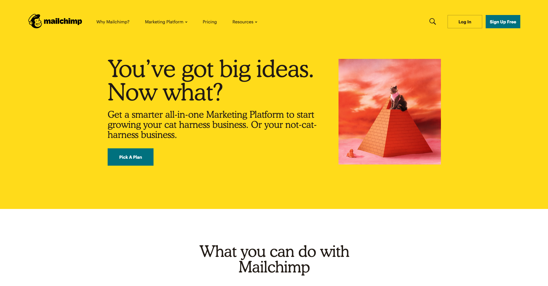
There’s a lot to love about Mailchimp’s website navigation. The overall navigation experience is simple and clean with beautiful illustrations accompanying each content category which makes them all feel just that little bit more human. The unexpected animation that appears on hover on the logo is a nice touch that engages visitors and winks at them as if to say “Yes, this will take you back to the home page”.
The universal navigation bar at the top of the page hides when a website visitor scrolls down the page and reappears when they hover over the top of the page or scroll back up. It hides when you’re moving away from it and it reappears when you’re moving back towards it. I also find Mailchimp’s take on a fat footer (see below) especially interesting — it fills an entire page view and works quite well.
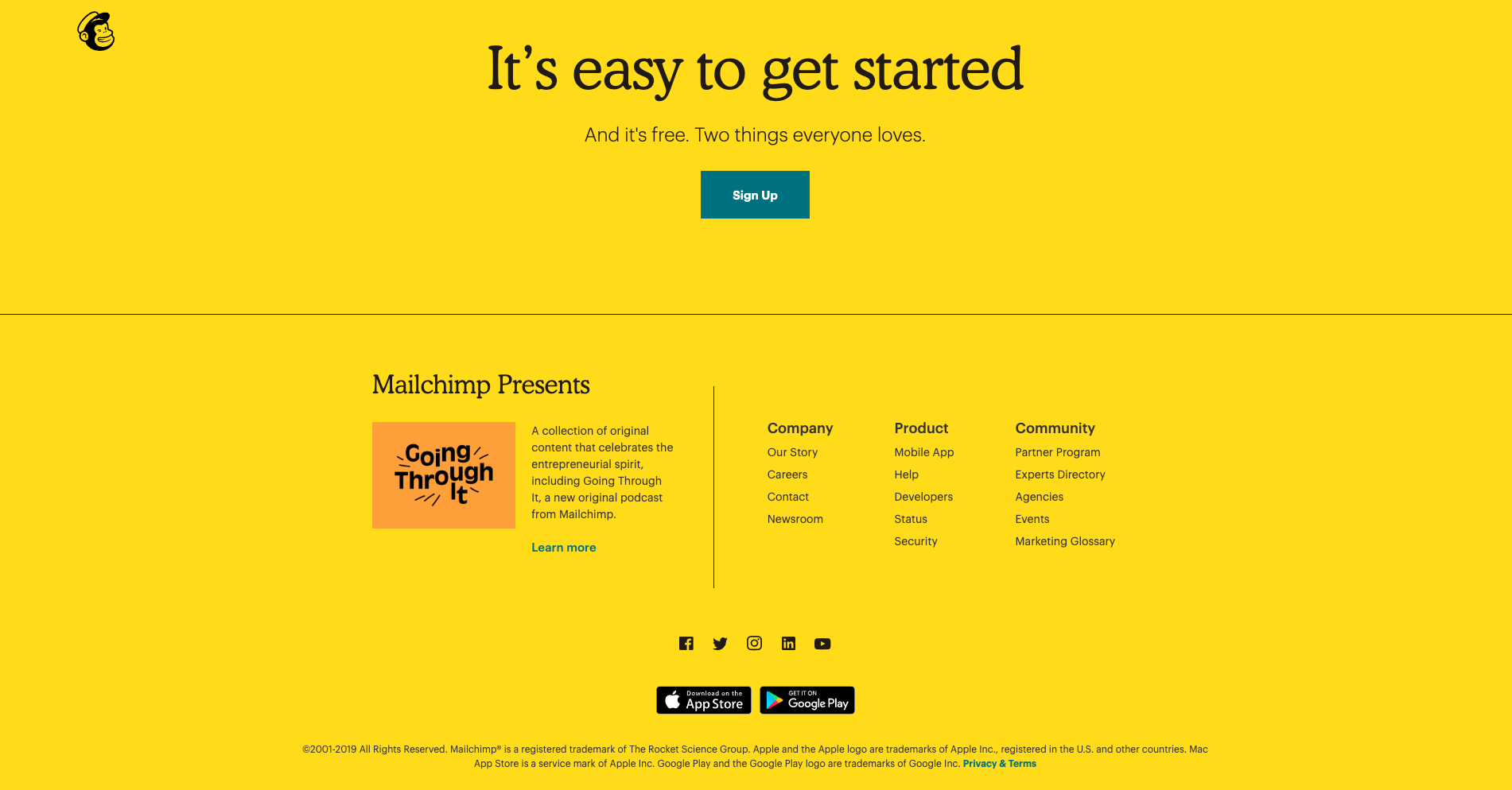
A footer has many jobs including: communicating to website visitors that they’ve reached the bottom of the page, housing content that doesn’t belong anywhere else (e.g., privacy policies, social media links etc) and it serves as a safety net for people who might be feeling a bit lost. Mailchimp’s fat footer has five sections that are not overwhelming at all and is consistent with the rest of the website through its clear and simple content groupings and functionality.
2. Mosster Studio

With a riot of colour and delightfully animated illustrations, Mosster Studio’s website is amazing to look at. It also takes that animation one step further through a really cool navigational feature that helps orient website visitors. The top navigation bar is sticky on scroll and the building block-like shapes for each page are animated — on hover they push out and on click they push in as shown in the below image for the ‘Info’ page.
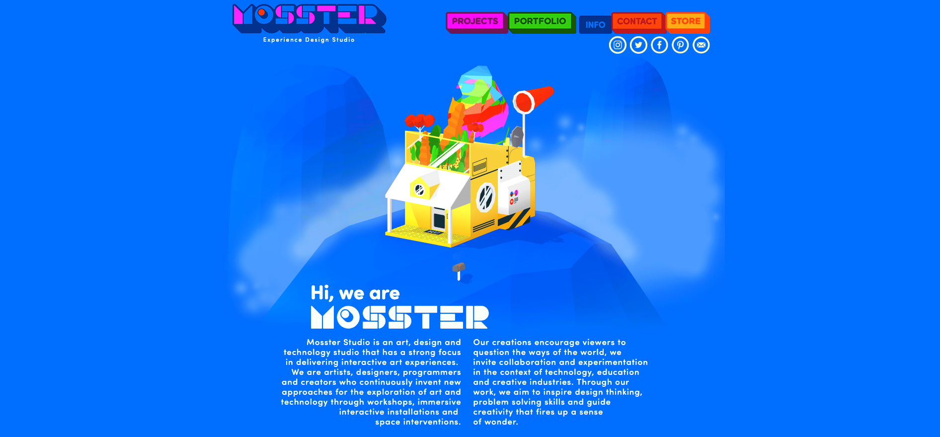
This is a really nice way to show people where they are on this website and it’s definitely consistent with the overall experience. This website also has a sticky minimal non-footer footer that can be seen at the bottom of both the images above. It works because it only has two items in it — copyright information and the privacy policy — and no matter where you are on the website, it’s always there within easy viewing and reach. I feel that it’s just right for this particular website. The IA is quite shallow and the sticky top navigation menu ensures that the footer safety net isn’t really needed in this case.
3. Brit + Co
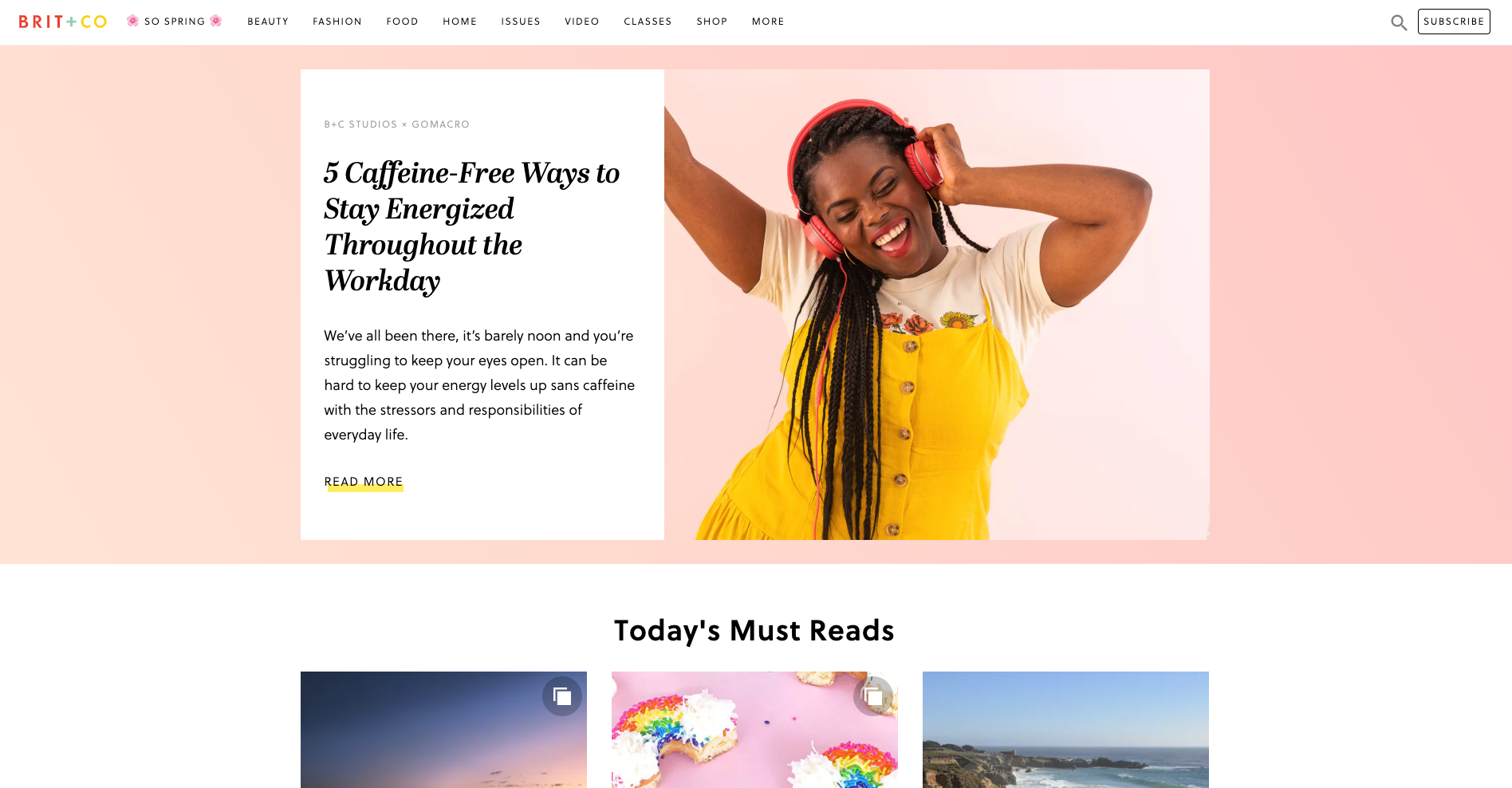
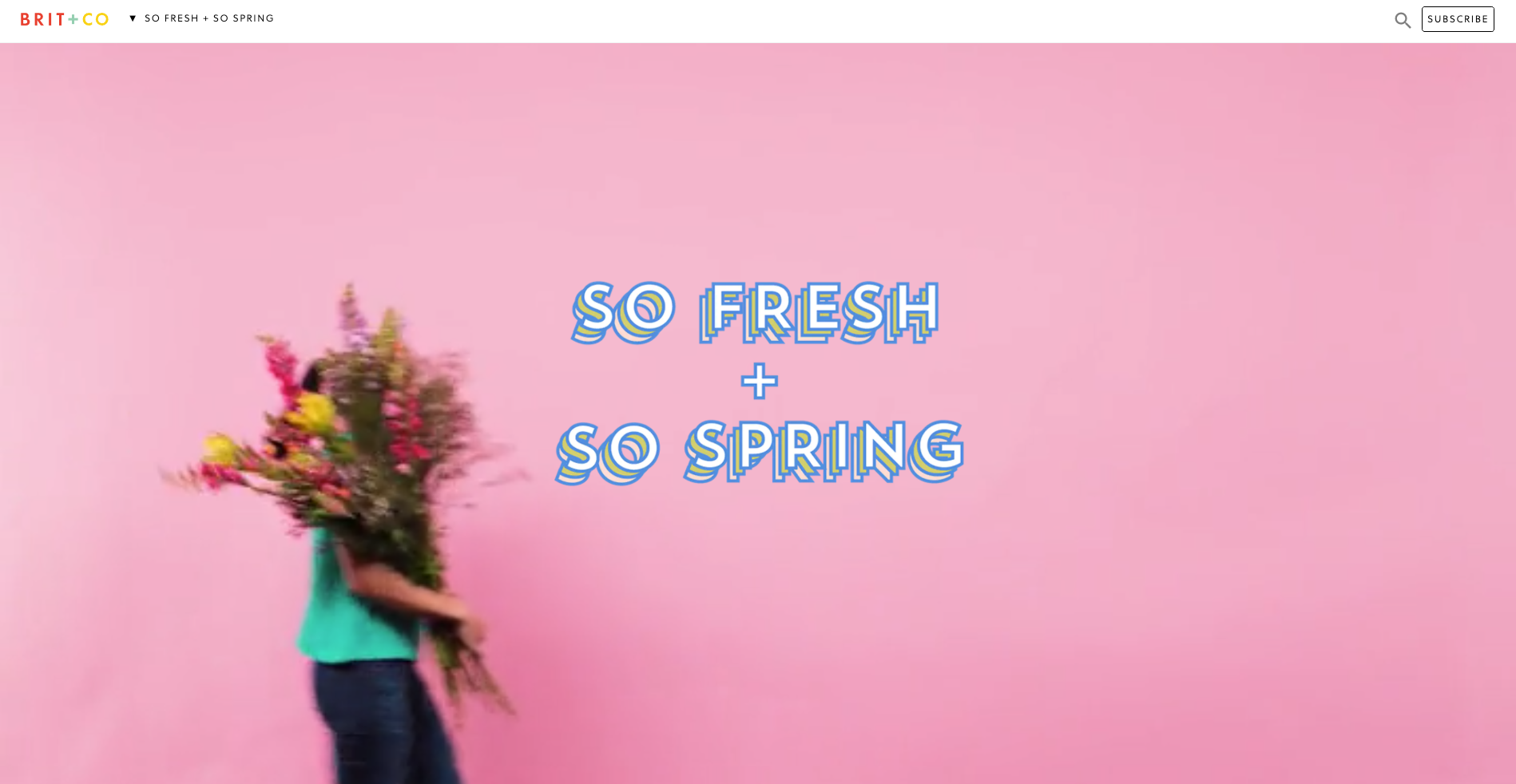
Brit + Co is a media company and the thing I really love about their website navigation is what happens when a website visitor clicks into an area called ‘So Spring’. It’s a single page space with seasonal specific content where the main website top navigation bar is replaced by a single label in the header. It feels like a website within a website — it’s connected to the main website which is easily accessed through the link on the logo and the subscribe call to action (CTA) is still there, but it definitely has its own architecture and navigation style.
When first opened (see below image), the label at the top says ‘So fresh + So Spring’ and the visitor is presented with a gorgeous wide, animated banner with a woman walking across the page and turning around while carrying an enormous bunch of flowers.
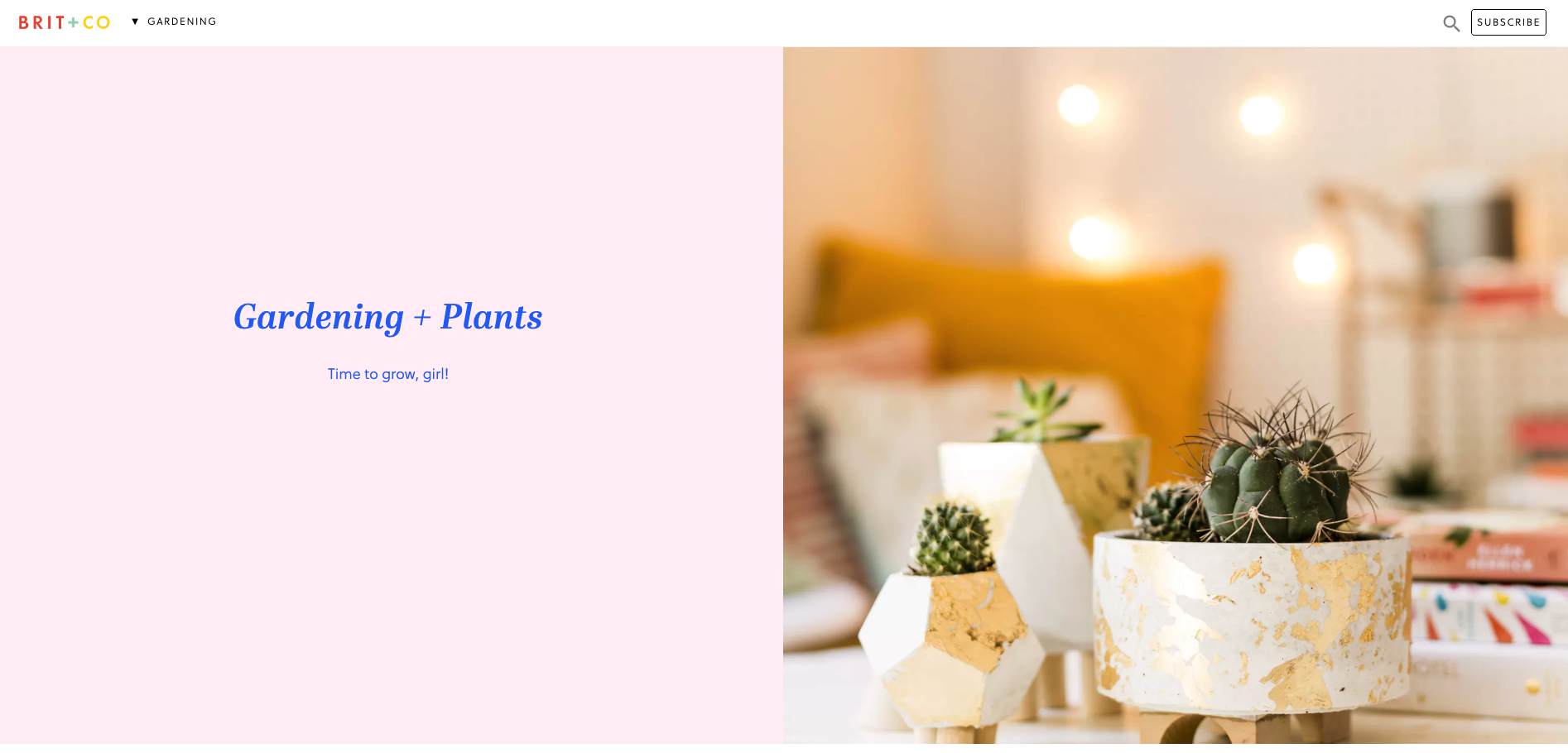
Then, when the website visitor scrolls down the page to the next content section, the header automatically changes to show them where they are in this mini website as shown in the below image when I scrolled down to the ‘Gardening’ section — awesome!
This dynamic navigation feature also contains a dropdown menu allowing website visitors to see all the other topics at a glance and directly navigate between them (see below image).

I feel that these navigation choices make this presumably temporary online space even more immersive and really well thought out.
4. Mental Floss
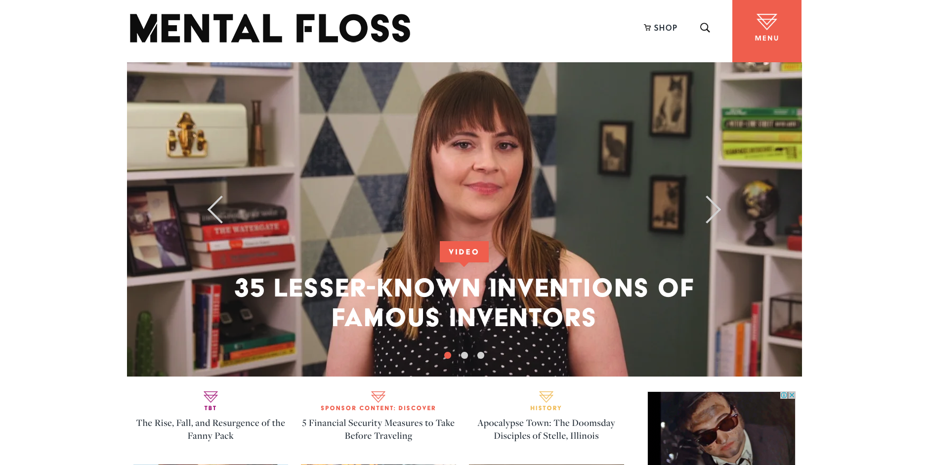
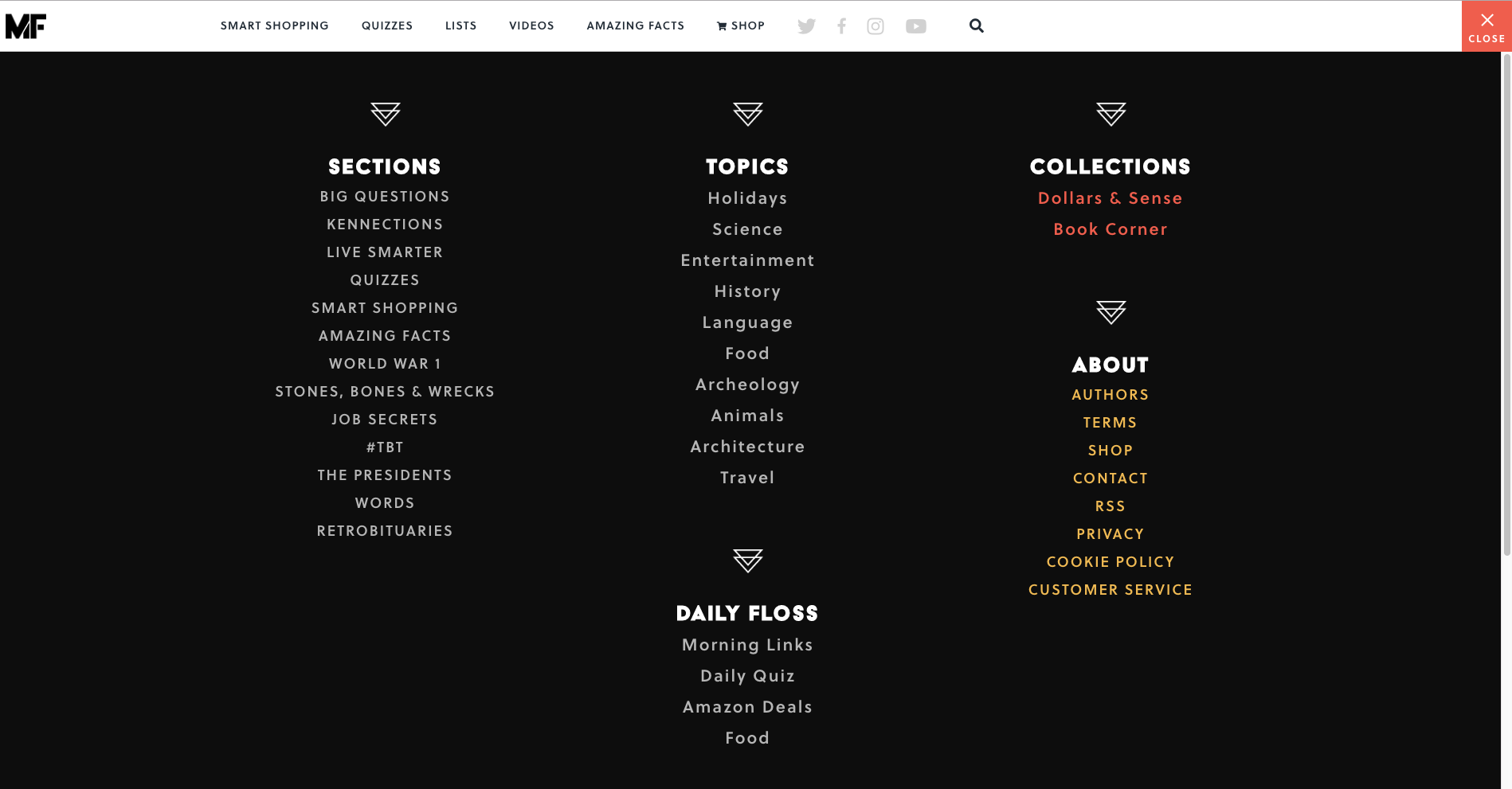
Mental Floss is a long time favourite website of mine. In addition to its fun articles, quizzes and amazing facts generator — did you know that the national animal of Scotland is the unicorn?! — it also has a super cool transforming navigation menu. It starts out as shown in the image above with a big orange square in the top right hand corner that’s simply labelled ‘Menu’ that when clicked, opens a large, full page menu as shown in the image below.
When a website visitor scrolls down the very long home page, the header transforms into a sticky top navigation bar (see below image). The original menu tile is still present and produces the same menu shown above when clicked, but has been shrunk down and attached to the newly transformed sticky navigation bar.
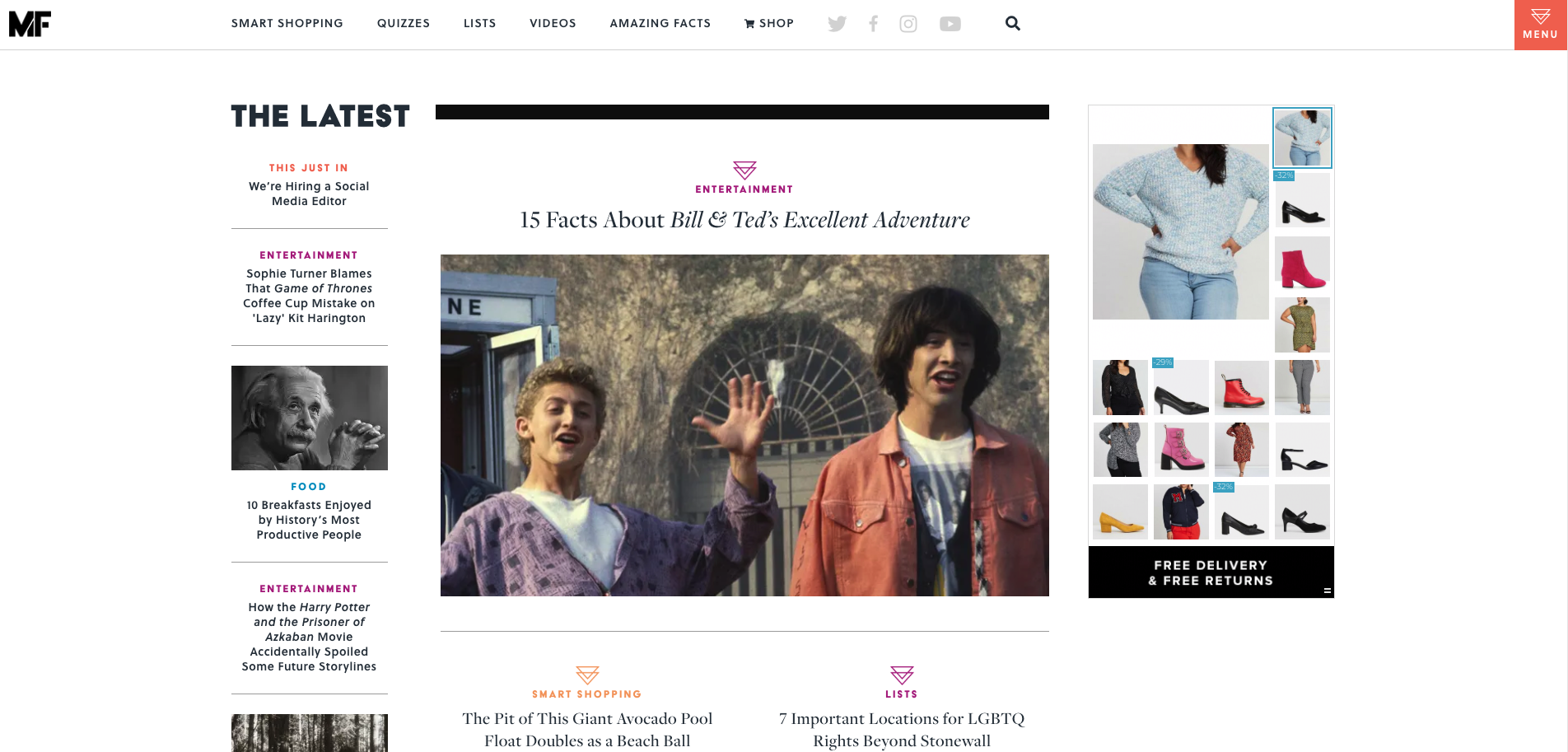
As the website visitor’s journey progresses further down the home page, clearly sectioned groups of content with their own micro navigation menus start to emerge — funnily enough, there’s one called ‘Sections’ that has a mini vertical side navigation (see below image) and this group of content also appears under the menu tile we saw a few moments ago.
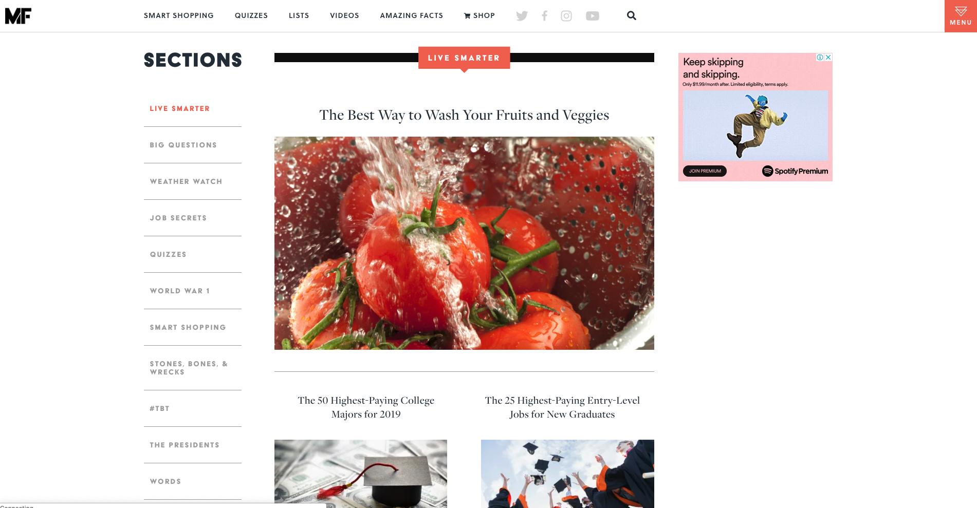
Mental Floss is like a rabbit hole in the best possible and most immersive way. Its transforming and intricately connected navigation works because it’s completely consistent with the experience of having a place to go and just get lost in interesting content. I love it.
5. Airtasker
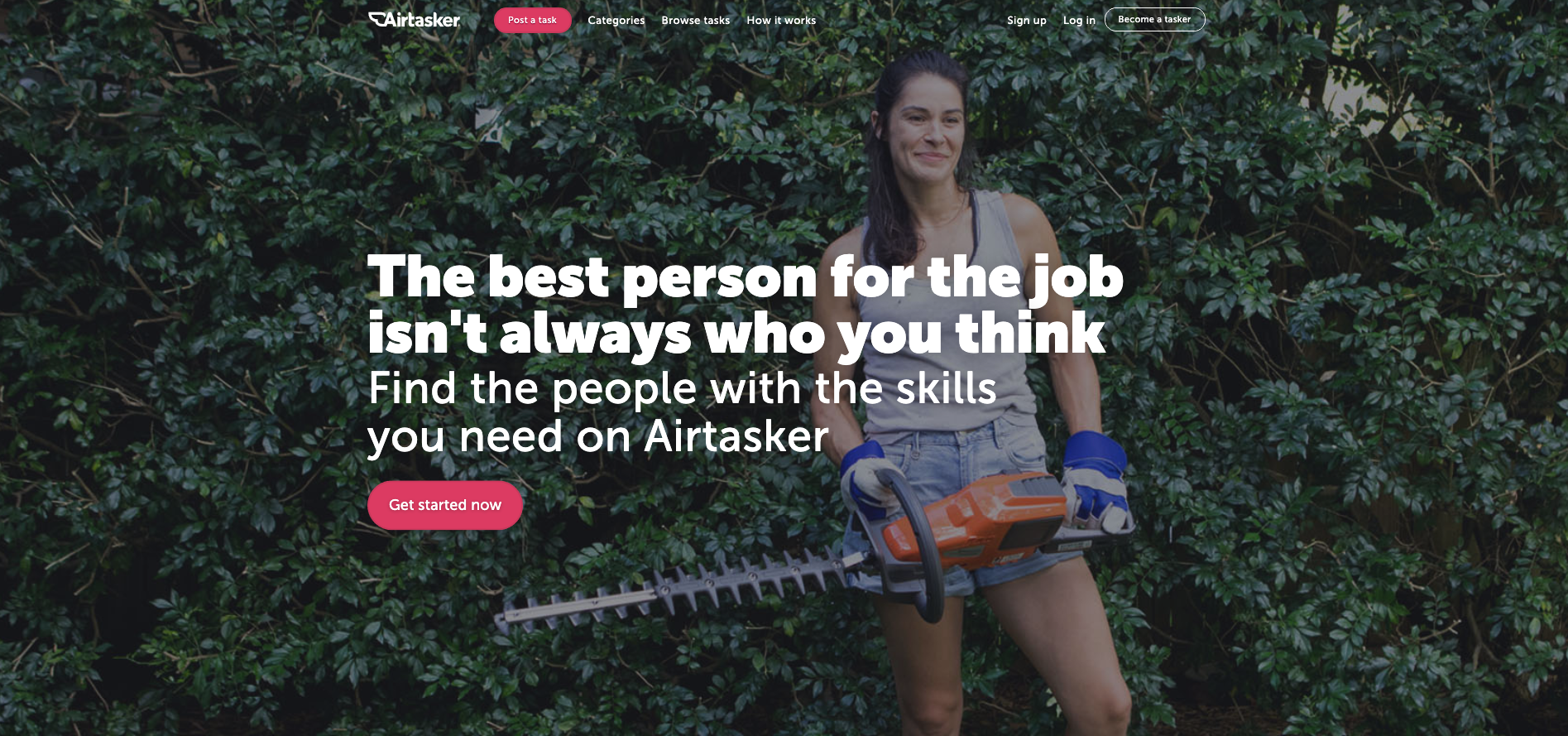
The category section on Airtasker’s website is — as expected — quite the mega menu. The overall website navigation is fairly simple with a fixed header running along the top of the page and the ‘Categories’ label does not lead to a landing page — it exists purely to launch that mega menu. What I really like about this navigation example is the way a website visitor can filter the category content at that very high level of the IA through the mega menu with one click by indicating if they are looking for work or looking to hire someone (see below image).
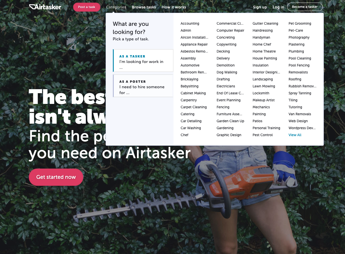
The categories themselves don’t reduce, increase or change in any way at this level, but the content below them is filtered to match the selected view so that when a visitor clicks into their category of choice, they’re only shown the perspective that matters to them. For example, if a website visitor selects ‘I’m a poster’ and then selects the ‘Catering’ category, they will be taken to the below screen.
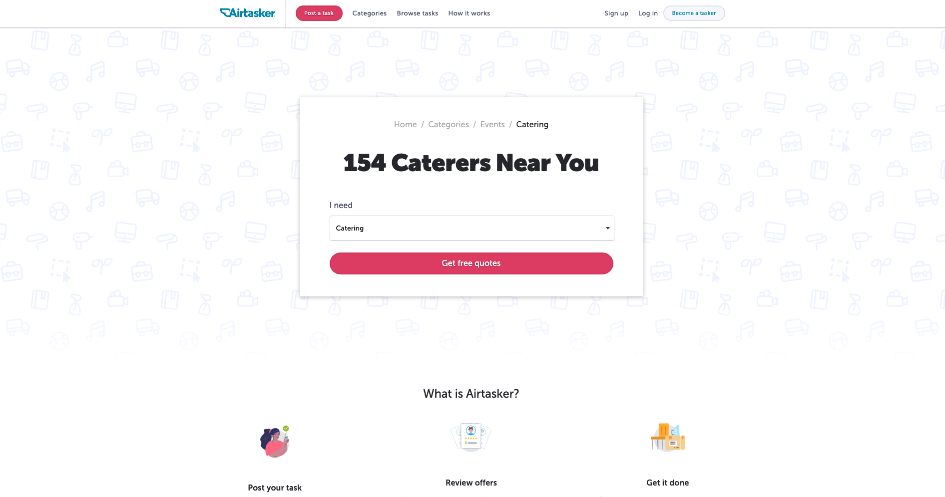
And for the same scenario in reverse where ‘I’m a tasker’ is selected before selecting ‘Catering’, this is the screen that appears (see below image).
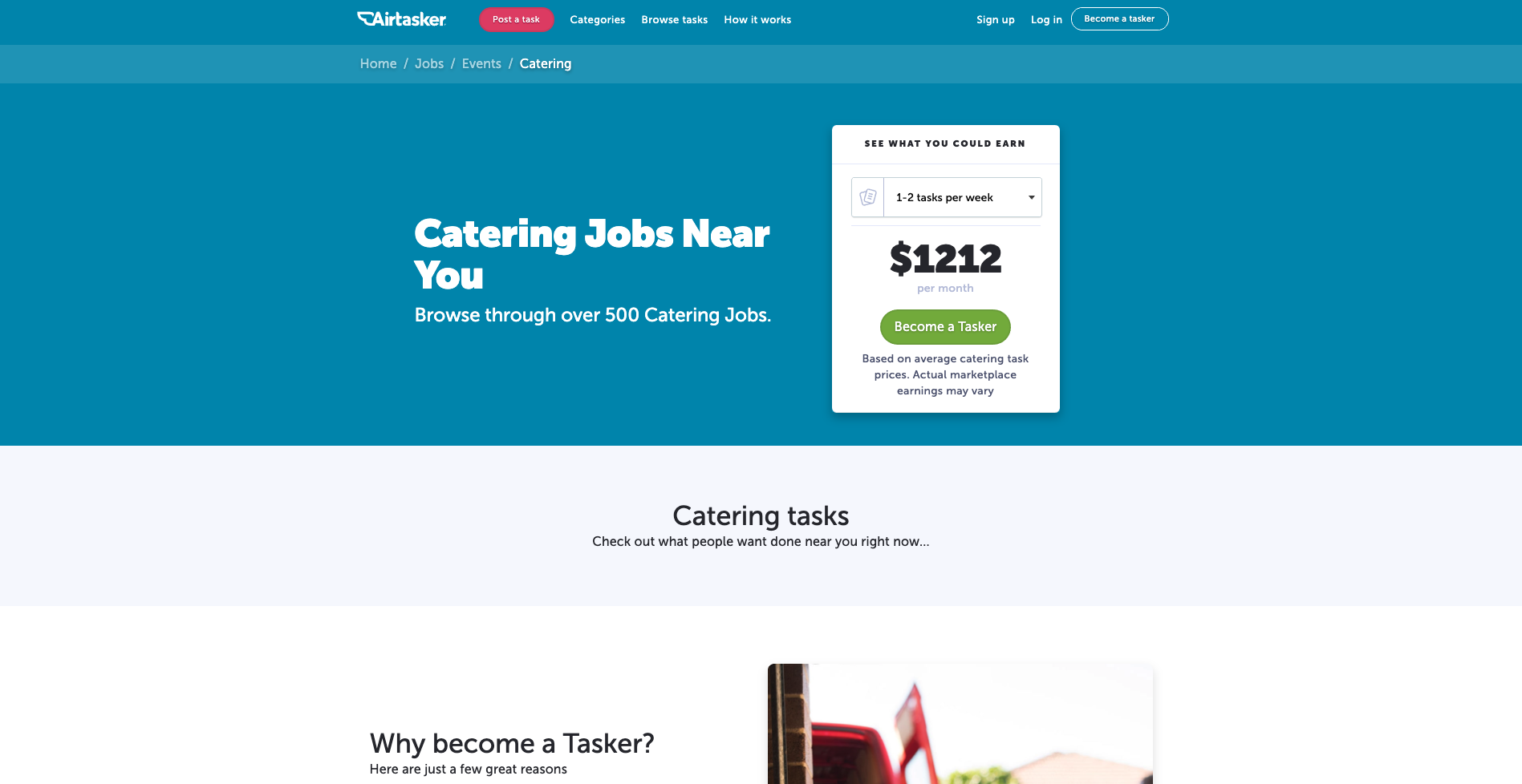
I think it’s a really cool way to chart that navigation course upfront and completely avoid content that holds no relevance in that moment.
