10 examples of great website navigation and why they’re awesome - Part 2
Note: This is part 2 of our series on great website navigation. You can read part 1 here.
Early on in my career, a wonderful mentor of mine shared what I consider to be my all time favourite analogy for describing the difference and relationship between information architecture (IA) and navigation. She called it the warehouse and the department store.
A department store is a beautiful space with many different product category based departments joined by clear, wide and well lit pathways. These pathways are lined with featured products highlighting the best each department has to offer and the order and placement of each department makes perfect sense to customers.
Women’s clothing is the largest department and adjacent to it, you will find the women’s shoe department and a little bit further down, women’s handbags and accessories. It flows intuitively allowing customers to find everything they need without having to hunt for it.
As for the warehouse, it’s out the back of the store but it’s also hidden in pockets throughout it supporting the department store experience every step of the way by making it easy for staff to access extra stock or store special orders for customers. It’s not that nice to look at it, but without it there wouldn’t be a beautiful department store to shop in. The warehouse is the IA and the department store is the navigation.
I’ve written about and have worked with IAs a lot throughout my career and today I am especially excited to step out into the department store and share some examples of great website navigation. I’ve trawled the internet and have pulled together (in no particular order) what I think are some great website navigation examples, so let’s take a look at them and why they’re awesome.
6. Walmart
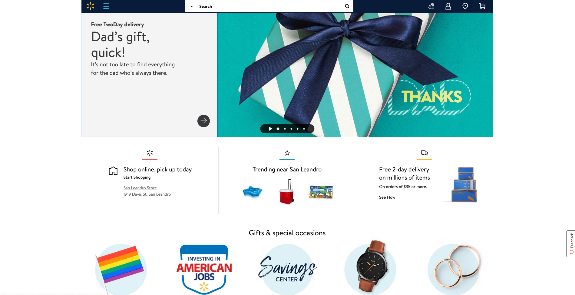
Speaking of mega menus, Walmart’s approach to guiding website visitors through its gigantic IA is quite clever. Hidden neatly away under a hamburger menu, Walmart’s mega menu uses vertical navigation instead of a horizontal dropdown that many websites with large IAs use (see below image).
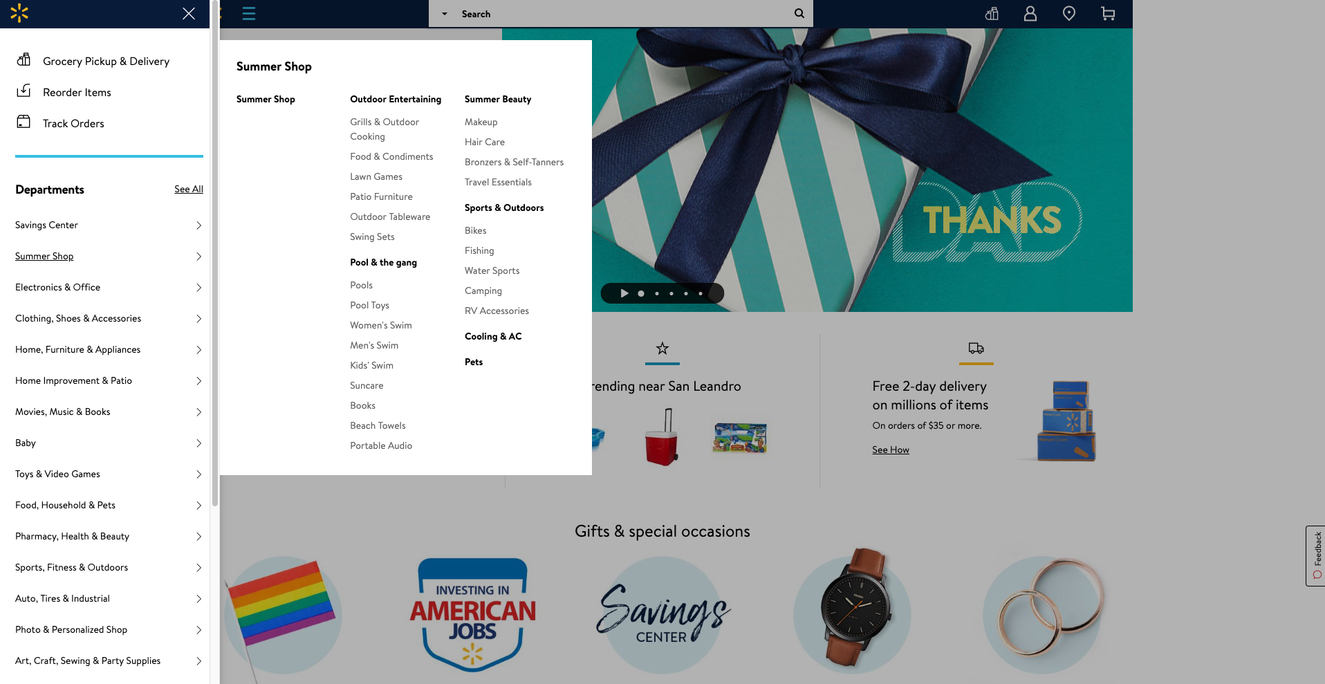
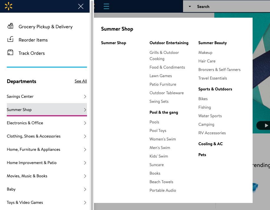
A website visitor can easily see all the categories and all the content labels below either by hovering over the level 1 labels or by clicking on them — clicking results in a pink line appearing under the label (see below image) making it easy to see where you are in the menu.
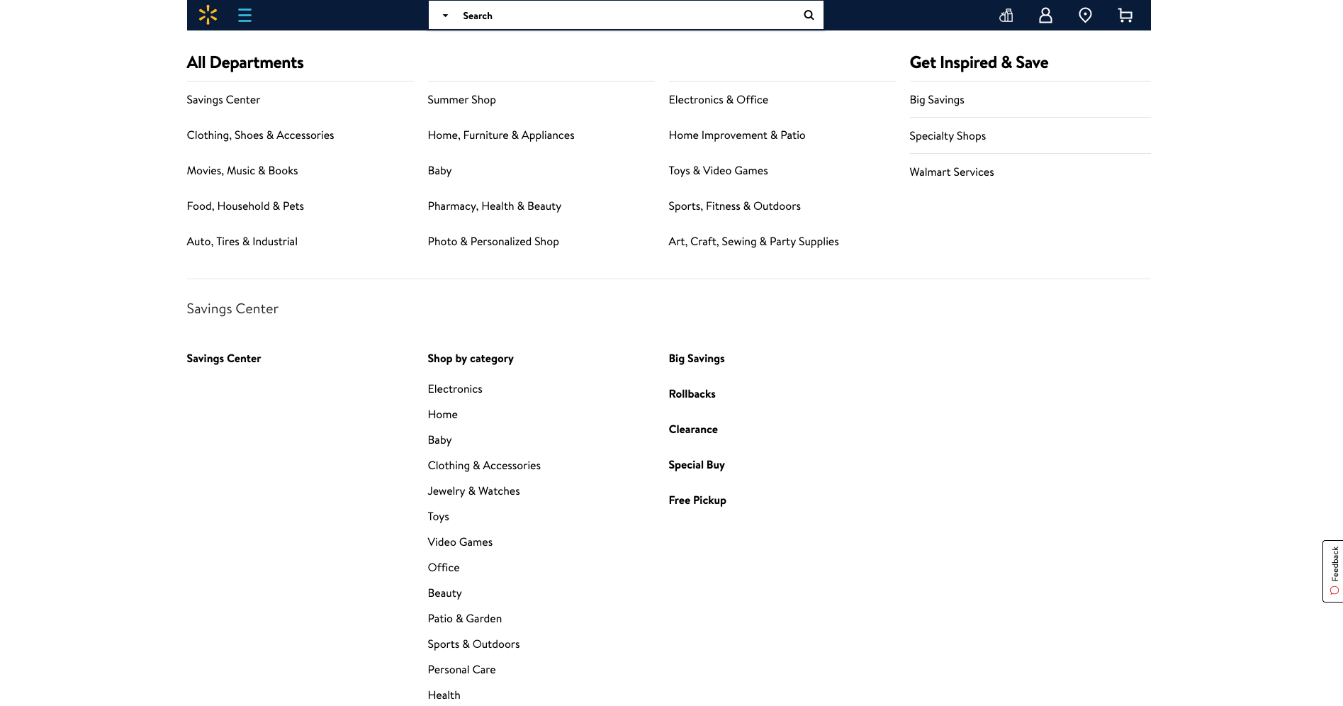
Selecting ‘See All’ next to ‘Departments’ takes the website visitor to a clear and simple site map-like page allowing them to see the whole IA on one page with no visual distractions at all (see below image).
Overall, Walmart’s simple and structured approach to surfacing a mega menu through vertical navigation is pretty awesome.
7. Android
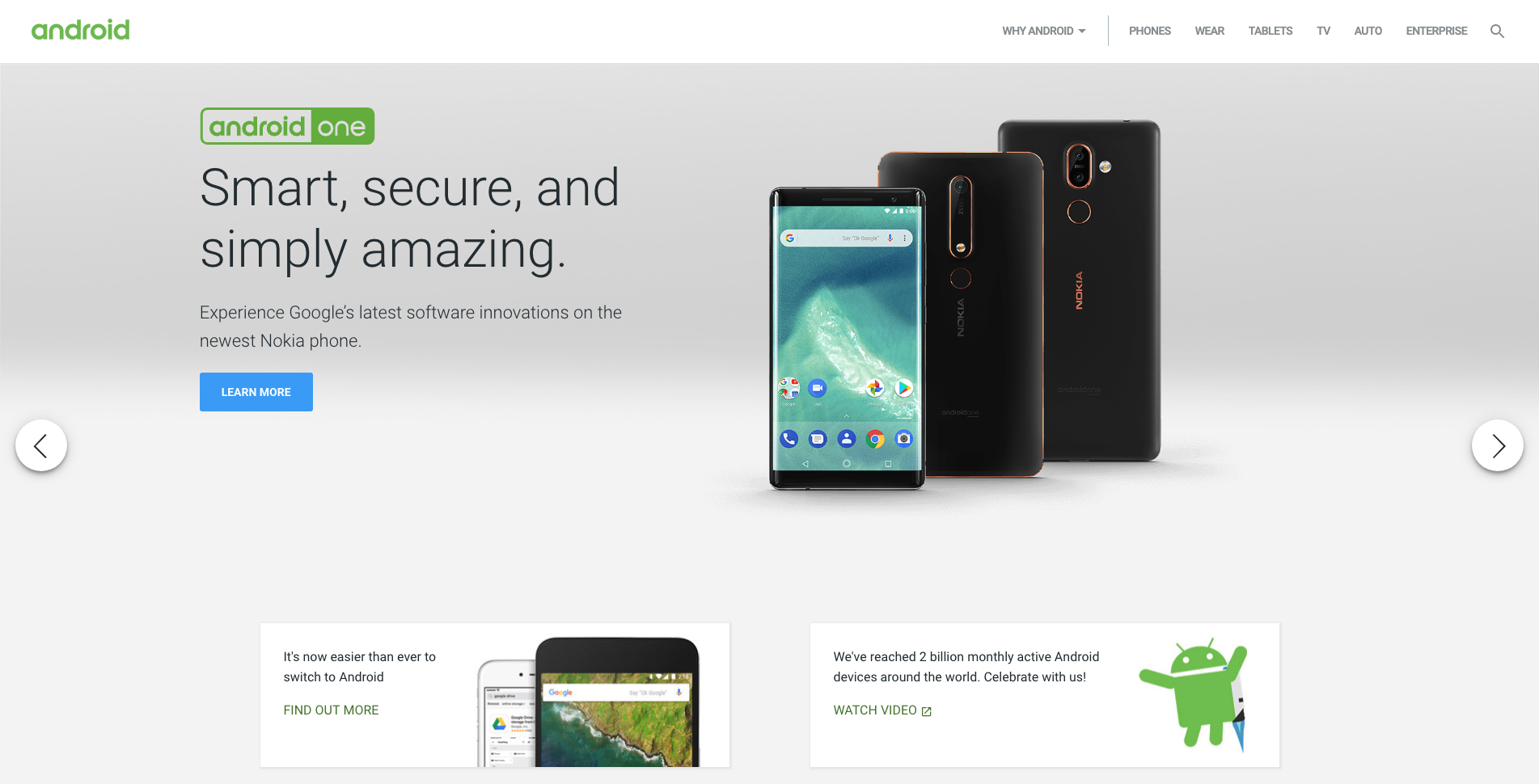
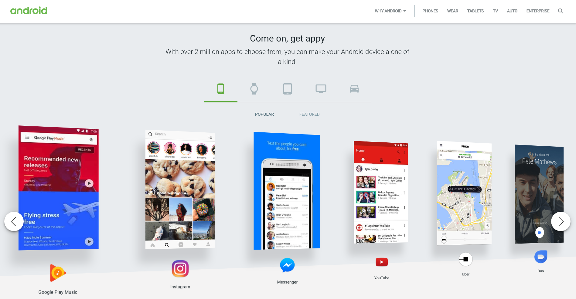
Android’s website has quite a few great navigational elements. Like a lot of technology websites, the home page is clean and simple and has a top navigation bar that hides when a website visitor scrolls down and reappears when they scroll up. The content carousel that sits at the top of the home page on opening is manually driven by the website visitor and doesn’t autoplay which is an awesome thing to see from an experience and accessibility perspective for all users. The rest of the content on the home page is sectioned off into clear horizontal groups and each one features its own manually driven carousel and filtered navigation by device type which is consistent, easy to understand and visually engaging (see below image).
8. Disqus
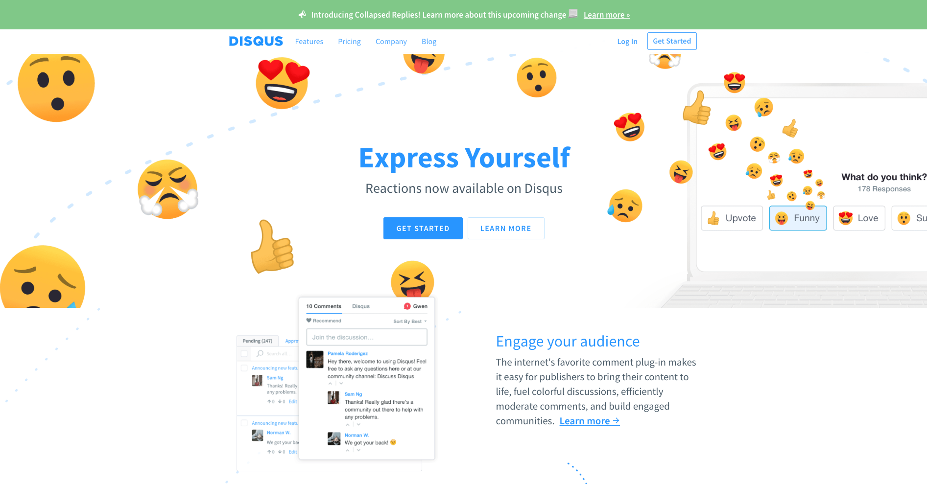
Disqus’s navigation menu is simple and flat. It has a universal top navigation bar with just four labels and only one of them (‘Features’) has suboptions to choose from. It works well because there’s nothing that doesn’t belong there and the labels clearly indicate what lies beneath. The dropdown menu that appears on ‘Features’ is quite interesting. If a website visitor hovers over it, the menu showing four suboptions appears and stays in place until the cursor is moved away from that space and then it hides. If ‘Features’ is clicked, the menu stays dropped down in place regardless of where a website visitor moves their cursor to until another link (that could be anywhere on the page) is clicked on. This is great because it responds to two different types of visitor behaviors where hovering might temporary and clicking might be ‘I want to take a closer look’ — it doesn’t matter what the visitor does, the menu is presented in a natural and intuitive way. And it’s worth taking a closer look because regardless of whether ‘Features’ has been hovered over or clicked on, when a website visitor hovers over those four options underneath, cute and friendly colour coded illustrations appear providing a nice human touch to the navigation experience (see below images).

9. Purple Orange
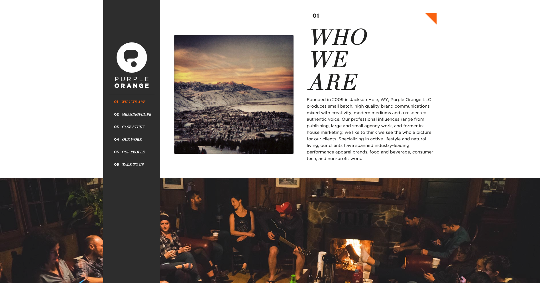
Purple Orange is a creative agency with a single page website that has a fixed vertical navigation menu that works really well. When a website visitor scrolls down the page, the text labels in that menu which is designed like a table of contents are highlighted in orange to show them where they are on the page (see below image). Website visitors can also navigate the content by clicking on the menu labels.
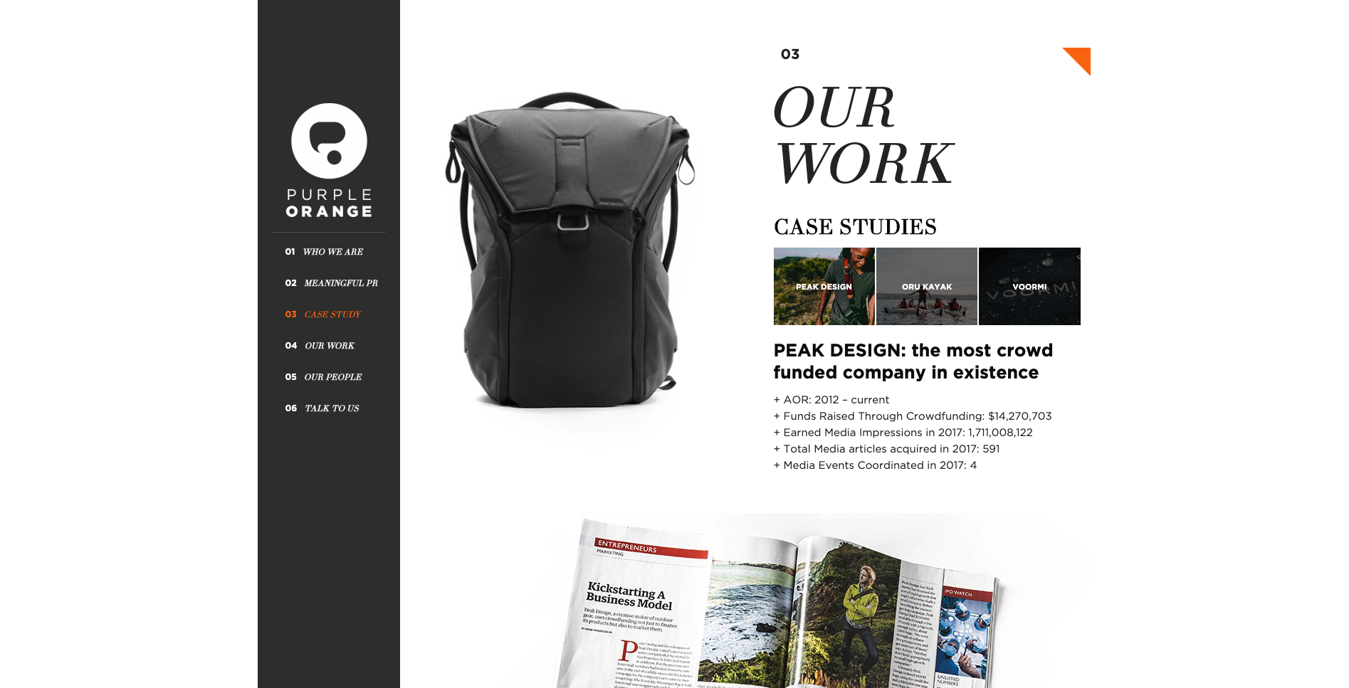
The thing I really love about this navigation experience is the layered approach to the visual design of the page. The content sections are visually divided by full width image banners and the fixed vertical navigation bar sits at the very foreground of the page. As a website visitor scrolls, all the content just passes behind it. It’s really beautiful. Navigation on single page websites can be tricky and many often end up just being a long scrolling page. This example highlights a great way to maintain that nice flat and uncomplicated one page feeling and add in an intuitive handrail to guide visitors.
10. Angry Bear

For our tenth and final example this time around, another single page agency website, Angry Bear, caught my interest due to its wonderful use of visual storytelling in its navigation experience. Upon arrival at the website, the visitor is presented with the image above. They land on the page standing at the top of a waterfall with a sign warning them to ‘beware of cliff falls’ as a howling bear shaped rock looms in the distance. The visual illustrations that form the backbone of this website make for an intriguing experience that transports the visitor to a far away forest - it doesn’t feel like a website and it’s awesome! The navigation menu is hidden under a dark red pull out tab with the logo on it on the left hand side of the screen and can be opened either by clicking on it or by scrolling down the waterfall (AKA the page). Once opened (see below image) the visitor is delighted with cleverly worded labels that clearly indicate the type and intent of the content but keep the story and the bear theme going. Instead of ‘Contact us’ it says ‘Yell for help’ and ‘Awards’ are ‘Trophies’.

The further the visitor scrolls down the page, the deeper they descend down the waterfall and into the darkness of the forest below. Angry Bear’s portfolio of work with the label name of ‘Public Works’ has a really interesting filtered tile navigation system (see below image).
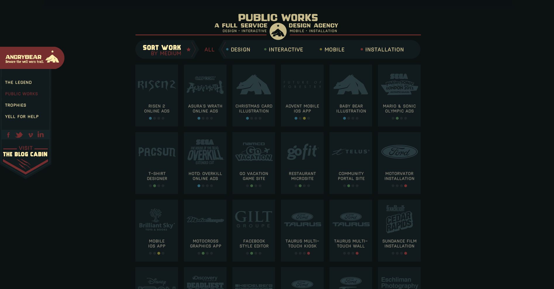
A website visitor can view all or can filter by type which eliminates all the tiles that don’t match the selection and clearly shows what has been selected by the animated filter which removes the background behind the label and has two arrow shapes pointing at it from either side (see below image showing the ‘Design’ filter in action).

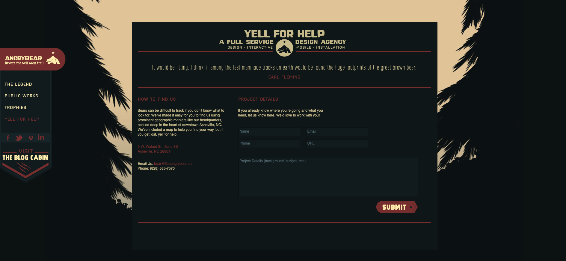
Finally, as the website visitor scrolls all the way down to the bottom of this one page website, the waterfall has become a tree lined stream trickling across the forest floor and the ‘Yell for help’ contact form does not disappoint with its note about how ‘bears can be difficult to track’ (see below image).
There’s just ten examples of great website navigation — what are your favourite examples?
