Subscribe to OW blog for an instantly better inbox
Oops! Something went wrong while submitting the form.
Articles and Podcasts on Customer Service, AI and Automation, Product, and more
The pace of product development has never been faster, and the cost of building on assumptions has never been higher. At Optimal, we've spent nearly two decades helping teams get closer to their users, and what we're seeing right now is a fundamental shift in how research gets done. More teams are running research than ever before and timelines to act on findings are tighter, while the expectations for what research needs to deliver keep rising.
That shift is exactly what's driving Optimal 3.0, our most ambitious reinvention of the platform yet, designed to give every team the speed, depth, and flexibility that modern research demands. Today's release is the next step in that journey.
Optimal's new mixed-methods research tool tears down the boundaries between methods. It brings prototype testing, live site testing, and surveys into a single, end-to-end study workflow. And grounded in our product principles: speed to insights, access for all, and communication.
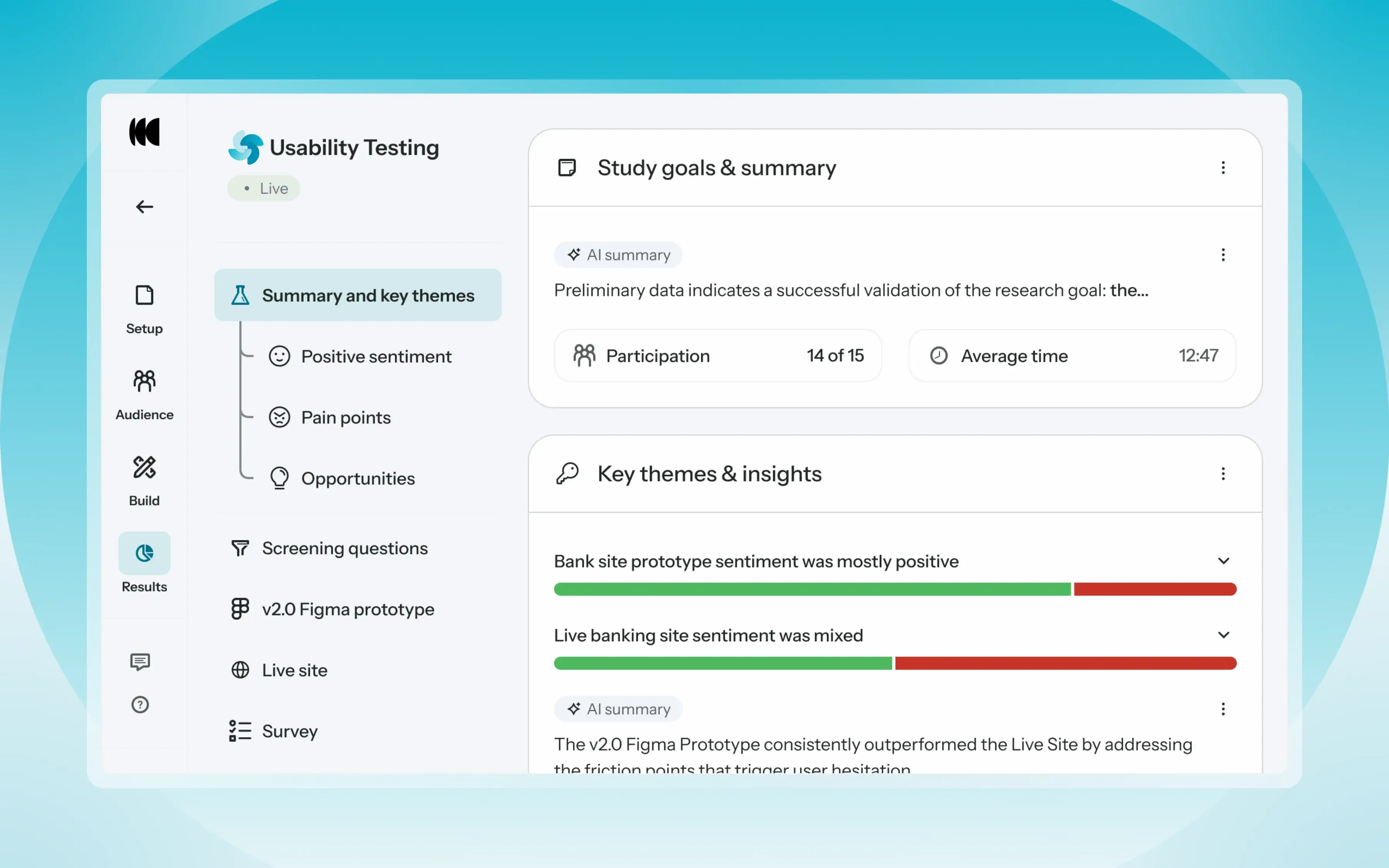
Optimal’s new Usability Testing tool marks the next step in the evolution of Optimal 3.0, giving teams the flexibility to evaluate experiences in whatever form they exist today.
Combine prototype testing, AI prototype testing, live site testing, and surveys in a single study. Test multiple prototypes side by side, compare different live URLs, or mix prototype and live site tasks together all in one workflow. Research can now mirror how products actually evolve, from early concept to shipped experience.
New speak-aloud question types, custom message blocks, auto-generated transcripts and insights, citations and highlight clips help you capture the context and reasoning behind every action. AI-assisted analysis then helps you make sense of it all fast and communicate with impact.
Review a study overview surfacing key themes, pain points, and sentiment analysis combining insights across all your study methods along with detailed results, task analysis and recordings, transcripts, key quotes, and automatically generated citations and video clips.
Coming soon: you can also use AI Chat to chat with your data directly, asking questions and pulling new insights and evidence across all your qualitative and quantitative inputs.
Modern product development is no longer linear. Teams continuously move between:
Traditional usability testing tools were not built for this fluidity. Optimal’s Usability Testing brings the flexibility to match how teams actually work today.
By combining multiple methods into a single study and pairing it with AI-powered synthesis, Usability Testing helps teams reduce setup and analysis time, recruit once, capture richer qualitative context, compare experiences more easily, move faster from feedback to action, and tell clearer, more compelling insight stories.
Learn how to get started with Usability Testing in Optimal and accelerate your path from idea to insight. Book a meeting, start exploring in your account, or join our live training webinar on June 24th to see it in action.
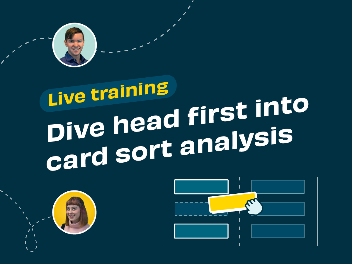
Your cards have been sorted, and now you have lots of amazing data and insight to help improve your information architecture. So how do you interpret the results?
Never fear, our product ninjas Alex and Aidan are here to help. In our latest live training session they take you on a walk-through of card sort analysis using OptimalSort.
What they cover:

In our latest live training session product experts, Pete and Caitlin, take us on a deep dive into the new and improved qualitative analysis tool Reframer.
The session is loaded with tips and demo’s on how to save time and streamline your qualitative research all within one tool. They also discuss best practices for setting up and conducting user interviews, and how to get the most out of your analysis.

Every month we have fun and informative “bite sized” presentations to add some inspiration to your lunch break. These virtual events allow us to partner with amazing speakers, community groups and organizations to share their insights and hot takes on a variety of topics impacting our industry.
Join us at the end of every month for Lunch n' Learn.
Leading design processes amidst a world in transition requires all practitioners to continuously invest in their own development. One aspect worth investing in, is an ability to integrate holistic thinking into our design leadership practice. This includes re-evaluating our own biases and how that bias is reflected in the tools we choose to work with when understanding and designing for/within complex systems.
Recently our guest Susanna Carman, Strategic Designer and founder of Transition Leadership LAB, introduced us to a holistic approach to qualitative design research using Ken Wilber’s 4 Quadrant Model. Susanna explained the fundamental principles underpinning the framework, and showed how it can be used to ensure a multi-perspectival harvest of critical qualitative and quantitative data on any design project.
Susanna Carman is a Strategic Designer and research-practitioner who helps people solve complex problems, the types of problems that have to do with services, systems and human interactions. Specialising in design, leadership and learning, Susanna brings a high value toolkit and herself as Thinking Partner to design, leadership and change practitioners who are tasked with delivering sustainable solutions amidst disruptive conditions.
Susanna holds a Masters of Design Futures degree from RMIT University, and has over a decade of combined experience delivering business performance, cultural alignment and leadership development outcomes to the education, health, community development and financial services sectors. She is also the founder and host of Transition Leadership Lab, a 9-week learning lab for design, leadership and change practitioners who already have a sophisticated set of tools and mindsets, but still feel these are insufficient to meet the challenge of leading change in a rapidly transforming world.
Grab your lunch, invite your colleagues and we hope to see you at our next Lunch n' Learn 🌯🍱🍜🍲
If you missed our live training, don’t worry, we’ve got you covered! In this session, our product experts Katie and Aidan discuss why, how and when to benchmark an existing structure using Treejack.
They also talk through some benchmarking use cases, demo how to compare tasks between different studies, and which results are most helpful.

Every month we have fun and informative “bite sized” presentations to add some inspiration to your lunch break. These virtual events allow us to partner with amazing speakers, community groups and organizations to share their insights and hot takes on a variety of topics impacting our industry.
Join us at the end of every month for Lunch n' Learn.
We all understand the need to better understand our users when designing new products, experiences and messages, but are we, as designers, missing an opportunity sitting in plain sight?
This recording of Lunch n' Learn features Cole Armstrong, Managing Director of behavioural strategy agency NeuroSpot. Cole gave us a quick intro to the world of behavioural science and how it can be applied to support design initiatives that really make a difference by driving actual behaviour. Drawing from examples around the world, he showed how a deeper understanding of human psychology has resulted in great outcomes. He also showed where it prevented failure, pointing out some of the design opportunities that we, as designers, could be overlooking.
Cole Armstrong is the founder and Managing Director of NeuroSpot, a behavioural strategy agency based in Auckland, New Zealand. At NeuroSpot, Cole is working with a range of New Zealand’s leading organisations, covering fields such as retail, supermarkets, financial services, and utilities amongst others, to apply a behavioural science lens to customer and user experience across a range of channels.
Cole has a diverse background covering academia, commerce and public sector, in New Zealand, Europe, Africa and the Middle East. His perspective is that behavioural science allows organisations to more effectively identify why people do what they do, and then set in motion a series of evidenced based strategies to deliver on organisational outcomes.
Grab your lunch, invite your colleagues and we hope to see you at our next Lunch n' Learn
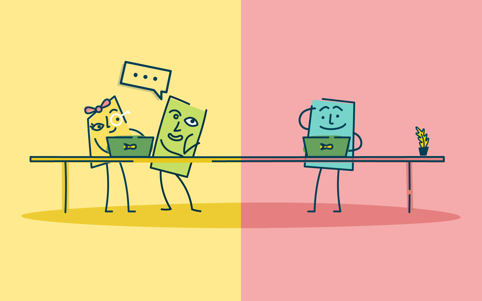
Knowing and understanding why and how your users use your product is invaluable for getting to the nitty gritty of usability. Delving deep with probing questions into motivation or skimming over looking for issues can equally be informative.
Put super simply, usability testing literally is testing how usable your product is for your users. If your product isn’t usable users often won’t complete their task, let alone come back for more. No one wants to lose users before they even get started. Usability testing gets under their skin and really into the how, why and what they want (and equally what they don’t).
As we have been getting used to video calling regularly and using the internet for interactions, usability testing has followed suit. Being able to access participants remotely has allowed us to diversify the participant pool by not being restricted to those that are close enough to be in-person. This has also allowed an increase in the number of participants per test, as it becomes more cost-effective to perform remote usability testing.
But if we’re remote, does this mean it can’t be moderated? No - remote testing, along with modern technology, can mean that remote testing can be facilitated and moderated. But what is the best method - moderated or unmoderated?
In traditional usability testing, moderated research is done in person. With the moderator and the participant in the same physical space. This, of course, allows for conversation and observational behavioral monitoring. Meaning the moderator can note not only what the participant answers but how and even make note of the body language, surroundings, and other influencing factors.
This has also meant that traditionally, the participant pool has been limited to those that can be available (and close enough) to make it into a facility for testing. And being in person has meant it takes time (and money) to perform these tests.
As technology has moved along and the speed of internet connections and video calling has increased, this has opened up a world of opportunities for usability testing. Allowing usability testing to be done remotely. Moderators can now set up testing remotely and ‘dial in’ to observe participants anywhere they are. And potentially even running focus groups or other testing in a group format across the internet.
- In-depth gathering of insights through a back-and-forth conversation and observing of the participants.
- Follow-up questions don’t underestimate the value of being available to ask questions throughout the testing. And following up in the moment.
- Observational monitoring noticing and noting the environment and how the participants are behaving, can give more insight into how or why they choose to make a decision.
- Quick remote testing can be quicker to start, find participants, and complete than in-person. This is because you only need to set up a time to connect via the internet, rather than coordinating travel times, etc.
- Location (local and/or international) Testing online removes reliance on participants being physically present for the testing. This broadens your ability to broaden the pool, and participants can be either within your country or global.
- Time-consuming having to be present at each test takes time. As does analyzing the data and insights generated. But remember, this is quality data.
- Limited interactions with any remote testing there is only so much you can observe or understand across the window of a computer screen. It can be difficult to have a grasp on all the factors that might be influencing your participants.
In its most simple sense, unmoderated user testing removes the ‘moderated’ part of the equation. Instead of having a facilitator guide participants through the test, participants are left to complete the testing by themselves and in their own time. For the most part, everything else stays the same.
Removing the moderator, means that there isn’t anyone to respond to queries or issues in the moment. This can either delay, influence, or even potentially force participants to not complete or maybe not be as engaged as you may like. Unmoderated research testing suits a very simple and direct type of test. With clear instructions and no room for inference.
- Speed and turnaround, as there is no need to schedule meetings with each and every participant. Unmoderated usability testing is usually much faster to initiate and complete.
- Size of study (participant numbers) unmoderated usability testing allows you to collect feedback from dozens or even hundreds of users at the same time.
- Location (local and/or international) Testing online removes reliance on participants being physically present for the testing, which broadens your participant pool. And unmoderated testing means that it literally can be anywhere while participants complete the test in their own time.
- Follow-up questions as your participants are working on their own and in their own time, you can’t facilitate and ask questions in the moment. You may be able to ask limited follow-up questions.
- Products need to be simple to use unmoderated testing does not allow for prototypes or any product or site that needs guidance.
- Low participant support without the moderator any issues with the test or the product can’t be picked up immediately and could influence the output of the test.
Each moderated and unmoderated remote usability testing have its use and place in user research. It really depends on the question you are asking and what you are wanting to know.
Moderated testing allows you to gather in-depth insights, follow up with questions, and engage the participants in the moment. The facilitator has the ability to guide participants to what they want to know, to dig deeper, or even ask why at certain points. This method doesn’t need as much careful setup as the participants aren’t on their own. While this is all done online, it does still allow connection and conversation. This method allows for more investigative research. Looking at why users might prefer one prototype to another. Or possibly tree testing a new website navigation to understand where they might get lost and querying why the participant made certain choices.
Unmoderated testing, on the other hand, is literally leaving the participants to it. This method needs very careful planning and explaining upfront. The test needs to be able to be set and run without a moderator. This lends itself more to wanting to know a direct answer to a query. Such as a card sort on a website to understand how your users might sort information. Or a first click to see how/where users will click on a new website.
With the ability to expand our pool of participants across the globe with all of the advances (and acceptance of) technology and video calling etc, the ability to expand our understanding of users’ experiences is growing. Remote usability testing is a great option when you want to gather information from users in the real world. Depending on your query, moderated or unmoderated usability testing will suit your study. As with all user testing, being prepared and planning ahead will allow you to make the most of your test.
