Subscribe to OW blog for an instantly better inbox
Oops! Something went wrong while submitting the form.
Articles and Podcasts on Customer Service, AI and Automation, Product, and more
The pace of product development has never been faster, and the cost of building on assumptions has never been higher. At Optimal, we've spent nearly two decades helping teams get closer to their users, and what we're seeing right now is a fundamental shift in how research gets done. More teams are running research than ever before and timelines to act on findings are tighter, while the expectations for what research needs to deliver keep rising.
That shift is exactly what's driving Optimal 3.0, our most ambitious reinvention of the platform yet, designed to give every team the speed, depth, and flexibility that modern research demands. Today's release is the next step in that journey.
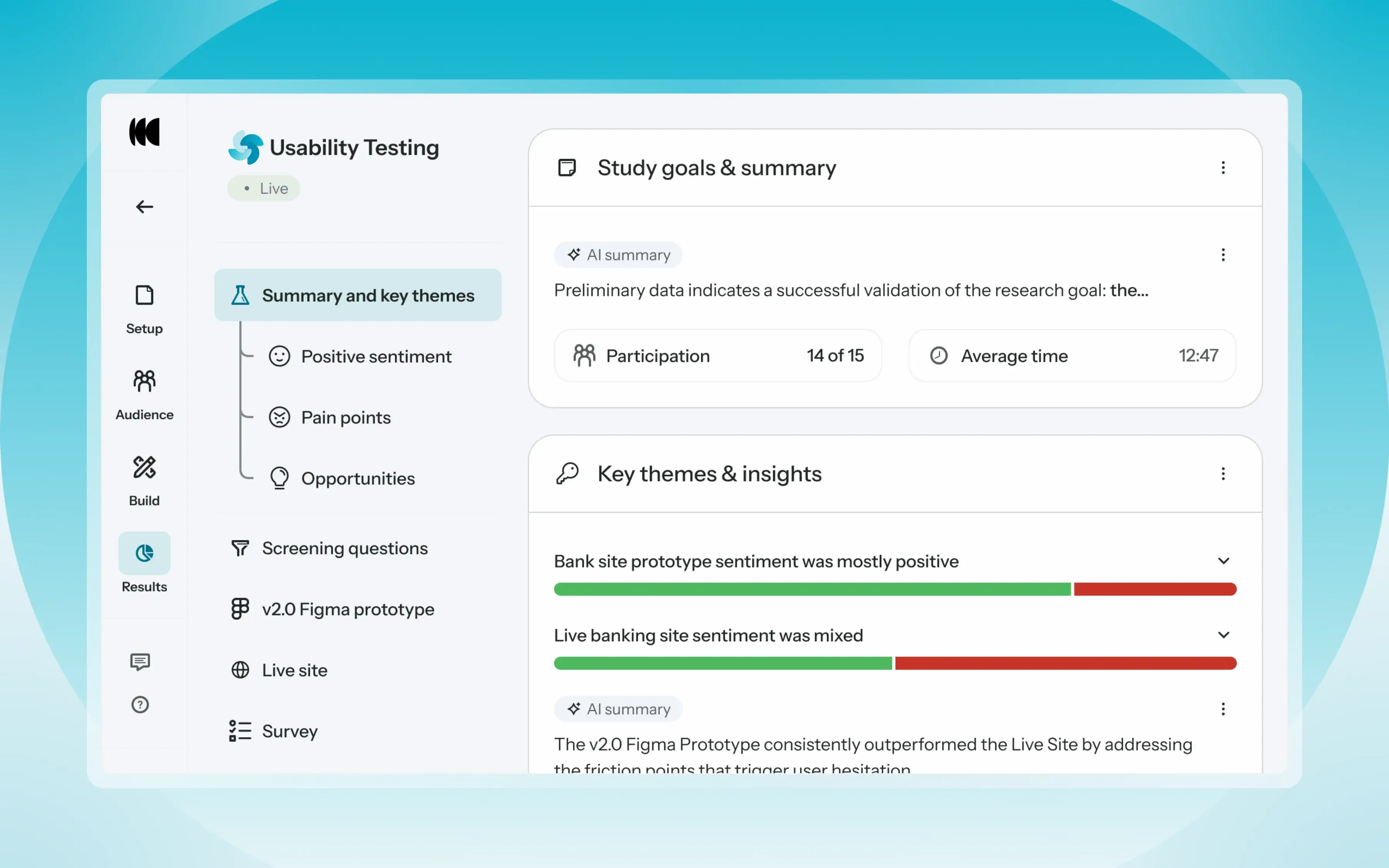
Optimal's new mixed-methods research tool tears down the boundaries between methods. It brings prototype testing, live site testing, and surveys into a single, end-to-end study workflow. And grounded in our product principles: speed to insights, access for all, and communication.
Optimal’s new Usability Testing tool marks the next step in the evolution of Optimal 3.0, giving teams the flexibility to evaluate experiences in whatever form they exist today.
Combine prototype testing, AI prototype testing, live site testing, and surveys in a single study. Test multiple prototypes side by side, compare different live URLs, or mix prototype and live site tasks together all in one workflow. Research can now mirror how products actually evolve, from early concept to shipped experience.
New speak-aloud question types, custom message blocks, auto-generated transcripts and insights, citations and highlight clips help you capture the context and reasoning behind every action. AI-assisted analysis then helps you make sense of it all fast and communicate with impact.
Review a study overview surfacing key themes, pain points, and sentiment analysis combining insights across all your study methods along with detailed results, task analysis and recordings, transcripts, key quotes, and automatically generated citations and video clips.
Coming soon: you can also use AI Chat to chat with your data directly, asking questions and pulling new insights and evidence across all your qualitative and quantitative inputs.
Modern product development is no longer linear. Teams continuously move between:
Traditional usability testing tools were not built for this fluidity. Optimal’s Usability Testing brings the flexibility to match how teams actually work today.
By combining multiple methods into a single study and pairing it with AI-powered synthesis, Usability Testing helps teams reduce setup and analysis time, recruit once, capture richer qualitative context, compare experiences more easily, move faster from feedback to action, and tell clearer, more compelling insight stories.
Learn how to get started with Usability Testing in Optimal and accelerate your path from idea to insight. Book a meeting, start exploring in your account, or join our live training webinar on June 24th to see it in action.
A great user experience (UX) is one of the largest drivers of growth and revenue through user satisfaction. However, when budgets get tight, or there is a squeeze on timelines, user research is one of the first things to go. Often at the cost of user satisfaction.
This short sighted view can mean project managers are preoccupied with achieving milestones and short term goals. And UX teams get stuck researching products they weren’t actually involved with developing. As a result no one has the space and understanding to really develop a product that speaks to users needs, desires and wants. There must be a better way to produce a product that is user-driven. Thankfully there is.
User research is an important part of the product development process. Primarily, user research involves using different research methods to gather information about your end users.
Essentially it aims to create the best possible experience for your users by listening and learning directly from those that already or potentially will use your product. You might conduct interviews to help you understand a particular problem, carry out a tree test to identify bottlenecks or problems in your navigation, or do some usability testing to directly observe your users as they perform different tasks on your website or in your app. Or a combination of these to understand what users really want.
To a project manager and team, this likely sounds fairly familiar, that any project can’t be managed in a silo. Regular check-ins and feedback are essential to making smart decisions. The same with UX research. It can make the whole process quicker and more efficient. By taking a step back, digging into your users’ minds, and gaining a fuller understanding of what they want upfront, it can curtail short-term views and decisions.
Bringing more user research into your development process has major benefits for the team, and the ultimately the quality of that final product. There are three key benefits:
As a project manager, making space and planning for user research can be one of the best ways to ensure the team is creating a product that truly is user-driven.
There are a couple of ways you can bring UX research into your product development process.
It can be more difficult to integrate UX research throughout the process, as it means planning the project with various stages of research built in to check the development of features. But ultimately this approach is likely to turn out the best product. One that has been considered, checked and well thought out through the whole product development process. To help you on the way we have laid out 6 key steps to help you integrate UX research into your product development process.
Take a step back, look at your product and define your research questions.
It may be tempting just to ask, ‘do users like our latest release?’ This however does not get to why or what your users like or don’t like. Try instead:
These questions help to form the basis of specific questions about your product and specific areas of research to explore which in turn help shape the type of research you undertake.
With a few key research questions to focus on, it’s time to create your research plan.
A great research plan covers your project’s goals, scope, timing, and deliverables. It’s essential for keeping yourself organized but also for getting key stakeholder signoff.
Every project plan requires attention to detail including a user research project. And with any good project there are a set of steps to help make sense of it.
Many user research methods benefit from an observational style of testing. Particularly if you are looking into why users undertake a specific task or struggle.
Typically, there are two approaches to testing:
It’s time to gather insights and data. The questions you are asking will influence how you run your research sessions and the methods you’ve chosen.
If you are running surveys you will be asking users through a banner or invitation to fill out your survey. Unmoderated and very specific questions. Gathering qualitative data and analyzing patterns.
If you’re using something qualitative like interviews or heat mapping, you’ll want to implement software and gather as much information as possible.
Analyze your findings, interrogate your data and find those insights that dive into the way your users think. How do they love your product? But how do they also struggle?
Pull together your findings and insights into an easy to understand report. And get socializing. Bring your key stakeholders together and share your findings. Bringing everyone across the findings together can bring everyone on the journey. And for the development process can mean decisions can be user-driven.
Part of any project, UX research should be essential to developing a product that is user-driven. Integrating user research into your development process can be challenging. But with planning and strategy it can be hugely beneficial to saving time and money in the long run.
There are over 5000 certified B Corporations around the world, including new recruit, New Zealand based SaaS company, Optimal Workshop. The ‘B’ in B Corp actually stands for ‘beneficial’, to reflect the founding vision behind the movement: ‘make business a force for good’. B Corp seeks to help companies balance purpose and profit, while also serving stakeholders by building a global community of like-minded organizations. We asked Andrew Mayfield, CEO and Julie Reddish, Head of People and Culture at Optimal Workshop about becoming a B Corp, the journey so far and why it’s so important.
Andrew: I’ve been interested in aligning our reporting with our purpose and values for years, so becoming a B Corp felt like a huge and natural step in this direction. Our ethos of placing people at the heart of decisions extends to the way we treat our own people, not just our customers. So I saw B Corp as a way of enshrining this thinking into the company and making sure these aspects were considered in future decision making.
Julie: One of the things we’ve always cared about is ‘how do we show our real commitment to people, to the environment, to sustainability, to doing ethical good work?’ Finding out B Corp existed as this global initiative, this reputable, recognized way of measuring yourself against other companies was compelling. It was a way for us to metrify or codify ‘the optimal way’ of doing things in a way that does good as a company and does good in the world.
Andrew: Practically it means writing up more policies to ensure the things we do for the good of our people and the planet, which we consider normal are actually written down and therefore, in effect, protected. Our Code of Ethics and Business Conduct, Whistleblower policy, Breast feeding and support policy and Environmental sustainability policy are some that spring to mind.
Julie: Oh my gosh - it’s been a big project. Little did we know how much work it would take to get accredited! It requires six different categories of certification which have, like 50 or 60 questions or areas you can gain points in and you need a minimum of 80 points to get certification. A lot of the questions weren’t really applicable to us so we really had to look closely and think, ‘what is there already that we do inside Optimal that actually equates to saying yes to that question?’ We had an awful lot of thinking to do about which questions to put our time and our money into.
Andrew: There were a lot of things we did that weren’t fully documented, that was the hard part. We didn’t have to change much of our actual behavior to be honest. We have been for years looking at a people-centered approach - our three values are Approachable, Bold and Curious. We had to write things down, make sure they were where people could find them. There wasn’t a lot we had to change to get our entrance score as such. If we want to continually improve each year then we will need to make continual changes for sure, like anyone trying to self improve.
Julie: We thought we were quite close, then there was this massive surge of interest and eight months to even see a consultant, then another six months before the verification process even started.
That’s when the rubber really hit the road. We were working away on different bits of the B Corp certification like there’s one for having an office set up for breastfeeding. Do you have a lockable door? Do you have a place that is private? Does everyone know? Is it communicated? Do you have a policy on breastfeeding? You had to look at each of those things and make sure that you could back it up with evidence. And that might be worth 0.2 points.
Julie: We already had thoughts on what we could do to make our organization great like sourcing local produce and local suppliers but the process of becoming a B Corp really flushed it out for us. Some of the suggestions and categories were things we were already looking at within the bigger picture of being a good employer and being a good contributor to our communities. Going through the assessment helped us identify a whole other layer of things that we could and should be doing.
Beyond measuring female representation, what else could we be doing for diversity? What about our indigenous representation? What could we be doing for people with disabilities? It got us into deeper thinking about what diversity actually means. It’s pretty amazing.
Julie: As an employer it’s reaffirming a commitment to treating people well and human-centered work practices. So the real nuts and bolts come down to individuals thinking how might I get involved with this: If I see something I don’t feel is right I call it out. I can also advocate for what is right.
Andrew: More and more I think people are interested in working for companies that care for more than simply enriching their shareholders, that care about taking care of their team and of their environment and of their impact more broadly, of the change they seek to make on society, knowledge-sharing and all this sort of thing. People are more aware of considering this on choice of where to work, where to stay and just generally where to spend their time. We all have scarce time these days and strong choices to make and it does play into where people choose to work.
Andrew: B Corp certainly takes into consideration who you choose to use as suppliers so it becomes a bit recursive in that way. If our customers value the fact we’re a B Corp then they need to be thinking about choosing suppliers who are also B Corps - so it would gradually happen over time I’d imagine.
Julie: It’s about thoughtful practices. Not just following trends. It’s about what works, not what’s popular.
Julie: I think it's a really cool company to be in. To share our thinking, to share policies and resources with somebody who’s traveled that road before us, with its dragons and potholes, to actually follow in someone’s footsteps, but also make it our own ‘Optimal’ way.
Andrew: Being part of a community of B Corps supporting each other with new ways to manage these obligations we choose to put on ourselves to be better corporate citizens as such is valuable. While there’s no desire to make it hard, sometimes it is hard to make sure you’re doing the right thing. It requires extra research and extra conscientiousness when making decisions so sharing ideas and experiences. Feeling like you’re not the only one who’s been there can help.
Andrew: My understanding is the requirements get harder and that’s a good thing. We can all get better. The biggest areas for us to improve are things like sharing information in decision-making, we’re already pretty transparent but haven’t formalized that so there are things we can do there.
The next checkpoint is in three years and we’re expected to improve plus the requirements get more onerous - so we’d better improve!

Every month we have fun and informative “bite sized” presentations to add some inspiration to your lunch break. These virtual events allow us to partner with amazing speakers, community groups and organizations to share their insights and hot takes on a variety of topics impacting our industry.
Join us at the end of every month for Lunch n' Learn.
Sign up now to stay in the loop.
In this Lunch n' Learn our guest Anh Duong drew on her proud Vietnamese heritage to explore how UX practitioners and advocates can consider non-native English speakers in UX. Ahn shared her personal experiences to show and discuss how empathizing with people who don't have English as their first language in your UX approach can really make a difference. This fun and interactive talk surfaced some really valuable takeaways including how considering a non-native English speaking point of view in your UX can actually improve digital experiences for everyone.
https://www.youtube.com/watch?v=u8nrSW1dvK0
Anh Duong wears multiple hats at Catalyst IT as a Business Analyst, UX consultant and Accessibility Specialist. Practicing in different disciplines has helped her see how accessibility ties into every part of the product life cycle. Anh is passionate about helping others and is always looking beyond the rules and standards of UX or WCAG to find practical ways to create awesome accessible web designs. She has delivered web accessibility training and audits to many clients and actively participates in creating and maintaining a culture of accessibility and inclusive design throughout the company. Anh is proudly made in Vietnam with a healthy obsession of Banh Mi and Ca Phe Sua Da.
Grab your lunch, invite your colleagues and we hope to see you at our next Lunch n' Learn
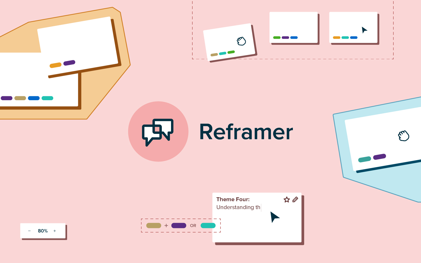
The only tool you need to power your entire qualitative research workflow is here. We’re excited to announce the new and improved Reframer is now live for all customers!
It’s an integral part of any research journey. Think: customer or stakeholder interviews, prototype testing, A/B testing, moderated interviews, and open-ended questions. In a nutshell, it’s anything that isn’t a closed question.
It’s also the most popular research method – 85% of people who do research conduct interviews and usability tests as part of their projects or workflows.

It’s no secret that anyone conducting research is time-poor. Qualitative research is especially time-consuming and messy, as it’s almost always conducted across multiple tools or mediums.
Reframer gives you your time back, and enables you to manage your entire qualitative research workflow within one single tool.
From setting up and conducting interviews, through to analyzing your data – you can uncover those juicy insights in days, not weeks (or months) without ever having to leave the Optimal Workshop app.
Analyzing and making sense of your interview or usability testing data with Reframer is easy and flexible (not to mention very aesthetically pleasing!)
Affinity mapping is a flexible and visual way to quickly group, organize and make sense of qualitative data (i.e. post-its and whiteboards).
With Reframer, affinity mapping is more powerful than ever. Your observations, tags and themes are all connected and stored in one place. It’s easy to search and filter your data, group like observations by proximity, then review and sort them in table format.

The Themes tab offers tag-based analysis with powerful filters. It enables you to explore the relationships between your observations and then create themes based on these relationships. This gives you more quantifiable results to support the qualitative, observation-based analysis that you’ve done in the affinity map.

The chord diagram is a beautifully visual way to easily explore the relationships between your tagged observations and spot key themes.
If you’ve got a lot of tags, it may look a little overwhelming to start with. But don’t let that fool you – it’s easy to get the hang of, and once you do, you’ll wonder how you ever analyzed data without it!

We recommend that you conduct qualitative research as a team, whenever you can. Reframer makes this easy – it was built with collaboration in mind.
On an Optimal Workshop team plan, you can work together from start to finish. Team members can take notes and create or use tags during interview sessions. In the affinity map, you can work collaboratively to group and edit observations in real-time.
If you just need an extra helping hand with taking notes during your interviews or usability tests, you can invite guest notetakers to your sessions. Guest notetakers can take notes in the sessions you invite them to, but can’t see notes taken by others or analyze data.
The guest notetakers feature is a great way to involve your wider team or stakeholders in your user research activities.
Need the raw data from your interviews? Want to share your affinity map visuals with other team members? Both are easily downloadable with the click of a button!

When it comes to conducting qualitative research, Reframer is faster, easier and tidier than using other digital (or manual) tools. It houses all your data and insights in one place and supports the collaborative nature of qualitative research.
It’s not just for seasoned researchers either. We’ve put special focus on ensuring that the analysis is easy to learn for anyone doing qualitative research, regardless of skill level. And our in-app guidance will have you up to speed in no time.
So what are you waiting for? Login now and get started on your Reframer journey!
Many organizations are aware that staying relevant essential for their success. This can mean a lot of things to different organizations. What it often means is coming up with plenty of new, innovative ideas and products to keep pace with the demands and needs of the marketplace. It also means keeping up with the expectations and needs of your users, which often means shorter and shorter product development life cycle times. While maintaining this pace can be daunting, it can also be seen as a strength, tightening up your processes and cutting out unnecessary steps.
A vital part of developing new (or tweaking existing) products is considering the end user first. There really is no point in creating anything new if it isn’t meeting a need or filling a gap in the market. How can you make sure you are hitting the right mark? Ask your users. We look into some of the key user research methods available to help you in your product development process.
If you want to know more about how to fit research into your product development process, take a read here.
User experience (UX) research, or user research as it’s commonly referred to, is an important part of the product development process. Primarily, UX research involves using different research methods to gather qualitative and quantitative data and insights about how your users interact with your product. It is an essential part of developing, building, and launching a product that truly meets the needs, desires, and requirements of your users.
At its simplest, user research is talking to your users and understanding what they want and why. And using this to deliver what they need.
User research is an essential part of the product development process. By asking questions of your users about how your product works and what place it fills in the market, you can create a product that delivers what the market needs to those who need it.
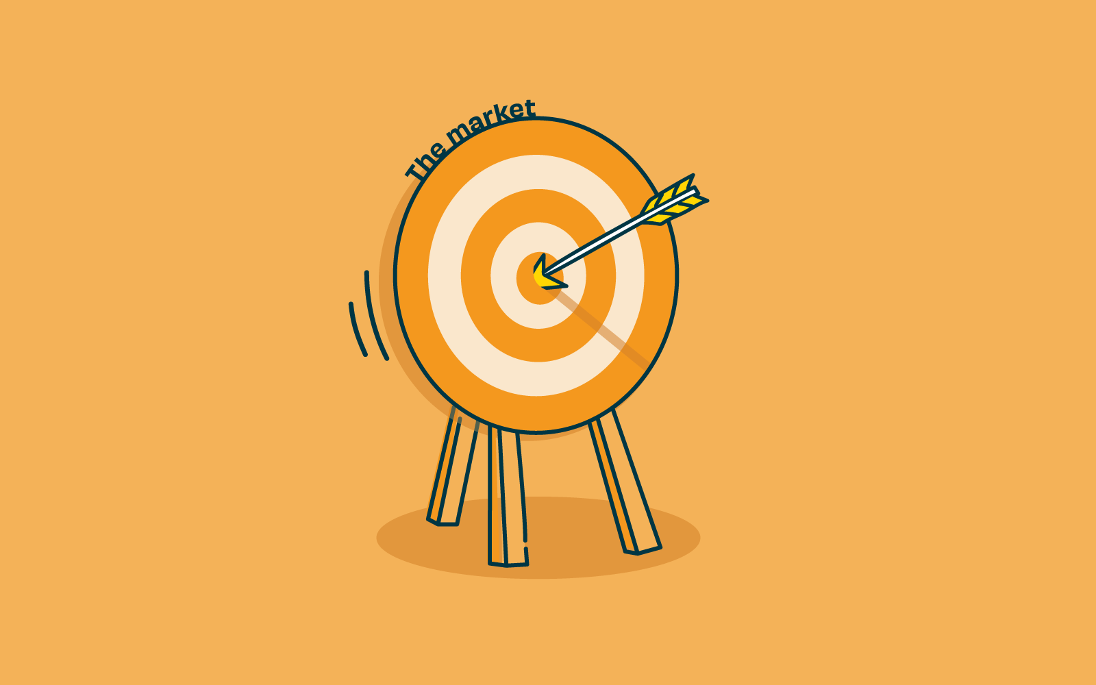
Without user research, you could literally be firing arrows in the dark, or at the very best, working from a very internal organizational view based on assuming that what you believe users need is what they want. With user research, you can collect qualitative and quantitative data that clearly tells you where and what users would like to see and how they would use it.
Investing in user research right at the start of the product development process can save the team and the organization heavy investment in time and money. With detailed data responses, your brand-new product can leapfrog many development hurdles, delivering a final product that users love and want to keep using. Firing arrows to hit a bullseye.
Qualitative research is about exploration. It focuses on discovering things we cannot measure with numbers and typically involves getting to know users directly through interviews or observation.
One of the best ways to learn about your users and how they interact with your new product is to observe them in their own environment. Watch how they accomplish tasks, the order they do things, what frustrates them, and what makes the task easier and/or more enjoyable for your subject. The data can be collated to inform the usability of your product, improving intuitive design and what resonates with your users.
Reviewing products already on the market can be a great start to the product development process. Why are your competitors’ products successful? And how well do they behave for users? Learn from their successes, and even better, build on where they may not be performing as well and find where your product fills the gap in the market.
Quantitative research is about measurement. It focuses on gathering data and then turning this data into usable statistics.
Surveys are a popular user research method for gathering information from a wide range of people. In most cases, a survey will feature a set of questions designed to assess someone’s thoughts on a particular aspect of your new product. They’re useful for getting feedback or understanding attitudes, and you can use the learnings from your survey of a subset of users to draw conclusions about a larger population of users.
Gathering information on your users during the product development process and before you invest time and money can be hugely beneficial to the entire process. Collating robust data and insights to guide the new product development and respond directly to user needs, and filling that all-important niche. Undertaking user experience research shouldn’t stop at product development but throughout each and every step of your product life cycle. If you want to find out more about UX research throughout the life cycle of your product, take a read of our article UX research for each product phase.
In-person moderated user testing is a valuable part of any research project. Meaning you can see first-hand how your users interact with your prototypes and products. But in-person isn’t always a viable option. What to do if your project needs user testing but it’s just not possible to get in front of your users personally?
Let’s talk unmoderated user testing. This approach sidesteps the need to meet your participants face-to-face as it’s done entirely remotely, over the internet. By it’s very nature there are also considerable benefits to unmoderated user testing.
In the most basic sense, unmoderated user testing removes the ‘moderated’ part of the equation. Instead of having a facilitator guide participants through the test, participants complete the testing activity by themselves and in their own time. For the most part, everything else stays the same.
The key differences are:
Is unmoderated user testing right for your research project?
By nature, unmoderated user research does not include any direct interaction between the researcher and the study participants. This is really the biggest benefit and also the biggest drawback.
If you’d like to know more about the benefits of unmoderated usability testing, take a look at our article five reasons you should consider unmoderated user testing.
Because of these limitations unmoderated usability testing usually works best for evaluating live websites and apps or highly functional prototypes. It’s great for testing activities that don’t require a lot of imagination or emotion from participants. Such as testing functionality or answering direct queries to do with your product.
With any usability testing, it pays to define your goals before getting underway with setting up the software. What do you want to know from the participants? Goals vary from test to test. Understanding your goals upfront will help you to make the correct tool choice.
With a clear understanding of your goal, now it’s time to consider which participants are right for your study. Think about who they are, their demographic, and where they live. Are they new users or existing? Are they experts or novices?
As unmoderated studies, are done remotely, the software used to faciliate the study plays a key role in ensuring you get useful results. Without a facilitator, the software must guide the participants through the session and record what happens. Take the time to test software and select one that is right for your study.
Think through your goals and what you want to achieve from the testing. Many of the unmoderated testing services include study templates with generic example tasks. Remember they are templates, and your tasks and questions should be specific to your particular study. Any task instructions guiding the participants should be clear and directive.
You’ve done all of the upfront work, now it’s time to test that it works, the software does what you expect and the instructions you have written can be followed. Doing a test run is crucial, especially with unmoderated usability testing, as there won’t be a facilitator in the testing to fix any problems.
Having defined your target audience and demographic, now is the time to recruit participants. Ensuring you have some control over the recruitment process is important, either through screening questions or recruiting your own. There are services that recruit from a pool of willing participants. Thiscan be a great way to get a wide range of users.
You are likely to accumulate a lot of data from your unmoderated testing. You’ll need a way to organize and analyze the data to derive insights that are valuable. Depending on the type of usability testing you do will vary the type of results. Quantitative testing gives data-driven results and direct answers. Whereas qualitative testing through audio or video recordings of participants’ actions or comments will need time to analyze and look at behavioral observations.
Unmoderated usability testing can be a good option for your study. It may not be right for all of your studies all of the time. While it can be quick to implement and often cheaper than moderated usability testing, it still requires time and planning to ensure you get the data insights you are looking for. Following a checklist can be a great way to ensure you approach your research methodically.
