Subscribe to OW blog for an instantly better inbox
Oops! Something went wrong while submitting the form.
Articles and Podcasts on Customer Service, AI and Automation, Product, and more
The pace of product development has never been faster, and the cost of building on assumptions has never been higher. At Optimal, we've spent nearly two decades helping teams get closer to their users, and what we're seeing right now is a fundamental shift in how research gets done. More teams are running research than ever before and timelines to act on findings are tighter, while the expectations for what research needs to deliver keep rising.
That shift is exactly what's driving Optimal 3.0, our most ambitious reinvention of the platform yet, designed to give every team the speed, depth, and flexibility that modern research demands. Today's release is the next step in that journey.
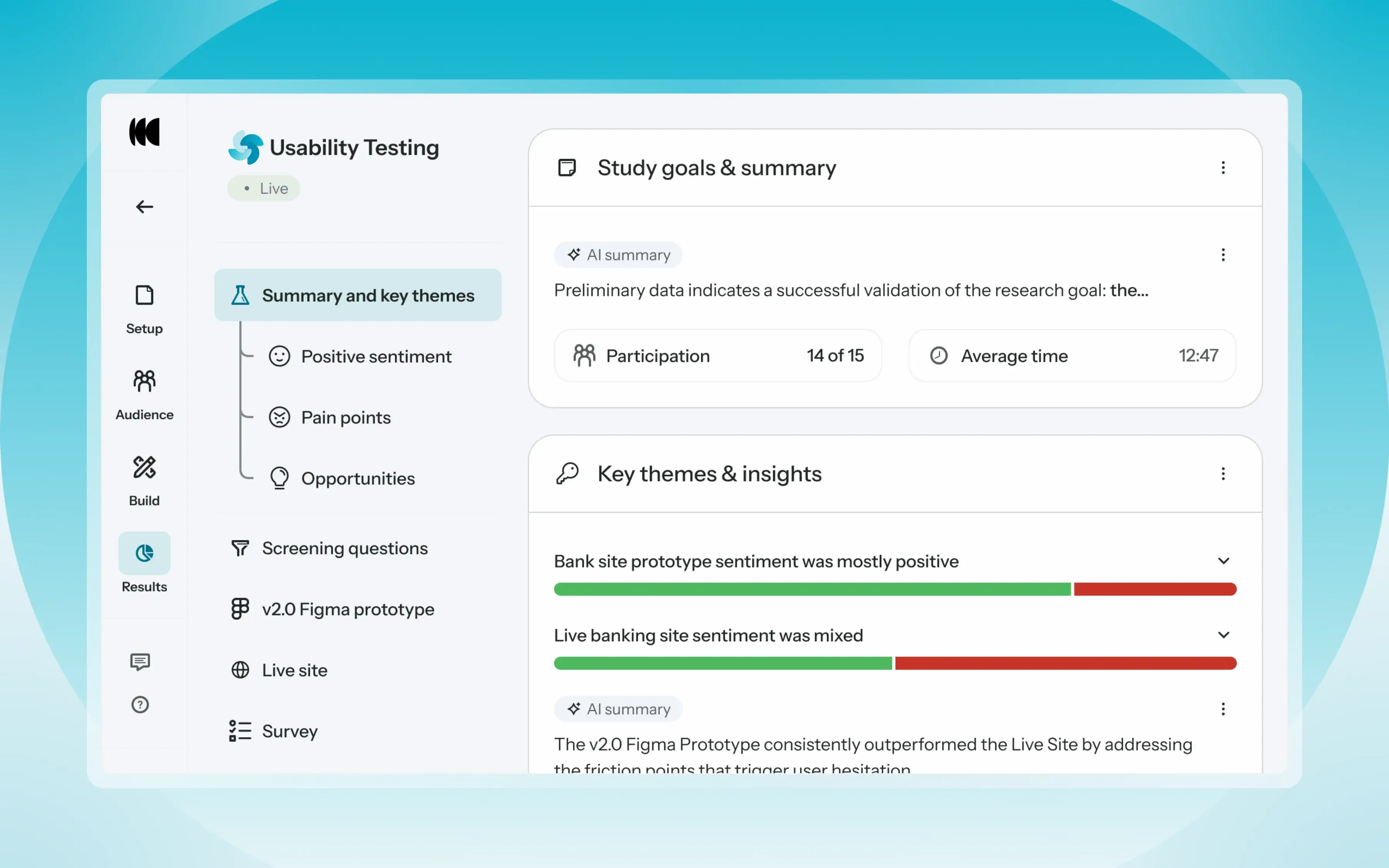
Optimal's new mixed-methods research tool tears down the boundaries between methods. It brings prototype testing, live site testing, and surveys into a single, end-to-end study workflow. And grounded in our product principles: speed to insights, access for all, and communication.
Optimal’s new Usability Testing tool marks the next step in the evolution of Optimal 3.0, giving teams the flexibility to evaluate experiences in whatever form they exist today.
Combine prototype testing, AI prototype testing, live site testing, and surveys in a single study. Test multiple prototypes side by side, compare different live URLs, or mix prototype and live site tasks together all in one workflow. Research can now mirror how products actually evolve, from early concept to shipped experience.
New speak-aloud question types, custom message blocks, auto-generated transcripts and insights, citations and highlight clips help you capture the context and reasoning behind every action. AI-assisted analysis then helps you make sense of it all fast and communicate with impact.
Review a study overview surfacing key themes, pain points, and sentiment analysis combining insights across all your study methods along with detailed results, task analysis and recordings, transcripts, key quotes, and automatically generated citations and video clips.
Coming soon: you can also use AI Chat to chat with your data directly, asking questions and pulling new insights and evidence across all your qualitative and quantitative inputs.
Modern product development is no longer linear. Teams continuously move between:
Traditional usability testing tools were not built for this fluidity. Optimal’s Usability Testing brings the flexibility to match how teams actually work today.
By combining multiple methods into a single study and pairing it with AI-powered synthesis, Usability Testing helps teams reduce setup and analysis time, recruit once, capture richer qualitative context, compare experiences more easily, move faster from feedback to action, and tell clearer, more compelling insight stories.
Learn how to get started with Usability Testing in Optimal and accelerate your path from idea to insight. Book a meeting, start exploring in your account, or join our live training webinar on June 24th to see it in action.
.webp)
Nearly 18 years ago, Optimal helped define what UX research could be, pioneering practices and tools that would become industry standard and change how teams worldwide better understand their users. As the industry has evolved, so has Optimal, expanding the platform, advancing participant recruitment, and building Optimal Intelligence AI to accelerate insight to action.
Now, we’re at the edge of another major shift. With the launch of the Model Context Protocol (MCP), we’re entering a new realm, moving from traditional research workflows to AI-powered intelligence.
Research data is one of the most valuable assets in any organization, but until now, it has been scattered across studies and reports, time-consuming to search and synthesize, and different to search or reuse. MCP now changes that for research teams.
Model Context Protocol (MCP) enables you to connect your Optimal research directly to AI tools, like ChatGPT, Claude, or Cursor, to explore and analyze your data seamlessly. Insights can go beyond data downloads, dashboards, or static reports. Access your insights and explore further with natural conversation.
Get instant insights for questions like:
With MCP-connected tools, you can:
The evolution is clear.
We started by helping teams understand users through early UX research methods.
We helped formalize how research is conducted, analyzed, and shared.
And now, with MCP in Optimal, we’re helping teams move beyond analysis altogether toward conversational, AI-driven research intelligence.
Log in to Optimal, connect with your AI tools, and get the most value from your research or book a demo to start building your research repository with Optimal.

We recently hosted a live webinar introducing Optimal's new Usability Testing tool, a powerful solution that brings multiple research methods together in a single study, helping you get better insights, faster.
Looking for the highlights? We've rounded up answers to the most common questions from the session.
Optimal's new Usability Testing tool is a mixed-methods research tool that brings Prototype Testing, Live Site Testing, and Surveys into a single, end-to-end study workflow. Instead of treating each method as its own initiative, you can combine them inside a single study to allow participants to move naturally between tasks, experiences, and questions.
With this tool, you can compare multiple prototypes side by side, benchmark a current live experience against a redesigned concept, evaluate a competitor's experience, and more. And researchers get everything analyzed in one place with AI-powered summaries, task results, video clips, and evidence-backed insights surfaced automatically.
Yes, participants can complete Usability Testing studies on mobile devices using their mobile browser or the Optimal Participant App. If screen recording is required, participants are prompted to download the Optimal Participant App, available for both iOS and Android.
You can keep it simple and run a single survey, a standalone prototype test, or a live site session on its own. Or, mix methods or run multiple of the same method, such as multiple prototypes or live website tests in one study. The tool supports however your study needs to be shaped.
Usability Testing currently supports over 30 languages enabling what participants see and guiding how AI models interpret responses, generate summaries, identify themes, and surface insights. Today, studies are configured around a single language, so participants are expected to respond in the chosen language. That said, multilingual study support is something we're exploring for our roadmap.
Just once. From the participant's perspective, this looks and feels like a single study regardless of how many methods are included. They move through the experience naturally from start to finish.
Section-level randomization shuffles the order of any sections, while question-level randomization works within a specific section, shuffling the order of tasks and follow-up questions. Both are supported, giving researchers the flexibility to reduce order bias, particularly useful when comparing multiple experiences.
Yes, with no limitations on the number of prototypes you can link to a single study so you can add multiple Figma prototype sections and connect a different prototype to each one.
Given that Usability Testing studies can grow complex, the ability to reorder things quickly was a priority. You can reorder individual tasks and questions within a section, and sections themselves by dragging them in the Build panel.
Scaling research isn't just about running more studies, it's about helping more people across the business access insights, understand them, and use them to make decisions. With Usability Testing, product managers, designers, and stakeholders can quickly understand what happened and why without having to see hours of recording through the automatically generated highlight reels, key quotes, and transcripts.
If you want to experience the full walkthrough, demo, and Q&A, watch the recording to see Usability Testing in action and pick up tips and best practices straight from the session.
👉 Watch the full webinar here.
%2520(1).webp)
Coordinating user interviews shouldn’t feel like a full-time job. Between juggling calendars, chasing confirmations, and sending reminders, scheduling can be the hidden bottleneck in research velocity and quietly consume the time you actually want to spend talking to customers.
If you want to run more interviews and generate insights more consistently, simplifying your scheduling process is one of best ways to remove friction and streamline your workflow.
What does a simpler workflow look like?
With a tool like Optimal’s Interviews Scheduler, you can:
It’s everything you need to manage interviews without the chaos.
With the Interviews Scheduler, you can sync your availability with Google Calendar and Microsoft Outlook in real time. Connect your own calendar or your team’s to ensure every busy slot is accounted for. Avoid double bookings, block out busy times, and keep everything in one place.
Once set up, your availability automatically updates, and participants can book directly into open slots, eliminating the back-and-forth. Plus, depending on your preferences, your sessions will either sync directly to your calendar or come through as an .ics file in the confirmation email, saving you one more step.
The Interviews Scheduler integrates directly with Zoom, Microsoft Teams, and Google Meet.
When someone books a session:
No copying links. No switching between tools.
The Interviews Scheduler isn’t just about booking time slots. It’s about removing friction from your research workflow.
With integrations at its core, you can:
Whether you’re running one-off interviews or managing weekly research sprints, the Interviews Scheduler helps you move faster and stay organised.
Ready to give it a try? Log in to your Optimal account and get started or book a demo to learn more.

So, you’re ready to run a study. It’s designed, you’ve planned your questions, your methodology is sound. Your discussion guide is carefully crafted to avoid leading questions and dig into real user motivations…then you start recruiting participants.
Suddenly, you’ve hit a massive bottleneck. Your perfect study depends entirely on finding the right people, getting them to show up, and hoping they provide thoughtful responses rather than one-word answers and distracted multitasking. You’ve now hit the crunch point that every researcher faces: your insights are only as good as your participants. What happens when participant quality isn’t great?
Let's be honest about what typically happens with recruitment. You need a minimum number of participants to get statistically significant results (depending on study type). You’ve got a time limit in which you need to get results so they’re still relevant to your product development lifecycle. You start reaching out through your usual channels: customer lists, screening surveys, panel providers, social media posts, begging colleagues to connect you with people who fit your criteria.
After a week of this, you've got a few confirmed participants, but not enough. Some people have expressed interest but haven't confirmed times and it’s teeming more and more like your study is going to launch late, and you’re going to miss product deadlines.
So you make compromises.
You accept the participant who sort of fits your criteria but isn't quite in the target demographic. You take the person who can only do a 30-minute session instead of the planned 60 minutes. You keep the flaky participant who's rescheduled twice because you need the numbers.
Then the sessions happen.
One person no-shows. Another is clearly distracted, giving minimal responses while probably checking email. A third seems to have misunderstood the screening criteria entirely and doesn't actually use the type of product you're researching. The two good participants provide valuable insights, but now you're making conclusions based on a sample size of two.
This isn't research. This is educated guessing with extra steps.
When you're under pressure to deliver research quickly, it's tempting to view participants as interchangeable. You need 8 people. Any 8 people who vaguely fit the criteria will do. But that’s not actually the case at all. The whole point of user research is to understand your specific users. Their context, their mental models, their workflows, their pain points. Generic "users" don't exist. There are only specific people with specific needs trying to accomplish specific things. If the participants in your study don't actually represent your target users, you're not doing research. You're doing work that looks like research but doesn't provide real insights. When we say quality participants we mean:
Many teams rely on user research panels, databases of people willing to participate in studies for compensation, which are often limited by the platform that they’ve purchased to one, proprietary panel for their research. Panels solve the recruitment problem by providing quick access to participants. But panels come with significant limitations.
When you're locked into a single panel provider, you're stuck with whatever quality standards they maintain.
The alternative to depending on a single panel is having access to multiple sources for participants. This means you're not limited by one panel's database. When you need specific, hard-to-reach audiences, you can access specialized panels that focus on those groups. When you need B2B professionals, you use networks that focus on business users. When you need consumers with specific characteristics, you access consumer panels with better targeting. The ecosystem model provides flexibility, better matching, and higher quality because you're not forcing every recruitment need through the same funnel. By the way, this is the way Optimal has intentionally chosen to offer participant recruitment via our platform for our customers (a panel ecosystem approach).
Imagine recruitment takes two days instead of two weeks. Imagine you can specify exactly the targeting you need and trust you'll get quality participants who match. How does your research change?
Poor participant quality isn't a minor annoyance. It's the difference between research that drives confident decisions and research that creates false confidence in bad decisions. Quality in, quality out isn't just a principle. It's the foundation that determines whether your research is worth doing at all.
The recruitment bottleneck is real. But it's solvable. Teams that solve it don't just do more research. They do research that's actually worth acting on.

User interviews have always been one of the most trusted and powerful UX research methods. They give you something beyond dashboards or written surveys: real, in-depth conversations and context.
But they’ve historically come with a cost – time, coordination, and a heavy lift to review recordings and turn videos into insights. Sometimes insights get buried. Recordings sit unused and research becomes challenging to revisit.
In our recent webinar, we explored how that’s changing and how you can reduce the heavy lift of interview review, while building a research repository.
A research repository is a centralized system for storing, analyzing, and reusing research data, especially qualitative data like user interviews. It helps teams answer questions like what users said, what patterns emerged, and how past research can inform future decisions.
For interviews, this means:
Optimal Interviews brings this to life by automatically capturing recordings, generating transcripts, structuring insights from the start, and making everything searchable so teams can easily revisit, build on, and continuously learn from their research.
So what did we learn? Here are some key takeaways from this webinar, plus answers to the most common questions we heard.
Running interviews isn’t just about talking to users. It’s everything before and after:
That overhead adds up quickly. There’s opportunity in automating these workflows and removing the friction around them. Optimal Interviews solves this by:
Research isn’t slowing down. Product cycles are getting faster, and teams expect insights just as quickly.
What stood out most:
One team told us that a few years ago it took them three weeks to analyze user interviews for an initiative. When they replicated the same study in Optimal Interviews, they were able to generate usable insights in about five minutes.
That shift from lagging insight to near real-time understanding is where the real impact lies.
Interview scheduling sounds simple, but it’s often where things break down.
You can use Optimal Interviews to ensure:
When done right, scheduling fades into the background so teams can focus on conversations, not coordination.
AI is already proving its value in the analysis phase:
But one point came through clearly: AI accelerates analysis but it doesn’t replace human judgment and sensitivity.
Researchers still play a critical role in validating insights, interpreting nuance, and deciding what matters for the business. Think of AI as getting you to 80% faster, while you own the final 20%.
Here’s what you can achieve with Optimal Interviews:
This turns research from static storage into something dynamic, something you can continuously mine and build on.
Both. You can extract insights from individual interviews, but the real value often comes from patterns across multiple sessions. Aggregation helps surface stronger, more reliable themes, while still preserving standout moments from single participants.
Privacy is a core focus and consideration with Optimal Interviews. Some of the key protections include automatic redaction of personally identifiable information (PII) and enterprise-grade AI infrastructure with strict data isolation. We're also looking to expand Optimal Interviews anonymized scheduling and communication and manual redaction controls before analysis.
Integrations are available for Google Meet, Microsoft Teams, and Zoom.
You can still run everything without integrations:
Integrations are helpful but not required.
Today, teams often bring relevant interviews into one project for analysis. Looking ahead, the goal is broader. Optimal’s looking into how the platform can search and query across all research, use AI chat to explore insights across studies, and surface insights at a Workspace level.
Yes. You can search transcripts directly and use AI-powered chat to explore themes, generate summaries, or even turn findings into shareable outputs like Slack posts or reports.
Interviews aren’t new. But the way we run them and what we can get out of them is changing fast.
By removing operational overhead and reducing time to insight, teams can talk to users more often, share insights faster, and build a research repository that becomes part of everyday product decision-making.
If you want to experience the full walkthrough, demo, and Q&A from the session, we encourage you to watch the full webinar.
👉 You can watch the full training webinar here.

We spent Research Week in San Francisco listening, taking notes, and talking with the UX and market researchers, research managers, human factors engineers, research operations program managers, and product designers who gathered coast to coast. Sessions covered Advanced Market Research, Growth UXR, Great Research, AI and UXR, Up Up and Away!, and Moonshot Research.
The gap in research most teams face right now is translation. Every function hears research differently. Each has a completely different "so what," as Apurva Luty puts it, so you need to respond and hear different ways, hearing data science in questions, design in critique, marketing in frameworks, engineering in constraints, and leadership in confidence. No one wants to hear: "we need to do more research”, but when you feel rushed for insights, you can always ask upfront if it’s a quick directional and recognize when you need more time for a comprehensive answer.
Building that bridge doesn’t mean you’re a gatekeeper. Rachel Ousley has seen democratizing access to data play out through more conversations and approaches with better questions. Map your stakeholders' "so what" and foster an open line of communication because you are working towards the same goal in the end.
Influence isn't a moment, it's a structure. Jess Holbrook breaks down direct influence versus indirect influence where direct influence is the central mechanism you present to senior leadership, and indirect influence is about setting the stage. Get ahead of it: know what your organization needs to understand in three months, six months, nine months, and how do we set ourselves up now to do that?
Build a culture of influence by giving credit loudly and often, saying people's names in the room by sharing wins and shoutouts. At Optimal, we do this through a celebrations Slack channel and quarterly value awards with open nominations through the company. Bring stakeholders, even ones you might not see eye-to-eye with upfront, into conversations where their perspective is genuinely valued, and anticipate what your team needs.
The value of research is clear: to build better experiences, you must listen to the people who are using the product, service, the thing you’re making, and are affected by it. It is in discovery where you, well, discover what users actually want. As Andrew Chamberlain says, those hack projects and rapid prototypes can scale and become new products, and beyond that, research is how you elevate your brand and get invited into new spaces.
In discovery, know when to screen for behavior and when to screen for demographics. Maybe you’re looking at how people us mobile devices in homes, where one phone does not necessarily mean one owner or one user and in this case, your questions need to be framed openly and intuitively to get insight into your users’ mental models and actions, often different from your own, with people assigning different meanings to the same words. Nicole Naurath uses the example of asking “Do you share a device?” instead of, “How does someone else access this device?” to capture richer, more accurate insights into actual behavior.
Research reporting is socialization. Your decks don't have to change, but the artifacts around it do. A compelling clip, a sharp stat, a well-chosen verbatim – nothing hits like it. Nicole Zeng explains UX research as the thing that silences rooms, changes minds, and redirects roadmaps.
Format your findings and discussion for the spaces people already work. Lauren Lin describes sharing insights as stackable and shareable clips on Slack as well as data cards that are downloadable as Figma components.
AI is enabling large-scale data processing that used to take months, which means you can spend less time in the weeds and more time on the work that moves the needle – the judgment, translation, organizational, goal setting, and influence-building work. AI can handle the volume and scale of your data. However, everyone has a different comfort level with new tools. Nicole Zeng uses the analogy of a lake: maybe you’re diving in headfirst, maybe you’re watching from the shore, or maybe you’re paddling through the waves.
Break your workflow and explore novel ways of leveraging AI in UX research, then share out your findings and flows, because that's how we make progress as teams, get deeper customer insights, and ultimately make better decisions. It's why we're constantly evolving Optimal, and Optimal 3.0 is built for exactly this: helping product teams discover, validate, and continuously optimize user experiences that drive real business results.
We're in an exciting time and it's moments like this when our industry comes together that we never forget. Stay connected with us on LinkedIn to get the latest updates on our upcoming events!
