Subscribe to OW blog for an instantly better inbox
Oops! Something went wrong while submitting the form.
Articles and Podcasts on Customer Service, AI and Automation, Product, and more

In our Value of UX Research report, nearly 70% of participants identified analysis and synthesis as the area where AI could make the biggest impact.
At Optimal, we're all about cutting the busywork so you can spend more time on meaningful insights and action. That’s why we’ve built automated Insights, powered by AI, to instantly surface key themes from your survey responses.
No extra tools. No manual review. Just faster insights to help you make quicker, data-backed decisions.
Automated Insights are just one part of our ever-growing AI toolkit at Optimal. We're making it easier (and faster) to go from raw data to real impact, such as our AI Simplify tool to help you write better survey questions, effortlessly. Our AI assistant suggests clearer, more effective wording to help you engage participants and get higher-quality data.
Ready to level up your UX research? Log into your account to get started with these newest capabilities or sign up for a free trial to experience them for yourselves.

Today we’re launching a new look for Optimal Workshop. While it’s a new direction for us visually, there’s also a little more to this story than meets the eye. This new identity represents a total rethink about how we present ourselves to the world, from our tools like OptimalSort and Reframer to way we present updates just like this one.
This brand update was a 7-month effort from concept through to execution, involving talents from both inside and outside the walls of our Wellington Office. Here, we’ll share a little about what made us decide to make this change and where you’re going to see the biggest changes.
So, without further adieu…
Here’s a quick round-up of some of the changes you can expect to see around the place – from the big things like our company logo right through to the smaller tweaks we’ve applied across the website.
When you log back into your account, you’ll find that everything works exactly the way that it did before – we’ve just applied a fresh coat of paint. Of course, if you do happen to come across any bugs or quirks, get in touch with our support team by clicking the little blue chat icon in the bottom right corner of the screen.
The most noticeable change is front and center with our logo. We’ve evolved it to outline what’s important. Now, we like to think that you can interpret it in a few different ways:
We’ve also designed our new logo to be quite flexible. We’re able to swap out the colors as well as the “O” to celebrate special occasions, people and events:
We’ve also refreshed our color palette. We still love green and blue, but we’ve introduced yellow as well as a few other options. Here are the highlights (no pun intended):Our new brand color is yellow. The color of Post-it notes, smiley face emojis and bright ideas. We hope it represents things like warmth, approachability, insight, discovery and enlightenment.
Our new colour palette ranges from yellow through to green and blue. We use tints of yellow to allow flexibility and accessibility when designing, while the dark navy is versatile and reliable. We place an emphasis on whites and grey tints for freshness and lightness.
We also use accent colors to add more variety and life. We’ll let you find these on your own as you experience the new palette on our website.

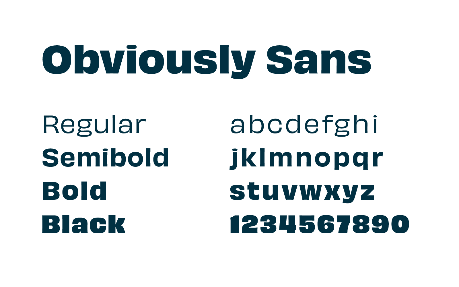
One of the biggest improvements we’ve made to the accessibility of the website comes in the form of our new typeface. Obviously Sans is our new heading typeface – it has a “steady” style, but it’s also quite interesting structurally.
You’ll see Obviously Sans throughout the website, app and blog. It’ll also make its way into our emails and other comms too!
The act of highlighting something is universally understood. We all use highlighters and we all know what it means when we highlight something. Highlighting to find patterns is what research is all about.
We often highlight to:
Here’s what the highlighting looks like in practice:

Wrap-up
So, that’s our brand refresh. We’re still the same Optimal Workshop, just with a new look that better represents who we are and what we do.
We’re trying to become an ever-more important part of the work that user experience professionals carry out every day. Whether that means hosting user interviews, validating their ideas, testing and probing their information architectures or running surveys, we want to be a part of it.
We believe in better experiences for all and putting people at the heart of decisions. The team at Optimal Workshop genuinely enjoy working together to build something that will leave the world in a better state than we found it.
Join us on the journey – there’s more to come.
Every day, people around the world use our research tools to craft better experiences for their users. Whether it’s a website for a new public library, an app for a self-driving car startup or even the layout of a physical retail store, our tools give researchers and designers everything they need to ensure the way people work, think and act are at the heart of every design decision.
We talk about our tools on a fairly regular basis (after all, we are quite proud of them), but this time we’re going to do something a little different. Here, we’re going to show you 17 creative ways to use OptimalSort, Treejack, Chalkmark, Reframer and Questions. Hopefully, we’ll inspire you to head off and start doing some more testing of your own. Let’s get started!
Tree testing is one of the best methods to assess the strength of your navigation structure, and Treejack is the best tool to execute this method. You can easily set up more than one Treejack study to run at the same time, allowing you to A/B test different navigation structures and pick a winner.
Ever struggle to get consensus from your team on a new logo or design? Use OptimalSort to solve the problem! Create a closed image sort with categories set up so your team can sort designs based on their preferences. You can then look at the results and determine the best path forward.
Reframer is a powerful qualitative research tool, and most of what makes it so useful for usability tests and user interviews also makes it a great tool for taking notes at conferences. Once you’ve taken all of your notes, you can use tags to mark up different insights and then share the results with your coworkers.
Card sorting is a great way to work out if you have any redundant content on your landing pages. Let’s use the example of simplifying your homepage. You can ask participants to sort cards (containing homepage links) based on how often they use them. You could then compare this data with analytics from your homepage and see if people’s actual behavior and perception are well aligned.
Determine if your icons are helping your users by testing whether they understand their purpose. Upload icons that you’re currently using (or even plan to use) to Chalkmark, and ask your participants to identify their meaning by using the post-task questions feature.
Card sorting isn’t just a technique for the digital realm. Run an open card sort with OptimalSort to figure out where items in a retail store should be grouped. If we use the example of a supermarket, the cards would be different food items and the ‘aisles’ would be the categories.
You can use Questions as a scheduling tool by setting up a survey designed to ask people which times they’re available to come in for usability testing sessions. You can send out one link to every participant and view the results in a single location. Easy!
Did you know you can use our integrated recruitment panel to remotely research participants from all around the world? This is a great way to see how different languages, countries, cultures and backgrounds interact with your website.
Chalkmark’s heatmap feature is an excellent way to get first impressions on your designs. You can see where your users clicked so you can get insights into what’s working (or not working) with your designs. It’s also fast, so it’s easy to iterate.
Empathy tests are a great way to find out whether your website, app or design is creating the right feelings with your users. Set up a closed card sort with a list of the words which could represent your design, then set up categories based on relevance. Show people your design and then ask them to sort the words into the categories which best match the experience.
The number of people using smartphones to browse websites continues to grow, making the UX of mobile websites key. Use Treejack to test the mobile IA of your website so you can work out if people are getting stuck.
Use first-click testing to find out if a text link or an icon is the best choice for navigating back to the homepage of your website. A quick test in Chalkmark will improve your website and save you design work down the line!
Ever heard of multivariate testing? It’s not too complicated. Basically, you just compare more than two versions of your studies to understand which version performs better with your audience. You can run this type of testing with Chalkmark and Treejack to determine the right design to iterate on.
Yep, you heard us. Running a card sort asking people which toppings are good for pizza and which ones aren’t is a great way to introduce people to the benefits of the card sorting method. Plus, it’s always fun to show off the results on a Friday afternoon in the office.
Search engine optimization (SEO) is an important part of any modern website, with an SEO-tuned website much more likely to show up in search results. There are many factors that go into SEO, but one of the most important is a website’s navigation. Use Treejack to improve how people navigate through your website and you’ll likely see your search engine ranking improve.
Login to your Optimal Workshop account on your laptop and get out into the field with Reframer! When you’re out conducting usability tests or user interviews with people away from your office, having Reframer makes it much easier to collect all of the necessary data. Once you’re back, use Reframer’s analysis features to make sense of your findings.
How are you supposed to test your paper prototypes when your users are spread all around the world? Well, you can simply take a photo of your prototype and use Chalkmark to remote test it with your users. Easy.
So that’s our list of 17 creative ways to use our tools. Have you got any of your own? If you do, don’t hesitate to click the little Intercom chat bubble in the corner of your screen and let us know! We always love to hear from you.
If you haven’t yet had the chance to play around with our 5 tools, you can try them for free - forever - by signing up here (no credit card required). Don’t just take our word for it, either. Check out these case studies from Xero and Intercom to learn about how 2 organizations managed to significantly improve different areas of their businesses.
Information architecture (IA) isn’t the easiest space for a newcomer. The myriad terms and technologies can often be quite tricky to understand on their own – not to mention how they all fit together.
We wanted to help, so we’ve put together a comprehensive cheat sheet/glossary that you can use whenever the topic of IA comes up.
Information architecture is the structure used to organize and label content on websites, mobile applications and other digital environments. At a very basic level, IA determines the paths people take to get to the content they’re looking for and where they might get lost.
IA isn’t actually one “thing”, but a number of different elements:
It’s also the layer upon which you build the design. This means that for your users, they’ll never likely see the IA – but they will feel the effects of the decisions you make when designing it. Your IA should help people find what they’re looking for, regardless of where the IA exists. It’s as important for desktop users as it is for mobile.
The term ‘experience architecture’ refers to a wider set of practices or terms that includes information architecture. Experience architecture covers IA, interaction design and experience design. It’s similar to how user experience (UX) is just one element under the wider customer experience (CX) umbrella.
Note that just as the field of information architecture has information architects, experience architecture has experience architects; people responsible for planning and executing experience architecture deliverables. Typically, the experience architecture role is quite varied in that it requires expertise in user-centered design, human behavior and interaction design.
A user journey is basically what it sounds like – the experiences someone has when they interact with something. It’s also most commonly used to describe these experiences and interactions in a software context.
User journeys describe the steps users take to complete a task when interacting with a website or other digital service. For example, for a photo storage app, the user journey may look something like this:
Typically, you’d create a user journey in the discovery phase of a project, as you can use this tool to visualize what the users need and to influence wireframe and information architecture development.
Depending on your needs, your user journey may be quite a bit more detailed, with overarching categories ‘before’, ‘during’ and ‘after’ to show where the user is with regards to using the product. You can also add in ideal emotions at each stage.

Chances are if you’re using a website or mobile app, it was a wireframe at some point in the past. Wireframing is essentially a way to design digital applications at a structural level, a way to map out broadly where different elements like content and functionality sit before adding in visual design.
Wireframing is to websites, apps and other digital applications what the rough first sketch of a building is to a finished skyscraper. It’s foundational, yet entirely important to nail down broad strokes ideas before investing more heavily in design.
Why might you produce a wireframe? In addition to using it as a way to prototype ideas prior to the visual design process, wireframes are an important method of getting stakeholders and other teams onboard.

In the world of information architecture, labels represent a relationship between your users and content. The idea behind labels is to communicate information to users without using too much space or requiring much work on the user’s part.
Let’s take a look at an example. ‘About us’ is a label that represents a larger chunk of information. On a website, this could be information about the people who work at the organization, what the office space is like and the work that the organization does. You wouldn’t want to present all of this information to a user on the homepage, so instead, you use a label like ‘About us’ to trigger the user’s association with that term. Once they’ve seen the label, a user can decide whether they want to proceed. In a nutshell, a label should be used to communicate information clearly and efficiently.
Labels are understandably important, and things can go awry when the people designing websites and other digital applications don’t adequately consider the importance of correct labeling. Perhaps more than most other parts of a website, poor labeling is an easy way to spot websites where user needs haven’t been appropriately considered.
Search is how your users go about looking for the information they require, whereas a search system is essentially a search engine: a way to sidestep the act of navigating through a website and search directly for information. One of the biggest misconceptions when it comes to designing digital applications is that search is the answer to all navigation problems. Search systems are often seen as a way to avoid developing user-focused navigation systems, as the common thinking is that users know what they’re looking for and so will just plug terms into a search bar.
This isn’t actually true, and there’s a great quote from Larry Page that neatly summarizes this argument: “The ultimate search engine would basically understand everything in the world, and it would always give you the right thing. And we’re a long, long way from that”.
Search engines often become bandages for websites with inadequate browsing systems. When considering adding a search engine to a website, consider how much content you actually have. The last thing you want to do is have to maintain a search engine when the browsing experience meets user needs.
When a search engine is appropriate:
In the world of information architecture, 2 terms that get thrown around and mixed up more than most others are taxonomy and metadata. Here’s a breakdown of what both of them mean, and how they relate to each other.
Metadata makes content findable and understandable for users and computer systems, it’s data about data. Rachel Lovinger describes it as “information about the content that provides structure, context, and meaning”. Photos typically have significant quantities of metadata attached to them, information like where the photo was taken, the date the photo was taken and the device the photo was taken on. Metadata is particularly important to search engines, helping to surface the right content based on what the user is searching for.
Taxonomies, on the other hand, refer to structures that organize information. Unlike metadata which applies to individual pieces of content, taxonomies help to organize content into hierarchical relationships.
So how do metadata and taxonomies work together? Well, if a taxonomy’s goal is to organize content, it needs terms to be stored as metadata. Christine Benson notes that “a taxonomy organizes information, and metadata describes it”. They’re really 2 parts of the same whole.
Hopefully, we’ve given you a clear idea of some of the more important information architecture terms and how they relate to each other. If you want to start rethinking your own website’s information architecture, there’s no better place to start than with a comprehensive understanding of how your users think the information on your website should be structured. You can read more about one of the best methods for this process, card sorting, right here on our blog.

Take a look at the navigation menu at the top of our blog. Mouse over the ‘Explore by topic’ menu and browse through the different elements.
If you’re new to the world of website architecture and UX, developing something like this may seem quite trivial – surely it’s just a matter of picking 'popular' areas of your website and dropping them in, right?
Not exactly.

When it comes to website design, navigation should sit at the top of the priority list. After all, it’s what sits between your user and their goal. It’s the critical link that’s usually the deciding factor in whether or not they’ll continue to use your website.
In this article, we’re going to cover off some of the key things that make for a good website navigation experience. But first, it’s important to dispel some confusion.
According to Wikipedia, “web navigation refers to the process of navigating a network of information resources [like content]”. This is key. Website navigation isn’t the design of a website, it’s the bones of a website – the core structure that sits beneath the design. It can be helpful to think of it like a freeway system linking drivers (users) to destinations (content). Without a navigation, or, as is more often the case, with a poor navigation, the experience of using a website falls over. And in real terms, this is going to impact whatever it is that your organization does.
There’s no shortage of elements that play into the user experience of a website. Everything from font, color, imagery, headlines, call to actions, page load time and form design have a bearing on the end user experience. But navigation is really the most important consideration of all. If people can’t find what they’re looking for within the structure of your website, they’ll likely leave and look for that same content elsewhere.
If you run an ecommerce website selling cosmetics, a frustrating navigation experience could mean your customers simply get fed up and try one of your competitors instead.
When looking at what separates merely functional website navigation experiences from great ones, there are a number of key considerations:
Website navigation bars have a habit of either including far too many links or not enough – it’s important to strike the right balance. You may find it helpful to consider the following 2 factors when designing your own navigation:
The difference in a user’s goals and your own is important. While your users may want to find information about your company history, you’ll have your own goals of getting users to product pages or perhaps signing up for accounts.

We’re not going to get into the specifics of structuring a brand tone and style here, but we’ll just note the following: Clear is kind. Unclear is unkind. This is an important rule to keep in mind when designing the labels/UX copy for your navigation items. You want people to immediately understand what they’re reading or about to click on – there should never be any confusion. When your confusing labels send users on a mission to find something that should be easily discoverable, there’s a good chance they won’t return to your website.
So what does this look like? Here are a couple of examples:
Web conventions exist for a reason – they’re based on ideas that work and are understood by the majority of web users. In many cases, these conventions work so well that most people will be able to navigate websites in entirely different languages simply because the functions are located in places that make sense.
When we redeveloped the Optimal Workshop blog at the beginning of 2019, we ran a series of usability tests on our website to work out how our users navigated their way through different types of content. The results were pretty interesting. When we asked people to find a link to our blog, many didn’t go for the ‘Learn’ menu in our navigation bar but instead went straight down to the footer at the bottom of the page.
Often overlooked, the footer forms a key function in your website’s navigation experience, for a few key reasons:
Building a navigation system that’s intuitive and understandable by the majority of your users isn't easy – but it’s not impossible. The first step on the path to creating such a navigation begins with an understanding of how your users think. Or, more specifically, how your users think the information on your website should be arranged.
One of the methods that we use to figure this out is called card sorting. With card sorting, you can work out how people understand and categorize information. In a typical card sort, you task participants with sorting cards containing different items into groups. You can then use the results to figure out how to group and label the information on your website in a way that makes the most sense to the people using.
The other technique that proves invaluable during the website design process is called tree testing. It’s best-suited to help you assess the findability of topics on a website. You run a tree test on a text-based frame of your website – there are no navigation aids or design elements to give any hints. By removing everything but the labels and how they’re, you can work out how effective your navigation is at getting people to the content they’re looking for. If you find that test participants consistently struggle to locate specific items, you’ll know there are issues with your structure.
These are 2 methods that can help you with website navigation design, but they make great starting points. You can use card sorting to get an idea of how people think information should be grouped, turn this into a rough structure of your website, test it, and then iterate. If you’d like to give card sorting and tree testing a try, give our UX platform a go.

The footer of a website sits at the very bottom of every single web page and contains links to various types of content on your website. It’s an often overlooked component of a website, but it plays several important roles in your information architecture (IA) — it’s not just some extra thing that gets plonked at the bottom of every page.
Getting your website footer right matters!
The footer communicates to your website visitors that they’ve reached the bottom of the page and it’s also a great place to position important content links that don’t belong anywhere else — within reason. A website footer is not a dumping ground for random content links that you couldn’t find a home for, however there are some content types that are conventionally accessed via the footer e.g., privacy policies and copyright information just to name a few.
Lastly, from a usability and navigation perspective, website footers can serve as a bit of a safety net for lost website visitors. Users might be scrolling and scrolling trying to find something and the footer might be what catches them and guides them back to safety before they give up on your website and go elsewhere. Footers are a functional and important part of your overall IA, but also have their own architecture too.
Read on to learn about the types of content links that might be found in a footer, see some real life examples and discuss some approaches that you might take when testing your footer to ensure that your website is supporting your visitors from top to bottom.
Deciding which content links belong in your footer depends entirely on your website. The type of footer, its intent and content depends on its audience of your customers, potential customers and more — ie your website visitors. Every website is different, but here’s a list of links to content types that might typically be found in a footer.
Let’s take a look at three diverse real life examples of website footers.
IKEA’s US website has an interesting double barrelled footer that is also large and complex — a ‘fat footer’ as it’s often called — and its structure changes as you travel deeper into the IA. The below image taken from the IKEA US home page shows two clear blocks of text separated by a blue horizontal line. Above the line we have the heading of ‘All Departments’ with four columns showing product categories and below the line there are seven clear groups of content links covering a broad range of topics including customer service information, links that appear in the top navigation menu and careers. At the very bottom of the footer there are social media links and the copyright information for the website.

As expected, IKEA’s overall website IA is quite large — and as a website visitor clicks deeper into the IA, the footer starts to change. On the product category landing pages, the footer is mostly the same but with a new addition of some handy breadcrumbs to aid navigation (see below image).

When a website visitor travels all the way down to the individual product page level, the footer changes again. In the below image found on the product page for a bath mat, while the blue line and everything below it is still there, the ‘All Departments’ section of the footer has been removed and replaced with non-clickable text on the left hand side that reads as ‘More Bath mats’ and a link on the right hand side that says ‘Go to Bath mats’. Clicking on that link takes the website visitor back to the page above.

Overall, evolving the footer content as the website visitor progresses deeper into the IA is an interesting approach - as the main page content becomes more focussed as does the footer while still maintaining multiple supportive safety net features.
The footer for the US website of this well known cosmetics brand has a four part footer. At first it appears to just have three parts as shown in the image below: a wide section with seven content link categories covering a broad range of content types as the main part with a narrow black strip on either end of it making up the second and third parts. The strip above has loyalty program and live chat links and the strip below contains mostly links to legal content.

When a website visitor hovers over the ‘Join our loyalty program’ call to action (CTA) in that top narrow strip, the hidden fourth part of the footer which is slightly translucent pulls up like a drawer and sits directly above the strip capping off the top of the main section (as shown in the below image). This section contains more information about the loyalty program and contains further CTAs to join or sign in. It disappears when the cursor is moved away from the hover CTA or it can be collapsed manually via the arrow in the top right hand corner of this fourth part. It’s an interesting and unexpected interaction to have with a footer, but it adds to the overall consistent and cohesive experience of this website because it feels like the footer is an active participant in that experience.

Domino’s Pizza’s US website has a reasonably flat footer in terms of architecture but it occupies as much space as a more complex or deeper footer. As shown in the image below, its content links are presented horizontally over three rows on the left hand side of the footer and these links are visually separated by forward slashes. It also displays social media links and some advertising content on the right hand side. The most interesting feature of this footer is the large paragraph of text titled ‘Legal Stuff’ below the links. Delightfully it uses direct, clear and plain language and even includes a note about delivery charges not including tips and to ‘Please reward your driver for awesomeness’.

Like every other part of your website, the only way you’re going to know if your footer is supporting your website visitors is if you test it with them. When testing a website’s IA overall, the footer is often excluded. This might be because we want to focus on other areas first or maybe it’s because testing everything at once has the potential to be overwhelming for our research participants.
Testing a footer is fairly easy thing to do and there’s no right or wrong approach — it really does depend on where you are up to in your project, the resources you have available to you and the size and complexity of the footer itself!
If you’re designing a footer for a new website there’s a few ways you might approach ensuring your footer is best supporting your website visitors. If you’re planning to include a large and complex footer, it’s a good idea to start by running an open card sort just on those footer links with OptimalSort. An open card sort will help you understand how your website visitors expect those content links in your footer to be grouped and what they think those groups should be called.
If you’re redesigning an existing website, you might first run a tree test in Treejack on the existing footer to benchmark test it and to pinpoint the exact issues. You might tree test just the footer in the study or you might test the whole website including the footer. Treejack is really flexible and you can tree test just a small section of an IA or you can do the whole thing in one go to find out where people are getting lost in the structure. Your approach will depend on your project and what you already know so far. If you suspect there may be issues with the website’s footer — for example, if no one is visiting it and/or you’ve been receiving customer service requests from visitors to help them find content that only lives in the footer — it would be a good idea to consider isolating it for testing. This will help you avoid any competition between the footer and the rest of your IA as well as any potential confusion that may arise from duplicated tree branches (i.e. when your footer contains duplicate labels).
If you’re short on time and there aren’t any known issues with the footer prior to a redesign, you might tree test the entire IA in your benchmark study, iterate your design and then along with everything else, include testing activities for your footer in your moderated usability testing plan. You might include a usability testing scenario or question that requires your participants to complete a task that involves finding content that can only be found in the footer (e.g., shipping information if it’s an ecommerce website). Also keep a close eye on how your participants are moving around the page in general and see if/when the footer comes into play — is it helping people when they’re lost and scrolling? Or is it going unnoticed? If so, why and so on. Talk to your research participants like you would about any other aspect of your website to find out what’s going on there. When resources are tight, use your best judgement and choose the research approach that’s best for your situation — we’ve all had moments where we’ve had to be pragmatic and do our best with what we have.
When you’re at a stage in your design process where you have a visual design or concept for your footer, you could also run a first-click test on it using Chalkmark. First-click tests are quick and easy and will help you determine how your website visitors are faring once they reach your footer and if they can identify the correct content link to complete their task. Chalkmark studies can be run remotely or in person and just like the rest of the tools in the Optimal Workshop suite, are super quick to run and great for reaching website visitors all over the world simply by sharing a link to the study.
For further reading on testing website footers, be sure to check out the case study review we ran on the footer of Sephora’s US website!

Co-design is a powerful way to improve design processes in two ways: speed and quality. When your work environment allows and encourages people to work remotely in a temporary or permanent way – as we do at Optimal Workshop – we need to get creative if we want to find ways to include everyone.
After a research project, my marketing team was looking at redesigning our Enterprise landing page. We wanted to speed up our experimentation and determined that collaboration was the best approach. Ideation exercises require more than just a team of designers – we needed to involve the right people with the right knowledge. To generate more diverse, creative and insightful outputs, we invited different personalities as well as different roles. Our team was comprised of a mix of sales, customer success, marketing, developers and designers. All located in different locations around the world, including the United States, New Zealand, France and Ireland.
To make this global session happen, we used Mural, a digital workspace for visual collaboration. It’s a great way to explore ideas in a collaborative space from anywhere with an internet connection and a laptop.
A co-design is a fast-paced workshop that generates abundant and diverse ideas beyond what just one individual can produce.
Define the problem you want to solve, articulate user needs and any pain points you’ve identified. It’s also important to explain why this problem is something worth investigating. This preparation work will help to cut back on inefficient conversations and ensure your team and stakeholders are aligned on goals, opportunities and problem statements.
HMW questions are a way to frame the challenge you are trying to solve using short, compelling questions to spark creative thinking and discover solutions.
Diverging is a quantitative process where you create as many ideas as possible by answering the HMW questions. Each member then presents their ideas while the rest of the team writes their feedback on Post Its in two ways: ‘I like’ – what you like about the solutions and ‘I wonder’ – how you might improve the solutions.
Converging is a qualitative process. Once everyone has presented their ideas and looked over the feedback, it’s time to consolidate the best designs into one solution. After presenting their solutions, team members vote on their favorite ideas or the most compelling features by placing stickers on the ones they like. Commonly, each person should have 3 stickers.
Once you’ve passed through the divergent and convergent stages for your HMW questions, you’ll hopefully have some key areas of impact to focus on that are worth prototyping in the form of a wireframe or a higher fidelity design. Using this process, you should be able to develop a design that incorporates input from all disciplines and departments.
The classic paper/post-it system isn’t suitable for remote workers. Despite video conferencing, it is still hard to hear everyone or read a whiteboard. I wanted a tool that would allow me to include everyone the same way, and allow easy follow up on the achievements. This system needed to work even for people who couldn’t attend or had to leave halfway through the meeting.
Feedback received:
Avoid questions like “please vote if you are okay to come in early” which makes remote workers feel bad.
Feedback received:
Handling time and people is tricky, you can easily run out of time and be forced to rush through the last steps of your meeting. Don’t hesitate to ask for help facilitating the co-design.
Feedback received:
Find a way to be as inclusive as possible, like finding a remote solution for snacks and drinks.
Feedback received:
Involving people from multiple countries or time zones requires preparation and consideration. Don't be afraid to ask people to arrive earlier than their standard working hours.
Depending on the number of participants, background music can prevent remote workers from hearing and understanding conversations.
Make sure everyone feels like they’re part of a team rather than a burden for being remote. Allow time for questions, repetition and clarification.
