Subscribe to OW blog for an instantly better inbox
Oops! Something went wrong while submitting the form.

Articles and Podcasts on Customer Service, AI and Automation, Product, and more
.webp)
Great research has never been about speed alone. It’s about asking the right questions, understanding the context behind them, and uncovering insights that help teams make better decisions.
Optimal's AI Interviewer is designed to support that process. It’s designed to work alongside researchers and teams, so you can move faster without losing the depth and human nuance that makes research valuable.
Before building AI Interviewer, we spoke with and surveyed researchers, designers, and product teams to how they approach interviews today and where AI could genuinely help.
What we heard was consistent:
AI isn’t useful if it ignores how your team works. So instead of building a generic interviewer, we focused on building an AI Interviewer that fits into your current workflows and keeps researchers and teams in the driver's seat.
Here’s what we learned and how we brought it to life with Optimal’s AI Interviewer.
The best interviews start with a clear understanding of what you’re trying to uncover. With the AI Interviewer, you can add your research goals, audience details, company and product context, and additional context you want the AI to consider. This means the AI doesn’t just ask questions; it understands what you’re trying to learn and helps guide conversations in the right direction.
The same context also powers AI insights, helping ensure summaries, key themes, and citations are relevant, accurate, and aligned with what you're trying to learn.
One of the concerns with AI-led interviews is not having enough control. We’ve designed the AI Interviewer with this in mind.
For each question, you can choose how deeply you would like the AI Interviewer to probe and follow-up. You decide when deeper exploration is valuable, how the conversation flows, and the AI can then carry this out on your behalf.
AI Interviewer helps remove some of the barriers that make qualitative research difficult to scale. Use it to:
This isn’t about replacing researchers. It’s about removing operational work so you can focus on higher-value work, like synthesis, storytelling, and decision-making.
Every session comes with recordings, key summaries, and AI-generated insights with clear detailed evidence. Instead of reviewing hours of footage, you can quickly find what matters and confidently back it up. Review insights across your full study, or dive deeper into individual sessions and specific questions.
On the roadmap: Once your interviews are complete, you can use AI Chat to go further with your data and explore patterns across sessions, ask follow-up questions, and validate assumptions with real evidence.
Let’s address the elephant in the room. AI-led interviews aren’t something everyone is immediately comfortable with, and that’s fair. There are real limitations.
Some research scenarios require human sensitivity and judgment. Nuance, emotion, and edge cases still benefit from a human touch. Vulnerable populations and complex topics should always be handled with care. Optimal values a human-in-the-loop approach and know an AI Interviewer isn’t always suitable. With that in mind, we made sure that:
The AI Interviewer supports your work. It doesn’t replace your expertise.
AI Interviewer is now available in early access, and we’re continuing to learn from the teams using it. If you’re looking to scale your research without scaling your workload, run interviews across time zones, and spend less time on logistics and more time on insights, we’d love for you to try it.
👉 Book a demo to see how it fits into your workflow.
Already with Optimal? Register your interest for early access.

Ever wondered what the relationship is between information architecture (IA) and UX? Simply put, IA is the foundation of UX. We outline why.
According to Abby Covert, a leader in the field of information architecture, IA is ‘the way we arrange the parts to make sense of the whole.’ This can relate to a website, a retail store or an app. And you could even consider the way a library is sorted to be information architecture. For the purposes of this article, we will focus on digital products (apps or websites).
Well-organized information architecture is fundamentally important to the success of your product. As a designer, knowing the content you are delivering and how, is fundamental to creating a UX that performs. Working with the needs of the organization and meeting the requirements of the users in a meaningful and delightful way. Organizing and structuring the information so that navigating, searching, and understanding your product is seamless is ultimately what UX design is all about. Arranging the parts to make sense of the whole, you could say.
While design is about creating visual pointers for users to find their way, information architecture can be broken down into 3 main areas to consider when building a great user experience:
When put like this it does seem pretty straightforward. Maybe even simple? But these tasks need to be straightforward for your users. Putting thought, time, and research at the front of your design and build can increase your chances of delivering an intuitive product. In fact, at any point in your product’s life cycle, it’s worth testing and reviewing these 3 areas.
Developing a well-thought-out and researched information architecture for your product could be considered a foundation step to creating a great UX product. To help you on your way, here are 6 key things to consider when building effective information architecture for a great user experience.
Information architecture is the foundation of designing a great product that meets (or even exceeds) your users’ needs, wants, and desires. By balancing an organization’s needs with insight into what users actually want, you’re well equipped to design an information architecture that helps build a product that delivers a positive user experience. Research, test, research, and test again should be the mantra throughout the development, design, and implementation of your product and beyond.

Sitting inside any beautifully crafted and designed digital product, there must be a fully functional and considered information architecture.
As much as information architecture shouldn’t be developed in a vacuum. Neither should the design and look of digital products. In fact, a large proportion of the function of digital designers is devoted to supporting users locating content they need and driving them towards content that the product owners want them to find.
Incorporating visual markers to make sure that certain content is distinct from the rest or creating layers that demonstrate the diverse content on a product.
If you do not have quality content, it is impossible to design a quality digital product. It all comes back to creating a user experience that makes sense and is designed to make task completion simple. And this relates back to designing the product with the content planned for it in mind.
As a designer, the more you know about information architecture, the better the products you design will meet your user requirements and deliver what they need. If you work with an information architect, even better. If you’re still learning about information architecture the 8 Principles according to Dan Brown is a great place to begin.
If you haven’t come across Dan Brown yet, you have more than likely come across his 8 principles. Dan Brown is one of the UX world's most prolific experts with a career that spans most areas of UX designs. He’s written 3 books on the subject and experience across a multitude of high profile projects. Aiding large organizations to make the most of their user experience.
It’s highly likely that you’ve already used some, or all, of these IA principles in your designs. Don’t be shy about mastering them, or at the very least be familiar. They can only help you become a better user experience designer.
Mastering the 8 principles, according to IA expert Dan Brown will see you mastering the complex tasks of information architecture. Understanding IA is key to creating digital designs with a content structure that is functional, logical and just what your users need to navigate your product. Design without good IA doesn’t work as well, just as a content structure without a well designed interface will not engage users.
A great information architecture (IA) is essential for a great user experience (UX). And testing your website or app’s information architecture is necessary to get it right.
Card sorting and tree testing are the very best UX research methods for exactly this. But the big question is always: which one should you use, and when? Very possibly you need both. Let’s find out with this quick summary.
Card sorting is used to test the information architecture of a website or app. Participants group individual labels (cards) into different categories according to criteria that makes best sense to them. Each label represents an item that needs to be categorized. The results provide deep insights to guide decisions needed to create an intuitive navigation, comprehensive labeling and content that is organized in a user-friendly way.
Tree testing is also used to test the information architecture of a website or app. When using tree testing participants are presented with a site structure and a set of tasks they need to complete. The goal for participants is to find their way through the site and complete their task. The test shows whether the structure of your website corresponds to what users expect and how easily (or not) they can navigate and complete their tasks.
Card sorting is a UX research method which helps to gather insights about your content categorization. It focuses on creating an information architecture that responds intuitively to the users’ expectations. Things like which items go best together, the best options for labeling, what categories users expect to find on each menu.
Doing a simple card sort can give you all those pieces of information and so much more. You start understanding your user’s thoughts and expectations. Gathering enough insights and information to enable you to develop several information architecture options.
Tree testing is a UX research method that is almost a card sort in reverse. Tree testing is used to evaluate an information architecture structure and simply allows you to see what works and what doesn’t.
Using tree testing will provide insights around whether your information architecture is intuitive to navigate, the labels easy to follow and ultimately if your items are categorized in a place that makes sense. Conversely it will also show where your users get lost and how.
You’ve got this far and fine-tuning your information architecture should be a priority. An intuitive IA is an integral component of a user-friendly product. Creating a product that is usable and an experience users will come back for.
If you are still wondering which method you should use - tree testing or card sorting. The answer is pretty simple - use both.
Just like many great things, these methods work best together. They complement each other, allowing you to get much deeper insights and a rounded view of how your IA performs and where to make improvements than when used separately. We cover more reasons why card sorting loves tree testing in our article which dives deeper into why to use both.
Wanting full, rounded insights into your information architecture is great. And we know that tree testing and card sorting work well together. But is there an order you should do the testing in? It really depends on the particular context of your research - what you’re trying to achieve and your situation.
Tree testing is a great tool to use when you have a product that is already up and running. By running a tree test first you can quickly establish where there may be issues, or snags. Places where users get caught and need help. From there you can try and solve potential issues by moving on to a card sort.
Card sorting is a super useful method that can be instigated at any stage of the design process, from planning to development and beyond. As long as there is an IA structure that can be tested again. Testing against an already existing website navigation can be informative. Or testing a reorganization of items (new or existing) can ensure the organization can align with what users expect.
However, when you decide to implement both of the methods in your research, where possible, tree testing should come before card sorting. If you want a little more on the issue have a read of our article here.
Check out our OptimalSort and Treejack tools - we can help you with your research and the best way forward. Wherever you might be in the process.

Designing for a mobile app is quite different to designing for websites. The content may be similar (even the same) but the intent for users is likely to be different, as are the environments and occasions they use them. When designing for mobile the information architecture (IA) uses a different set of rules. The key consideration needs to be around ease of use on a smaller screen for a user that is possibly on the move and very likely distracted. They have limited time, limited attention and need a quick result.
Your app could be the first point of contact. It might be the only way your user interacts with you on a regular basis. It needs to be super simple, clean, and quick to interact with. A well thought out, thoroughly researched, and organized information architecture plays a big part in helping to deliver an easy and enjoyable user experience.
According to Abby Covert, a leader in the field of information architecture, IA is ‘the way we arrange the parts to make sense of the whole.’ Information architecture (IA)is found in every digital product, from websites, apps to an intranet and can even be applied to the physical world in places like libraries and supermarkets.For the purposes of this blog we will focus on the importance of information architecture for mobile apps. Researching and designing an app’s IA with just the right amount of information is key. And providing a way of navigating that content in a way that is quick and intuitive is key to a good user experience.
The first thing to understand about mobile app information architecture is that it’s different – and not just with regards to size. The sheer physicality and specifications of mobile devices mean we need to consider different design requirements. Because mobile devices are light and portable, users are in constant contact with them and they are by far the most convenient way to access information. With mobile apps it can be even more important to consider the user journey, to keep that journey as short as possible, and anticipate the user's needs. Consideration should be given to:
Most mobile device interfaces are accessed through touch screens. Users rely on learnt gestures – in addition to a simple interface – to interact. Because of their smaller dimensions, users often expect the content structures to be simpler and smaller. Also, because of limited bandwidth and connectivity, mobile devices require app designs to be optimized for loading time, with reduced data demands.
Because we have constant access to our mobile devices, we tend to use them a lot more. They come with us on the bus, walking the dog, or even watching TV. We often use them while ‘doing’ something else. This means we often use the device under difficult viewing conditions, or among a variety of distractions.
We have different attitudes, behaviors and priorities while using mobile devices. Many of us often have our mobile device within arms reach at all times. We have become attached to these devices and feel ‘lost’ when we don’t have them nearby. Some people even consider them an extension of their being!
We need to think of mobile devices as having their own particular information architecture structure to work within their unique requirements and environments. While the structure of a responsive website may follow the same IA, native apps often employ navigational structures that are tab-based. There’s no one or ‘right’ way to architect a mobile site or application. Rather it’s dependent on factors like the size of the content you need to organize or what the intended user journey is that informs the choice of information architecture structure. Let’s take a look at some of the most popular IA structures for mobile apps:
A standard website structure with an index page and a series of sub pages. If you are designing a responsive website you may be restricted to this structure, however introducing additional structural patterns could allow you to tailor the user experience for mobile.
Gives you a central index from which users will navigate from. It’s the default pattern on Apple’s iPhone, with a home screen and the various apps users download. Users can’t navigate between spokes but must return to the hub (home screen), instead.


Leads users in a linear fashion to more detailed content. It’s a simplified interface which quickly leads on to the next step. It can be most useful when users are in distracting conditions because it’s a quick and easy method of navigation.
Regular app users will be familiar with this structure. It’s a collection of sections tied together by a toolbar menu. This allows the user to quickly scan and understand the functionality of the app as soon as it’s opened. Easy to navigate throughout the app.


Allows the user to navigate within a set of data by selecting filter options to create a view that suits them. Can be more difficult to view on mobile if there is too much content, as it can be difficult to display.

When designing for mobile devices it is important to always keep in mind the user journey and how (and when) users are likely to be interacting with your app. What is their primary objective? What is your organization's objective? How do you move them through their tasks to enable them to complete them quickly, simply and easily? Working within the size restrictions and limitations of mobile devices and users needs and desires with a thoroughly thought out IA structure will always win on the day.
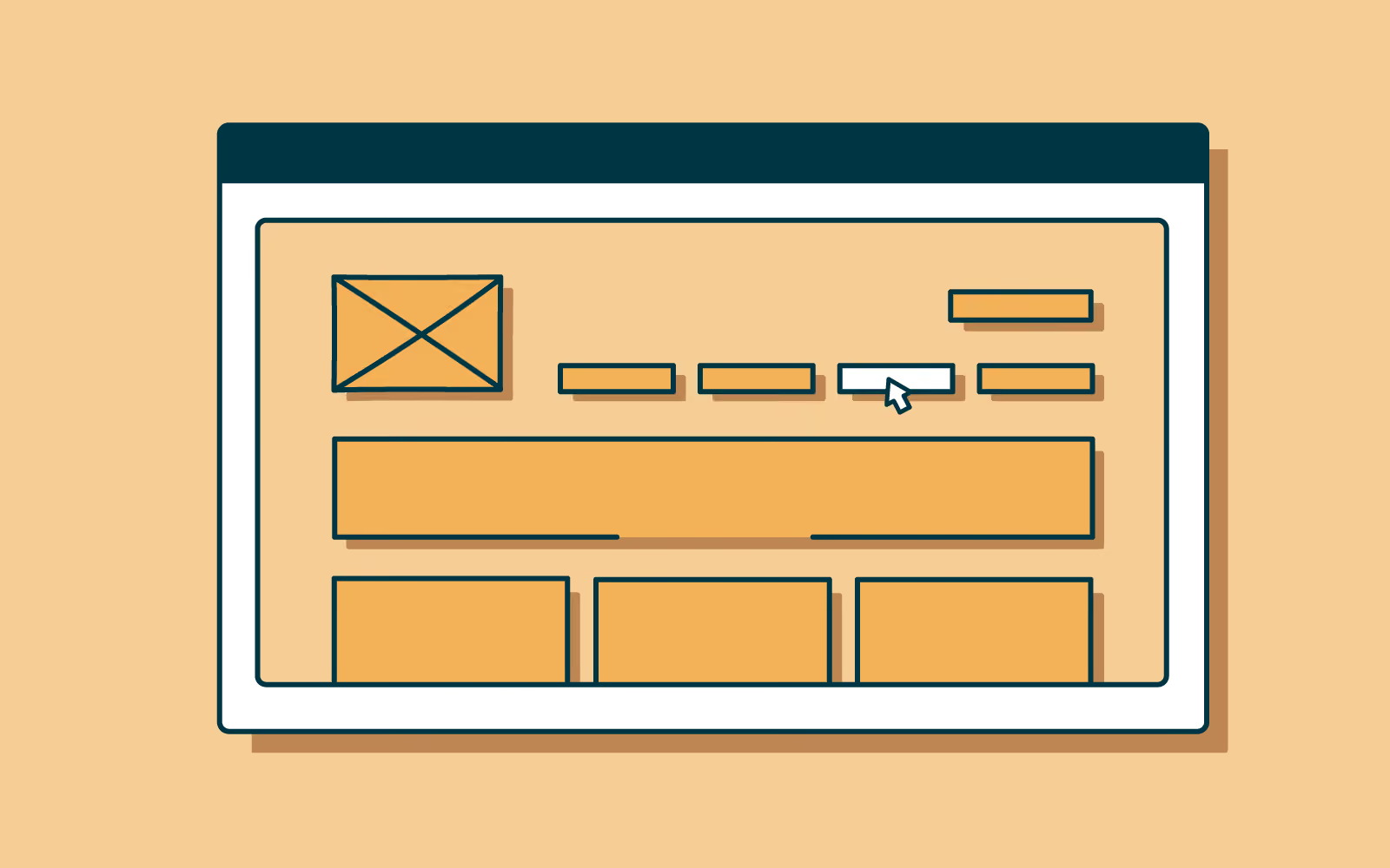
According to Abby Covert, a leader in the field of information architecture, IA is ‘the way we arrange the parts to make sense of the whole.’ Information architecture (IA) is found in every digital product, from websites and apps to an intranet.
For the purposes of this article we focus on the importance of information architecture to user experience (UX) design because IA is fundamentally important to the success of your user experience. It determines how users will access your content and ultimately how successful their experience is when using your product.
When put like this it does seem pretty straightforward. Maybe even simple? But these tasks need to be straightforward for your users. Putting thought, time and research in at the front of your design and build can help build an intuitive product. IA is the structure that sits in behind and allows the design to tell the story and the content to be found in an easy way.
Information architecture forms the framework for any UX design project. You need to consider the visual elements, functionality, interaction, and navigation and if they are built according to IA principles. If not considered fully even the most compelling content and powerful user experience design can fail without an organized and functional IA design. Disorganized content can make finding your way through difficult, meaning users get lost, annoyed and frustrated. Frustrated users don’t stick around and most likely don’t come back.
Through solving or preempting users’ issues with research and designing powerful and effective IA it reduces usability and navigation problems. Meaning that researched, thought through and designed information architecture can save both money and time for your organization in the longer term.
Often it can be confusing that there isn’t much difference between IA and UX design. While these terms do relate to each other and need to be considered alongside, they are not one and the same.
“Information architecture (IA) is the discipline of making information findable and understandable, helping people understand their surroundings and find what they’re looking for online and in the real world” - Interaction Design
“User experience (UX) design is the process design teams use to create products
that provide meaningful and relevant experiences to users” - Interaction Design
UX design is well grounded with good functional information architecture but that’s not where it stops. The user experience focus is on influencing users’ behaviors and actions through emotion and psychology. Information architecture is focussed on the users' goals and task completion. They work together to create the very best user experience. IA provides the foundation of a well organized space that is easy to navigate and UX design ensures that the overall experience meets (or exceeds) users’ expectations, through their wants, needs and desires.
There are four key components to consider when building a strong information architecture:
How information is named and represented. Labels need to communicate information to users without using too much space or requiring much work on the user’s part.
How people make their way through information. Without robust IA which has been thought through this is the quickest way to confuse users. If they can’t find their way to the information they need, they won’t be able to complete their task. It really is that simple.
How people will look for information (keywords, categories). A search system is especially important when there is a lot of content to wade through. A search engine, filters, and many other tools help users search content. Great UX design will consider how the information will be displayed once searched.
How the information is ordered. These help users to predict where they can find information easily:
Information architecture is a key part of a powerful user experience design. Efficient IA helps users quickly and easily move through content and find what they want. And what do users want but to find what they want, complete their task and get on with their day!
Provide an IA that functions well, is intuitive to use and well labeled, coupled with UX design that is smooth, attractive and responds to users needs, wants and desires and you’ll have a winner on the day.

If there’s one universal truth in user research, it’s that at some point you’re going to need to find people to actually take part in your studies. Be it a large number of participants for quantitative research or a select number for in-depth, in-person user interviews. Finding the right people (and number) of people can be a hurdle.
With the right strategy, you can source exactly the right participants for your next research project.
We share a practical step-by-step guide on how to find participants for user experience research.
It has to be acknowledged that there are challenges when recruiting research participants. You may recognize some of these:
We’ll simplify the process, talk about who the right participants are, and unpack some of the best ways to find them. Removing these blocks can be the easiest way to move forward.
1. The first step to a successful participant recruitment strategy is clarifying the goals of your user research and which methods you intend to use. Ask yourself:
2. Define who your ideal research participant is. Who is going to have the answers to your questions?
3. Work out your research recruitment strategy. That starts by understanding the differences between recruiting for qualitative and quantitative research.
Quantitative research recruiting is a numbers game. For your data analysis to be meaningful and statistically significant, you need a lot of data. This means you need to do a lot of research with a lot of people. When recruiting for quantitative research, you first have to define the population (the entire group you want to study). From there, you choose a sampling method that allows you to create a sample—a randomly selected subset of the population who will participate in your study.
Qualitative recruiting involves far fewer participants, but you do need to find a selection of ‘perfect’ participants. Those that fit neatly into your specific demographic, geographic, psychographic, and behavioral criteria relevant to your study. Recruiting quality participants for qualitative studies involves non-random sampling, screening, and plenty of communication.
How many participants to include in a qualitative research study is one of the most heavily discussed topics in user research circles. In most cases, you can get away with 5 people – that’s the short answer. With 5 people, you’ll uncover most of the main issues with the thing you’re testing. Depending on your research project there could be as many as 50 participants, but with each additional person, there is an additional cost (money and time).
Quantitative research is obviously quite different. With studies like card sorts and tree tests, you need higher participant numbers to get statistically meaningful results. Anywhere from 20 - 500 participants, again coming back to the purpose of your test and your research budget. These are usually easier and quicker to implement therefore the additional cost is lower.
Let’s get into your research recruitment strategy to find the best participants for your research project. There are 5 clear steps to get you through to the research stage:
Who are they? What do they do? How old are they? Do they already use your product? Where do they live? These are all great questions to get you thinking about who exactly you need to answer your research questions. The demographic and geographic detail of your participants are important to the quality of your research results.
Screening participants will weed out those that may not be suitable for your specific project. This can be as simple as asking if the participants have used a product similar to yours. Or coming back to your key identified demographic requirements and removing anyone that doesn’t fit these criteria.
This is important and can be time-consuming. For qualitative research projects, you can look within your organization or ask over social media for willing participants. Or if you’re short on time look at a participant recruitment service, which takes your requirements and has a catalog of available persons to call on. There’s a cost involved, but the time saving can negate this. For qualitative surveys, a great option can be a live intercept on your website or app that interrupts users and asks them to complete a short questionnaire.
In some cases you will need to provide incentives. This could be offering a prize or discount for those who complete online qualitative surveys. Or a fixed sum for those that take part in longer format quantitative studies.
Once you have waded through the emails, options, and communication from your inquiries make a list of appropriate participants. Schedule time to do the research, either in person or remotely. Be clear about expectations and how long it will take. And what the incentive to take part is.
You’ve got your participants sorted and have a great pool of people to call on. If you keep hitting the same group of people time and time again, you will experience the law of diminishing returns. Constantly returning to the same pool of participants will eventually lead to fatigue. And this will impact the quality of your research because it’s based on interviewing the same people with the same views.
There are 2 ways to avoid this problem:
Of course, it might be unavoidable to hit the same audience repeatedly when you’re testing your product development among your customer base.
Understanding your UX research recruitment strategy is crucial to recruiting quality participants. A clear idea of your purpose, who your ideal participants are, and how to find them takes time and experience.
And to make life easier you can always leave your participant recruitment with us. With a huge catalog of quality participants all at your fingertips on our app, we can recruit the right people quickly.
