Subscribe to OW blog for an instantly better inbox
Oops! Something went wrong while submitting the form.
Articles and Podcasts on Customer Service, AI and Automation, Product, and more
The pace of product development has never been faster, and the cost of building on assumptions has never been higher. At Optimal, we've spent nearly two decades helping teams get closer to their users, and what we're seeing right now is a fundamental shift in how research gets done. More teams are running research than ever before and timelines to act on findings are tighter, while the expectations for what research needs to deliver keep rising.
That shift is exactly what's driving Optimal 3.0, our most ambitious reinvention of the platform yet, designed to give every team the speed, depth, and flexibility that modern research demands. Today's release is the next step in that journey.
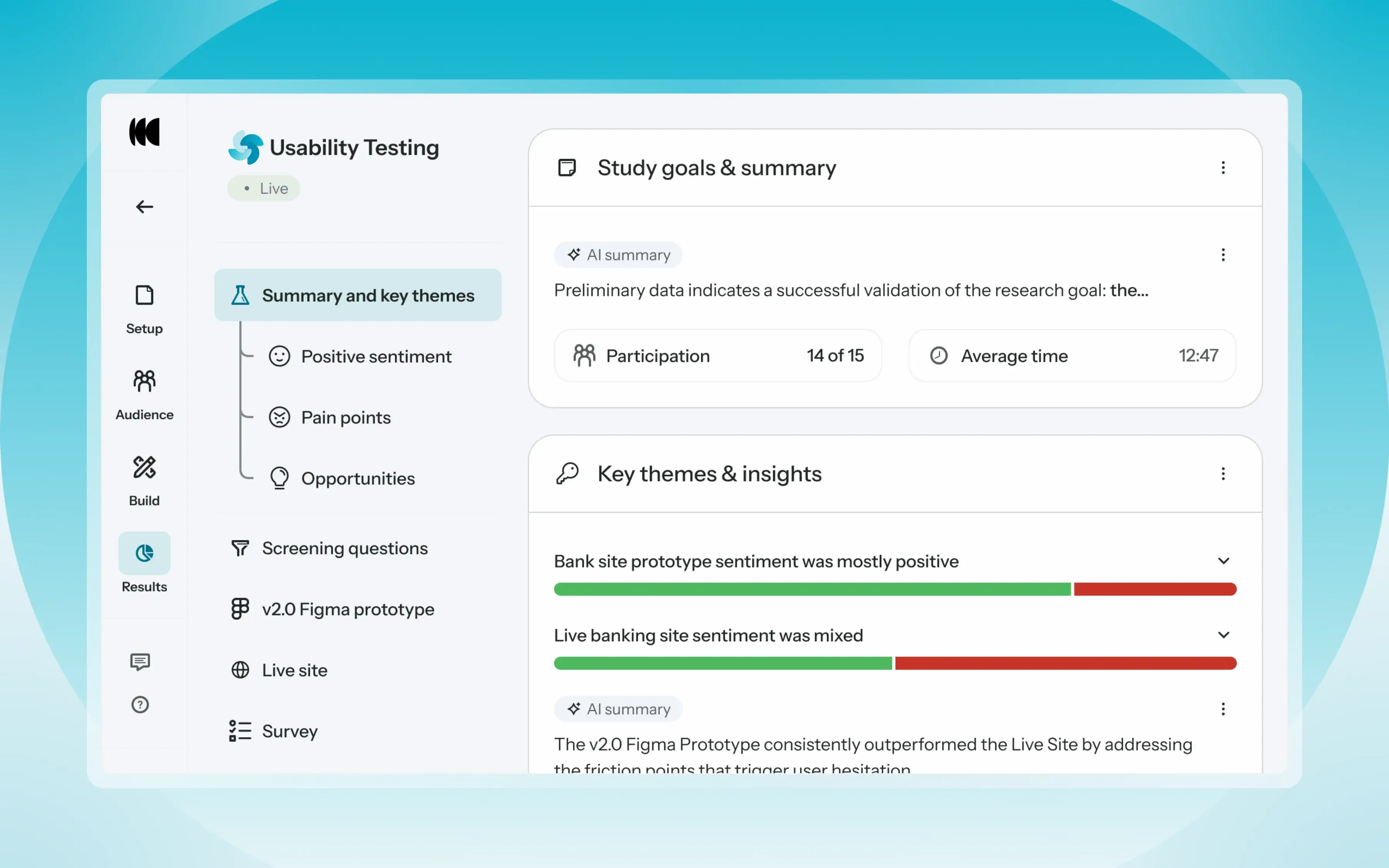
Optimal's new mixed-methods research tool tears down the boundaries between methods. It brings prototype testing, live site testing, and surveys into a single, end-to-end study workflow. And grounded in our product principles: speed to insights, access for all, and communication.
Optimal’s new Usability Testing tool marks the next step in the evolution of Optimal 3.0, giving teams the flexibility to evaluate experiences in whatever form they exist today.
Combine prototype testing, AI prototype testing, live site testing, and surveys in a single study. Test multiple prototypes side by side, compare different live URLs, or mix prototype and live site tasks together all in one workflow. Research can now mirror how products actually evolve, from early concept to shipped experience.
New speak-aloud question types, custom message blocks, auto-generated transcripts and insights, citations and highlight clips help you capture the context and reasoning behind every action. AI-assisted analysis then helps you make sense of it all fast and communicate with impact.
Review a study overview surfacing key themes, pain points, and sentiment analysis combining insights across all your study methods along with detailed results, task analysis and recordings, transcripts, key quotes, and automatically generated citations and video clips.
Coming soon: you can also use AI Chat to chat with your data directly, asking questions and pulling new insights and evidence across all your qualitative and quantitative inputs.
Modern product development is no longer linear. Teams continuously move between:
Traditional usability testing tools were not built for this fluidity. Optimal’s Usability Testing brings the flexibility to match how teams actually work today.
By combining multiple methods into a single study and pairing it with AI-powered synthesis, Usability Testing helps teams reduce setup and analysis time, recruit once, capture richer qualitative context, compare experiences more easily, move faster from feedback to action, and tell clearer, more compelling insight stories.
Learn how to get started with Usability Testing in Optimal and accelerate your path from idea to insight. Book a meeting, start exploring in your account, or join our live training webinar on June 24th to see it in action.

Every month we have fun and informative “bite sized” presentations to add some inspiration to your lunch break. These virtual events allow us to partner with amazing speakers, community groups and organizations to share their insights and hot takes on a variety of topics impacting our industry.
Join us at the end of every month for Lunch n' Learn.
Join us for a FREE Fireside chat on Jan 31st @ 12-1pm PST (Jan 30th at 9am NZT) with Eniola. You’ll learn about her career journey from integrative biology to UX, 3 things that are changing about the industry, and what you need to know to transition into UX this year. This is a casual, Q/A style conversation so bring your questions and get excited to meet Eniola!
Eniola Abioye, Founder of UX Outloud and UX Researcher at Meta will be hosting a HYBRID masterclass to help you uplevel your UX career. This event will take place on Feb 24th in the SF Bay Area & virtually worldwide!
I help UX Researchers improve their research practice. Whether you’re seasoned and looking to level up or a new researcher looking to get your bearings in UX, I can help you focus and apply your skillset.
Now, I am a UX Researcher at Meta and speak to all different types of users their experience on the platform. I take an agile approach and often employ Rapid Iterative Testing and Evaluation. I am innately curious, a self-starter, adaptable and communicative with a knack for storytelling.
Grab your lunch, invite your colleagues and we hope to see you at our next Lunch n’ Learn! 🥗

It’s no secret - New Zealand has a diversity problem in design and technology.
Throughout her career, Sachi often felt like the odd one out - the only woman, the only Pasifika person, the one who laughed too loud, the one who looked different and sounded different. But as a leader, Sachi has been able to create change.
Sachi Taulelei, Head of Design, ANZ, recently spoke at UX New Zealand, the leading UX and IA conference in New Zealand hosted by Optimal Workshop, on how she is building a diverse team of designers at New Zealand’s largest bank.
In her talk, Sachi shares the challenges she’s faced as a Pasifika woman in design and technology; and how this has shaped her approach to leadership and her drive to create inclusive environments where individuals and teams thrive.
Sachi is a creative strategist, a design leader, and a recovering people pleaser. She has worked in digital and design for over 25 years, spending most of her career creating and designing digital experiences centered on people.
As a proud Pasifika woman, she has a particular interest in diversity, equity, and inclusion. She has spoken out about the need for more diversity within design and technology and the impact it can have on the technology we create.
Sachi is passionate about giving back - when she's not running after her two kids, you'll find her mentoring Pasifika youth, cheering on young leaders through the Young Enterprise Scheme, judging awards for Women in AI, or volunteering at the local hospice.
Contact Details:
Email: sachi.taulelei@anz.com
LinkedIn: https://www.linkedin.com/in/sachi-taulelei/
Looking and sounding different from her peers, Sachi always felt like she was trying to find her place in the office. She always felt like she didn’t belong.
Sachi has experienced all forms of racism and discrimination as a result of her heritage. These experiences aren’t spoken about and often go unnoticed by the majority. She has held equivalent jobs to male counterparts but received lower pay, and was advised to change her name from Sachi to Sacha on her job applications to improve her chances.
Sachi’s response was to work hard and become great at what she does, which was recognized over time. Slowly, she began to rise through the ranks. However, having reached leadership roles, she struggled to be heard and participate, without knowing why. The advice was given freely by managers to “stick at it”, to “grow thicker skin”, and to grow through the “school of hard knocks”. Although this advice worked at face value and she flourished, Sachi began to feel like a fraud and constantly second-guessing herself. She began to “edit” herself to fit into an acceptable mold and, in doing so, felt like she lost part of who she was.
Success often comes in the form of our leaders who have already climbed the mountains of achievement. When you see success in this way, as someone who doesn’t fit the mold, there is pressure to conform to get ahead. Using the same tools and advice given to these leaders, she realized, would actually hold her back.
Sachi recounts the treatment of Japanese-American citizens in the U.S. in the years following Pearl Harbour, where Japanese-American citizens were moved to concentration camps. This happened despite an official report finding conclusively that there was no threat from this population. Even though Germany and Italy were also at war with the U.S., for example, citizens with Italian and German heritage were not treated this way. This caused immeasurable pain, shame, and fear for the victims, and fostered a head-down, work-hard mentality in order to try and forget the treatment they received. This attitude, Sachi believes, was passed down to her from her ancestors who experienced that reality. Sachi explains that while there are many things that can hold someone back in life, creating meaningful change starts with introspection. Often, that requires us to work through fear and shame.
Reflecting on her heritage, which is part Samoan and part Japanese, Sachi started to embrace her unique traits. In her case, she embraced the deep empathy and human compassion from her Japanese side and the deep sense of community and connection from her Samoan side. Her uniqueness is something to celebrate, not to hide behind.
Becoming a leader and realizing this, Sachi wanted to create a team culture based on equity, openness, and a sense of belonging – all things that Sachi wished for herself on her journey.
Once she understood herself and what she wanted for her team, Sachi set to work on building a new team culture. Sachi breaks down key learnings from how she turned this vision into reality.
Define what diversity means for your team. You need to clearly understand what it is you want to achieve before you can achieve it. For Sachi’s team, they knew that they wanted to create a team that was representative of New Zealand. Sachi knew, for example, that she had a lack of Māori and Pacific representation within the team. Māori and Pasifika represent 25% of the population. So, an effort was made to increase ranks by hiring talent from these cultures.
Additionally, Sachi focused on creating new role levels - from intern right through to graduates, juniors, and intermediate-level positions. This helped to acknowledge age differences within her team and also helped to manage career progression opportunities.
It can be difficult to achieve diversity and inclusion and it requires a lot of work. For example, Sachi learned that posting an ad on job boards and expecting to receive hundreds of Māori and Pasifika applicants wasn’t realistic. Instead, partnerships were built with local design schools, and networking events were consistently attended. Job referrals from within the team were also leveraged, as well as establishing a strong direction for recruitment specialists within the organization.
Sachi also recognized that, as a leader, she needed to be more visible and more vocal about sharing her views of the world and what she was trying to achieve. It was important to be clear about the type of culture she was building within her team so that she could promote it.
In less than a year her team grew (from 11 to 40!) which meant a focus on building an inclusive team culture was required. The central theme throughout this time was, “You have to connect to yourself and your strengths first and foremost, before you can connect with others and as a team”. This meant that the team used tools like the Clifton Strength Finder, in order to learn about themselves and each other. Each designer was then encouraged to delve into their own natural working styles and were taught how to amplify their own strengths through various workshops. This approach also becomes handy when recruiting and strengthening potential weak spots.
It’s important to have leaders who care - you can’t do it on your own. There can be pain points on the journey to creating diversity and inclusion, so it’s necessary to have leaders who listen, support, and work through some of the challenges that can arise.
Why push for diversity and inclusion? Sachi argues that the benefits are evident in the way that her team designs.
For example, her team:
Most importantly, the benefits show up in the way that each other is treated, and the relationships that are built with key stakeholders. Diversity and inclusion are wins for everyone - the team, the organization, and the customer.


Natalie and Lulu have forged a unique team culture that focuses on positive outputs (and outcomes) for their app’s growing user base. In doing so, they turned the traditional design approach on its head and created a dynamic and supportive team.
Natalie, Director of Design at Hatch, and Lulu, UX Design Specialist, recently spoke at UX New Zealand, the leading UX and IA conference in New Zealand hosted by Optimal Workshop, on their concept of “radical collaboration”.
In their talk, Nat and Lulu share their experience of growing a small app into a big player in the finance sector, and their unique approach to teamwork and culture which helped achieve it.
Over the last two decades, Lulu and Nat have delivered exceptional customer experiences for too many organizations to count. After Nat co-founded Hatch, she begged Lulu to join her on their audacious mission: To supercharge wealth building in NZ. Together, they created a design and product culture that inspired 180,000 Kiwi investors to join in just 4 years.
Contact Details:
Email: natalie@sixfold.co.nz
LinkedIn: https://www.linkedin.com/in/natalieferguson/ and https://www.linkedin.com/in/lulupach/
Nat and Lulu discuss how they nurtured a team culture of “radical collaboration” when growing the hugely popular app Hatch, based in New Zealand. Hatch allows everyday New Zealanders to quickly and easily trade in the U.S. share market.
The beginning of the COVID pandemic spelled huge growth for Hatch and caused significant design challenges for the product. This growth meant that the app had to grow from a baby startup to one that could operate at scale - virtually overnight.
In navigating this challenge, Nat and Lulu coined the term radical collaboration, which aims to “dismantle organizational walls and supercharge what teams achieve”. Radical collaboration has six key pillars, which they discuss alongside their experience at Hatch.
Listening to hundreds of their customers’ stories, combined with their own personal experiences with money, compelled Lulu and Nat to change how their users view money. And so, “Grow the wealth of New Zealanders” became a powerful mission statement, or North Star, for Hatch. The mission was to give people the confidence and the ability to live their own lives with financial freedom and control. Nat and Lulu express the importance of truly believing in the mission of your product, and how this can become a guiding light for any team.
As Hatch grew rapidly, trusting each other became more and more important. Nat and Lulu state that sometimes you need to take a step back and stop fueling growth for growth’s sake. It was at this point that Nat asked Lulu to join the team, and Nat’s first request was for Lulu to be super critical about the product design to date - no feedback was out of bounds. Letting go, feeling uncomfortable, and trusting your team can be difficult, but sometimes it’s what you need in order to drag yourself out of status quo design. This resulted in a brief hiatus from frantic delivery to take stock and reprioritize what was important - something that can be difficult without heavy doses of trust!
During their journey, the team at Hatch heard lots of stories from their users. Many of these stories were heard during “Hatcheversery Calls”, where team members would call users on their sign-up anniversary to chat about their experience with the app. Some of these calls were inspiring, insightful, and heartwarming.
Everyone at Hatch made these calls – designers, writers, customer support, engineers, and even the CEO. Speaking to strangers in this way was a challenge for some, especially since it was common to field technical questions about the business. Nevertheless, asking staff to wear many hats like this turned the entire team into researchers and analysts. By forcing ourselves and our team outside of our comfort zone, we forced each other to see the whole picture of the business, not just our own little piece.
In an increasingly competitive industry, designers and developers are often tempted to consistently deliver new and exciting features. In response to rapid growth, rather than adding more features to the app, Lulu and Nat made a conscious effort to really listen to their customers to understand what problems they needed solving.
As it turned out, filing overseas tax returns was a significant and common problem for their customers - it was difficult and expensive. So, the team at Hatch devised a tax solution. This solution was developed by the entire team, with almost no tax specialists involved until the very end! This process was far from glamorous and it often fell outside of standard job descriptions. However, the team eventually succeeded in simplifying a notoriously difficult process and saved their customers a massive headache.
Over time Hatch’s user base changed from being primarily confident, seasoned investors, to being first-time investors. This new user group was typically scared of investing and often felt that it was only a thing wealthy people did.
At this point, Hatch felt it was necessary to take a step back from delivering updates to take stock of their new position. This meant deeply understanding their customers’ journey from signing up, to making their first trade. Once this was intimately understood, the team delivered a comprehensive onboarding process which increased the sign-up conversion rate by 10%!
Nat and Lulu describe a moment when Allbirds wanted to work with Hatch to allow ordinary New Zealanders to be involved in their IPO launch on the New York stock exchange. Again, this task faced numerous tax and trade law challenges, and offering the service seemed like yet another insurmountable task. The team at Hatch nearly gave up several times during this project, but everyone was determined to get this feature across the line – and they did. As a result, New Zealanders were some of the few regular investors from outside the U.S that were able to take part in Albirds IPO.
Over four years, Hatch grew to 180,000 users who collectively invested over $1bn. Nat and Lulu’s success underscores the critical role of teamwork and collaboration in achieving exceptional user experiences. Product teams should remember that in the rapidly evolving tech industry, it's not just about delivering the latest features; it's about fostering a positive and supportive team culture that buys into the bigger picture.
The Hatch team grew to be more than team members and technical experts. They grew in confidence and appreciated every moving part of the business. Product teams can draw inspiration from Hatch's journey, where designers, writers, engineers, and even the CEO actively engaged with users, challenged traditional design decisions, and prioritized solving actual user problems. This approach led to better, more user-centric outcomes and a deep understanding of the end-to-end user experience.
Most importantly, through the good times and tough, the team grew to trust each other. The mission weaved its way through each member of the team, which ultimately manifested in positive outcomes for the user and the business.
Nat and Lulu’s concept of radical collaboration led to several positive outcomes for Hatch:
Over the next week, Lulu and Nat encourage designers and researchers to get outside of their comfort zone and:

Every month we have fun and informative “bite sized” presentations to add some inspiration to your lunch break. These virtual events allow us to partner with amazing speakers, community groups and organizations to share their insights and hot takes on a variety of topics impacting our industry.
Join us at the end of every month for Lunch n' Learn.
A multi-faceted approach is key when creating digital products for users who may be in a vulnerable, sensitive, or distressed state. Adopting an approach to copy, design, and testing that considers the unique needs of your main user group not only enhances their experiences, but improves the product for everyone.
From user interviews, to copywriting, to IA decisions, to testing - Ally will cover tools and tips for how you can ensure vulnerable users needs’ are considered at every stage of the digital design process.
Ally has worked in digital experience in the higher education, FMCG, and not-for-profit industries for over 14 years, most recently at Australian healthcare charity Lives Lived Well. She’s passionate about working with users to create data-driven, meaningful and valuable digital content and navigation pathways. She lives in Brisbane and also teaches Design Thinking at the Queensland University of Technology.
Grab your lunch, invite your colleagues and we hope to see you at our next Lunch n’ Learn 🌮🍕🥪

Every month we have fun and informative “bite sized” presentations to add some inspiration to your lunch break. These virtual events allow us to partner with amazing speakers, community groups and organizations to share their insights and hot takes on a variety of topics impacting our industry.
Join us at the end of every month for Lunch n' Learn.
The world is growing increasingly volatile and uncertain. Design practitioners working during these times are tasked with bringing skills and professional expertise to help solve complex customer and internal-facing challenges. However, many of us are operating in professional contexts that are resistant to change, struggle to understand what we do, or are unable to fully embrace the value we have to offer. Trying to do ‘good’ work in these conditions can be isolating, frustrating and anxiety producing. In order to sustain our capacity for impact, now is the time to invest in integrating our own well-being into our design practice.
Design Leadership & Learning specialist, Susanna Carman, returns to offer 60-minutes of sanctuary for those who would like to explore the questions:
Susanna will present and share restorative practices that deepen understanding, enhance capacity for self-care, and reframe the quality of impact we can have with others in our professional roles.
Susanna Carman is a Strategic Designer and research-practitioner who helps people solve complex problems, the types of problems that have to do with services, systems and human interactions. Specializing in design, leadership and learning, Susanna brings a high value toolkit and herself as Thinking Partner to design leadership and change practitioners who are tasked with delivering sustainable solutions amidst disruptive conditions.
Susanna holds a Masters of Design Futures degree from RMIT University, and has over a decade of combined experience delivering business performance, cultural alignment and leadership development outcomes to the education, health, community development and financial services sectors. She is also the founder and host of Transition Leadership Lab, a 9-week learning lab for design, leadership and change practitioners who already have a sophisticated set of tools and mindsets, but still feel these are insufficient to meet the challenge of leading change in a rapidly transforming world.
Grab your lunch, invite your colleagues and we hope to see you at our next Lunch n' Learn 🌮🍕🥪

We all want to be experts in what we do. We train, we practice, and we keep learning. We even do 10,000 hours of something believing it will make us an expert.
But what if our ‘expertise’ actually comes with some downfalls? What if experts can be less creative and innovative than their less experienced counterparts? What if they lack flexibility and are more prone to error?
Ruth Brown, freelance Design Lead, recently spoke at UX New Zealand, the leading UX and IA conference in New Zealand hosted by Optimal Workshop, on how experts can cover their blind spots.
In her talk, Ruth discusses the paradox of expertise, how it shows up in design (and especially design research), and most importantly - what we can do about it.
Ruth is a freelance researcher and design leader. She currently works in the design team at ANZ. In the past, she has been GM of Design Research at Xero and Head of User Experience at Trade Me.
Ruth loves people. She has spent much of her career understanding how people think, feel, and behave. She cares a lot about making things that make people’s lives better. Her first love was engineering until she realized that people were more interesting than maths. On a good day, she gets to do both.
Contact Details:
Email address: ruthbrownnz@gmail.com
LinkedIn URL: https://www.linkedin.com/in/ruth-brown-309a872/
Ruth is an avid traveler and travel planner. She is incredibly organized but recounts a time when she made a mistake on her father’s travel documents. The error (an incorrect middle name on a plane ticket) cost her up to $1,000 and, perhaps worse, dealt a severe knock to her confidence as a self-stylized travel agent!
What caused the mistake? Ruth, after recovering from the error, realized that she had auto-filled her father’s middle name field with her own, voiding the ticket. She had been the victim of two common ways that people with expertise fail:
This combination is known as the Paradox of Expertise.
While experts are great at many things and we rely on them every day, they do have weaknesses. Ruth argues that the more we know about our weaknesses, the more we can avoid them.
Ruth touches on what’s happening inside the brain of experts, and what’s happening outside the brain (social).
In her talk, Ruth focuses on the three things that have the most impact on design and research experts.
Hundreds of studies support the claim that experts are bad at predicting the future. One study by Philip Tetlock tested 284 experts (across multiple fields) and 27,450 predictions. It was found that after 20 years, the experts did “little better than dart-throwing chimpanzees”.
As designers and researchers, one of the most difficult things we get asked is to predict the future. We get asked questions like; will people use this digital product? How will people use it? How much will they pay?
Since experts are so bad at predicting the future, how can we reduce the damage?
In general, experts are fairly average teachers. Despite knowing the principles, theory, and practice of our fields, experts aren’t usually very good teachers. This is because experts tend to think in abstraction and concepts that have been built up over thousands of hours of experience. This leads experts to skip the explanation of foundational steps i.e. explaining why the concepts themselves are important.
Ruth highlights the fact that experts find it hard to process new information, especially new information that challenges closely held beliefs or experiences. It is difficult to throw away existing arguments (or schemas) in place of new, seemingly untested arguments.
Understanding the Paradox of Expertise can help designers and researchers become more effective in their roles and avoid common pitfalls that hinder their work.
Ruth's insights into the inner workings of experts' brains shed light on the cognitive processes that can work against us. The development of schemas and the efficiency of information processing, while beneficial, can also lead to cognitive biases and resistance to new information. This insight reminds UX professionals to remain open-minded and adaptable when tackling design and research challenges.
The three key points Ruth emphasizes - the inability of experts to predict the future accurately, their challenges as teachers, and their resistance to innovation - have direct implications for the UX field. UX designers often face the daunting task of predicting user behavior and needs, and recognizing the limitations of expertise in this regard is crucial. Furthermore, the importance of embracing interdisciplinary teams and seeking diverse perspectives is underscored as a means to mitigate the shortcomings of expertise. Collaboration and humility in acknowledging that others may be better suited to certain tasks can lead to more well-rounded and innovative solutions.
Finally, Ruth's call to stay curious and open-minded is particularly relevant to UX professionals. In a rapidly evolving field, the ability to adapt to new information and perspectives is critical. By recognizing that expertise is not a fixed state but an ongoing practice, designers and researchers can continuously improve their work and deliver better user experiences.
UX New Zealand is a leading UX and IA conference hosted by Optimal Workshop, that brings together industry professionals for three days of thought leadership, meaningful networking and immersive workshops.
At UX New Zealand 2023, we featured some of the best and brightest in the fields of user experience, research and design. A raft of local and international speakers touched on the most important aspects of UX in today’s climate for service designers, marketers, UX writers and user researchers.
These speakers are some of the pioneers leading the way and pushing the standard for user experience today. Their experience and perspectives are invaluable for those working at the coalface of UX, and together, there’s a tonne of valuable insight on offer.
