Subscribe to OW blog for an instantly better inbox
Oops! Something went wrong while submitting the form.
Articles and Podcasts on Customer Service, AI and Automation, Product, and more
The pace of product development has never been faster, and the cost of building on assumptions has never been higher. At Optimal, we've spent nearly two decades helping teams get closer to their users, and what we're seeing right now is a fundamental shift in how research gets done. More teams are running research than ever before and timelines to act on findings are tighter, while the expectations for what research needs to deliver keep rising.
That shift is exactly what's driving Optimal 3.0, our most ambitious reinvention of the platform yet, designed to give every team the speed, depth, and flexibility that modern research demands. Today's release is the next step in that journey.
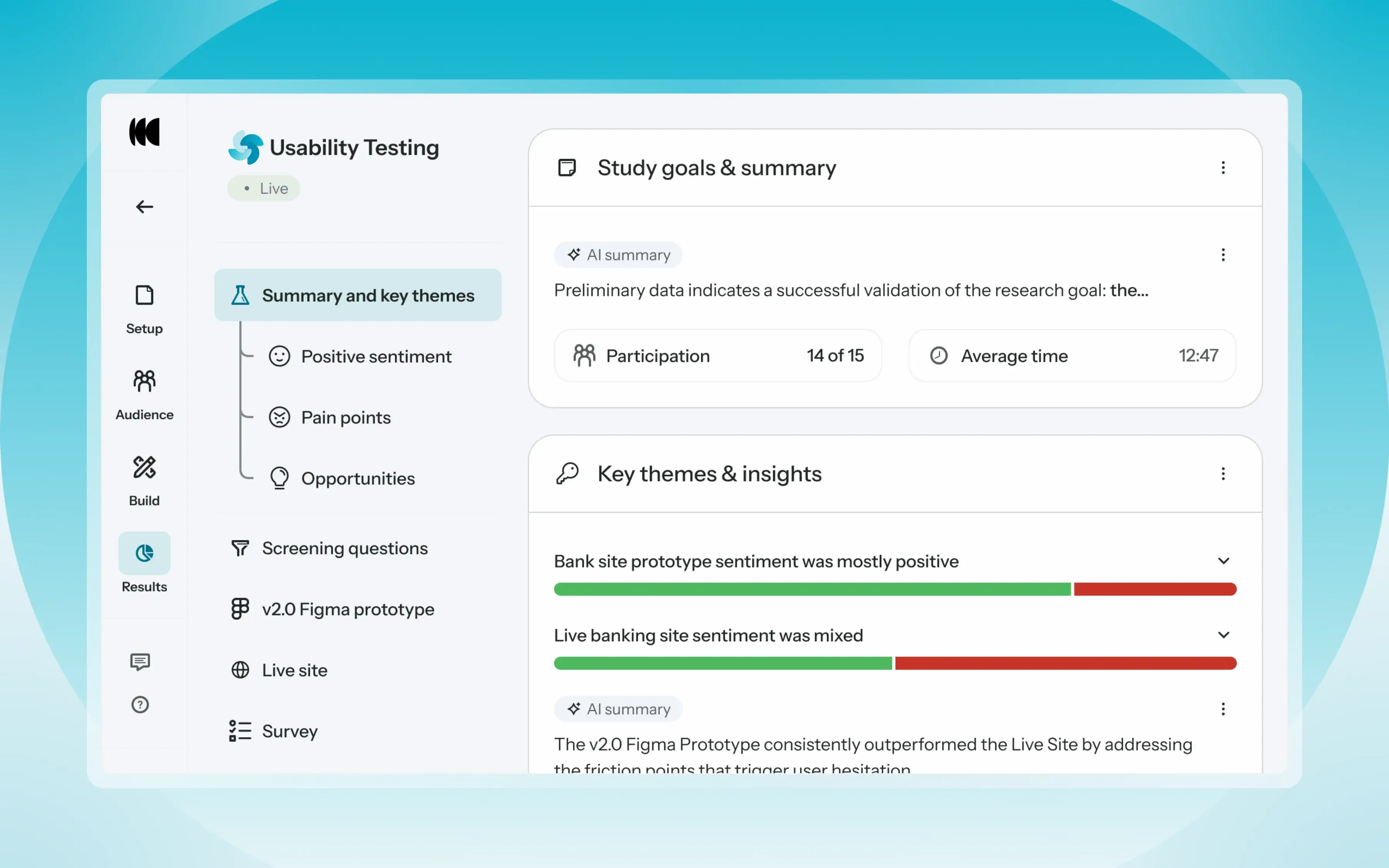
Optimal's new mixed-methods research tool tears down the boundaries between methods. It brings prototype testing, live site testing, and surveys into a single, end-to-end study workflow. And grounded in our product principles: speed to insights, access for all, and communication.
Optimal’s new Usability Testing tool marks the next step in the evolution of Optimal 3.0, giving teams the flexibility to evaluate experiences in whatever form they exist today.
Combine prototype testing, AI prototype testing, live site testing, and surveys in a single study. Test multiple prototypes side by side, compare different live URLs, or mix prototype and live site tasks together all in one workflow. Research can now mirror how products actually evolve, from early concept to shipped experience.
New speak-aloud question types, custom message blocks, auto-generated transcripts and insights, citations and highlight clips help you capture the context and reasoning behind every action. AI-assisted analysis then helps you make sense of it all fast and communicate with impact.
Review a study overview surfacing key themes, pain points, and sentiment analysis combining insights across all your study methods along with detailed results, task analysis and recordings, transcripts, key quotes, and automatically generated citations and video clips.
Coming soon: you can also use AI Chat to chat with your data directly, asking questions and pulling new insights and evidence across all your qualitative and quantitative inputs.
Modern product development is no longer linear. Teams continuously move between:
Traditional usability testing tools were not built for this fluidity. Optimal’s Usability Testing brings the flexibility to match how teams actually work today.
By combining multiple methods into a single study and pairing it with AI-powered synthesis, Usability Testing helps teams reduce setup and analysis time, recruit once, capture richer qualitative context, compare experiences more easily, move faster from feedback to action, and tell clearer, more compelling insight stories.
Learn how to get started with Usability Testing in Optimal and accelerate your path from idea to insight. Book a meeting, start exploring in your account, or join our live training webinar on June 24th to see it in action.

When you have a small design team or none at all, how do you ensure that your content is consistent, has the right tone, and is captivating? It can be difficult, but it doesn’t have to be! Julia Steffen, Principal Content Designer at Varis, spoke at UX New Zealand, the leading UX and IA conference in New Zealand hosted by Optimal Workshop, about how startups can achieve impactful content and delight users.
In her talk, Julia shares her most useful tips, tricks, and rules of thumb to ensure meaningful content design. She also shares some helpful tools to achieve maximum efficiency.
Julia has worked in content for 10+ years at St.Jude, Wunderman Thompson, MetaLab, and Grubhub. She is based in the United States and is the Principal Content Designer at Varis.
Contact Details:
Email address: julia.steffen@govaris.com
You can find Julia on LinkedIn
Why should you care about content design? Julia argues that “content design is product success”. Because Julia specifically talks about content design in relation to startups, she focuses on how to achieve the best results possible with a small, lean team. To that end, Julia discusses four must-haves for content design:
Why is your company’s voice important? Voice tells your users who you are, creates meaningful connections, and provides valuable signals that convey whether or not your company is deserving of trust. Choosing the voice for your startup begins with a competitor audit. Documenting who you compete against, and how you might want to differentiate your startup is crucial to finding your corner of the market. For example, is your voice welcoming, gentle, and positive, or are you more formal and technical?
User research can also be really helpful when determining and monitoring your voice. Involve your research team and learn what does and doesn’t delight your audience when it comes to your messaging.
It’s also important to map your voice to your startup’s values. Be sure to connect to your mission and your brand. Julia sums up product voice as:
Product voice = your values + space to differentiate + what research tells you
So, when you find your voice, where can you lean into it? There are several key areas or moments that provide opportunities to share your unique voice, such as:
To remain lean and efficient as a startup, one of the best things you can do is create a style guide. This helps to keep your content and voice consistent. For example, what pronouns do you use in your interface, do you capitalize certain words, etc? There is actually a lot to consider here, so Julia points viewers to various resources that allow you to copy and paste, such as Quinn Keast’s Product Language Framework.
A glossary or language bank is also important. Record branded words, terms that you never use, and terms that you’ve heard your users say organically. This helps to ensure that you’re using language that resonates with your audience and language that reduces cognitive load as much as possible.
Pro tip: Use the Writer app with Figma. This integration helps to ensure that your style guide is actually used! It includes your style guide and glossary so that you’re being consistent as you work. You can also use the Hemingway app or Grammarly to look out for passive voice, hard-to-parse sentences, and overall readability.
The first thing Julia points out when approaching writing is the need to be user-focused. This might seem obvious to UX practitioners, but word selection can be nuanced, and subtle changes can be powerful. For example, instead of writing “[Your company] introduces a new feature”, think about how can you change the statement to be more about what the new feature means for the user, rather than your company. Here are a few rules of thumb to help refine your writing.
Julia suggests that design reviews are the perfect place to sense-check your words and content. Review your designs intentionally and through a content lens. Again, the Microcopy Canvas can be a useful tool when conducting this step, helping to ensure you have considered the right tone and achieved your purpose with your words.
Following a design review process, it’s important to test for clarity and affinity. Conduct user tests frequently to ensure your words and content are clear, understood, and hitting the mark in the intended way.
Finally, make sure your content goals are recorded in your dashboards. Be accountable to your own success measures, KPIs, and OKRs (Objectives and Key Results). Some metrics that help track success are:
If you’re falling short on some metrics, review your content and try to figure out where words can be sharpened to be clearer, more friendly, or less technical, for example. Then, feed this information into your prioritization and planning. What changes are going to have the most impact on your product’s success? What changes are quick wins?
Julia’s talk is important for UX and content designers, particularly those working in startup environments, as it highlights the critical role of content design in achieving product success. The content you share, the voice and tone you adopt, and the clarity of communication, all add to the user's overall experience with your product. Investing time into your content is critical and, as Julia explains, it doesn’t have to put too much stress on your team's workload. If time isn’t invested, however, you may find yourself with poor content, delivering poor experiences, resulting in high customer attrition.
Efficiency, therefore, should be a focus for startups wanting to achieve great content design without being weighed down. Julia offers pragmatic advice on maintaining consistency through tools like style guides and language banks and by leveraging apps like Hemingway and Grammarly. Tools like these are incredibly helpful when streamlining processes and ensuring a cohesive and polished user interface.
At the end of the day, Julia stresses the impact that content design has on user experiences and encourages startups to pay close attention to content in ways that are achievable for small teams.


There is strong backlash about the perceived failures of Human Centred Design (HCD) and its contribution to contemporary macro problems. There seems to be a straightforward connection: HCD and Design Thinking have been adopted by organizations and are increasingly part of product/experience development, especially in big tech. However the full picture is more complex, and HCD does have some issues.
Dan Dixon, UX and Design Research Director and Stéphan Willemse, Strategy Director/Head of Strategy, both from the Digital Arts Network, recently spoke at UX New Zealand, the leading UX and IA conference in New Zealand hosted by Optimal Workshop, about the evolution and future of HCD.
In their talk, Dan and Stéphan cover the history of HCD, its use today, and its limitations, before presenting a Post HCD future. What could it be, and how should it be different? Dan and Stéphan help us to step outside of ourselves as we meet new problems with new ways of Design Thinking.
Dan is a long-term practitioner of human-centred experience design and has a wealth of experience in discovery and qual research. He’s worked in academic, agency and client-side roles in both the UK and NZ, covering diverse fields such as digital, product design, creative technology and game design. His history has blended a background in the digital industry with creative technology teaching and user experience research. He has taken pragmatic real-world knowledge into a higher education setting as well as bringing deeper research skills from academia into commercial design projects. In higher education, as well as talks and workshops, Dan has been teaching and sharing these skills for the last 16 years.
Stéphan uses creativity, design and strategy to help organizations innovate towards positive, progressive futures. He works across innovation, experience design, emerging technologies, cultural intelligence and futures projects with clients including Starbucks, ANZ, Countdown, TradeMe and the public sector. He holds degrees in PPE, Development Studies, Education and an Executive MBA. However, he doesn’t like wearing a suit and his idea of the perfect board meeting is at a quiet surf break. He thinks ideas are powerful and that his young twins ask the best questions about the world we live in.
Contact Details:
Email: dan.dixon@digitalartsnetwork.com
Dan and Stéphan take us through the evolving landscape of Human Centred Design (HCD) and Design Thinking. Can HCD effectively respond to the challenges of the modern era, and can we get ahead of the unintended consequences of our design? They examine the inputs and processes of design, not just the output, to scrutinize the very essence of design practice.
In the 1950s and 1960s, designers began exploring the application of scientific processes to design, aiming to transform it into a systematic problem-solving approach. Later in the 1960s, design thinkers in Scandinavia initiated the shift towards cooperative and participative design practices. Collaboration and engagement with diverse stakeholders became integral to design processes. Then, the 1970s and 1980s marked a shift in perspective, viewing design as a fundamentally distinct way of approaching problems.
Moving into the late 1980s and 1990s, design thinking expanded to include user-centered design, and the idea of humans and technology becoming intertwined. Then the 2000s witnessed a surge in design thinking, where human-centered design started to make its mark.
Dan and Stéphan discuss the “design squiggle”, a concept that portrays the messy and iterative nature of design, starting chaotically and gradually converging toward a solution. For 20 years, beginning in the early 90s, this was a popular way to explain how the design process feels. However, in the past 10 years or so, efforts to teach and pass down design processes have become common practice. Here enter concepts like the “double diamond” and “pattern problem”, which seek to be repeatable and process-driven. These neat processes, however, demand rigid adherence to specific design methods, which can ultimately stifle innovation.
The critique of such rigid design processes, which developed alongside HCD, highlights the need to acknowledge that humans are just one element in an intricate network of actors. By putting ourselves at the center of our design processes and efforts, we already limit our design. Design is just as much about the ecosystem surrounding any given problem as it is about the user. A limitation of HCD is that we humans are not actually at the center of anything except our own minds. So, how can we address this limitation?
Post-anthropocentric design starts to acknowledge that we are far less rational than we believe ourselves to be. It captures the idea that there are no clear divisions between ‘being human’ and everything else. This concept has become important as we adopt more and more technology into our lives, and we’re getting more enmeshed in it.
Post-human design extends this further by removing ourselves from the center of design and empathizing with “things”, not just humans. This concept embraces the complexity of our world and emphasizes how we need to think about the problem just as much as we think about the solution. In other words, post-human design encourages us to “live” in our design problem(s) and consider multiple interventions.
Finally, Dan and Stéphan discuss the concept of Planetary design, which stresses that everything we create, and everything we do, has the possibility to impact everything else in the world. In fact, our designs do impact everything else, and we need to try and be aware of all possibilities.
To think beyond HCD and to foster innovation in design, we can begin by embracing emerging design practices and philosophies such as "life-centered design," "Society-centered design," and "Humanity-centered design." These emerging practices have toolsets that are readily available online and can be seamlessly integrated into your design approach, helping us to break away from traditional, often linear, methodologies. Or, taking a more proactive stance, we can craft our own unique design tools and frameworks.
To illustrate how design processes can evolve to meet current and future challenges of our time, Dan and Stéphan present their concept of “Post human-centered design” (Post HCD). At its heart, it seeks to take what's great about HCD and build upon it, all while understanding its issues/limitations.
Dan and Stéphan put forward, as a starting point, some challenges for designers to consider as we move our practice to its next phase.
Suggested Post HCD principles:
The talk wraps up by encouraging designers to incorporate some of this thinking into everyday practice. Some key takeaways are:

As information professionals, we work with the “stuff” of information in our everyday work. We search for information, we spend time analyzing and synthesizing it, and we carefully create and structure it. Whether you elicit information from users and stakeholders, explore large data sets, design ‘journeys’ or interfaces, or create information architectures, understanding the information you are using and creating as information can help you do your work better.
Kat King, Business Intelligence Analyst at the University of Michigan Library, recently spoke at UX New Zealand, the leading UX and IA conference in New Zealand hosted by Optimal Workshop, about understanding exactly what information is, and where it is, in our work.
In her talk, Kat uses simple examples to teach you to “see” the information around you and understand what makes something “information” in the context of working as a human to accomplish something.
Kat King is an Information Architect interested in language, meaning, and the things we make. She currently works as a Business Intelligence Analyst for the University of Michigan Library.
Contact Details:
Email: Katalogofchaos@gmail.com
Information theory can be dense and jargon-filled, and discussions in academic texts can feel divorced from the practice of actually working with information. We’re all told that information architecture is much more than website navigation. So, what is it? IA has a reputation for being difficult to understand, and in her talk, Kat attempts to help us understand what it is, where the information is, and what is it that we’re doing when we use IA methods.
Kat defines IA as “the practice of ensuring ontological alignment”. ‘Ontological’ relates to concepts, categories, properties, and relationships. ‘Alignment’ means arrangements into appropriate relative positions. Therefore, information architecture is “the practice of ensuring concepts, categories and their properties and relationships are arranged into appropriate relative positions.”
To align information then, you need to begin by sorting it into concepts and categories, which is difficult because information can sometimes be “slippery and abstract”. Kat argues this is the real reason that IA is sometimes hard to wrap our heads around. So, getting to the heart of the question, what is information?
Kat defines information as “a patterned relationship between differences that reduces uncertainty”. The key word here is ‘differences’. The trick to understanding and taming information is to identify what is different about sets of information. The next trick is to identify consistencies between these differences.
This can be a little confusing, so Kat uses the example of picking fruit. We tend to use color (the difference) to identify when fruit is ripe and sweet. We know for a fact that, at some point, the fruit will be at its sweetest and, while there is a scientific way of identifying this point, we have to use the information we have at our disposal instead i.e. the colour of the fruit. The skin of the fruit in this example is like an interface - allowing a flow of information from the fruit’s ripening process to our eyes.
The relationship between the information described in the fruit example can be split into two categories. “Information 1” is a factual, objective description of when the fruit is ripe (i.e. the science of why the fruit is the color that it is right now), whereas our subjective observation, based on color, is “Information 2”.
Information 1 poses challenges for us because we have a narrow range of perception, attention, and aggregation, which means we, as humans, can’t possibly understand the laws of nature just by observing. We have evolved to be simple, efficient observers of what is important to us. In other words, we don’t need to understand everything in order to get things right. We see patterns and generalize. Going back to the fruit example – we only need to know the color of ripe fruit, not the exact chemistry of why it is ripe.
We use semantic information by processing concepts, patterns, categories, mental models, and even language as inputs to form our understanding. As social animals, we tend to reinforce general ‘truths’ about things because we’re constantly cooperating using shared information. General ‘truths’ are good enough.
Kat uses the following interaction to demonstrate the interplay of different information.
In this interaction, the different pieces of information can be broken down by category:
Using our ability to communicate and understand concepts (words “red”, “good”, and “raspberries”) helps us to understand Information 2 (processing the words and concepts to understand that a red berry is good”), which aligns with Information 1 (the evolutionary science and ongoing consistency of red/ripe berries being sweet) that helps us decide when processing all of this information.
So, now that we understand a little more about information, how does this influence our roles as designers?
Thanks to our individual lived experiences, people have many different inputs/concepts about things. However, Kat points out that we’re pretty good at navigating these different concepts/inputs.
Take conversations, for example. Conversations are our way of getting a “live” alignment of information. If we’re not on the same page we can ask each other questions to ensure we’re communicating semantic information accurately.
When we start to think about technology and digital products, the interfaces that we design and code become the information that is being transmitted, rather than words in a conversation. The design and presentation become semantic information structures, helping someone to understand the information we’re putting forward. This highlights the importance of aligning the interface (structure and semantic information) and the users' ontology (concepts and categories). For the interface to work, IA practitioners and designers need to know what most people understand to be true when they interact with information, concepts, and categories.
We need to find some sort of stability that means that most users can understand what they need to do to achieve a goal or make a decision. To do this, we need to find common ground between the semantic information (that might vary between users) so that users can have successful Information 2 style interactions (i.e. absorbing and understanding the concepts presented by the interface).
To wrap up, let’s remind ourselves that information architecture is “the practice of ensuring concepts, categories and their properties and relations are arranged into appropriate and relevant positions”. As IA practitioners and designers, it’s our job to ensure that concepts and categories are arranged in structures that can be understood by the nuance of shared human understanding and semantic information – not just in some physical diagram.
We need to present stable, local structures that help to reduce uncertainty at the moment of interaction. If we don’t, the information flow breaks and we aren’t reducing uncertainty; instead, we create confusion and disappointing user interactions with our digital products. Making sure we present information correctly is important (and difficult!) for the success of our products – and for better or worse, it’s the work of information architecture!

It’s a chicken and egg situation when it comes to securing funding for a large transformation program in government. On one hand, you need to submit a business case and, as part of that, you need to make early decisions about how you might approach and deliver the program of work. On the other hand, you need to know enough about the problem you are going to solve to ensure you have sufficient funding to understand the problem better, hire the right people, design the right service, and build it the right way.
Now imagine securing hundreds of millions of dollars to design and build a service, but not feeling confident about what the user needs are. What if you had the opportunity to change this common predicament and influence your leadership team to carry out alignment activities, all while successfully delivering within the committed time frames?
Meera Pankhania, Design Director and Co-founder of Propel Design, recently spoke at UX New Zealand, the leading UX and IA conference in New Zealand hosted by Optimal Workshop, on traceability and her learnings from delivering a $300 million Government program.
In her talk, Meera helps us understand how to use service traceability techniques in our work and apply them to any environment - ensuring we design and build the best service possible, no matter the funding model.
As a design leader, Meera is all about working on complex, purpose-driven challenges. She helps organizations take a human-centric approach to service transformation and helps deliver impactful, pragmatic outcomes while building capability and leading teams through growth and change.
Meera co-founded Propel Design, a strategic research, design, and delivery consultancy in late 2020. She has 15 years of experience in service design, inclusive design, and product management across the private, non-profit, and public sectors in both the UK and Australia.
Meera is particularly interested in policy and social design. After a stint in the Australian Public Service, Meera was appointed as a senior policy adviser to the NSW Minister for Customer Service, Hon. Victor Dominello MP. In this role, she played a part in NSW’s response to the COVID pandemic, flexing her design leadership skills in a new, challenging, and important context.
Contact Details:
Email address: meera@propeldesign.com.au
Meera’s talk explores a fascinating case study within the Department of Employment Services (Australia) where a substantial funding investment of around $300 million set the stage for a transformative journey. This funding supported the delivery of a revamped Employment Services Model, which had the goal of delivering better services to job seekers and employers, and a better system for providers within this system. The project had a focus on aligning teams prior to delivery, which resulted in a huge amount of groundwork for Meera.
Her journey involved engaging various stakeholders within the department, including executives, to understand the program as a whole and what exactly needed to be delivered. “Traceability” became the watchword for this project, which is laid out in three phases.
Meera’s work initially meant conducting extensive research and engagement with executives, product managers, researchers, designers, and policymakers. Through this process, a common theme was identified – the urgent (and perhaps misguided) need to start delivering! Often, organizations focus on obtaining funding without adequately understanding the complexities involved in delivering the right services to the right users, leading to half-baked delivery.
After this initial research, some general themes started to emerge:
The conclusion of this phase was that “what” needed to be delivered wasn’t clearly defined. The same was true for “how” it would be delivered.
Meera’s journey heavily revolved around the concept of "traceability” and sought to ensure that every step taken within the department was aligned with the ultimate goal of improving employment services. Traceability meant having a clear origin and development path for every decision and action taken. This is particularly important when spending taxpayer dollars!
So, over the course of eight weeks (which turned out to be much longer), the team went through a process of combing through documents in an effort to bring everything together to make sense of the program as a whole. This involved some planning, user journey mapping, and testing and refinement.
Numerous artifacts and documents played a crucial role in shaping decisions. Meera and her team gathered and organized these artifacts, including policy requirements, legislation, business cases, product and program roadmaps, service maps, and blueprints. The team also included prior research insights and vision documents which helped to shape a holistic view of the required output.
After an effort of combing through the program documents and laying everything out, it became clear that there were a lot of gaps and a LOT to do.
As a result of these gaps, a process of task prioritization was necessary. Tasks were categorized based on a series of factors and then mapped out based on things like user touch points, pain points, features, business policy, and technical capabilities.
This then enabled Meera and the team to create Product Summary Tiles. These tiles meant that each product team had its own summary ahead of a series of planning sessions. It gave them as much context (provided by the traceability exercise) as possible to help with planning. Essentially, these tiles provided teams with a comprehensive overview of their projects i.e. what their user needs, what certain policies require them to deliver, etc.
Meera wanted every team to feel confident that we weren’t doing too much or too little in order to design and build the right service, the right way.
Standard design and research check-ins were well adopted, which was a great start, but Meera and the team also built a Delivery Readiness Tool. It was used to assess a team's readiness to move forward with a project. This tool includes questions related to the development phase, user research, alignment with the business case, consideration of policy requirements, and more. Ultimately, it ensures that teams have considered all necessary factors before progressing further.
As the program progressed, several sustainable work practices emerged which Government executives were keen to retain going forward.
Some of these included:
Meera's journey serves as a valuable resource for those working on complex design programs, emphasizing the significance of aligning diverse stakeholders and maintaining traceability. Alignment and traceability are critical to ensuring that programs never lose sight of the problem they’re trying to solve, both from the user and organization’s perspective. They’re also critical to delivering on time and within budget!

At Optimal Workshop, we're dedicated to building the best user research platform to empower you with the tools to better understand your customers and create intuitive digital experiences. We're thrilled to announce some game-changing updates and new products that are on the horizon to help elevate the way you gather insights and keep customers at the heart of everything you do.
Last month, we joined forces with design powerhouse Figma to launch our integration. You can import images from Figma into Chalkmark (our click-testing tool) in just a few clicks, streamlining your workflows and getting insights to make decisions based on data not hunches and opinions.
With session replay you can focus on other tasks while Optimal Workshop automatically captures card sort sessions for you to watch in your own time. Gain valuable insights into how participants engage and interpret a card sort without the hassle of running moderated sessions. The first iteration of session replays captures the study interactions, and will not include audio or face recording, but this is something we are exploring for future iterations. Session replays will be available in tree testing and click-testing later in 2024.
Say goodbye to juggling note-taking and hello to more efficient ways of working with Transcripts! We're continuing to add more capability to Reframer, our qualitative research tool, to now include the importing of interview transcripts. Save time, reduce human errors and oversights by importing transcripts, tagging and analyzing observations all within Reframer. We’re committed to build on transcripts with video and audio transcription capability in the future, we’ll keep you in the loop and when to expect those releases.
The team is fizzing to be working on a new Prototype testing product designed to expand your research methods and help test prototypes easily from the Optimal Workshop platform. Testing prototypes early and often is an important step in the design process, saving you time and money before you invest too heavily in the build. We are working with customers and on delivering the first iteration of this exciting new product. Stay tuned for Prototypes coming in the second quarter of 2024.
Making Optimal Workshop easier for large organizations to manage teams and collaborate more effectively on projects is a big focus for 2024. Workspaces are the first step towards empowering organizations to better manage multiple teams with projects. Projects will allow greater flexibility on who can see what, encouraging working in the open and collaboration alongside the ability to make projects private. The privacy feature is available on Enterprise plans.
Our survey product Questions is in for a glow up in 2024 💅. The team are enjoying working with customers, collecting and reviewing feedback on how to improve Questions and will be sharing more on this in the coming months.
We are looking for new customers to join our research panel to help influence product development. From time to time, you’ll be invited to join us for interviews or surveys, and you’ll be rewarded for your time with a thank-you gift. If you’d like to join the team, email product@optimalworkshop.com

The Ministry for Primary Industry’s (MPI) customers have some of the most varied information needs — possibly the most varied in New Zealand. MPI provides information on how to follow fishing rules, what the requirements are to sell dairy products at the market, and how to go about exporting honey to Asia. Their website mpi.govt.nz has all the information.
However the previous website was dense and complicated, and MPI’s customers were struggling to find the information they needed, often calling the contact center instead — one of several indicators that people were lost and confused on the website.
Ruth Hendry, Head of Strategic Growth at Springload, recently spoke at UX New Zealand, the leading UX and IA conference in New Zealand hosted by Optimal Workshop, about how new IA helped MPI’s broad range of customers find the information they needed.
In her talk, Ruth takes us through the tips and techniques used to create an IA that met a wide variety of user needs. She covers the challenges they faced, what went well, what didn’t go so well, and what her team would do differently next time.
Ruth was Springload’s Content Director; now she’s Head of Strategic Growth. She has broad experience in content, UX, and customer-led design. A data nerd at heart, she uses analytics, research and testing to drive decision-making, resulting in digital experiences that put the customer at the forefront.
At Springload Ruth has worked on large-scale content and information architecture projects for organisations including Massey University, Vodafone and Air New Zealand. She got into the world of websites in her native UK, working on Wildscreen's ARKive project. After she arrived in Aotearoa, she spent four years looking after Te Papa's digital content, including the live broadcast of the colossal squid dissection. She's Springload's resident cephalopod expert.
She finds joy in a beautiful information architecture, but her desk is as messy as her websites are tidy.
Contact Details:
Email address: ruthbhendry@gmail.com
LinkedIn URL: https://www.linkedin.com/in/ruth-hendry-658a0455/
Ruth begins her talk by defining IA. She says, “If IA is the way information is organized, structured, and labeled, then an IA strategy is the plan for how you achieve an effective, sustainable, people-focused IA.”
Considering this, applying an IA strategy to the Ministry of Primary Industries (MPI) website was a challenge due to its diverse user groups. MPI is responsible for a range of things, such as publishing food recalls, looking after New Zealand’s biosecurity, outlining how much fish can be caught, how to export products, and even how to move pets between countries. Needless to say, the scope of this IA project was huge.
The current state of the website was challenging to navigate. In fact, one customer said, “It’s hard to find what you need and hard to understand”. MPI Contact Center staff often found themselves simply guiding customers to the right information online over the phone.
So, in solving such a massive problem, does having an IA strategy work? Ruth says yes! And it can have a huge impact. She backs up her strategy with the results of this project before broadly outlining how she and her team achieved the following improvements.
The project achieved:
Ruth attempts to summarize 14 weeks' worth of work that she and her team delivered in this project.
During this step, Ruth and her team looked at finding out exactly what MPI wanted to achieve, what its current state is, what its digital maturity is, what its current IA was like (and the governance of it), how the site got to be in the way that it was, and what their hopes and aspirations were for their digital channels. They conducted:
Step two: Understand the customers
In this step, the team looked at what people want to achieve on the site, their mental models (how they group and label information), their main challenges, and whether or not they understood what MPI does. They conducted:
This talk doesn’t cover strategy development in depth, but Ruth shares some of the most interesting things she learned (outlined below) throughout this project that she’ll take into other IA strategy projects.
Throughout the project, Ruth felt that there were eight fundamental things that she would advise other teams to do when creating an IA strategy for large organizations with massively diverse customer needs.
Your IA strategy needs to consider
Finally, Ruth reemphasizes that AI is more than just designing a new menu! There’s a lot more to consider when delivering a successful IA strategy that meets the needs of the customer - approach the project in a way that reflects this.
