CRUX #6: Information architecture in unexpected places
According to Abby Covert, author, teacher and community leader in the field of information architecture (IA) : ‘IA is the way we arrange pieces of content to make sense when experienced as a whole. By this definition: there is information architecture in everything. Mindblown?’
😮 (That’s a resounding yes from an IA rookie like me.)
In this issue of CRUX we go in search of information architecture and have some surprising encounters in the worlds of emoji, elevators, walking tracks, games and more. We meet UX designers, developers, researchers and even a Senior Park Ranger. It seems you can have your ‘IA hat’ on without even realising it. That’s the power of information architecture.
Some highlights from this issue:
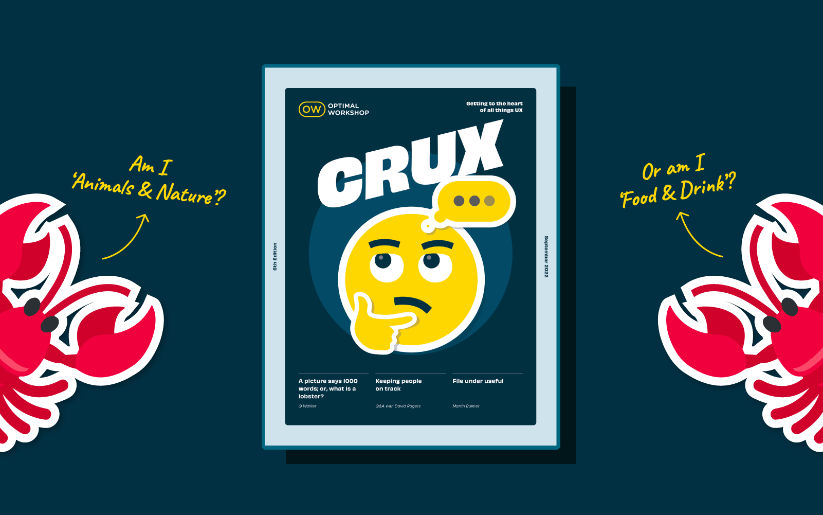
UX research and strategy specialist, Q Walker explores the world of emoji from an information architecture perspective and sparks curiosity along the way. Have you ever wondered why clock emojis are organized under travel and places? 🤔
We talk to Senior Park Ranger David Rogers about the thinking behind creating and building New Zealand’s national walking track network and reveal how information architecture can also live ‘in the wild’.
UX developer Ben Chapman delves into the classification systems of libraries over time and ponders the pros and cons for users of moving information online.
We talk to Sam Cope, Lead UX Designer at Wētā Workshop’s Interactive division about what it takes to drive design decisions with the end user in mind - something crucial for any video game’s success, whether it’s a blockbuster or something more niche.
And much more about information architecture in unexpected places….
The stories and people in this issue of CRUX certainly captured our imagination and attention - we hope they inspire and even surprise you too.
Do you have a burning idea to share or a conversation you’re dying to kickstart that’s of interest to the world of UX? Now’s your chance. We’re already on the lookout for contributors for our next edition of CRUX for 2022. To find out more please drop us a line.
In the crowded and complex world we live in, great user experiences can make all the difference to the way we navigate day-to-day life.
CRUX#5 reveals the many faces of information architecture at work and its positive impact in the fields of business, entertainment, education, and more. Our enthusiastic and knowledgeable contributors generously paint a picture of the challenges, opportunities and benefits of harnessing the power of IA in their world.
In this issue
Author/teacher and games user research expert Steve Bromley reveals some fascinating, even surprising insights from the niche world of UX for video games.
Product Designer Katie Del Angel from Shopify shares some of her favorite ways to adopt an IA mindset when designing digital products.
Digital interactive designer Kate Berry talks information architecture according to the world of visitor experience
Chantal Schweizer from Earley Information Science dives into the all important area of taxonomies and the merits of following best practice to help drive success in the world of eCommerce
And UX Researcher Rebecca Klee shares five approaches to increase the alignment and impact of your IA research.
As always we're grateful to all our contributors for helping shine a light on the fascinating, even addictive world of UX. They certainly captured our imagination and attention - we hope they inspire and even surprise you too.
According to Abby Covert, a leader in the field of information architecture, IA is ‘the way we arrange the parts to make sense of the whole.’ Information architecture (IA) is found in every digital product, from websites and apps to an intranet.
For the purposes of this article we focus on the importance of information architecture to user experience (UX) design because IA is fundamentally important to the success of your user experience. It determines how users will access your content and ultimately how successful their experience is when using your product.
When put like this it does seem pretty straightforward. Maybe even simple? But these tasks need to be straightforward for your users. Putting thought, time and research in at the front of your design and build can help build an intuitive product. IA is the structure that sits in behind and allows the design to tell the story and the content to be found in an easy way.
The role of information architecture in UX design 🏗️
Information architecture forms the framework for any UX design project. You need to consider the visual elements, functionality, interaction, and navigation and if they are built according to IA principles. If not considered fully even the most compelling content and powerful user experience design can fail without an organized and functional IA design. Disorganized content can make finding your way through difficult, meaning users get lost, annoyed and frustrated. Frustrated users don’t stick around and most likely don’t come back.
Through solving or preempting users’ issues with research and designing powerful and effective IA it reduces usability and navigation problems. Meaning that researched, thought through and designed information architecture can save both money and time for your organization in the longer term.
What is the difference between IA and UX? 🤯
Often it can be confusing that there isn’t much difference between IA and UX design. While these terms do relate to each other and need to be considered alongside, they are not one and the same.
“Information architecture (IA) is the discipline of making information findable and understandable, helping people understand their surroundings and find what they’re looking for online and in the real world” -Interaction Design
“User experience (UX) design is the process design teams use to create products that provide meaningful and relevant experiences to users” - Interaction Design
UX design is well grounded with good functional information architecture but that’s not where it stops. The user experience focus is on influencing users’ behaviors and actions through emotion and psychology. Information architecture is focussed on the users' goals and task completion. They work together to create the very best user experience. IA provides the foundation of a well organized space that is easy to navigate and UX design ensures that the overall experience meets (or exceeds) users’ expectations, through their wants, needs and desires.
The key components of IA 🧱
There are four key components to consider when building a strong information architecture:
Labeling
How information is named and represented. Labels need to communicate information to users without using too much space or requiring much work on the user’s part.
Navigation
How people make their way through information. Without robust IA which has been thought through this is the quickest way to confuse users. If they can’t find their way to the information they need, they won’t be able to complete their task. It really is that simple.
Search
How people will look for information (keywords, categories). A search system is especially important when there is a lot of content to wade through. A search engine, filters, and many other tools help users search content. Great UX design will consider how the information will be displayed once searched.
Organization
How the information is ordered. These help users to predict where they can find information easily:
Hierarchical is the hierarchy of the content and literally the order of importance the user expects to see information against what the organization needs.
Sequential Taking a stroll in your user's shoes can be valuable. Considering the path a user would take and the journey they make. Walking step-by-step, ensuring that as users progress through their tasks they are easily led to the next step.
Matrix This is a little more complicated for users as it lets them choose how to navigate on their own. Users are given the choice of content organization. For example, the searchability of a website. Where the user could choose to search by topic, size, price or any other filter or option.
Wrap up 🥙
Information architecture is a key part of a powerful user experience design. Efficient IA helps users quickly and easily move through content and find what they want. And what do users want but to find what they want, complete their task and get on with their day!
Provide an IA that functions well, is intuitive to use and well labeled, coupled with UX design that is smooth, attractive and responds to users needs, wants and desires and you’ll have a winner on the day.
As information professionals, we work with the “stuff” of information in our everyday work. We search for information, we spend time analyzing and synthesizing it, and we carefully create and structure it. Whether you elicit information from users and stakeholders, explore large data sets, design ‘journeys’ or interfaces, or create information architectures, understanding the information you are using and creating as information can help you do your work better.
Kat King, Business Intelligence Analyst at the University of Michigan Library, recently spoke at UX New Zealand, the leading UX and IA conference in New Zealand hosted by Optimal Workshop, about understanding exactly what information is, and where it is, in our work.
In her talk, Kat uses simple examples to teach you to “see” the information around you and understand what makes something “information” in the context of working as a human to accomplish something.
Kat King bio 🎤
Kat King is an Information Architect interested in language, meaning, and the things we make. She currently works as a Business Intelligence Analyst for the University of Michigan Library.
Information theory can be dense and jargon-filled, and discussions in academic texts can feel divorced from the practice of actually working with information. We’re all told that information architecture is much more than website navigation. So, what is it? IA has a reputation for being difficult to understand, and in her talk, Kat attempts to help us understand what it is, where the information is, and what is it that we’re doing when we use IA methods.
Kat defines IA as “the practice of ensuring ontological alignment”. ‘Ontological’ relates to concepts, categories, properties, and relationships. ‘Alignment’ means arrangements into appropriate relative positions. Therefore, information architecture is “the practice of ensuring concepts, categories and their properties and relationships are arranged into appropriate relative positions.”
To align information then, you need to begin by sorting it into concepts and categories, which is difficult because information can sometimes be “slippery and abstract”. Kat argues this is the real reason that IA is sometimes hard to wrap our heads around. So, getting to the heart of the question, what is information?
Kat defines information as “a patterned relationship between differences that reduces uncertainty”. The key word here is ‘differences’. The trick to understanding and taming information is to identify what is different about sets of information. The next trick is to identify consistencies between these differences.
This can be a little confusing, so Kat uses the example of picking fruit. We tend to use color (the difference) to identify when fruit is ripe and sweet. We know for a fact that, at some point, the fruit will be at its sweetest and, while there is a scientific way of identifying this point, we have to use the information we have at our disposal instead i.e. the colour of the fruit. The skin of the fruit in this example is like an interface - allowing a flow of information from the fruit’s ripening process to our eyes.
Information categories 🧺🧺🧺
The relationship between the information described in the fruit example can be split into two categories. “Information 1” is a factual, objective description of when the fruit is ripe (i.e. the science of why the fruit is the color that it is right now), whereas our subjective observation, based on color, is “Information 2”.
Information 1: Matter and energy, and their properties and interactions i.e. the laws of physics and universal truth or rules
Information 1 poses challenges for us because we have a narrow range of perception, attention, and aggregation, which means we, as humans, can’t possibly understand the laws of nature just by observing. We have evolved to be simple, efficient observers of what is important to us. In other words, we don’t need to understand everything in order to get things right. We see patterns and generalize. Going back to the fruit example – we only need to know the color of ripe fruit, not the exact chemistry of why it is ripe.
Information 2: This is Information 1 that is given meaning by humans. This is done via processing semantic information, or “differences and structures that create meaning for people”.
We use semantic information by processing concepts, patterns, categories, mental models, and even language as inputs to form our understanding. As social animals, we tend to reinforce general ‘truths’ about things because we’re constantly cooperating using shared information. General ‘truths’ are good enough.
Kat uses the following interaction to demonstrate the interplay of different information.
Person 1: If the raspberries look good, can you get some for me?
Person 2: How can tell is they’re good?
Person 1: Get the ones that are the most red.
In this interaction, the different pieces of information can be broken down by category:
Semantic information = Words and concepts
Information 1 = Meaningful signs
Information 2 = Perceptible differences
Real life information = Raspberries
Using our ability to communicate and understand concepts (words “red”, “good”, and “raspberries”) helps us to understand Information 2 (processing the words and concepts to understand that a red berry is good”), which aligns with Information 1 (the evolutionary science and ongoing consistency of red/ripe berries being sweet) that helps us decide when processing all of this information.
So, now that we understand a little more about information, how does this influence our roles as designers?
Why it matters 👀
Thanks to our individual lived experiences, people have many different inputs/concepts about things. However, Kat points out that we’re pretty good at navigating these different concepts/inputs.
Take conversations, for example. Conversations are our way of getting a “live” alignment of information. If we’re not on the same page we can ask each other questions to ensure we’re communicating semantic information accurately.
When we start to think about technology and digital products, the interfaces that we design and code become the information that is being transmitted, rather than words in a conversation. The design and presentation become semantic information structures, helping someone to understand the information we’re putting forward. This highlights the importance of aligning the interface (structure and semantic information) and the users' ontology (concepts and categories). For the interface to work, IA practitioners and designers need to know what most people understand to be true when they interact with information, concepts, and categories.
We need to find some sort of stability that means that most users can understand what they need to do to achieve a goal or make a decision. To do this, we need to find common ground between the semantic information (that might vary between users) so that users can have successful Information 2 style interactions (i.e. absorbing and understanding the concepts presented by the interface).
To wrap up, let’s remind ourselves that information architecture is “the practice of ensuring concepts, categories and their properties and relations are arranged into appropriate and relevant positions”. As IA practitioners and designers, it’s our job to ensure that concepts and categories are arranged in structures that can be understood by the nuance of shared human understanding and semantic information – not just in some physical diagram.
We need to present stable, local structures that help to reduce uncertainty at the moment of interaction. If we don’t, the information flow breaks and we aren’t reducing uncertainty; instead, we create confusion and disappointing user interactions with our digital products. Making sure we present information correctly is important (and difficult!) for the success of our products – and for better or worse, it’s the work of information architecture!