

In-person moderated user testing is a valuable part of any research project. Meaning you can see first-hand how your users interact with your prototypes and products. But in-person isn’t always a viable option. What to do if your project needs user testing but it’s just not possible to get in front of your users personally?
Let’s talk unmoderated user testing. This approach sidesteps the need to meet your participants face-to-face as it’s done entirely remotely, over the internet. By it’s very nature there are also considerable benefits to unmoderated user testing.
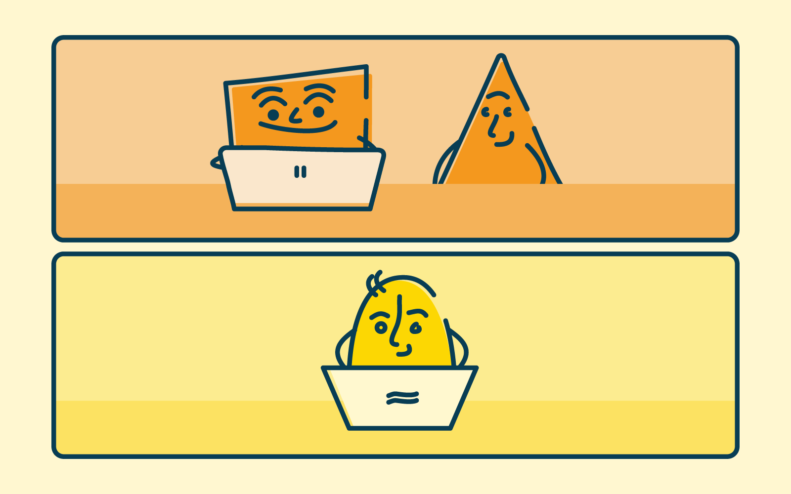
What is unmoderated user testing? 💻👀
In the most basic sense, unmoderated user testing removes the ‘moderated’ part of the equation. Instead of having a facilitator guide participants through the test, participants complete the testing activity by themselves and in their own time. For the most part, everything else stays the same.
The key differences are:
- You can’t ask follow-up questions
- You can’t use low-fidelity prototypes
- You can’t support participants (beyond the initial instructions you send them).
Is unmoderated user testing right for your research project?
By nature, unmoderated user research does not include any direct interaction between the researcher and the study participants. This is really the biggest benefit and also the biggest drawback.
Benefits of unmoderated usability testing 👩🏻💻
- Speed and turnaround - As there is no need to schedule meetings with each participant, unmoderated testing is usually much faster to initiate and complete. Depending on the study, it may be possible to launch a study and receive results in just a few hours.
- Size of study (participant numbers) - Unmoderated user testing also allows you to collect feedback from dozens or even hundreds of users at the same time.
- Location (local and/or international) -Testing online removes reliance on participants being physically present for the testing which broadens the ability to make contact with participants within your country or across the globe.
If you’d like to know more about the benefits of unmoderated usability testing, take a look at our article five reasons you should consider unmoderated user testing.
Limitations of unmoderated usability testing 🚧
- Early-prototype testing is difficult without a moderator to explain and help participants recover from errors or limitations of the prototype.
- Participant behavior - Without a moderator, participants tend to be less engaged and behave less realistically in tasks that depend on imagination, decision-making, or emotional responses.
- Inability to ask follow-up questions - by not being in the testing with the participant, the facilitator can’t ask further questions to get a deeper understanding of the participant’s reasoning. As you can’t rely on human judgment through a moderator being in the room with the participants and the ability to adjust the test in the moment, unmoderated usability testing needs thorough up front planning.
Because of these limitations unmoderated usability testing usually works best for evaluating live websites and apps or highly functional prototypes. It’s great for testing activities that don’t require a lot of imagination or emotion from participants. Such as testing functionality or answering direct queries to do with your product.
What’s involved when setting up unmoderated usability testing? 🤔💭
- Define testing goals
With any usability testing, it pays to define your goals before getting underway with setting up the software. What do you want to know from the participants? Goals vary from test to test. Understanding your goals upfront will help you to make the correct tool choice.
- Define your demographic
With a clear understanding of your goal, now it’s time to consider which participants are right for your study. Think about who they are, their demographic, and where they live. Are they new users or existing? Are they experts or novices?
- Selecting testing software
As unmoderated studies, are done remotely, the software used to faciliate the study plays a key role in ensuring you get useful results. Without a facilitator, the software must guide the participants through the session and record what happens. Take the time to test software and select one that is right for your study.
- Write your own tasks and questions
Think through your goals and what you want to achieve from the testing. Many of the unmoderated testing services include study templates with generic example tasks. Remember they are templates, and your tasks and questions should be specific to your particular study. Any task instructions guiding the participants should be clear and directive.
- Trial session
You’ve done all of the upfront work, now it’s time to test that it works, the software does what you expect and the instructions you have written can be followed. Doing a test run is crucial, especially with unmoderated usability testing, as there won’t be a facilitator in the testing to fix any problems.
- Recruit participants
Having defined your target audience and demographic, now is the time to recruit participants. Ensuring you have some control over the recruitment process is important, either through screening questions or recruiting your own. There are services that recruit from a pool of willing participants. Thiscan be a great way to get a wide range of users.
- Analyze results
You are likely to accumulate a lot of data from your unmoderated testing. You’ll need a way to organize and analyze the data to derive insights that are valuable. Depending on the type of usability testing you do will vary the type of results. Quantitative testing gives data-driven results and direct answers. Whereas qualitative testing through audio or video recordings of participants’ actions or comments will need time to analyze and look at behavioral observations.
Wrap Up 🌯
Unmoderated usability testing can be a good option for your study. It may not be right for all of your studies all of the time. While it can be quick to implement and often cheaper than moderated usability testing, it still requires time and planning to ensure you get the data insights you are looking for. Following a checklist can be a great way to ensure you approach your research methodically.