Subscribe to OW blog for an instantly better inbox
Oops! Something went wrong while submitting the form.
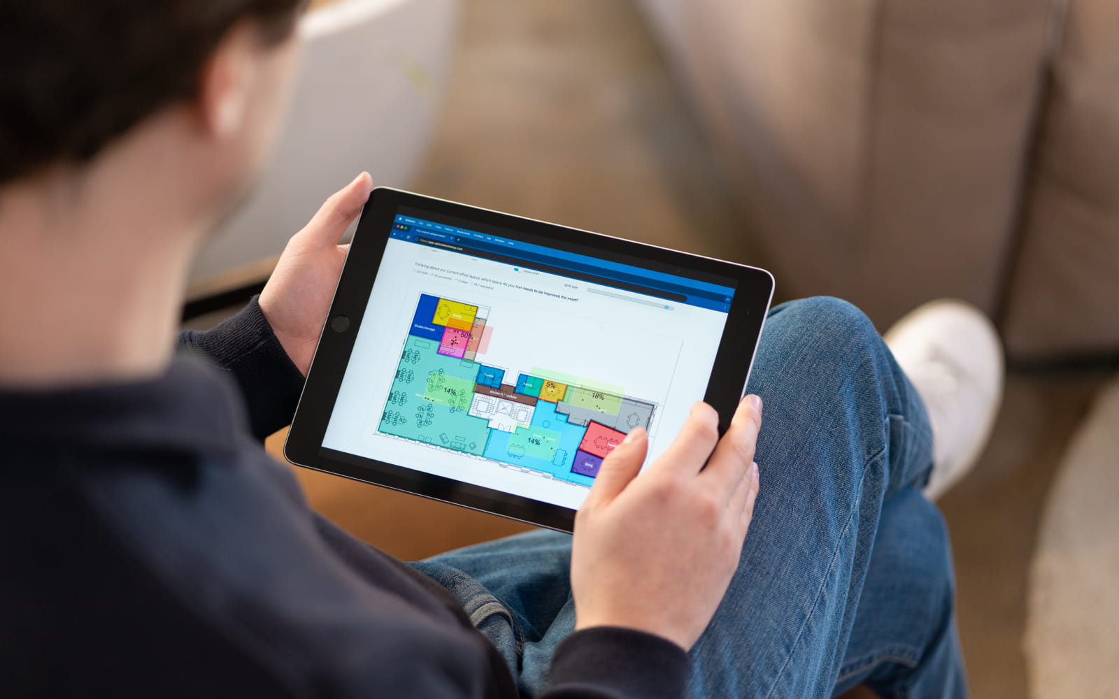
Knowing and understanding why and how your users use your product can be invaluable for getting to the nitty gritty of usability. Where they get stuck and where they fly through. Delving deep with probing questions into motivation or skimming over looking for issues can equally be informative.
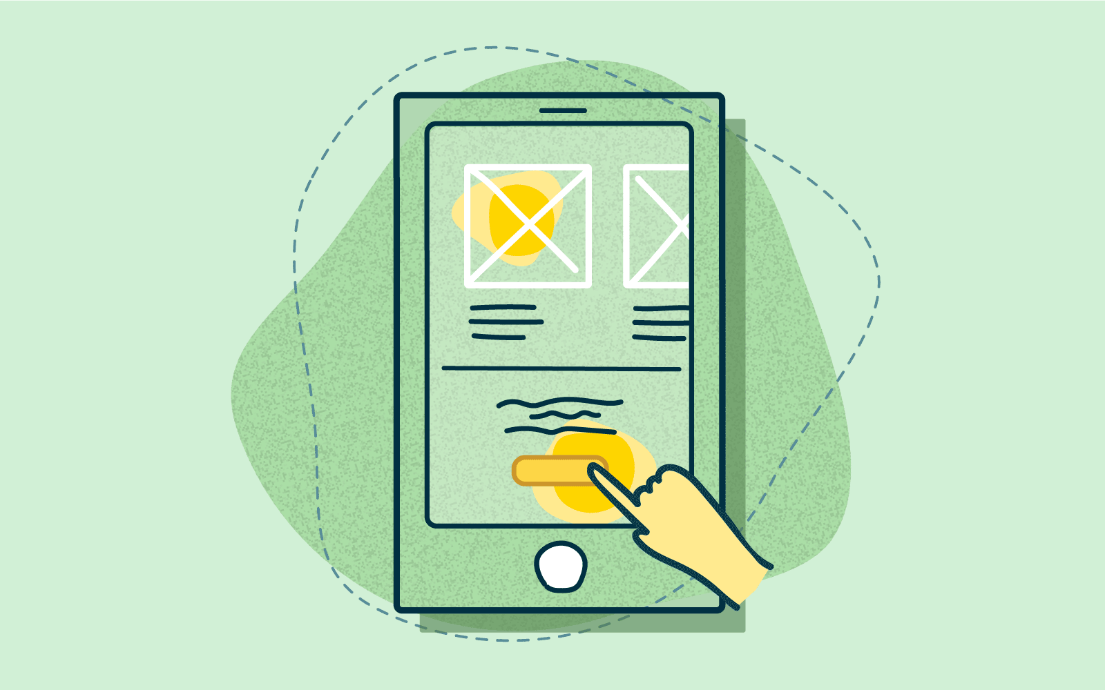
Usability testing can be done in several ways, each way has its benefits. Put super simply, usability testing literally is testing how useable your product is for your users. If your product isn't useable users will not stick around or very often complete their task, let alone come back for more.
Usability testing is a research method used to evaluate how easy something is to use by testing it with representative users.
These tests typically involve observing a participant as they work through a series of tasks involving the product being tested. Having conducted several usability tests, you can analyze your observations to identify the most common issues.
We go into the three main methods of usability testing:
Moderated usability testing is done in-person or remotely by a researcher who introduces the test to participants, answers their queries, and asks follow-up questions. Often these tests are done in real time with participants and can involve other research stakeholders. Moderated testing usually produces more in-depth results thanks to the direct interaction between researchers and test participants. However, this can be expensive to organize and run.
Top tip: Use moderated testing to investigate the reasoning behind user behavior.
Unmoderated usability testing is done without direct supervision; likely participants are in their own homes and/or using their own devices to browse the website that is being tested. And often at their own pace. The cost of unmoderated testing is lower, though participant answers can remain superficial and making follow-up questions can be difficult.
Top tip: Use unmoderated testing to test a very specific question or observe and measure behavior patterns.
Remote usability testing is done over the internet or by phone. Allowing the participants to have the time and space to work in their own environment and at their own pace. This however doesn’t give the researcher much in the way of contextual data because you’re unable to ask questions around intention or probe deeper if the participant makes a particular decision. Remote testing doesn’t go as deep into a participant’s reasoning, but it allows you to test large numbers of people in different geographical areas using fewer resources.
Top tip: Use remote testing when a large group of participants are needed and the questions asked can be direct and unambiguous.
In-person usability testing, as the name suggests, is done in the presence of a researcher. In-person testing does provide contextual data as researchers can observe and analyze body language and facial expressions. You’re also often able to converse with participants and find out more about why they do something. However, in-person testing can be expensive and time-consuming: you have to find a suitable space, block out a specific date, and recruit (and often pay) participants.
Top tip: In-person testing gives researchers more time and insight into motivation for decisions.
These three usability testing methods generate different types of information:
Explorative testing is open-ended. Participants are asked to brainstorm, give opinions, and express emotional impressions about ideas and concepts. The information is typically collected in the early stages of product development and helps researchers pinpoint gaps in the market, identify potential new features, and workshop new ideas.
Assessment research is used to test a user's satisfaction with a product and how well they are able to use it. It's used to evaluate general functionality.
Comparative research methods involve asking users to choose which of two solutions they prefer, and they may be used to compare a product with its competitors.
Top tip: Depending on what research is being done, and how much qualitative or quantitative data is wanted.
Whether the testing is done in-person, remote, moderated or unmoderated will depend on your purpose, what you want out of the testing, and to some extent your budget.
Depending on what you are testing, each of the usability testing methods we explored here can offer an answer. If you are at the development stage of a product it can be useful to conduct a usability test on the entire product. Checking the intuitive usability of your website, to ensure users can make the best decisions, quickly. Or adding, changing or upgrading a product can also be the moment to check on a specific question around usability. Planning and understanding your objectives are key to selecting the right usability testing option for your project.
Let's take a look at a couple of examples of usability testing.
Imagine you have a website that sells sports equipment. Over time your site has become cluttered and disorganized, much like a bricks and mortar store may. You’ve noticed a drop in sales in certain areas. How do you find out what is going wrong or where users are getting lost? Having an in-person, lab (or other controlled environment), moderated usability test with users you can set tasks, watch (and record) what they do.
The researcher can literally be standing or sitting next to the participant throughout, recording contextual information such as how they interacted with the mouse, laptop or even the seat. Watching for cues as to the comfort of the participant and asking questions about why they make decisions can provide richer insights. Maybe they wanted purple yoga pants, but couldn’t find the ‘yoga’ section which was listed under gym rather than a clothing section.
Meaning you can look at how your stock is organised, or even investigate undertaking a card sort. This provides robust and fully rounded feedback on users behaviours, expectations and experiences. Providing data that can directly be turned into actionable directives when redeveloping the website.
You are looking at launching an app for parents to access for information and updates for the school. It’s still in development stage and at this point you want to know how easy the app is to use. Setting some very specific set tasks for participants to complete the app can be sent to them and they can be left to complete (or not). Providing feedback and comments around the usability.
The next step may be to use first click testing to see how and where the interface is clicked and where participants may be spending time, or becoming lost. Whilst the feedback and data gathered from this testing can be light, it will be very direct to the questions asked. And will provide data to back up (or possibly not) what assumptions were made.
You’re right at the start of the development process. The idea is new and fresh and the basics are being considered. What better way to get an understanding of what your users’ truly want than an explorative study.
Open-ended questions with participants in a one-on-one environment (or possibly in groups) can provide rich data and insights for the development team. Imagine you have an exciting new promotional app that you are developing for a client. There are similar apps on the market but none as exciting as what your team has dreamt up. By putting it (and possibly the competitors) to participants they can give direct feedback on what they like, love and loathe.
They can also help brainstorm ideas or better ways to make the app work, or improve the interface. All of this done, before there is money sunk in development.
Key objectives will dictate which usability testing method will deliver the answers to your questions.
Whether it’s in-person, remote, moderated or comparative with a bit of planning you can gather data around your users very real experience of your product. Identify issues, successes and failures. Addressing your user experience with real data, and knowledge can but lead to a more intuitive product.
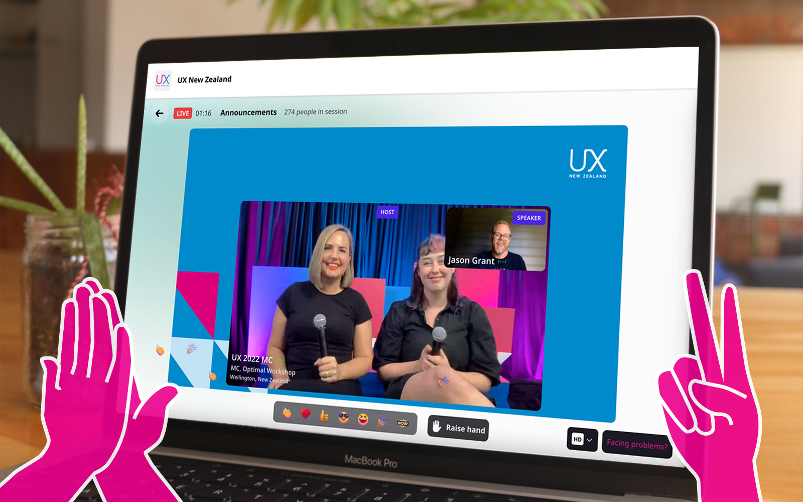
An impressive line-up of researchers, strategists, and designers from the global UX community shared their ideas, experiences, insights, and approaches to effective ways of working at this year’s 100% virtual 3-day UX New Zealand conference.
We introduce 7 speakers, highlight what they had to say, and share their full video presentations.
Designers focus on creating great experiences for customers but who’s looking out for the designers themselves? Marine Bucher, Service Designer at Humankind shared how a Design Ops approach is creating and maintaining a healthy environment for 170+ designers globally and 40+ locally in New Zealand, to thrive at ANZ bank.
“The goal of Design Ops is to remove all operational headaches so designers can focus on designing and researching.”
An impressive trio from Deloitte Digital: Carol Yung, Georgia Chetwynd-Talbot, and Matt Cobham took us through what it was like to be part of the agile team tasked with designing and piloting a core service of the UK’s pandemic response in just weeks, and delivering it at scale in just 2-3 months.
"Our lifecycle from design, to build, to deployment was extremely quick, learning as we went. We had to think and act like a start-up’."
Have you ever had a stakeholder ask you to present the findings of your study one hour before a meeting? Michael Ryan, User Research Director at Liberty Mutual Insurances shared his solution to this and other challenges researchers face presenting their work in a practical and entertaining talk.
“Can you present the findings from last week’s study now? Scenarios like that used to stress me out as a UX researcher so I came up with 1-pagers.”
Sarah Goforth, Senior UX Researcher at Trade Me considers herself and her fellow researchers, Kaitiaki, 'guardians of our people'. Sarah shared the challenges and wins of building their particular type of UX research operations (ReOPs) at Trade Me which includes everyone, (researchers and non-researchers), in the process.
"Not having an impact with your research really sucks as a researcher…and should not be wasted."
Phil Balagtas, President, and Founder of Futures Thinking believes designers have a responsibility to design better futures and policies for generations to come by embedding a future-thinking mindset into the products and services they design. He referenced the confusing, often intelligible world of Terms and Conditions to illustrate the need for designers to take a more human-centered approach.
"Policies are not always designed as a dialogue. Yet it's a gateway to using a service."
After introducing the four-day week at Perpetual Guardian, Andrew Barnes, Founder of 4 Day Week Global, actively advocates for its adoption by others as part of the future of work. He talks through the issues, challenges, and opportunities of embracing a 4 day working week in the digital age.
“When we started back in 2018 we were a pretty lone voice…The 4 day week has been given rocket fuel by Covid-19.”
While many avoid or despair when faced with UX complexity, Sophia Prater, Founder & Lead UX Designer at Rewired UX embraces complexity, untangling it with an approach she calls Object-Oriented UX. She shared four tough questions to ask early on to help wrangle complexity to benefit the user.
"I see portfolio pieces like this a lot. I can tell complexity has been completely swept under the rug and the end-user ends up handling it.”
For a taste of what even more speakers from UX New Zealand 2022 had to share, head over to our highlights reel.
User research is key to discovering the inner workings of your users’ minds – their emotional, organizational, informative needs and desires. These are all super important to creating a user experience that is intuitive and meeting your users’ needs in a way that means they feel loved, cared for and considered. All the deep understanding stuff that keeps them coming back!
Qualitative research allows you to collect verbatim data from participants that give insights into why they do or feel things. You can even get into whether ‘Dee’ understood how the website worked or why ‘Andrew’ would (or wouldn’t) revisit the app outside of testing.
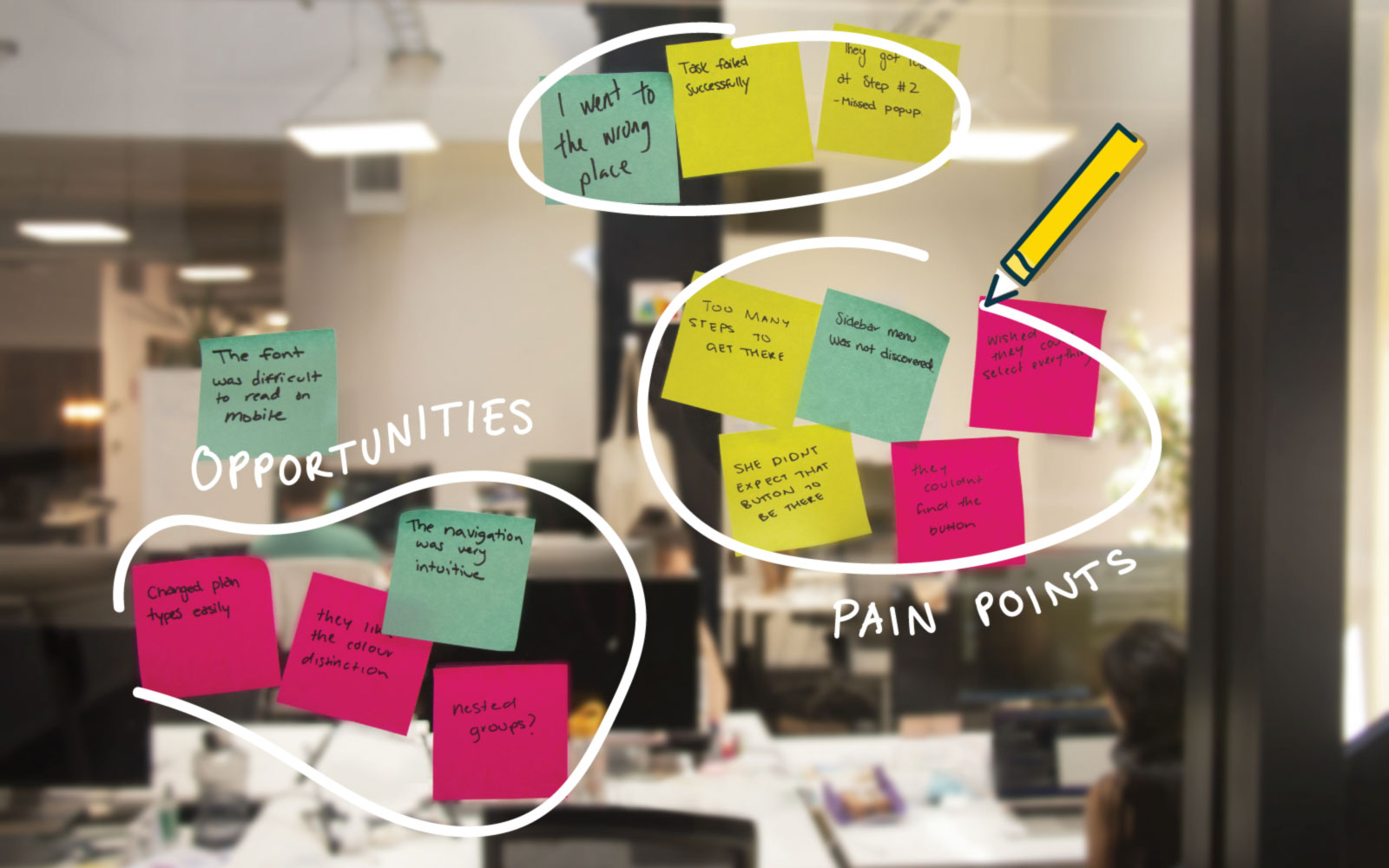
Gathering these awesome insights is one step. Analyzing and organizing these is a skill and talent in its own right. And armed with the right tools or methods it can be immersive, interesting and a great way to get under the skin of your users. Let’s take a look at affinity mapping as a method of analyzing this data - as a tool it can help researchers visualize and easily group and theme data.
Affinity mapping is used outside of the UX world and can be done independently, however is a great analysis method to use collaboratively. For researchers, it can be a great tool to collaborate and engage the team and potentially stakeholders. Bringing people together to identify, discuss and resolve user experience issues.
Here we’ll lay out what affinity mapping is, specifically why it’s useful for user research and set out key steps to get you underway.
By definition, affinity mapping is the process of collecting, organizing, and grouping qualitative data to create an affinity diagram.
Put simply it is a tool to group, map, sort and categorize information. A tool where you’ll look at the information and patterns of your qualitative user research and work to group these together to make sense of them. It helps you to find patterns, similar outcomes and insights that allow you to draw conclusions and collate results in a cohesive manner, then report to the wider team in a way that makes sense and provides a clear road to applicable and achievable outcomes.
An affinity diagram is what you have once you have gone through the affinity mapping process. It is the final ‘diagram’ of your grouping, sorting and categorizing. An ordered visual sorting of insights and information from your user research. And the place to filter or funnel observations and information into patterns and reach final outcomes.
Allowing you to see where the key outtakes are and where there may need to be improvements, changes or updates. And from here a roadmap can be decided.

Essentially the mapping part is the process of creating the diagram, a visual sorting of insights and information from your user research. So how do you make affinity mapping work for you?
This could be a table, desk, pinboard or even a whiteboard. Somewhere that you can stick, pin or attach your insights to in a collaborative space. Becoming more common recently is the use of shared digital and online whiteboard tools. allowing people to access and participate remotely.
Write observations, thoughts, research insights on individual cards or sticky notes.
As a group read, comment and write notes or observations. Stick each of the notes onto the board, desk or whiteboard. Add, and shuffle into groups as you go. You can keep adding or moving as you go.
This will start to make sense as more sticky notes are added to the map. Creating groups for similar observations or insights, or for each pattern or theme.

As more notes are added there will be natural groups formed. Openly discuss if there are notes that are more difficult to categorize or themes to be decided. (We’ve outlined some ideas for UX research themes in another section below.)
You’ve tidied everything into themes and groups, now what? How do you decide which of these are priorities for your organization? Discussion and voting can be the best way to decide what outcomes make the most sense and may have the biggest impact on your business.
Pulling together and reporting on the findings through your affinity diagram process should be key to putting actionable outcomes in place.
Commonly, user research is digested through thematic analysis. During thematic analysis, you aim to make sense of all the notes, observations, and discoveries you’ve documented across all your information sources, by creating themes to organize the information.
Depending on your role and the type of research you conduct, the themes you create for your affinity diagram can vary. Here are some examples of affinity groups that you could form from your UX research:
Qualitative user testing and the resulting observations can be some of the best insights you get into your users’ minds. Filtering, organizing and ordering these disparate and very individual observations can be tricky. Especially if done in silo.
So, draw a team together, bring in stakeholders from throughout your organization and work collaboratively to sort, organize and categorize through affinity mapping. This opens the doors to discussion, buy-in and ultimately a collective understanding of user research. Its importance and its role within the organization. And most importantly the real-world implications UX research and its insights have on organizational products and output.

Information architecture (IA) is everywhere. Like the best websites and apps in the digital world, information architecture also brings clarity and understanding to the real world. It helps us navigate complexity and clutter, enables us to get things done more easily even with enjoyment, and reduces our cognitive load as we go about our lives.
As Abby Covert, IA advocate and author of ‘How to Make Sense of Any Mess’, puts it:
‘I believe information architecture has the power to make the world a clearer place’
We share five examples of information architecture at work in everyday life.

Does your phone home screen look like a random bunch of icons or a well-laid-out work of art? Fitness, entertainment, shopping, transport, banking…these days there’s some kind of app for every aspect of your life. While it’s handy to be able to access all these apps on the go, keeping track of them can be a mission unless you have some kind of system. If finding the right app at the right time is driving you crazy - maybe it’s time to give your phone information architecture some love?

Are your books arranged by subject, category, author, size, color, or something else? Do you go for the common approach that everyone understands like a library or something more personal like ‘books I read a lot’ or ‘books I’ll never read’? However you do it, there’s some kind of system, (or information architecture), at work that drives your decisions about where individual books end up on your shelf - what’s yours?

When you’ve got lots on and feeling overwhelmed or you’re packing for that well-earned holiday and don’t want to forget anything, chances are you enlist the help of some kind of list. What a relief to get all that stuff out of your head somewhere, in some kind of order. Whether you put pen to paper and stick it on your fridge or carry it around on your phone, the main thing is you’ve got a list somewhere - that’s a great information architecture starting point.

Supermarket shopping - love it or hate you - it’s got to be done. Do you browse the aisles or aim to get in and out as quickly as possible? Whether you’re pushing a trolley around your local haunt, out of town in unfamiliar territory or simply shopping online, you’re relying on some kind of signposts to guide your way through the myriad of products. Phew - Information architecture can be a lifesaver. It can also change lives as Jennie Leng discovered in her case study on online shopping at Countdown.
https://www.youtube.com/watch?v=abnHLaGV_aw&list=PLKQWFP9YS6b479paxcG89cOjHUjQcPlem&index=19&t=7s

Imagine you’re doing a spot of research ahead of a job interview, looking for the right person in a big company to pitch your product or you’re the newbie at work and unsure who’s who - an organizational chart can save time, and embarrassment - and generally make life easier. All power to information architecture!
So there you have it. Information architecture isn’t all about content audits, complex site maps or complex tree testing projects. It’s also about systems and structures that help us navigate everyday life in the real world.
Having access to the specialist subscription-based tools you need to do your work is a reasonable thing to expect. But what if you’re relying on someone else’s SaaS account to access what you need? Sounds like a good solution but think again. It’s risky - even fraught. Here are 3 good reasons to avoid shared login credentials and why you need your own.
If you don’t know who’s signed up and using the subscriptions your organization pays for and holds, how can you protect their data once they’ve gone? As the account holder, you’re responsible for keeping the personal data of anyone accessing your subs safe and secure. That’s not only the right thing to do - it’s pretty important from a legal perspective too.
In today’s data-driven world safeguards around privacy and security are essential. You only need to look at the fallout from serious data breaches around the world to see the damage they can do. There’s a myriad of privacy laws around personal data out there but they’re based on the universal principle of protecting personal data. One of the better-known laws is GDPR the EU’s data protection law.
The General Data Protection Regulation (GDPR) regulates and protects the processing of the personal information of EU citizens and residents by establishing rules on how organizations such as companies and governments can process this personal data. It’s important to note the GDPR applies to those handling the data whether they’re EU-based organizations or not.
Avoid encouraging shared logins in your organization to ensure peace of mind that you’re doing everything you can to keep people’s personal data safe and secure - as well as keeping on the right side of the law.
Having single logins rather than shared logins saves time and energy and makes the whole administration smoother and easier for everyone.
For instance, maybe you need to delete data as part of honoring GDPR rules. This could be tricky and time consuming if there are multiple users on one email as a generic email isn’t specific to a person.
Generic email addresses also make it harder for SaaS providers to understand your account activity and implement the changes you want or need. For example, customers often ask to retrieve information for account billing. Having multiple employees using a single login can make this problematic. It can be a real struggle to identify the right owners or users.
And if the ‘champion’ of the tool leaves your organization and you want to retrieve information on the account, your SaaS provider won't be able to do this without proof you’re the real owner of this account.
Another added benefit ,(which your IT & security team will thank you for), of having a personal login, is the way it makes setting up functionality such as single-sign-on (SSO) so easy. Given the way single sign-on works, shared emails just don’t cut it anymore. Also if your organization uses SSO it means you’ll be able to log into tools more quickly and easily.
When things go wrong or you just need help using products or tools from your friendly SaaS it’s important for them and for you, that they’re in the best position to support you. Supporting people is a big part of the job and generic emails make it harder to connect with customers and create the people to people relationships that enable the best outcome when problems arise or training or help is needed.
You may be surprised to hear what a blocker multiple users on a single email can be. For instance, generic email addresses can make it harder for us to get to the right person and communicate with you. We won’t know if you have another email active in the system we can use to help you.
We’ve given you 3 good reasons not to account share - still, need convincing?
What about getting the right plan to meet your organization’s needs - so you don’t need to share in the first place? There could be all kinds of reasons why you’ve ended up having to account share: maybe a workmate signed up, shared it, and got you hooked too. Or your organization has grown and you need more subs. Whatever the reason there’s no need to account share - get in touch and sound us out to find a better, safer solution.
Mobile app testing with users before, during and beyond the design process is essential to ensuring product success. As UX designers we know how important usability is for interaction design, but testing early and often on mobile can sometimes be a challenge. This is where usability testing tools like Chalkmark (our first-click testing tool) can make a big difference.
First-click testing on mobile apps allows you to rapidly test ideas and ensure your design supports user goals before you invest time and money in further design work and development. It helps you determine whether you’re on the right track and whether your users are too — people are 2 to 3 times as likely to successfully complete their task if they got their first click right.
Read on for our top tips for mobile testing with Chalkmark shared through an example of a study we recently ran on Airbnb and TripAdvisor’s mobile apps.
There’s 2 ways that you might approach mobile app testing with Chalkmark: remotely or in person. Chalkmark is great for remote testing because it allows you to gain insights quickly as well as reach people anywhere in the world as the study is simply shared via a link. You might recruit participants via your social networks or email lists or you could use a recruitment service to target specific groups of people. The tool is also flexible enough to work just as well for moderated and in-person research studies. You might pop your study onto a mobile device and hit the streets for some guerrilla testing or you might incorporate it into a usability testing session that you’ve already got planned. There’s no right or wrong way to do it — it really depends on the needs of your project and the resources you have available.
For our Airbnb and TripAdvisor mobile app study example, we decided to test remotely and recruited 30 US based participants through the Optimal Workshop recruitment service.
Chalkmark works by presenting participants with a real-world scenario based task and asking them to complete it simply by clicking on a static image of a design. That image could be anything from a rough sketch of an idea, to a wireframe, to a screenshot of your existing product. Anything that you would like to gather your user’s first impressions on — if you can create an image of it, you can Chalkmark it.
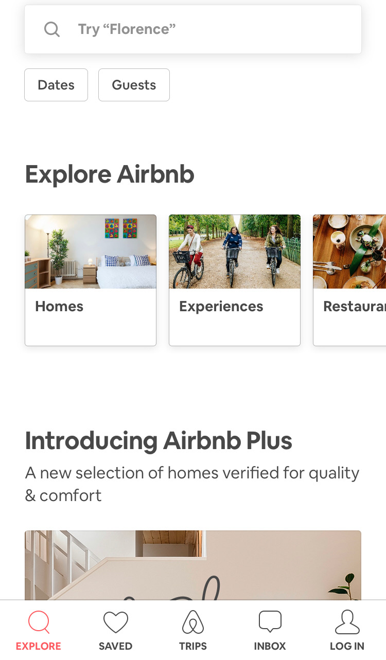
To build your study, all you have to do is upload your testing images and come up with some tasks for your participants to complete. Think about the most common tasks a user would need to complete while using your app and base your mobile testing tasks around those. For our Airbnb and TripAdvisor study, we decided to use 3 tasks for each app and tested both mobile apps together in one study to save time. Task order was randomized to reduce bias and we used screenshots from the live apps for testing.
For Airbnb, we focused our mobile testing efforts on the three main areas of their service offering: Homes, Experiences and Restaurants. We wanted to see if people understood the images and labels used and also if there were any potential issues with the way Airbnb presents these three options as horizontally scrollable tiles where the third one is only partially shown in that initial glance.
For TripAdvisor, we were curious to see if the image-only icons on the sticky global navigation menu that appears when the page is scrolled made sense to users. We chose three of these icons to test: Holiday Rentals, Things To Do and Forums.

Our Chalkmark study had a total of 6 tasks — 3 for each app — and we tested both mobile apps together to save time.
Our tasks for this study were:
1. You’ll be spending the holidays with your family in Montreal this year and a friend has recommended you book yourself into an axe throwing workshop during your trip.
2. Where would you go to do this? (Airbnb)
3. You’ve heard that Airbnb has a premium range of places to stay that have been checked by their team to ensure they’re amazing. Where would you go to find out more? (Airbnb)
4. You’re staying with your parents in New York for the week and would like to surprise them by taking them out to dinner but you’re not sure where to take them. Where would you go to look for inspiration? (Airbnb)
5. You’re heading to New Zealand next month and have so many questions about what it’s like! You’d love to ask the online community of locals and other travellers about their experiences. Where would you go to do this? (TripAdvisor)
6. You’re planning a trip to France and would prefer to enjoy Paris from a privately owned apartment instead of a hotel. Where would you go to find out what your options are? (TripAdvisor)
7. You’re currently on a working holiday in Melbourne and you find yourself with an unexpected day off. You’re looking for ideas for things to do. Where would you go to find something like this? (TripAdvisor)
Task order was randomized to reduce bias and we used screenshots from the live apps for testing.All images used for testing were the size of a single phone screen because we wanted to see if they could find their way without needing to scroll. As with everything else, you don’t have to do it this way — you could make the image longer and test a larger section of your design or you could focus on a smaller section. As a testing tool, Chalkmark is flexible and scalable.
We also put a quickly mocked up frame around each image that loosely resembled a smart phone because without it, the image looked like part of it had been cropped out which could have been very distracting for participants! This frame also provided context that we were testing a mobile app.
Chalkmark makes it really easy to make sense of your research through clickmaps and some really handy task results data. These 2 powerful analysis features provide a well-rounded and easy to digest picture of where those valuable first clicks landed so that you can evolve your design quickly and confidently.
A clickmap is a visualization of where your participants clicked on your testing image during the study. It has different views showing heatmaps and actual click locations so you can see exactly where they fell. Clickmaps help you to understand if your participants were on the right track or, if they weren’t, where they went instead.The task results tab in Chalkmark shows how successful your participants were and how long it took them to complete the task. To utilize the task results functionality, all you have to do is set the correct clickable areas on the images you tested with — just click and drag and give each correct area a meaningful name that will then appear alongside the rest of the task results. You can do this during the build process or anytime after the study has been completed. This is very useful if you happen to forget something or are waiting on someone else to get back to you while you set up the test!
For our Airbnb and TripAdvisor study, we set the correct areas on the navigational elements (the tiles, the icons etc) and excluded search. While searching for something isn’t necessarily incorrect, we wanted to see if people could find their way by navigating. For Airbnb, we discovered that 83% of our participants were able to correctly identify where they would need to go to book themselves into an axe throwing workshop. With a median task completion time of 4.89 seconds, this task also had the quickest completion time in the entire study. These findings show that the label and image being used for the ‘Experiences’ section of the app appears to be working quite well.
We also found that 80% of participants were able to find where they’d need to go to access Airbnb Plus. Participants had two options and could go via the ‘Homes’ tile (33%) or through the ‘Introducing Airbnb Plus’ image (47%) further down. Of the remaining participants, 10% clicked on the ‘Introducing Airbnb Plus’ heading, however at the time of testing, this area was not clickable. It’s not a huge deal because these participants were on the right track and would have likely found the right spot to click fairly quickly anyway. It’s just something to consider around user expectations and perhaps making that heading clickable might be worth exploring further.
83% of our participants were able to figure out where to go to find a great restaurant on the Airbnb app which is awesome! An additional 7% would have searched for it which isn’t wrong, but remember, we were testing those navigational tiles. It’s interesting to note that most people selected the tiles — likely indicating they felt they were given enough information to complete the task without needing to search.
For our TripAdvisor tasks, we uncovered some very interesting and actionable insights. We found that 63% of participants were able to correctly identify the ‘Forums’ icon as the place to go for advice from other community members. While 63% is a good result, it does indicate some room for improvement and the possibility that the ‘Forums’ icon might not be reasonating with users as well as it could be. For the remaining participants, 10% clicked on ‘Where to?’ which prompts the user to search for specific locations while 7% clicked on the more general search option that would allow them to search all the content on the app.
63% of participants were able to correctly identify the ‘Holiday Rentals’ icon on the TripAdvisor app when looking for a privately owned apartment rather than a hotel to enjoy Paris from, while 20% of participants appear to have been tripped up by the ‘Hotel’ icon itself.
With 1 in 5 people in this study potentially not being able to distinguish between or determine the meaning behind each of the 2 icons, this is something that might merit further exploration. In another one of the TripAdvisor app’s tasks in this study, 43% of participants were unable to correctly identify the ‘Things To Do’ icon as a place to find inspiration for activities.Where to from here?
If this were your project, you might look at running a quick study to see what people think each of the 6 icons represent. You could slip it into some existing moderated research you had planned or you might run a quick image card sort to see what your users would expect each icon to relate to. Running a study testing all 6 at the same time would allow you to gain insights into how users perceive the icons quickly and efficiently.
Overall, both of these apps tested very well in this study and with a few minor tweaks and iterations that are part of any design process, they could be even better!
Now that you’ve seen an example of mobile testing in Chalkmark, why not try it out for yourself with your app? It’s fast and easy to run and we have lots of great resources to help you on your way including sample studies that allow you to interactively explore both the participant’s and the researcher’s perspective.
Further readingCreate and analyze a first-click test for freeView a first-click test as a participantView first-click test results as a researcherRead our first-click testing 101 guideRead more case studies and research stories to see first-click testing in action
Originally published on 29 March 2019
