Subscribe to OW blog for an instantly better inbox
Oops! Something went wrong while submitting the form.


User experience (UX) is the pointy end of website design. Great UX validates a lot of hard work behind the scenes, but poor UX will quickly render it useless. Why? Users are becoming more and more impatient. If they can’t find what they’re looking for, or interactions aren’t intuitive, they’ll simply leave as quickly as they arrive. What’s worse? They probably won’t come back! Thankfully, many businesses are recognizing the importance of great user experience and its influence on website performance.
In this article, we’ll cover 4 key UX metrics to measure the success of your website performance: bounce rate, time on site, pages per session, and conversion rate. Captured by website analytics platforms, these metrics provide you with a high-level understanding of how well users are engaging with your website, and where you might be able to improve user experience. We’ll also look at the roles of navigation, content, and the customer journey, and how they impact overall website performance.
If a user bounces on a trampoline, they’re probably having fun. If they’re bouncing on your website, they’re probably having the opposite of fun. Let’s discuss bounce rate, and why it’s such a good indicator of why your users aren’t having much fun.
Bounce rate is a UX metric that measures the percentage of users that visit just one page on your site before leaving. Essentially they arrive and they might scroll, but they don’t click anywhere; they simply leave. A high bounce rate means that a lot of people are doing this. Why is this (usually) a bad thing? Generally speaking, you want users to be so engaged in the page they landed on that they stay and have a look around. You want them to explore your other content, maybe fill in a form, watch a video, etc.
There are a bunch of ways to improve your bounce rate, but there are two key things you should consider if you’re experiencing a high bounce rate:
Bounce rates give you a strong indication of what your users' first impressions are of your website. You’ll need to dig deeper to find out the cause of high bounce rates, but it’s certainly worthwhile. Use the 3 elements mentioned above as your starting point.
As a final note on bounce rates, we want to point out that there are exceptions where high bounce rates might not directly relate to poor user engagement. For example, users may arrive at a blog post that contains everything they wanted to know. This usually happens if you're generating traffic to a specific page from social media or search engines. However, if your home page has a high bounce rate, for example, you’ll want to investigate. So, be sure to keep bounce rate metrics in context.
In addition to bounce rate, you should find out how long users are sticking around in general. Time on site is the next logical UX metric to analyze. The longer users spend on your site, the more confident you can be that you’re providing exceptional user engagement and experience.
Keep an eye on the following metrics to gauge time on site and website performance:
So, armed with these metrics, what should we look for to improve website performance? Well, firstly you should look for some benchmarks. How are you performing compared to other sites in your industry? How do time on page figures compare with each other? For example, if some of your pages are getting over 5 minutes of time-on-page and others are getting 20 seconds, there’s a disparity between how useful, engaging, or relevant the content is.
Even if your website is performing well, we recommend analyzing your time on site metrics to understand where improvements could be made. A great place to start is a content audit. This pulls together data from all of your content into one place where you can analyze what is redundant, obsolete, and trivial (ROT analysis). What’s driving engagement? What information isn’t adding value? Overlapping this audit with time on page figures can reveal extremely useful insights into how you can improve user experience by providing the most useful content.
You should also shine a light on your navigation. If users can’t find their way through your content, they’re not going to stick around. Can you streamline your navigation? Can you order your content from most to least relevant to better meet user needs? Are some menus confusingly labeled? Improve your website performance by taking a critical look at the factors that influence time on page.
Pages per session calculate the average number of pages on your website that users access per session. It is calculated by taking the total page views and dividing it by the total number of sessions that have taken place across the same period.
Pages per session is an important UX metric to track because it reveals how relevant and ‘explorable’ your website is. The higher the figure, the more pages your users are visiting during their stay, and the more engaged they’re likely to be. As we highlighted earlier with bounce rate, users will quickly leave if they’re not finding what they want. Therefore, in general, if users are sticking around, it’s a good indication you’re providing a good user experience.
How can you increase pages per session? Firstly, provide useful, relevant content at every turn. No matter where your users may land on your website, they should be satisfied and gratified. All going well, this initial content will leave them thirsty for more. This is another great reason to perform regular content audits - to critically analyze the type of content that makes up your site.
But great content doesn’t automatically mean great user experiences. User engagement might be high, but how are they getting between pages? How easily are they getting from one part of your site to the next? This is where navigation comes to the fore. And whilst menus and sub-menus are obviously important, we want to highlight call-to-actions and internal links.
Cleverly placed call-to-actions and internal links pull users along. They sit there within the content (or below the content) urging them to learn more and search more. A good example of this is ‘related articles’ at the end of a blog. Of course, the key is that they should be relevant. Disrupting the user’s journey with something unrelated could put them off, rather than retain them. This is particularly true for call-to-action buttons - they should be visible and attractive, but not so much as to obstruct the user.
It’s important to remember the goal of your website. Good UX is great, but there’s no point aiming for the highest page per session figures unless you’re getting conversions. Which, incidentally, is our next subject.
Tracking conversion rate is the ultimate test of user experience design. Of course, there are a lot of factors involved in conversion rate, so we’ll focus on which elements of UX design can have the most impact.
Conversion rate is the percentage of users that perform specific tasks you define. Conversion rates are therefore dictated by your goals, and in most cases, will include things like transactions, newsletter sign-ups, phone calls, completing contact forms, or downloading a white paper. Why are conversion rates important to track? Well, your website is a machine for [insert your purpose here]! In many cases, we simply want to increase sales or leads.
There are a few ways to increase conversion rates. Firstly, if you haven’t already, review or build your customer journey map. Customer journey mapping is a technique used to help you visualize your customer’s key touchpoints, sentiments, pain points, and actions. It helps you understand how your user gets from awareness of your product/brand/website, right through to conversion. Every customer journey is slightly different, which is why it’s so important to understand. Fail to understand your customer and it will be glaringly obvious in your user experience design.
Customer journey mapping leads nicely to your value proposition. Do you have it clearly defined? What is your point of difference? How is it being communicated? Whilst encouraging a user to explore and engage in your website is great, some users may be time-poor. Could you speed up the consumption of your information? Trial a short video on your home page or landing page, for example. You may find that it increases engagement and conversion rates.
Increasing conversion rates can also be achieved by reducing navigation friction. Make call-to-action buttons obvious and easy to find. Ensure the readability of buttons and text. Perhaps your forms could be optimized, for example, you may want to reduce the number of fields required, or you could embed forms at the bottom of key pages, reducing the chance of clicking away. Form optimization can be a simple yet effective way of improving conversion rates.
Tracking UX metrics is an ongoing task that ensures you’re meeting the needs of your users. As your users’ needs, demands, and expectations change, so should your website design. One of the easiest ways to do this is to keep track of your UX metrics for website performance.
Bounce rate, time on site, pages per session, and conversion rates are some of the most revealing metrics. Collectively, they highlight user engagement levels on your website and give strong indications of where your UX design is meeting expectations, or where it’s falling short.
The key strength of these metrics depends on how you interpret them. You may need to dig deeper into why certain aspects of your site aren’t performing well. Implement some of the research techniques mentioned in this article, like content audits or customer journey mapping, to find clues to the answer. The answers could very well lead to a significant boost in website performance!

The term ‘usability’ captures sentiments of how usable, useful, enjoyable, and intuitive a website or app is perceived by users. By its very nature, usability is somewhat subjective. But what we’re really looking for when we talk about usability is how well a website can be used to achieve a specific task or goal. Using this definition we can analyze usability metrics (standard units of measurement) to understand how well user experience design is performing.
Usability metrics provide helpful insights before and after any digital product is launched. They help us form a deeper understanding of how we can design with the user front of mind. This user-centered design approach is considered the best-practice in building effective information architecture and user experiences that help websites, apps, and software meet and exceed users' needs.
In this article, we’ll highlight key usability metrics, how to measure and understand them, and how you can apply them to improve user experience.
Usability metrics aim to understand three core elements of usability, namely: effectiveness, efficiency, and satisfaction. A variety of research techniques offer designers an avenue for quantifying usability. Quantifying usability is key because we want to measure and understand it objectively, rather than making assumptions.
There are a few key metrics that we can measure directly if we’re looking to quantify effectiveness, efficiency, and satisfaction. Here are four common examples:
Usability metrics are outputs from research techniques deployed when conducting usability testing. Usability testing in web design, for example, involves assessing how a user interacts with the website by observing (and listening to) users completing defined tasks, such as purchasing a product or signing up for newsletters.
Conducting usability testing and collecting usability metrics usually involves:
Tools such Reframer are helpful in conducting usability tests remotely, and they enable live collaboration of multiple team members. It is extremely handy when trying to record and organize those insightful observations! Using paper prototypes is an inexpensive way to test usability early in the design process.
User-centered design challenges designers to put user needs first. This means in order to deploy user-centered design, you need to understand your user. This is where usability testing and metrics add value to website and app performance; they provide direct, objective insight into user behavior, needs, and frustrations. If your user isn’t getting what they want or expect, they’ll simply leave and look elsewhere.
Usability metrics identify which parts of your design aren’t hitting the mark. Recognizing where users might be having trouble completing certain actions, or where users are regularly making errors, are vital insights when implementing user-centered design. In short, user-centered design relies on data-driven user insight.
But why hark on about usability metrics and user-centered design? Because at the heart of most successful businesses is a well-solved user problem. Take Spotify, for example, which solved the problem of dodgy, pirated digital files being so unreliable. People liked access to free digital music, but they had to battle viruses and fake files to get it. With Spotify, for a small monthly fee, or the cost of listening to a few ads, users have the best of both worlds. The same principle applies to user experience - identify recurring problems, then solve them.
Usability metrics should be analyzed by design teams of every size. However, there are some things to bear in mind when using usability metrics to inform design decisions:
Remember, data analysis is only as good as the data itself. Give yourself the best chance of designing exceptional user experiences by collecting, researching, and analyzing meaningful and accurate usability metrics.
Usability metrics are a guiding light when it comes to user experience. As the old saying goes, “you can’t manage what you can’t measure”. By including usability metrics in your design process, you invite direct user feedback into your product. This is ideal because we want to leave any assumptions or guesswork about user experience at the door.
User-centered design inherently relies on constant user research. Usability metrics such as success rate, time-based efficiency, number of errors, and post-task satisfaction will highlight potential shortcomings in your design. Subsequently, they identify where improvements can be made, AND they lay down a benchmark to check whether any resulting updates addressed the issues.
Ready to start collecting and analyzing usability metrics? Check out our guide to planning and running effective usability tests to get a head start!

Understanding your customers is central to any organization which wants to deliver an outstanding experience. But how do you understand your customers better? Tailoring their experience with your products and your organization to suit them should include a customer journey map.
It doesn’t mean your organization needs a brightly colored, fully designed infographic that outlines each and every action your user takes within your product. It does mean an effective customer journey map that promotes empathy and provides a clear vision for improving customer interactions. There are no rules around what that visualization looks like and it is up to your team to create one that makes the most of your customer’s journey.
Customer journey mapping (sometimes referred to as a user experience map) is a technique that allows you to visualize your customer’s key touchpoints, sentiments, pain points, and actions. Plotted in sequential order. It’s a map of a customer’s experience with your brand or product, from awareness to purchase and beyond.
Customer journey mapping helps you look beyond key touchpoints and encourages empathy with your customers. To understand who they are, even a persona to give them a life and demographic. Helping designers and key stakeholders understand where they are coming from. And where you can address their needs, avoid their pain points and encourage them to engage with your product. And even identify opportunities for innovation and improvement across the board.
What’s better than a customer that feels seen and understood once? A customer that feels the organization or product really understands their needs (and responds to their frustrations). Like all successful, long-term relationships, keeping customers returning is built on empathy and a solid grasp of their needs and frustrations.
When you want to get to know your customer, like really get to know them, it’s essential to map their customer journey. Creating a shared understanding of what your customers think, feel, and struggle with as they interact with your organization. Spending the time to establish a customer journey map can help align around identifying known problems, identifying new user pain points, and removing roadblocks for your customers, ensuring their success.
Spending the time to get inside the mind and journeys of your customers through mapping helps your team to:
Here are 8 key steps to get the most out of your customer journey map process:
Each and every customer’s journey is different. This, of course, means that there is no single best customer journey map example or template. Instead, the best customer journey map for any given situation will depend not only on your customers but also on your product, your team, and the goals you’re hoping to achieve by creating the map in the first place.
We’ve found a few examples of customer journey maps to help inspire your thinking:
Current state customer journey maps help you to visualize a user’s experience as it is right now. These are fact-based journey maps - to create an accurate, current state journey map. A good dose of user research data around your actual customers and interactions will help shape this.
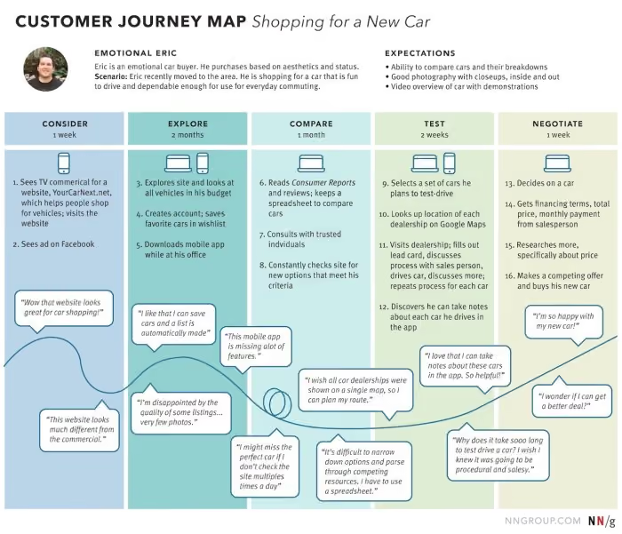
Future state customer journey maps focus on what the customer journey can and should look like in the future. Although UX data is certainly an important aspect of understanding customers, future state journey maps involve a fair amount of creative speculation and interpretation. These customer journey maps focus on customer hopes and wants (future feelings), in addition to experiences and reactions. They can be a little objective and should be developed in balance with both positive and negative interactions.
Day in the life customer journey maps help you visualize your customer’s entire daily routine. Interactions with family, their commute, work meetings, afternoon coffee, etc. Regardless of whether or not the activities are related to your company. This type of journey map should be organized chronologically to give key insights into how and where customers are. What are the distractions, and where could they interact with your brand or product? How can key pain points be eased?
Service blueprints are a useful counterpart to a classic customer journey map. Whereas a customer journey map focuses on the thoughts, needs, and actions of the customer, a service blueprint reflects the perspective of the organization and its employees. What needs to happen behind the scenes to ensure the customer’s experience is the very best it can be.
Circular customer journey maps may be useful to visualize the customer journey as a circle or loop. Recognizing that some customers are recurring and non-transactional. Particularly through subscription-based relationships.
An empathy map is used to create a shared understanding of customers around their wants, needs, thoughts, and actions. This can be a great starting point to getting under your customer’s skin.
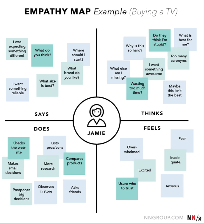
There is no one size fits all customer journey map. Each customer is unique, each organization is different. Through creating customer journeys, personas and visualizing their key touchpoints, pain points, and understanding who they are, empathy throughout the organization can be generated. With this as a tool to bring key stakeholders on board and to pinpoint where products (and services) can be improved to keep customers or even bring new ones on board, the user experience can be better and more effective.
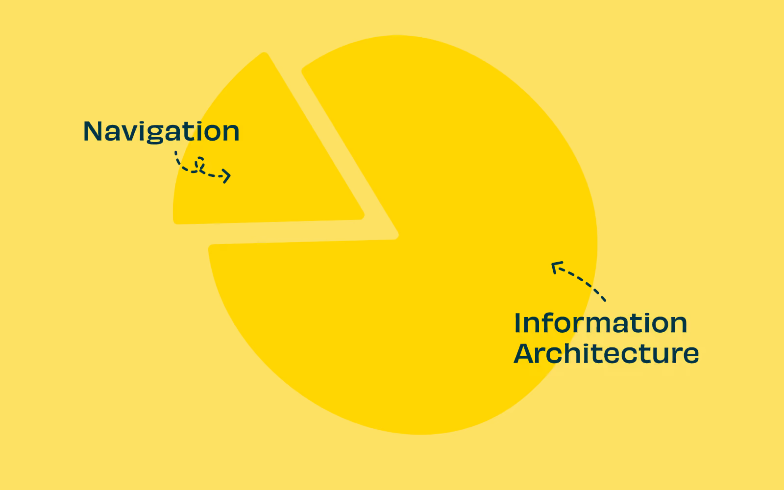
Information architecture is so much more than finding your way around a website or app. IA should be considered the foundation of a great user experience. The planning and consideration that goes into how information is organized labeled, and named. Once this foundation is laid, the user interface is what sits above and allows users to access the information. Navigation is one way that designers can point users in the right direction. But without correct labeling and naming (or even searching) navigation can only get us part of the way.
Let’s go into detail about what information architecture and the role navigation really plays.
Probably the easiest example of navigation is on a website. We are familiar with websites and how navigation can make or break a user experience. A website's information architecture (IA) can be considered to be made of two main components:
When a user lands on your website they won’t see the information architecture, rather, they will be interacting with the user interface (UI). While the IA itself is not visible while using the user interface it most certainly impacts the user's experience (UX).
The IA should be planned and the content structure visualized through diagrams, spreadsheets, and with wireframes, prototypes, or comprehensive layouts. Designing with the IA in mind web designers can create a better user experience. The user will not see the structure of the website but they will quickly discover the way the content has been divided up and then connected visually. And how well the information architecture matches these expectations will influence their UX.
When this interaction is not a great experience, users may leave feeling that your website content or functionality is not what they needed. They may end up feeling disappointed with the experience due to poor organization, naming, or structure.
Ensuring that the information architecture is thought through, considered from the end users’ perspective, tested, and planned is essential to building a great website from the ground up. Great navigation is what cues users to move on to the next step in their journey and ultimately will determine their experience.
Navigation is but one part of the story and tools to help users find their way through a website, app, or other product.
Information architecture can be broken down into three main areas to consider when building a great user experience:
When put like this it does seem pretty straightforward. Information architecture isn’t just how your information is navigated (on a website or app) but how it is labeled, the taxonomy, and the searchability help users find what they need from the information architecture.
An information architecture that has been planned, considered, researched, and structured with understanding and the intention of the needs of users and the owners will be robust and at its very best intuitive.
With an information architecture that has been organized well the navigation doesn’t need to work as hard. With correct labeling and organization of the content, navigation acts as a visual guide on your product to help users find their way to what they want. Imagine well-named road signs that are expected and easily seen. It makes finding what (where) you want much easier, even on a dark night.
Coupled with robust IA navigation will provide intuitive pathways for users to complete tasks. For instance, if you want your users to find where your contact information is, making certain that there is a navigation tab at the top of your website labeled ‘contact us’ which then has what might be expected (address, phone number, map, and even an email contact form) will make sense for users and the owners of the website.
Whilst navigation is a key component to users finding their way through your content information architecture is so much more than navigation. IA is the foundation of a great product, naming, labeling, organizing, and planning your information in a logical and expected way. Navigation is the sign that directs people to the content they want. And from there to the task or product they are looking for. If there is navigation without thought through information architecture, they may look in the wrong place, becoming lost and abandoning their task altogether.

Ever wondered what the relationship is between information architecture (IA) and UX? Simply put, IA is the foundation of UX. We outline why.
According to Abby Covert, a leader in the field of information architecture, IA is ‘the way we arrange the parts to make sense of the whole.’ This can relate to a website, a retail store or an app. And you could even consider the way a library is sorted to be information architecture. For the purposes of this article, we will focus on digital products (apps or websites).
Well-organized information architecture is fundamentally important to the success of your product. As a designer, knowing the content you are delivering and how, is fundamental to creating a UX that performs. Working with the needs of the organization and meeting the requirements of the users in a meaningful and delightful way. Organizing and structuring the information so that navigating, searching, and understanding your product is seamless is ultimately what UX design is all about. Arranging the parts to make sense of the whole, you could say.
While design is about creating visual pointers for users to find their way, information architecture can be broken down into 3 main areas to consider when building a great user experience:
When put like this it does seem pretty straightforward. Maybe even simple? But these tasks need to be straightforward for your users. Putting thought, time, and research at the front of your design and build can increase your chances of delivering an intuitive product. In fact, at any point in your product’s life cycle, it’s worth testing and reviewing these 3 areas.
Developing a well-thought-out and researched information architecture for your product could be considered a foundation step to creating a great UX product. To help you on your way, here are 6 key things to consider when building effective information architecture for a great user experience.
Information architecture is the foundation of designing a great product that meets (or even exceeds) your users’ needs, wants, and desires. By balancing an organization’s needs with insight into what users actually want, you’re well equipped to design an information architecture that helps build a product that delivers a positive user experience. Research, test, research, and test again should be the mantra throughout the development, design, and implementation of your product and beyond.

Designing for a mobile app is quite different to designing for websites. The content may be similar (even the same) but the intent for users is likely to be different, as are the environments and occasions they use them. When designing for mobile the information architecture (IA) uses a different set of rules. The key consideration needs to be around ease of use on a smaller screen for a user that is possibly on the move and very likely distracted. They have limited time, limited attention and need a quick result.
Your app could be the first point of contact. It might be the only way your user interacts with you on a regular basis. It needs to be super simple, clean, and quick to interact with. A well thought out, thoroughly researched, and organized information architecture plays a big part in helping to deliver an easy and enjoyable user experience.
According to Abby Covert, a leader in the field of information architecture, IA is ‘the way we arrange the parts to make sense of the whole.’ Information architecture (IA)is found in every digital product, from websites, apps to an intranet and can even be applied to the physical world in places like libraries and supermarkets.For the purposes of this blog we will focus on the importance of information architecture for mobile apps. Researching and designing an app’s IA with just the right amount of information is key. And providing a way of navigating that content in a way that is quick and intuitive is key to a good user experience.
The first thing to understand about mobile app information architecture is that it’s different – and not just with regards to size. The sheer physicality and specifications of mobile devices mean we need to consider different design requirements. Because mobile devices are light and portable, users are in constant contact with them and they are by far the most convenient way to access information. With mobile apps it can be even more important to consider the user journey, to keep that journey as short as possible, and anticipate the user's needs. Consideration should be given to:
Most mobile device interfaces are accessed through touch screens. Users rely on learnt gestures – in addition to a simple interface – to interact. Because of their smaller dimensions, users often expect the content structures to be simpler and smaller. Also, because of limited bandwidth and connectivity, mobile devices require app designs to be optimized for loading time, with reduced data demands.
Because we have constant access to our mobile devices, we tend to use them a lot more. They come with us on the bus, walking the dog, or even watching TV. We often use them while ‘doing’ something else. This means we often use the device under difficult viewing conditions, or among a variety of distractions.
We have different attitudes, behaviors and priorities while using mobile devices. Many of us often have our mobile device within arms reach at all times. We have become attached to these devices and feel ‘lost’ when we don’t have them nearby. Some people even consider them an extension of their being!
We need to think of mobile devices as having their own particular information architecture structure to work within their unique requirements and environments. While the structure of a responsive website may follow the same IA, native apps often employ navigational structures that are tab-based. There’s no one or ‘right’ way to architect a mobile site or application. Rather it’s dependent on factors like the size of the content you need to organize or what the intended user journey is that informs the choice of information architecture structure. Let’s take a look at some of the most popular IA structures for mobile apps:
A standard website structure with an index page and a series of sub pages. If you are designing a responsive website you may be restricted to this structure, however introducing additional structural patterns could allow you to tailor the user experience for mobile.
Gives you a central index from which users will navigate from. It’s the default pattern on Apple’s iPhone, with a home screen and the various apps users download. Users can’t navigate between spokes but must return to the hub (home screen), instead.


Leads users in a linear fashion to more detailed content. It’s a simplified interface which quickly leads on to the next step. It can be most useful when users are in distracting conditions because it’s a quick and easy method of navigation.
Regular app users will be familiar with this structure. It’s a collection of sections tied together by a toolbar menu. This allows the user to quickly scan and understand the functionality of the app as soon as it’s opened. Easy to navigate throughout the app.


Allows the user to navigate within a set of data by selecting filter options to create a view that suits them. Can be more difficult to view on mobile if there is too much content, as it can be difficult to display.

When designing for mobile devices it is important to always keep in mind the user journey and how (and when) users are likely to be interacting with your app. What is their primary objective? What is your organization's objective? How do you move them through their tasks to enable them to complete them quickly, simply and easily? Working within the size restrictions and limitations of mobile devices and users needs and desires with a thoroughly thought out IA structure will always win on the day.

