Subscribe to OW blog for an instantly better inbox
Oops! Something went wrong while submitting the form.

We love getting stuck into scary, hairy problems to make things better here at Trade Me. One challenge for us in particular is how best to navigate customer reaction to any change we make to the site, the app, the terms and conditions, and so on. Our customers are passionate both about the service we provide — an online auction and marketplace — and its place in their lives, and are rightly forthcoming when they're displeased or frustrated. We therefore rely on our Customer Service (CS) team to give customers a voice, and to respond with patience and skill to customer problems ranging from incorrectly listed items to reports of abusive behavior.
The CS team uses a Customer Relationship Management (CRM) system, Trade Me Admin, to monitor support requests and manage customer accounts. As the spectrum of Trade Me's services and the complexity of the public website have grown rapidly, the CRM system has, to be blunt, been updated in ways which have not always been the prettiest. Links for new tools and reports have simply been added to existing pages, and old tools for services we no longer operate have not always been removed. Thus, our latest focus has been to improve the user experience of the CRM system for our CS team.
And though on the surface it looks like we're working on a product with only 90 internal users, our changes will have flow on effects to tens of thousands of our members at any given time (from a total number of around 3.6 million members).
We face unique challenges designing customer service systems. Robert Schumacher from GfK summarizes these problems well. I’ve paraphrased him here and added an issue of my own:
1. Customer service centres are high volume environments — Our CS team has thousands of customer interactions every day, and and each team member travels similar paths in the CRM system.
2. Wrong turns are amplified — With so many similar interactions, a system change that adds a minute more to processing customer queries could slow down the whole team and result in delays for customers.
3. Two people relying on the same system — When the CS team takes a phone call from a customer, the CRM system is serving both people: the CS person who is interacting with it, and the caller who directs the interaction. Trouble is, the caller can't see the paths the system is forcing the CS person to take. For example, in a previous job a client’s CS team would always ask callers two or three extra security questions — not to confirm identites, but to cover up the delay between answering the call and the right page loading in the system.
4. Desktop clutter — As a result of the plethora of tools and reports and systems, the desktop of the average CS team member is crowded with open windows and tabs. They have to remember where things are and also how to interact with the different tools and reports, all of which may have been created independently (ie. work differently). This presents quite the cognitive load.
5. CS team members are expert users — They use the system every day, and will all have their own techniques for interacting with it quickly and accurately. They've also probably come up with their own solutions to system problems, which they might be very comfortable with. As Schumacher says, 'A critical mistake is to discount the expert and design for the novice. In contact centers, novices become experts very quickly.'
6. Co-design is risky — Co-design workshops, where the users become the designers, are all the rage, and are usually pretty effective at getting great ideas quickly into systems. But expert users almost always end up regurgitating the system they're familiar with, as they've been trained by repeated use of systems to think in fixed ways.
7. Training is expensive — Complex systems require more training so if your call centre has high churn (ours doesn’t – most staff stick around for years) then you’ll be spending a lot of money. …and the one I’ve added:
8. Powerful does not mean easy to learn — The ‘it must be easy to use and intuitive’ design rationale is often the cause of badly designed CRM systems. Designers mistakenly design something simple when they should be designing something powerful. Powerful is complicated, dense, and often less easy to learn, but once mastered lets staff really motor.
Our improvement of Trade Me Admin is focused on fixing the shattered IA and restructuring the key pages to make them perform even better, bringing them into a new code framework. We're not redesigning the reports, tools, code or even the interaction for most of the reports, as this will be many years of effort. Watching our own staff use Trade Me Admin is like watching someone juggling six or seven things.
The system requires them to visit multiple pages, hold multiple facts in their head, pattern and problem-match across those pages, and follow their professional intuition to get to the heart of a problem. Where the system works well is on some key, densely detailed hub pages. Where it works badly, staff have to navigate click farms with arbitrary link names, have to type across the URL to get to hidden reports, and generally expend more effort on finding the answer than on comprehending the answer.
The first thing that we did was to sit with CS and watch them work and get to know the common actions they perform. The random nature of the IA and the plethora of dead links and superseded reports became apparent. We surveyed teams, providing them with screen printouts and three highlighter pens to colour things as green (use heaps), orange (use sometimes) and red (never use). From this, we were able to immediately remove a lot of noise from the new IA. We also saw that specific teams used certain links but that everyone used a core set. Initially focussing on the core set, we set about understanding the tasks under those links.
The complexity of the job soon became apparent – with a complex system like Trade Me Admin, it is possible to do the same thing in many different ways. Most CRM systems are complex and detailed enough for there to be more than one way to achieve the same end and often, it’s not possible to get a definitive answer, only possible to ‘build a picture’. There’s no one-to-one mapping of task to link. Links were also often arbitrarily named: ‘SQL Lookup’ being an example. The highly-trained user base are dependent on muscle memory in finding these links. This meant that when asked something like: “What and where is the policing enquiry function?”, many couldn’t tell us what or where it was, but when they needed the report it contained they found it straight away.
Therefore, it came as little surprise that staff found the subsequent card sort task quite hard. We renamed the links to better describe their associated actions, and of course, they weren't in the same location as in Trade Me Admin. So instead of taking the predicted 20 minutes, the sort was taking upwards of 40 minutes. Not great when staff are supposed to be answering customer enquiries!
We noticed some strong trends in the results, with links clustering around some of the key pages and tasks (like 'member', 'listing', 'review member financials', and so on). The results also confirmed something that we had observed — that there is a strong split between two types of information: emails/tickets/notes and member info/listing info/reports.

After card sorting, we created two new IAs, and then customized one of the IAs for each of the three CS teams, giving us IAs to test. Each team was then asked to complete two tree tests, with 50% doing one first and 50% doing the other first. At first glance, the results of the tree test were okay — around 61% — but 'Could try harder'. We saw very little overall difference between the success of the two structures, but definitely some differences in task success. And we also came across an interesting quirk in the results.
Closer analysis of the pie charts with an expert in Trade Me Admin showed that some ‘wrong’ answers would give part of the picture required. In some cases so much so that I reclassified answers as ‘correct’ as they were more right than wrong. Typically, in a real world situation, staff might check several reports in order to build a picture. This ambiguous nature is hard to replicate in a tree test which wants definitive yes or no answers. Keeping the tasks both simple to follow and comprehensive proved harder than we expected.
For example, we set a task that asked participants to investigate whether two customers had been bidding on each other's auctions. When we looked at the pietree (see screenshot below), we noticed some participants had clicked on 'Search Members', thinking they needed to locate the customer accounts, when the task had presumed that the customers had already been found. This is a useful insight into writing more comprehensive tasks that we can take with us into our next tests.
What’s clear from analysis is that although it’s possible to provide definitive answers for a typical site’s IAs, for a CRM like Trade Me Admin this is a lot harder. Devising and testing the structure of a CRM has proved a challenge for our highly trained audience, who are used to the current system and naturally find it difficult to see and do things differently. Once we had reclassified some of the answers as ‘correct’ one of the two trees was a clear winner — it had gone from 61% to 69%. The other tree had only improved slightly, from 61% to 63%.
There were still elements with it that were performing sub-optimally in our winning structure, though. Generally, the problems were to do with labelling, where, in some cases, we had attempted to disambiguate those ‘SQL lookup’-type labels but in the process, confused the team. We were left with the dilemma of whether to go with the new labels and make the system initially harder to use for staff but easier to learn for new staff, or stick with the old labels, which are harder to learn. My view is that any new system is going to see an initial performance dip, so we might as well change the labels now and make it better.
The importance of carefully structuring questions in a tree test has been highlighted, particularly in light of the ‘start anywhere/go anywhere’ nature of a CRM. The diffuse but powerful nature of a CRM means that careful consideration of tree test answer options needs to be made, in order to decide ‘how close to 100% correct answer’ you want to get.
It's great to see that our research is influencing the next stage of the CRM system, and we're looking forward to seeing it go live. Of course, our work isn't over— and nor would we want it to be! Alongside the redevelopment of the IA, I've been redesigning the key pages from Trade Me Admin, and continuing to conduct user research, including first click testing using Chalkmark.
This project has been governed by a steadily developing set of design principles, focused on complex CRM systems and the specific needs of their audience. Two of these principles are to reduce navigation and to design for experts, not novices, which means creating dense, detailed pages. It's intense, complex, and rewarding design work, and we'll be exploring this exciting space in more depth in upcoming posts.

"Dear Optimal Worshop
I have two huge content structures I would like to A/B test. Do you think Treejack would be appropriate?"
— Mike
Hi Mike (and excellent question)!
Firstly, yes, Treejack is great for testing more than one content structure. It’s easy to run two separate Treejack studies — even more than two. It’ll help you decide which structure you and your team should run with, and it won’t take you long to set them up.
When you’re creating the two tree tests with your two different content structures, include the same tasks in both tests. Using the same tasks will give an accurate measure of which structure performs best. I’ve done it before and I found that the visual presentation of the results — especially the detailed path analysis pietrees — made it really easy to compare Test A with Test B.
Plus (and this is a big plus), if you need to convince stakeholders or teammates of which structure is the most effective, you can’t go past quantitative data, especially when its presented clearly — it’s hard to argue with hard evidence!
Here’s two example of the kinds of results visualizations you could compare in your A/B test: the pietree, which shows correct and incorrect paths, and where people ended up:

And the overall Task result, which breaks down success and directness scores, and has plenty of information worth comparing between two tests:

Keep in mind that running an A/B tree test will affect how you recruit participants — it may not be the best idea to have the same participants complete both tests in one go. But it’s an easy fix — you could either recruit two different groups from the same demographic, or test one group and have a gap (of at least a day) between the two tests.
I’ve one more quick question: why are your two content structures ‘huge’?
I understand that sometimes these things are unavoidable — you potentially work for a government organization, or a university, and you have to include all of the things. But if not, and if you haven’t already, you could run an open card sort to come up with another structure to test (think of it as an A/B/C test!), and to confirm that the categories you’re proposing work for people.
You could even run a closed card sort to establish which content is more important to people than others (your categories could go from ‘Very important’ to ‘Unimportant’, or ‘Use everyday’ to ‘Never use’, for example). You might be able to make your content structure a bit smaller, and still keep its usefulness. Just a thought... and of course, you could try to get this information from your analytics (if available) but just be cautious of this because of course analytics can only tell you what people did and not what they wanted to do.
All the best Mike!
In 2009, Bob Bailey and Cari Wolfson published published findings that changed how we approach first click testing and usability testing. They analyzed 12 scenario-based user tests and found that if someone gets their first click right, they're about twice as likely to complete their task successfully. This finding was so compelling that we built First Click Testing (formerly Chalkmark) specifically to help teams test this. But we'd never actually validated their research using our own data, until now.
Turns out, we're sitting on one of the world's largest databases of tree testing results. So we analyzed millions of task responses to see if the "first click predicts success" hypothesis holds up.
It does. Convincingly.
Users who get their first click correct are nearly three times more likely to complete their task successfully (70% vs 24% success rate).
Here's how we validated the original study, what our data shows, and why first clicks matter more than you might think.
Bob and Cari analyzed data from twelve usability studies on websites and products with varying amounts and types of content, a range of subject matter complexity, and distinct user interfaces. They found that people were about twice as likely to complete a task successfully if they got their first click right, than if they got it wrong:
If the first click was correct, the chances of getting the entire scenario correct was 87% if the first click was incorrect, the chances of eventually getting the scenario correct was only 46%.
We analyzed millions of tree testing responses in our database. We've found that people who get the first click correct are almost three times as likely to complete a task successfully:
If the first click was correct, the chances of getting the entire scenario correct was 70% if the first click was incorrect, the chances of eventually getting the scenario correct was 24%
To give you another perspective on the same data, here's the inverse:
If the first click was correct, the chances of getting the entire scenario incorrect was 30% if the first click was incorrect, the chances of getting the whole scenario incorrect was 76%
Bob and Cari proved the usefulness of the methodology by linking two key metrics in scenario-based usability studies: first clicks and task success. First Click Testing doesn't measure task success — it's up to the researcher to determine as they're setting up the study what constitutes 'success', and then to interpret the results accordingly. Tree Testing (formerly Treejack) does measure task success — and first clicks.
In a tree test, participants are asked to complete a task by clicking though a text-only version of a website hierarchy, and then clicking 'I'd find it here' when they've chosen an answer. Each task in a tree test has a pre-determined correct answer — as was the case in Bob and Cari's usability studies — and every click is recorded, so we can see participant paths in detail.
Thus, every single time a person completes an individual tree testing task, we record both their first click and whether they are successful or not. When we came to test the 'correct first click leads to task success' hypothesis, we could therefore mine data from millions of task.
To illustrate this, have a look at the results for one task. The overall Task result, you see a score for success and directness, and a breakdown of whether each Success, Fail, or Skip was direct (they went straight to an answer), or indirect (they went back up the tree before they selected an answer):

In the pie tree for the same task, you can look in more detail at how many people went the wrong way from a label (each label representing one page of your website):

In the First Click tab, you get a percentage breakdown of which label people clicked first to complete the task:

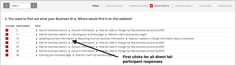
And in the Paths tab, you can view individual participant paths in detail (including first clicks), and can filter the table by direct and indirect success, fails, and skips (this table is only displaying direct success and direct fail paths):
First click analysis is one of the most predictive metrics in usability testing. Whether you're testing wireframes, landing pages, or information architecture, measuring first click success gives you early insight into whether your design will work.
This analysis reinforces something we already knew: first clicks matter. It is worth your time to get that first impression right. You have plenty of options for measuring the link between first clicks and task success in your scenario-based usability tests. From simply noting where your participants go during observations, to gathering quantitative first click data via online tools, you'll win either way. And if you want quantitative first click data, Optimal has you covered. First Click Testing works for wireframes and landing pages, while Tree Testing validates your information architecture.
To finish, here are a few invaluable insights from other researchers on getting the most from first click testing:
About this study
This analysis was conducted in 2015 using millions of task responses from Optimal’s First Click and Tree Testing tools. While the dataset predates recent UI trends, the underlying behavioral principle, that a correct first click strongly predicts task success, remains consistent with modern usability research.

Usability guru Jared Spool has written extensively about the 'scent of information'. This term describes how users are always 'on the hunt' through a site, click by click, to find the content they’re looking for. Tree testing helps you deliver a strong scent by improving organisation (how you group your headings and subheadings) and labelling (what you call each of them).
Anyone who’s seen a spy film knows there are always false scents and red herrings to lead the hero astray. And anyone who’s run a few tree tests has probably seen the same thing — headings and labels that lure participants to the wrong answer. We call these 'evil attractors'.In Part 1 of this article, we’ll look at what evil attractors are, how to spot them at the answer end of your tree, and how to fix them. In Part 2, we’ll look at how to spot them in the higher levels of your tree.
One of my favourite examples of an evil attractor comes from a tree test we ran for consumer.org.nz, a New Zealand consumer-review website (similar to Consumer Reports in the USA). Their site listed a wide range of consumer products in a tree several levels deep, and they wanted to try out a few ideas to make things easier to find as the site grew bigger.We ran the tests and got some useful answers, but we also noticed there was one particular subheading (Home > Appliances > Personal) that got clicks from participants looking for very different things — mobile phones, vacuum cleaners, home-theatre systems, and so on:

The website intended the Personal appliance category to be for products like electric shavers and curling irons. But apparently, Personal meant many things to our participants: they also went there for 'personal' items like mobile phones and cordless drills that actually lived somewhere else.This is the false scent — the heading that attracts clicks when it shouldn’t, leading participants astray. Hence this definition: an evil attractor is a heading that draws unwanted traffic across several unrelated tasks.
Attracting clicks isn’t a bad thing in itself. After all, that’s what a good heading does — it attracts clicks for the content it contains (and discourages clicks for everything else). Evil attractors, on the other hand, attract clicks for things they shouldn’t. These attractors lure users down the wrong path, and when users find themselves in the wrong place they'll either back up and try elsewhere (if they’re patient) or give up (if they’re not). Because these attractor topics are magnets for the user’s attention, they make it less likely that your user will get to the place you intended. The other evil part of these attractors is the way they hide in the shadows. Most of the time, they don’t get the lion’s share of traffic for a given task. Instead, they’ll poach 5–10% of the responses, luring away a fraction of users who might otherwise have found the right answer.
The easiest attractors to spot are those at the answer end of your tree (where participants ended up for each task). If we can look across tasks for similar wrong answers, then we can see which of these might be evil attractors.In your Treejack results, the Destinations tab lets you do just that. Here’s more of the consumer.org.nz example:

Normally, when you look at this view, you’re looking down a column for big hits and misses for a specific task. To look for evil attractors, however, you’re looking for patterns across rows. In other words, you’re looking horizontally, not vertically. If we do that here, we immediately notice the row for Personal (highlighted yellow). See all those hits along the row? Those hits indicate an attractor — steady traffic across many tasks that seem to have little in common. But remember, traffic alone is not enough. We’re looking for unwanted traffic across unrelated tasks. Do we see that here? Well, it looks like the tasks (about cameras, drills, laptops, vacuums, and so on) are not that closely related. We wouldn’t expect users to go to the same topic for each of these. And the answer they chose, Personal, certainly doesn’t seem to be the destination we intended. While we could rationalise why they chose this answer, it is definitely unwanted from an IA perspective. So yes, in this case, we seem to have caught an evil attractor red-handed. Here’s a heading that’s getting steady traffic where it shouldn’t.
It’s usually quite simple to figure out why an item in your tree is an evil attractor. In almost all cases, it’s because the item is vague or ambiguous — a word or phrase that could mean different things to different people. Look at our example above. In the context of a consumer-review site, Personal is too general to be a good heading. It could mean products you wear, or carry, or use in the bathroom, or a number of things. So, when those participants come along clutching a task, and they see Personal, a few of them think 'That looks like it might be what I’m looking for', and they go that way.Individually, those choices may be defensible, but as an information architect, are you really going to group mobile phones with vacuum cleaners? The 'personal' link between them is tenuous at best.
Just as it’s easy to see why most attractors attract, it’s usually easy to fix them. Evil attractors trade in vagueness and ambiguity, so the obvious remedy is to make those headings more concrete and specific. In the consumer-site example, we looked at the actual content under the Personal heading. It turned out to be items like shavers, curling irons, and hair dryers. A quick discussion yielded Personal care as a promising replacement — one that should deter people looking for mobile phones and jewellery and the like.In the second round of tree testing, among the other changes we made to the tree, we replaced Personal with Personal Care. A few days later, the results confirmed our thinking. Our former evil attractor was no longer luring participants away from the correct answers:

This brings up a final point about tree testing (and about any kind of user testing, really): you need to iterate your testing — once is not enough.The first round of testing shows you where your tree is doing well (yay!) and where it needs more work so you can make some thoughtful revisions. Be careful though. Even if the problems you found seem to have obvious solutions, you still need to make sure your revisions actually work for users, and don’t cause further problems. The good news is, it’s dead easy to run a second test, because it’s just a small revision of the first. You already have the tasks and all the other bits worked out, so it’s just a matter of making a copy in Treejack, pasting in your revised tree, and hooking up the correct answers. In an hour or two, you’re ready to pilot it again (to err is human, remember) and send it off to a fresh batch of participants.
Two possible outcomes await.
In Part 1, we’ve covered what evil attractors are and how to spot them at the answer end of your tree: that is, evil attractors that participants chose as their destination when performing tasks. Hopefully, a future version of Treejack will be able to highlight these attractors to make your analysis that much easier.
In Part 2, we’ll look at how to spot evil attractors in the intermediate levels of your tree, where they lure participants into a section of the site that you didn’t intend. These are harder to spot, but we’ll see if we can ferret them out.Let us know if you've caught any evil attractors red-handed in your projects.
