Subscribe to OW blog for an instantly better inbox
Oops! Something went wrong while submitting the form.

Summary: User researcher Ashlea McKay runs through some of her top tips for carrying out advanced analysis in tree testing tool Treejack.
Tree testing your information architecture (IA) with Treejack is a fantastic way to find out how easy it is for people to find information on your website and pinpoint exactly where they’re getting lost. A quick glance at the results visualization features within the tool will give you an excellent starting point, however your Treejack data holds a much deeper story that you may not be aware of or may be having trouble pinning down. It’s great to be able to identify a sticking point that’s holding your IA back, but you also want to see where that fits into the rest of the story and also not just where people are getting lost in the woods, but why.
Thankfully, this is something that is super quick and easy to find — you just have to know where to look. To help you gain a fuller picture of your tree testing data, I’ve pulled together this handy guide of my top tips for running advanced analysis in Treejack.
Treejack results are exciting and it can be all too easy to breeze past the Participants tab to get to those juicy insights as quickly as possible, but stopping for a moment to take a look is worth it. You need to ensure that everyone who has been included in your study results belongs there. Take some time to flick through each participant one by one and see if there’s anyone you’d need to exclude.
Keep an eye out for any of the following potential red flags:
Treejack also automatically excludes incomplete responses and marks them as ‘abandoned’, but you have full control over who is and isn’t included and you might like to reintroduce some of these results if you feel they’re useful. For example, you might like to bring back someone who completed 9 out of a total of 10 tasks before abandoning it as this might mean that they were interrupted or may have accidentally closed their browser tab or window before reaching the end.
You can add, remove or filter participant data from your overall results pool at any time during your analysis, but at a minimum deciding who does and doesn’t belong at the very beginning will save you a lot of time and effort that I certainly learned about the hard way.
Once you’re happy with the responses that will be included in your results, you’re good to go. If you made any changes, all you have to do is reload your results which you can do from the Participants tab and all your data on the other tabs will be updated to reflect your new participant pool.
Pietrees are the heart and soul of Treejack. They bring all the data Treejack collected on your participants’ journeys for a single task during your study together into one interactive and holistic view. After gaining an overall feel for your results by reviewing the task by task statistics under the Task Results tab, pietrees are your next stop in advanced analysis in Treejack.
Start by reviewing the overall size of the pietree. Is it big and scattered with small circles representing each node (also called a ‘pie’ or a ‘branch’)? Or is it small with large circular nodes? Or is it somewhere in between? The overall size of the pietree can provide insight into how long and complex your participants’ pathways to their nominated correct answer were.
Smaller pietrees with bigger circular nodes like the one shown in the example below taken from a study I ran in 2018 testing IKEA’s US website, happen when participants follow more direct pathways to their destination — meaning they didn’t stray from the path that you set as correct when you built the study.

This is a good thing! You want your participants to be able to reach their goal quickly and directly without clicking off into other areas but when they can’t and you end up with a much larger and more scattered pietree, the trail of breadcrumbs they leave behind them will show you exactly where you’re going wrong — also a good thing! Larger and more scattered pietrees happen when indirect and winding pathways were followed and sometimes you’ll come across a pietree like the one shown below where just about every second and third level node has been clicked on.

This can indicate that people felt quite lost in general while trying to complete their task because bigger pietrees tend to show large amounts of people clicking into the wrong nodes and immediately turning back. This is shown with red (incorrect path) and blue (back from here) color coding on the nodes of the tree and you can view exactly how many people did this along with the rest of that node’s activity by hovering over each one (see below image).
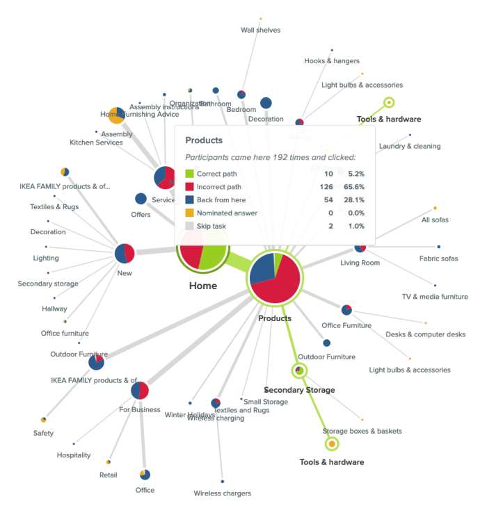
In this case people were looking for an electric screwdriver and while ‘Products’ was the right location for that content, there was something about the labels underneath it that made 28.1% of its total visitors think they were in the wrong place and turn back. It could be that the labels need a bit of work or more likely that the placement of that content might not be right — ‘Secondary Storage’ and ‘Kitchens’ (hidden by the hover window in the image above) aren’t exactly the most intuitive locations for a power tool.
When analyzing your pietree keep an eye out for any labels that might be potentially leading your users astray. Were there large numbers of people starting on or visiting the same incorrect node of your IA? In the example shown below, participants were attempting to replace lost furniture assembly instructions and the pietree for this task shows that the 2 very similar labels of ‘Assembly instructions’ (correct location) and ‘Assembly’ (incorrect location) were likely tripping people up as almost half the participants in the study were in the right place (‘Services’), but took a wrong turn and ultimately chose the wrong destination node.

Have a look at your pietree to see the number of times ‘Home’ was clicked. If that number is more than twice that of your participants, this can be a big indicator that people were lost in your IA tree overall. I remember a project where I was running an intranet benchmarking tree test that had around 80 participants and ‘Home’ had been clicked on a whopping 648 times and the pietrees were very large and scattered. When people are feeling really lost in an IA, they’ll often click on ‘Home’ as a way to clear the slate and start their journey over again. The Paths tab — which we’re going to talk about next — will allow you to dig deeper into findings like this in your own studies.
While the pietrees bring all your participants’ task journeys together into one visualization, the Paths tab separates them out so you can see exactly what each individual got up to during each task in your study.
As we discussed earlier, you want your IA to support your users and enable them to follow the most direct pathway to the content that will help them achieve their goal. The paths table will help show you if your IA is there yet or if it needs more work. Path types are color coded by directness and also use arrows to communicate which direction participants were traveling in at each point of their journey so you can see where in the IA that they were moving forward and where they were turning back. You can also filter by path type by checking/unchecking the boxes next to the colours and their text-based label names at the top of the table.
Here’s what those types mean:

It’s also important to note that while some tasks may appear to be successful on the surface — e.g., your participants correctly identified the location of that content — if they took a convoluted path to get to that correct answer, something isn’t quite right with your tree and it still needs work. Success isn’t always the end of the story and failed tasks aren’t the only ones you should be checking for lengthy paths. Look at the lengths of all your paths to gain a full picture of how your participants experienced your IA.
If you’re seeing large numbers of people failing tasks — either directly or indirectly — it’s worth taking a closer look at the paths table to find out exactly what they did and where they went. Did multiple people select the same wrong node? When people clicked into the wrong node, did they immediately turn back or did they keep going further down? And if they kept going, which label or labels made them think they were on the right track?
In the Sephora study example on that task I mentioned earlier where no one was successful in finding the correct answer, 22% of participants (7 people) started their journey on the wrong first node of ‘Help & FAQs’ and not one of those participants turned back beyond that particular Level 1 starting point (ie clicked on ‘Home’ to try another path). Some did backtrack during their journey but only as far back as the ‘Help & FAQs’ node that they started on indicating that it was likely the label that made them think they were on the right track. We’ll also take a closer look at the importance of accurate first clicks later on in this guide.

Treejack allows participants to skip tasks either before attempting a task or during one. The paths table will show you which node the skip occurred at, how many other nodes were clicked before they threw in the towel and how close (or not) they were to successfully completing their task. People skipping tasks in the real world affects conversion rates and more, but if you can find out where it’s happening in the IA during a tree test, you can improve it and better support your users and in turn meet your business goals.
Coming back to that Sephora study, when participants were looking to book an in-store beauty consultation, Participant 14 (see below image) was in the right area of the IA a total of 5 times during their journey (‘About Sephora’ and ‘Ways to Shop’). Each time they were just 2-3 clicks away from finding the right location for that content, but ultimately ended up skipping the task. It’s possible that the labels on the next layer down didn’t give this participant what they needed to feel confident they were still on the right track.

Borrowing a little functionality from Chalkmark, the first clicks tab in Treejack will help you to understand if your participants started their journey on the right foot because that first click matters! Research has shown that people are 2-3 times as likely to successfully complete their task if they start out on the right first click.
This is a really cool feature to have in Treejack because Chalkmark is image based, but when you’re tree testing you don’t always have a visual thing to test. And besides, a huge part of getting the bones of an IA right is to be deliberately visual distraction-free! Having this functionality in Treejack means you can start finding out if people are on the right track from much earlier stages in your project saving you a lot of time and messy guesswork.
Under the First clicks tab you will find a table with 2 columns. The first column shows which nodes of your tree were clicked first and the percentage of your participants that did that, and the second column shows the percentage of participants that visited that node during the task overall. The first column will tell you how many participants got their first click right (the correct first click nodes are shown in bold text ) and the second will tell you how many found their way there at some point during their journey overall including those who went there first.
Have a look at how many participants got their first click right and how many didn’t. For those who didn’t, where did they go instead?
Also look at how the percentage of correct first clicks compares to the percentage of participants who made it there eventually but didn’t go there first — is the number in the second column the same or is it bigger? How much bigger? Are people missing the first click but still making it there in the end? Not the greatest experience, but better than nothing! Besides that task’s paths table and pietree will help you pinpoint the exact location of the issues anyway so you can fix them.
When considering first-click data in your own Treejack study, just like you would with the pietrees, use the data under the Task results tab as a starting point to identify which tasks you’d like to take a closer look at. For example, in that Sephora study I mentioned, Task 5 showed some room for improvement. Participants were tasked with finding out if Sephora ships to PO boxes and only 44% of participants were able to do this as shown in the image below.

Looking at the first click table for this task (below), we can see that only 53% of participants overall started on the right first click which was ‘Help & FAQs’ (as shown in bold text).

Almost half the participants who completed this task started off on the wrong foot and a quarter overall clicked on ‘About Sephora’ first. We also know that 69% of participants visited that correct first node during the task which shows that some people were able to get back on track, but almost a third of participants still didn’t go anywhere near the correct location for that content. In this particular case, it’s possible that the correct first click of ‘Help & FAQs’ didn’t quite connect with participants as the place where postage options can be found.
As we near the end of this advanced Treejack analysis guide, our last stop is the Destinations tab. Under here you’ll find a detailed matrix showing where your participants ended their journeys for each task across your entire study. It’s a great way to quickly see how accurate those final destinations were and if they weren’t, where people went instead. It’s also useful for tasks that have multiple correct answers because it can tell you which one was most popular with participants and potentially highlight opportunities to streamline your IA by removing unnecessary duplication.
Along the vertical axis of the grid you’ll find your entire IA tree expanded out and along the horizontal axis, you’ll see your tasks shown by number. For a refresher on which task is which, just hover over the task number on the very handy sticky horizontal axis. Where these 2 meet in the grid, the number of participants who selected that node of the tree for that task will be displayed. If there isn’t a number in the box — regardless of shading — no one selected that node as their nominated correct answer for that task.
The boxes corresponding to the correct nodes for each task are shaded in green. Numberless green boxes can tell you in one quick glance if people aren’t ending up where they should be and if you scroll up and down the table, you’ll be able to see where they went instead.
Red boxes with numbers indicate that more than 20% of people incorrectly chose that node as well as how many did that. Orange boxes with numbers do the same but for nodes where between 10% and 20% of people selected it. And finally, boxes with numbers and no shading, indicate that less than 10% selected that node.
In the below example taken from that Sephora study we’ve been talking about in this guide, we can see that ‘Services’ was one of the correct answers for Task 4 and no one selected it.

The Destinations table is as long as the IA when it’s fully expanded and when we scroll all the way down through it (see below), we can see that there were a total of 3 correct answers for Task 4. For this task, 8 participants were successful and their responses were split across the 2 locations for the more specific ‘Beauty Services’ with the one under ‘Book a Reservation’ being the most popular and potentially best placed because it was chosen by 7 out of the 8 participants.

When viewed in isolation, each tab in Treejack offers a different and valuable perspective on your tree test data and when combined, they come together to build a much richer picture of your study results overall. The more you use Treejack, the better you’ll get at picking up on patterns and journey pathways in your data and you’ll be mastering that IA in no time at all!
Further reading
“Questions are never indiscreet, answers sometimes are.”Oscar Wilde
Frequently asked question pages. Love them or hate them, I don’t think they’re going anywhere anytime soon. This debate has been going on for quite some time and there is an equal number of opinions on both sides of the FAQ fence. Nielsen Norman Group’s Susan Farrell says FAQs can still add value to a website when done properly, and Gerry McGovern says FAQs are the dinosaurs of web navigation.
So, how do we really know for sure if they will or won’t add value to a design? Like anything in UX, you have to test it! I don’t know about you, but I’m a shake-it-and-see-what-falls-out kind of UXer, so naturally I decided to run a Treejack study. Scouring the web one fine day, I came across Sainsbury’s Active Kids. Its FAQ page was unlike any I had ever seen and I knew I’d found the one. I was also curious to see how it would test with people who don’t use the website — after all, anyone should be able to use it. Since Active Kids is an active lifestyle program for UK schools and sports clubs, I recruited my participants entirely from the US.
Pull up a chair and get comfy because what I found out should serve as a lesson to us all.
First of all, why did I choose this in the first place? The Active Kids FAQ page caught my attention for three main reasons:
The structure of this FAQs page is quite deep, complex and very different from the rest of the site — almost like another information architecture (IA) had been built within the main structure. Imagine you have a large warehouse with hundreds of shelves, and then somewhere in the middle of it, someone builds a house — that’s how it felt to me.
There are two ways to get to it: through the “Help” label on the top navigation bar and the “FAQ” label in the footer. It also uses a combination of drop-down filters that the user needs to apply, but it also has automatic filter options and confusing labels that can send you down a path you don’t necessarily want to take.
I also found it very interesting that most of the information contained within the FAQs section cannot be located anywhere else on the website and most of this is essential to gaining a fundamental understanding of what Active Kids actually does. Adding to the house in the warehouse analogy, it’s like the house holds all the key information the warehouse needs to function, but no one knows which room it’s kept in.

Treejack was the perfect choice for testing the findability of information on the Active Kids FAQ page and I decided to test the IA of the website as a whole — this means both the warehouse and the house. I couldn’t just test the house in isolation because that’s not how a user would interact with it. The test needed the context of the whole site to gain an understanding of what’s going on. Creating a Treejack study is quick and easy and all you have to do is build the structure out in a basic Excel spreadsheet and then copy and paste it into Treejack.
My next job was to determine the task based scenarios that my participants would use during the study. I decided to choose nine and all were derived from content located in the FAQs section and related to tasks a user might carry out when investigating or participating in the program. Once I had my tree and my tasks, all I had to do was set the correct answers based on where the information currently sits on the Active Kids website and I was ready to launch.
In my experience,recruiting participants for a Treejack study is quick and easy. All you have to do is determine the screener criteria for your participants and Optimal Workshop takes care of the rest. For this study I requested 30 participants and they all had to reside in the US. I ended up with 31 completed responses and it was all over in less than two hours.
So, what fell out of that tree when I tested a website aimed at parents and teachers of kids in the UK with 31 Americans? I’ll be honest with you: it wasn’t pretty. Here’s what I discovered in this study:

On the flip side, 68 per cent of participants in this study were able to locate a phone number to contact Active Kids directly (number 6 on the graph) and 97 per cent were successfully able to work out how to redeem vouchers (number 7). Overall, it wasn’t great.In addition to some very useful quantitative data, Treejack also provides detailed information on the pathways followed by each participant.
Understanding the journey they took is just as valuable as discovering how many found their way to the correct destination. This additional level of granularity will show you where and when your user is getting lost in your structure and where they went next. It’s also handy for spotting patterns (e.g., multiple participants navigating to the same incorrect response).
I always set my studies to collect responses anonymously and when this occurs, Treejack assigns each participant a numerical identifier to help keep track of their experience without the participant having to share his or her personal details. For task 6, the paths chart below shows that participants numbered eight to 20 were able to navigate directly to the correct answer without deviating from the correct path I defined during setup.

For Task 3 (below) , the story told by the paths was quite different. Participant number five navigated back and forth several times through the structure in their attempt to locate information on how to share a wishlist. After all that effort, they were unable to find the information they needed to complete the task and nominated to contact Active Kids directly. Not only is this a bad experience for the user but it also puts unnecessary pressure on the call centre because the information should be readily available on the website.

Treejack also provides insights into where participants started their journey by recording first click data. Just like Chalkmark, this functionality will tell you if your users are starting out on the right foot from that all important first click.In this study I found it interesting that when looking for information regarding the eligibility of home educators in the Active Kids program, 42 per cent of participants clicked on “Schools & Groups” and 19 per cent clicked on “Parents & Community” for their first click. Only 6 per cent clicked on “Help”, which happens to be the only place this information can be found.

I also found the first click results for Task 9 to be very interesting. When looking for basic information on the program, more than half (52 per cent) of the participants in this study went straight to “Help”. This indicates that, for these participants, none of the other options were going to provide them the information they needed.

I mentioned earlier there was a lesson in this for everyone, and rather than dwell on how something tested, it’s time to move on to some lessons learned and constructive ideas for improvement. Based on the results of this Treejack study, here are my top three recommendations for improving the Active Kids website:
Most of the key information required to master the basics of what Active Kids is all about is housed entirely in the FAQs section. FAQs should not be the only place a user can find out basic information needed to understand the purpose of a product, program or service. I believe this website would benefit from some further thinking around what actually belongs in the FAQs section and what could be surfaced much higher.
Another idea would be to follow the lead of the Government Digital Service and remove the FAQs section altogether — food for thought. Frequently asked questions would not be frequently asked questions if people could actually find the information on your site in the first place. Figure out where the answers to these questions really belong.
If you’re using Treejack, just look at the fails in your results and figure out where people went first. Is there a trend? Is this the right place? Maybe think about putting the answer the user is looking for there instead.
If you must have an FAQs section (and believe me I do understand that they don’t just disappear overnight! Just try to keep it as an interim solution only) please consider streamlining the way they are presented to the user. Ditch the filtering and display the list on one page only. Users should not have to drill down through several layers of content and then navigate through each category. For further reading on getting your FAQs straight, this Kissmetrics article is well worth a read.
Looking at the Active Kids website and the results from this study, I feel the intent of this website could use some refining. If we come back to my warehouse and house analogy, the main chunk of the website (the warehouse) seems to be one giant advertisement, while the house (the FAQs) is where the action-oriented stuff lies. The house seems to hold the key information that people need to use the program and I think it could be displayed better. Don’t get me wrong, Active Kids does some incredibly good work for the community and should absolutely shout its achievements from the rooftops, however a sense of balance is required here. I think it’s time for the house and the warehouse to join forces into a solution that offers both rooftop shouting and usable information that facilitates participation.
This study goes to show that regardless of where you are in your design process, whether that’s at the very beginning or a few years post-implementation, there is value to be gained from testing with a fresh set of eyes. I’m still undecided on which side of the FAQs debate I belong to — I’m going to sit on the fence and stand by the “if in doubt — test it” school of thought.
There’s no doubt usability is a key element of all great user experiences, how do we apply and test usability principles for a website? This article looks at usability principles in web design, how to test it, practical tips for success and a look at our remote testing tool, Treejack.
Web usability is defined as the extent to which a website can be used to achieve a specific task or goal by a user. It refers to the quality of the user experience and can be broken down into five key usability principles:
Aside from the obvious desire to improve the experience for the people who use our websites, web usability is crucial to your website’s survival. If your website is difficult to use, people will simply go somewhere else. In the cases where users do not have the option to go somewhere else, for example government services, poor web usability can lead to serious issues. How do we know if our website is well-designed? We test it with users.
There are many ways to evaluate web usability and here are the common methods:
Tree testing is a remote usability testing tool that uses tree testing to help you discover exactly where your users are getting lost in the structure of your website. Treejack uses a simplified text-based version of your website structure removing distractions such as navigation and visual design allowing you to test the design from its most basic level.
Like any other tree test, it uses task based scenarios and includes the opportunity to ask participants pre and post study questions that can be used to gain further insights. Tree testing is a useful tool for testing those five key usability principles mentioned earlier with powerful inbuilt features that do most of the heavy lifting for you. Tree testing records and presents the following for each task:
The level of detail recorded on the pathways followed by your participants makes it easy for you to determine the ease of use, learnability, efficiency and impact of errors of your website. The time taken to complete each task and the directness of each result also provide insights in relation to those four principles and user satisfaction can be measured through the results to your pre and post survey questions.
The first click data brings in the added benefits of first click testing and knowing when and where your participants gave up and moved on can help you identify any issues.Another thing tree testing does well is the way it brings all data for each task together into one comprehensive overview that tells you everything you need to know at a glance. Tree testing's task overview- all the key information in one placeIn addition to this, tree testing also generates comprehensive pathway maps called pietrees.
Each junction in the pathway is a piechart showing a statistical breakdown of participant activity at that point in the site structure including details about: how many were on the right track, how many were following the incorrect path and how many turned around and went back. These beautiful diagrams tell the story of your usability testing and are useful for communicating the results to your stakeholders.
Here are seven practical usability testing tips to get you started:

"Dear Optimal Worshop
I have two huge content structures I would like to A/B test. Do you think Treejack would be appropriate?"
— Mike
Hi Mike (and excellent question)!
Firstly, yes, Treejack is great for testing more than one content structure. It’s easy to run two separate Treejack studies — even more than two. It’ll help you decide which structure you and your team should run with, and it won’t take you long to set them up.
When you’re creating the two tree tests with your two different content structures, include the same tasks in both tests. Using the same tasks will give an accurate measure of which structure performs best. I’ve done it before and I found that the visual presentation of the results — especially the detailed path analysis pietrees — made it really easy to compare Test A with Test B.
Plus (and this is a big plus), if you need to convince stakeholders or teammates of which structure is the most effective, you can’t go past quantitative data, especially when its presented clearly — it’s hard to argue with hard evidence!
Here’s two example of the kinds of results visualizations you could compare in your A/B test: the pietree, which shows correct and incorrect paths, and where people ended up:

And the overall Task result, which breaks down success and directness scores, and has plenty of information worth comparing between two tests:

Keep in mind that running an A/B tree test will affect how you recruit participants — it may not be the best idea to have the same participants complete both tests in one go. But it’s an easy fix — you could either recruit two different groups from the same demographic, or test one group and have a gap (of at least a day) between the two tests.
I’ve one more quick question: why are your two content structures ‘huge’?
I understand that sometimes these things are unavoidable — you potentially work for a government organization, or a university, and you have to include all of the things. But if not, and if you haven’t already, you could run an open card sort to come up with another structure to test (think of it as an A/B/C test!), and to confirm that the categories you’re proposing work for people.
You could even run a closed card sort to establish which content is more important to people than others (your categories could go from ‘Very important’ to ‘Unimportant’, or ‘Use everyday’ to ‘Never use’, for example). You might be able to make your content structure a bit smaller, and still keep its usefulness. Just a thought... and of course, you could try to get this information from your analytics (if available) but just be cautious of this because of course analytics can only tell you what people did and not what they wanted to do.
All the best Mike!

In 2009, Bob Bailey and Cari Wolfson published apaper entitled “FirstClick Usability Testing: A new methodology for predicting users’ success on tasks”. They’d analyzed 12 scenario-based user tests and concluded that the first click people make is a strong leading indicator of their ultimate success on a given task. Their results were so compelling that we got all excited and created Chalkmark, a tool especially for first click usability testing. It occurred to me recently that we’ve never revisited the original premise for ourselves in any meaningful way.
And then one day I realized that, as if by magic, we’re sitting on quite possibly the world’s biggest database of tree test results. I wondered: can we use these results to back up Bob and Cari’s findings (and thus the relevanceof Chalkmark)?Hell yes we can.So we’ve analyzed tree testing data from millions of responses in Treejack, and we're thrilled (relieved) that it confirmed the findings from the 2009 paper — convincingly.
Bob and Cari analyzed data from twelve usability studies on websites and products ‘with varying amounts and types of content, a range of subject matter complexity, and distinct user interfaces’. They found that people were about twice as likely to complete a task successfully if they got their first click right, than if they got it wrong:
If the first click was correct, the chances of getting the entire scenario correct was 87%If the first click was incorrect, the chances of eventually getting the scenario correct was only 46%
We analyzed millions of tree testing responses in our database. We've found that people who get the first click correct are almost three times as likely to complete a task successfully:
If the first click was correct, the chances of getting the entire scenario correct was 70%If the first click was incorrect, the chances of eventually getting the scenario correct was 24%
To give you another perspective on the same data, here's the inverse:
If the first click was correct, the chances of getting the entire scenario incorrect was 30%If the first click was incorrect, the chances of getting the whole scenario incorrect was 76%
Bob and Cari proved the usefulness of the methodology by linking two key metrics in scenario-based usability studies: first clicks and task success. Chalkmark doesn't measure task success — it's up to the researcher to determine as they're setting up the study what constitutes 'success', and then to interpret the results accordingly. Treejack does measure task success — and first clicks.
In a tree test, participants are asked to complete a task by clicking though a text-only version of a website hierarchy, and then clicking 'I'd find it here' when they've chosen an answer. Each task in a tree test has a pre-determined correct answer — as was the case in Bob and Cari's usability studies — and every click is recorded, so we can see participant paths in detail.
Thus, every single time a person completes an individual Treejack task, we record both their first click and whether they are successful or not. When we came to test the 'correct first click leads to task success' hypothesis, we could therefore mine data from millions of task.
To illustrate this, have a look at the results for one task.The overall Task result, you see a score for success and directness, and a breakdown of whether each Success, Fail, or Skip was direct (they went straight to an answer), or indirect (they went back up the tree before they selected an answer):

In the pietree for the same task, you can look in more detail at how many people went the wrong way froma label (each label representing one page of your website):

In the First Click tab, you get a percentage breakdown of which label people clicked first to complete the task:

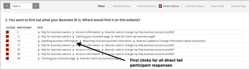
And in the Paths tab, you can view individual participant paths in detail (including first clicks), and can filter the table by direct and indirect success, fails, and skips (this table is only displaying direct success and direct fail paths):
This analysis reinforces something we already knew that firstclicks matter. It is worth your time to get that first impression right.You have plenty of options for measuring the link between first clicks and task success in your scenario-based usability tests. From simply noting where your participants go during observations, to gathering quantitative first click data via online tools, you'll win either way. And if you want to add the latter to your research, Chalkmark can give you first click data on wireframes and landing pages,and Treejack on your information architecture.
To finish, here's a few invaluable insights from other researchers ongetting the most from first click testing:

Usability guru Jared Spool has written extensively about the 'scent of information'. This term describes how users are always 'on the hunt' through a site, click by click, to find the content they’re looking for. Tree testing helps you deliver a strong scent by improving organisation (how you group your headings and subheadings) and labelling (what you call each of them).
Anyone who’s seen a spy film knows there are always false scents and red herrings to lead the hero astray. And anyone who’s run a few tree tests has probably seen the same thing — headings and labels that lure participants to the wrong answer. We call these 'evil attractors'.In Part 1 of this article, we’ll look at what evil attractors are, how to spot them at the answer end of your tree, and how to fix them. In Part 2, we’ll look at how to spot them in the higher levels of your tree.
One of my favourite examples of an evil attractor comes from a tree test we ran for consumer.org.nz, a New Zealand consumer-review website (similar to Consumer Reports in the USA). Their site listed a wide range of consumer products in a tree several levels deep, and they wanted to try out a few ideas to make things easier to find as the site grew bigger.We ran the tests and got some useful answers, but we also noticed there was one particular subheading (Home > Appliances > Personal) that got clicks from participants looking for very different things — mobile phones, vacuum cleaners, home-theatre systems, and so on:

The website intended the Personal appliance category to be for products like electric shavers and curling irons. But apparently, Personal meant many things to our participants: they also went there for 'personal' items like mobile phones and cordless drills that actually lived somewhere else.This is the false scent — the heading that attracts clicks when it shouldn’t, leading participants astray. Hence this definition: an evil attractor is a heading that draws unwanted traffic across several unrelated tasks.
Attracting clicks isn’t a bad thing in itself. After all, that’s what a good heading does — it attracts clicks for the content it contains (and discourages clicks for everything else). Evil attractors, on the other hand, attract clicks for things they shouldn’t. These attractors lure users down the wrong path, and when users find themselves in the wrong place they'll either back up and try elsewhere (if they’re patient) or give up (if they’re not). Because these attractor topics are magnets for the user’s attention, they make it less likely that your user will get to the place you intended. The other evil part of these attractors is the way they hide in the shadows. Most of the time, they don’t get the lion’s share of traffic for a given task. Instead, they’ll poach 5–10% of the responses, luring away a fraction of users who might otherwise have found the right answer.
The easiest attractors to spot are those at the answer end of your tree (where participants ended up for each task). If we can look across tasks for similar wrong answers, then we can see which of these might be evil attractors.In your Treejack results, the Destinations tab lets you do just that. Here’s more of the consumer.org.nz example:

Normally, when you look at this view, you’re looking down a column for big hits and misses for a specific task. To look for evil attractors, however, you’re looking for patterns across rows. In other words, you’re looking horizontally, not vertically. If we do that here, we immediately notice the row for Personal (highlighted yellow). See all those hits along the row? Those hits indicate an attractor — steady traffic across many tasks that seem to have little in common. But remember, traffic alone is not enough. We’re looking for unwanted traffic across unrelated tasks. Do we see that here? Well, it looks like the tasks (about cameras, drills, laptops, vacuums, and so on) are not that closely related. We wouldn’t expect users to go to the same topic for each of these. And the answer they chose, Personal, certainly doesn’t seem to be the destination we intended. While we could rationalise why they chose this answer, it is definitely unwanted from an IA perspective. So yes, in this case, we seem to have caught an evil attractor red-handed. Here’s a heading that’s getting steady traffic where it shouldn’t.
It’s usually quite simple to figure out why an item in your tree is an evil attractor. In almost all cases, it’s because the item is vague or ambiguous — a word or phrase that could mean different things to different people. Look at our example above. In the context of a consumer-review site, Personal is too general to be a good heading. It could mean products you wear, or carry, or use in the bathroom, or a number of things. So, when those participants come along clutching a task, and they see Personal, a few of them think 'That looks like it might be what I’m looking for', and they go that way.Individually, those choices may be defensible, but as an information architect, are you really going to group mobile phones with vacuum cleaners? The 'personal' link between them is tenuous at best.
Just as it’s easy to see why most attractors attract, it’s usually easy to fix them. Evil attractors trade in vagueness and ambiguity, so the obvious remedy is to make those headings more concrete and specific. In the consumer-site example, we looked at the actual content under the Personal heading. It turned out to be items like shavers, curling irons, and hair dryers. A quick discussion yielded Personal care as a promising replacement — one that should deter people looking for mobile phones and jewellery and the like.In the second round of tree testing, among the other changes we made to the tree, we replaced Personal with Personal Care. A few days later, the results confirmed our thinking. Our former evil attractor was no longer luring participants away from the correct answers:

This brings up a final point about tree testing (and about any kind of user testing, really): you need to iterate your testing — once is not enough.The first round of testing shows you where your tree is doing well (yay!) and where it needs more work so you can make some thoughtful revisions. Be careful though. Even if the problems you found seem to have obvious solutions, you still need to make sure your revisions actually work for users, and don’t cause further problems. The good news is, it’s dead easy to run a second test, because it’s just a small revision of the first. You already have the tasks and all the other bits worked out, so it’s just a matter of making a copy in Treejack, pasting in your revised tree, and hooking up the correct answers. In an hour or two, you’re ready to pilot it again (to err is human, remember) and send it off to a fresh batch of participants.
Two possible outcomes await.
In Part 1, we’ve covered what evil attractors are and how to spot them at the answer end of your tree: that is, evil attractors that participants chose as their destination when performing tasks. Hopefully, a future version of Treejack will be able to highlight these attractors to make your analysis that much easier.
In Part 2, we’ll look at how to spot evil attractors in the intermediate levels of your tree, where they lure participants into a section of the site that you didn’t intend. These are harder to spot, but we’ll see if we can ferret them out.Let us know if you've caught any evil attractors red-handed in your projects.
